Last updated on Nov 15, 2024
How to Design a Book Cover: A 7-Step Guide (with Pro Tips)
Martin Cavannagh
Head of Content at Reedsy, Martin has spent over eight years helping writers turn their ambitions into reality. As a voice in the indie publishing space, he has written for a number of outlets and spoken at conferences, including the 2024 Writers Summit at the London Book Fair.
View profile →Dario Villirilli
Editor-in-Chief of the Reedsy blog, Dario is a graduate of Mälardalen University. As a freelance writer, he has written for many esteemed outlets aimed at writers. A traveler at heart, he can be found roaming the world and working from his laptop.
View profile →A book’s cover is one of the most important marketing assets that authors have at their disposal. A great cover instantly conveys the book’s content and tone, drawing in readers browsing a bookstore or scrolling through Amazon — and can even double your sales.
So, what does it take to create an outstanding cover design? In this post, we’ll walk you through the entire process step-by-step — from gathering inspiration, to developing a concept, to finalizing your composition — and share professional tips from Reedsy's designer Raúl Gil.
How to design a book cover:
1. Take inspiration from covers in your genre
Research and planning should be an essential step in all design projects. With book covers, that research should be focused on how to:
- Attract your target reader’s attention and
- Communicate your book’s genre, tone, and content.
Thankfully, publishing is a trend-driven industry, and the creative choices of top publishers are reflected in the books you find on your local high street.
Snoop around bookshops and online retailers
Mainstream bookshops are especially useful places to start since they will stock books that are selling right now and will only carry the latest editions (so you won’t be misled by 30-year-old cover designs).
When looking at books in your genre, you’ll want to note any common uses of color, imagery, and general approach to design.
Here’s an (edited) snapshot of top-selling psychological thrillers on Amazon at the start of 2025:
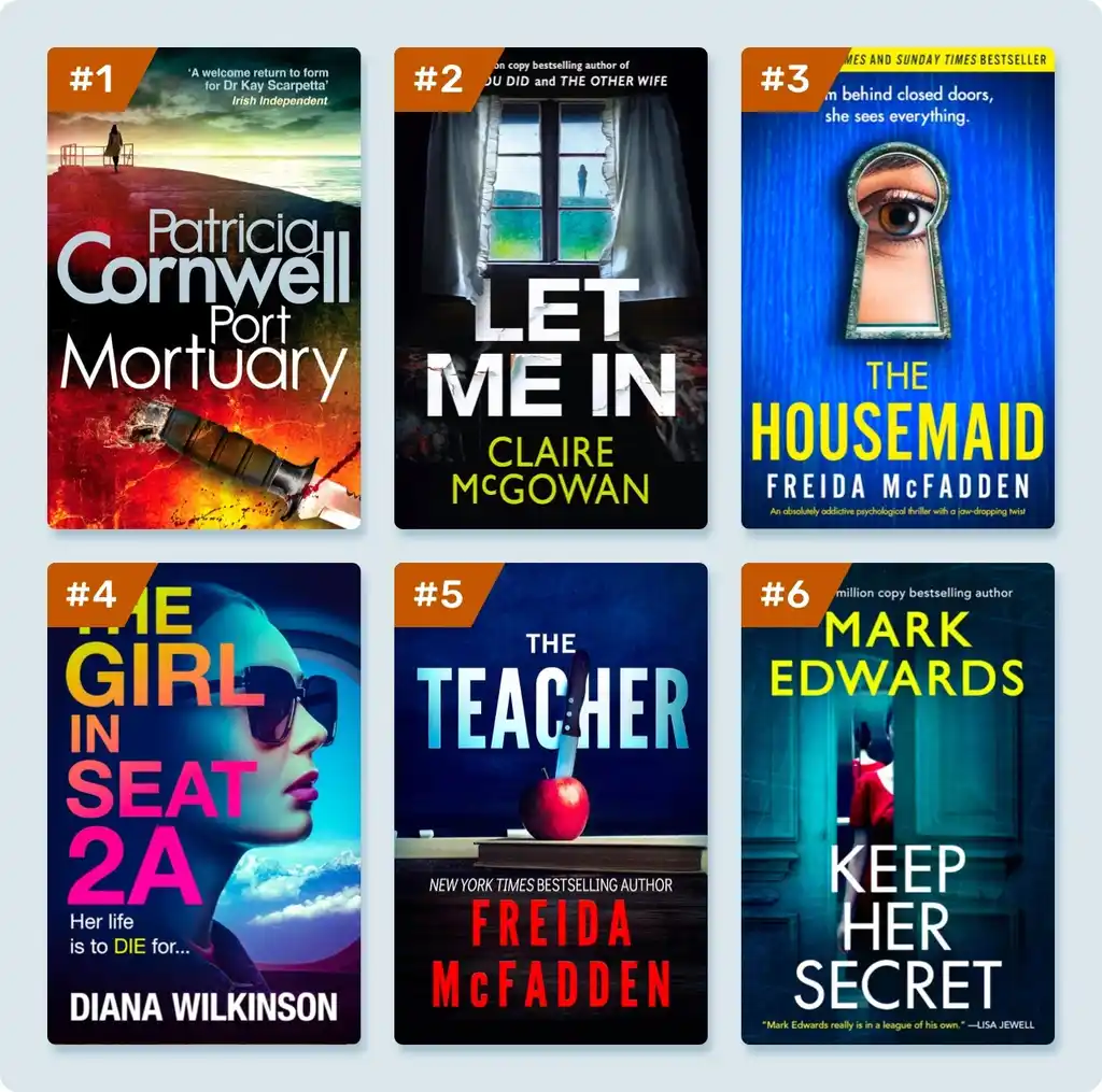
At a glance, you might see that many of these covers:
- Use a font similar to Helvetica, a sans serif typeface that feels quite contemporary.
- Employ a certain amount of yellow, red, and blue in some of the designs.
- Feature a character who’s obscured in some way.
All genres have their trends and tropes, and a good designer should be aware of them before working up their concepts. Once you’ve gathered this intel for the genre you write in, use it in your design to communicate what your book is about.
Q: How important are a genre's tropes in book cover design?
Suggested answer
Very. You want the audience to perceive the book's genre at a passing glance. A part of the design should deliver what the audience expects. But that doesn't mean you can't have fun with the design, either. Start with the tropes, and then put your own spin on them. Best case, you help to modify what audiences expect.
Michael is available to hire on Reedsy ⏺
Genre tropes are crucial in book cover design because they instantly communicate the book's category to potential readers, helping it stand out in a competitive market. By aligning with familiar visual cues while adding a unique twist, a well-designed cover can both meet audience expectations and spark curiosity.
Robert is available to hire on Reedsy ⏺
But before diving into the design process, deciding on the tools you’ll use is crucial.
2. Pick the right design tools
A poor craftsperson blames their tools — however, Leonardo didn’t compose the Mona Lisa with crayons. So before you get too far into the design process, you need to know two things:
- What software are you using to design your cover?
- Will you be proficient enough in that software to bring your ideas to life?
If you’re not 100% certain of your digital design skills, look into collaborating with a professional cover designer for your project. You can still remain in creative control of how the book looks, but with their market knowledge and ability to execute a design, a pro will give you the best chance of giving your book the design it deserves.
Work with an amazing designer
David T.
Available to hire
Exceedingly detail oriented and organized, with strong collaborative and interpersonal skills; highly dedicated, and reliable.
Gene M.
Available to hire
Full-service design studio specializing in cover art and branding for indie authors and independent publishers.
Ryan M.
Available to hire
You've come to the right place :) I am a professional book cover designer in Northern California, helping authors realize their vision.
If you’re confident in your abilities, look at some of the most popular book cover design apps and see which one you’d be best suited to.
Professional-grade software
- Adobe Suite: Encompassing InDesign, Illustrator, and Photoshop, Adobe Suite offers a comprehensive and flexible array of editorial layout, design, and image editing tools.
- QuarkXPress: Although it’s no longer the industry’s leading application for editorial design work, Quark has a long history as a professional product with a community of loyal users.
- Affinity Suite: The most professional and powerful alternative to the Adobe Suite. It offers most of the tools necessary for professional performance and, importantly, an accessible business model.
- Procreate & Adobe Fresco: Two of the most popular and powerful tools for illustrators. While Procreate is an iOS-exclusive tool, Fresco also works on Windows. In recent years, they have replaced Photoshop as the standard app for professional illustrators.
Consumer software
- Canva: A popular online design tool that’s remarkably simple and well-priced. The templates are easy to use but can result in very generic results.
- Adobe Spark: A consumer-level design tool from the makers of Photoshop and InDesign. One of its major benefits includes easy access to Adobe’s stock image library.
- GIMP: A free PhotoShop-style app that’s powerful but can be daunting for first-time users.
Depending on your level of expertise with design tools, choose your favorite one to bring your cover to life. Now, let’s start to get creative.
Q: What software do book cover designers use?
Suggested answer
I use a mix of Adobe products (of course!).
Adobe Illustrator for any illustrative/drawn elements such as illustrations, graphics, special text treatments or icons etc.
Adobe Photoshop for the general background of the whole cover/jacket (so, usually front, back and spine … and flaps if needed) as one high resolution document (allowing for bleed and spine width changes!). More often than not photographic elements too. This is where I will import and blend the graphics from Illustrator with photography/stock images to become a bespoke/original image. Sometimes title work will be done in Photoshop if it needs to combine/blend with the image more (not just plonked on the image for instance). Larger amounts of text shouldn’t be done in Photoshop as it’s a ’raster-based’ or ‘pixel-based’ app – it will never be as sharp as InDesign or Illustrator (both vector based – or infinitely scalable).
I can also control ink densities in Adobe Photoshop to make sure that my rich blacks are not too rich! In other words; not too much ink in the dark areas in the finished print (printers don’t like that!)
Then the artwork (mechanicals) are always completed in Adobe InDesign – the Photoshop file(s) is/are imported into my artwork file which is a much more accurate setup with grids and guides to make everything just perfect. InDesign cannot be beaten for its layout and type handling capabilities – when used properly! So normally the titles, book blurb and subtitles etc are done inDesign. Also ISBN codes, prices and any other required text is added InDesign. The app itself is much quicker to use and navigate with imported graphics and images then trying to do the same work in an app like Illustrator. This is what InDesign was developed for.
Also, any special finishes such as spot varnish, Pantone colours, embossing, de-bossing or foil blocking etc can be set up in Indesign using layers – much easier to control in Indesign than any other app.
Adobe Bridge can be used to produce colour profiles that could be synchronised over all the Adobe apps. So it’s easier to control your colour workflow across all the software apps.
Finally, print ready PDFs can be exported directly from InDesign including any layered special finishes. In my experience, PDFx4a files are the most stable and reliable PDFs to export.
I know all this text is a bit waffly, but it gives you an idea of how I go about my work.
Hit me up if you need a pro! (Haha!)
Nathan is available to hire on Reedsy ⏺
I use Adobe Illustrator to create the design of the cover, including the custom illustration. The advantage of working in Illustrator is that it allows me to work on both typography and illustration at the same time. It also allows for different artboards with variations of the cover design next to each other, making it a good tool for comparing different elements and aspects of the design.
To make a print-ready file, I sometimes use Adobe InDesign.
For the cover illustrations I also reach out to various drawing software apps on the iPad such as Procreate and Adobe Fresco that I then import into Illustrator.
Hester is available to hire on Reedsy ⏺
I use Adobe products like InDesign, Photoshop and/or Illustrator.
Photoshop and Illustrator for the images creation, manipulation and composition. Then I use InDesign for layout and typesetting.
Veronica is available to hire on Reedsy ⏺
3. Brainstorm an enticing concept
The only way to find a suitable concept is to first come up with a bunch of ideas that are off the mark, kinda good, or wrong but headed in the right direction. Even professional designers who know what they’re doing start by throwing ideas at the wall and seeing what sticks.
As a starting point, ask yourself: What emotions do you want your cover to evoke?
Capture the book’s tone at a glance
In today’s publishing landscape, more readers are buying their books from online retailers like Amazon. The average shopper will only see a small thumbnail of a book’s cover — and perhaps only for a fraction of a second. Bearing that in mind, your design needs to be clear, fairly simple, and communicate your book’s emotional tone.
From your research, you should have a good idea of how covers in your niche communicate the tone of the book. If it’s a thriller novel, it may be dark and mysterious, like the design for A Flicker in the Dark. If it’s a humorous nonfiction book, it’ll use lighter colors and feature an image that conveys the concept and tone of the book, like the cover of Jenette McCurdy’s funny, gallowsy memoir.
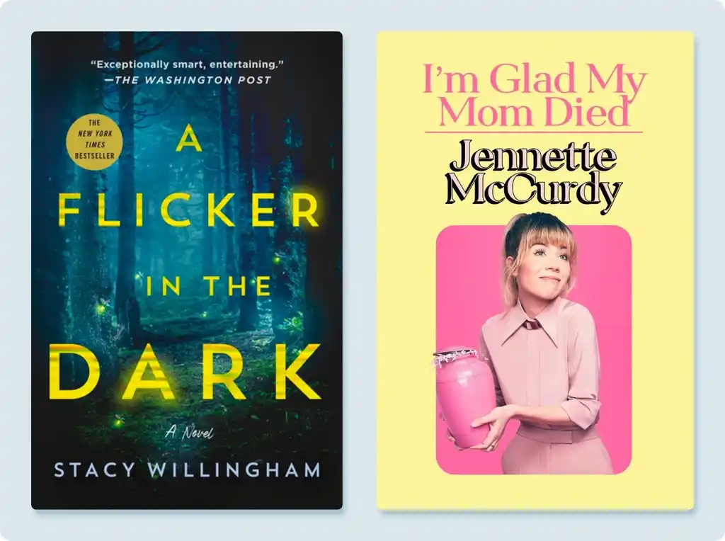
But beyond that, what else can draw readers to a book?
Characters (with or without eyes)
Fiction readers, broadly speaking, can be enticed by a character they’d want to spend 300-odd pages with. To that end, you will see covers that feature a character from the book.
In certain genres, you’ll notice that character faces are often concealed in some way. You’ll rarely see a character’s full face on literary fiction and mystery novels. They might be backlit (as is common in thrillers) or obscured by some design feature. There are many reasons why this might be the case, but we think it boils down to the fact that readers want to put themselves in a protagonist’s shoes — and if they see a model’s face on the front cover, it makes it hard for them to recast themselves as the hero of the story.

Though, of course, there are exceptions. Books adapted to film will often have tie-in covers featuring the poster art – after all, who’d say no to having Leo DiCaprio’s face on your book? Romance is another example of where you’d see a character’s face — the old cliché of handsome shirtless cover models remains as true today as it was in the Fabio era.
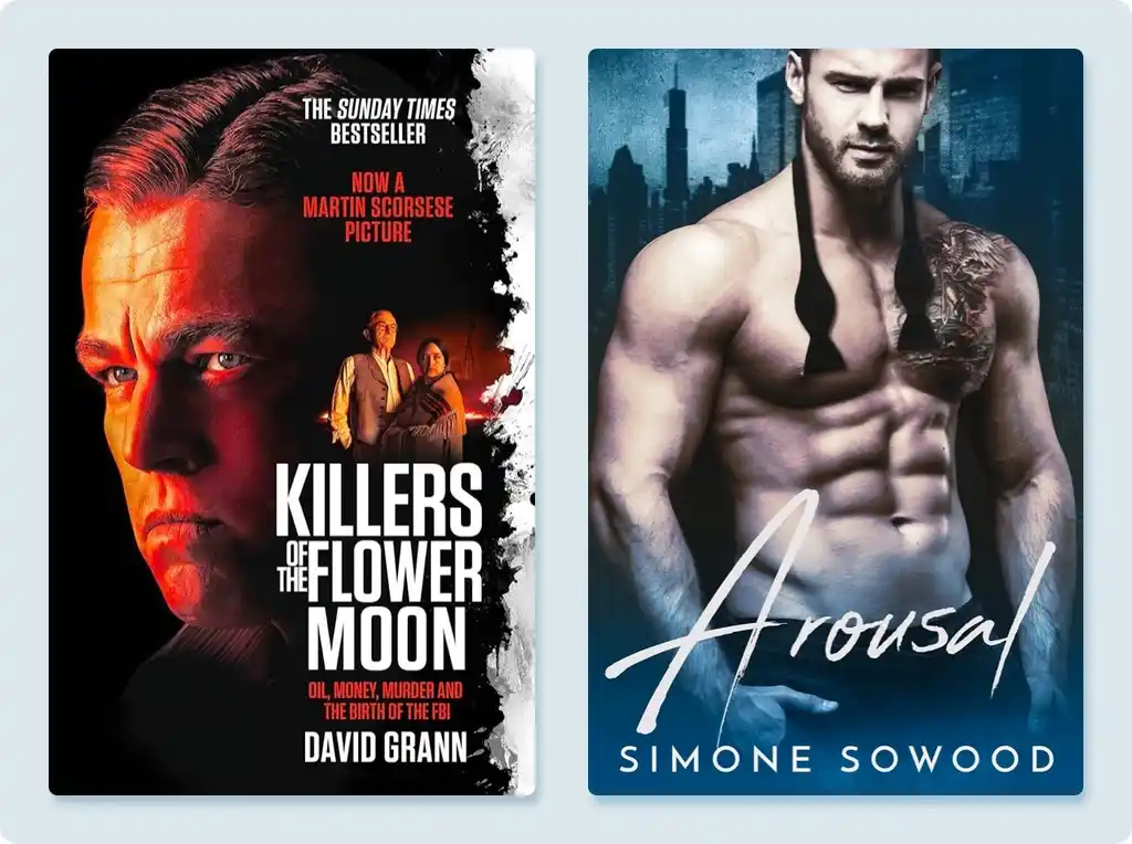
If your genre’s design trends call for featuring a character on the cover, consider how much of their face you want to show. For instance, women’s fiction and cozy romance often use illustrations of the main characters. But stylized, hand-drawn depictions offer readers some room to imagine themselves in the lead role (unlike a photo of an Abercrombie & Fitch model).
Location and period
Readers also like knowing where a book is set and are often attracted to books that promise to take them off to a certain time and place. Take a look at these examples:
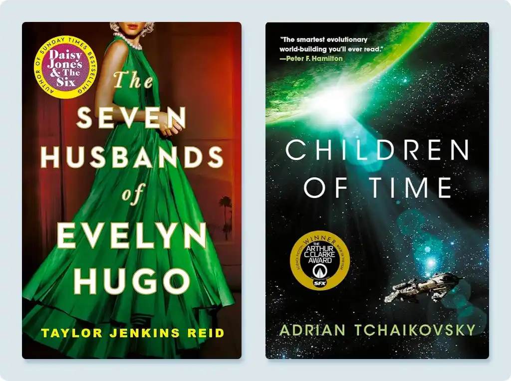
The cover for Taylor Jenkins Reid’s The Seven Husbands of Evelyn Hugo, while foregrounding a character, uses costume to tell readers that they’re in for a dose of Old Hollywood glamor. (Note how you don’t see her eyes!)
The jacket for Adrian Tchaikovsky’s Children of Time instantly says that we’re going to a retro-futuristic world where people travel the galaxy in broken-down hunks of junk.
For books that offer readers a sliver of escapist entertainment, a focus on location can oftentimes be a winner.
Iconography
Going back to what we said about covers only having a split second of a browser’s attention, you’ll see more covers these days leaning towards very simple and iconographic — something that is either recognizable or evokes instant meaning.
In the past twenty-odd years, you’re likely to see this approach with literary novels, but with an increasingly digitally minded approach, it’s also become commonplace in genre fiction.
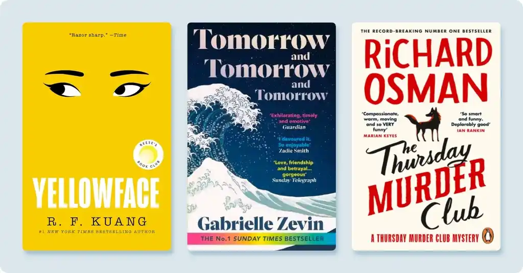
Take a look at the three examples and see how they use simple, iconic images to make an impression:
- RF Kuang’s Yellowface has a striking design that says all it needs to say with its recognizable depiction of East Asian eyes on a solid yellow background.
- The cover for Gabrielle Zevin’s Tomorrow and Tomorrow and Tomorrow recontextualizes Hokusai’s The Great Wave off Kanagawa.
- Every entry in Richard Osman’s bestselling Thursday Murder Club series can be recognized by its type-led design and simple fox motif.
Reflect on your story and the key tropes of your genre, and think about how you can weave in some of the design elements discussed. Once you have a basic concept in mind, you'll want to consider what imagery and design style you want to adopt.
Q: What’s the biggest mistake authors make when thinking about book cover design?
Suggested answer
You don't need every aspect of your story represented on the cover! I get a lot of authors who run through a list of very specific objects, places, and characters they want on the cover, but many times that doesn't align with the best selling strategies for their genre. Depending on the genre, to capture your audience, you may want to focus on a character or two only, or perhaps one setting. But usually not all of it. The main purpose of a cover is to capture the feeling of your book, not tell the whole story. Oftentimes the cover is more of a metaphor or abstracted visual that just indicates a mood. Less is more!
Caitlin b. is available to hire on Reedsy ⏺
The biggest mistake would be not being open to input. Most people in the book world have a working knowledge of what particular books are supposed to look like. BUT, there is a great big world of book creatives out there who specialize in every single aspect of making a book. Cover design is no different. Authors and designers should ideally have an organic collaboration. Reedsy has given me the opportunity to cultivate this exact skill while working with authors.
Michael is available to hire on Reedsy ⏺
Trying to tell the whole book story on the cover. The cover needs to be simple and eye catching. The design style, like fonts colors and images, will give the hint of the story and attract the reader. Then let the blurb explain the story.
Veronica is available to hire on Reedsy ⏺
I think a lot of authors approach their cover thinking very literally about what they want to depict. Sometimes they want to create a specific scene from the story. And of course, this is normal. The author has been living these scenes and moments, imagining the characters - how they look, what they say, their gestures.
But I try to approach the cover by thinking more about themes - what essentially is your book saying? Is it a story of hope? Of bravery? Of loss? And I try to convey that over-arching theme. That way you'll achieve a timeless design that speaks to your potential readership before they've read a single word. Other times I might focus on a recurring motif that's present throughout the book. What I always try to avoid is recreate the story literally in a single cover image - that method always fails because you're trying to pack in too much information which is impossible and only makes sense once the book has been read.
Wayne is available to hire on Reedsy ⏺
One of the biggest mistakes authors often make when thinking about book cover design is focusing too much on personal preferences rather than the target audience and market trends. While it’s natural to want the cover to reflect their vision, a book cover’s primary purpose is to attract the right readers and communicate the genre and tone of the book instantly.
Robert is available to hire on Reedsy ⏺
4. Choose your imagery and design style
Broadly speaking, there are four ways that you can approach your cover — each led by the type of imagery that will dominate the design. Pretty much every title you’ll see in a bookshop will fall into one of these four categories:
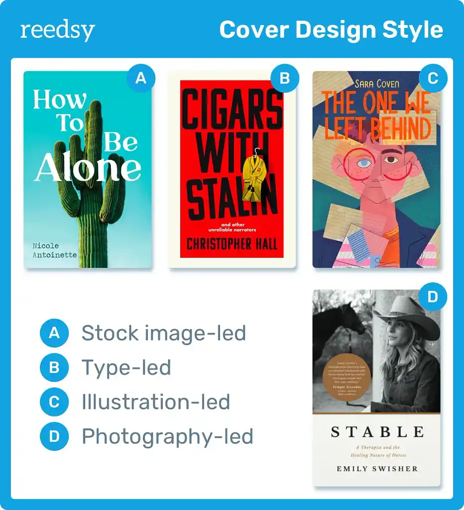
Stock image-led
The vast majority of book covers released by major publishers will feature stock images that are then cropped, manipulated, or edited into the design. You see a lot of these covers in most romance subgenres, as well as crime/thrillers and self-help.
Type-led designs
You’ll see this approach in a lot of nonfiction and literary fiction these days, where the focus of the design is a creative manipulation of the title text.
Illustrated covers
These range from intricate, life-like illustrations of the book’s world (which you’d see on the cover of a lot of Fantasy and Science Fiction), to evocative works of abstract art that you might find on the front of a literary fiction novel.
Photography
This is where new photography is commissioned for the cover design. These days, you only see this style of cover on celebrity memoir covers, where the big selling point is the author.
😁 Check more covers made by Reedsy designers!
If you were looking to hire a professional to make your cover, you would first decide which style is best for your book, then seek out designers who specialize in that style.
Once you've settled on a design concept and style, you can begin refining and iterating on it.
5. Adapt and develop your concept
This is the part where you creative various design concepts, until you choose on the one which feels right. Of course, it will all depend on your specific book and story.
To show how the process works, we teamed up with Reedsy’s in-house designer, Raúl Gil, who created a cover for a hypothetical novel called Rocket Bride. This will give you a glimpse into how a professional designer approaches their work, and hopefully, you can apply some of these methods to your own cover.
Rocket Bride: a case study
This book doesn’t exist, but if it did, this is what it would be about:
🚀 Rocket Bride is a space opera targeted mainly at a romance-reading audience. It centers on a princess who’s engaged to an evil land developer and the roguish intergalactic smuggler who helps the princess escape on her wedding day. Like oil and water, chalk and cheese, these two heroes are unlikely accomplices — and maybe even unlikelier lovers.
Let’s go back through all the steps we've covered and see how they apply to this novel:
-
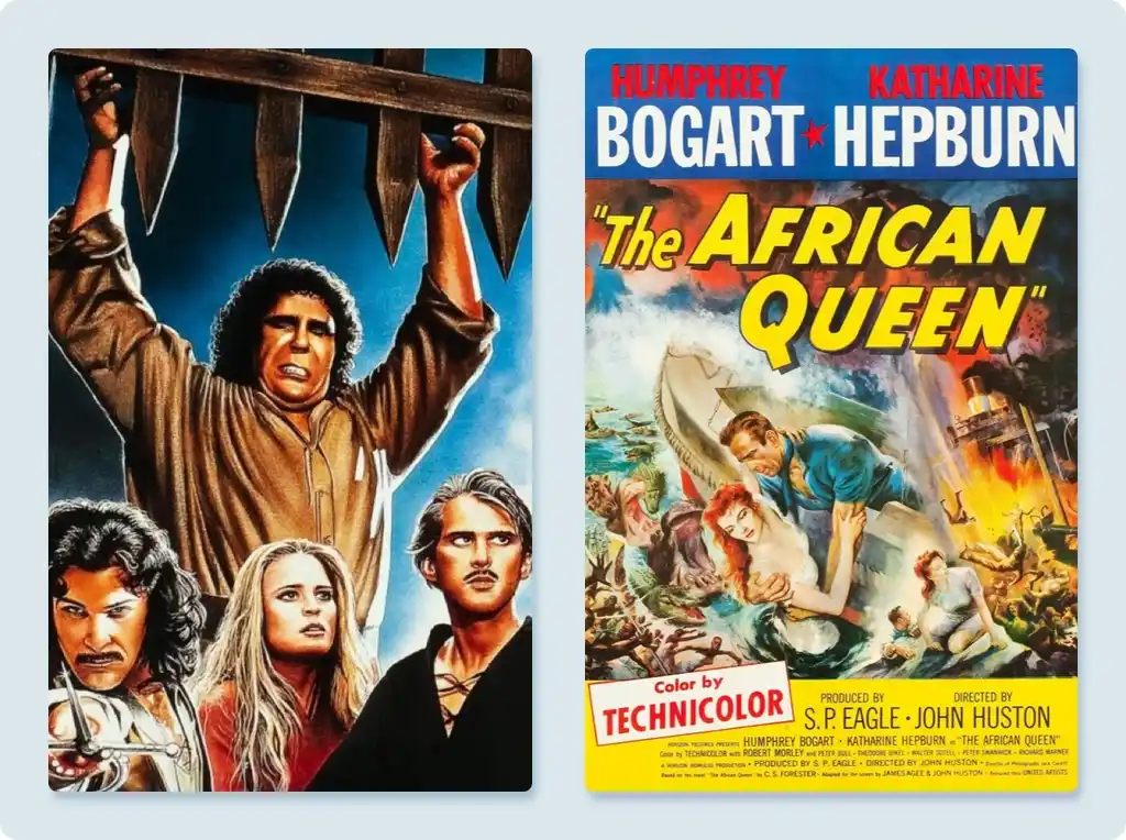
Inspiration: We drew inspiration from contemporary romance and women’s fiction. Given the story’s classic B-Movie vibe, we also provided Raúl with examples of Jet Age imagery that would suit Rocket Bride’s cover.
![The princess bride and The African Queen]()
images: 20th Century Studios [The Princess Bride], United Artists [The African Queen] - Design tools: Raúl works with Procreate and Adobe Illustrator.
- Imagery and design style: Our market research indicates that cozy illustrations are popular in women’s fiction and certain non-historical romance subgenres. With this in mind, we chose to go with an illustrated design.
In our discussion with Raúl, we talked about the humor of the story, but also the bristling romance of Classic Hollywood. The relationship between our two heroes is like Hepburn and Bogart in The African Queen; like Han and Leia in Star Wars. We wanted the cover to convey the fact that this book is feisty, fun, and far from the hard sci-fi books that many casual romance readers would normally avoid. It’s more Princess Bride than Dune.
After sending him our design idea, Raúl soon returned with several concepts that showed our lead characters and science fiction setting, rendered with a sense of excitement and romance.
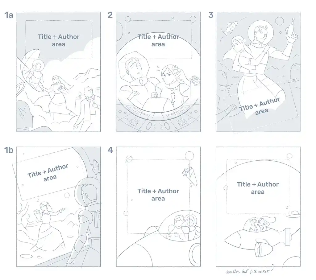
Of these concepts, we ultimately decided to move forward with version #3. It captures the sense of adventure and romance at the core of Rocket Bride: the pose of its main characters reminded us of classic romance covers with a hint of fun and a healthy dose of mid-century sci-fi imagery.
📏 Pro tip: Before you go much further with the design, make sure you’re working to the right dimensions. For ebooks, the standard front cover size on KDP is 2560 x 1600 pixels. We’ll dive into the specifics of print editions later on in this guide.
Once you’ve landed on your final concept, you can treat it as a jumping-off point and start to play around with the small details that’ll impact how your reader engages with the cover.
Focus on the details that matter
In the course of refining the concept, you shouldn’t get carried away with cramming in too many details. There’s a temptation to add extra elements into your design, like a full moon, an abandoned house, or an extra character. A professional designer will be able to pull off those things — but if you’re doing it yourself, remember that less is almost always more.
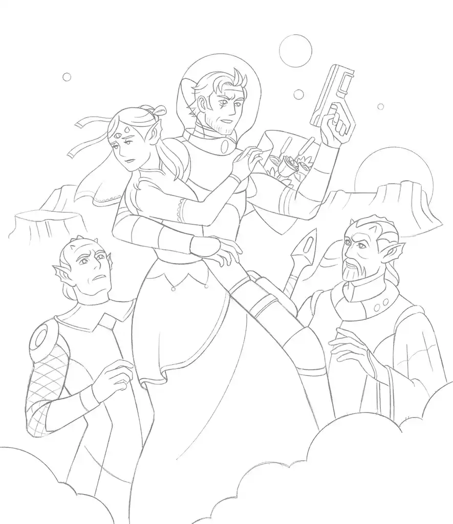
From Raul’s original concept for Rocket Bride, we were able to request a few changes. We loved the fun tone of the illustration, but felt like some of the details were a bit too close to The Jetsons for our liking. We also wanted the background to resemble the American Southwest a bit more.
With this feedback, Raúl tweaked the design by changing out our hero’s weapon, removing the rocketship, and adding in some stunning Monument Valley-style buttes. He gave Captain Perseus some rugged battle scars and added a third eye to Princess Andromeda (an essential part of her character backstory).
🤓 Pro tip: If you’re working with a professional designer, you may have agreed in your contract how many rounds of redesigns you’re entitled to as part of your fee. Try to include as much feedback at once and have a discussion with your designer about what is practical.
With the details locked in, it’s time to put a lick of paint on it.
See what color schemes pop out (and fit in)
Your design style will determine how much color-tweaking can be done at this stage: for example, the sky’s the limit for illustrators, while those working with stock images may be limited by the original photo (or their Photoshop skills).
However, even a small change in color temperature or a slight hint of color can transform how the design will impact the reader.

In the example above, the designer of Angela Morrison’s Sing Me to Sleep used a licensed stock image from Shutterstock then recolored the character’s sleeve and added ‘atmosphere’ in the form of digital snowflakes.
💵 Pro tip: make sure you pay for image licenses. If your cover design includes licensed images, it’s at this stage that you’ll have to purchase the rights to use them. Professional designers will typically use watermarked and low-resolution images in their initial concepts until you approve the final (truly final) version. If you’re hiring a pro to create your design, they will usually handle the licensing for you.
Returning to your research, you might have an idea of the color schemes trending in your genre. Again, we’re not saying that you need to adhere to tropes — but if you’re stuck for ideas, it can’t hurt to try out a color palate that instantly communicates the genre of your book.
For Rocket Bride, Raúl took our preferred concept and applied a few different color schemes that were inspired by science fiction imagery, retrofuturist design, and pulp cover art from the mid-20th century.
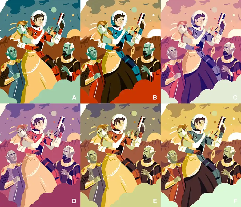
Each version lends the design a slightly different vibe and emotional quality — some more nostalgic, some more menacing. There are also some genre implications: the version with the blood red dust could have a superhero comic book feel, while versions E and F remind us of spaghetti westerns.
After mulling these options over, we decided to go with Version C, with pastel shades that you’d see in contemporary rom-com novels — offsetting the sci-fi setting and letting the readers know that this isn’t just a straightforward shoot ’em up in space.
If you’ve been following all the steps, at this stage you should have your chosen concept (refined with meaningful details) and a color scheme that nicely fits your story.
Q: How do you ensure a cover design is legible and compelling when viewed as a thumbnail?
Suggested answer
To ensure a book cover is legible and compelling at thumbnail size, I focus on bold, clear typography and strong contrast to make titles and key elements stand out. I prioritize simple, striking designs with iconic imagery that remains recognizable when scaled down. Thoughtful color choices and clean layouts help maintain impact and clarity, while I continuously test the design at thumbnail size to refine its effectiveness. This ensures the cover grabs attention and communicates its message, whether viewed online or on a shelf.
Robert is available to hire on Reedsy ⏺
Big shapes and bold lines and colors! My designs are all created from scratch to suit the given project. I try to take the genre/subject matter and distill it down to it's simplest component parts. The image should grab you and get you to start asking questions, no matter the scale.
Michael is available to hire on Reedsy ⏺
The key is to make sure that there's strong contrast between the title text and whatever background appears behind it. Its also important that the text is not too small. I t needs to be readable as a thumbnail.
A well defined composition will also attract the eye of your potential readers. Not having too many small details helps although this doesn't mean that you should never use small details. Just that any really important element should be clear even at thumbnail size.
While using a colour scheme that is controlled (not too busy) and with pleasing contrasting colours or vibrant complimentary colours
Wayne is available to hire on Reedsy ⏺
It’s time to consider the fonts you'll use and the final layout.
6. Refine your typography and composition
If you haven’t already, this is the point where you’ll start adding all the elements that make a book cover more than just a piece of art. In this section, we’ll share some professional tips to avoid the most common mistakes we’ve seen on self-made book covers.
Make the important bits easy to read
Once again, quick communication is key to your success. You want the reader to glean the most important bits of text in the half-second that they might look at it — which means that there’s no room for error. Contrast is one of the most important things to consider for text placement. There needs to be enough of a color difference between the text and the background so that your title and author name are easy to read (see below: Aya’s Blood).
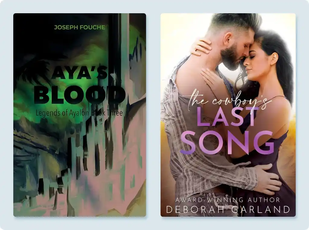
In the second example, The Cowboy’s Last Song, you can see that the designer has created contrast by laying the title over a shadow in the middle of the page. While this does greatly help with legibility, it adds a bit of unintentional muddiness to the final design.
Use two to three fonts
For the sake of minimizing your cover’s busyness, don’t use too many typefaces. If you check out the books on your shelves, you’ll probably notice that there aren’t more than two or three fonts at play. Between the title, the author’s name, and any other text you want to include on the cover, you can find a way to make two fonts stretch.
Use typography that is easy to read
When it comes to typography, there are some basic best practices, but few actual rules about which fonts to use and how to use them. A small, well-treated text with the right typeface in the middle of a large space can be more legible than a huge text taking up the entire surface.
However, we must take into account specific contexts, such as the visibility of the title in difficult-to-read situations, such as thumbnails on digital platforms. A bold typeface will better withstand size reduction, and if you use slightly condensed fonts, you can encapsulate a greater number of characters in less space.
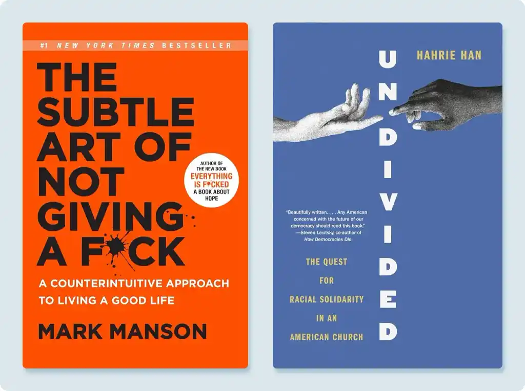
Give your author name the right size
The general rule of thumb is that the more famous you are, the bigger your name will be on the cover. After all, STEPHEN KING is more enticing to readers than the words FAIRY TALE. But if you’re reading this, you’re probably not Stephen King, so make sure that your name doesn’t take up too much real estate. For a good example, look at Stacy Willingham’s A Flicker in the Dark, which nicely balances the title and the author’s name, favoring the former over the latter.
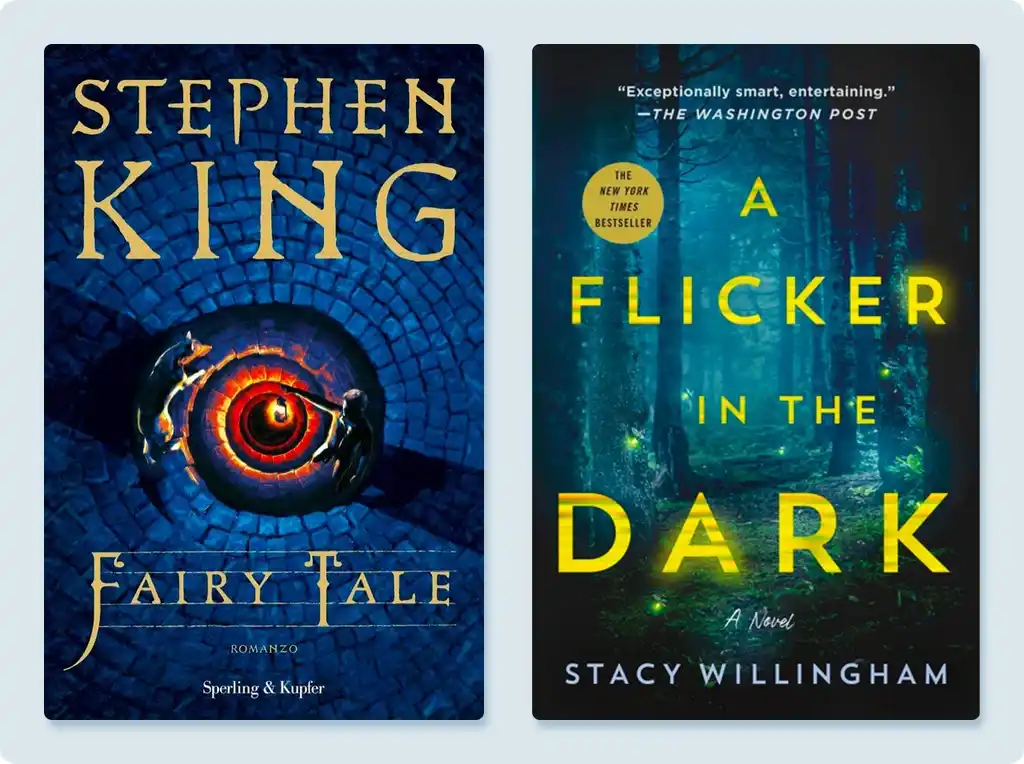 You also want to avoid the common first-time-author mistake of being overly modest and making it too small. While your name might not be recognizable (yet!), people will want to know who wrote the book.
Loglines, reviews, and testimonials
Another common element you’ll see on almost every cover is either a short logline or testimonial (usually from an established print outlet, author, or authority on the subject matter of your book). Let’s look at two examples:
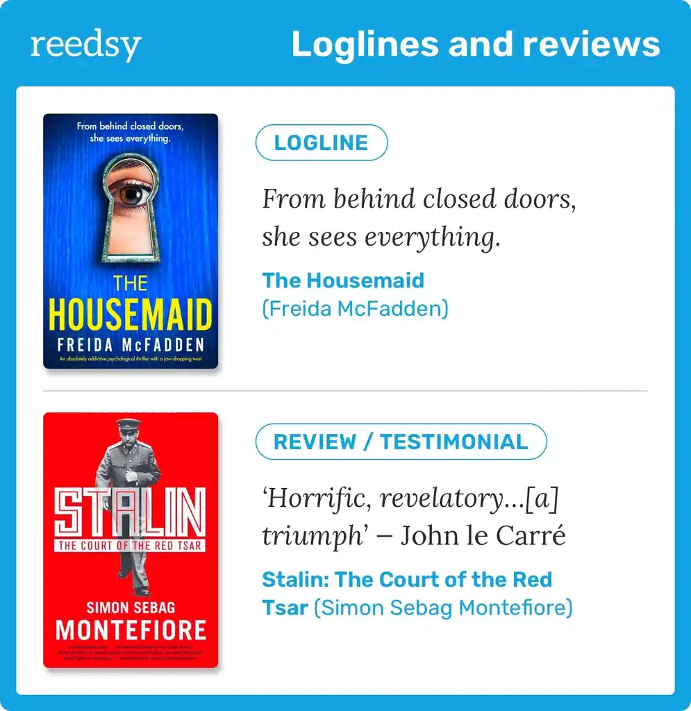
Readers are so used to seeing thousands of book covers every year, and almost every one of them will have some sort of logline or testimonial (or even just a line that says “from the author of X book”) — so if your design is missing this element, your cover is in danger of feeling a bit naked.
So, putting all of these into practice, let’s add some copy to Rocket Bride.
Rocket Bride: Bespoke title treatment
In the case of Rocket Bride, we were clear that the title had to be more prominent than the author’s name, so the relationship between texts was clear. Raúl stuck to a single font for all the text, varying their weight, size, and color.
From the first sketches, he reserved a safe area at the base of the illustration on which to accommodate the title without contrast problems.
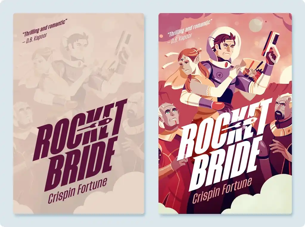
Visually, we wanted a dynamic treatment of the text that could provide expressiveness to the composition and enhance the “light science fiction” component of the novel. So, Raúl used a condensed and thick typeface to form a solid typographic mass, and then he skewed it, adapting it to the forms and counterforms of the base illustration.
Finally, he added a small graphic treatment in which a small rocket moves in the direction of the text — a typographic treatment that’s more than just expository text. The title “Rocket Bride” almost becomes the book’s logo, a brand that we can read and recognize even in small thumbnails on online platforms.
And with that, we now have a front cover we're thrilled with!
Now, in case you find yourself at this stage with a second strong cover concept still in the mix and you can’t decide which to choose, consider running a few tests...
Test your final cover concepts
If you’re still undecided between two strong final concepts, you can run some tests to determine which one will perform best. Afterall, numbers don’t lie, and knowing which concept generates the most engagement from your readers can seriously help your marketing efforts.
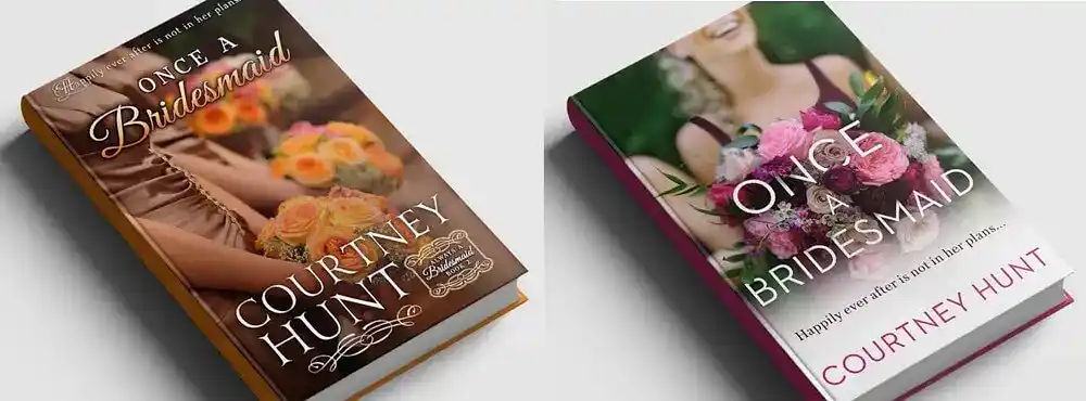
You can create simple mockups of your book with both cover concepts using tools like Placeit or Canva. Then, test them in a few ways:
- A/B testing with ads: Create a custom audience that matches your target demographic and run ads on platforms like Facebook or Amazon. This is one of the best ways to assess the marketing value of your cover.
- Testing on polling platforms: Platforms like PickFu let you poll a panel of consumers, either by A/B testing your covers or by collecting general feedback. (We have a free course on this marketing tactic!)
- Social media polls: If you’ve built a decent following, leverage Instagram Stories, Twitter, or TikTok to share your different cover options and let your followers vote. If you have a newsletter, you can also engage your subscribers and ask for their input.
- Online forums: If you’re feeling brave, you can tap into online communities on sites like Goodreads, Reddit (e.g., r/selfpublish), or genre-specific forums. Ask for honest feedback and constructive criticism — just be ready to handle the occasional troll!
Gather the data and make you call. Once your heart and mind are settled on the final design, the only thing left to do is to prepare your files for publication and/or print.
7. Adapt the design to other book formats
Now that the front cover design is complete, the next step is to adapt it for the various book formats you plan to publish. Let's start with the simplest option: publishing your manuscript as an ebook. For this, you only need to prepare a front cover.
Export your ebook cover with the correct dimensions
Your cover dimension will simply depend on the retailer you choose to publish your book with. To ensure you’re exporting them in the correct size and format, check with your retailer’s website. Here are the requirements for the most popular ones:
|
Platform |
Ebook cover format |
Recommended size |
|---|---|---|
|
.jpeg, .tif |
1,600 x 2,560 pixels |
|
|
.jpeg, .png |
Minimum 1400 pixels on the shorter axis |
|
|
.jpeg, |
1600 x 2400 pixels |
|
|
.jpeg, .png, .pdf, .tiff, or .zip |
Minimum 640 pixels, maximum 7,200 pixels |
|
|
.jpeg, .png |
1448 x 1072 pixels |
Simply export the file from your design app and get ready to publish 一 you're all set!
If instead you’re opting for a paperback or hardback edition, you’ll need to choose a printing service and prepare a full-jacket cover.
Choose a print-on-demand service
You can choose to either print your book in bulk or on-demand. Most authors these days choose the latter as it’s easier and more convenient.
You'll need to evaluate the main print-on-demand services in terms of costs, print quality, royalties etc. Fortunately, we’ve done the heavy lifting for you and put together an in-depth analysis of the six best services.
Your book cover dimensions will be determined by a number of factors, such as the binding type you choose (paperback or hardback), the paper type (which determines its thickness), and how many pages your novel is. It will also depend on your book’s genre. Is your book a romance novel or a memoir? Different genres have different standard book sizes.
Below, we've linked resources where you can find the recommended cover dimensions for popular print-on-demand services:
In particular, KDP offers a template generator that will turn out a PDF that you can import into your image editing software and lay over your design. This should help to keep your proportions right.
Be careful with bleeding and margins
When arranging the different design elements on the cover, remember to maintain sufficient margins and an extra area for bleeding, which is necessary for the printing and cutting process.
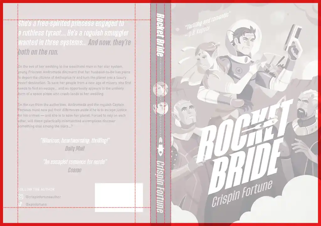 As a general rule, do not bring any element too close to the margins of the available area. In addition to cutting off parts of the information, you run the risk of drowning out the composition, which may negatively impact its reading, as well as give it an amateurish look.
And don’t forget to leave some space for the ISBN barcode, which usually goes at the bottom left or right. And if you choose to get an ASIN barcode from Amazon, simply keep that area clean, and Amazon will add the code to it.
If you're feeling overwhelmed by all the details, remember you can always work with a professional designer — this is their bread and butter.
Get a cover from the world's top book designers
The industry's finest designers are here on Reedsy. Come meet them.
Learn how Reedsy can help you craft a beautiful book.
Let’s now consider the back cover design…
Craft an effective back cover
The design of your book’s back cover can play an essential role in selling the book. You can incorporate elements like reviews, endorsements, the book’s blurb, your personal byline as an author, and social media handles to tell potential readers a bit more about yourself.
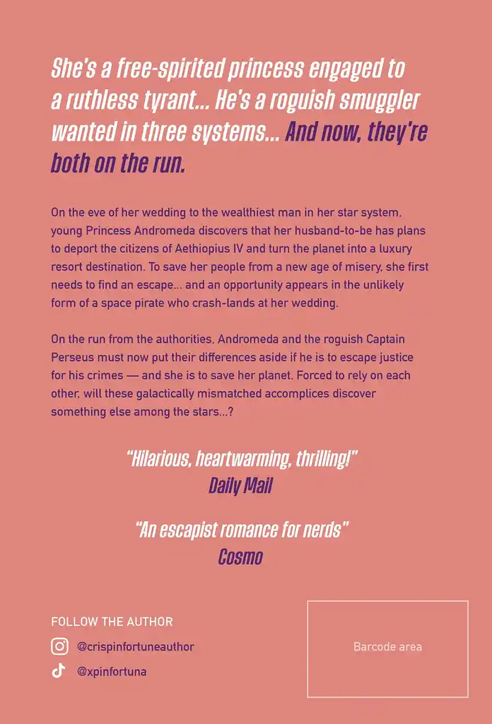
In deciding how big all the elements should be, try to think about the experience of an average reader. What information do you want to know when you hold a book in your hands and turn it over? A descending hierarchy — where the most important details are the largest in size — will guide the reader appropriately.
In order, you might be looking at:
- Hook or logline (largest)
- Reviews and awards
- Blurb
- Social media and contact (smallest)
Once you figure out where all these blocks will go on the back cover, you can assign them a spot in your type hierarchy to lead readers through a little journey.
Play around with the spine
One of the challenges of making a full cover is to get the spine right, since it depends on the book format, binding type, paper stock, and page count you choose.
Not all books are so long as to have a large spine, so in most cases, they are usually resolved with the most essential information: title and author. But a spine is an interesting area of action in terms of design.
Imagine people looking for a book on the shelves of a bookstore or library: an original spine can attract a reader’s eye more effectively.
In the case of Rocket Bride, we not only made sure to display the typographic information at an appropriate size and contrast, but we also introduced the faces of the main protagonists and a rocket logo.
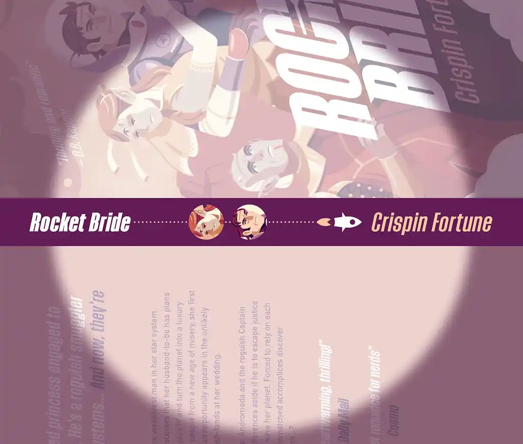
📒 Pro tip: Remember that in print-on-demand services (and in any printing company in general), perfection is difficult to achieve. Occasionally, small displacements may occur that slightly move the spine elements out of their area. This is especially problematic for short books with very narrow spines (e.g. publications of around 100 pages). Therefore, try to ensure that the information on the spine has enough breathing room above and below it.
With the spine ready, you can export your print cover files as a PDF, ready to upload to your print service!
To wrap things up, let’s touch on creating an audiobook cover and any potential marketing materials for your website and social media.
Create a cover for the audiobook version
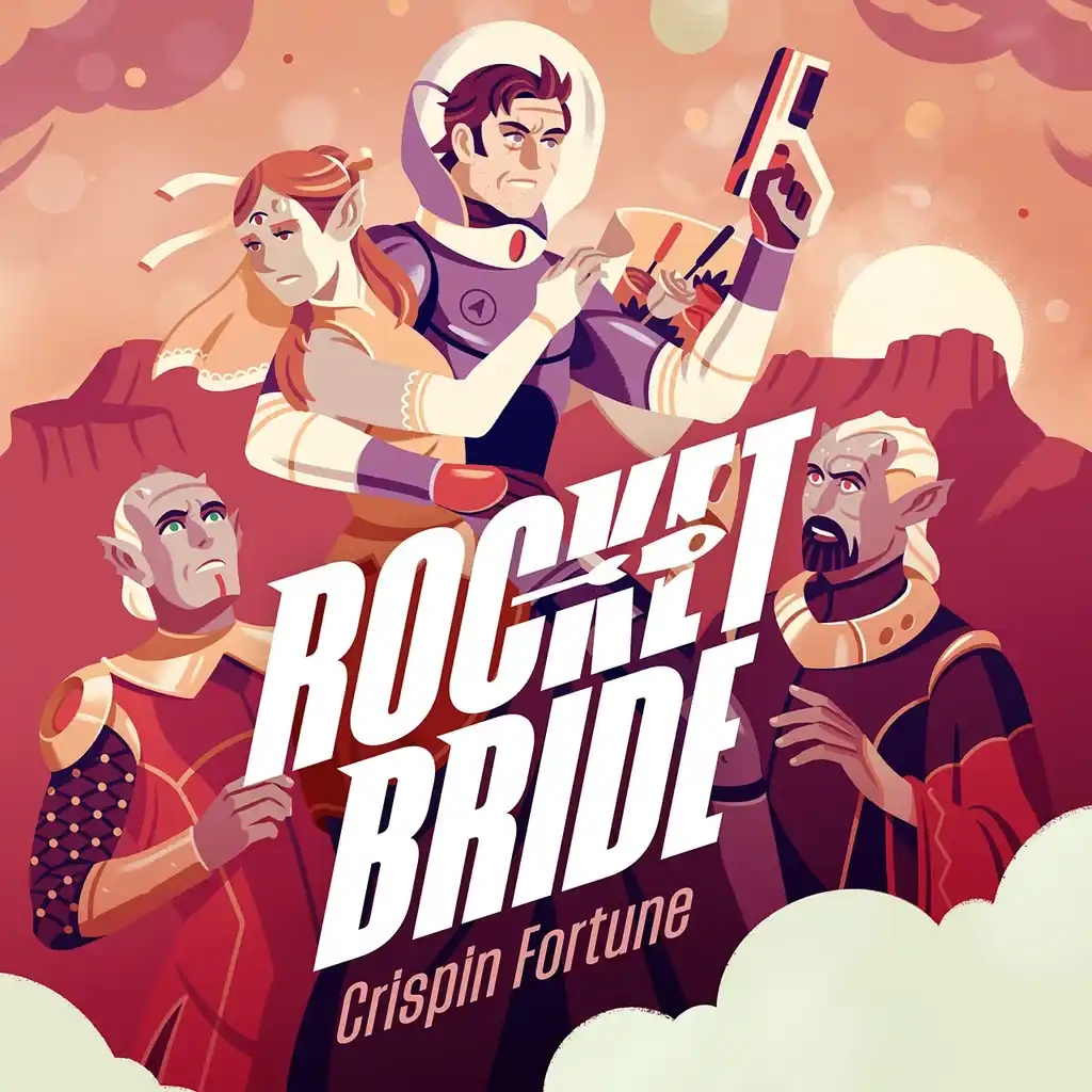
If you’re creating an audiobook version of your book, you’ll need a different cover design format.
Adapting your cover design to a square format may mean needing a larger image to cover the entire area and fit properly with the specific composition of that context. Keep this in mind when hiring a photographer, illustrator, or designer.
(Note how the square format requires a larger illustrated area.)
And other promotional material
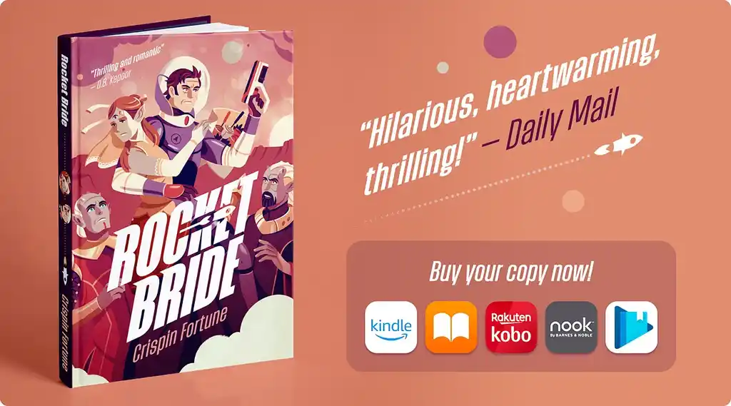
You finally have it: a shiny, brand-new book cover you can use to represent your book on the shelves and across all marketing channels! You might want to create a variety of 3D mockup images to use on digital ads, social media cover photos, or on your website.
As already mentioned, you can use sites like Placeit or Canva to do it yourself, or if you’re collaborating with a professional, make sure to discuss this additional service before starting the project.
And this is how you design a cover from start to finish, going from a rough idea to an artwork that will help you sell copies and establish your brand as an author.
As you’ve probably realized by now, this process involves thorough industry research, creative brainstorming, and technical expertise, which is why we encourage indie authors to work with professionals in the field.
While the fate of our princess and intergalactic smuggler remains a mystery, one thing is certain: their story boasts an outstanding cover, and your book deserves the same!
