Posted on Jan 17, 2023
How Creative Poetry Book Layouts Can Elevate Your Verse
About the author
Reedsy's editorial team is a diverse group of industry experts devoted to helping authors write and publish beautiful books.
More about the Reedsy Editorial Team →Poetry books pose a unique design challenge: to present a collection of poems in a visually interesting way that embodies their tone, mood, and atmosphere without distracting from the content of the work.
The Reedsy marketplace has some of the most experienced poetry book layout designers in the industry — and we’ve gathered a few of their designs and insights to inspire and educate anyone seeking inspiration for their poetry book layouts.
Every design element reinforces the poetry’s intent
A successful poetry book's layout involves a simple and effective title page, introduction, and table of contents, images and illustrations arranged around poems, solutions to page breaks (when poems must be divided into multiple pages), a typeface that suits the spirit of the work, and visual playfulness if appropriate.
Typesetting poetry is often a collaborative process where the poet leads the designer toward a common artistic vision. It begins with establishing facts — Sebastián Cudicio, a Reedsy designer and illustrator with over 20 years of experience in the industry, always starts by asking the poet about three fundamental issues:
- whether the collection consists of text only
- whether it requires a specific graphic solution or treatment, and
- whether the book will include illustrations or images.
From there on, the layout designer is tasked with considering the mood and subject matter of the poems, ensuring that their visual choices are guided by these, or at the very least aligned in attitude.
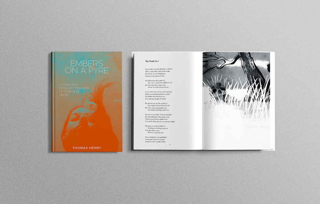
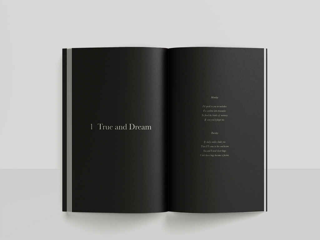
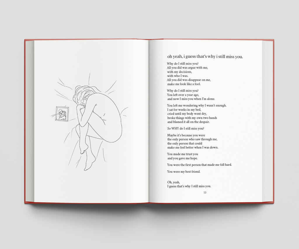
In the example above, taken from a poetry collection that deals with dark thoughts during times of struggle, Sebastián's layout is simple and serious, in line with the themes of the work.
The right layout design will only take liberties afforded to it by the text. "There is a potential for expanded creativity when designing the interior of a poetry book," says David Provolo, one of Reedsy’s most in-demand book designers. "But ultimately, the aesthetic and composition are directed by the nature of the poems (alignment, line lengths, and meter) and the poet’s vision."
In other words, the design can be a graphic re-interpretation of the poetry collection, a reflection of its essence through a different artistic medium.
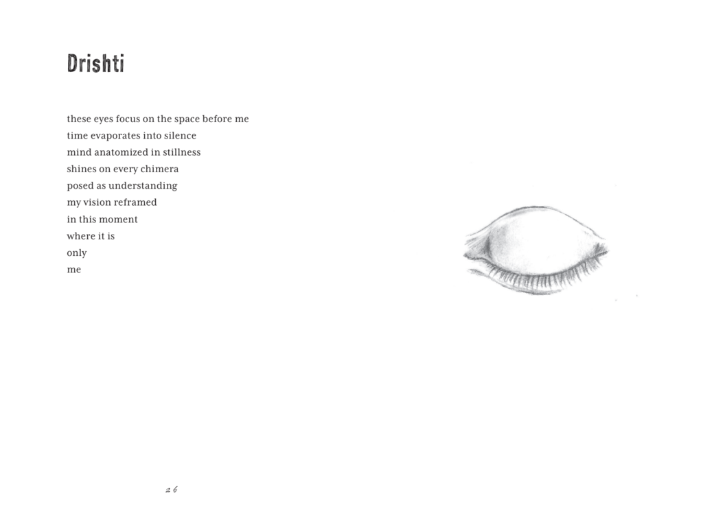
In the example above, the poem refers to 'the space before me,' suggesting an unfilled expanse which the design emulates by almost pushing the entire poem to the top left-hand corner of a double-page spread. The layout, in this case, reflects the imagery and haunting tone conjured in the poem.
Typefaces reflect the poetry's tone
Those new to book design often marvel at the seriousness required when laying out a book, unable to understand how conscious and intentional every minor decision has to be. To illustrate how this works in the context of poetry books, we spoke with Theo Inglis, a graphic designer and typesetter.
When choosing a typeface for a poetry book, Theo first looks for something that suits the poet's tone and voice, whether that's based on weight or style. “Some poets like to work formally and build on the traditions of the craft, which tends to suit a more classical approach to typesetting and font choice. Others are more experimental, which suggests something more contemporary. The goal is always to find a typeface which feels suitable, inevitable even, rather than distracting.”
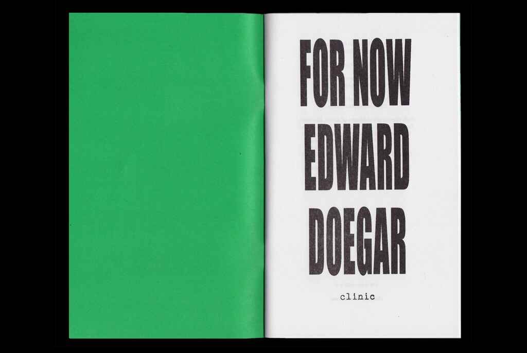
The above title page, designed by Theo, uses a bold, sans serif font to reflect the simple and sparse language of the chapbook, and to signal modernity.
When it comes to typesetting the poems themselves, the size of the text and width of the page provide Theo with one of his biggest hurdles. “Poets usually have set line breaks, which I have to replicate, which in some cases require lots of words per line – so a typeface that works at a smaller size and is a bit more narrow is a good choice."
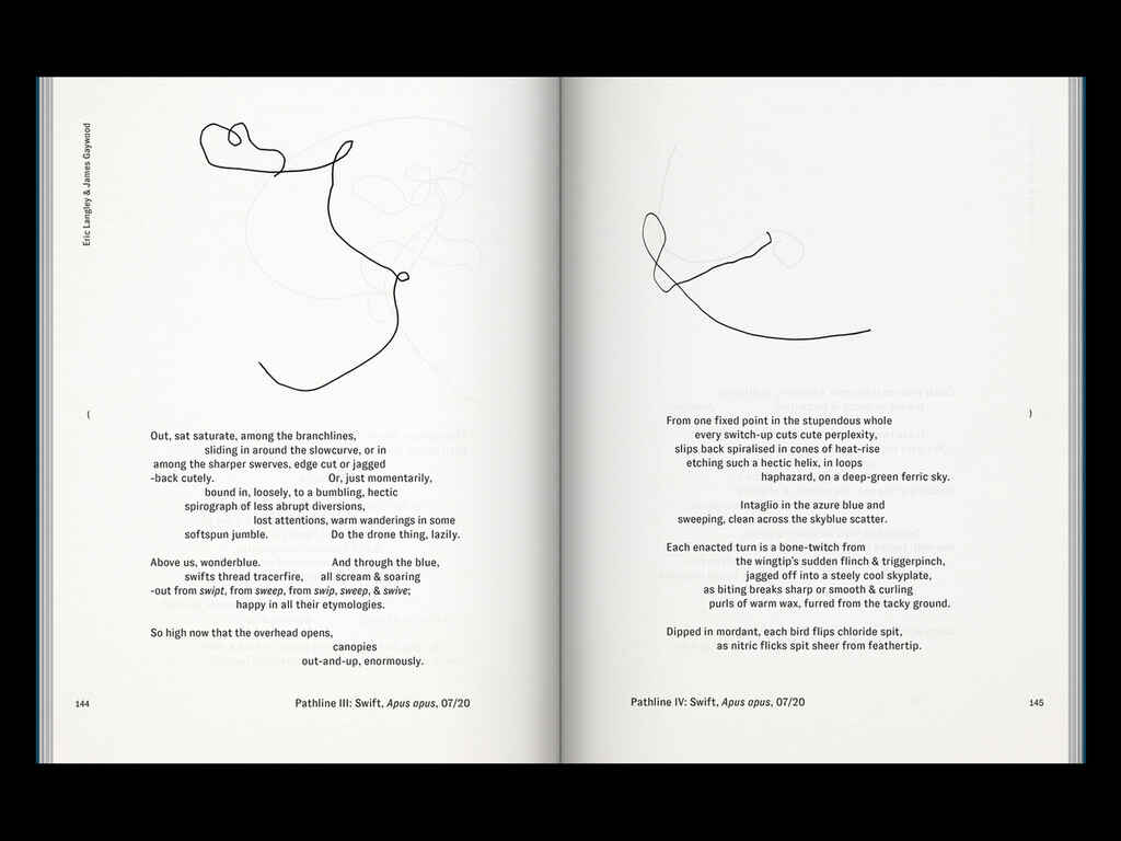
In the PROTOTYPE example above, the poem contains unorthodox gaps and indenting. A particularly wide typeface may have distorted the poet's intended visual effect, encouraging Theo to choose a narrower font.
“The challenge with any poetry book is finding a format, style, and size that works well for every poem set exactly as the author intended."
The devil, as always, is in the details — and with a medium that hinges on attention to minutiae, you can see why poetry books require such experienced and dedicated designers.
Think the designs in this post are cool? They’ve all been made by designers you can hire right here on Reedsy 😎
Hire a poetry book designer

Rachel S.
Available to hire
Fine artist turned illustrator. Using a blend of paint + graphics to design books. Confession: I buy books by their covers!

Nuno M.
Available to hire
Creative art director and designer with 20 years of experience working for publishers and independent authors worldwide.

Robert J.
Available to hire
I'm a book cover designer with over 15 years of experience. I will help you transform your literary masterpiece into an eye-catching cover!
Simple layouts create space for the poet’s ideas
Though they take a long time to put together, poetry book designs should ideally look like the most natural, obvious solution, essentially effortless. In poetry, "what the reader will experience is the power of words, rhythm, and sometimes the space between words and intentions," says Nuno Moreira. This attention to detail is why he often advises authors to err on the side of simplicity, insisting that simplicity is the key.
“To meet the challenge of allowing the words to shine on their own and be the main element of the experience, we should leave space for them to exist without constraints. For this reason, I find that interior layouts for poetry books should be clean, minimal, and have very little in the way.”
In the example above, the sleek, stark, white-on-black design for More Than That creates a powerful visual impact while allowing the poem to stand out.
Publishing conventions can be questioned
The design can often dispense with standard typesetting elements in pursuit of simplicity. Nuno offers an example, drawing from his 15+ years of experience: headings, though they make sense in fiction books, can be distracting in the context of poetry pages, and can easily be omitted.
The two double-page spreads below were designed by Natalia Junqueira, Reedsy designer and illustrator, and show how potent simplicity can be — notice the lack of headings, as well.
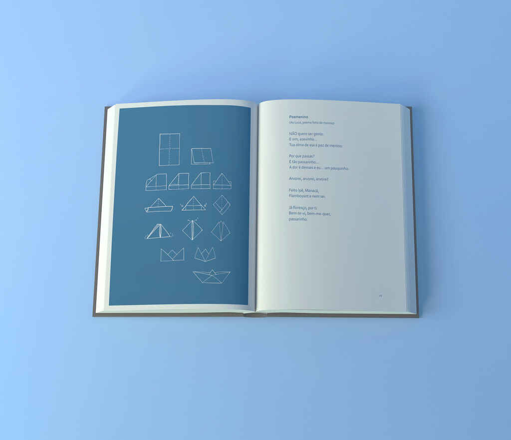

Natalia tells us that the color blue was integral to the author’s concept, as she associated it with her childhood, and the same applies to the paper cranes. For Natalia, it’s incredibly helpful when an author can express the feeling they hope to create with their poetry collection: “Is it happiness, sadness, a feeling of being lost, found, or non-belonging? This helps immensely to design the right mood from the start, so not only do the poems tell us a story, but the layout helps this story to be told.”
Free course: Book Design 101
Learn the fundamentals of book design, from creating beautiful covers to formatting and typesetting professional-grade interiors. Get started now.
Visually complex poetry takes center stage
Poetry takes countless shapes: from traditional forms like odes, villanelles, sonnets, and sestinas, to experimental and unconventional free verse or prose poems, there is limitless variety in the shape a poem can take on the page. To make things even more interesting, some poetry incorporates visual elements: take blackout and collage poetry, for example.
💡For a breakdown of 15 different poetic forms, check out our post on the many types of poetry.
When it comes to visually experimental poems or busy illustrations, the design's aim is often to simplify whatever can be simplified so that those other, louder elements can occupy the forefront.
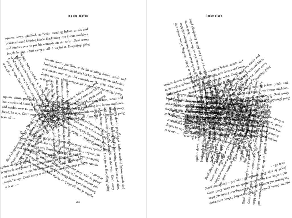
In the Lance Olsen example above, the poet forces the reader to work to read the poem, rotating parts of the text. In response, Matthew Revert keeps additional design elements to an absolute minimum, even omitting the page number on the right — when a poet makes you turn the book upside down, the design has to interfere as little as possible.
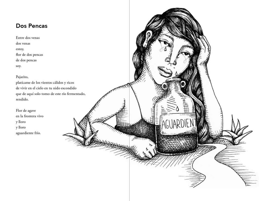
The two designs above and below, by Matthew Revert and Natalia Junqueira respectively, employ a similar strategy of simply creating space for strong visual elements to unfold, in this case illustrations. Generally, when a poet has chosen to accompany their work with photographs or illustrations, layout design tends to err on the side of minimalism, which these two examples reflect.
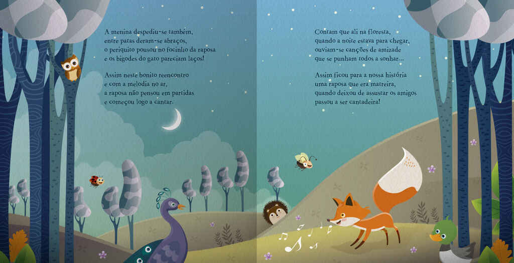
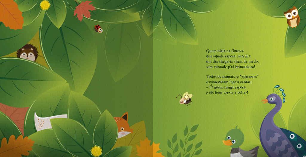
Children's picture books keep typography simple
The same is true of children’s rhyming books, of course. Given the age range that picture books address (typically 0-6 years old), it’s likely that the words are being read out to them by an adult, while the children marvel at the gorgeous illustrations. For that reason, picture books don’t typically feature ornate letterwork or calligraphy: typography tends to remain as simple as possible, so that kids can be immersed in the sweeping landscapes of a double-page spread.
Front matter can get a creative twist
A poetry book's front matter can also get creative: that applies to title pages, introductions, and copyrights pages. Section breaks occuring throughout the book aren't exempt, either, as you can see below.
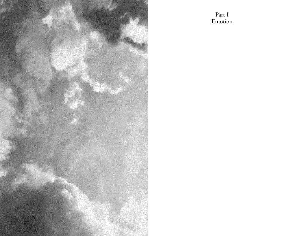
Simple and thoughtful, the design above echoes the poetry's thoughtfulness by replicating the perspective of someone lying down staring at the clouds.
Classic design choices still have an impact
Laying out contents pages may seem like a practical matter, but it's very much affected by the mood of the poetry, too. The two contents pages below don't try to do anything crazy, respecting the mood and tone of the work.
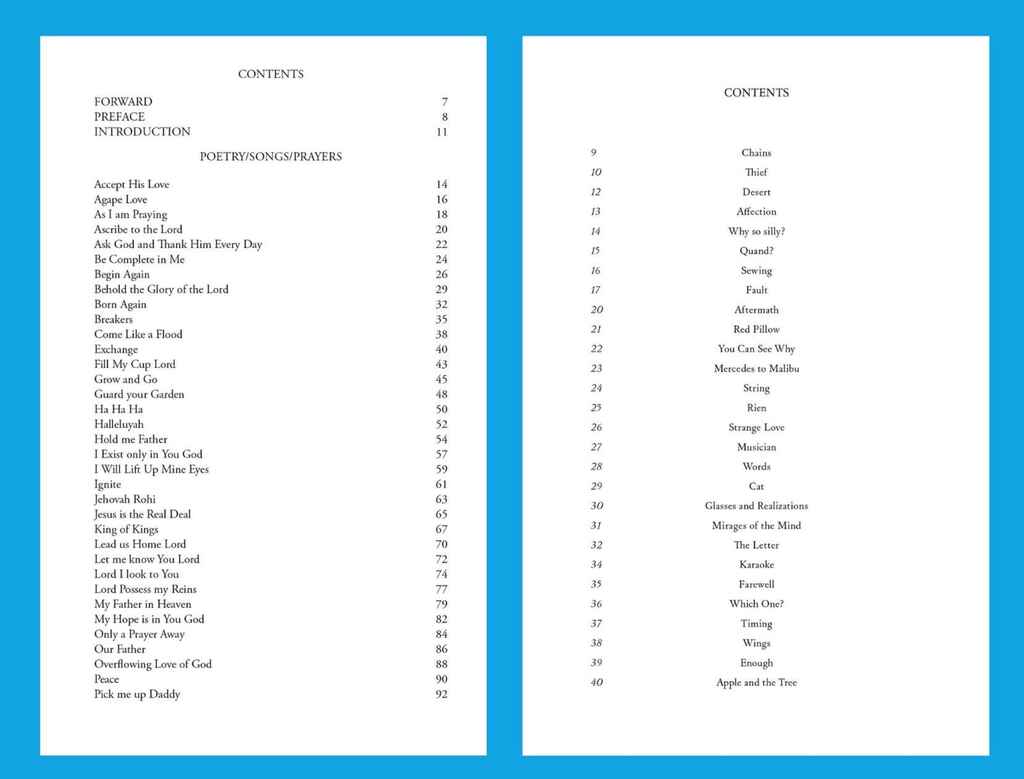
The example on the left comes from a book of religious poetry where poems are accompanied by extracts of scripture. Reedsy's Margherita Buzzi has opted for a clean, serious, and classic layout design.
Meanwhile, the design on the right balances creative freedom (page numbers on the left, poem titles centre-justified) and conventionality. This is a serious collection, dealing with trauma and heartbreak, but the design is gesturing toward peace and healing.
Though they still look fairly traditional, both of these have the right impact and fit in contextually.
Unusual choices introduce fun and make a point
The more playful and experimental the written work, the more wacky the typesetting ‘gets’ to be.
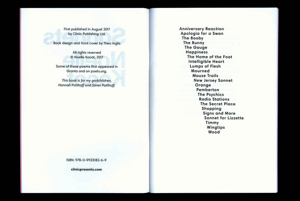
Noelle Kocot's Sonnets, above, works within the sonnet form to subvert and violate conventions, and the contents' page's design mirrors this willingness to play the game while breaking the rules. Fun, right?
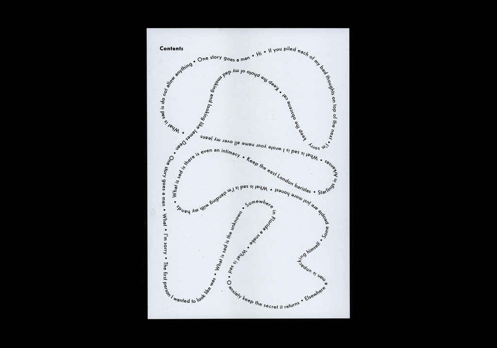
This final example comes from a chapbook of non-linear poetry, where pages aren't numbered, poems are printed in a variety of colors, and the poet experiments freely. The wacky design of this contents page embraces the spirit of the poems.
Poetry books can be incredibly fun, yet also challenging, to design and publish — which is why we always advise authors to put their work in the hands of professional book layout designers with experience in poetry books. We hope reading this post has helped you understand why!