
Last updated on Jul 26, 2022
Revealed: The Real Marketing Value of a Professional Book Cover
About the author
Reedsy's editorial team is a diverse group of industry experts devoted to helping authors write and publish beautiful books.
More about the Reedsy Editorial Team →Martin Cavannagh
Head of Content at Reedsy, Martin has spent over eight years helping writers turn their ambitions into reality. As a voice in the indie publishing space, he has written for a number of outlets and spoken at conferences, including the 2024 Writers Summit at the London Book Fair.
View profile →When marketing a book, a cover design one of your best sales tools. It's the face of your project and the one thing that can elevate it to a professional standard. But, if authors know this, why do so many still create their own book covers?
Most often, it comes down to resources. Professionally designed book covers cost money (but not as much as you might think), so you have to ask yourself: will it get me more clicks and sales?
To answer this question, we decided to run an experiment.
How we ran our book cover experiment
To determine the marketing value of a professional cover design, we invited self-published authors to get their books rebranded by an experienced professional on Reedsy. Four titles from a range of genres were selected and entered into an A/B test on Facebook ads:
- We ran two ads for each book over one week;
- Both ads were identical, except for the cover image; and
- Each variant was exposed to approximately 1,000 users from the same audience set.
This way, we would discover how much the redesigned cover impacts the click-rate rate of an advert.
Result: On average, we saw a 35% increase in the marketability of books with professional covers.
What does this mean? For each test, the professionally designed cover had a click-through rate that was 12.5–50% higher than their non-professional counterparts.
Let's take a quick look at each redesign and let our designers explain their approaches.
Results and takeaways
We calibrated the ads in each test towards a target demographic based on age, gender, and fandom of comparable authors. Here are the results at the end of the week.
Romance (48% more clicks)
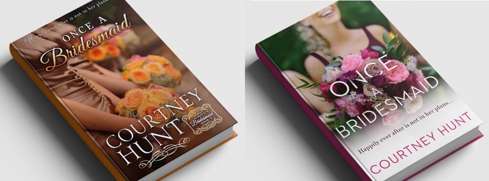
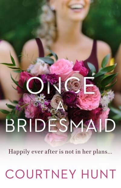
Title: Once a Bridesmaid
Author: Courtney Hunt
New cover by: Caroline Teagle, an in-house designer at Penguin Random House.
Facebook Ads targeted to: Women; aged 25-64; who like Cecelia Ahern, Jude Deveraux, or Julie Garwood
Synopsis
Always a bridesmaid… and that's precisely how professional bridesmaid Lauren Bennett wants it. When a case of mistaken identity lands her in the bed of photographer Kyle, she finds herself entering into a battle of wills with a born-again romantic.
The Redesign
"I tried to select images that gave a sense of character and went in a softer, women's fiction direction," Caroline Teagle told the author. "I wanted something clean and fresh for the color palette and typography."
While staying with the original cover's concept — bridesmaids holding bouquets — Caroline chose an image with an improved white balance, creating a greater contrast of colors. She then turned her attention to the typography.
"I feel like scripty wedding-invitation type font is fairly cliché, and when the bridesmaid is in the title and the image immediately signals wedding, it's not entirely necessary."
In her final design, Caroline employs a simple sans serif font for the title and author name, ensuring the logline wasn't lost — improving readability when reduced to a thumbnail.
Learning Points
- Use genre trends to your advantage while still avoiding cliches.
- Brighter, higher contrast images can help your cover pop in thumbnail form, as will simpler fonts.
💸
What will it cost you to get a professional book cover?
Mystery/Thriller (53% more clicks)
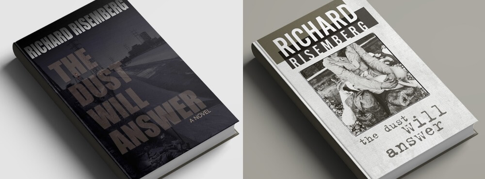
Title: The Dust Will Answer
Author: Richard Risemberg
New cover by: Mark Thomas, a talented multi-disciplinary designer based in Wales, UK.
Facebook Ads targeted to: All genders; aged 25-60; who like Walter Mosley, James Ellroy, Raymond Chandler, or Michael Connelly
Synopsis
1978: The wave of gentrification has yet to break over downtown Los Angeles. When his friend nags him into tracking down a missing girlfriend, straight arrow Lennie Strasser reluctantly agrees. His quest takes him into the hobo jungles and punk squats by the LA River — and into a world of moral ambiguity that changes Lenny's life in ways he'd never dreamed of.
The Redesign
Upon reviewing Richard's existing cover, Reedsy designer Mark Thomas first addressed its biggest problem:
"The immediate issue that seemed to be holding it back was one of visibility: the cover was too dark!
"I got on the phone with the author to discuss the book and get a feel for the story and the tone he wanted the cover to set. It turns out that Richard is a quite gifted photojournalist, which gave me access to several of his photographs of LA."
Whilst not totally contemporary to the book's setting, Mark used one of the author's photographs as he felt it provided a flavor of Los Angeles' seedier industrial side. Retaining the author's monochrome concept, Mark substantially brightened the cover, while keeping the gritty, downtrodden feel.
"Another fairly important change was to make Richard's name more of an impactful part of the front by greatly increasing its size and prominence," Mark told us. "The final cover ticks several boxes: a bolder author branding, a selective cropped use of a photograph of a female vagrant, and typewritten representation of the book's title."
Learning Points
- Make sure your cover is bright enough. If you struggle to read the title, that's a red flag.
- Consider presenting the author's name as a brand.
- A cover doesn't need to be loaded with color to be 'cool.'
Learn to run tests with Facebook Ads
Nonfiction (12.5% more clicks)
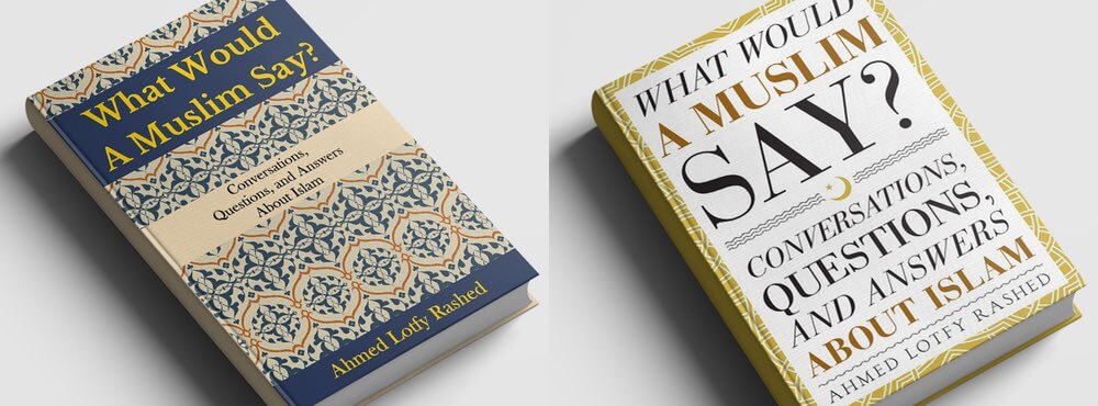 Title: What Would a Muslim Say?
Author: Ahmed Lefty Rashed
New cover created by… Stewart Williams, a prolific and eclectic designer of covers ranging from cookbooks and novels, to a collection of screenplays by filth maestro John Waters.
Facebook Ads Targeted to: All genders, aged 25 - 60, who like Theology, Religious Criticism, or Christianity
Synopsis
"Many books teach Islam, preach it, criticize it, or academically explain it. This book is different. This book is a compilation of actual conversation transcripts, showcasing everyday people asking real questions and getting straight answers about Islam."
Redesign
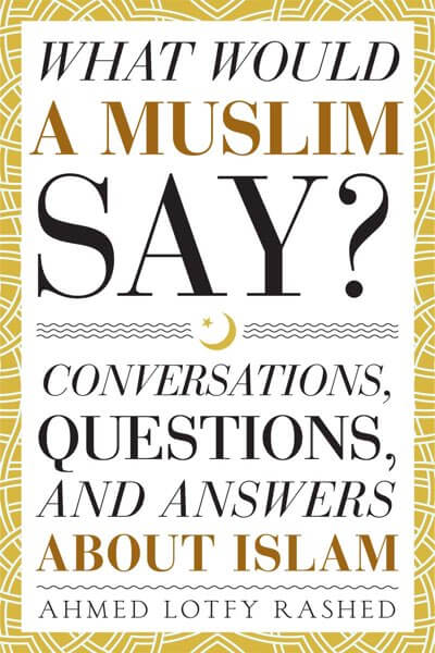
By communicating via Reedsy's messaging platform, cover designer Stewart Williams discovered the author's purpose for this book: to speak to non-Muslim Americans and dispel misconceptions about the Islamic faith. With that target audience in mind, Stewart presented several concepts in line with contemporary nonfiction titles.
"I wanted the book to be inviting to those who might otherwise be put off by topics about Islam," said Williams. "This wasn't going to be easy, given the contemporary political tone. When dealing with political or potentially hot issues, I try to ensure I understand the topic, or at least research it before developing imagery.
"Above all, this cover had to be a mix of gentle and inviting, scholarly but approachable."
Working with colors and symbols associated with Islam, Stewart landed on a final design that let the book's title speak for itself. In the Facebook ad test, it was essential for the audience to be able to read that subtitle.
Learning Points
- Research and understand the book's content and the types of books your target audiences are drawn to.
- If you want the audience to read what's on your cover, make sure it's large enough.

YA Fantasy (28% more clicks)
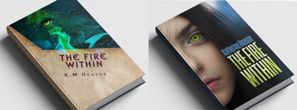 Title: The Fire Within
Genre: Katherine Heason
New cover by: Chuck Regan, an illustrator and designer with an extensive background in advertising.
Facebook Ads Targeted to: Women; Aged 16-35; who like Kami Garcia, Suzanne Collins, Veronica Roth, or Cassandra Clare
Synopsis
Seventeen-year-old Lillith is just an ordinary girl living in a quiet seaside town. All she has to worry about is her impending exams and her non-existent love life. When her past catches up with her present, she's flung into a world of witchcraft that sees her desperately fighting for her life and her newfound soulmate.
The Redesign

Before work started on the new cover, author Katherine Heason sent Reedsy a short description of her main character.
"Her name is Lillith, which means 'dark angel' — she certainly has darkness in her. Her eyes are bright green and luminous, which ties into her powers. She lives on the English coast, where it's cold, and there's lots of wind."
"I immediately pictured a Celtic-looking teen," commented designer Chuck Regan. "A bold and intimate close-up of a girl with energy swirling around her. I narrowed my stock photo search to reasonable matches and found a photo that the author said was perfect. Boom! Magic."
Chuck could manipulate a stock image of a girl and add loose strands of hair to suggest the character's wind-swept look and magical aura.
"Katherine helped clarify the best way to illustrate the type of magic portrayed in the story — subtle and intense, with an implication of hidden dangers. The flames in the title text were also her suggestion, adding another layer of energy to the cover."
In general, Chuck's redesign is far less cryptic than the original. It tells us quite a bit about the book. From the cover alone, a reader can discern that its main character is a young woman, that magic might be involved, and that it probably belongs to the YA genre: all things readers will want to know.
Learning Point
- Covers should communicate something about the book: character, tone, or genre.
Why do professional covers matter?
An effective cover will get relevant readers responding to your ads and heading to your Amazon page.
Once there, the design will communicate the tone and content of your book and get more (of the right) readers to buy or download it. This, in turn, improves your chances of positive reviews and ratings, which will send you up Amazon's rankings, giving your book greater visibility and leading to even more downloads. More so than in most markets, self-publishing benefits heavily from the snowball effect.
And we haven't even touched on how your cover can be used for reader magnets and crowdfunding campaigns!
To see about maximizing your book's potential in terms of marketing, head over to the Reedsy Marketplace and request free quotes from over 300 experienced book designers with experience in almost every imaginable genre.


5 responses
czerwonka says:
21/09/2017 – 18:22
Want a better cover? Use movie posters for inspiration. Movie posters tend to do a much better job at grabbing eyeballs.
Exclasius Dolvine says:
22/09/2017 – 01:05
First off, I believe the re-designed cover for What Would Muslims Say looks like a cookbook. I liked the older cover better. I liked both covers for the Fire Within... The original having a unique look and feel the new having the identity as described to a point by the new cover designer. I believe I would have added some effect to the lettering (font) of the Dust Will Answer's original cover which would have made it more mysterious and less common stock book cover as the re-creation affords. And finally, Once a Bridesmaid's re-created cover was the best example of a well designed remake. Good work for all. Just my passing thoughts on this presentation.
↪️ Morgan Dax replied:
30/11/2019 – 18:00
As someone with (admittedly limited) design education and experience, I agree with all these points.
Fiona MacBain says:
22/09/2017 – 04:52
This is very interesting and great to see the value of a professional book cover. Mark Thomas also did both of my covers and almost all of my book sales have been generated via facebook targeting - the covers have been instrumental in that. For me it was money well spent and I've had some great feedback on the look of my books.
James Young says:
24/09/2017 – 15:37
I agree with the fact a cover redesign can make all the difference. The cover for my first book was serviceable, and sales were not bad at all. However, when I commissioned new cover art, it was almost as if I republished it with the difference in sales. I now tell folks cover art and editing should be #1 and #2 in the budget even if not necessarily in that order. If you search hard enough, you can find amazing covers for under $100 (and still have artists get paid decently for their time).