Posted on Oct 11, 2023
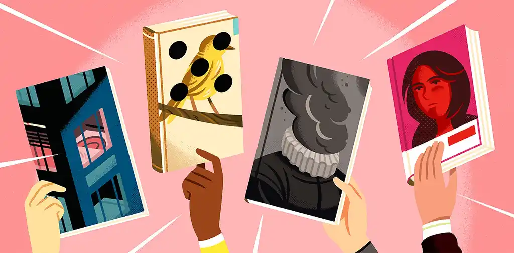
Can a Professional Book Cover Double Your Sales?
About the author
Reedsy's editorial team is a diverse group of industry experts devoted to helping authors write and publish beautiful books.
More about the Reedsy Editorial Team →Martin Cavannagh
Head of Content at Reedsy, Martin has spent over eight years helping writers turn their ambitions into reality. As a voice in the indie publishing space, he has written for a number of outlets and spoken at conferences, including the 2024 Writers Summit at the London Book Fair.
View profile →Who doesn’t love a great book cover?
For many authors, covers work in harmony with the content of a book or artwork, turning a ream of bound paper into something lovely to behold. From a publisher's perspective, they’re a book’s number one marketing tool.
But what monetary value can you put on a great cover design? Couldn’t you save money by rustling something up on Canva and letting your words do the talking instead?
Well… let’s find out.
The experiment
We recently invited self-published authors to repeat an experiment we ran a few years ago: to get their covers rebranded by a professional.
Seven books were selected from a range of genres and assigned to professional designers with experience in that genre. Once the designers returned with their updated designs — all remade according to their understanding of the target audience — we entered them into an A/B test on two of the most popular book advertising platforms.
For each book:
- We ran two ads over a week
- Both ads were identical except for the cover image
- Each variant was served to over 1,000 users from the same audience set.
The results of these tests would give us a snapshot of how much the redesigned cover would impact the click rate of an advert (which would also indicate how ‘clickable’ the thumbnail image would be on a retail site).
Where did we run the tests?
We ran tests on the ad platform with the best access to the book’s target audience. For most types of fiction, this was BookBub — a company with 15 million subscribers, most of whom had explicitly stated their genre preferences when they signed up. On a few occasions, we used Facebook ads, which allowed us to target more non-literary interests.
With one exception, the new covers positively impacted click rates, with one new design bringing almost three times as many clicks as its old cover.
Let’s look at the redesigns and see how they performed in our test.
Middle Grade (24% improvement)
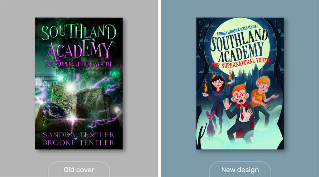 Title: Southland Academy for Supernatural Youth by Sandra Tentler & Wren Tentler
Advertiser: BookBub
Audience: Middle-Grade Author Mix
Result: 24.70% more clicks
Sandra and Wren Tentler’s middle-grade novel is a fun fantasy adventure set in a school for kids with paranormal abilities. Its original cover design nods heavily toward a certain hit series set in a wizarding school. And while the choice of font and imagery indeed suggests Potter-like themes, the colors and execution indicate something darker and more violent. This might be less appealing to the average MG reader, who is usually between eight and 12 years old.
Redesign
For the redesign, we brought in Madrid-based Diego Alcalá, whose work is sought after by crime novelists, literary writers, and children's authors worldwide.
Diego suggested a concept that depicted the book's main characters: a young vampire afraid of blood, a glitchy witch, a sassy cat, and a boy-next-door wolf shifter. To demonstrate this concept, he soon returned with a couple of treatments.
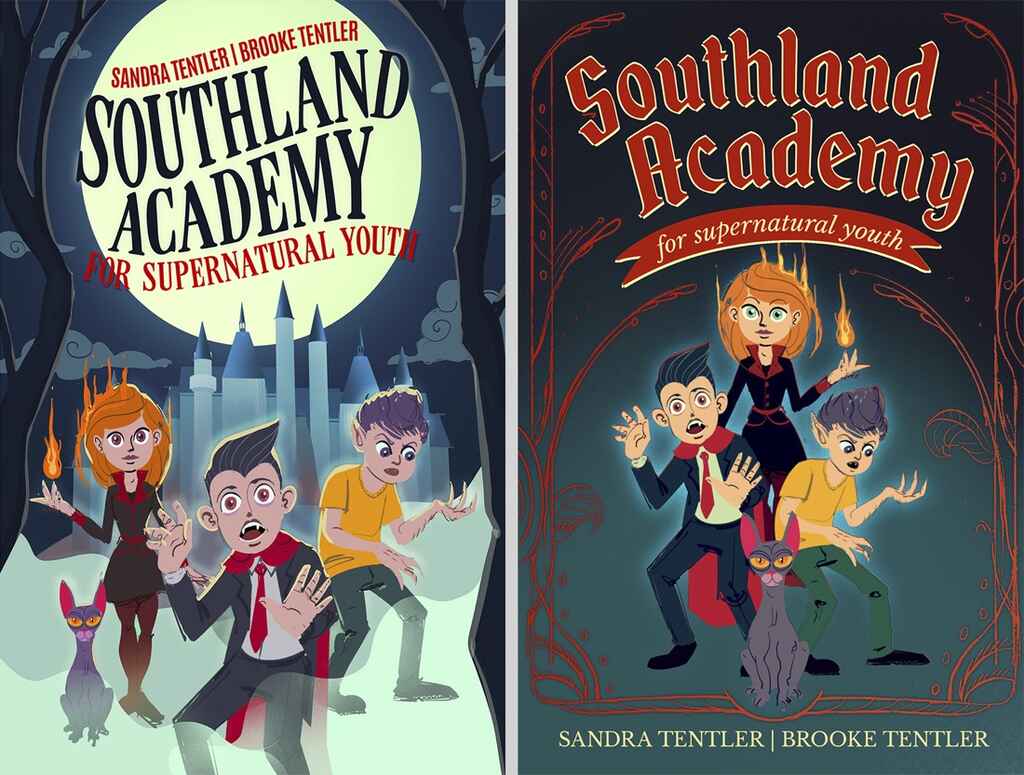
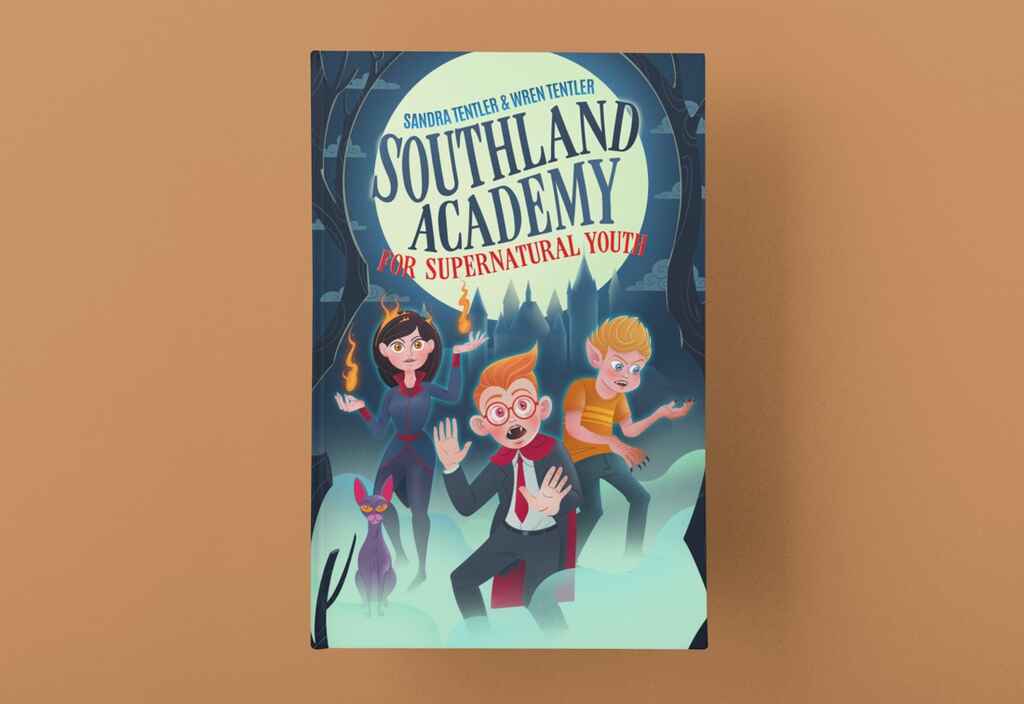
Both concepts were appealing for different reasons, though ultimately, we went for the version that featured the background castle and the title silhouetted by the moon. With a few further tweaks (including finessing the illustrations and correcting some of the character details), Diego returned with the final design.
Result
Each cover was served to over 1,800 users on BookBub who had shown interest in a mix of comparable Middle-Grade Books. Diego’s design resulted in 24.7% more clicks in this test than the original cover.
Want to work with Diego on your next book? Sign up to Reedsy and send him a request.
Fantasy (164% improvement)
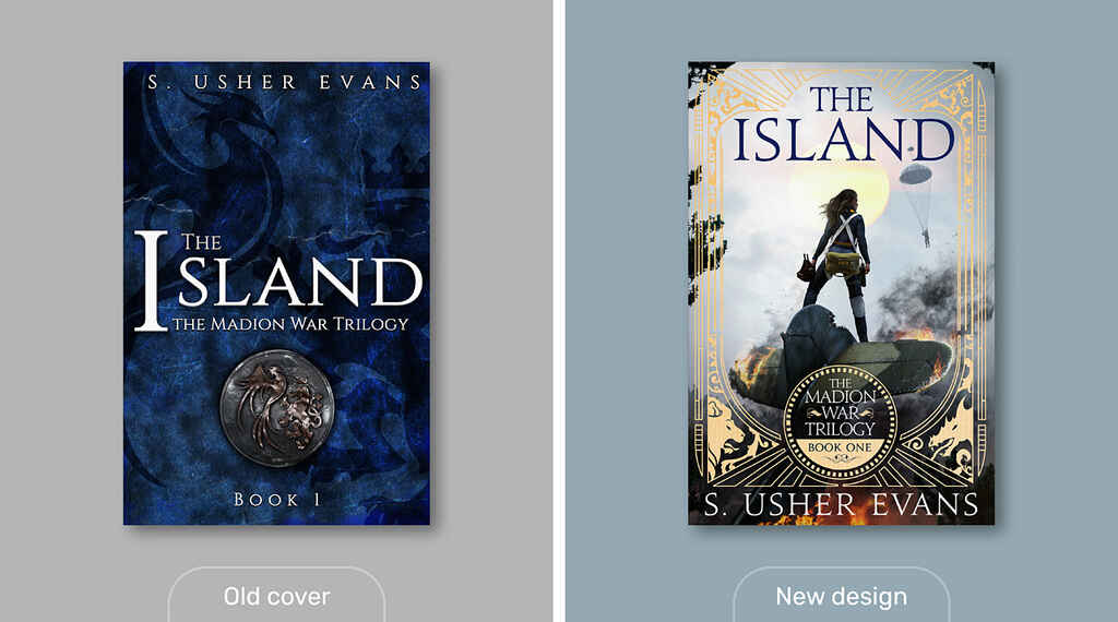 Title: The Island by S. Usher Evans
Ad Platform: BookBub
Audience: Marie Rutkoski, Fantasy
Result: 164.22% more clicks
The first book in S. Usher Evans’ Madion War Trilogy is set in an alternate 20th-century Earth. It centers on a fighter pilot, the prince of a land her country is at war with, and the unlikely romance that strikes when they crash-land on a remote island.
While Evans’s original cover does not look out of place on the shelf of a fantasy reader, it also doesn’t do enough to communicate the book’s unique setting, compelling characters, and tried-and-true plot.
Redesign
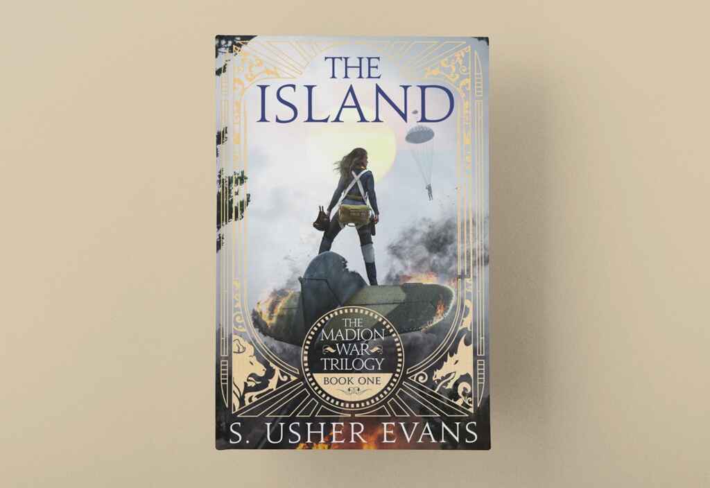
For this book, we knew exactly who to call: Jake Clark, a longtime Reedsy designer whose covers are detailed, photorealistic, and never fail to create a sense of place and excitement. Once Jake had enough information on the book itself, including plot and character details and historical influences, he returned with a stunning concept that would’ve thrilled any author.

While we loved this design, certain details didn’t match how things played out in the book. For one, how the island is described in the book is closer to how you’d imagine the forest in the Pacific Northwest — compared to the tropical rainforest Jake had rendered. In addition, our pilot crash-lands, while the prince is saved by a parachute.
Happily accommodating these changes, Jake returned with an updated version that was just as impactful — and ready to hit the shelves!
Results
This campaign was conducted on Bookbub, targeting readers of Fantasy and the writer Marie Rutkoski (whose The Winner’s Curse is name-checked on Evans’s blurb as a comp title). Jake’s new design received 164.22% more clicks than the original cover, providing a clear winner.
For a kickass cover of your own, sign up to Reedsy and send Jake a request.
Mystery (89% improvement)
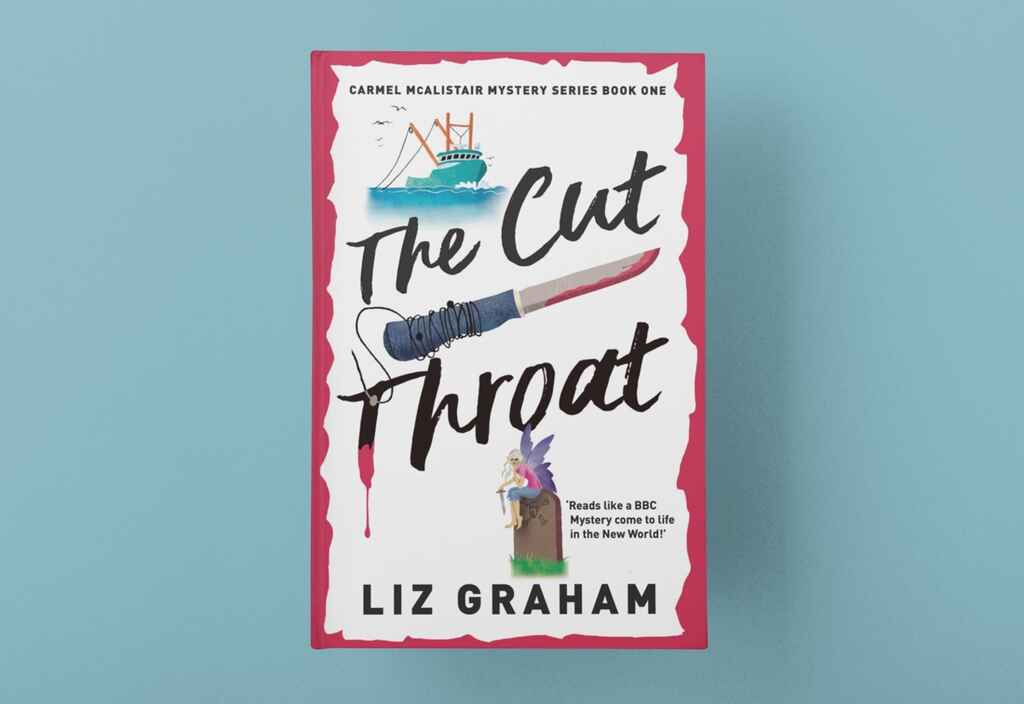
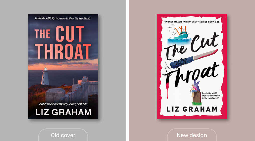 Title: The Cut Throat by Liz Graham
Advertiser: BookBub
Audience: Simon Brett + Cozy Mysteries
Result: 89.58% more clicks
A murder has occurred in a charming fishing town on the edge of the North Atlantic — and it’s up to new-in-town Carmel McAlistair to figure out whodunnit! This first book in Liz Graham’s mystery series set in Newfoundland features a cover design that showcases the coastal setting and creates a foreboding atmosphere.
Redesign
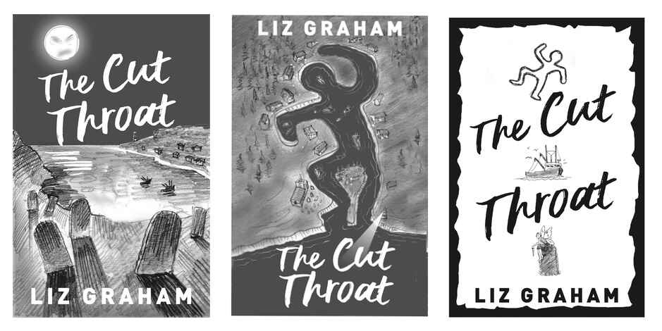
For this project, we brought on designer Patrick Knowles, who has previously worked on books by Charmaine Harris, George R.R. Martin, and Anthony Horowitz. Working from the author’s synopsis, Patrick quickly returned with almost a dozen concepts ranging from moody and macabre to light and humorous.
In the Amazon reviews for The Cut Throat, the vast majority of readers praised the book for its romance, charm, and coziness — with the cover quote calling it “a BBC Mystery come to life in the New World.”
With this feedback ringing in our heads, we started to suspect that Graham’s book could be a hit with the cozy mystery community — so we went with the version that best hinted at the cozy mystery genre. In fact, one might say that this concept calls to mind some of the more Richard Osman-y novels currently burning up the charts.
With a few further tweaks, Patrick delivered a final cover ready to take on the cozy mystery market.
Result
Each ad was served on BookBub to over 1800 users interested in Cozy Mysteries and the detective author Simon Brett. Patrick’s cover resulted in 90% more clicks than the previous design.
Did you know that Patrick is also a highly sought-after calligrapher? His work included calligraphy for the wedding of Prince William and Princess Catherine of Wales! If you want to work with him on your book, head to his profile on Reedsy.
Nonfiction (28% improvement)
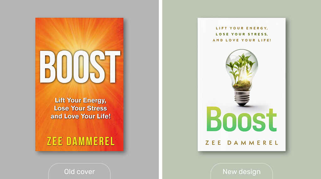
Title: Boost by Zee Dammerel
Ad platform: Meta
Audience: Health & Wellness, Kindle
Result: 28.28% more clicks
Published at the end of 2020, a year in which global stress levels were, should we say, high, Boost offers readers a way to create balance in their lives. Offering insights into the behaviors that sap the energy out of everyday modern existence, Dammerel’s book gives readers several “light bulb” moments of understanding how simple changes can produce huge results.
While the book received many five-star reviews from readers, the original cover was perhaps less inspiring than the content. While there’s nothing wrong with the choice of font, its use of drop shadow to provide depth does give it the somewhat dated 90s look.
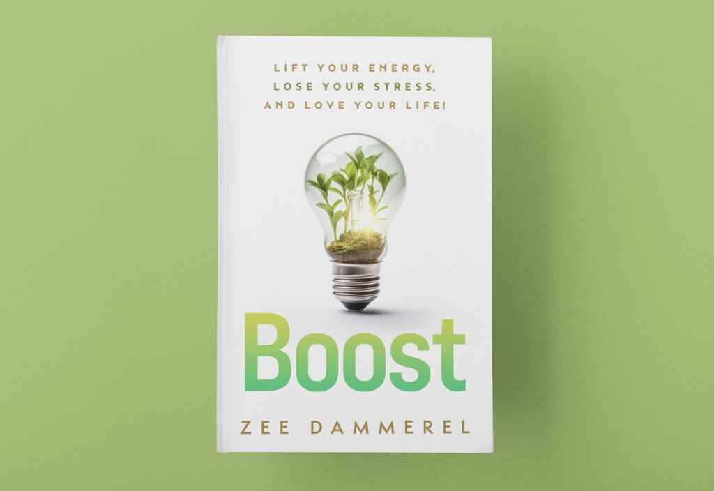
Redesign
To give Dammerel’s book the clean, contemporary look of traditionally published nonfiction books, we turned to Vanessa Mendozzi, a London-based designer with a rich background in making nonfiction covers. With the brief in hand, she soon returned with over a dozen impactful, on-trend concepts.
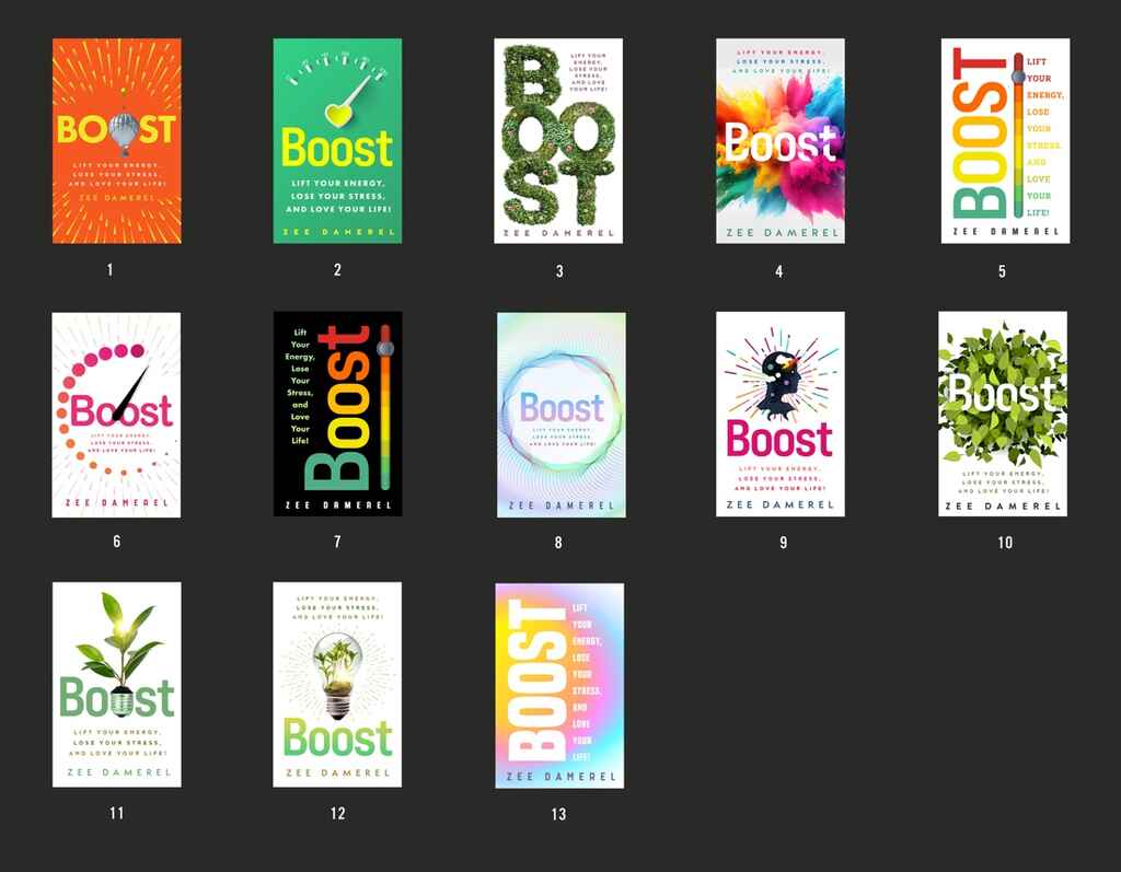
Of these designs, the one that stood out to us the most took Dammerel’s concept of “lightbulb moments” and combined it with one of the book’s themes of living in harmony with the planet.
With just a few adjustments, including correcting the author's name (not the designer’s fault — we misspelled it in the brief), Vanessa delivered the final product:
Results
We set this campaign up with Meta ads on their platforms, including Facebook and Instagram. Targeting users interested in the topic of Health & Wellness as well as reading books on Kindle, the version designed by Vanessa received 28.28% more clicks than the original design.
Memoir (14% improvement)
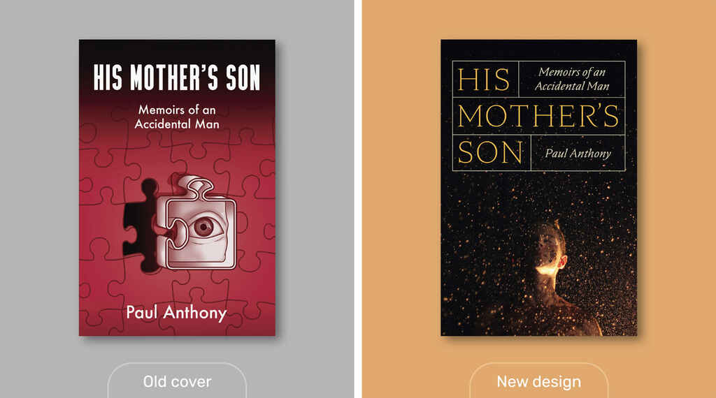 Title: His Mother’s Son by Paul Anthony
Ad platform: BookBub
Audience: Lucy Grealy, Memoir
Result: 13.48% more clicks
This memoir's original cover is conceptually strong. In encapsulating his story of a dysfunctional upbringing and journey to recovery, the metaphor of a wrong puzzle piece is appropriate (if perhaps a bit on the nose). Any major issue with this first design lies in whether or not:
- It effectively communicates the genre or subject matter
- It has been executed to a professional standard.
Redesign
For this memoir, we gave designer Jason Arias a broad brief, suggesting a typographically led design (as was seemingly common within the genre). However, we clarified that we were keen to see his ideas based on the synopsis. Taking us at our word, Jason returned with several thoughtful and inventive concepts.
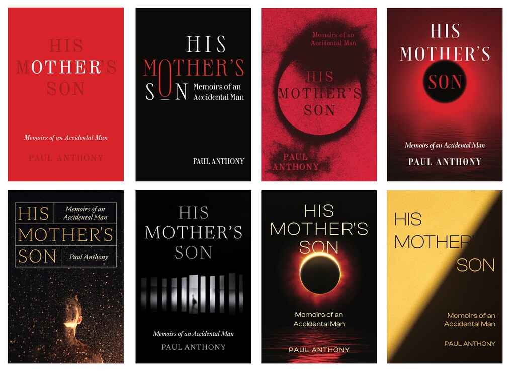
Along with these fully realized concepts, Jason provided detailed rationales for his designs, which helped us quickly understand the approach. Highlights included:
- “An elegant, purely typographic design where ‘other’ in ‘Mother’ is emphasized to suggest Paul's fractured relationship with his mother.”
- “A moody, illustrated eclipse symbolizing Paul's mother's overshadowing of his own identity.”
- “A photograph of a young boy, covered in dirt and caught in a deluge of rain. This boy's exposure to the harsh elements mirrors his tumultuous relationship with his mother and his struggle to find his individuality well into adulthood.”
- “A photographic cover with an elegant type treatment. The photo shows a hazy man walking along a corridor, which is fragmented into segments. The segmented pieces are meant to mirror Paul's fragmented psyche and how his connection to himself was obscured by his relationship with his mother.”
Although we had initially set out for a typographical design, we were drawn to the image of the young boy caught in the dirt and rain. Returning with some small feedback, we were soon delivered the final files.
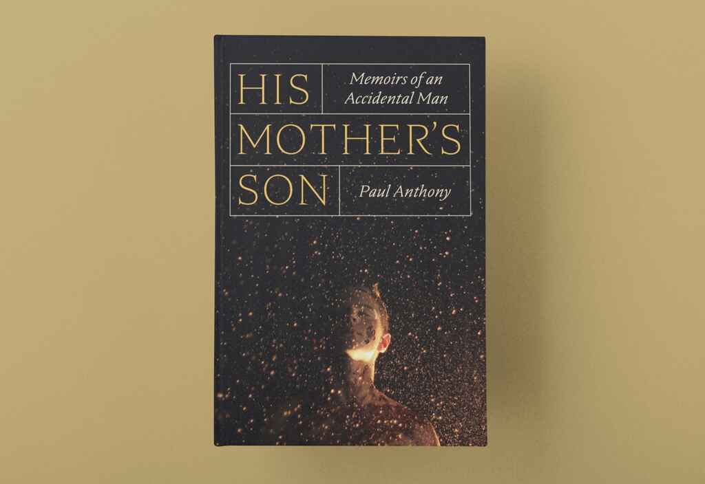
Results
Memoirs are notoriously hard to advertise online — as fewer readers openly classify themselves as ‘memoir fans’ the way that a History geek, Sci-Fi fanatic, or Romance buff might.
Through BookBub’s ad platform, we targeted its (relatively modest) Memoir segment and readers of Lucy Grealy, whose 1994 book Autobiography of a Face dealt with a somewhat similar theme of traumatic childhood. Jason’s new cover drew 13.5% more clicks than the original design.
For a closer look at Jason's portfolio (and the work he does with authors) check out his Reedsy profile.
Horror (63% improvement)
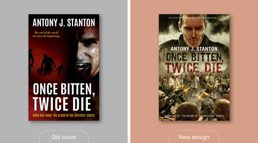 Title: Once Bitten, Twice Die by Antony J. Stanton
Ad Platform: Meta
Audience: World War Z, Kindle Readers
Result: 63.41% more clicks
In the first book of Antony J. Stanton’s Blood of the Infected series, a revolutionary drug gone wrong has turned a large chunk of the world’s population into zombies. An increasingly overwhelmed military has only one hope: vampires!
Redesign
To bring a bit of Hollywood production value to this book, we brought on Alejandro Colucci, an award-winning illustrator with a client list that includes publishing heavy hitters like Robin Hobb (the Farseer series), Andrzej Sapkowski (Witcher), and cyberpunk pioneer William Gibson.
Emphasizing the central concept of Vampires vs. Zombies (with a nod toward I Am Legend and World War Z), Colucci created a dramatic new design that would appeal to fans of the genre.
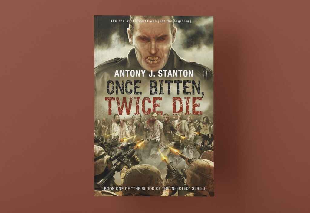
Result
In a week-long campaign on Meta ads targeted at fans of World War Z with an interest in Kindle books, the new cover for Once Bitten, Twice Die garnered over 63% more clicks than the original design.
Looking for a gorgeous, high-quality cover? Check out Alejandro's profile on Reedsy.
Women’s Fiction (9% decline)
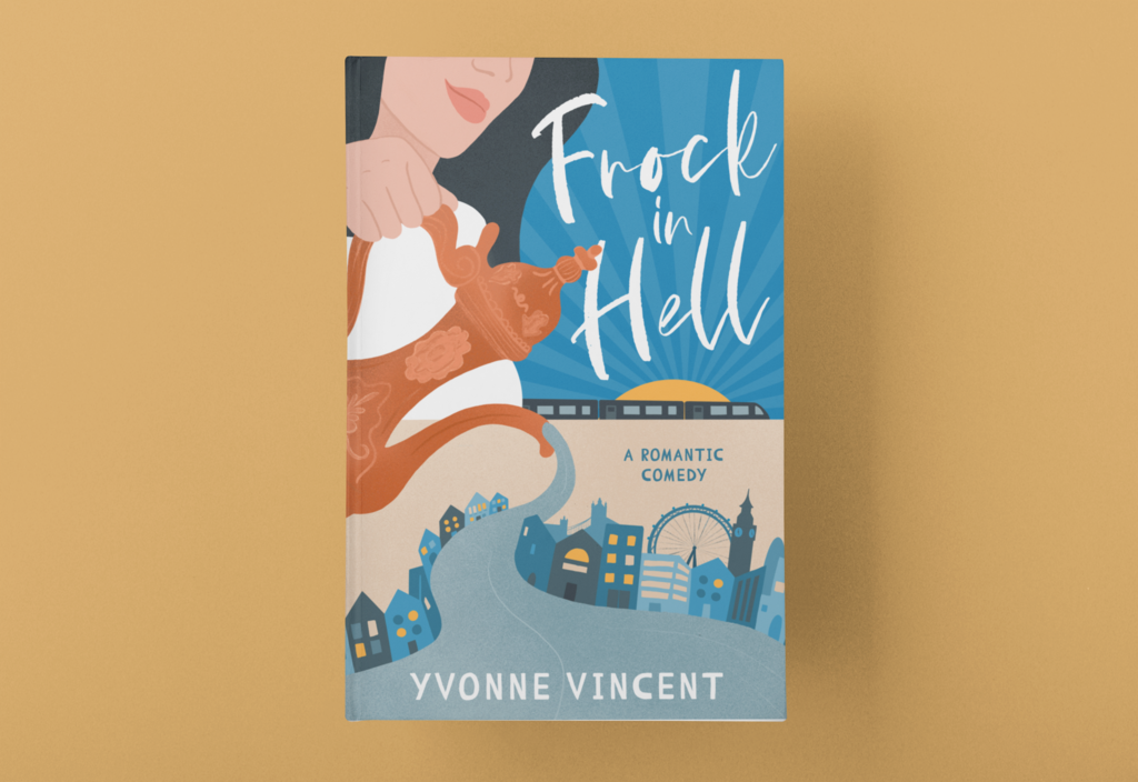
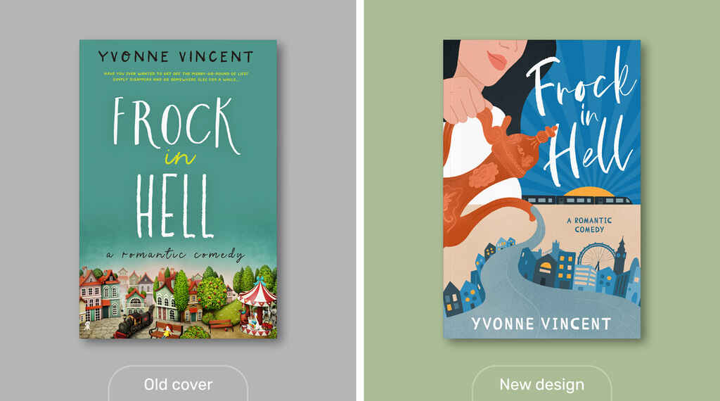 Title: Frock in Hell by Yvonne Vincent
Ad Platform: BookBub
Audience: Melanie Summers, Rom Com
Result: 9.67% fewer clicks
In Yvonne Vincent’s charming rom-com, Katie Frock oversleeps on a train trip. She finds herself in London, swapping her role as a wife and mother in Yorkshire for a new stint as a waitress in a Turkish restaurant — where she’s soon embroiled in all sorts of big-city shenanigans!
Redesign
Yvonne’s existing cover does a lot of things right. The color palette and clear, fun typography match what you’d expect from the women’s fiction and romance genres — and you can clearly read the most critical bits of text. However, the choice of illustration didn’t match the novel’s plot, which is set in a distinctly non-pastoral London.
For this assignment, we brought on French-based Canadian designer Bailey McGinn, whose charming illustrated covers bring to mind the books of authors like Sophie Kinsella and Marion Keyes.
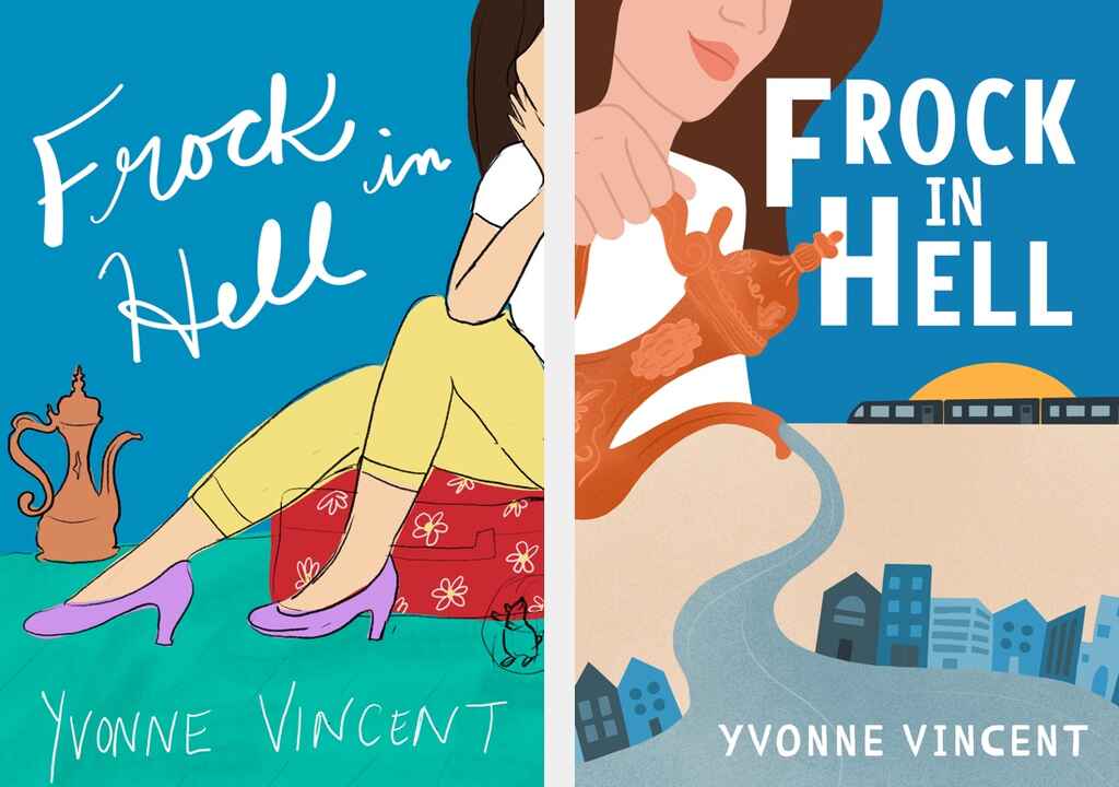
Bailey’s concepts played with key images from Yvonne’s novel, such as the Turkish tea set. We genuinely loved the first concept, with its subtle inclusion of the hamster (another pivotal plot point) and the floral suitcase to suggest a woman away from home. Ultimately, we went for the second concept, which invokes the big city, the stream from Katie’s tea set turning into the River Thames.
After a few small rounds of adjustments — adding recognizable London landmarks and making tweaks to the type — we arrived at our final design.
Results
For this campaign, we served both designs to BookBub users interested in rom-coms and the author Melanie Summers. While the book's author was absolutely delighted with the redesign, our test results were a little disappointing. The new cover received 9% fewer clicks than the original.
The difference in clicks is possibly within the margin of error, but maybe within the context of the ad, the original cover simply popped a bit more. Or, more likely, the Melanie Summers fans we targeted may have preferred her Royal romances and novels set in holiday destinations — rather than her modern, city-based books. In this case, the readers may have been drawn to the promise of a small-town romance (old cover) over the hustle and bustle of the big city (new cover).
This final test shows that creating a cover design that resonates with your target audience is as much a slippery art as it is a science. But as we can see with most of our test cases, working with a professional designer paid dividends.
After all, 20% greater clickability will impact how well a book converts at every stage of the sales process, from ads and social media posts to appearances on search results pages or a list of books featured on a promo site. If you can make your book more appealing by 20% at every stage, it will eventually compound and profoundly affect sales.
And if nothing else, a professional cover will give you a book that you’ll be proud to call your own — one that will take pride of place on your bookshelf for years to come.