Last updated on Oct 15, 2025
The Elements of a Book Cover: A Deeper Dive
Martin Cavannagh
Head of Content at Reedsy, Martin has spent over eight years helping writers turn their ambitions into reality. As a voice in the indie publishing space, he has written for a number of outlets and spoken at conferences, including the 2024 Writers Summit at the London Book Fair.
View profile →Ever wondered what makes a successful book cover? While authors and designers obviously want their covers to stand out on the shelves, there are many standard features that you'll find on pretty much any book cover.
In this post, we'll dive into the elements that make up a cover design to better understand their crucial role in contributing to a book's appeal.
Front cover: the moneymaker
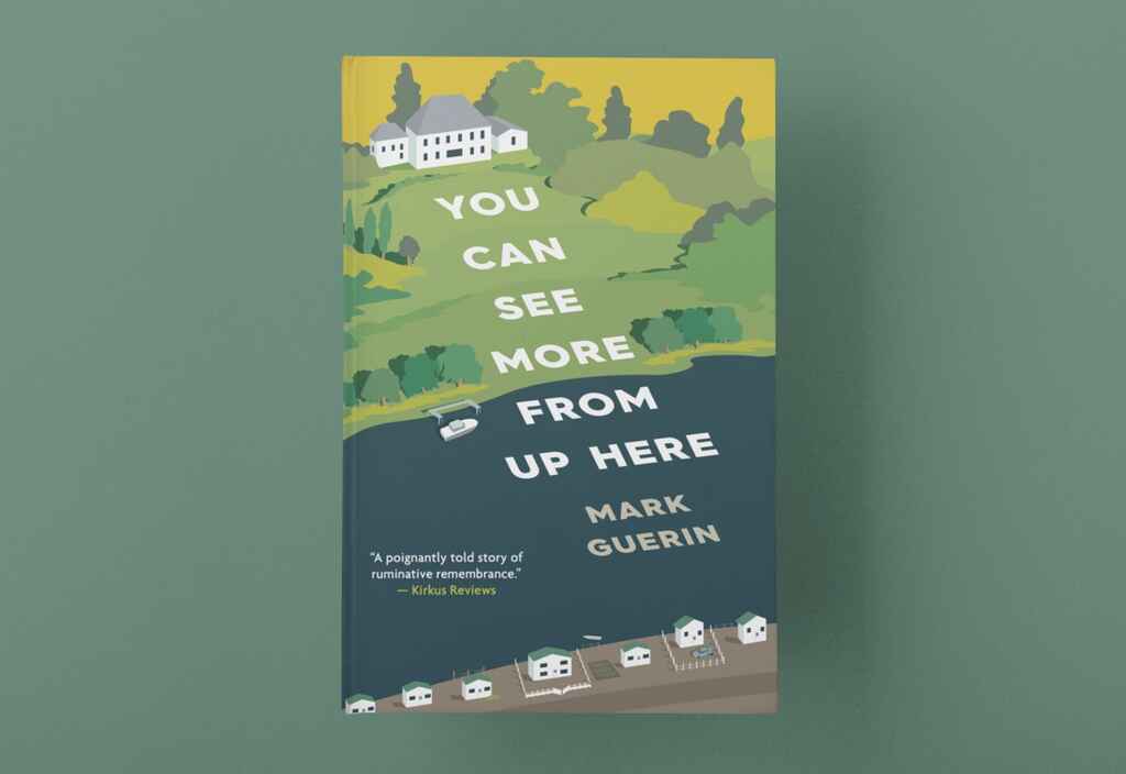
Let's be honest; we all judge books by their covers, and for a good reason! The front cover should be designed to reflect its genre and hint at what it's actually about. It's the first thing a reader will see, making it your number one marketing tool.

The crucial elements of a front cover are the title and the author's name, but those alone would hardly jump out at you from the shelves. Cover art, color scheme, and typography are just a few other elements that will make your book stand out to potential readers.
Cover art
Your cover art will be one of the most critical aspects of your book cover design — different styles and trends are closely associated with specific genres, so it's important to get it right. This is why it's essential to hire a professional cover designer who knows what's fit for the market you want to sell to.
Adding photos or illustrations to the cover of a book can help offer some insight into what the book is about and signal to a reader whether or not they'd like it. The designs for the two books below do a great job of communicating genre, tone, and content.

The log cabin set in the moody, moon-lit forest for Hidden Beneath the Pines (above) simply screams "mystery-thriller" and tells the reader where the story will be set. On the other hand, the catalog-perfect room on the cover of Messy Bed, Messy Head immediately connects to the book's content — and offers a glimpse of what the reader might aspire to.

However, some covers are more abstract and give an idea of their concept, rather than plot or specific locations and characters. Reedsy designer George Stevens's cover for The Pain Habit takes author Drew Coverdale's metaphor of a 'journey to recovery' and represents it as a trail map up a mountain.

Through George's use of color and playful graphics, he's able to represent a topic that's tied up in trauma and present it in a hopeful light.
The cover below (by Reedsy designer Patrick Knowles) uses bespoke illustrations to capture the unique story in Goran Baba Ali's The Glass Wall.

This design bridges the gap between literal and abstract cover art by depicting the book's characters and settings and the book's complex theme. The book deals with the vast inequalities and challenges facing immigrants escaping conflict in the Middle East. To offset the challenging subject matter, Knowles and Ali ensured that the cover remained accessible, rather than too abstract or metaphorical.
While you can just use stock images to create your cover, illustrations tailored to your book will convey your message much better and help it stand out more, especially if you're putting it out as an ebook that could so easily be scrolled past.
Type hierarchy
The title of the book and the author's name aren't carelessly slapped onto the book's cover without any thought. The font, size, and placement of any text are key elements of book cover design — not only can it be used to catch a reader's eye and guide them to the most essential information. That's why the names of well-known authors are often more prominent than the title of their book, while debut authors will put more focus on an intriguing title.

Taking the reader's eye on a journey across the cover is especially important on nonfiction covers. More often than not, they'll have a subtitle to clarify what the book is specifically about. The title 'Our Road to Damascus', for example, could be for almost any kind of book — anything from adventure or fantasy to religion and memoir would fit. It's the subtitle, '7 Lessons for a Life of Purpose and Meaning,' that tells us it's a self-help book.
Testimonial

If you've already got some reviews for your book you might want to include a short testimonial on the front cover, too — especially if they're from a recognizable or reputable source. The cover above omits photos or illustrations in favor of a striking background, bold title, and a short recommendation from another author.
Spine: I bet you look good on the bookshelf
The spine is the center of the book's cover, where all pages are bound. It holds your book together and, if done well, will make your book stand out on the bookshelf.
The essentials for a book's spine are the book's title and the author's name — these should be in the same font as the main text on the front cover. In the example below from Patrick Knowles, the spine continues the front cover and re-utilizes one of the graphical elements.

Back cover: the (not-so) boring bits
Once a front cover has caught the reader’s attention, it's up to the back cover to convince them to actually buy and read your book. To anyone sighing because "no one ever looks at the back cover," we ask: how many times have you bought a book without reading its description?
Practical elements
Let's get all of the less glamorous practicalities out of the way first, starting with the ISBN. An ISBN is a unique, 13-digit code used to identify a book, usually found just above the barcode at the bottom of the back cover.

Traditionally published books will also display the publisher's logo towards the bottom of the book's back cover.
Marketing materials
The most important feature of a book's back cover is the blurb — a short description to tell readers what it's all about. It shouldn't be a lengthy synopsis, and nor should it contain any spoilers, but it should make your readers curious about the pages between the covers.
Another great way to draw in new readers is a positive review from another author in your genre, especially if you've not already got a testimonial on your front cover or if this is your first book. Many authors also add a personal touch. A short author biography and headshot is standard — especially in nonfiction.
Flaps: the hardback's special feature
Your book's cover will look a little different if you're publishing a hardback. Hardbacks usually have dust jackets — a removable cover printed on thick, heavyweight paper. Some features usually found on the back cover may be relocated to the dust jacket's back panels (or flaps).

There aren't really any hard and fast rules — the author's photo and bio are the most common choices for the flaps, but they can also house a book's blurb or some testimonials.
The exterior design of a book is one of its most important features so getting it right can feel a little daunting at first. But, now that you’ve got a solid grasp of its various elements — you know what it takes for a cover to truly work. If you want a professional cover for your next book, be sure to check out Reedsy's network of experienced book designers.
Hire an expert cover designer on Reedsy
Matthew R.
Available to hire
A graphic designer with a passion for book design. Over 600 cover credits with clients including Jeff VanderMeer. Let me dress your book!
Daniel G.
Available to hire
I specialize in humorous character focused covers, but my style naturally fits both horror and dramatic works too.
Florin E.
Available to hire
I am a professional editorial illustration artist and graphic designer, creating a wide range of graphics that can be used for any project.

