As a HarperCollins-published author, Chandra Hoffman didn’t have much control over how her books would look or how often she could publish new titles. That’s why she turned to indie publishing. And to ensure her new book looked as professional as her traditionally published title, she put her trust in a Reedsy cover designer.
A trendy cover that didn’t represent my book
When I moved from traditional publishing and founded my own press, one of the things I was most excited about was having input on the creation of my book cover designs. Previously, my novel, Chosen, was packaged and branded by the publisher alone. The outcome was a pleasing cover that didn’t really capture the book’s dark themes of kidnapping and extortion. My editor called this process ‘Lovely-Bonesing’: concealing a book’s gritty subject matter with a cheery cover.

What worried me about this approach was that readers could feel tricked — they could turn on the book just because it wasn’t as upbeat and pretty as the cover promised. So when I left traditional publishing to go the indie route with my recent release, What Pretty Gets You, I wanted the cover to be a truer reflection of the story, while still clearly signalling its genre. Again, this book belonged to the same genre: contemporary upmarket women’s fiction with dark undertones. Its theme: the privilege and peril of physical beauty.
Balancing market trends and accuracy
To hire a designer, my writer friend Melissa Senate pointed me to the Reedsy marketplace. I requested quotes from four designers, but when I saw Asya Blue’s profile, I knew right away she was the best candidate for me. The clean aesthetic and attention to detail that she showed in her portfolio were hard to beat. And, luckily, she was available for my cover!
The first step was a Zoom call to discuss my ideas and get Asya’s expert opinion on my cover brief. I sent her photographs that reflected the tone and setting of my story, and examples of the four cover trends I’d identified in my genre:
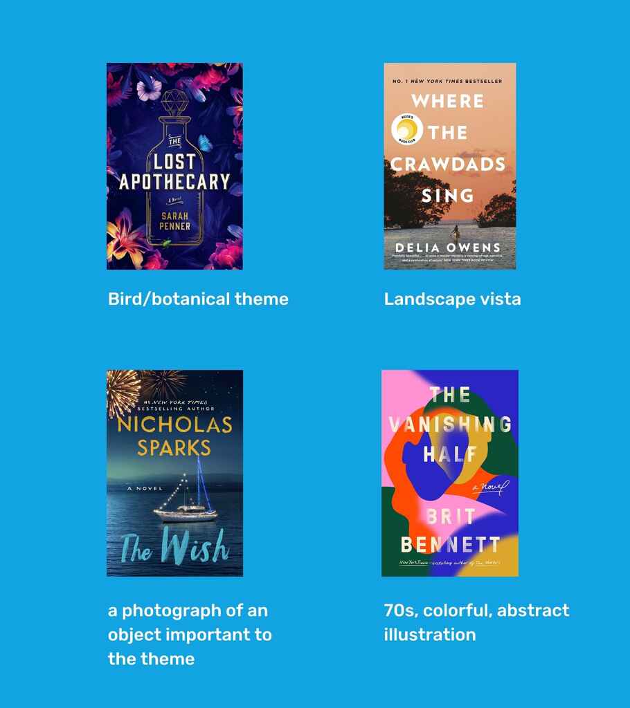
From speaking with Asya, I realized that the latter two were the most suitable for my story. She cautioned me that using a photograph, à la Sparks, might not work for my book because of its gritty genre, but we decided to give it a go. Within days, she had three fabulous designs for me:
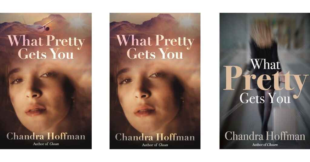
Just like on the HGTV house shows, there is always one you can immediately rule out and that was the third option. While I liked the color scheme and creepy stalker vibe, my main character is working class, so the business attire didn’t work. That left me with the covers featuring a close-up of a woman’s face.
I was totally in love with the first option: the inherent sadness on the main character’s face, the mottled darkness that could be bruises or cloud shadows from the airplane window that, for me, evoked the opening shots of The English Patient.
But then a friend who owns a bookstore gently pointed out that it’s been a long time since she’s seen a close-up photograph of a woman on the covers of my genre. Her comment was a reminder that just because I loved something, that didn’t mean it was going to attract my readership. What I needed was to find the right balance between adhering to market trends and evoking my book’s individual themes.
So I went back to Asya and asked for something on-trend, perhaps an abstract illustration that conveyed the same vibe of the mock-up I liked so much. Giving Asya more creative freedom, I got a message with this design a few days later:
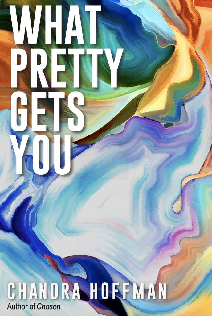
At this point, I struggled to make a decision. I liked it, but still preferred the previous cover. I decided to get feedback from a focus group and have them choose between the original photographic mock-up and this new fluid illustration cover.
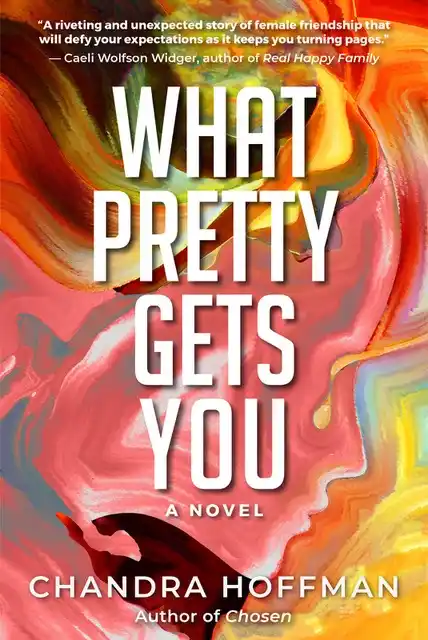
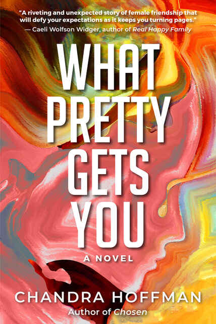
Readers voted for the latter. Some even pointed out how the new cover caught their eye while scrolling on their phones — exactly what you want as an author. Given all this feedback, we moved forward with the illustration. In the end, it’s important to choose a cover that will sell. With some refinement — a new font, layout and warmer color tones — we had our final cover:
A cover that reaches readers
What Pretty Gets You was released on March 15, 2021 and is quickly finding a home with book clubs and women looking for their next Jodi Picoult-type read. I’ve already collected over 50 Amazon reviews and a 5-star rating from Discovery reviewer Sacha T. Y. Fortuné who describes it as “a raw, riveting, and masterful women's fiction thriller about the beauty and ugliness lurking inside us all.”
I often say the best thing about indie publishing is everything is up to you, and the worst thing about indie publishing? Everything is up to you. Luckily, in my case, I was helped along by Asya, who was endlessly professional and patient as I worked out what I wanted and what would reach readers. I cannot wait to collaborate on our next projects.

