Posted on Aug 30, 2020
Guide to Book Layout: What Makes a Book More Readable?
About the author
Reedsy's editorial team is a diverse group of industry experts devoted to helping authors write and publish beautiful books.
More about the Reedsy Editorial Team →About Martin Cavannagh
Head of Content at Reedsy, Martin has spent over eight years helping writers turn their ambitions into reality. As a voice in the indie publishing space, he has written for a number of outlets and spoken at conferences, including the 2024 Writers Summit at the London Book Fair.
Learn more →About Raúl Gil
Illustrator and designer passionate about cover design and visual identity.
Learn more →When authors think about book design, the first thing that pops into their heads is usually the cover. We’ll be the first to admit that cover design is incredibly important — but book layout is arguably just as important! After all, your cover may attract readers’ initial interest, but your interior design needs to maintain it.
Whether you plan to hire a professional in book layout design or typeset the whole thing yourself, it’s crucial to know the basics of interior design so you can ensure a quality final result. To that end, we’ve compiled this guide to book layout, with advice from some of Reedsy’s top-rated designers.

Need a book layout designer you can trust?
300+ of the best designers are on Reedsy. Sign up to meet them today!
Learn how Reedsy can help you craft a beautiful book.
The key elements of book layout
“I believe a book’s style and functionality comes only through careful assessment of content,” says Adam Hay, a cover and interior designer with over 30 years’ experience in the field. Depending on your own work’s content, book layout will depend on the demands made by the topic and content, so be prepared to be flexible.
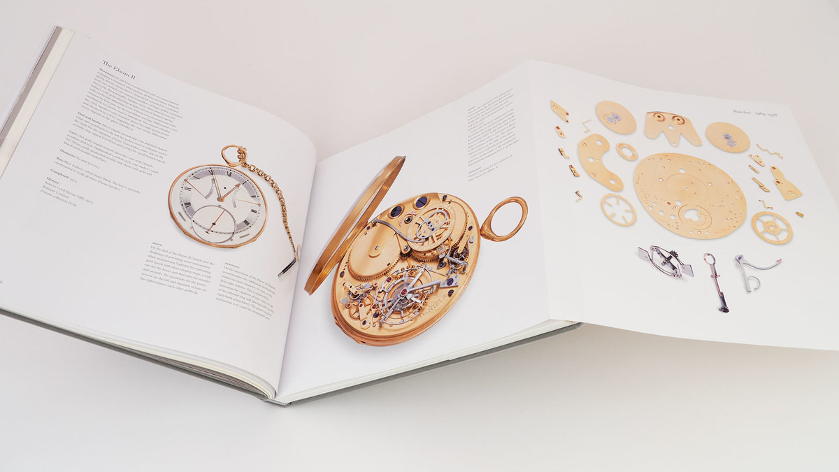
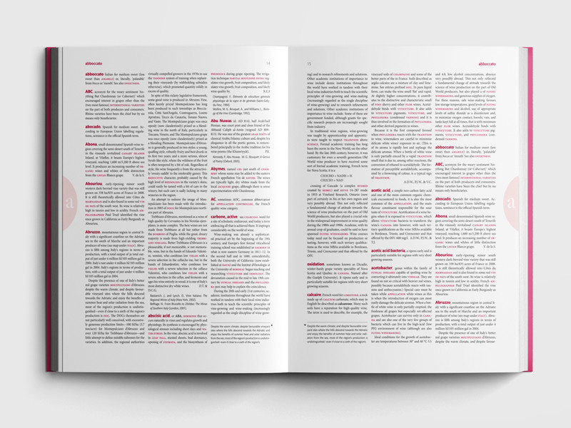
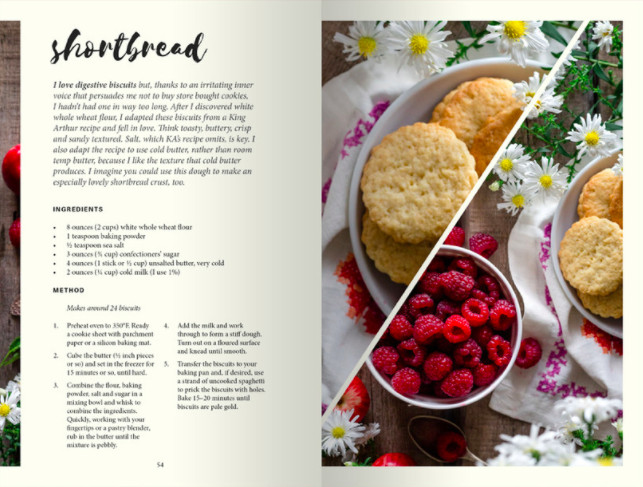
To give a few examples, content-led design is especially important for image-heavy books like cookbooks, photography books, and catalogs. However, authors formatting text-only books should still remain conscious of subject matter and genre conventions — which typefaces are used, how chapters are divided, etc. When in doubt about what your content requires, flip through books that are similar to yours and take note of which design elements crop up.
Now let’s make sure you have a solid grasp of the three key elements of book layout: alignment, margins, and trim size.
1. Alignment
Any book with a substantial amount of text (which is to say, most of them) relies on carefully considered alignment. You might be thinking: “Okay, I’ll line up the text. How hard can it be?” Well, harder than you think. Professional alignment means that both spacing and grids must be flawlessly adjusted to the needs of your book.
Spacing
For alignment to be done well, your lines need to have consistent vertical spacing, as well as be spaced so they’re all roughly the same length (or “justified”). Don’t rush into automatic word processor justification, though, or you may end up with some really awkward-looking stuff. Instead, use specialized book design software like Reedsy Studio, which hyphenates some words for subtler justification, or hire a layout designer to manually adjust the text.
Grid
You’ll also need a consistent grid, which means making sure the text lines up horizontally from page to page. This may be tricky if you’re pring physical copies of your book, as print companies sometimes skew the grid even if you’ve sent them a flawlessly aligned file. So if you’re printing on demand, make sure to order a test copy before mass-printing your book.

2. Margins
In order to maintain a standard line length for your margins, you’ll need to determine how wide they should be. (Also keep in mind that “margins” aren’t just the space on either side of your text, but above and below as well!)
Luckily, there’s a clear-cut answer to this question. For a standard-sized book, your outer (or “rag”), top, and bottom margins should all be about 0.5 inches each, while your inner or “gutter” margins should be 0.75-0.9 inches. This ensures that your text isn’t swallowed up when the pages are bound, and that all your margins ultimately appear about half an inch wide — just enough space for someone to hold a physical copy of your book open.
When formatting your text for ebook distribution, your gutter margins can (and should) be thinner! The standard for ebooks seems to be about 0.5 inches all around. Most ebook formatting tools will calibrate this automatically, but it’s still worth checking before you upload.
3. Trim size
We’ll squeeze in just one more technical element — this only applies to those of you printing books, so if you’re going digital, feel free to skip ahead! Basically, you want to make sure that your trim size complements the length of your book.
You’ll find genre-specific trim size guidelines in this post on standard book sizes, but the vast majority of print books are one of the following:
- Digest (5.5” x 8.5”)
- US trade (6” x 9”)
How do you choose? Simply consider how long your book is — your goal is to produce a book that's neither too thick nor too skinny. So to get the perfect goldilocks book, go for the trade format if your book is over 125,000 words, and choose digest for books under 100,000 words.
If your book is between 100,000-125,000 words, it’s really up to you! Either trim size will look reasonable; your only other consideration may be whether you’d prefer hardcover or paperback copies. (For hardcover, the larger trim will be better.)
Zooming in: interior design details
Let's zero in on some of the details that will make your book flow. Though you might think of certain design details as more distracting than engaging, a good designer knows that honing such details is key to a smooth reading experience!
“Clarity and readability turn on the smallest of details,” says cover and interior designer Euan Monaghan, “from the font used for page numbers to the letter spacing of small caps. These details are received subconsciously by your readers. [When done right], the book will simply feel good to read.”
In constructing your own book’s interior, pay close attention to:
Typography
Typography encompasses both typefaces (e.g. Times New Roman, Garamond, etc.) and font styling (bold, italics, font size, etc.). Typography is genre-dependent, so you may want to research other books in your genre as you refine yours.
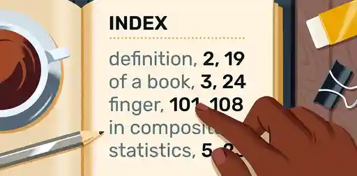
Running heads and feet
These are formatted lines at the top and bottom of each page, containing information like the chapter title (at the top) and page numbers (at the bottom). Keep the font size small and make sure they're either centered or aligned with your rag margins.
Ornamental scene breaks
You may have specially designed ornamental breaks, you may want to use dots or dashes, or you can disregard them altogether and just add extra white space.
Line spacing
Again, be sure to align your text evenly, and try to avoid widows and orphans (isolated lines in the body of your text).
White space
White space can be used in many ways — and can easily tip into bad design.
For text-only books, white space is mostly rags and gutters, the margins on either side of your text. As mentioned, when typesetting, make sure these are measured properly; you don’t want massive margins constricting your text. Also mind the space around chapter headings! Each chapter should begin with a “sink” that takes up roughly one-third of the page, with plenty of white space to pillow the chapter title.
When it comes to books with images, white space is used in more diverse ways. The crucial thing here is to ensure sufficient visual breathing space between text and images. Resist the temptation to cram as many elements as possible onto a single page — it won’t look dynamic, it’ll just look busy. Remember that white space is your friend.
Art and images
Though you’ll want to adhere to convention in terms of technical aspects like alignment and margins, you can still experiment with header type, images, and other visual elements in your book.
Interior and cover designer Stewart Williams exemplifies this intrepid spirit: “I often create original artwork in Photoshop from multiple images,” he says of his creative process. “Strong typographic solutions are also an option… [such as] scanning text from old newspapers and magazines for a more organic, edgy feel. I always work toward a solution that fits the work of each particular author.”
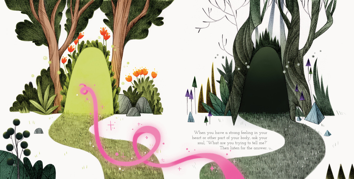
As with white space, design-heavy books present more opportunities for innovation. You can even add a few drawings, as long as they don’t feel too jarring! Black-and-white, minimalist illustrations usually do the trick in an all-text book, as seen below.
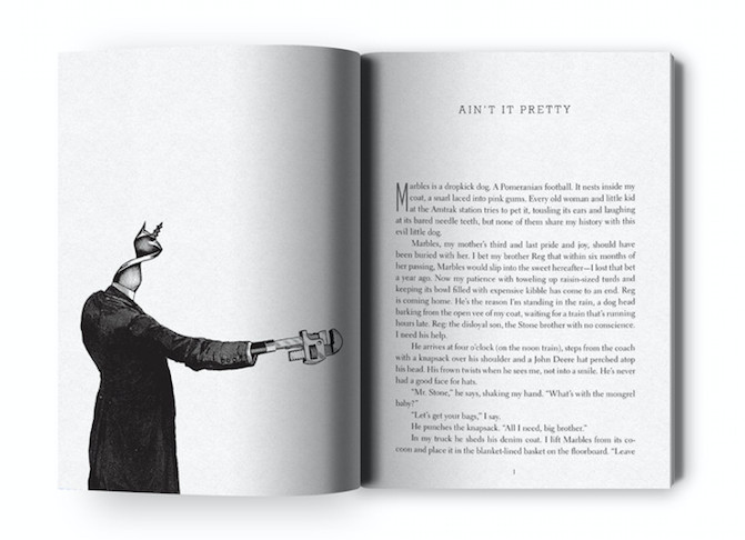
A striking example of a chapter heading illustration. Designed by Stewart Williams.
Book templates for a flawless book layout
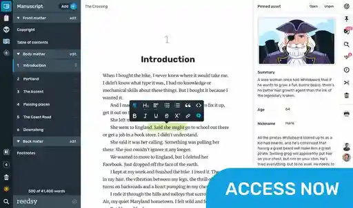
Too much information? Don’t worry, we’ve got you covered with our free book templates! To help you format your book to a professional standard, our free tool Reedsy Studio offers three different layout templates: Reedsy, Classic, and Romance.
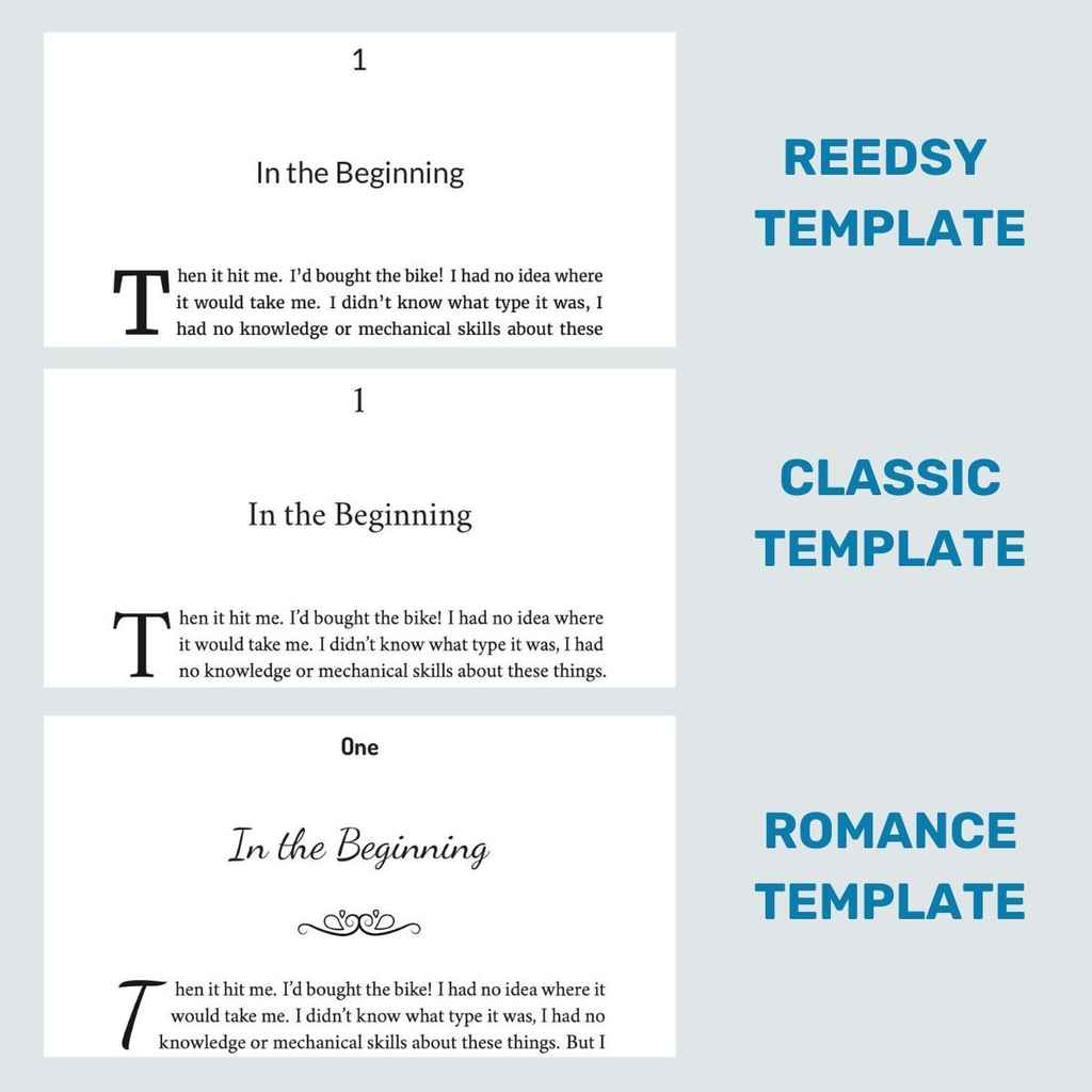
As you can see, each template comes with its own distinct flourishes, with Romance being the most ornate of the three to suit genre conventions.
You may also notice that each sample here contains the same opening text, but the words align differently in each to fit the needs of the page. We’ve worked hard to make this free typesetting and formatting tool available to everyone, and you can sign up to use it right here.
Finally, if your book does pose some design challenges, you may want to hire a professional for this task — you’re mere clicks away from finding the perfect layout designer for you! We hope these tips have helped you gain insight into the world of interior book design, and wish you the best of luck.