Blog •
Posted on Jun 10, 2024
6 Tips for Creating An Illustration Portfolio + 18 Examples to Inspire You
Linnea Gradin
The editor-in-chief of the Reedsy Freelancer blog, Linnea is a writer and marketer with a degree from the University of Cambridge. Her focus is to provide aspiring editors and book designers with the resources to further their careers.
View profile →This article was created in collaboration with professional illustrator Raúl Gil, Reedsy’s very own in-house illustrator. You can see his portfolio here.
As an illustrator, your portfolio is one of the most important resources at your disposal — if not the most important. More than any other qualification, clients want to see proof of concept, so a well-curated portfolio is a must. It acts as your shop front and calling card, signaling what type of illustration work you excel at and with whom you would love to work.
With so much riding on it, here are 6 tips for what you should (and shouldn’t) do when setting up your illustration portfolio, complete with stunning examples to inspire you. Let’s dive in.
1. Only include work you'd love to get hired for
The best portfolios clearly showcase the work of an artist who knows who they are and what they’re great at. So, as a rule of thumb, your portfolio should first and foremost communicate what you specialize in and love to work on — not just what you’re capable of or “willing” to get hired for.
Take a long, hard look at your work and remove any pieces that you wouldn’t absolutely want to get hired for (even if they are excellent) and only keep those that highlight the parts of your artistry that make your heart flutter (even if they have a more narrow appeal). With this as your north star, you should be able to create a cohesive and compelling portfolio that attracts exactly the right clients for you.
Check out this article by designer Colleen Sheehan for more tips on how to only get projects that you love.
Example: Anna Sorokina
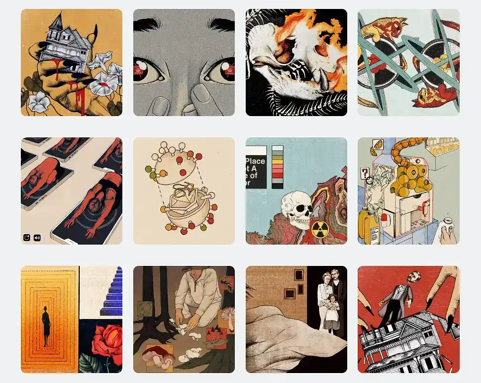
Reedsy illustrator Anna Sorokina has a clear passion for vintage sci-fi, which her portfolio captures beautifully. The market may be niche, but anyone who lands on her portfolio immediately knows what she excels at, filtering away irrelevant queries.

JOIN REEDSY
Find exciting new projects
We connect publishing professionals with our community of 1,500,000 authors.
2. Make it cohesive, but not repetitive
Speaking of cohesive portfolios: when you’re selecting your pieces, make sure that it feels like they’re all coming from the same illustrator, without making it boring or repetitive. You also want to make sure that you’re showcasing different techniques, themes, and subjects.
This might seem like a paradox at first, but cohesion and variety can be achieved by making sure that there’s a “red thread” running through your portfolio. Perhaps you tend to stay within the same color palette, or maybe you specialize in illustrations that draw from nature, but create widely within that theme.
Example: David van der Veen
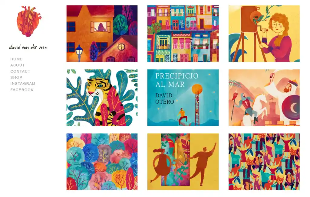
Illustrator David van der Veen strikes just the right balance with his portfolio, with a consistent palette that’s employed in a few different ways. Visitors to his website immediately get a sense of what they would get if they hired him: bold colors and playfulness.
Example: Courtney Hopkins
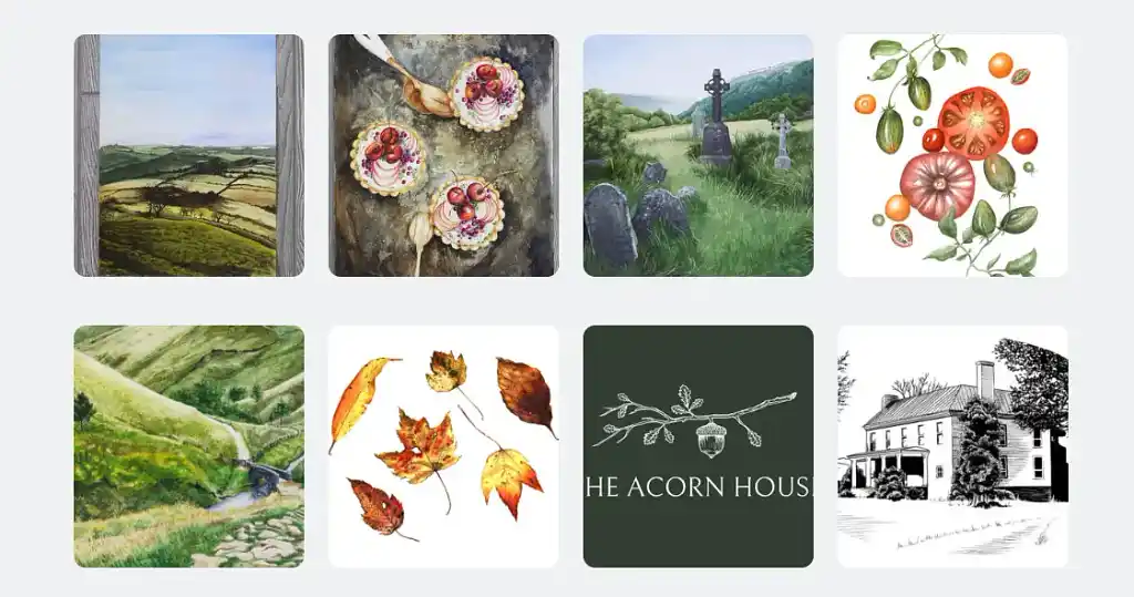
Another example of a cohesive yet diverse portfolio is Reedsy freelance illustrator Courtney Hopkins, who says it best herself: she is a nature-focused illustrator whose work “inspires wonder and delight in the wild beauty of nature.” Through her portfolio, it's clear to see that she masters several different techniques and motifs, with nature as the common denominator.
3. Keep your portfolio concise
When trying to showcase a variety of techniques and motifs, it can be easy to get carried away and add everything you’ve ever done to your portfolio. But each piece you add should serve a specific purpose — perhaps showcasing how you can bring a protagonist to life through your illustrations or your ability to accommodate text in illustrated works — and there should be no filler pieces.
So how many pieces are too many? Well, it’s a bit of a Goldilocks situation: you don’t want your portfolio to be too short, but also not too long. 10 to 20 pieces should be enough. Any more than 40 and it’s starting to get indulgent.
If you’re struggling to scrape together 10 quality pieces that all serve a purpose, you might need to go back to the drawing board — literally! Alternatively, if you find it difficult to limit yourself, ask yourself if there are any pieces you’re keeping because they represent an old achievement or style and, ultimately, if you’d still want to get hired for it.
Example: Becca Stadtlander
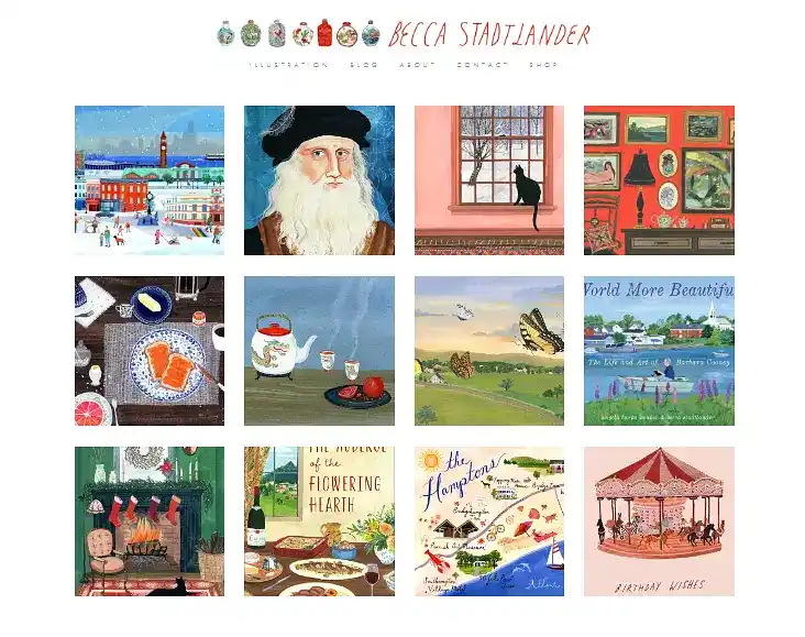
With just 12 illustrations, Becca Stadlander showcases both her unique style and several of the themes and motifs that she has mastered: character work, animals and nature work, city and landscape work, domestic scenes and items, and even maps and amusements. Your potential client shouldn’t have to scroll ad infinitum to make their mind up about hiring you; they should know pretty instantly if you’re what they’re looking for.
4. Keep your target market in mind
While your own creative vision should drive your portfolio, it doesn’t hurt to keep an eye on what is happening in the rest of the industry. For instance, if you want to enter the book illustration field, it’ll be helpful to know which genres you’d like to work with and how other book cover artists have formatted their portfolios.
We highly suggest specializing in one field to begin with (you can always branch out later). But if you’re someone who wants to dip their toe in both invitation cards and editorial illustration, for example, you might want to segment your portfolio into easy-to-navigate subcategories. Doing so shows that you understand precisely who your clients are and what you can do for them.
Example: Evangeline Gallagher
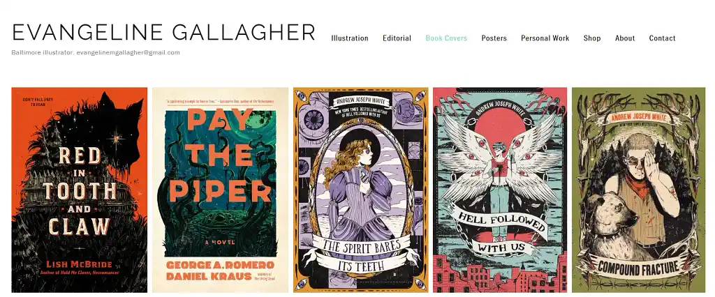
Illustrator Evangline Gallagher’s portfolio contains 5 broad types of illustration work, divided into clear categories: general illustration, editorial, book covers, and posters, as well as personal work. Here, she showcases some of her work for book covers, which indicate a cohesive style, yet also an ability to work on spec to match the mood and genre of the story — something which is especially important if you want to make a living illustrating for publishing projects.
You can check out more book cover art here for more inspiration.
5. Build your digital portfolio to suit your needs
As for where to host your portfolio and in which format, there are several options available to you. Social media like Instagram can be a good start, but a proper digital portfolio will lend a greater sense of gravitas and professionalism and make it easier for serious clients to discover you.
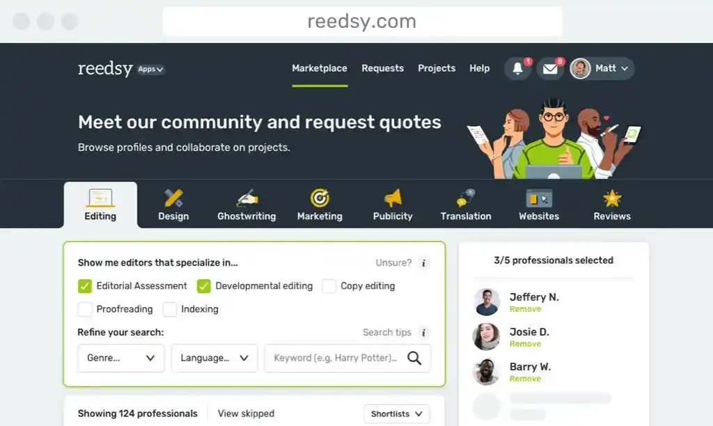
This digital portfolio could be hosted on your website — one that you build on yourself or contract a professional to create — on a portfolio platform like Behance, or on a marketplace like Reedsy. Wherever it’s hosted, your portfolio should be easy to navigate and compatible with all types of devices for maximum impact. Most importantly, it should be built around your needs and the target audience you want to reach.
If you’re interested in joining Reedsy as a professional illustrator, check out our selection criteria for more details about what we’re looking for.
Here’s a list of the essentials that you should include:
- Your work — This is what people are here to see and should make up the landing page of your portfolio.
- Contact details — The whole point with your digital portfolio is to help people discover you and, hopefully, hire you, so make it easy for them to get in touch.
- An “about” page — This is one of the most frequently visited pages of a portfolio. If someone is interested in the work, they’ll want to find out more about the person behind it.
Essentials for a Reedsy profile:
- A professional profile photo: those expressing joy and happiness result in 20% more requests on average.
- A clear short description which highlights your service and genre of choice: a narrow focus is better than Jacks and Jills of all trades.
- A well-curated portfolio and gallery that clearly matches your chosen genres and showcases your professional experience: clients are looking for proof of concept.
For more information on how to set up your portfolio on Reedsy, specifically, check out our FAQ for freelancers.
In a website portfolio, you can also include some optional content, like:
- A newsletter sign-up form — Let visitors, loyal clients, and fans know what you're up to by inviting them to exclusive email updates about your WIP and upcoming events.
- A blog — Engage your audience with longer-form content that might also help attract organic traffic to your website.
- Case studies — Whether part of your blog, newsletter, or a separate entity in your portfolio, process-based case studies can give potential clients a better idea of what working with you might be like.
- A shop front — If you want to sell your illustrations directly on your website, include a shop front or links to where people can buy your pieces.
- Social media links — Let people know where they can connect with you on other platforms, and build up a bigger following.
Example: Mikel Casal
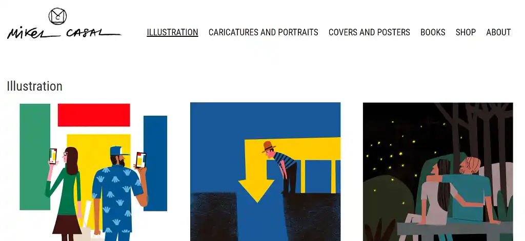
Mikel Casal’s portfolio is a great example of a beautifully designed, custom-made portfolio that is easy to navigate and suited to his needs. It’s well-organized and navigable with 3 sections for different types of illustrations, a shop front, and an “about” page, which contains a friendly, bilingual text written by himself, as well as contact details.
6. Update your portfolio regularly
As a last piece of advice, it’s important that you update your portfolio regularly. This will ensure that it reflects your current style — and also that it doesn’t contain any dead links, irrelevant information, or pieces that you no longer want to get hired for.
You can ask trusted friends and peers for honest feedback about your portfolio or, if you’re feeling brave, anonymous strangers. Most of all, if you find that your portfolio is attracting the wrong types of clients, that’s an important clue that you might be due for an update.
Example: Rachel Sierra
A fresh and contemporary portfolio from Reedsy illustrator Rachel Sierra, this collection feels well-curated and carefully thought through.
More illustration portfolio examples
With these tips, you should be more than ready to set up a winning portfolio. But, if you’re still looking for inspiration, we’ve put together an extended list of portfolios that are excellent examples of how you can communicate who you are to clients.
Penelope Dullaghan’s interactive portfolio with moving elements is not only easy to navigate, but also feels high-end and professional in its offerings.
Michael Batista
Comic book illustrator Michael Batista hosts his portfolio on Reedsy, where clients can get in touch with him directly and hire him via the platform. His portfolio and profile is specific and highlights his areas of expertise: true crime storytelling and drawings of people and faces.

FREE RESOURCE
Reedsy Profile Checklist
Make sure you tick all the boxes on your Reedsy profile by referring to our handy checklist.
A vivid and well-curated portfolio from illustrator Montse Galbany, with a no-nonsense layout that lets the artwork take center stage.
Vibrant and playful, Joohee Yoon’s portfolio is divided into two art categories, an about-me page, a newsletter, and a shop. Simple, yet effective.
Tommy Parker’s sleekly designed portfolio contains animated elements and interactive features, letting you engage with the artwork directly on the page, or use the subtle menu in the top-right corner to navigate around.
Reedsy illustrator Caitlin B. Alexander showcases her mastery in both book cover design and picture book illustrations in her portfolio.
You can read more about Caitlin B. Alexander and her experience working as a freelance illustrator in this interview.
From Youngju Kim’s portfolio, it’s immediately apparent what you’ll get if you hire her to illustrate your picture book: sweet, softly rendered images of children and animals in natural color tones.
🪇 Looking to get hired as a picture book illustrator? Check out this article for insight on where to find children’s book illustrator jobs.
With a distinct style and darker palette, Jon Kvassay keeps his portfolio to 19 unique pieces.
Madli S. clearly indicates her areas of interest with the pieces she’s selected for her portfolio: fantasy and YA with female characters on the book cover.
Lastly, Essi Kimpimäki’s portfolio is all about vibrant neons, animal companions, food, and nature. No frills or redundant elements here, just pure art.
For information about how to showcase your experience, get more clients, or notifications about free webinars, check out our blog and follow us on LinkedIn.
Reviewed by Savannah Cordova
Savannah is a senior editor with Reedsy and a published writer whose work has appeared on Slate, Kirkus, and BookTrib. Her short fiction has appeared in the Owl Canyon Press anthology, "No Bars and a Dead Battery".
Savannah is a writer at Reedsy who specializes in content about short fiction and the editorial process. Her work has appeared in Slate, Kirkus, BookTrib, DIY MFA, and various other outlets focused on writing and publishing. She particularly enjoys analyzing wider publishing trends and trying to predict what will happen next in the industry.
Savannah's short fiction has also been published in the Owl Canyon Press anthology No Bars and a Dead Battery. Her non-publishing interests include cooking, watching rom-coms, and visiting various art museums around London, where she is currently based.
