
Blog •
Posted on Feb 24, 2023
How to Illustrate Characters: 30 Tips for Iconic Character Design
Linnea Gradin
The editor-in-chief of the Reedsy Freelancer blog, Linnea is a writer and marketer with a degree from the University of Cambridge. Her focus is to provide aspiring editors and book designers with the resources to further their careers.
View profile →In the world of illustration, good design doesn’t always have to be complex or difficult. In fact, some of the most famous illustrated characters are based on simple but effective design principles. Just think of The Simpsons or Charlie Brown: both deceptively straightforward characters, yet instantly recognizable and iconic. However, oftentimes, it’s not so easy as it would seem to strike the golden combo of simplicity and clarity.
To help you draw characters that jump off the page, we’ve outlined some of our best tips to help you on your character design journey — with plenty of examples to illustrate, of course.
Center the storytelling
Illustration is, at its core, a storytelling medium that helps readers and viewers get to know a character beyond their appearance. In this sense, centering the story before you even start thinking about the visuals is almost essential if you want to lay a strong foundation and add depth to your character design.
But “centering the story” sounds pretty abstract, so let’s break it down a bit further.
1. Give your character a backstory
A first step to center storytelling is to start thinking about backstory. You don’t have to go as in-depth as an author might, but having an idea about who the character is and what they do can help spark your imagination and draw something that jumps off the page.
For example, when you’re trying to develop a unique silhouette or exaggerate a particular feature (something we’ll talk more about later), knowing your character’s backstory can inform everything from their attire to their posture.
💡Psst. Make sure that the character’s outward appearances match their narrative arc so there’s no distracting dissonance between the two!
If you’re working with a client who already knows the backstory of the character — like an author — you can simply ask them for the information you need to proceed. This way you can make sure that the character’s hair is actually flaming red or that they’re holding an archery bow, like they asked. But if that’s not an option, invest some time in coming up with a rough profile of those characters — it’ll help you create a more coherent and consistent design, and will be worth it in the long-run.
If the character you’re designing is based on a person you know in real life, you can get a headstart on building backstory into your illustration. Here’s an example of Reedsy’s Co-founder, Ricardo Fayet, designed by Raúl Gil for his latest book Amazon Ads for Authors. The backstory follows from his first book, How to Market a Book, where Ricardo lights the way through the publishing jungle. Now, he’s made it to the heart of the jungle and has found the Pandora's Box known as ‘Amazon Ads’ and he holds the key to unlocking its mysteries.
 If the character you’re designing is based on a person you know in real life, you can get a headstart on building backstory into your illustration. Here’s an example of Reedsy’s Co-founder, Ricardo Fayet, designed by Raúl Gil for his latest book Amazon Ads for Authors. The backstory follows from his first book, How to Market a Book, where Ricardo lights the way through the publishing jungle. Now, he’s made it to the heart of the jungle and has found the Pandora's Box known as ‘Amazon Ads’ and he holds the key to unlocking its mysteries.
This process can be as simple or as complex as you want and need it to be. Check out our free template below to get started.
FREE RESOURCE
Reedsy’s Character Profile Template
A story is only as strong as its characters. Fill this out to develop yours.
Next, focus on the intended audience.
2. Remember who the target audience is
Illustrators, much like authors, need to have a good idea of who their target audience is to make sure you’re speaking a pictographic language they will understand.
Ideally, the whole world will enjoy your work, but realistically, your audience will be more narrow, so creating a hypothetical ideal audience member can help you make better design choices. Put yourself in your audience’s shoes and consider what other references they have before coming to your work and what they expect to see in the type of story you’re trying to convey.
Helpful questions to determine target audience
- What is your target audience demographics? Your niece might like one type of character, while your uncle will likely prefer something else entirely.
- What previous references and experiences does your target audience have? Are they an experienced Manga reader, a Classic Arts major, or a complete beginner to visual storytelling?
- What genre or type of illustration are you doing? Superhero graphic novels, slice-of-life manhwas, and whimsical picture books come with different stylistic and thematic conventions which the audience will expect you to either comply with or challenge, but at the very least acknowledge.
You can’t custom design a character for every type of reader, but asking yourself these questions is a great way to start a thought process that will help inform your design. This can ultimately have a great impact on your ideal reader’s ability to interpret, resonate, and enjoy your work.
3. Focus on communicating one message
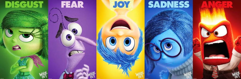
Lastly, when it comes to centering storytelling, you should ask yourself what lasting impression you want your design to leave. What is the primary message — the larger story — you want the character to convey? Is it empathy, sadness, fierceness, or anger, for instance? Good vs. evil? Political satire?
Illustrators have different tools than authors: they can go into detail and explain any uncertainties or contradictions with words, but you don’t have that luxury. Instead, you are much better served by focusing on one central aspect you want your design to communicate, and make that as clear as possible 一 by removing or toning down any distracting or conflicting elements that might muddle the message.
JOIN REEDSY
Find exciting new projects
We connect publishing professionals with our community of 1,500,000 authors.
Gather reference material
Once you have an idea of the foundation of the character, it’s time to do some research and preparation. Gathering reference material will not only inspire you, but help you continually grow and improve your craft.
Here are some of our favorite ways to gather references:
4. Draw inspiration from life
Life is a great source of inspiration — some would even say the best — and
one superpower that illustrators have is their ability to observe interesting details that other people don’t see. Therefore, always carry a notebook or sketch pad with you for when inspiration strikes, or download an app like Sketchbook on your phone. Your next door neighbor who always badgers you about your hedges could be the perfect source material for your next project, or why not the squirrel that occasionally visits the tree outside your window?
The best characters truly are those that are anchored in reality and seem to capture something inherently true about the world, so don’t forget about this vital source of inspiration.
5. Browse through pinterest and portfolios
The good thing about the digital age we’re living in is that you can also gather inspiration from real life or other creators without leaving your house. Whether you’re creating mood boards, pinning your favorite pictures, or simply looking for some inspiration, Pinterest and other galleries like Artstation are a great place to start.
You may just be searching for an elusive “vibe” or a certain art style, or be looking for specific advice on body proportion and how to draw movement, but online image searches and browsing through illustration portfolios are sure to yield some interesting results pretty instantly. Just be prepared to sort through some duds before you strike gold (and once you do, bookmark them for later projects).
6. Read books and comics
To cultivate the images inside your own head, what better way than to read? Anything from dense-nonfiction about the flora and fauna of Madagascar, to science fiction, fantasy novels, or graphic novels can spark your imagination. Reading widely and extensively will also help you understand what makes storytelling successful and get you thinking about how you can transfer that to illustration.
Of course, if you’re hoping to fine tune your craft in a specific genre — say, children’s books — then you should focus on reading anything you can get your hands on in that genre. This way, you’ll stay on top of trends, you’ll be familiar with any and all references, and you’ll get a better understanding of what the target audience enjoys. Plus, if this is your genre of choice, it should be pretty enjoyable. Not a bad deal.
7. Watch movies, cartoons, and anime
Similarly, you can expand your understanding of storytelling by watching movies — whether animated or live action. This may also give you a better sense of movement, how characters work set against different backdrops, and genre conventions.
8. Step away from your references
No work consists in a vacuum and there will always be some amount of borrowing and referencing to other artists. Just remember that inspiration is one thing, and copying is another entirely.
To avoid becoming a copy-cat or — gasp — unoriginal, once you’ve gathered a good amount of reference material and are ready to put pen to paper, you should take a step away from your reference material and really consider the story at hand, and what message it is you want to convey with this piece.
So what’s the first thing to look at to make sure you’re designing a unique character? Well, you can start by looking at the silhoutte.
Make sure the silhouette stands out
The silhouette of your character is one of the most crucial aspects of your design. This is the outline or shape which is left when you remove everything else, and getting it right will lay the foundation for the character.
Most famous characters have distinct silhouettes that makes it possible to recognize them in any context, even if you alter the original style of illustration.
Let’s look a bit closer at what you can do to create a unique silhouette.
9. Employ consistent shape language
One of the most important parts of nailing your silhouette is being conscious and intentional about the shape language (also known as shape motif) you use.
According to art theory, different shapes subconsciously communicate different messages to the viewer. At the most basic level, squares can indicate values such as trust, stability, or even stubbornness; circles might indicate that someone is friendly, bouncy, soft, or happy; and triangles can suggest things like edginess, danger, intensity, or speed.
Here are some well-known examples to illustrate:
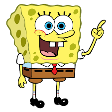
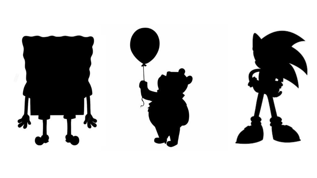
Square
There are generally two types of square characters: large and daunting, or comforting and clumsy. Spongebob, a literal square, would belong to the latter category. (Image: Nickelodeon)
Circle
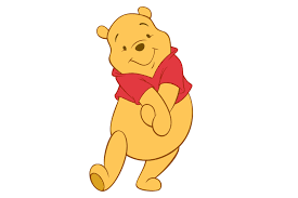 Winnie the Pooh is a character that consistently sticks to the circle motif, with his round belly, ears, and paws. Even when props are added, they tend to stay in the round realm, like a balloon or a honey pot. It’s as non-threatening as a bear could ever get. (Image: Disney)
Triangle
 Sonic the Hedgehog, with his spiky hair, is a clear example of how triangle shapes are used to visually represent speed. The illustrator uses this shape language on the ears and the points of his shoes as well to create congruence. (Image: Sega)
Intentionally mixing shapes
While it’s generally good to avoid conflicting messages, sometimes combining shape motifs makes sense. So long as you do it with intention and remember to keep one shape as the focal point. This helps the viewer instinctively pick out the central message, even if there are sub-messages too. Wall-E is a good example of this:
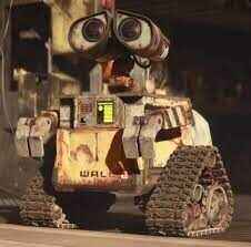 The main shape of Wall-E is the square body, indicating trust and stability, but also stagnation. Adding the round eyes and triangle tracks, the illustrator is making a nod to his friendly and innocent personality, and his longing for movement (ironically hindered by the clunky triangle shape). Combined, the audience is likely to interpret Wall-E as a character they’re meant to empathize with. (Image: Disney/Pixar)
10. Strip your characters down to black
A good way to control that your silhouette and shape language are distinct enough is to strip all colors away until all you have is a blacked out outline.
If your character is still recognizable and the shape motif clearly distinguishable, you’re on the right track. If not, you might need to go back to the drawing board.
11. Flip the canvas while you draw
Another important trick to make sure your silhouette is balanced is to flip the canvas frequently while you draw. Our brains are fantastic at drawing conclusions of their own, filling in information, and correcting proportions without our knowledge. If you don’t stay vigilant, you may end up drawing a lopsided character without even noticing.
Flipping the canvas forces you to reassess your character and can instantly alert your attention to anything that feels off about the design.
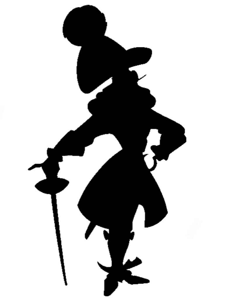
12. Add a unique element
If you feel like you’ve done everything you can to sharpen the silhouette but it’s still missing something to set it apart from the rest, a simple trick you can use is to add a characteristic element. This might be anything from a hairstyle (like Sonic), to clothing, (like Donald Duck’s sailor shirt and cap), to a weapon (like Captain Hook’s hook and cutlass sword).
13. Avoid tangents to create a sense of depth
A tangent refers to the space or area where two things in your design are getting a bit too close for comfort, or are indeed overlapping in a way that the human eye will find uncomfortable. When done wrong, tangents can suggest that two lines in your illustration should be interpreted as if they belong together, when that was not your intention. Perhaps there’s not enough space between the crook of the elbow and the character’s torso, or the ears of the bunny you have drawn are too close together.
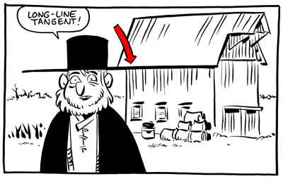
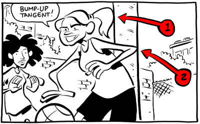
Tangents can also throw off the dimensions of your design, making it feel flat or skewed, and checking your silhouette can be a helpful trick to spot this.
14. Make each character unique, yet consistent
If you’re designing more than one character for a project, you want them to be both different from each other so that you can tell them apart, and consistent enough that they make sense together. This is primarily achieved by maintaining the same style for the whole cast, but that’s easier said than done.
Q: What steps do you take to ensure a character design is consistent across various scenes or projects?
Suggested answer
![]()
My first step when I start a children's book is to create a character sheet of all the main characters. Having a character line up shows how each character will look and compare to each other. Who is the tallest/ shortest, what colors is everyone wearing, do they all look like they belong in the same world etc.
Once I have this I'll send it to the author for revisions. Being on the same page from the very beginning of the project helps things move smoothly and avoids frustration between clients and illustrators.
I always have the client approved character drawing in front of me as I work on drawing the rest of the book. This way the characters and colors stay consistent throughout the project.
Danika is available to hire on Reedsy ⏺
Character consistency is so important, especially now with the rise of AI – one of the things that makes AI obvious is that most users of it can't make the character look the same in a set of 12 or more illustrations. I've always used a copy and paste method to check consistency – so I'll finish all the illustrations, then copy the character from each scene and paste them into a new document so I can see them all together on one page. That makes it easier to see where something is 'off' and correct it. I'll also start by doing a character sheet, where I'll draw the main character in various positions and emotions, often with their favourite things (toys/books/kit/etc) to help me get a feel for how they'll look and behave on the page.
Siski is available to hire on Reedsy ⏺
Once I have the basic character design down, I tend to just run with it, peeking back at references as needed. Once I'm complete with the project, I'll review everything. Usually only requires minor tweaks to maintain consistency.
Michael is available to hire on Reedsy ⏺
To make sure that your characters don’t become too same-y or, on the contrary, feel like characters that don’t belong on the same page, control whether you have a firm understanding of the overall story and of the world it is set in. Additionally, remember to frequently place your characters side by side throughout your illustration process — preferably on the same sheet — to see how they play off each other.
You can either do this by putting together character trios, quartets, quintets, and so on, or you put them in a classic lineup.
15. Compare multiple characters by using lineups
In a lineup, you place your characters next to each other on a baseline to compare their dimensions, just like suspects are lined up in front of a witness.
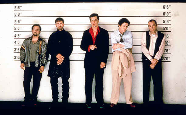
In illustration, this helps to reveal whether your characters are too similar or too different from each other: if all of your characters are the same height and build, for instance, the overall illustration becomes stale and the audience will have a harder time distinguishing between characters; if all of your characters are based on the same shape language — say, you only have round, circular characters — it might be an indication that you’re missing some variation in your cast.
Essentially, comparing your characters will help you make sure that your design remains dynamic and that you don’t inadvertently draw the same character over and over again.
If you apply all of these tricks to your silhouette(s), it’s time to start thinking about how to add color back in.
Be selective with your color palette
A carefully curated color palette, i.e. having fewer colors on your palette, can help you create clarity and set you up for success. But how do you know what colors you should use and how to combine them?
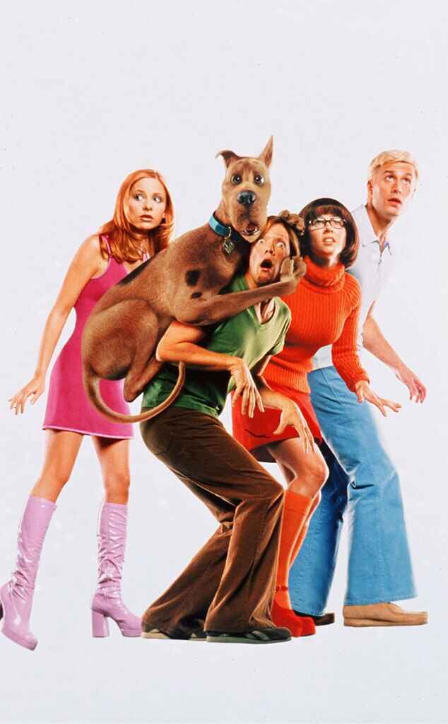
Well, color, much like silhouette, is about breaking it down to the essentials. See if you can guess which Scooby Doo character this color swatch is from:
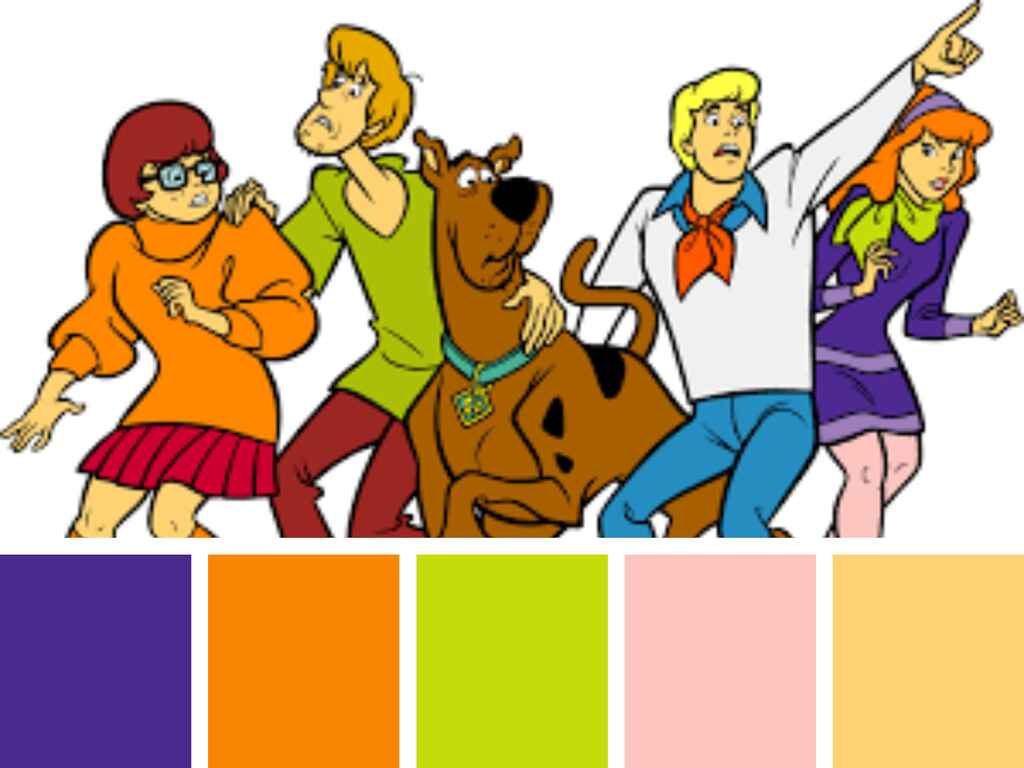
👆 Note that though each Scooby Doo character has a unique color palette, some of the colors are echoed in other characters to create cohesion.
Here are a few things to consider when you’re choosing your color palette.
16. Consider color language
Just like your silhouette should be based on the basic principles of shape language, you can pick your color palette by considering the language and emotions associated with certain colors. The issue is that color language is a bit more complex than shape language.
Yellow may signify joy and happiness, green trust and stability, and red danger. But yellow can also mean sickly, green can mean rotten or poisonous, and red can mean love. Colors might also have different meanings depending on the culture and context, like how red is a lucky color in China while white is the color of mourning, as opposed to black in many Western cultures.
Getting familiar with some color theory and picking your colors carefully is a good habit to cultivate and can be an important part of making your characters pop. But with infinite options on the color wheel — not to mention your ability to play around with contrast and color values (more on this later) — you should probably approach color language more as a guideline than a hard and fast rule. The good news is that this leaves lots of room to experiment.
17. Use colors to represent elements
One way you can use color is to indicate what type of environment a character is from, or whether they have any particular ability to manipulate the elements. You can, for instance, use blue to suggest that a character comes from a cold place, or has the ability to control water or air, while green might mean they may come from a verdant place, or are able to manipulate mother earth.
Using colors this way can help you tell a story effectively by honing in on a particular characteristic and highlighting it. This signals to the reader what type of character they’re seeing and how they’re supposed to feel about them.
18. Create a color hierarchy
For designers and illustrators, visual hierarchy is part of your bread and butter; that is, arranging the elements of your design so that you guide the viewer's eyes towards what’s most important. Color choice and establishing an internal hierarchy amongst your colors can be one way of doing this. But what does that mean?
Well, we’ve already said that you should be selective with your colors and avoid adding too many to the same design. Then, amongst the colors you have chosen, you might want to pick one dominant color that you use on the most significant part of your design. The other colors on your palette should support this color, not compete with it, to avoid making your palette too crowded.
Let’s take Sonic the Hedgehog as an example again.

Here, the dominant color is clearly blue while the supporting colors are white, beige, red, neon green and black. None of these colors compete with blue for attention, but still add important detail to the design.
19. Pay attention to how you combine colors
To help you select colors for your palette, it’s also useful to consider what and how to combine colors effectively. Here are three types of situations to look out for:
Colors vying for attention

A competing color may just be a color that is trying to one-up the dominant color in the color hierarchy you’ve established. Using two strong colors in equal measures can draw attention away from the thing you intended to highlight. In the Sonic example, making the large swatches of beige a vibrant green would have rivaled the blue and potentially taken some of the focus off the hair — which is arguably Sonic’s most iconic trait.
This may unnecessarily complicate and muddle your message. If this is the case, go back and reconsider your color hierarchy.
Colors that are too similar
Colors that are similar to each other start to blend together, and sometimes it can make the different parts of your character design less distinct.
One way to discover this is to remove the line art to see if you can still clearly separate one element of your design from the other, the way you intended. If not, you may want to switch one color up to create more distinction.
Contrasting/complementary colors
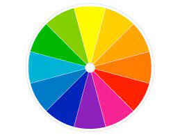 Lastly, ‘contrasting’ or ‘complementary colors’ — i.e. colors that are on the complete opposite side of each other on the color wheel — run the risk of pulling the audience’s attention in too many directions at once. On the other hand, you run no risk of blending elements together, so use them with purpose and intention.
🎨 The complementary colors of yellow, blue, and red are purple, orange, and green respectively.
20. Play around with color values and saturation
According to color theory, color value is a “shade of lightness” and refers to how light or dark a color is. Saturation, on the other hand, refers to the intensity of the hue. You can play around with these scales to find a balance to your palette and avoid blending or clashing.
🎨 You may also have heard of the term ‘clashing colors’ which seems to suggest one color is pitted against another, but which more specifically refers to different shades of colors that don’t work well together. For instance, a bright yellow with high contrast will work well with a contrasting color such as a bright purple, but less well with a warm and muted purple.
21. Convert to grayscale to check color value and balance
To make sure that there’s balance in your composition, you can also convert your design to grayscale every now and then. This will reveal the brightness (color value) of all your colors. If all of your values are the same or similar, try adjusting the brightness of a few colors to create some more contrast.
For an even more precise tool, you can also look at the color balance, which allows you to fine-tune the level of cyan, magenta, yellow, red, green, and blue in each color swatch.
22. Check your character palette against various backgrounds
Lastly, no matter how carefully you choose the colors for your character design, remember to always check it against the background(s) your characters will be placed on. All your work will be in vain if it clashes or blends too well with the background.
With all that said, let’s take a moment to acknowledge that color theory is complex and that there are no hard and fast rules. In the end, you decide what you want to highlight and how to apply your colors, but if you let ‘clarity’ and ‘simplicity’ of message be your guiding principles, you’re more likely to step on the right path.
Now, once you’ve settled on your silhouette and color palette, it’s time to hone in on a few essential details and turn them up a notch.
Exaggerate your observations of reality
As an artist, regardless of what medium you work in, one of your ultimate goals is probably to capture and reinterpret reality so that other people can see it through a new lens; telling a story about the world as you see it, with the hopes that it will resonate with other people too.
Of course, how to capture reality and communicate something that rings true is one of the biggest questions in all of art — and probably not one we’ll be able to answer in this article — but exaggerating one or two elements that capture something you’ve observed is a good place to start.
23. Strip it down to the essentials
You’re probably sick of hearing it at this point, but the first thing to do with your design is to strip it down to the essentials. What is the main message of the story that you want to communicate, what is the main quality you want your character to represent, what is the overwhelming feeling you want the viewer to get when they look at your design, and what are the silhouettes, colors, and proportions you can use to achieve this? And, most importantly, how do these things help capture the world you’ve observed?
If you have these answers, a lot of decisions you make later in the process will feel obvious, and not really like decisions at all, but instinct.
24. Hone in on a few details
Having established your essentials, it’s time to pick a few details that can represent your message in visual form. Say you want to communicate trust and stability, then you can drill down on the square shape motif and make it extra obvious with a non-threatening color palette. Or perhaps you want to draw a relatable and clumsy character, so you give them two left feet, literally.
No matter what you do, focusing on a few details is better than trying to do it all at once. This makes it easier for the audience to decode your message and enjoy the storytelling. And from a creative process point of view, it’s much easier to work with a clear goal in sight than if you’re pulled in too many directions.
🦄 Good character design is reliant on quickly communicating a message, but that also makes it easy to revert to cliches and stereotypes. There are countless villains wearing dark capes, and more than enough alluring vixens who all look the same out there, so when you’re deciding on a detail to highlight, think about how you can put your own spin on it, or how you can subvert conventions and expectations as you go.
25. Create dynamic spacing between the head, torso, and limbs
Depending on what effect you want to achieve with your illustration — drama, humor, fantasy, etc. — a key point of any successful character design is to capture the audience’s interest and make them sit up in their chairs to look a bit closer.
An effective way to achieve this is to tweak your proportions until something feels slightly off. As mentioned, the human brain is excellent at correcting flaws in the information it receives, but by exaggerating the proportions between head, torso, and limbs, you can one-up the brain and make people look twice. Doing so could also inject a bit of humor or flair into your design, which is never a bad thing, creating that unique silhouette we talked about earlier.
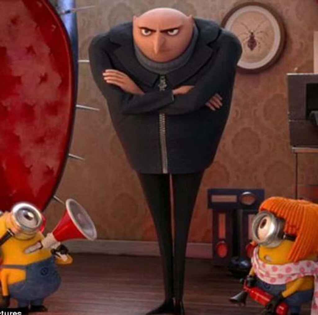
If you have multiple characters, playing around with the proportions is important because it helps you create a more dynamic cast of characters. If they all follow a predictable pattern — some sort of Golden Ratio — they start to blend in to each other and the aggregated effect becomes stale and uninspiring.
26. Play around with proportions and dimensions to direct attention
In addition to working on the main components of the silhouette (head, torso, limbs), you can also hone in on details such as attire, facial features, or props to create a unique and cool character design.
I mean, who can’t help but fall in love with a dog whose ears are so long they keep stepping on them, or laugh at the evil antagonist who is too small to wield their weapon properly? Playing around with the proportions in this way can make your character memorable, and create more variety in a larger cast.
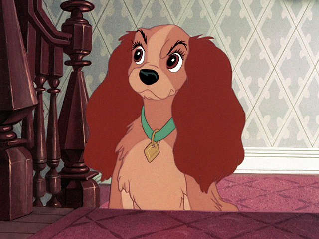
27. Capture emotions with clear facial features
As far as details go, facial features are often a great way to get a point across and communicate emotions, but also tricky to get right. A frown, a goofy smile, or an evil grin have vastly different effects, and can elevate your design to new heights, when applied appropriately.
No matter how elaborate the costume or epic the weapon is, characters can feel pretty flat and devoid of personality if you don’t pay the same attention to their facial features. This is often where the real emotion shines through, so a small flick of the brush can have a big impact on the final outcome.
Q: How do you work to translate a character’s personality into visual design?
Suggested answer
![]()
First I have the author provide me with as much information as they can about their character. The character's physical appearance and a general sense of their personality. From there, I leverage my years of experience is visual design to craft the character's appearance. In most cases, the first draft of the character is pretty close to what the author envisioned. In the other cases, we are usually one or two small revisions away from the final vision. Nothing is more rewarding than illustrating a character who has only lived before in the author's head!
Michael is available to hire on Reedsy ⏺
I think so much of a character's personality is in their eyes, and how they move. If they're a busy dog, then they are always going to be moving or sniffing, or bouncing! If they are a worried character, then they might not take up the whole page, because they probably want to make themselves smaller. I love my characters to interact with each other, and I think that gives a big clue to how they feel.
I am a very empathetic person, so I use that empathy to really imagine how that character is feeling, and how that emotion effects the way they sit or stand or run.
Sarah is available to hire on Reedsy ⏺
I usually "see" the character when I'm reading the story. I also look at images to inspire regarding what he or she might be wearing or what her facial features might be. Because I've always been visual, coming up with a distinct look for a character is easy and fun. I do a lot of scribbles and sketches while I read a story. And I keep a pad of paper by my bed! I often have character ideas while I sleep. Sometimes I'll wake up and write down something like "freckles" because it came to me in a dream.
Personality is driven by the story so often I will know right away if my main girl or boy should be brooding or joyful!
Penny is available to hire on Reedsy ⏺
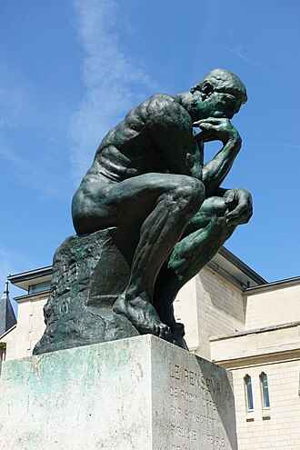
28. Use poses to convey characteristics
With that said, facial features are not the only way to express emotion or personality. In fact, you’ll achieve the best effect if you manage to combine it with body language. A character may grit their teeth however much they want, but if they’re just standing up straight as a stick, the audience is unlikely to interpret it as frustration. And sass is always best expressed with one hand on the hip and an eye roll, wouldn’t you say?
Poses and body language can express anything from typical ideas of femininity and masculinity, to sadness, pensiveness, or confidence. Just think of the emotions this classic Rodin bronze sculpture:
Get feedback and continue to improve
If you’ve used the tips and tricks in this article and applied some of your own unique flavor to your character, it’s time to ask for feedback before it’ll be ready to be published.
29. Ask peers and clients for feedback
Many illustrators work on a freelance basis and, if you’re working from home, it can be pretty isolating. That’s why it’s important to build a network of other professionals in your industry who you trust to give you honest and constructive feedback. If you’re having trouble with a design but you’re not quite sure why, sometimes you just need a fresh pair of eyes, so don’t be afraid to ask for help and remember to be open to the feedback you receive. Being a member of industry organisations, like SCBWI, is a great way to make connections with fellow designers who may be willing to share insight.
And if you’re working with a client, it’ll be your job to decide how to incorporate their feedback, when you should trust your instinct as a designer, and how to communicate your design to a non-designer. Ultimately, making sure that the client is happy with your work is important, so trust and good communication is key.
Q: Can you share your process for balancing creativity with a client's demands?
Suggested answer
![]()
To me, this comes down to client selection. Of course, authors control who they decide to hire, but editors can likewise decline a client request.
Sometimes, for example, an author will ask me to complete a proofread. But after reviewing their sample, it's evident that their manuscript isn't ready for this finishing touch: their manuscript has bigger, substantive issues which require attention first. In that scenario, I'd (gently) identify some of these issues for the prospective client, explain why I believe a proofread is premature, then redirect them to another service. Hopefully, the prospective client understands where I'm coming from and is keen to talk further. But if this tactic has rankled them, then I guess we weren't a good match in the first place! At the end of the day, I always want to feel like I'm doing right by the client as well as the client's manuscript.
Kevin is available to hire on Reedsy ⏺
🤔 Wondering how other illustrators approach character design? Check out this webinar.
30. Revise and refine your character design to perfection
With feedback in hand, it’s time to head back to the drawing board and make revisions or final tweaks. Once you’re happy with the final result, your character should be ready to leap off the page and into people’s hearts.
Happy drawing!

Reviewed by Raúl Gil
Illustrator and designer passionate about cover design and visual identity.
After an extensive career (+20y) in multiple areas of design, learning and collaborating with all kinds of professionals, he decided to recover his passion for illustration, dividing his activity between commercial work for clients and more personal projects in any medium in which images, words and/or interaction combine to tell stories.
He enjoys working on projects in which illustration can provide a decisive value. This covers many areas. From offering alternative readings in editorial content to building complete narratives for books and games or helping to consolidate visual identities.
His work is influenced by classic European and American comic books, animation and contemporary illustration, with an important focus on characters and the clarity and legibility of the images. You can visit his portfolio here. He also writes a semi-monthly newsletter.
