Last updated on Oct 14, 2025
How to Build a Book Back Cover in 5 Simple Steps
Linnea Gradin
The editor-in-chief of the Reedsy Freelancer blog, Linnea is a writer and marketer with a degree from the University of Cambridge. Her focus is to provide aspiring editors and book designers with the resources to further their careers.
View profile →Picture an intrepid reader in the bookstore. They’re skimming the shelves when their eye is caught by a brilliantly imagined front cover. They pick the book up. Check. The spine is bold and inviting. Check. Then they flip to the back of the book cover — and it’s a boring solid background with no text.
When it comes to book design, your thoughts probably don’t jump straight to a book’s back — it’s not as attention-grabbing as, say, the front. But it happens to be one of the most important sales tools at your disposal. So let's clear up some misconceptions:
- Nobody ever sees the back cover of a book online! Amazon.com now allows customers to view the back of paperback books.
- I don’t need a back cover to create a print book! KDP Print and IngramSpark require you to upload a front cover, spine, and back cover.
Then there’s the biggest myth of all: nobody pays attention to the back of a book. Almost everyone reads the blurb before they decide whether to purchase. What’s more, they’ll spend only 10 seconds doing it. In this post, we’ll show you how to make that time count so that a reader ends up deciding in your favor.
What makes a good back cover?
To understand what makes a back cover tick, let’s expose its partner-in-crime: the front cover. When readers browse the bookshelves, it’s the front cover (or spine) that gets them to pick it up. But the job’s not done! At best, they’re only vaguely intrigued at this point. The back cover is there to finish the job.
Done properly, the back cover will motivate the reader to open up and start reading. The best ones do this through:
- Convincing copy that makes the reader impatient to find out what’s inside.
- Some strong aesthetic style — a sign of professionalism and finesse.
To fully cover both points, we’ve split this post into two sections. Part 1 will address the first point: creating great copy for the back of your book cover. Then Part 2 contains tips from our top designers on the best ways to design an aesthetically beautiful jacket.
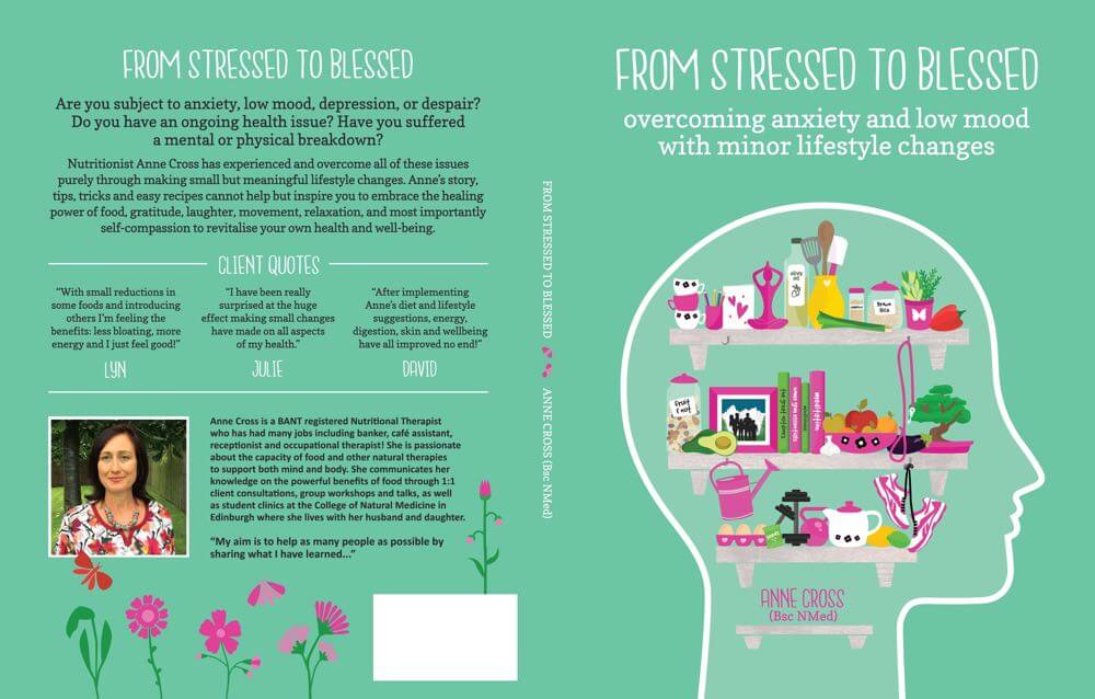
But we’ll start by turning to the essentials. What exactly should be on the back of a book cover?
Part 1: How to WRITE the back of a book cover
In general, the back cover design is composed of the following parts:
- Tagline
- Blurb
- Author bio
- Testimonials
These are the four most common ingredients that the back of a book cover uses, and we’ll run you through each of them.
Tagline
You’ve got three seconds to grab a reader’s attention from the moment they flip it over. So strike them with the tagline right at the top of the back.
The tagline can be a:
- Short descriptive sentence
- Catchphrase
- Quote from the book or review
For instance:
“May the odds be ever in your favor.” – The Hunger Games
“Even in the future, the story begins with Once Upon a Time…” – Cinder
“A great modern classic and the prelude to Lord of the Rings.” – The Hobbit
“Winter is coming.” – Game of Thrones
As you can see from these examples, a great tagline doesn’t need to summarize the whole novel. But you do need to tease readers. Once you’ve successfully enticed them, their eyes will drift to the next bit of copy: the blurb.
The Blurb
Let’s get this straight. The blurb on your back cover is not the:
- Synopsis: This is a four-page document that summarizes the entire narrative arc of your book for an agent or publisher.
- Testimonial “Blurb”: That’s a bunch of short stand-up quotes from a testimonial or review. We discuss this in another section of this post.
- Book Description: This generally means the copy on your online book sales page. Check out our guide on writing a book description for more information!
We also recommend downloading the below free template to get a headstart.

FREE RESOURCE
Book Description Template
Learn to write a book description that will make readers click “buy.”
Here’s what a back blurb is: a description of your book that acts as your 10-second elevator pitch when readers pick it up.

Therefore, your first instinct is probably to make it dazzling. But the real secret to a great blurb is to know your audience. Write it with the reader’s desires in mind. That’s why the blurbs for nonfiction and fiction books are based on two separate formulas.
For nonfiction authors
Nonfiction books should promise to teach the audience something valuable. Therefore, the most effective blurbs will:
- Present the question/challenge/problem.
- Promise answers.
- Tell readers in plain words what they’ll take away from the book.
Here’s the blurb for Stephen Hawking’s A Brief History of Time, for instance:
A landmark volume in science writing by one of the great minds of our time, Stephen Hawking’s book explores such profound questions as: How did the universe begin—and what made its start possible? Does time always flow forward? Is the universe unending—or are there boundaries? Are there other dimensions in space? What will happen when it all ends?
Told in language we all can understand, A Brief History of Time plunges into the exotic realms of black holes and quarks, of antimatter and “arrows of time,” of the big bang and a bigger God—where the possibilities are wondrous and unexpected. With exciting images and profound imagination, Stephen Hawking brings us closer to the ultimate secrets at the very heart of creation.
Notice the ground that it covers in just two paragraphs? If you crawl into the mind of nonfiction readers, they’re basically asking, “What new information will I gain from reading this book?” Don’t be cute or vague. Your best bet is to directly tell them — and use bullet points if you need to communicate a great deal of information efficiently.
For fiction authors
The novel’s blurb should promise intrigue, excitement, mystery, wonder, or drama. Hint at the emotional payoff that awaits them within the pages! Think of a movie trailer and try to capture that effect.
Let’s take a familiar example:
Harry Potter has never even heard of Hogwarts when the letters start dropping on the doormat at number four, Privet Drive. Addressed in green ink on yellowish parchment with a purple seal, they are swiftly confiscated by his grisly aunt and uncle. Then, on Harry's eleventh birthday, a great beetle-eyed giant of a man called Rubeus Hagrid bursts in with some astonishing news: Harry Potter is a wizard, and he has a place at Hogwarts School of Witchcraft and Wizardry. An incredible adventure is about to begin!
In other words, make your readers curious. Check out this article for more in-depth tips (and examples) on writing a great blurb for your novel.
Download: Cover Design Checklist!
Enter your email address for our #1 design resource.
To recap, your best practices for both nonfiction and fiction blurbs are to:
- Keep the blurb short, punchy, and interesting
- Know your target audience and appeal to their specific interests
- Demonstrate the benefit that readers will get out of your book

The Author Bio
Take note, authors: the bio isn’t always your “About the Author” section! In many cases, it’s even more compact.
The first rule of the author bio is: KISS. Keep it simple, stupid. Here’s an example from David Sedaris’ Me Talk Pretty One Day:
DAVID SEDARIS is also the author of Barrel Fever, Naked, and Holidays on Ice. He is a regular contributor to Public Radio International’s “This American Life.”
Compare that to the 500-word “About the Author” section that you can find on Mr. Sedaris’ website. See the difference? The bio on the back of the book cover should be the nutshell inside of the nut.
For fiction authors, this is optional. However, nonfiction authors must include an author bio as part of their back cover copy to convince readers of their authority. You can use the author bio template provided in this post on creating a memorable author bio.
To recap, your best practices for the author bio are to:
- Keep the bio on your back cover brief and clear
- Don’t regale the reader with a description of your eye color: list your previous publications, achievements, education, (if you wish) your place of residence, and (if applicable) your author website
Testimonials
Testimonials (also known as “cover blurbs”) are positive endorsements from notable personalities, such as a fellow author or a publication.

The back of a book cover is the perfect place to put this social proof. Testimonials are incredibly persuasive in transforming potential readers into readers. Our friends over at Bookbub carried out an A/B test in which they sent Group A a book description with a testimonial and Group B a version without a testimonial. The book description with a testimonial caused 22.6% more readers to click and buy.
How to get testimonials
You can go to three sources for testimonials:
- Fellow authors: These are VIPs or your author friends. Be sure to contact somebody who’s relevant to your genre. Potential readers browsing online will respond to names that they recognize.
- Publication reviews: Like a snippet from a New York Times or Washington Post review. Self-published authors can submit their books to Reedsy Discovery for review.
- Customer reviews: If you’ve started your book review campaign already (as you should’ve done), you can pluck testimonials from some of your five-star reader reviews.
Start building relationships within the community early! You’ll probably find it easier to reach out to a friend for a cover blurb than cold-emailing a stranger.
That said, if you’re asking a VIA (Very Important Author) to read your book, send a polite email. Personalize your note. If they say that they’re open to it, send them a free ARC (advance review copy) of your book.

FREE RESOURCE
The Guide to Getting Book Reviews
Learn to pitch your book to potential reviewers with our handy checklist.
How to present testimonials on the back of your cover
Generally, you can’t go wrong if you aim to include two or three testimonials. You want to strike a good balance between all the moving pieces, so use your best judgment when determining the number to include.
Then it’s just a matter of following this rule: if you’ve got it, flaunt it.
If you secured a starred review from a publication, be sure to note that in parentheses.
If you won a cover blurb from a fellow author, make sure that the author’s credentials are prominent. For instance:
“There are many pieces to solving the SEO puzzle. From reputation management to content marketing, SEO for Growth will help you put it all together.”
— Joost de Valk, Founder and CEO, Yoast
Or, if you’re the author of a fiction book:
“Her work understands human secrets generally as well as secret places both in the world and in the mind.”
― Lorrie Moore, New York Times bestselling author of Bark and Birds of America
To recap, your best practices for testimonials are to:
- Start planning early and make sure to get some reviews under your belt if you can't access any fellow authors in the field
- Emphasize the credentials of the person who's writing your testimonial
Voilà. You’ve got social proof for your book. Now let's turn to the second aspect of the book of your book: design.
Part 2: How to DESIGN the back of a book cover
Creating the back of a book cover is a two-step process. You might’ve written brilliant marketing copy for it. Now you need to design it.
To give you complete mastery over this step, we’ve turned to our top designers for their sharp insight. Here are their best tips for you, in their own words:
Tips from designers
Jake Clark: Don't overcrowd your back cover. I've seen too many back covers that are slammed from margin to margin with text with the blurb in the largest font possible. Treat your back cover with the same respect as your front cover. Let your text breathe a little and still be selective in the blurb and supporting text you place on the back cover.
Patrick Knowles: Continue the visual story. Most obviously this could be to repeat a background image or border treatment. Think about how you can create extra elements to enhance the blurb and give it a sense of atmosphere. The main thing is to give some creative energy to the back and make it look as though the whole project is integrated and thought through.
Jakob Vala: Design with a clear hierarchy of information in mind. Make blurbs or callouts bigger or in a different color from the description. Publisher information, if you have it, is the least important. It should be the last thing people notice.
Maxwell Roth: Let it speak to the reader. Too often, I’ll spot a good book cover and turn it over only to find a solid background and an outdated font. Why not use that space to illustrate the author’s text? A book cover can (and should be) an interaction with the reader: A spectacular cover. Turn. A spine to be displayed on a shelf or desk. Turn. A spectacular back cover and continuation of the author’s narrative. And then, to turn the pages.
Jakob Vala: Incorporate elements from the rest of the book. Sometimes I employ the film texture from the front as a background. I also use the same font and color scheme. The drop cap at the beginning of the description can reflect the style used inside the book.
Hire an expert cover designer
Daniel G.
Available to hire
I specialize in humorous character focused covers, but my style naturally fits both horror and dramatic works too.
Michael R.
Available to hire
Internationally recognized book designer in both fiction + non-fiction, incl. Penn Press S+S Harlequin PRH Hallmark Harper and Sourcebooks.
Florin E.
Available to hire
I am a professional editorial illustration artist and graphic designer, creating a wide range of graphics that can be used for any project.
Examples of back covers
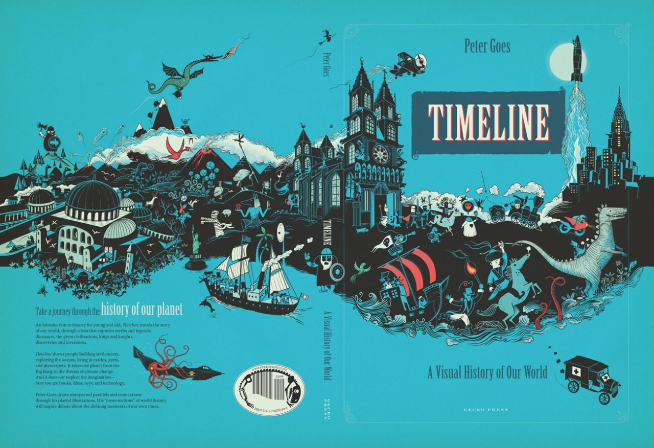
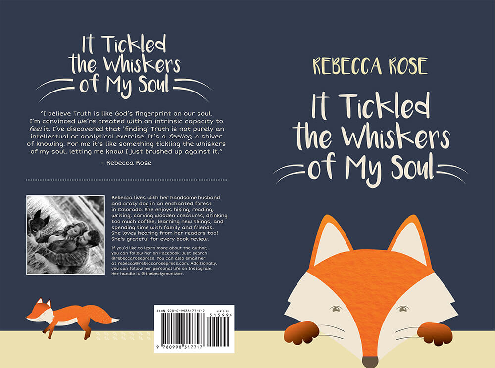
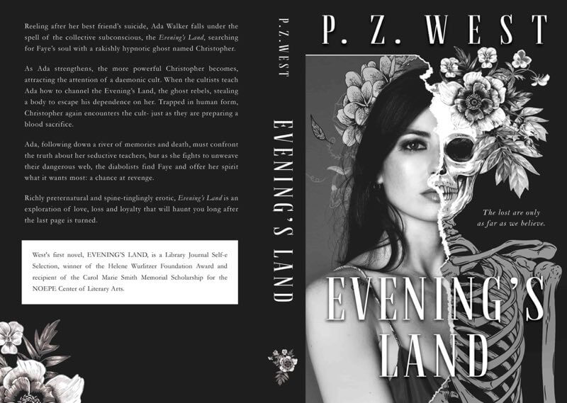
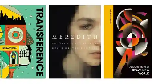
These cover spreads can help give you an idea of what a great back cover looks like once these tips are put in practice.
TEMPLATE: Putting the Back Cover Together
Now that you’ve seen what should go onto the back cover, you might be wondering: how do I juggle everything and pull it all together?
We’ve created a couple of templates to show you the most popular configurations out there.
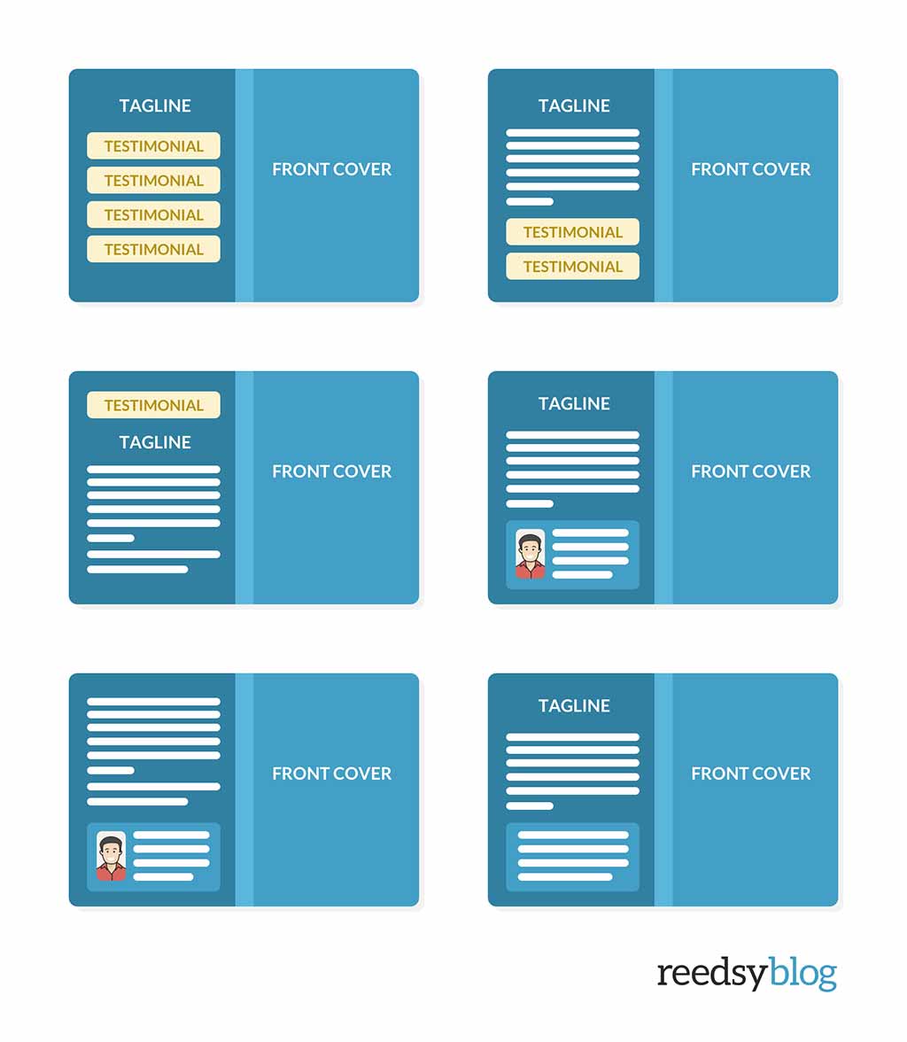
As you start putting your own back cover together, just remember: experiment to find a balance that works for your book. When you hit a perfect balance between all the elements, you’ll have created a back cover that works.
Are you in the middle of designing your own back cover? How have you found the experience? Leave your thoughts in the comments below.




5 responses
SeverelyLtd says:
06/02/2019 – 23:02
When a book is changed you're required to get a new ISBN #. If you receive positive blurbs and add them to the back cover, are you required to get a new ISBN? Where exactly is the line for having to get a new one?
Brenda Joyce Mills says:
15/08/2019 – 07:27
Excellent information. Thank you...
Juan says:
21/12/2019 – 13:45
How to download those templates? I can not download as I don't see any link. Thanks
↪️ Martin Cavannagh replied:
26/12/2019 – 11:36
These templates don't need to be downloaded. You can read them at the bottom of this article.
M J says:
07/03/2020 – 14:46
I do not want to design my own book cover, but I do want to use my own artist. From what I've read, I think that I can upload a jpeg from my artist into a template on kdp, and then my artist and I can work with the template to overlay the text. Is this correct?