


Why is a quality book cover so important?
Beyond all the clichés, book covers play an increasingly vital role in modern-day bookselling. Since most readers now find their books online, any book’s cover design must quickly attract their attention by standing out, communicating the book’s content and tone, and demonstrating its production quality.
This last point is especially important with independent publishing. Readers prefer to buy professionally made books, and a rough-around-the-edges cover design may suggest otherwise — even if your manuscript is compelling and incredibly well written. This is why it’s important to have a book cover that reflects the quality of your work.
What are the benefits of professionally designed book covers?
Getting a professional book designer to work on your cover design isn’t just about making it look nice. It’s also about making sure that it’s fit for the market. The designers on Reedsy have years of traditional publishing experience — they understand the prevailing trends, and can help you create a photo-based book cover that signals the kind of book you’re publishing while also offering something new.
A professional cover will also boost your book’s salability. In a recent experiment, we asked our professional designers to rebrand existing indie books. Using A/B testing with Facebook ads, we pitted the new covers against the original non-professional ones and found that the new designs could attract over 50% more interest from readers.
How do I find the right designer for me?
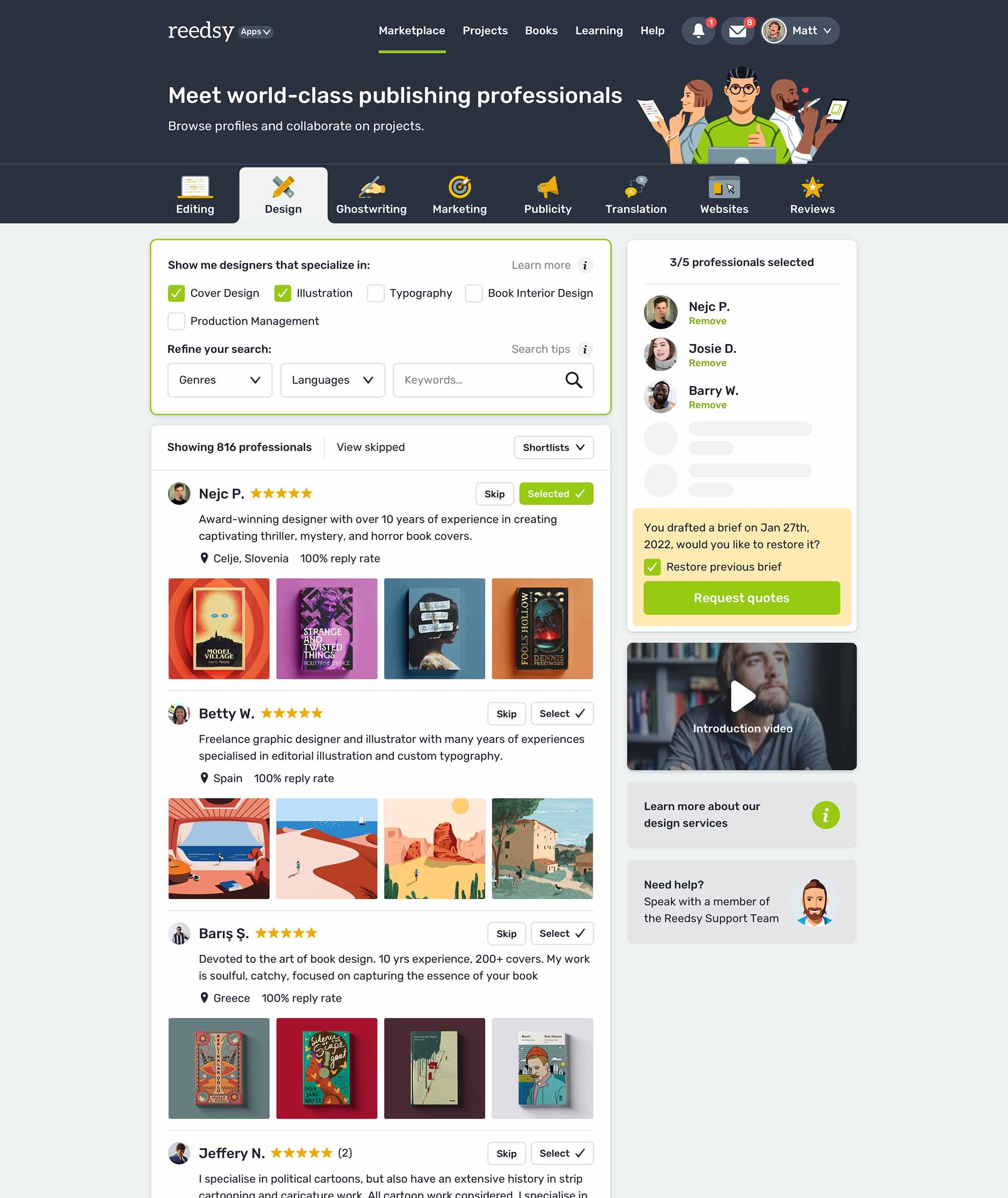
On Reedsy Marketplace, you can search for cover designers who specialize in photography. Review their galleries to gauge their style and compatibility with your work. Once you've identified a few designers who might be a good fit, send them your brief with your book details, design preferences, examples, budget, and timeline. For more tips on how to write an effective cover design brief, check out this post.
Once you receive some collaboration offers, choose the designer you feel most inspired and excited to work with. Remember to start your search and send briefs well in advance of publication, as designers' schedules fill up quickly. A proactive approach will ensure you have ample time for the design process.
How much should I expect to pay?
For your budget, it’s good to consider the level of experience that your designer brings to the table. The rule of thumb is that the more experienced your designer is (and the more prestigious authors they’ve worked with), the higher you can expect their quotes to be. To learn more about how much you can expect their services to cost, check out this post.
Browse Reedsy’s hand-picked community of book cover designers and request a free quote today.
Further reading:
- 🎨 Book Design: What Goes Into Making a Stunning Book? (Click here)
- 🖼️ The Elements of a Book Cover: A Deeper Dive (Click here)
- 🖌️ 30 Amazing Children's Book Illustrators (and How to Hire Them) (Click here)
- 🐲 Book Illustration: 25 Beautiful Examples (Click here)
- 🔠 10 Brilliant Fonts for Your Book Layout (Click here)
- 📸 20 Royalty-Free Stock Image Sites to Source a Book Cover Picture (Click here)
- 📏 Book Cover Sizes: What are the Right Dimensions for Your Design? (Click here)
- 📖 How to Build a Book Back Cover in 5 Simple Steps (Click here)
- 💻 Book Cover Design Software: The Best Paid and Free DIY Apps (Click here)
