
Last updated on Oct 26, 2022
How To Build an Author Website: a Step-by-Step Guide [+ Checklist]
Ricardo Fayet
Reedsy co-founder and Chief Marketing Officer, Ricardo Fayet has worked with hundreds of authors on their launches and marketing campaigns. He is the author of two bestselling guides on marketing for authors, and a regular presenter at the largest writers' conferences.
View profile →Dario Villirilli
Editor-in-Chief of the Reedsy blog, Dario is a graduate of Mälardalen University. As a freelance writer, he has written for many esteemed outlets aimed at writers. A traveler at heart, he can be found roaming the world and working from his laptop.
View profile →An author website is a must for any writer who wants to be taken seriously. It’s the best way to present your work to the world, and an important marketing tool to grow a readership and sell more books. Luckily, you don’t need to be a tech wizard to make a beautiful site — with a bit of guidance, anyone can do it.
Here’s how to build an author website in 7 steps:
1. Buy a domain name
A domain name is your “street address” on the web, which you can buy — or more accurately, rent — in order to get started. There are many services to acquire your own domain for as little as $8/year, such as Namecheap, Google domains, and GoDaddy. You can also buy a domain name directly from many website builders, which we’ll cover in the next step, but it will usually cost you more money.
Here are a couple of ideas for choosing domain names:
- Go with your full author name if it’s available, or something close to it (i.e. rupikaur.com).
- If your name is already taken, try including “author” (i.e. johncaseyauthor.com)
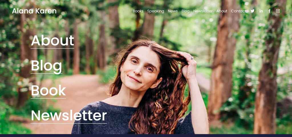
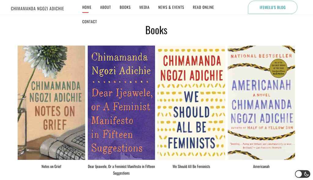
- In case your author name is long or easy to mistype, pick something as simple as possible (i.e. Chimamanda Ngozi Adichie’s website is simply chimamanda.com).
Once you’ve snatched your domain name, it’s time to decide on the tool you’ll use to create your digital home.
2. Choose a website builder and hosting service

A website builder is a site where you can craft and edit the layout and content of your author website, whereas a hosting service provides the servers where your website will be hosted. To use a real estate analogy, if your domain is your street address, the hosting server rents you the land, and the website builder is the construction company that lets you build on top of it.
Most website builders today come with hosting included, which spares you the trouble of signing up for another service, connecting them together, and paying two separate annual bills. But as we said before, this option is costlier.
Here are a few of the best options for website builders:
- Wordpress.com: the OG website builder and go-to option for most authors looking to launch their first site;
- Squarespace: a popular builder that offers easily customizable designs already optimized for mobile navigation;
- Wix: similar to Squarespace, Wix offers high customization and a user-friendly interface;
- Author Websites by BookBub: made specifically for authors, this builder offers author-friendly templates, dynamic cover displays, built-in tools for reader magnets, and more;
- Shopify: designed for e-commerce sites, Shopify should be your choice if you’re planning on creating a store to sell books and merchandise.
You’ll have to spend some time figuring out which service best meets your needs and budget, then go through the usual account creation process. Now that the boring part is over, it’s finally time to design your little corner of the Internet.
Q: What website builder and hosting would you recommend?
Suggested answer
![]()
This is not a one-size-fits-all answer. Many factors go into choosing the right platform for your website. However, to answer the question straight:
- For complete control, I use and recommended WordPress + Avada on WP Engine. Alternatives to this could be WordPress + Elementor or WordPress + Divi on another host that specialized in WordPress, aka Managed WordPress hosting. (Avoid GoDaddy for anything but domain names.)
- If you want more out-of-the-box but less control, you can go with a DIY builder like Squarespace or WIX. These are capable of handle most features authors needs.
- I advise against Weebly, as they have fallen behind.
Every web designer has an opinion on this, but the truth is, if we're talking about standard author websites, most website/web design platforms and hosts are capable of achieving what's necessary. It comes down to the designer and their mastery of the platform chosen. The bottom line is:
- Is it mobile friendly?
- Is it SEO friendly?
- Does it load fast?
Besides that, deciding factors can include:
- How much customization do you require?
- How much of "web design basics" do you want to learn to maintain the content? Because no matter what, any DIY or drag-and-drop builder is going to have a learning curve for anyone unfamiliar with web design.
- How much do you want to pay monthly/annually?
This is a brief introduction on choose a website platform and host. There's a lot that goes into choosing, but don't over think it. They can all get the job done, as long as you have the right person at the helm.
Chad is available to hire on Reedsy ⏺
This all depends on what backend you're most comfortable with. Youtube has some great video tutorials for Wordpress/Squarespace/Wix, which will offer an overview of what it's like to create or update a page. That's where I'd start, as you want something that's easy for you to update.
Self-hosted Wordpress will give you the most control. This is especially important if you have 5+ books. Some designers can offer automation—meaning they can set the site up so you only have to add a new book page and the book's cover/info automatically appear everywhere it needs to across the site. (Double check with your designer to make sure they offer this.) Which is great if you have a long series or multiple books.
However, Wordpress doesn't have a default visual editor. (Some plugins/themes offer visual editing with mixed results.) Most hosting options are solid—look for free SSL, and if there's a limit on emails addresses or domain names/sites. Space is nice, but most sites don't hit 2gb (unless there are multiple sites and a separate store). 5gb is usually more than enough. It's nice to have the option for multiple sites, in case you want to have a separate store later (or a separate site for a pen name).
For specific host recommendations, I've had good luck with Hostgator, SiteGround, MDDHosting, and Inmotion. While Bluehost is often recommended online, it's been very slow this year (2024) especially for the price. I've heard good things about Cloudways, Hostinger, and A2 Hosting. Wordpress.com is also viable with their business plan, though it won't give you as much control as a standard host.
For page builders (visual editors), I tend to recommend Squarespace over Wix, as I find Squarespace more intuitive since Wix's update (introducing Studio) this past spring (2024). Page builders offer no automation, which means adding a new book can be a laborious process depending on where you want the book's info to appear. For example, if you only want the cover on the book page and the home page, that's only two pages to update. If you have a series and want each book in the series to have a "read more" section with the other books in the series, then you have to update the cover manually on each of the series' book pages. Not a big deal for a small library, but rather a pain for a larger one.
At baseline though, start with YouTube. Skim tutorials on what it's like to create/update a page on the platform you're interested in. This will give you a better sense of how the platforms operate. Whatever is easiest for you to operate is (almost) always the best option.
Tessa is available to hire on Reedsy ⏺
3. Hire an author website designer
The prospect of designing your website from scratch can be overwhelming, but the good is that you don’t have to. Each of the website builders mentioned above offer plenty of free templates for you to choose from. You could simply browse through the different styles and pick the one that speaks to you the most, then drag and drop your images and copy. But there’s a catch.
If you’re hoping to stand out and build a truly unique website, using ready-made templates risks creating something that looks too similar to other author websites, which could damage your brand.
One popular option is to work with a professional author website designer — it will cost you more money (around $1,600 on average), but it will guarantee a professional result. Collaborating with a designer will give you the creative freedom to personalize your site to your branding. Most web designers will also help you through potential technical challenges, such as connecting your domain to your content management system (CMS).
Freelance web designers are available all over the internet, but if you want ones with experience in creating sites of authors, you can find them on the Reedsy marketplace. Browse their profiles by signing up below, and get in touch with them for a quote.
Hire an expert web designer

Tessa E.
Available to hire
Story-focused print and site design, along with website maintenance and social icons .

Amelia W.
Available to hire
Hi, I’m Amelia, a web designer with 10+ years of experience. I create engaging, easy-to-use websites that connect with your readers.

Kiersten A.
Available to hire
As a freelance web designer/developer I specialize in creating custom Wordpress websites for all creative individuals with a story to tell.
Once the layout of your digital house is built, it’s time to furnish it with quality content.
4. Add content to your homepage
There are a few essential features that your website should have, although feel free to play around with them. To see what you want to include in your own online presence, you can always check out the websites of your favorite authors for some examples.
Generally speaking, a professional website will usually include:
An ‘About me’ page. A dedicated page with your author bio, your professional headshot, and ideally, some fun facts about yourself (i.e. “In my downtime, I swim with sharks.”).
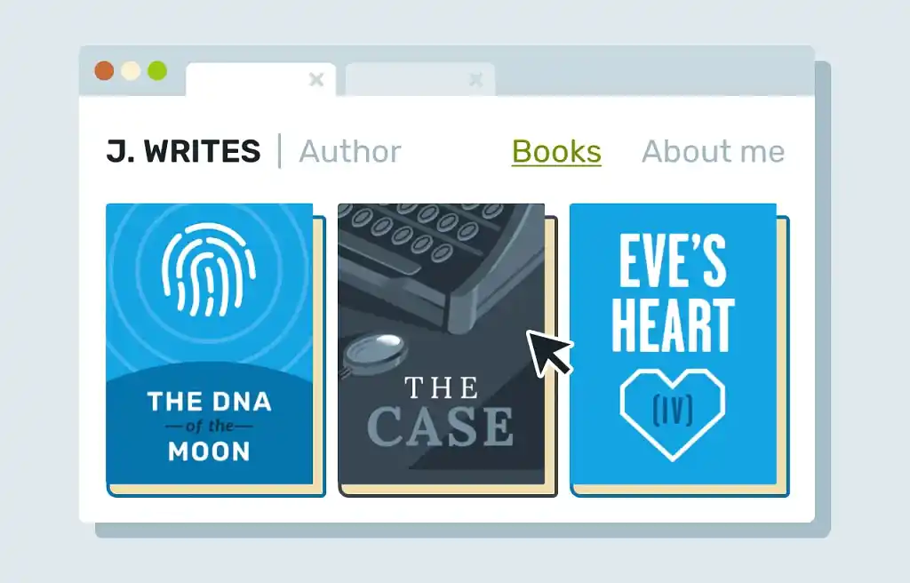
A ‘Books’ page. A clear display of all of your books, audiobooks, etc. with links for readers to easily buy them.
A contact form. A simple way to get in touch with you, whether through a form, a simple email address, or a phone contact (if you want to live life on the edge and invite spam calls).
Social media links. If you’re not on social media, do you really exist? Jokes aside, if you’re actively growing an online following, link to your accounts on the top or bottom section of each page.
A blog. Mostly recommended for nonfiction authors, a blog is useful to keep your audience in the loop and to share your latest thoughts and ideas.
Q: What’s the most important element to include on an author homepage?
Suggested answer
![]()
This depends on the goal of the author's homepage, their current marketing strategy and the overall size and structure of the whole website.
That said, if there is one single element you need on your homepage, for SEO it's an <h1> tag with either the author's name or the primary book.
If we're talking the best single element for visitors, it's a nice looking mockup of the primary book.
Chad is available to hire on Reedsy ⏺
Once the basic features have been built, the next step is to set up a newsletter that will let you directly communicate with your audience.
💡Listen to our top-rated web designer, Stuart Grant, discussing how to make your website work for you. He shares his best tips from 6 years of helping authors create stunning sites.
5. Set up an email newsletter
A mailing list is the most important asset for growing your readership and it’s the cornerstone of every author’s platform. Unlike social media, an email newsletter is a communication channel that you have control over, and can use to turn readers into life-long supporters.
We’ve already covered this in another post how to build an author list, but here are the three main steps:
Choose a mailing list provider. Depending on your needs and budget, pick among the most popular options like MailerLite, ConvertKit, Flodesk, and Active Campaign.
Connect it to your site. This step is a bit technical, and it will include creating an email form on your email provider, and then copy an embed code on your website builder page. Each mail provider should offer detailed set-up instructions but always test that the integration works by signing up to your newsletter.
Top tip: if you have a Gmail account, you can sign up to your lists multiple times by adding a + to your address. For example, authorname@gmail.com can also signup as authorname+123@gmail.com
Create automated campaigns. The beauty of email is that most can be automated. For example, every time someone subscribes to your list, they should be greeted with a warm welcome email that tells them what they can expect from you. The more complex your engagement with your audience, the more automations you’ll need to create 一 start with the welcome email and scale up from there.
Q: What should authors write newsletters about?
Suggested answer
![]()
Authors can write about a lot more than just their book! Ideas to write about are:
- Top 10 favorite books - Write a blog post about your ten favorite books and then share it with your newsletter audience.
- Behind The Scenes - This is a broad category. You can write a newsletter about how you got the idea for the book, or about how certain characters came to be, their motives or any backstory that may not have been mentioned.
- Appearances and events - This should go without saying, but letting your audience know about any scheduled appearances in person or online is great to share with your mailing list.
- Ask them something! - Make your audience feel important and seen by asking for their input on something. Make sure it's something that you really want to know because the public can sometimes surprise you!
- In Depth Bio - You can write a more in-depth bio and share it with your audience. This pulls back the curtain and allows your fans to learn more about you, further strengthening their interest and trust in you / your author brand.
- A Short Story - Write a quick story and share it with your subscribers. Giving away free content is critical to gaining and keeping customers/fans these days.
This is just scratching the surface. I hope this has sparked some ideas of what authors can write newsletters about.
Chad is available to hire on Reedsy ⏺
Congrats, you’ve set up your newsletter! Remember that most visitors will not subscribe to your email list without an incentive, so your next goal should be to create an enticing lead magnet.

FREE COURSE
How to Build Your Author Mailing List
Learn how to connect with your audience and sell more books with email.
6. Create a free resource for your visitors
A lead magnet is simply a free resource prospective buyers can access by giving you their email address. The content of the lead magnet can be anything you want, as long as it’s valuable to your readers.
If you write fiction, it could be a short story, or perhaps the first book in your series of multiple books. If you’re writing nonfiction, it could be access to an exclusive online course, or a free chapter of your book. Whatever you decide, make it worth your readers’ time (and email).
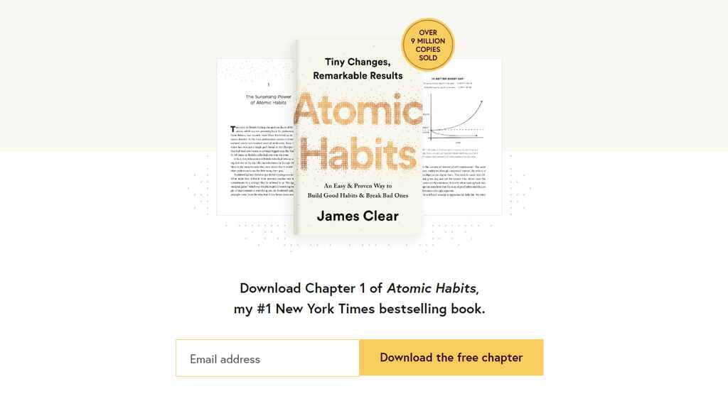
To set up the lead magnet, you’ll have to create the resource (often a PDF file) and set up another email sequence that delivers the file to all who sign up for it. Again, register for this sequence and check that everything works fine.
If you followed all the steps so far, you have a professional website up and running - congratulations! From now on, it’ll just need some extra love and maintenance.
7. Keep improving the user experience
There is always room to improve your visitors' experience on your website. From adding dynamic elements, banners for price promotions, or a calendar page for your book tour. Your options are endless.
Again, if managing all these things sounds too complicated to tackle on your own, consider a professional web designer. On Reedsy, you’ll find top-notch designers who will help you tailor a website to your needs.

Hire an author website designer
Hundreds of the best website designers are on Reedsy. Sign up to meet them within seconds!
Learn how Reedsy can help you craft a beautiful book.
Remember, this is your home on the Internet — and it will influence what readers, agents, and strangers alike think of you when they Google your name. Your website is worth the extra care and effort to make it as beautiful and professional as possible, and hopefully, this post will set you in the right direction.
8 responses
Harry Christman says:
08/05/2019 – 12:31
Some great advice here. Though I have a website with my book cover on it, I know it needs to be improved to catch the reader's mind.
Eyeland Gurl says:
08/05/2019 – 12:31
Excellent advice for authors. I always enjoy seeing how creative authors can get with their website and blog designs. This piece is an inspiration to me. Thanks so much for sharing!
Janet Nicholson says:
08/05/2019 – 12:31
Thanks for this info. White font on a black background is very difficult to read, especially for people with astigmatism. I'm not the only reader who doesn't bother reading a website with light font on a dark background. I think it would be worth keeping this in mind when designing a website.
↪️ Ricardo Fayet replied:
08/05/2019 – 12:32
I totally agree with you, light fond on a dark background is rarely easy on the eyes. However, you see it quite often out there because on newer screens (like the retina ones) it doesn't render quite as badly as on old screens.
C.F. Lapinel says:
08/05/2019 – 12:31
Great piece. Lots of cool insights. Thanks!
↪️ Ricardo Fayet replied:
08/05/2019 – 12:32
Glad you liked it! We'll have a second piece on author websites next Tuesday, so do come back for more insights! Or alternatively, join the newsletter on the ribbon above, we only send them once a month :)
H Gibson says:
08/05/2019 – 12:31
Interesting article. I am glad my website ticks most of the boxes. Due to some of The Chronicles of Han Storm's ('older' 65+ years) niche market readers, it was essential to design a basic, user friendly environment.
↪️ Ricardo Fayet replied:
08/05/2019 – 12:32
Of course! It's very important to take your target market's demographics and interests into account when designing your website. Of course, if your books respect those rules and you design your website in such a way that it reflects your books' branding, this shouldn't be a problem!