
Last updated on Oct 25, 2022
13 Author Websites That Get It Right
About the author
Reedsy's editorial team is a diverse group of industry experts devoted to helping authors write and publish beautiful books.
More about the Reedsy Editorial Team →Dario Villirilli
Editor-in-Chief of the Reedsy blog, Dario is a graduate of Mälardalen University. As a freelance writer, he has written for many esteemed outlets aimed at writers. A traveler at heart, he can be found roaming the world and working from his laptop.
View profile →Most professional authors will have their own website, both as a way to market themselves and connect with their readership. It's the one corner of the internet that the author fully controls — without interference from publishers or social media rules.
In this short guide, we'll show you some examples of effective author websites before giving you a step-by-step process for building your own. By the end, you'll be ready to take on the world (wide web).
Here are 13 examples of excellent author websites:
1. Austin Kleon
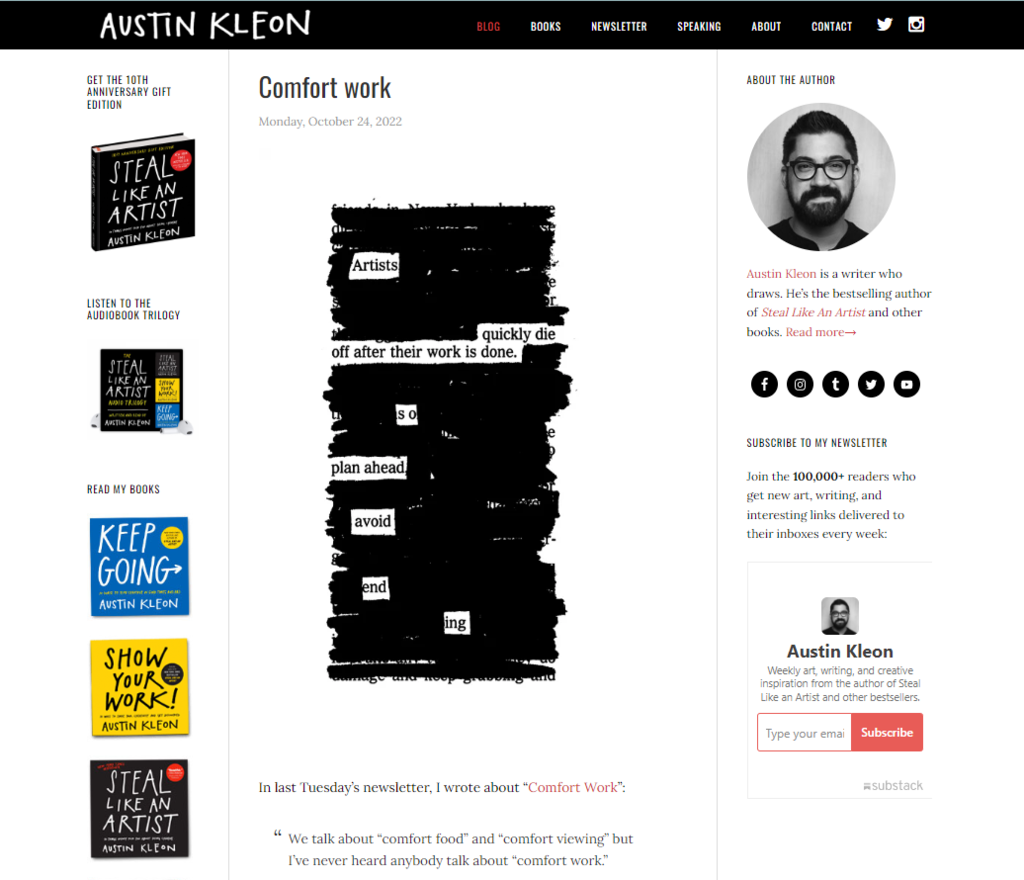
New York Times bestselling author Austin Kleon identifies himself as “an author who draws” and uses his website to talk not only about his own books, but also about art and writing in general, offering creative inspiration to fans and casual visitors alike.
Simple to navigate, and signposting all the relevant information — from blog posts, to his books, a newsletter mailing list to stay in touch, an author bio, and contact information — one of the main advantages of Kleon’s website is that it’s kept up-to-date with seasonal posts and frequent life updates.
FREE COURSE
How to Build Your Author Mailing List
Learn how to connect with your audience and sell more books with email.
Takeaway: Keep your website up-to-date
Knock, knock. Who’s there? You should be. Unless you’ve got a ghostwriter on your team or you can uncannily churn out quality books constantly, you probably won’t always have new bookish updates. However, when people visit your site, you don’t want it to seem like it’s been idly collecting dust for years between publication dates. You want it to seem as though someone is home.
Austin Kleon’s website achieves this with fresh blog posts displayed front and center. Straight away, you know that he’s active behind the keyboard. Not only does it feel like he’s talking directly to you, but it also incentivizes you to come back, which can be handy for your next book launch. Studies confirm this: businesses that run blogs have 55% more website visitors than those that don’t.
Something as simple as an up-to-date Twitter feed or a list of upcoming events can keep your website fresh and show that you’re committed to interacting with your readers. If you're able to blog regularly, all the better! If your blog gets popular enough, it could become the foundation for your next book.
FREE COURSE
How to Build an Amazing Author Blog
10 lessons to help you start your blog and boost your book sales.
2. Rupi Kaur
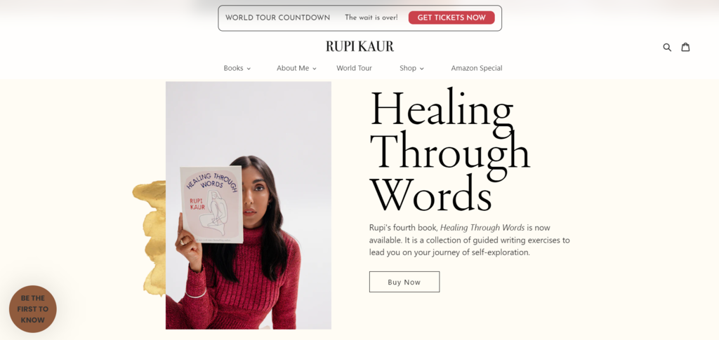
You’d expect nothing less than a well-designed website from the queen of Instapoetry herself, Rupi Kaur. Her elegant homepage immediately exudes “Rupi Kaur” and the message she wants her readers to receive. It’s on brand — aesthetically pleasing, with short guiding phrases, and creative with form — and much like her poetry, it sticks to the essentials to deliver a core message in just a few words.
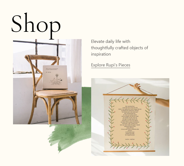
But make no mistake; this is no minimalist, bare-bones version of a website. With customized stickers, an integrated webshop for merchandise, and links to both an Amazon Prime special and a world tour, it’s clear that Kaur has invested some time and dollars on making this a comfortable browsing experience for her readers.
Takeaway: Invest in branding and user experience
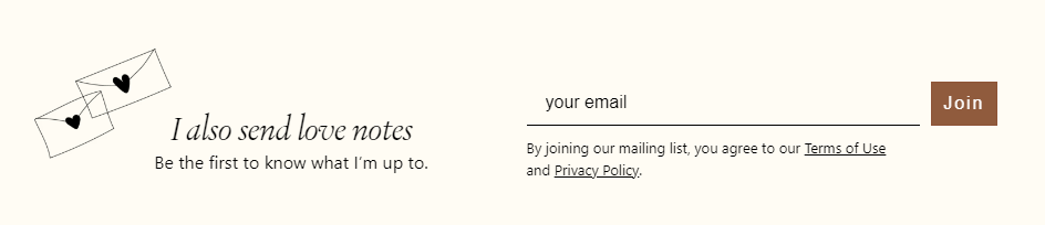
Granted, not every author can inject cash into a website like social media sensation Rupi Kaur. However, her online presence features several practices that are good takeaways for any author website. Kaur, for instance, doesn’t send her subscribers “newsletters” like Kleon does. Instead, she sends “love notes”. Readers can also follow the journey of her third book, Home Body, as it travels across the US, “sisterhood of the traveling pants” style. These touches make her website feel authentic and true to her brand.
Paying a bit extra to get a custom-made website that fits your needs perfectly and appeals to your readers can improve user experience significantly, making it not only pleasing to the eye, but also easy to navigate.
💻
Tell us about your book and we'll match you with a website style!
It'll only take a minute!
3. LJ Ross
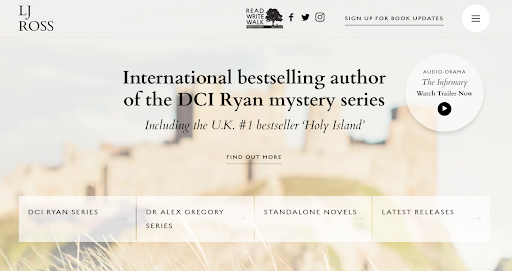
You can make your website stand out from the crowd by adding dynamic and interactive elements, and self-published author LJ Ross is no stranger to this strategy. Just like in her bestselling mystery series DCI Ryan, LJ Ross’s website takes inspiration from the atmospheric landscape of Lindisfarne (also known as Holy Island), located on the northeast coast of England.
This eye-catching website is brought to life with some well-chosen dynamic elements: a bird flying across the landing page, mist rolling in as you hover your cursor, and a hamburger menu that folds out to direct you where you need to go, to name a few.
LJ Ross also gets a bonus point for subverting the expectations for what a crime and mystery author’s website should look like, with a sunny background picture and a lighter color scale throughout the site.
Takeaway: Bring your site to life
If your site is a pretty-but-static thing, you may be missing an opportunity. With some simple dynamic elements that draw the eyes, you can elevate your website and give visitors a reason to extend their session on your site. And the longer they stay, the more likely they are to engage with what your website offers.
Start by capturing people’s attention with cool visuals, highlighting what you want visitors to see first (in this case: Ross’s different books series and a link to an audio drama production on Audible), and then invite them to engage by linking to your social media.
4. Miquel Reina
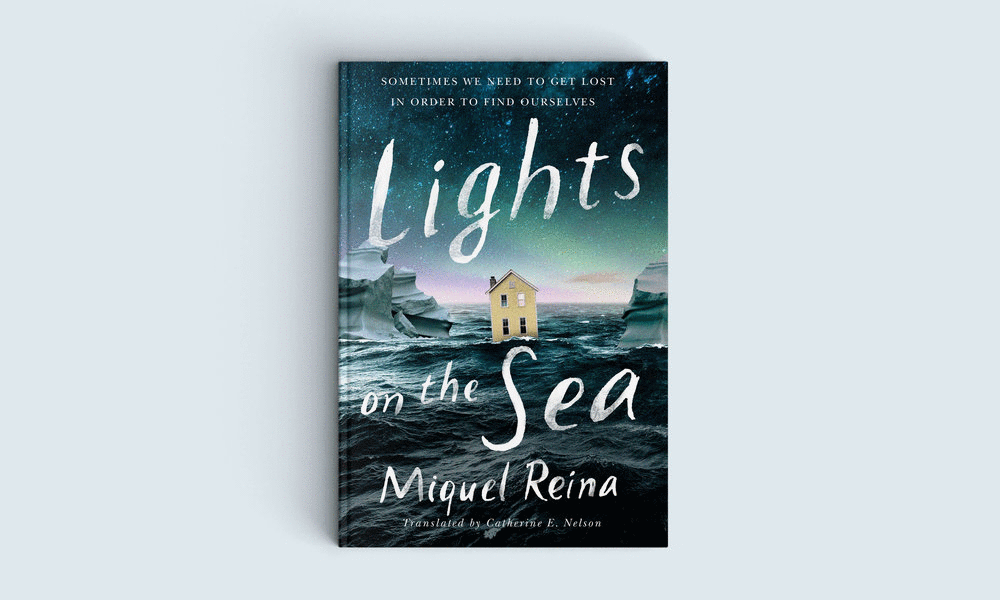
Another author who incorporates some movement into their author website to really bring it to life is Miquel Reina. This can be a risky maneuver — more often than not, flashy gifs and scrolling text scream “tacky.” But when it pays off, it creates a beautiful effect that will impress and entrance readers who stumble upon your page.
Upon first glance at the homepage of Miquel Reina's author website, nothing appears out of the ordinary... until the first image begins to change. As you can see, each translation (and gorgeous new visual) of Reina's book Lights on the Sea morphs into the next, providing a beautifully comprehensive sense of his accomplishments.
If you’re not a web designer, this tactic could easily go awry, but Reina ensures that all his images are carefully sized and timed to create a calibrated effect. The transitions are calmly paced to give you enough time with each cover, but not so slow that you risk missing the effect entirely. He also wisely avoids cluttering the rest of his homepage with additional text and images, so the viewer focuses solely on the slow-moving book covers.
Takeaway: Keep it simple (but sophisticated)
Again, it's easy to go overboard with this tactic; you don't want your author website to look like a carnival. To keep things interesting yet professional, bring your site to life with just one or two smoothly transitioning GIFs.
Fun fact: You can find Miquel Reina, who designed his own website (!), right here on Reedsy. Click here to check out his other projects.
💡Pro tip: Keep site speed in mind! On the technical side, a simple setup will help your site load faster. Heavy images will slow a site down and frustrate visitors. They came to find out about your book, not wait around watching their fingernails grow.
Hire a web designer and give your site a professional look

Tessa E.
Available to hire
Story-focused print and site design, along with website maintenance and social icons .

Kiersten A.
Available to hire
As a freelance web designer/developer I specialize in creating custom Wordpress websites for all creative individuals with a story to tell.

Chad L.
Available to hire
No fuss, all frills. Expert website designer/SEO pro for authors and books. #1 US based Reedsy Web Designer. ⭐⭐⭐⭐⭐
5. David Sedaris
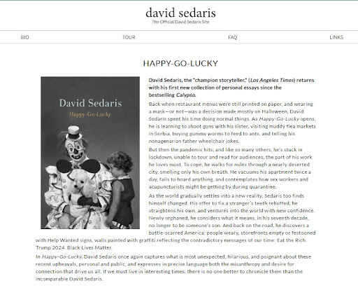
Authors sometimes make the mistake of thinking that people visit their websites just to read their bio. Are you, the author, important? Sure, but your books are way more important. Let people know they’re on an author’s website by making your product the star of the show, as David Sedaris does. A minimalist setup makes it impossible not to notice the main event: Sedaris’ newest book.
Takeaway: Put your book front and center
If a reader visits your site and doesn’t immediately realize that you’re an author with a book to sell, you’re probably doing something wrong. Placing your book front and center announces that, whatever else you may be offering through your site, you’re first and foremost an author who wants to share their stories with the world.
Also important are the buttons that urge people to buy your book and steer folks to their retailer of choice. For the perfect user experience, it’s vital to generate retailer links to your books and make sure people can easily add them to their basket.
6. Brit Bennett
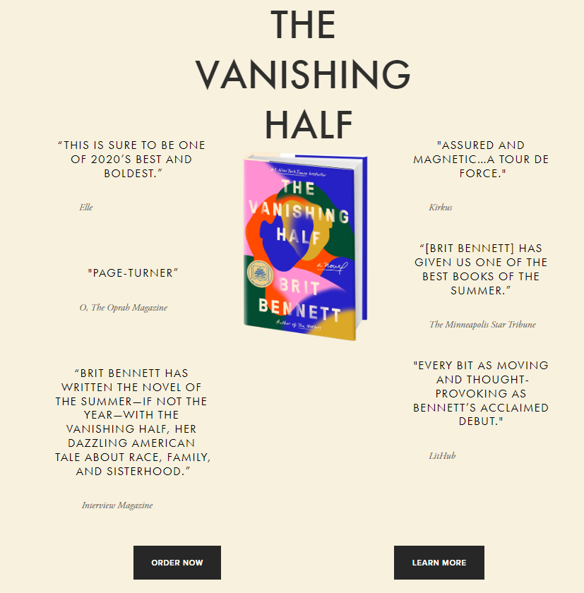
Another author who has embraced the idea of putting their book front and center is Brit Bennett. Her hugely successful novel The Vanishing Half is clearly the star of the show as you enter her landing page, and unlike David Sedaris’ lengthy book description, Bennett focuses on some strong endorsements in the form of quotes to sell her book — and clearly has no trouble doing so.
Takeaway: Include testimonials and reviews
There’s nothing quite as effective as word-of-mouth marketing when it comes to book sales. With a well-chosen quote from the right person, you may see your book sales soar, so it would be wasteful not to use the prime real estate of your website to let others highlight your writing prowess through testimonials and reviews.
💡Pro tip: Testimonials and reviews are a great way to market your work and authorship so make sure to leave some space for that on your website.
For more marketing insights, check out our course on the fundamentals of book marketing:
FREE COURSE
Book Marketing 101
Learn seven tried-and-true strategies for boosting book sales.
7. Lesley M. M. Blume
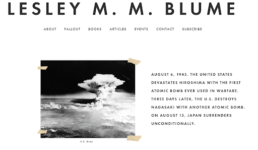
When you first land on Lesley M.M. Blume’s website, you are met with an old, faded picture of an atomic bomb, held up by tape and a short journalistic description This documentary approach quickly envelopes readers into the topic material that Blume — an award-winning journalist — has written about in her latest book, Fallout: The Hiroshima Cover-up and the Reporter Who Revealed it to the World.
Within moments of arriving on Lesley’s site, you become aware that she is a writer and journalist. This quick preview of her book grabs your attention and sets the tone.
Takeaway: Give readers a visual taste of your book
As an author, your medium of choice is often the written word, but your website is an excellent opportunity to expand on the imagery you’re trying to capture and make your messaging more vivid. By focusing on the visual aspects of your website rather than the textual, you allow readers to get an idea of what your book is all about straight off the bat — and you can present it in a way that is quicker and easier to consume than a full synopsis.
Is your book a fluffy romcom, or is it hard facts? Offer a glimpse of what readers can expect of your writing, and don’t fall for the temptation to clutter your website with too much text; instead, use the power of images to elevate your message.
8. Maggie Stiefvater
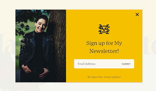
Your author website should always include a good reason or two for visitors to offer up their email addresses. When you navigate your way to Maggie Stiefvater’s website, you’re immediately presented with the opportunity to sign up for her newsletter. But the opt-in choices on her email list are plenty. For instance, you can sign up for an 8-hour seminar to improve your writing craft, led by Stiefvater herself!
In marketing, this is known as lead magnets 一 offering something of genuine value in return for an email address — a marketing strategy we highly encourage authors to use..
Takeaway: Use a lead magnet
In publishing, a lead magnet usually means offering free content in exchange for an email address, such as downloadable PDF prints, exclusive interviews, or bonus chapters of your upcoming release. This helps you build your mailing list so that when you publish another book, you already have a group of people to advertise it to.
💡Pro tip: A free sample does more than just incentivize people to offer their contact info. If you’ve read our Reedsy Learning course on how to run a price promotion, you’ll know that offering a free book is also a great way to hook readers and create a loyal fanbase for future publications.
A free preview can work similarly, giving readers a commitment-free chance to get drawn into your book, leaving them more likely to pay to read the rest.
9. Megan McDonald and Peter H. Reynolds (Judy Moody)
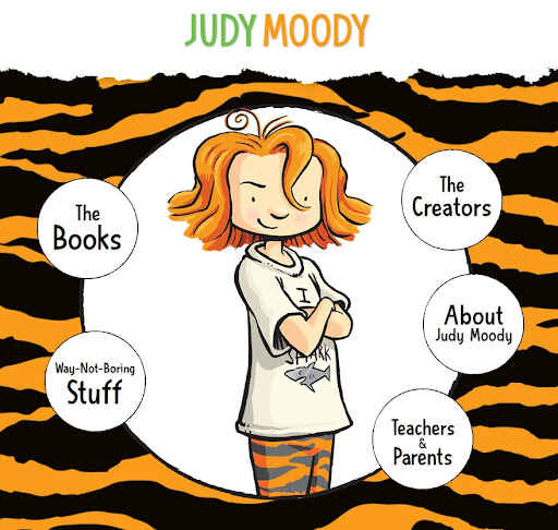
Using images is perhaps even more essential when you’re writing a children’s book. The illustrative style on the Judy Moody website gets the brand across almost immediately: fun children’s books! And if there were ever any doubts, it cements the message that the best author websites are extensions of the author’s novels and wider brand.
The creators of the website know the Judy Moody audience, with nudges and winks in the direction of teachers and parents, as well as younger readers with playful phrasing such as “Way-Not-Boring Stuff,” which links to several fun lead magnets, in the shape of games and downloadable PDFs, perfect for kids’ birthday parties.
Takeaway: Speak to your target audience
When designing your own website, some of the questions you should ask yourself, like Judy Moody’s publicist clearly has, are all about personal branding:
- Are you branding yourself or a series?
- What’s the voice and tone of your book?
- Who is your target audience; and
- Would your site resonate with them?
Judy Moody's authors have chosen to highlight the eponymous character of the series rather than themselvces, but whichever way you lean, there should always be a recognizable red thread that runs between your books and your website. Keep the voice and tone of your website distinctive and consistent, so people immediately recognize the relation to your work.
🎨 If you’re thinking about how you can develop your own author brand, check out this article about how Lara Coates enlisted a Reedsy designer to help establish hers.
10. Fonda Lee
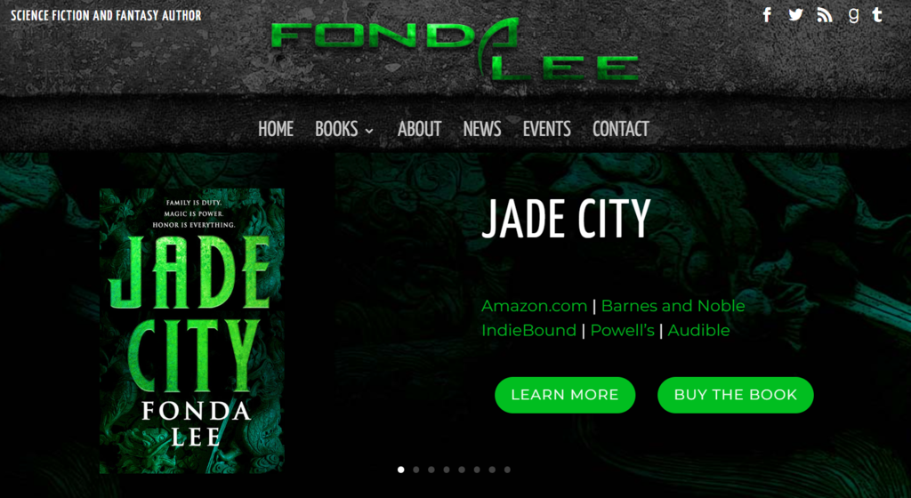
One way to ensure that you’re speaking to your target audience is to match your website to the genre you’re writing in. Fonda Lee leaves no room for doubt with her Y2K style logo and dark color pallet. But just in case you missed it, she makes sure to signpost herself as a “science fiction and fantasy author,” and uses a gallery of pictures to highlight her catalog of published works.
Takeaway: Signpost your genre
While many visitors to your website may already know what genre you’re working in, it’s always a good idea to make sure you match your website to the content you’re publishing. This goes hand in hand with author branding, but the visual elements of your website can also add another dimension to the worlds you’re building in your books.
11. Neon Yang
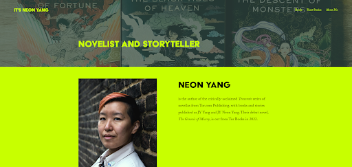
Whether you’re a maximalist or a minimalist when it comes to design, the use of bold or contrasting colors is another way to make your website pop and highlight something particularly important you want to draw attention to. And you don’t have to have a name like Neon Yang in order to do so. But choose your colors wisely, and stick to one or two for the best effect.
Takeaway: Be selective in your use of colors
The psychology of color can have a big impact on how people perceive something, but don’t make the mistake of trying to catch ‘em all; using all of the colors of the rainbow together at once is unlikely to have the desired effect of drawing the eye to one thing. Instead, too many colors can be distracting and more confusing than helpful, making the message you want to communicate murky and sometimes even hard to read.
When using bold colors, one or two is enough to draw visitors’ focus toward the most important things. Neon Yang fittingly uses neon lime green to contrast against a darker background, which effectively highlights key information, fits their unique brand, and adds a tongue-in-cheek touch to the whole website.
💡Pro tip: When using accent colors, choose them carefully, and avoid writing huge chunks of texts in colors that are hard to read to make your website more accessible to all visitors.
12. Brené Brown
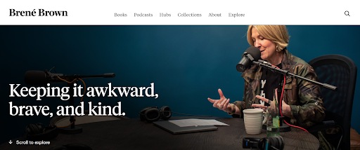
Speaking of accessibility, no matter how beautiful and well-crafted your homepage is, or how nicely your logo fits on the corner of that picture you’ve chosen, here’s your official reminder to make your website compatible with all types of devices. Brené Brown has made sure her website will meet everyone’s needs, regardless of their browsing weapon of choice.
Takeaway: Optimize for mobile navigation
Nothing is as frustrating as a clunky website that you can’t read, especially when you’re on the go. Today mobile traffic accounts for almost 60% of all web traffic, so your website should be made to fit all devices to make it as easy as possible for visitors to explore.
13. Angie Thomas
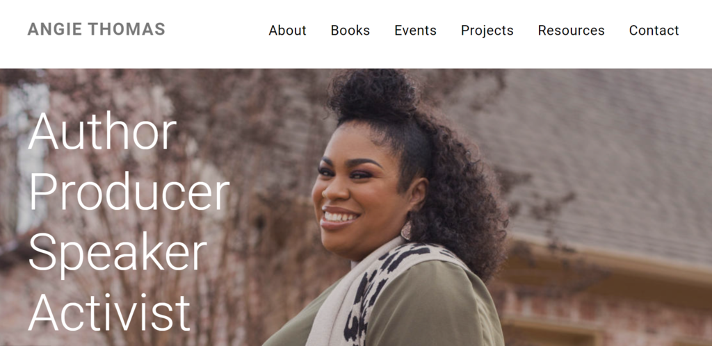
Finally, one of the biggest reasons people visit author websites is to get a better sense of who the person behind the words on the page is, so don’t be afraid to show your face. Angie Thomas goes straight for the kill with a beautiful, professional headshot that is both inviting and confident. This, paired with some hand-picked words to the left, is a strong introduction to Thomas both as a person and as an author.
Takeaway: Show your face
Whether you want your brand to focus on you as an author or on your books, it’s a good rule of thumb to use your website to introduce yourself to the world. Unless, of course you’re a ghostwriter or writing under a pen name and prefer to work in anonymity. But even then, your website should include an avatar at the very least.
You don’t have to place your author photo front and center, but your site should contain some indication that your work was written by an actual human and not an AI. Your ‘About’ section is a good place to start, but sprinkling a few photos that show who you are throughout your different sections is a good way to make your readers feel connected to you.
In the next part of this guide, we'll show you how to create your very own website using some of the most popular tools in the internet.

11 responses
Brent Jones says:
02/06/2017 – 12:29
Well, never did I ever think I'd appear on the same list of authors as JK Rowling for something. Wow! You guys over at Reedsy made my day. Thanks!
Kristen Steele says:
21/06/2017 – 15:29
Great examples! Branding is a powerful element, but works best if all of your books follow a specific theme.
arushi says:
30/08/2018 – 05:47
Nice Article www.booksoul.in
Zain Khan says:
06/12/2018 – 09:28
Thanks for the awesome blog post. keep it up. Recycling Media
Michael Barrett says:
05/03/2019 – 15:00
mbbarrett.com
christopher sparacino says:
08/05/2019 – 12:28
I wrote a book i'm trying to get out there, feel free to read it! it's free, about 70 pages... http://bit.ly/evolveordiebook enjoy
Oohgirlbybk says:
08/05/2019 – 12:28
Good info! Thank you! My website is live, but I will be contacting my web designer :)
Sayli@digitalmarketing says:
22/05/2019 – 10:25
This the list every digital marketer and web designer should have! Thanks for this amazing list!
Paul Nieto says:
23/05/2019 – 17:00
Thank you for the ideas and examples. I signed up for the checklist also.
amber says:
05/09/2019 – 09:50
wow, what a great example. branding is the most powerful tool. I am also an author
David Evans says:
17/11/2019 – 10:05
The Lesley M. M. Blume site and the Austin Kleon site are pretty good , i often find that alot of sites go for design over typography which mostly doesnt work , your right about having blog posts front and centre , problem is most authors ive encountered never want that ( customer is always right etc ) .. which is a shame