
Last updated on Oct 14, 2025
Children's Book Template: Create a Perfect Layout (+ Download)
Dario Villirilli
Editor-in-Chief of the Reedsy blog, Dario is a graduate of Mälardalen University. As a freelance writer, he has written for many esteemed outlets aimed at writers. A traveler at heart, he can be found roaming the world and working from his laptop.
View profile →You’ve penned a children's book and you need illustrations to bring scenes and characters to life. If you’ve successfully pitched your manuscript to traditional publishers, they’ll take care of everything. But if you’re going about it solo, you'll need to brainstorm how your words and illustrations will complement each other on the page.
Crafting a storyboard, often called a dummy book, allows you to map out your story page-by-page, giving a tangible glimpse of the final illustrated product. Importantly, using a template will help you think about story pacing, giving you a sense of where your story is strong or falls short.
In this post, we’ll offer a downloadable template you can edit, and guide you through the process of laying out your book.
How to lay out a children’s book:
FREE RESOURCE
Children's Book Storyboard Template
Bring your picture book to life with our 32-page planning template.
1. Polish your story beforehand
When editing the template, it’s best to work with the final version of your manuscript. This means that you've gone through a few rounds of copy and developmental editing to refine aspects like vocabulary, dialogue, and rhyming; as well as theme, characters, and structure. Without a polished story you might find yourself oscillating between story layout and revisions, which can muddle the process.
Q: What are the most common formatting mistakes authors make when submitting children's manuscripts, and how can they be avoided?
Suggested answer
![]()
It depends on the end-goal of the manuscript. One issue I see frequently is that many picture book authors think they need to have an illustrator before reaching out to an agent or publisher. You do NOT need an illustrator for either of those.
The second note I have is that I see too many illustrator notes. If you're hoping to have a picture book published or represented, you need to keep in mind that you'll often have less creative control over the illustration. A few light notes are totally fine, but you'll want to let the illustrator have creative control.
For picture books, you also don't need to space each "page" or "spread" on a fresh page. Usually, the page-breaks and spreads will be decided by the illustrator and editor. It's often better if you send it without page breaks and just as a standard document with double spaced lines and standard font and font size (Times New Roman 12pt).
In terms of MG or YA, you'll want to set up your chapters with heading styles and populate the table of contents using those headings versus going in and typing the actual pages and such.
Val is available to hire on Reedsy ⏺
Including illustrations (Don't! unless you are an author-illustrator)
Funky fonts (You can't go wrong with Times New Roman, double spaced, 12 pt size)
Extensive art notes (It's important to leave room for the illustrator to tell part of the story; keep these to a minimum)
Pagination (Too early in the manuscript stage! Just use paragraph breaks for now)
Rennie is available to hire on Reedsy ⏺
This is for all manuscripts, really.
Standard manuscript format is Times New Roman, 12 pt font, though a font like Calibri works fine too. The manuscript should be double spaced with new paragraphs indented. There should not be an extra line break between paragraphs! Word's default is to add those line breaks, so you'll have to go in and remove them!
Whenever a new character/person is talking, it's a new paragraph.
Each chapter should start on a new page.
Use CTRL/ENTER to start a new page versus hitting the return key until there's a new page.
Page numbers can be at the top or bottom, and in that same header/footer you should include the manuscript's title and your name: GREAT BOOK/Author name.
Kim is available to hire on Reedsy ⏺
If your manuscript is ready, set up your template based on your book’s length and preferred layout.
2. Define your book’s length
As with all forms of art that are intended for a mass audience, picture books must often conform to established printing and publishing rules, particularly concerning length.
A standard picture book typically ranges from 400 to 800 words and is usually 32 pages long, though you’ll find variants of 24, 40, or 48 pages. When in doubt, sticking to the industry standard is the best course.
Self-publishing and print-on-demand (POD) services offer greater flexibility, though you’ll need to research the specific printing options of the platform you choose. For instance, IngramSpark mandates a minimum of 16 pages, whereas Amazon KDP sets its minimum at 24 pages for paperbacks and 75 for hardcovers.
Consider the front and back matter
Regardless of your total page count, remember it should include both front and back matters, which are integral parts of every book. If you’re working towards a 32-page book, you’ll actually only have 30 pages or less to tell your story.
Q: How should the formatting of children's manuscripts differ from that of adult books to meet industry standards?
Suggested answer
![]()
Formatting for children's books can be different to adult books, particularly if they are 'picture-led', where illustrations or images are key to the story. However, many writers are hesitant to offer ideas on how to set their words to any accompanying pictures. Perhaps they feel their job is done, or they don't feel it's their area of expertise.
I couldn't agree less!
Think of Jon Klassen's missing hat books, Goodnight Moon or the fabulous 'You Choose' series, where the illustrations reveal fantastic additional layers and a chance for the reader to go back again and again and see something new.
This is where I believe formatting shines, offering instructions for an editor, designer and illustrator on how they can enhance and build on a manuscript. If you are writing for children, I recommend inserting a descriptive sentence or two on the pictures you envision alongside the text for each of your pages or spreads (two pages opposite each other).
These 'instructions' can be crucial to understanding your manuscript's narrative, plot and characters. For example, a monster in the dark outside the window . . . the text is about a 'monster' but the illustration instruction asks for a cat on a branch. The author is now saying – the narrator thinks it is a monster, but we, the reader, can see it is a cat on a branch. Without this note, the illustrator may have simply drawn a monster – and changed the author's story entirely.
Sometimes an author won't have solid illustration ideas yet. And I love helping with this part. Thinking together on the pictures and their narrative possibilities can be a lot of fun. Text mentions a missing teddy? Perhaps teddy can appear - a little leg poking from under the bed - a few pages later. Further on in the book, teddy is found. And how nice for the reader to have seen that first and to be waiting – hoping – teddy is found. But the designer must know about this, so we add a note on the 'little foot poking out' on the correct page.
For older children's books, with fewer pictures, visualizing a book remains important. Here are some tips:
- Use shorter chapters, paragraphs and sentences than for adult books.
- Read your words aloud, slower than you might normally, and the ideal chapter lengths for your age range will become more clear.
- Give the text more room to 'breathe' than an adult book. Break it up with quotes, sketches or even the odd doodle or border.
- Visualize the text itself. If suitable, have words that wiggle, letters of different sizes, paragraphs in bold or a contrasting font, and give clear instructions such as [bold] or [wiggly] or [bigger font here] placed within the actual text.
Finally, after all this, read your manuscript again, keeping your visual formatting instructions in mind as you go. You'll be amazed at how many more ideas you might come up with.
Happy writing (and visualizing)!
Robin is available to hire on Reedsy ⏺
If you are writing a children's picture book, it is important to insert page breaks as a practice to see how the story fits into the standard 32-page format. But, for submission to an agent or editor, you would format the manuscript as you would adult fiction with standard formatting: a recognizable 12-point font like Times New Roman, double spaced, 0.5" indent for new paragraphs.
Jenny is available to hire on Reedsy ⏺
If they are chapter books (in any form, for any age), they can be formatted similarly to adult books. For picture books, which obviously have a completely different architecture, it's important to break the text into spreads (PBs typically have 13 spreads--though this can differ). Doing this does a couple of key things.
First, it forces us to think in scenes. This helps us consider the illustrations--both what they might look and how they help tell the story. But second, this helps us tap into the power of the page flip. In PBs, page flips play a huge role. Page flips set the pace. Page flips foster mood--be it intrigue, humor, or a good calm down. Page flips help build suspense, land that joke, or help draw out that sleepy-time yawn.
While first drafts certainly can be written in straight prose or verse, as you edit, as you sharpen, tighten, revisit, consider the book's architecture (what happens on each spread, what role the page flip plays) every bit as much as you consider the words, the story, and the illustrations.
Caryn is available to hire on Reedsy ⏺
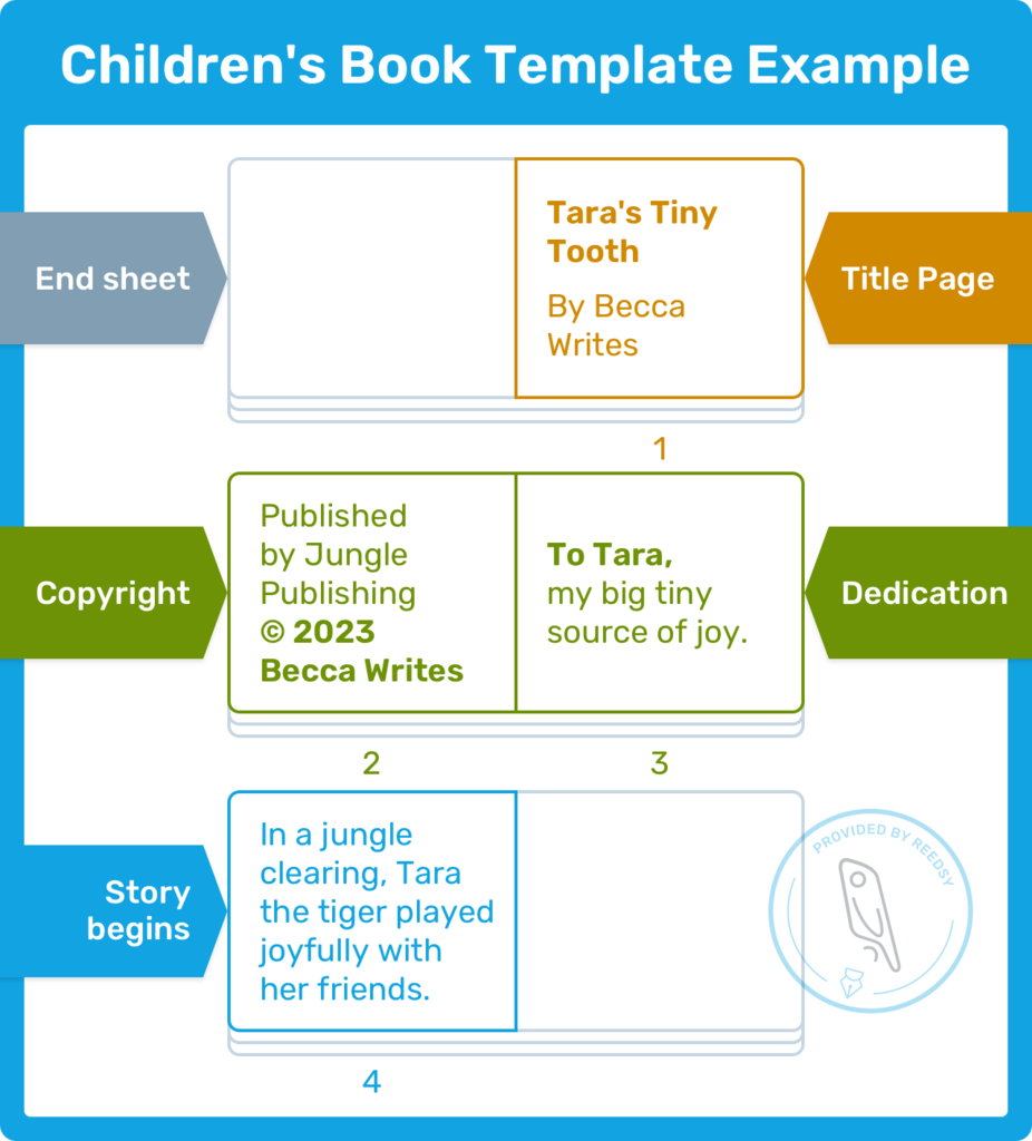
The front matter typically includes elements like the title page, copyright information, and a book dedication, while the back matter is often reserved for a short author bio.
⚡ Pro tip. Create your copyright page in less than 5 minutes using our free writing tool, Reedsy Studio.
Your choice about the front matter will determine whether your story starts on a single page or on a two-page spread, so consider what’s best for your narrative. Does your first scene stand on its own? Or does it need a full spread to get the story going?
Depending on your needs, adjust the template to have more or fewer pages. Then you can focus on the story.
3. Mark the spreads and page turns
Like any other narrative, a children’s book follows a story arc, starting with some expository scenes, rising action, a climax, and a resolution. You’ll want to think about the significance of each scene in your story and determine how many pages it should occupy.
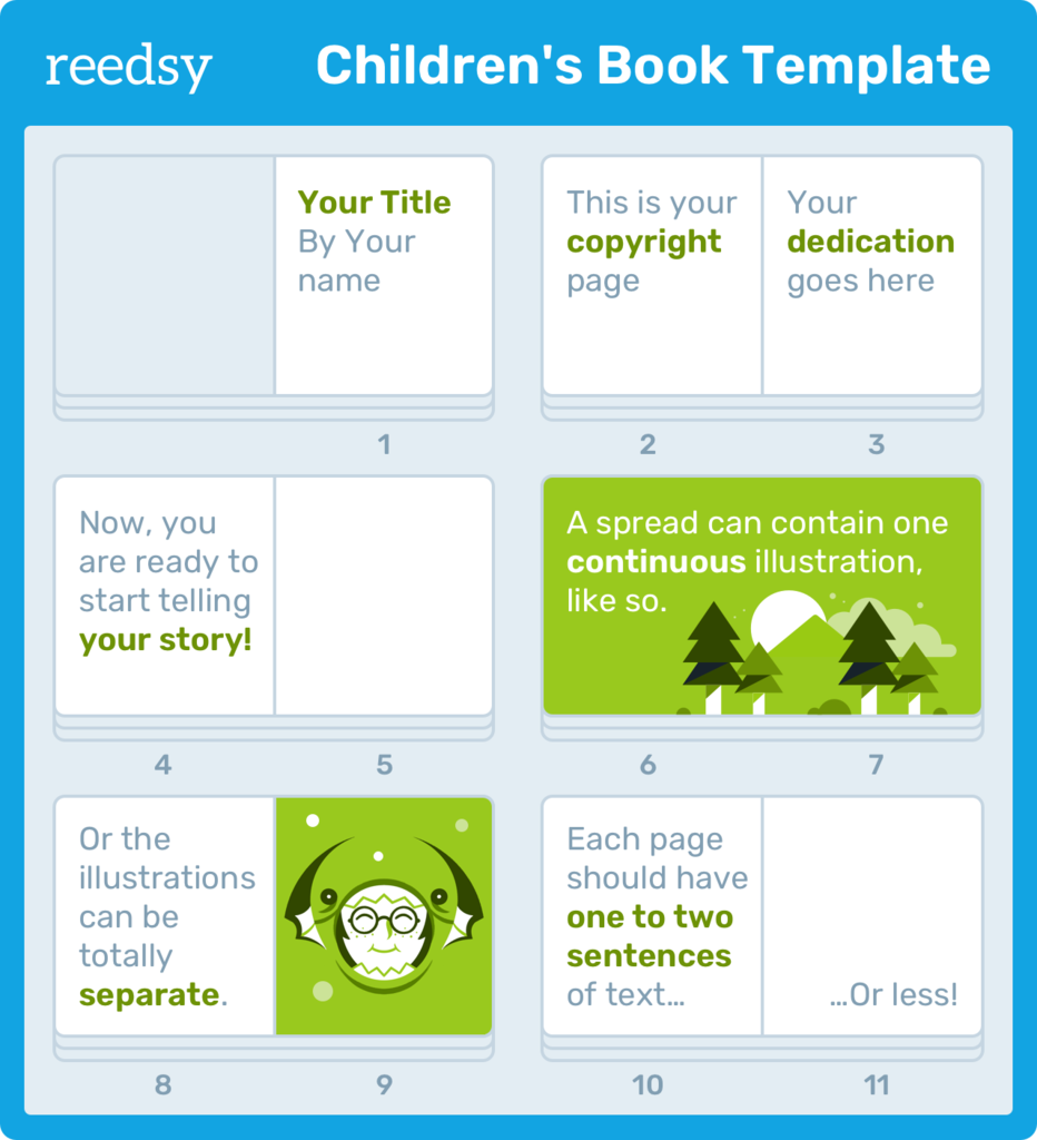
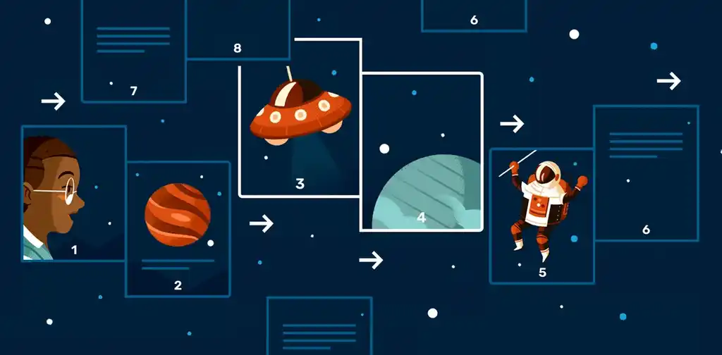
Insert your text into our children's book template. If it helps, add sketches, photos, or simple text to represent the illustrations you envision. Gauge if the layout reflects their importance.
Q: What, in your opinion, is most important to remember when illustrating for children's books?
Suggested answer
![]()
Have fun.
These books are for kids and if you think about it the world of children's books doesn't need to have rules. So push the boundaries of your drawings. Maybe the trees are pink, blue, and red instead of green. Or the house is full of wonky windows, you don't need to stick to reality. Colors, textures, and shapes push them and see what they can do, it's way more fun as an artist to draw something that pushes your creativity. You'll of course need to keep the client involved, sometimes they ask for more realistic illustrations. Don't be afraid to ask I've found that most of the time authors want their book to be fun and whimsical too.
Danika is available to hire on Reedsy ⏺
Always see the world through the child’s eyes.
When I’m illustrating a children’s book, I try to align myself with that sense of exaggeration that kids feel so naturally. Is the main character feeling happy? Then everything around him is colourful and alive! Is he feeling anxious? Then maybe the people surrounding him are grey and looming. The tree you used to climb when you were little surely felt like it touched the sky… so why not draw it like that?
I also think it’s important to create artwork that invites kids to explore. I love when an illustration has little surprises, like a hidden animal peeking from behind a tree, or a character wearing mismatched socks. Plot-irrelevant details give children a reason to linger on the page and discover something new each time they read the book.
Christina is available to hire on Reedsy ⏺
A children’s book should above all spark the imagination: it’s not a mere visual translation of the words, but a parallel world that lives in harmony with the text. Illustrations should spark curiosity, invite questions, and go beyond rules and conventions. They should open windows onto unexplored, fantastic worlds where children can wander and discover.
Sasha is available to hire on Reedsy ⏺
Fun, expressive & relatable characters. Bringing their personalities to life!
Tommy is available to hire on Reedsy ⏺
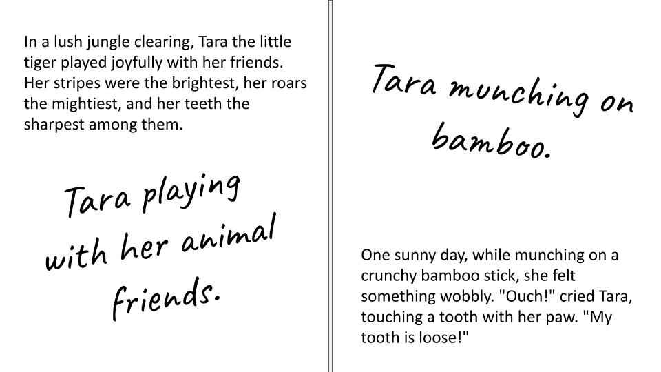
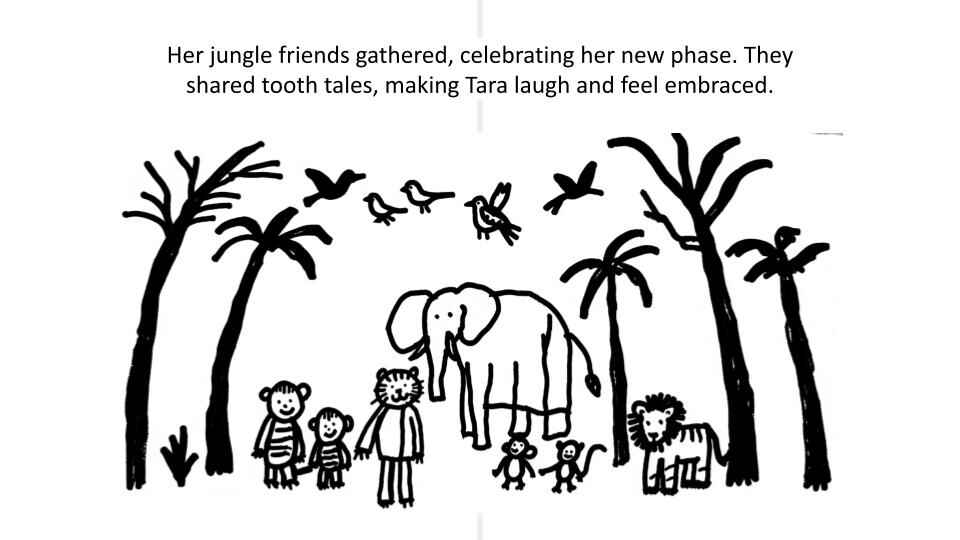
As an example, consider this story about Tara, a baby tiger navigating the rite of passage of losing her first tooth. You might establish the story with two separate scenes 一 one which describes her everyday life in the jungle, and another in which she feels a wobbly tooth, the hook that sets the story in motion.
Save double-page spreads for your big moments
Later in the story, Tara loses her tooth. She’s concerned, but also hopeful noticing the new one peeking through. All her friends gather to celebrate the important milestone. It’s a special moment about friendship and growth which you might want to highlight with a full spread.
Next, think critically about page turns and pacing. Given the short attention span of 4-6 years old children, each page or two-page spread should be strong on its own and serve as a hook for the following one. Also, as a rule of thumb the word count should not exceed 30 words per page.
Tweak the layout until each page and spread feels right. Then you can start thinking about actually creating the illustrations.
4. Finalize your illustrations
Unless you’re a designer, the final illustrations for your book will be done by a professional you choose to collaborate with. But before you hire someone, it's ideal to create art notes detailing the number and type of illustrations you want. This will serve as a starting point, the illustrator will then infuse their expertise and creativity into your ideas.
👩🏼🎨 Talented Children's Book illustrators, at your fingertips.

caterina B.
Available to hire
Children’s book & YA illustrator since 2011. Trusted by publishers worldwide to deliver engaging, timeless illustrations.

Driss C.
Available to hire
Book covers illustrator who believes in colourful designs for all genres.

Judit T.
Available to hire
Currently cooking for US children's book publishers, mixing it with some storyboarding on the side and topping it with creative writing.
Create your art notes
Review your children's book template and tally the number of illustrations required. Each illustration should feel unique, necessary, and sized to match the importance of the plot point. For each, provide a description of what you envision 一 a sentence or two should be enough, but don’t be afraid to go more in detail.
Q: What criteria should authors consider when selecting an illustrator whose style and approach align with their story's tone and themes?
Suggested answer
![]()
Take a look at an illustrator's portfolio and compare that first with the typical style of the genre of your story-- for example, you'd probably want to eliminate an artist who does bright, colorful character-based romance cover designs if your book is a serious historical fiction. You want to see the mood of your story already in that cover designer's portfolio, usually.
Caitlin b. is available to hire on Reedsy ⏺
As children’s book illustrator Sara Kuba points out, art notes can be very helpful. “It's great when authors have a clear vision for their book. It also saves time, as there's less guesswork to do when sketching pages and designing characters.”
🎨 The advantage of self-publishing is the extent of creative control it affords. In contrast, when pursuing traditional publishing, it's advisable to minimize art notes. Illustrators at publishing houses have more autonomy in steering the book's creative vision.
There are different types of illustrations for picture books, from vignettes to full-page images. Different scenes of your story may require a different style, which you can specify in the art notes too.
Find an illustrator whose work you love
The illustration style will largely depend on the children's book illustrator you select. Every artist possesses a unique flair — from simplistic sketches to watercolor images to Pixar-esque renderings, you should choose someone whose art resonates with your vision for the book.
Q: How do you collaborate with authors to ensure your illustrations align with their vision?
Suggested answer
![]()
Working with authors means making sure the illustrations match their vision while staying true to my style. Here’s how I make that happen:
They come for my style – My portfolio does the talking. I keep it fresh and up to date, so when an author reaches out, they already know what to expect. This keeps our creative visions aligned from the start.
Visual brainstorming – We dive into the project, discuss ideas, and swap references. Mood boards, sketches, inspirations—whatever helps us get on the same page.
Open process on Miro – I share my progress on a Miro board, where the author can follow along, give input, and be part of the journey. This keeps everything transparent and collaborative without disrupting my workflow.
In the end, I want the final illustrations to feel natural and exciting for both of us.
Evgenia is available to hire on Reedsy ⏺
It's important to remember that every author is different. Even if an author has worked on their book for months, if not years, and has a deep understanding of places, characters and content, it doesn't always mean they know how it should look. Other times the author knows exactly what they want.
Often an author has prepared visual references and described their project in detail in their proposal. But others can be less sure. Either way, I will want to pick their brains and try and get as much information and hopefully relevant picture references from them as possible. This could be other illustrations, art or books they like, but also experiences and situations that have inspired the book that they think are relevant. I may also suggest some references here if I think it can help. If the author is unsure at the start, then this process will help them find a visual idea that we can build upon.
Then the next stage is to find a coherent look and style from this material that can work for the project. To do this I will narrow down the references to find a core idea by making a number of sketches and mockups of characters or scenes with references for colours, lines, light or textures that we can discuss. It's good to give this phase a little extra time to ensure we both understand what I am aiming for in the visuals. It may take a couple of variations but hopefully we can agree on a look that we are both happy with. I want to make illustrations that match their vision but also need to be sure it's a look that I am comfortable making that's not too far from my personal style.
After this, and if its a bigger project with many illustrations, then it can be a good idea to choose a 'typical' scene from the book and make a single, finished illustration for approval that can be a style reference for all the rest.
Even if we both agree on the visuals, it's still important to me that the author can follow the progress throughout the rest of the project to avoid any problems or disappointment at the end. This doesn't mean the author has to give a critique of everything I make, but it's good to confirm my work feels right for them and see if there are details that they want to change.
In short its a process of respect, understanding and guidance from both parties that leads to a successful visual interpretation.
Ben is available to hire on Reedsy ⏺
When an Author sends me their text, my first step is to produce a written visual layout on their text. So for each page I will write in red my idea for the page or spread. This is solely for me to begin researching any reference I need and collect this into a folder to refer to later.
I will then produce a rough layout of each page, very loose, quick sketches to convey the action and composition of the scene, I will do this for the whole book. Then all the text and rough sketches go into a PDF which is sent to the author for notes. This way, we can agree overall composition, make sure it flows well etc, but also, we can make changes easily. So when I move into producing the final artwork, we are both as prepared as can be. There will inevitably be further changes for the final art but this way, they tend to be minimal. It's about setting the ground work early on so the client knows what to expect.
Rich is available to hire on Reedsy ⏺
As Sara Kuba suggests, if you’re unsure what art style will look good on your book, you can ask the illustrator for an art test (like designing a character, or doing a spot illustration.) This will help you both visualize the story, and get a feel for how it’s like to collaborate with them.
🎨
Which children's book illustrator is the best fit for your book?
It'll only take a minute!
Choose a book size
Do you prefer a square, portrait, or landscape layout for your book? The trim size you choose will influence the illustration design. This is not so essential when creating your storyboard, which you can do using simple slides like with our template. But when you collaborate with an illustrator, you'll need to express your preference 一 ideally before they start working on any art.
With your input and vision, the illustrator will take care of illustrations, text, page layout, etc., delivering a PDF file that can be uploaded and printed through the major POD platforms. But before you do that, you’ll need to wrap things up with a beautiful cover.
5. Get a cover design that sells
The final touch to your layout will be designing the front and back cover. You may be tempted to design it yourself, perhaps taking one of the illustrations and sticking the title and author name on top of them. But just like for the illustrations, it’s better to hire a professional designer to do it.
Q: As a standard, how many concepts and rounds of revisions do designers offer in their quotes?
Suggested answer
![]()
I provide a minimum of three distinct initial concepts, each showcasing a unique design approach. This variety allows the author to explore different creative directions. Occasionally, if inspiration strikes, I may offer additional concepts, but three original designs are always guaranteed to start the process. Once the author selects their preferred concept, we refine it through up to three rounds of revisions, though many projects require only one or two rounds to achieve the final design. If multiple initial concepts resonate, we combine elements—such as typography, color palettes, or layouts—from several designs to create a cohesive and tailored final cover.
Rachel is available to hire on Reedsy ⏺
As a standard, my process includes three main stages, each with clear steps and opportunities for feedback and revisions to ensure the final design meets the client’s expectations.
For concepts, I offer three black-and-white thumbnail sketches in the first round. These serve as the foundation for the design, allowing him to select one concept to move forward with. If necessary, he can request revisions during this stage, with up to three revision rounds included. Additional rounds are available for a fee, though most clients are satisfied with the initial sketches.
Once a concept is chosen, we move to the Detailed Sketch Round, where I refine the selected design, adding more clarity and, if relevant, suggesting a color scheme. The client is entitled to two revision rounds at this stage, with extra revisions available for an additional fee. Revisions during this phase should be smaller and align with what was approved in the previous round to avoid production delays.
Finally, during the Final Cover Round, I produce the polished, final version of the design. One last minor revision round is included to ensure all details are perfect.
This structured process allows for clear communication, minimizes unexpected delays, and ensures both the client and I are happy with the final product.
Carl is available to hire on Reedsy ⏺
I’m happy to provide unlimited revisions for my clients until we create a design they absolutely love—that’s just how I like to work!
Robert is available to hire on Reedsy ⏺
Typically up to three revisions included. However, I want you to REALLY love the end product. Additional revisions are case by case :)
Michael is available to hire on Reedsy ⏺
The short answer is two per round.
I have several rounds during a project, and before I start each round, I ask for and read through all the authors' notes about what they are looking for. If I've forgotten something that they specifically asked for in the beginning, I won't count that as part of a revision. If the author has changed their mind about something or updated the manuscript in a way that requires changes to the artwork, that will count as a revision. After two revisions, I will do more, but it will be at an additional cost.
I send my clients a PDF of my work process before we start a project. It outlines all the steps/rounds in the project and the revisions allowed in each. It also goes over the additional fee that will be added to the project budget if the revision amount is exceeded. It's important to always be on the same page from the very beginning about this. If an illustrator doesn't mention revisions, it's something I would bring up before starting a project. It's frustrating as an illustrator to have endless revisions without additional pay for extra time spent on the project. It's also frustrating for an author to suddenly be asked to pay more when they weren't aware that was the expectation.
Danika is available to hire on Reedsy ⏺
I supply a minimum of 3 different concepts but I often give a few more if the books subject has inspired me or I've come up with more valid designs than the standard 3.
I carry out 3 rounds of revisions to the client's chosen preferred front cover option. Another 3 rounds for the combined back cover and spine. And if I'm commissioned to design the interior, 3 rounds to revise that too.
Wayne is available to hire on Reedsy ⏺
I think my method is a little different from most as I offer different rates depending on how much/how often the client wants to potentially make changes/revisions. Sometimes a client is happy for me to describe how I envision each illustration, do very rough sketches (stick-man level!) and then leave me to outlining, painting etc until they get the final image. Other clients want to see the final outlines (second stage); while others may want to be able to make changes even once I've painted (this is usually only clients where the characters in the book are people they know, I've found).
So each rate has a different number of rounds of revisions included. The higher the rate the more rounds of revisions. Most authors go for the mid-rate, which includes revisions at sketch stage, and at final pencil outline stage.
Siski is available to hire on Reedsy ⏺
I usually invite the client to give feedback at every stage of the process, thumbnail, sketch and final, ensuring that there's no miscommunication throughout. If there is a situation where the feedback stage becomes drawn out, I limit myself to a maximum of two rounds of revisions before additional fees get added. However, I try to remain flexible when responding to client feedback, with my goal always being to end up with a result the client is happy with. Extra fees are normally only added if the revisions cause serious delays or are outside the scope of what the client is paying for.
Torbjörn is available to hire on Reedsy ⏺
I love working closely with authors, making them an integral part of the process at every step. Typically, we begin with the sketch phase, during which I offer two free revisions. After that, we move on to approving the color palette together, and again, the author has the opportunity for two free revisions per page or spread.
This approach allows authors the freedom to provide input without additional costs, ensuring the process remains fluid and collaborative. It’s a system that works wonderfully and often leads to amazing results!
Mariana is available to hire on Reedsy ⏺
Technically there should be a maximum of three rounds of revisions after I send rough sketches. If there is ever a time where the author asks for a fourth round and it's reasonable and the person is friendly and kind then I'll do a fourth! I've never felt I had to charge more because of too many revisions. It's usually only one or two.
Penny is available to hire on Reedsy ⏺
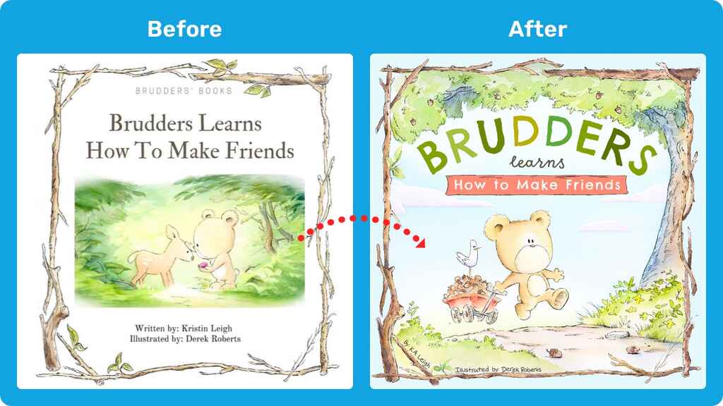
Consider the story of K.A. Leigh and Derek Roberts, the creators of Brudders Learns How to Make Friends. Even though Derek illustrated the book himself, it was only by consulting with designer David Miles that they were able to turn their DIY cover into a professional-grade product.
The new design better conveyed Brudders’ personality, the message of the story, and the book’s adventurous nature. In addition, it featured elements that the authors could use for future books in the series, like the wavy banner.
Q: How do you best work with clients to capture their vision for their book cover?
Suggested answer
![]()
Firstly, always listen to what the client is saying and - read between the lines - what do they really want. Read the brief. Then read it again. I don't just slavishly give the client exactly what they ask for. They are paying me for my expertise. So I will consider what they want to achieve (which is usually different than what they initially want to see). Then I will come back with ideas that will achieve their aims. Its a bit of back-and-forth between me and the client until we align on the final cover. Clients tell me all the time, they could never have expected the final cover to look how it does, and how thrilled they are with the result. Sometimes a client will come with a firm idea or element. If that serves the book then great, I will incorporate it in a way that optimises what the cover needs to communicate. Its ultimately about communicating clearly with the client.
Wayne is available to hire on Reedsy ⏺
The best way to capture a client’s vision is to start by asking lots of questions. I like to find out not just about the story, but also about any concerns or fears they might have, what they do and don’t like, and how they want the book to feel on the shelf. Sometimes a video chat helps enormously to get a sense of their taste and personality.
If a client has a specific idea, I always do my best to use that and make it look professional. If I think the project could benefit from a different approach, I will suggest alternatives, but always as part of a collaborative discussion.
Stage one of my process is research and idea generation. I play around, try out unusual or even odd concepts, and see what comes from that experimentation. With every idea I present, I include variations in colour, composition, or typography so the client can see the possibilities.
Many authors actually do not know exactly what they want, and that is great too. In those cases, I cast my visual net wider, presenting lots of ideas and styles to see what resonates with the book. Once we have settled on a direction, the refining and to-and-fro can take several stages to resolve. Getting every detail right on the spine and back cover is equally important. From there, we work together to shape a cover that is both creatively exciting and commercially strong.
Clare is available to hire on Reedsy ⏺
Communication is key. Asking questions and asking for examples of favorite covers is a start.
After that I like to send a few different concepts. I like to make it clear that the first round is still like a shot in the dark and work in progress. Specially when the client is not sure what they want. The best way to understand what a client expectation is, for design and style, is to send a few different options first and start working from there.
Veronica is available to hire on Reedsy ⏺
As Derek reflected afterwards, “Your book can have many wonderful, well-intentioned selling points, but the cover is the first and sometimes only thing people will actually see. They will make up their minds instantly (even if they didn’t mean to), so our advice is to make your cover a priority as early as possible in your self-publishing journey.”
We hope this post and our free template will help you map out your children's book page-by-page before you add illustrations, and help you get closer to your dream of self-publishing your picture book.
In the next post of our guide, we look more in detail at how to find an illustrator to bring your book to life.
