
Last updated on Nov 07, 2025
13 Author Websites That Get It Right
Dario Villirilli
Editor-in-Chief of the Reedsy blog, Dario is a graduate of Mälardalen University. As a freelance writer, he has written for many esteemed outlets aimed at writers. A traveler at heart, he can be found roaming the world and working from his laptop.
View profile →If you want to be a professional author, you’ll need your own website — your personal corner of the internet where you can showcase your work and connect with readers on your own terms.
But you don’t want just any website. You want one that looks professional, reflects your author brand, and turns casual visitors into loyal fans.
In this post, we’ll look at 13 great author website examples and break down what makes them work — so you can gather ideas and inspiration for your own. In the next part of this guide, we’ll show you exactly how to build it.
Let’s begin.
1. Austin Kleon
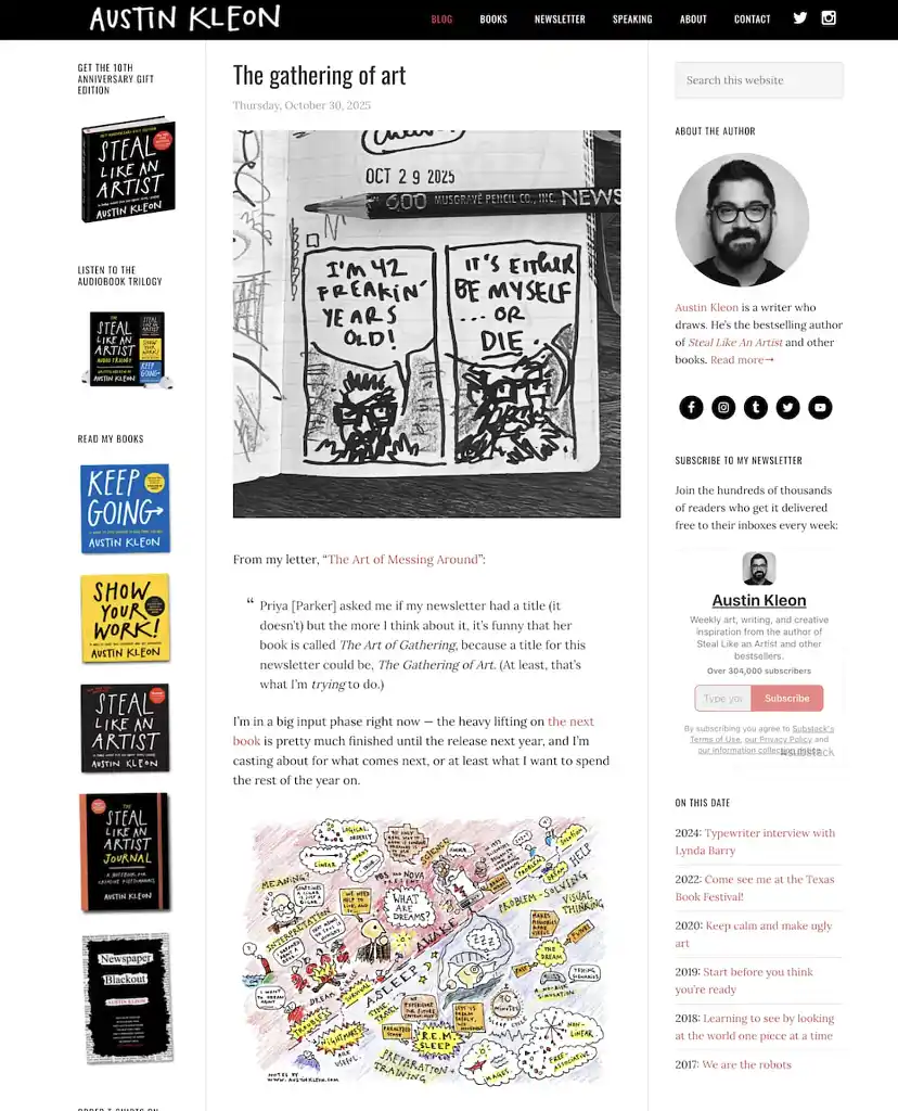
Austin Kleon is a New York Times bestselling author who calls himself “an author who draws.” He uses his website to showcase not just his books, but his creative process. He shares regular posts on art and writing, making the site feel like an ongoing conversation rather than a static portfolio.
Why it works: The site is clean, easy to navigate, and highlights everything readers might look for — blog posts, books, newsletter signup, bio, and contact info. Most importantly, it’s consistently updated. New blog posts are front and center, showing that Kleon is active and engaged. This makes visitors want to return, which is invaluable for upcoming book launches.
Something as simple as an up-to-date Twitter feed or a list of upcoming events can keep your website fresh and show that you’re committed to interacting with your readers.
Takeaway: Keep your website updated. You don’t want your site to look abandoned between publication dates — you want visitors to feel like someone’s home.
Q: What key elements should every author include on their homepage to engage visitors and build their brand?
Suggested answer
![]()
If you think of a website like a book, it needs to follow some formula: outline, chapters, and plot.
In the case of an author's website, this could translate to a compelling banner image with an attention-grabbing and relevant headline that, at a glance, tells your visitors what your site is about. This is your H1.
Below that, write a few sentences that expand on the headline. This could be the perfect place to introduce yourself, your current book, or project. Depending on your comfort level, you might also want to include an image of yourself or your book cover, if not already above.
From here, you can get creative, depending on where you are in your career. These could include:
-- an excerpt from your book
-- reviews or quotes
-- a list or logos of outlets where people can purchase your book (Amazon, Barnes&Noble, etc.)
-- upcoming events, book readings or signings
-- latest blog posts
-- news and/or press
For the above, pick and choose what is most relevant, and if you don't have access to those yet, that's okay. Be where you are and add on as needed.
When possible, add links to other reputable websites. For example: news, press, reviews, or where to purchase. Links to external websites should always open in a new window so your website remains open, while links to other pages or sections on your site should open in the same window.
As you reach the bottom of your home page, be sure to include a sign-up form. Even if you are not ready to market your work or send emails, the time to start gathering emails is NOW! Pro tip: It's a nice touch to send a thank-you email when someone subscribes. This can be automated through most web builders.
Finally, make sure you include a way for people to reach you. This doesn't have to be on the home page, but should be clearly linked from it. And last but not least, be sure to include links to your social media, as followers can become buyers!
Good luck!
Sharon is available to hire on Reedsy ⏺
This depends on the goal of the author's homepage, their current marketing strategy and the overall size and structure of the whole website.
That said, if there is one single element you need on your homepage, for SEO it's an <h1> tag with either the author's name or the primary book.
If we're talking the best single element for visitors, it's a nice looking mockup of the primary book.
Chad is available to hire on Reedsy ⏺
2. Rupi Kaur
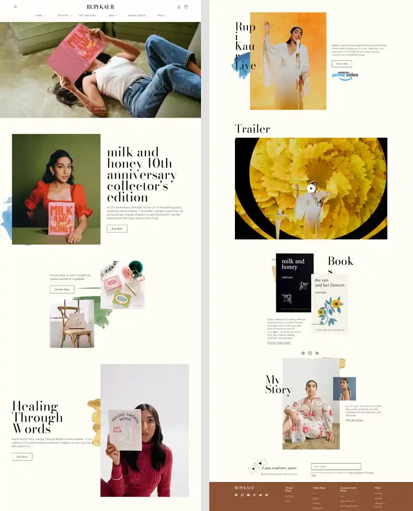
Rupi Kaur — internationally bestselling poet and queen of Instapoetry — uses her website to immerse readers in her brand. The moment you land on her homepage, you feel her aesthetic: elegant, minimal, emotionally intentional.
Why it works: Every element on the site reinforces her artistic identity. The homepage guides visitors with short phrases and clean design, just like her poetry. Beyond the minimal look, the site is full-featured: her books, a merch shop, links to her Amazon Prime special, and tour information. Even her newsletter isn’t called a newsletter — it’s a “love note,” adding a personal, playful touch.
Takeaway: Invest in branding and user experience. Paying a bit extra to get a custom-made website that fits your needs perfectly and appeals to your readers can improve user experience significantly, making it not only pleasing to the eye, but also easy to navigate.
Hire a web designer and give your site a professional look

Matthew P.
Available to hire
A 5-star rated WordPress web designer, who will build you a beautiful, custom author site to wow your readers and develop your brand online.

Matthew Y.
Available to hire
I create attractive, intuitive websites on WordPress and Squarespace that deliver your message and that are easy to update and maintain.

Elena S.
Available to hire
Custom websites for authors & small businesses. Your story, your spotlight.
3. Seth Ring
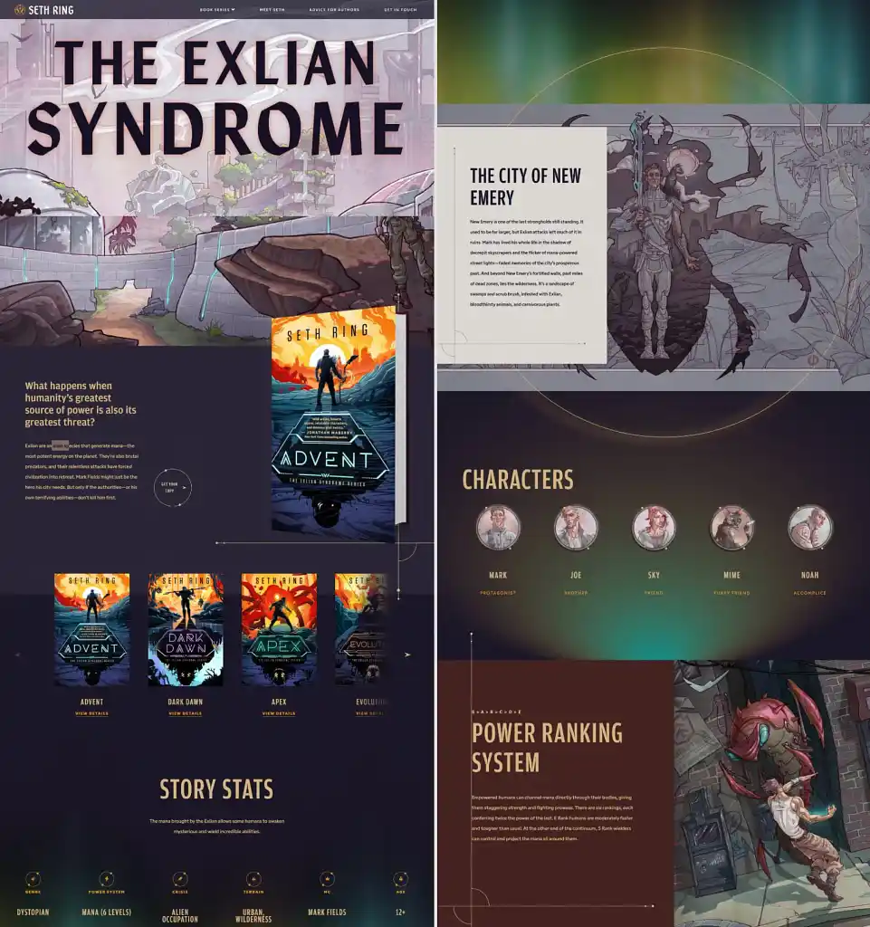
Bestselling LitRPG author Seth Ring turns his website into an extension of his fictional universe. Instead of a static homepage, you enter what feels like a game: animated elements, illustrated character portraits, and world-building details that make you feel like you’ve stepped inside the story.
Why it works: The site isn’t just visually striking — it aligns perfectly with what his audience loves: immersion. Each book series has its own dedicated landing page, complete with character cards and portraits, world maps and lore, and more, all subtly animated.
It feels like exploring a game wiki, not browsing an author page, which is exactly the point. The design pulls visitors deeper into the world and keeps them exploring longer, increasing the chances they’ll buy a book or sign up for updates.
Takeaway: Bring your site to life. Most author websites are static, and that’s fine — but if your genre leans into world-building (fantasy, sci-fi, LitRPG), adding interactive or dynamic elements can elevate the experience. Even small touches — animated icons, character art, or world stats — can keep readers exploring and emotionally invested.
4. Ali Hazelwood
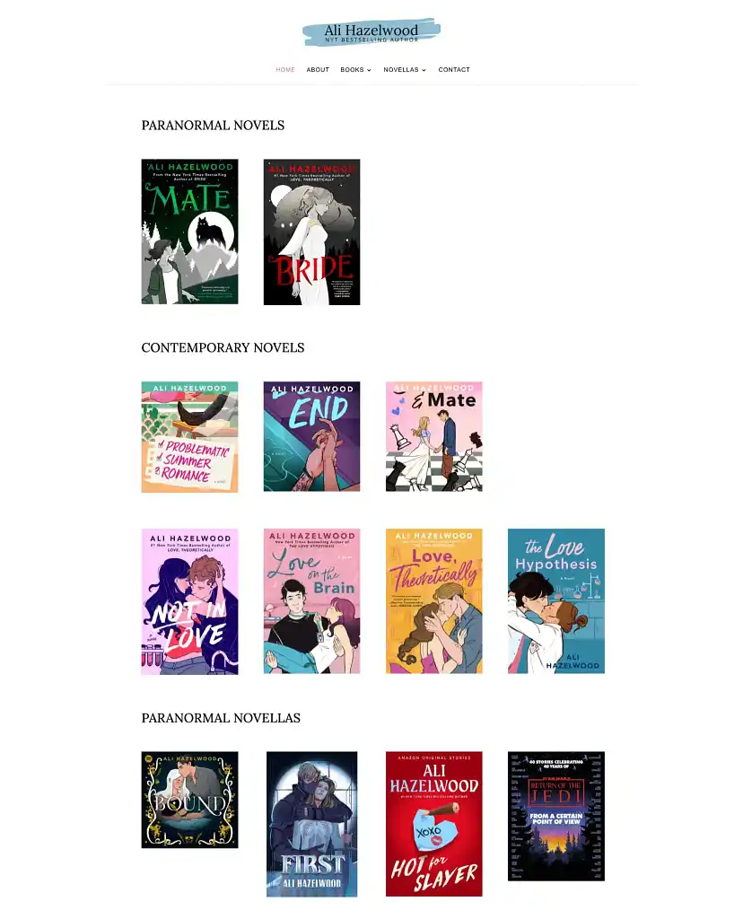
Ali Hazelwood is an author known for STEM-romance and fan-favorite characters. Her site’s homepage is essentially a bookstore display. You land on the site and immediately see her full catalog, neatly organized into series and formats.
Why it works: The design strips away distractions. No lengthy intro, no scrolling to find the “good stuff.” Her books are front and center 一 each cover clicks through to the respective book’s landing page with a purchase link. It’s frictionless, which is exactly what you want when someone is already book-curious.
Takeaway: Make your books impossible to miss. Put your newest book (or books) front and center, and include retailer buttons so readers can purchase from their preferred store with one click. Make it easy for someone to go from “oh, this looks interesting” to “added to cart.”
Q: What specific skills do you need to design author websites?
Suggested answer
![]()
You need web design skills! These days, you don't need to know how to build a web page in HTML, but you do need to know the basics of how web pages and browsers function together to display a web page. Here are some basics to cover:
- Basic Server and Domain Knowledge. Learn how to manage the hosting and domain name, and the difference between the two. I don't know how to build or manage a server itself, but I know how the ins and outs of my host and domain registrar.
- Basic HTML/CSS tags. Even with drag-and-drop builders, you need to know what is going on under the surface. You'll almost always need to inject some custom CSS or a basic script somewhere along the way.
- Basic SEO. Understand how to properly use heading tags, meta descriptions and image alt tags, at the bare minimum.
- Colors. Get good enough at creating color schemes. There are plenty of tools online that can help with this. I use Paletton.
- Information Architecture. This includes building the sitemap (which pages go where) and on-page content (what content goes where on the page.)
- Integrating email marketing platforms. Almost every author I've built a site for wants a subscribe form. Learn how to embed these forms.
That's a basic list to get you started!
Chad is available to hire on Reedsy ⏺
Designing an author website isn’t just about looking pretty. It’s about giving readers a place that feels like your book.
The key skills you need?
- Storytelling → turning your voice into a digital experience.
- Branding → using fonts, colors, and images that feel like you.
- Clarity → making it easy for readers to find what matters (your books, your bio, your contact).
- Editing → cutting the clutter so your story shines.
- Flow → guiding readers naturally toward joining your list or buying your book.
When all of this comes together, your site stops being a résumé… and becomes an invitation.
Your website is your first page. Make it worth turning.
Maite dalila is available to hire on Reedsy ⏺
Building websites for authors isn’t quite the same as designing for other businesses. You’re not just creating a digital brochure or a sales funnel. You’re building a space that reflects someone’s personality, showcases their work, and helps readers connect with them.
It’s a mix of creative, technical, and practical skills. Here’s what you really need if you want to do it well.
1. A good eye for design
This probably goes without saying, but the site needs to look good. Fonts, colours, spacing, layout—it all needs to feel considered. A messy or outdated site gives the wrong impression, even if the writing is great. You don’t need to be a trained graphic designer, but you do need to understand how to make things look clean, balanced, and easy to read.
2. An understanding of how people use websites
It’s not just about how it looks. It’s also about how it works. Can a reader quickly find the latest book? Is there a simple way to join the mailing list? Are the key links easy to tap on a phone? Knowing how visitors actually move through a site is key, especially when you’re designing for readers who may not be particularly techy.
3. Clear, concise content
Authors are good at writing, obviously. But writing for a website is different. You need to help shape the content so it gets to the point quickly and encourages people to take action. That might mean rewriting a rambling bio, tightening up a homepage introduction, or suggesting a stronger headline. It’s not about replacing the author’s voice—it’s about making sure that voice works online.
4. Basic SEO knowledge
A big part of an author’s audience will find them through Google, so the site needs to be easy to discover. That means knowing how to use keywords sensibly, writing image descriptions, setting page titles, and getting the overall structure right. You don’t need to be an SEO expert, but you do need to understand the foundations.
5. Confidence with the platform
Whether you're using Wix, WordPress or something else, you need to be comfortable with the tools. That includes building forms, connecting domains, setting up mailing list integrations, and making sure it all works properly on mobile. A lot of time can be wasted fumbling around with settings if you’re not familiar with how things work behind the scenes.
6. The ability to listen
Not every author wants the same thing. Some want to build a list, some want to impress a publisher, others just want a clean place to showcase their books. Listening carefully at the start, asking good questions, and understanding what the author actually needs is one of the most useful skills you can have.
Stuart is available to hire on Reedsy ⏺
💻
Tell us about your book and we'll match you with a website style!
It'll only take a minute!
5. Brit Bennett
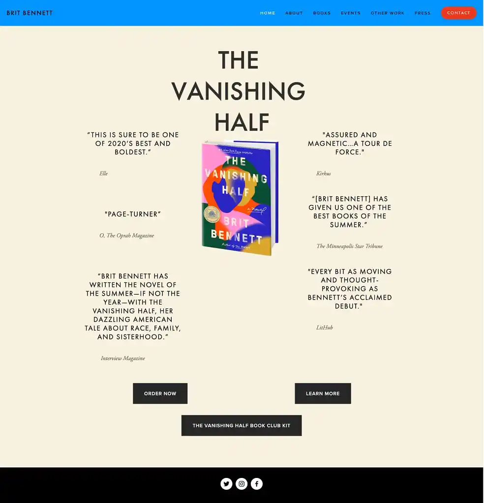
Brit Bennett has authored three books, but she’s best known for her mega-hit The Vanishing Half. On her website, she places it front and center, surrounded by glowing endorsements from major publications.
Why it works: Bennett lets social proof do the talking. The book’s praise from Oprah Magazine, Elle, Kirkus, and more instantly signals quality and credibility. There’s no confusion, no clutter — just a powerful case for why you should buy the book.
Takeaway: Use testimonials and reviews. Readers trust readers, especially influential ones. Featuring endorsements on your homepage (even if they're not from Oprah) gives your book immediate credibility and leverages social proof to boost sales.
6. A.G. Lamar
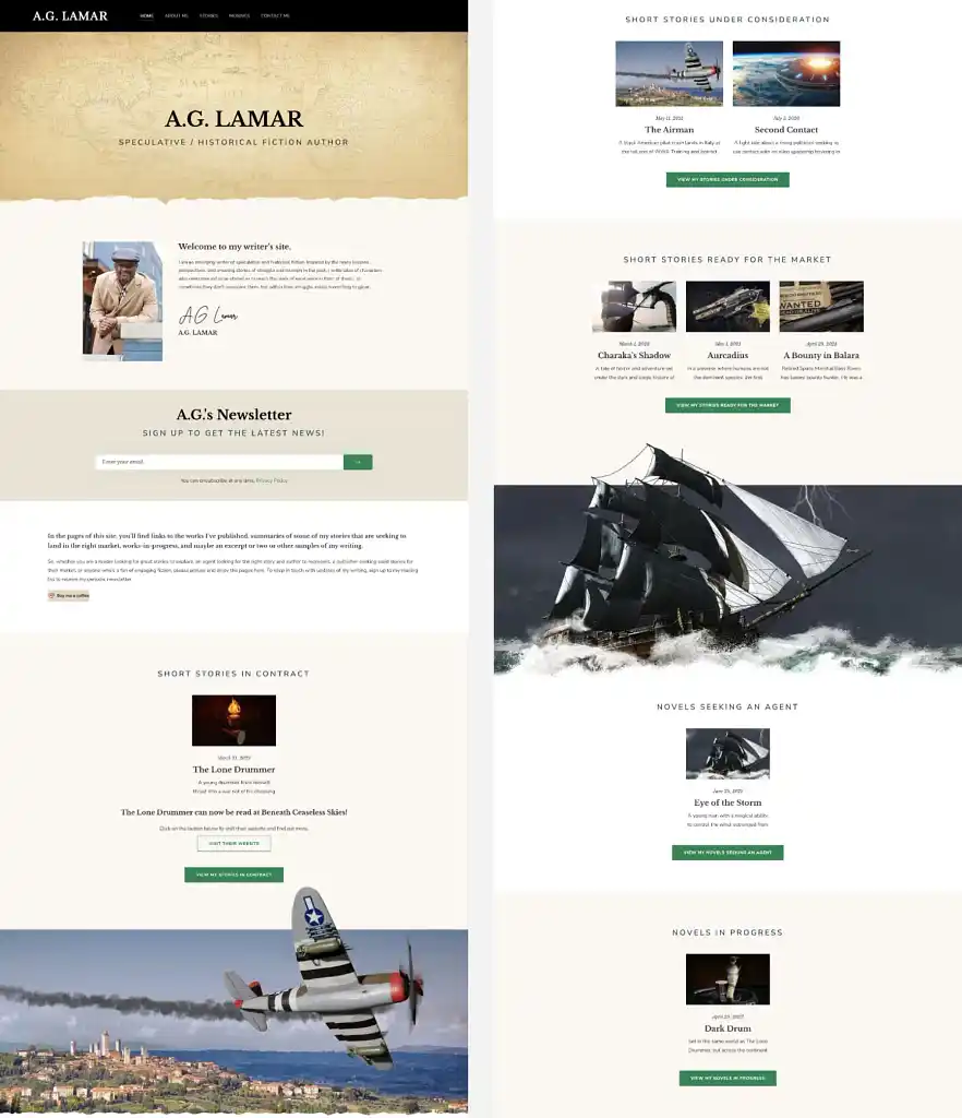
A.G. Lamar is an indie speculative and historical fiction author, and his website design — crafted by Reedsy’s Matthew P. — instantly communicates his genre.
Why it works: Instead of generic stock photos or a neutral layout, Lamar uses a textured nautical map header and striking visuals like fighter planes and tall ships that evoke action and historical atmosphere. The entire homepage reinforces the type of fiction he writes.
Takeaway: Signpost your genre visually. Even if readers already know what you write, your website should look and feel like your books. Match your design to your genre — whether that’s fantasy, romance, sci-fi, or historical — so the moment someone lands on your site, they feel like they’ve stepped into your world.
Q: What website builders and hosting services do you recommend for authors looking to create a professional author website?
Suggested answer
![]()
This is not a one-size-fits-all answer. Many factors go into choosing the right platform for your website. However, to answer the question straight:
- For complete control, I use and recommended WordPress + Avada on WP Engine. Alternatives to this could be WordPress + Elementor or WordPress + Divi on another host that specialized in WordPress, aka Managed WordPress hosting. (Avoid GoDaddy for anything but domain names.)
- If you want more out-of-the-box but less control, you can go with a DIY builder like Squarespace or WIX. These are capable of handle most features authors needs.
- I advise against Weebly, as they have fallen behind.
Every web designer has an opinion on this, but the truth is, if we're talking about standard author websites, most website/web design platforms and hosts are capable of achieving what's necessary. It comes down to the designer and their mastery of the platform chosen. The bottom line is:
- Is it mobile friendly?
- Is it SEO friendly?
- Does it load fast?
Besides that, deciding factors can include:
- How much customization do you require?
- How much of "web design basics" do you want to learn to maintain the content? Because no matter what, any DIY or drag-and-drop builder is going to have a learning curve for anyone unfamiliar with web design.
- How much do you want to pay monthly/annually?
This is a brief introduction on choose a website platform and host. There's a lot that goes into choosing, but don't over think it. They can all get the job done, as long as you have the right person at the helm.
Chad is available to hire on Reedsy ⏺
Let's start with the "big three": WordPress, Squarespace, and Wix. Each has its own pros and cons. I'd start with identifying the goal of your website, the complexity of your design, and your comfort level.
WordPress
With countless themes and plugins to choose from, WordPress allows for almost limitless design, but this comes at a cost as plugins and themes must be updated regularly.
I recommend the free Astra theme and Elementor with an upgrade to the Pro version. This mimics the feel of the Squarespace and Wix interface, but with so many more capabilities. If mobile first is your goal, this is a great choice as you can create an entirely different experience.
There is no built-in function for SEO, but there are countless plugins to choose from. I typically use Yoast SEO.
Your WordPress site is only as good as your host provider. Be cautious about what may seem like a bargain. Companies like GoDaddy and Bluehost seem less expensive but don't include backups, added security, SSL, etc. The add-ons can add up.
I recommend that all of my WordPress clients choose WP Engine. They offer a daily backup, a staging environment for future updates/design. They also offer an add-on "Smart Plugin Manager" that keeps everything up to date and will restore from a backup if there's ever an issue (cost $100 annually).
Squarespace
Squarespace is a great choice for authors' sites. The user interface is drag-and-drop, and most clients find it easy to self-manage and make changes going forward.
Need a blog, a store, or a scheduling tool? Interested in custom merch, forms, social media feeds, and links? No problem, it's all built in and ready for you when needed.
The downside of Squarespace is site speed, and though you can customize on mobile, it is somewhat restrictive.
Squarespace covers the basics for SEO: H1, SEO descriptions and titles, alt-text, etc. There is a free (or paid) Chrome extension called SEO Space that is a game-changer for Squarespace's SEO. If you choose Squarespace, I HIGHLY recommend this tool!
Wix
I have a love-hate relationship with Wix. It shares a similar drag-and-drop design tool and a variety of pre-built sections and components, which can help jumpstart your creativity.
Unlike other web building tools, it allows you to draw way outside the lines, meaning there are no restrictions to brand guidelines, so you can choose as many fonts and colors as you like. This can lead to style overload, and why I often get hired to clean up Wix sites.
Wix allows for customization on mobile. More so than Squarespace, less so than WordPress/Elementor.
The biggest advantage to Wix, as I see it, is the built-in SEO tool. In my experience, Wix sites tend to show up on search engines more quickly if you follow their guidelines. They are also the only platform that attempts to address ADAA compliance issues.
Summary
Understand your priorities and find a tool that you enjoy working with that best meets your needs.
Sharon is available to hire on Reedsy ⏺
This all depends on what backend you're most comfortable with. Youtube has some great video tutorials for Wordpress/Squarespace/Wix, which will offer an overview of what it's like to create or update a page. That's where I'd start, as you want something that's easy for you to update.
Self-hosted Wordpress will give you the most control. This is especially important if you have 5+ books. Some designers can offer automation—meaning they can set the site up so you only have to add a new book page and the book's cover/info automatically appear everywhere it needs to across the site. (Double check with your designer to make sure they offer this.) Which is great if you have a long series or multiple books.
However, Wordpress doesn't have a default visual editor. (Some plugins/themes offer visual editing with mixed results.) Most hosting options are solid—look for free SSL, and if there's a limit on emails addresses or domain names/sites. Space is nice, but most sites don't hit 2gb (unless there are multiple sites and a separate store). 5gb is usually more than enough. It's nice to have the option for multiple sites, in case you want to have a separate store later (or a separate site for a pen name).
For specific host recommendations, I've had good luck with Hostgator, SiteGround, MDDHosting, and Inmotion. While Bluehost is often recommended online, it's been very slow this year (2024) especially for the price. I've heard good things about Cloudways, Hostinger, and A2 Hosting. Wordpress.com is also viable with their business plan, though it won't give you as much control as a standard host.
For page builders (visual editors), I tend to recommend Squarespace over Wix, as I find Squarespace more intuitive since Wix's update (introducing Studio) this past spring (2024). Page builders offer no automation, which means adding a new book can be a laborious process depending on where you want the book's info to appear. For example, if you only want the cover on the book page and the home page, that's only two pages to update. If you have a series and want each book in the series to have a "read more" section with the other books in the series, then you have to update the cover manually on each of the series' book pages. Not a big deal for a small library, but rather a pain for a larger one.
At baseline though, start with YouTube. Skim tutorials on what it's like to create/update a page on the platform you're interested in. This will give you a better sense of how the platforms operate. Whatever is easiest for you to operate is (almost) always the best option.
Tessa is available to hire on Reedsy ⏺
If you're starting a website—whether you're a first time author, prolific writer, entrepreneur, or creator—the first big decision is: what platform should you use to build and host it?
The short answer? Use Wix. And no, I’m not being paid to say that. In my opinion it’s the best all-in-one option for most creatives—especially those who want a professional-looking site without needing a full-time developer or a background in code. I know this because I have made 350 author sites on Wix. And NONE of the clients have swapped out to another platform. They love Wix.
Let’s break it down.
- Why Wix?
Wix is a drag-and-drop website builder, meaning you design your site by moving things around the screen—text, images, buttons, forms—without touching a single line of code. It’s intuitive, flexible, and surprisingly powerful.
Need a newsletter signup? Built in. Want to sell something? E-commerce tools are ready. Looking to blog, book appointments, take payments, or embed video? Check, check, check, and check.
It’s also strong on SEO (Search Engine Optimization), which is crucial if you want people to actually find your site. Wix gives you full control over metadata, image alt text, and URL structure—important features that many budget builders skip or limit.
Wix also has a huge suite of Ai tools not just to create your site, but tools to help you grow your business.
- Hosting? Covered.
One of the best things about Wix is that hosting is included. You don’t have to worry about servers, SSL certificates, or whether your site will crash when you get a spike in traffic. It’s all taken care of behind the scenes.
Their hosting is fast, secure, and globally distributed. And because everything is in one place—your domain, design, hosting, analytics—you’re not juggling between different services trying to stitch it all together. (Currently wix is £259 for THREE years)
- What About WordPress?
Great question. WordPress is flexible and widely used. But it’s also more technical. You’ll need to find your own hosting, install updates, manage plugins, and troubleshoot issues as they arise. You'll need to buy something like "Divi" to actually build your site ON, as Wordpress is just a framework.
If you enjoy that level of control and don't mind some backend tinkering, WordPress is a solid option. But if you'd rather spend your time creating content or building your business, Wix is much more straightforward.
- What About Squarespace?
Squarespace is slick and polished, and works well for simple sites. But in my experience, it's more restrictive when it comes to customization, third-party tools, and SEO settings. Their editor also isn’t as smooth or flexible as Wix’s.
- Final Verdict
If you’re looking to launch a professional, polished, easy-to-manage website that doesn’t eat up your time Wix is my top recommendation. It’s beginner-friendly, robust, and grows with you and your business.
And if you want to make sure your site not only looks great but also works hard for your brand or business—that’s where I come in.
Stuart is available to hire on Reedsy ⏺
7. James Clear
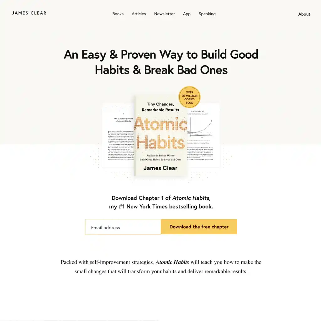
James Clear is the author of the global phenomenon Atomic Habits, and uses his website to immediately offer value. Before you even scroll, you’re presented with a free downloadable chapter of his bestselling book.
Why it works: This is a textbook example of a lead magnet — offering something useful in exchange for an email address. Visitors get a risk-free sample of the book, and James Clear grows a highly engaged audience he can reach when launching future books, products, or events. The clean layout and single clear call-to-action (download the free chapter) make it impossible to miss or ignore.
Takeaway: Give away something valuable. Whether it’s a sample chapter, a printable, or bonus content, offer readers something meaningful in exchange for their email. It will help build trust and rapport.
Q: What tools do you recommend for authors to capture and nurture leads on their websites?
Suggested answer
![]()
It's imperative to have, at the very least, a simple email subscribe form. You don't need an elaborate email marketing plan, just start collection. E-mail is still the most effective at reaching your total audience because it's direct connection, unlike social media which is unreliable and erratic when it comes to getting your message to the right people.
Chad is available to hire on Reedsy ⏺
Let's start with the basics of a signup form. Most web builders have forms built in, but make sure it's connected to some email marketing tool. Squarespace and Wix have their own, or you may choose to add a third-party like Mailchimp.
I recommend setting up an automation so that when someone signs up for your list, they receive a welcome email. This could also include any related news or next steps. You may also want to create a "drip campaign" that sends additional emails every few days or weeks, but a warning only send emails that add value and are of interest. Don't email just for the sake of emailing.
Another way to nurture a list is by adding a value-add that is gated. For example, a PDF or link to preview your book, a guide for writers, etc. Something that encourages them to share their email in exchange for something that makes them feel like an insider.
And of course, make sure there is a way to get in touch with you either by listing your email and/or phone, or a contact form. Also make sure your social media is prominent.
Last tip, even if you aren't ready to start sending emails, the time to start building your list is ASAP. Some visitors may only visit your site once so make sure your CTA (call to action) is clear without being confrontational.
Good luck!
Sharon is available to hire on Reedsy ⏺
8. Megan McDonald and Peter H. Reynolds (Judy Moody)
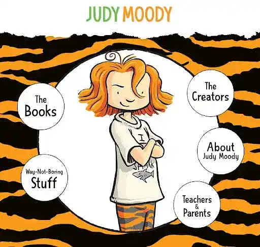
Megan McDonald and illustrator Peter H. Reynolds use the Judy Moody website to bring the world of the character to life. The moment you land on the site, you’re met with vibrant illustrations, playful language, and an energy that feels unmistakably “Judy Moody.”
Why it works: The homepage immediately signals fun, with bright colors, character art, and whimsical navigation buttons like “Way-Not-Boring Stuff.” The content also speaks to multiple audiences at once: kids get games and printable activities, while parents and teachers get resources and book info. Overall, the site extends the reading experience into an interactive, kid-friendly space.
Takeaway: Speak directly to your audience. Your website should reflect your book’s voice, tone, and intended readers (in this case, both kids and adults, since grown-ups ultimately buy the books).
9. Neon Yang
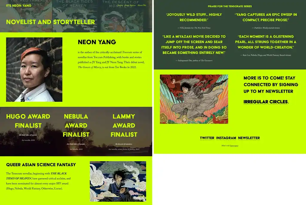
Neon Yang, author of the award-nominated Tensorate series, uses bold, high-contrast color to make their website impossible to ignore.
Why it works: Color is one of the strongest visual tools you can use to guide attention. The neon lime background instantly signals personality, energy, and genre. Instead of blending in with a muted or generic palette, their site leans into a strong identity. The design says: this author has a distinctive voice, and the books do too.
Takeaway: Use color intentionally. One or two bold colors are enough to draw attention to what matters most (like a newsletter signup, new release, or reviews). Done well, color becomes part of your brand and makes your website unforgettable.
10. Brené Brown
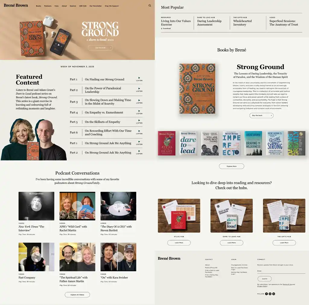
Brené Brown uses her website as a content hub rather than a static portfolio. Readers can explore her books, listen to podcast episodes, watch video interviews, or dive into resource “hubs” tied to her latest release.
Why it works: The site is designed for engagement. Instead of immediately pushing a sale, Brené gives visitors multiple ways to interact with her work — podcasts, exercises, videos, resource kits. Each section feels like a self-contained experience, encouraging deeper exploration and longer time on site. It’s not just a website: it’s a learning center built around her ideas.
Takeaway: Create a content ecosystem. Think beyond “here’s my book” and give visitors meaningful ways to engage with your world through various resources. The more time someone spends interacting with your content, the more likely they are to buy your book and become part of your community.
11. Angie Thomas
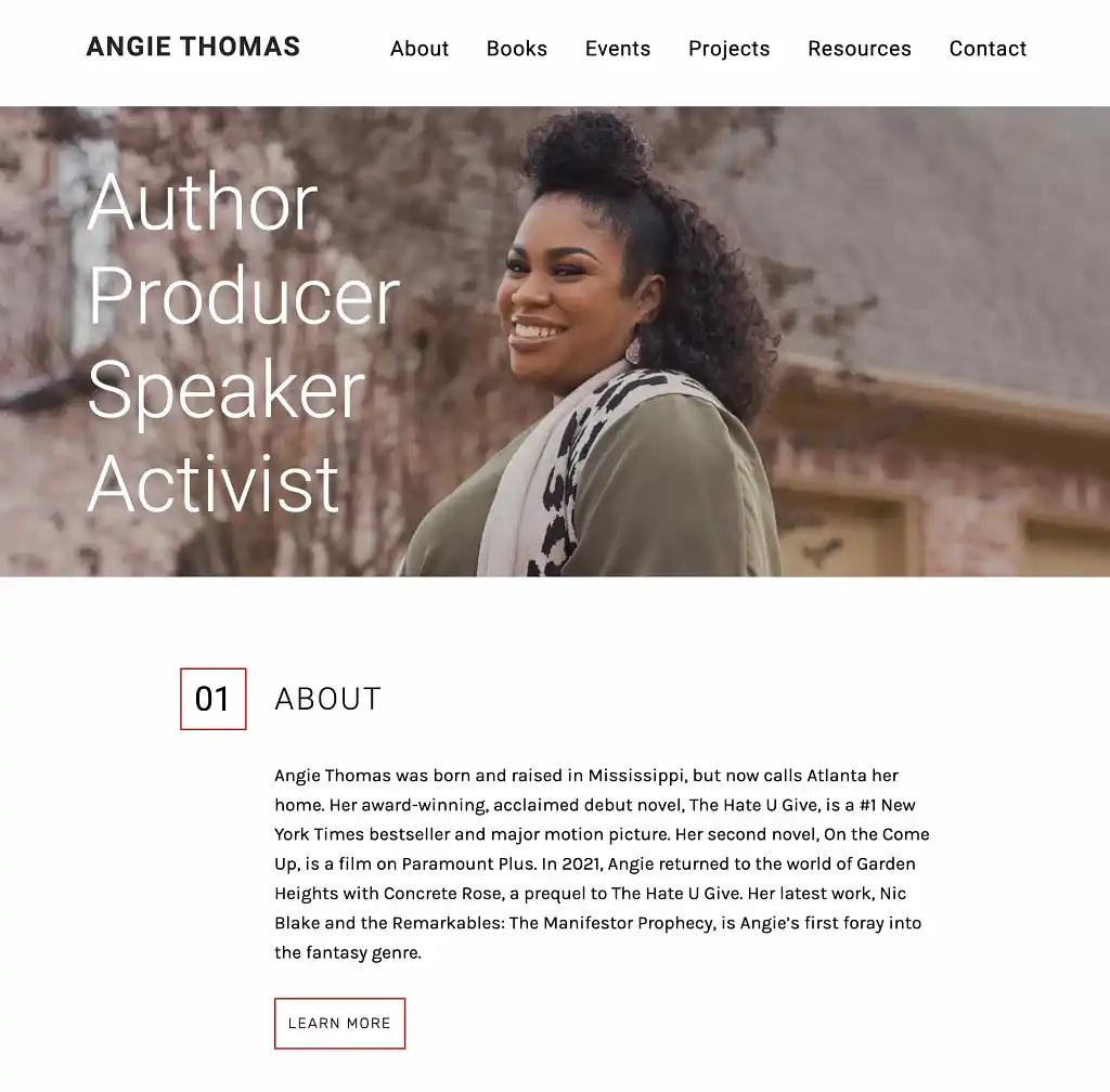
Angie Thomas is the bestselling author of The Hate U Give. She welcomes her visitors with a confident portrait and four powerful words: Author. Producer. Speaker. Activist. With one glance, visitors understand who she is and what she stands for.
Why it works: Readers don’t just connect with books but with the values of the authors behind them. By leading with a warm, welcoming headshot and a short, focused identity statement, Angie immediately establishes trust and personality.
Takeaway: Show your face. Use your website to introduce the human behind the work. Start with your ‘About’ section, but don’t stop there: add a few photos of yourself across different sections, if fitting, to help readers feel more connected to you.
12. Victoria Aveyard
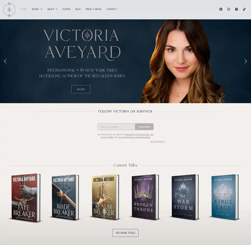
Victoria Aveyard is the author of several successful romantasy novels, including Red Queen. Her site is a great example of giving visitors a clear next step: besides welcoming them with her portrait and accolades, she invites them right away to subscribe to her Substack newsletter.
Why it works: Victoria is very intentional about where she wants to engage with readers, putting her Substack front and center — even before her titles. This move is strategic. She rightfully prioritizes her mailing, which gives her a direct line to readers for future book launches, preorders, and announcements.
Takeaway: Design your homepage around one primary goal. Whether you care about newsletter subscribers, preorders, or book sales, make that action impossible to miss!
13. Nita Prose
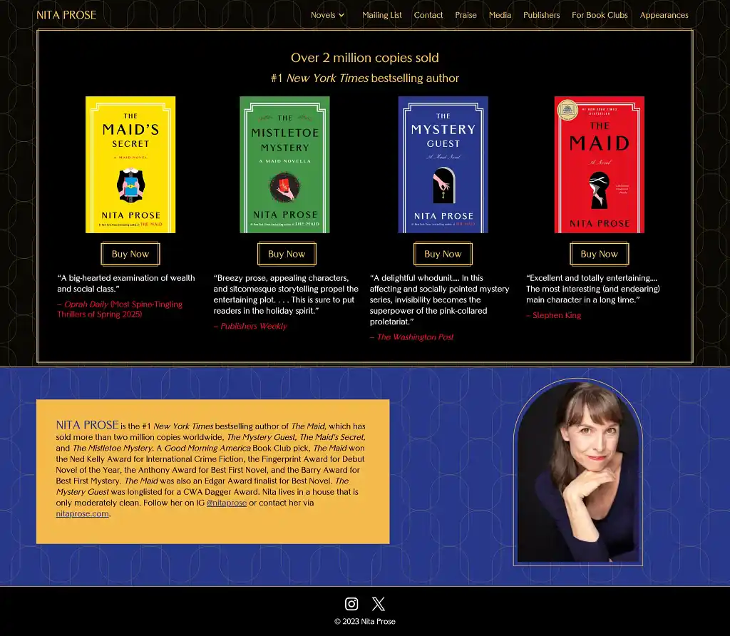
Nita Prose, author of The Maid, builds her entire website around the visual identity of her books. The typography, color palette, and layout are all designed to look and feel like her novels.
Why it works: The homepage looks like an extension of her novels. The books are framed with the same graphic borders used on the covers, and her author photo is literally placed inside the signature doorway motif readers recognize. Even without animation or interactive world-building, the design feels cohesive and intentional. The site proves that you don’t need dynamic elements to stand out — a strong, consistent brand can do the heavy lifting.
Takeaway: Create a seamless brand experience. Use your book’s fonts, colors, and tone throughout your site so readers instantly feel like they’re already inside your world. Consistency builds trust — and trust sells books.
Looking at these examples, the best author websites share common traits: they're regularly updated (not abandoned between book launches), visually aligned with the author's brand, and focused on clear goals — whether that's showcasing books front-and-center or prioritizing newsletter signups, or something else. They also build trust through testimonials, professional headshots, and free content like sample chapters.
In the next part of this guide, we'll show you how to create your very own website using some of the most popular tools on the internet.


11 responses
Brent Jones says:
02/06/2017 – 12:29
Well, never did I ever think I'd appear on the same list of authors as JK Rowling for something. Wow! You guys over at Reedsy made my day. Thanks!
Kristen Steele says:
21/06/2017 – 15:29
Great examples! Branding is a powerful element, but works best if all of your books follow a specific theme.
arushi says:
30/08/2018 – 05:47
Nice Article www.booksoul.in
Zain Khan says:
06/12/2018 – 09:28
Thanks for the awesome blog post. keep it up. Recycling Media
Michael Barrett says:
05/03/2019 – 15:00
mbbarrett.com
christopher sparacino says:
08/05/2019 – 12:28
I wrote a book i'm trying to get out there, feel free to read it! it's free, about 70 pages... http://bit.ly/evolveordiebook enjoy
Oohgirlbybk says:
08/05/2019 – 12:28
Good info! Thank you! My website is live, but I will be contacting my web designer :)
Sayli@digitalmarketing says:
22/05/2019 – 10:25
This the list every digital marketer and web designer should have! Thanks for this amazing list!
Paul Nieto says:
23/05/2019 – 17:00
Thank you for the ideas and examples. I signed up for the checklist also.
amber says:
05/09/2019 – 09:50
wow, what a great example. branding is the most powerful tool. I am also an author
David Evans says:
17/11/2019 – 10:05
The Lesley M. M. Blume site and the Austin Kleon site are pretty good , i often find that alot of sites go for design over typography which mostly doesnt work , your right about having blog posts front and centre , problem is most authors ive encountered never want that ( customer is always right etc ) .. which is a shame