Blog •
Posted on Jan 12, 2021
What is Typography, And How Can You Get It Right?
About the author
Reedsy's editorial team is a diverse group of industry experts devoted to helping authors write and publish beautiful books.
More about the Reedsy Editorial Team →Linnea Gradin
The editor-in-chief of the Reedsy Freelancer blog, Linnea is a writer and marketer with a degree from the University of Cambridge. Her focus is to provide aspiring editors and book designers with the resources to further their careers.
View profile →If you’ve ever wondered what typography is and what its guiding principles are, you’ve come to the right place. This aspect of graphic design is an often overlooked but important ingredient that permeates everyday life, implicitly affecting the way we perceive everything we’re seeing.
From the lettering on a road sign to the flourishes on a Coke bottle, typography really is at work everywhere, and books are no exception, as it makes our favorite stories both readable and memorable. If you’re considering getting started with typography, read on to learn everything you need to know about it.
What is typography?
Typography is the art of arranging text in a legible and visually pleasing fashion. It’s not to be confused with typesetting, which describes the technical process of getting text onto a page.
Essential elements of typography include typefaces and fonts (which, incidentally, aren’t the same thing), and approaches to their arrangement, like hierarchy, kerning, and leading. We'll cover all of these below, but first, let's talk about why typography is so important.
Why is typography important?
Typography encompasses far more than mere font selection — and there’s a lot more at stake, too. Done right, it’ll draw readers’ eyes and get them to click “buy” on a product page. But if you phone it in, it can make a book stand out for all the wrong reasons, resulting in a sloppy-looking volume that’s a headache to read.
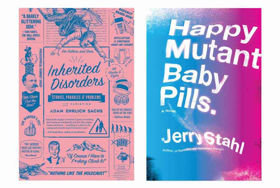
Want to learn more? Here are four reasons getting typography right is crucial for anyone involved in publishing.
1. Clear typography lets people access a book’s story
If you say the words “book typography,” most people will probably think of the title emblazoned on the front of their masterpieces. But before we start judging books by their covers, let’s take a look at the most important part of any volume: the text itself.
One of the less glamorous aspects of typography is its function: making a text easier to read. Clean and consistent type allows readers to disappear into the words. Bad typography, on the other hand, diverts attention away from the writing, and toward its arrangement on the page.
Worst case scenario, you might use a typeface that doesn’t pass the basic test of legibility, or is a terrible choice for the context it’s in — think CVs in Monotype Corsiva. In that case, your readers will end up squinting at the page, using all their brain-space to decipher your words instead of enjoying them, or be too annoyed with your choice of font to pursue the task of reading the text very diligently. In both cases, odds are they’ll stop reading long before the book is done.
2. Beautiful typography draws readers’ eyes
Now let’s talk about covers, an area where bold and beautiful typography can really shine (let these book covers show you exactly what that means). For authors jostling for attention in a crowded marketplace like Amazon, an eye-catching title can attract readers.
You can head to our guide to book cover design if you’d like to learn more about the elements that make a book cover. But for now, it’s important to know how crucial typography is to a beautiful, compelling cover.
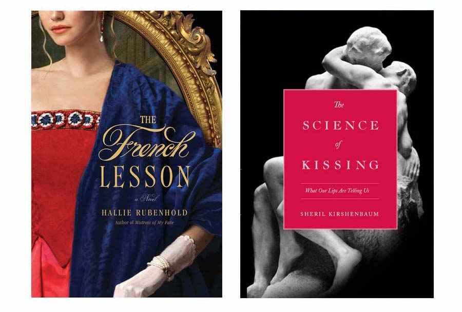
Choosing the right typeface for a book cover requires you to think beyond mere beauty. In addition to visual appeal, all the text on a cover needs to be:
- readable;
- appealing at thumbnail size;
- genre-appropriate.
Even the most gorgeous font won’t cut it if it’s illegible, confusing at thumbnail dimensions, or suggestive of, say, high fantasy when a book is a contemporary romance.
3. Distinctive typography helps distill an author’s brand image
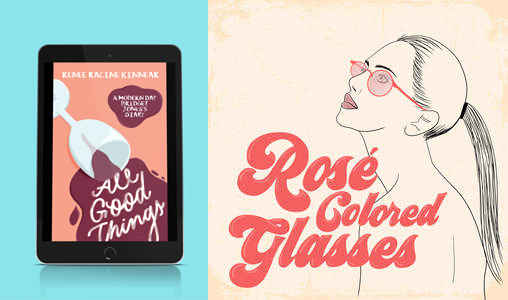
A cover with appealing typography can do more than pique interest at a glance — it can also create a powerful impression that makes a book stick in readers’ minds. Adorn a cover with a memorable type that perfectly encapsulates the feel of the story, and its author might find themselves with a brand on their hands. For that reason, typography is particularly useful for signalling that a number of books belong to the same series or are written by the same author.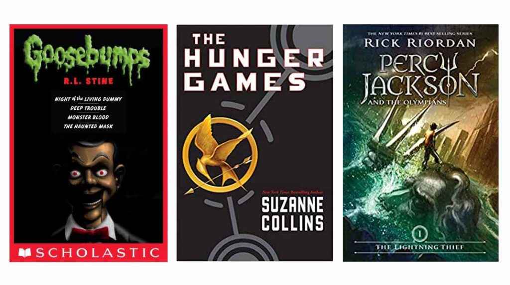 If you want proof of this branding power, just think of R.L. Stine’s Goosebumps series. What comes to mind? Probably the distinct, drippy typeface splashed across its covers. The Goosebumps font works because it pinpoints the series' genre and sensibility — creepy and gross, but still kid-friendly.
There’s also The Hunger Games, with its bold and blocky sans-serifs suggestive of Soviet propaganda posters. See them, and you already have a hint you're in for a dystopian tale. Percy Jackson, meanwhile, uses antique, heirloom-looking lettering to reference the series’ roots in Greek mythology.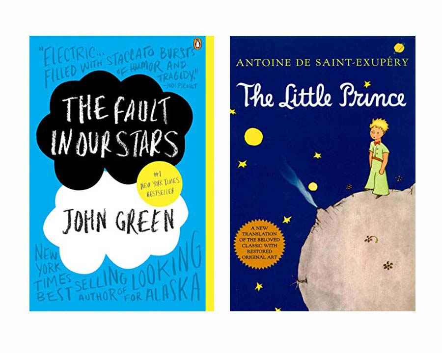 But of course, distinctive typography isn’t just for books with sequels. The Little Prince, for example, stands out with its whimsical cursive, which captures the book's fairy-tale innocence. And The Fault in Our Stars, with its chalky, handwritten-looking title, evokes the adolescent turmoil at the heart of the story.
4. Professional typography makes books seem worth the money
We’ve talked about the role typography plays both on a book’s cover and within its pages. Now, let’s look at how those two elements work together to create a powerful impression of professionalism.
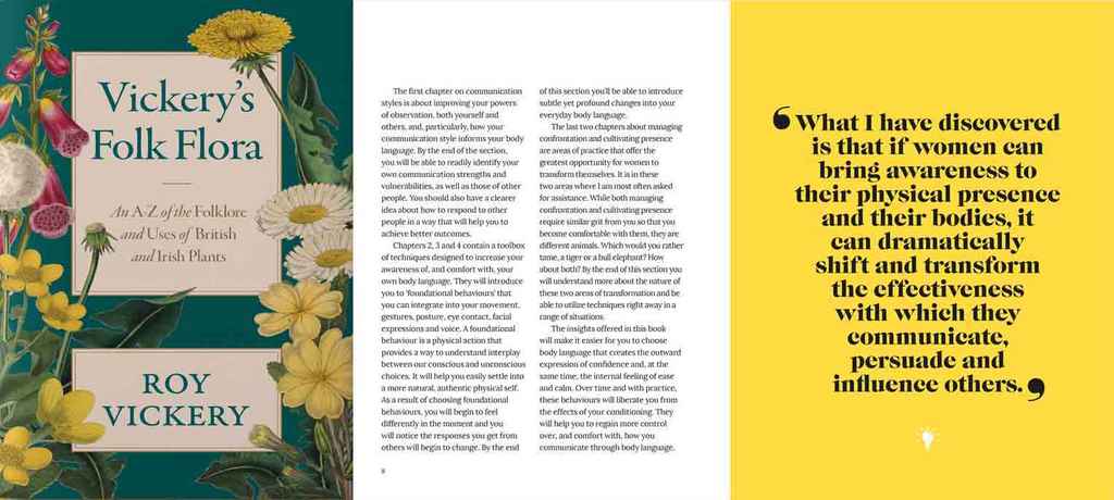
To potential readers, a book’s design — typography included — is a proxy for the time and care the author put into making a quality product. Say they see a lazy Times New Roman title on a cover, or leaf through a book’s pages to encounter Comic Sans. That might make them think the author cut corners everywhere, including in the writing.
That’s where professional typographers step in. Their artistic vision, design chops, and publishing experience all work together to identify each book’s palette of fonts.

JOIN REEDSY
Find exciting new projects
We connect publishing professionals with our community of 1,500,000 authors.
The essential terms of typography
Some typographical terminology, like 'fonts', has made it into the mainstream, primarily through writing tools like MS Word, but that doesn't mean these terms are understood correctly. So before we dive into technicalities, we want to clarify certain terms.
Font and Typeface
Most people who don’t live and breathe typography are under the impression that these two words are interchangeable. In reality though, there’s a subtle distinction. When most people think of “fonts,” they actually mean typefaces.
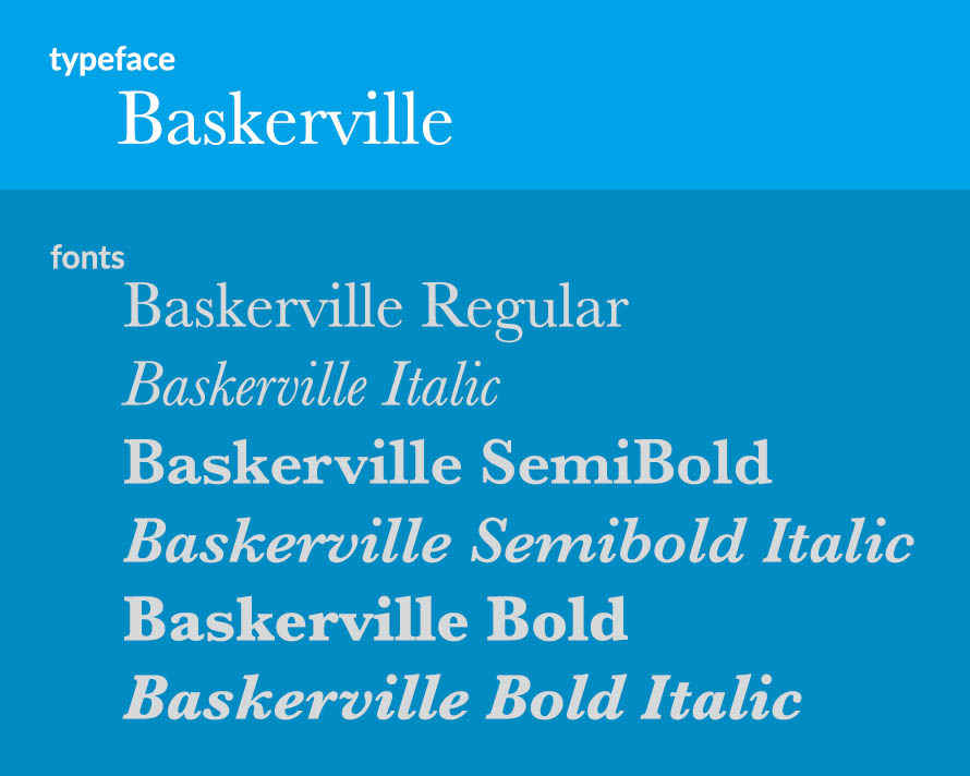
A typeface is a set of letters, numerals, and special characters designed to look a certain way. Times New Roman, Baskerville, Calibri — these are all examples of typefaces. A font, on the other hand, is a version of a typeface, distinguished by its weight (i.e. light or bold) or style (e.g. regular or italic).
Serif and Sans-serif
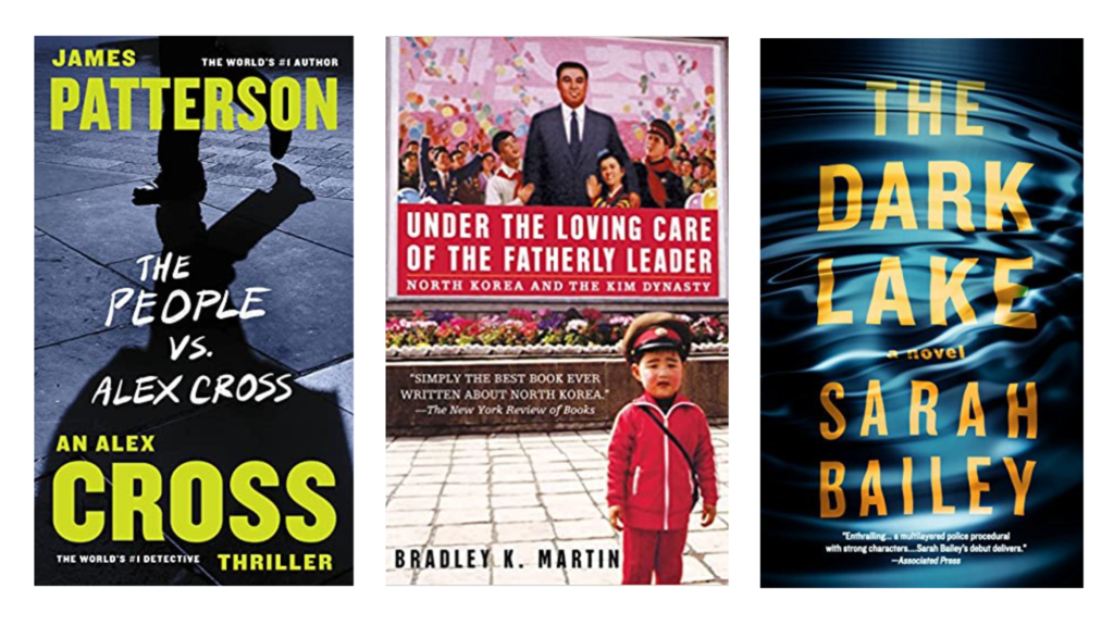
Unlike the distinction between typeface and font, casual typography watchers probably know this one already. Just in case, a serif is a small, decorative stroke appearing at the end of a larger stroke in a character. Typefaces that feature these strokes, like Georgia and Garamond, are called "serif typefaces". On the other hand, typefaces without any serifs, like Helvetica and Futura, are called "sans-serifs".
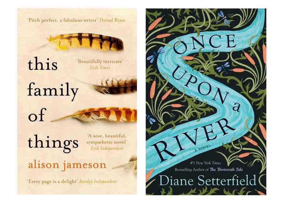
Serifs are often considered elegant and old-world — you’ll see them on the covers of romance novels and historical fiction. Sans-serifs, on the other hand, strike readers as modern and bold. They’re associated with genres like sci-fi and thrillers.
Contrast
Typographical contrast doesn't refer to the "black on white" sort of chromatic contrast you may have in mind. In typography, contrast usually refers to weight contrast, in other words how thin or thick the strokes comprising each letter are. Lighter type is thin and heavier type is bold, with an increase in weight contrast meaning an increase in stroke thickness.
Typography elements 101
Let's move on to the fundamental approaches you need to master first. Here’s a glossary of important typography elements: consider it your cheatsheet to Typography 101.
Hierarchy
In typography, “hierarchy” refers to how type is organized on the page to convey the relative importance of different parts of the text. More important elements are highlighted to draw the reader's attention. In practice, typographic hierarchy means elements like, say, chapter titles are set apart from the rest of the text, perhaps by center alignment, a larger font size, a bolder font, or all of the above.

You see typographic hierarchy at work on book covers as well as in book interiors. When you're looking at a cover, which part of the text generally draws your attention first? Probably the title. That's because it's generally been set apart by bigger, brighter, or more interesting type — or maybe the author’s name if we’re talking about a celebrity or successful author.
Q: What's your process for creating typographic hierarchy in a book design?
Suggested answer
When creating typographic hierarchy in book design, I focus on simplicity and clarity, often following a principle known as "unity of type." This approach ensures that all typefaces work harmoniously to guide the reader through the content without unnecessary distraction.
For example, in the catalogues I design for Neue Galerie New York, I use a straightforward yet effective system. The primary typeface is Neue Bold, a custom font developed specifically for the museum. Its weight and boldness make it ideal for headlines, immediately drawing attention. For secondary text, I use Akzidenz Grotesk Light, which is thinner and provides a clear contrast to the heavier Neue Bold. This contrast establishes a visual hierarchy, making it easy for readers to distinguish between primary and supporting information at a glance.
By keeping the typography cohesive and intentional, I ensure that the design enhances readability and aligns with the overall tone and identity of the book.
William Loccisano
Senior Art Director, Books & Exhibitions
William is available to hire on Reedsy ⏺
Kerning
Typographical kerning decides the spacing between each letter. That might not sound too complicated, but kerning a type involves dealing with problematic letters and characters that most of us don't ordinarily spend much time thinking about. Still, like most typographic elements, kerning works subliminally, by eliminating awkward spaces that could detract from the focus of the design.
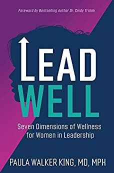
Consider the cover above, made by Reedsy designer Matt Davies — the arrangement of the type in the title doesn't strike one as particularly hard to achieve. But check out what happened when Reedsy's writers tried to replicate this effect: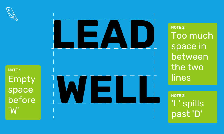
Not so easy after all, huh?
Leading
If you take a look at our terrible typography attempt above, you'll see we've noted the existence of too much space between the two lines. That's what leading is needed for. While kerning takes care of the horizontal spaces between characters, leading (pronounced like ledding) makes sure there isn't too much or too little vertical space between lines. And as you can tell from our humbling imitation of Lead Well's cover type, it's pretty important.
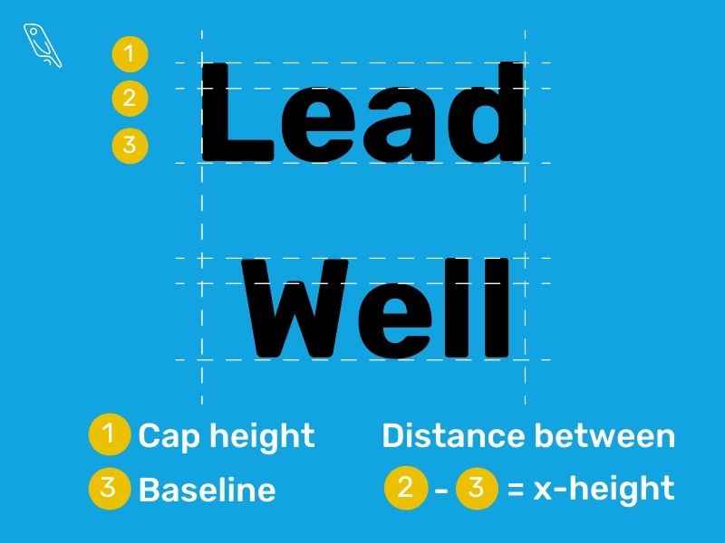
Baseline, cap height, x-height, descenders
When you work with kerning and leading, you'll no doubt encounter these four terms: baseline, cap height, x-height, and descenders.
- The baseline of a type is, unsurprisingly, the bottom line on which all characters sit.
- The cap height is the maximum height allocated to each line, and the one touched by the top of each capital letter.
- X-height is, simply, the height between the baseline and the upper part of the characters' main bodies. Letters that do not exceed the x-height line or descend below the baseline occupy just the x-height: these include e, r, w, u, o, s, a, z, c, x, v, n, and m (though this will vary with each type).
- Descenders are characters that extend below the baseline: p, q, y, g, and j (again subject to type variations).
Let's look at our previous example, laid in lowercase, to clarify these visually:
Aperture
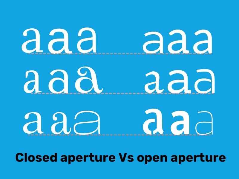
Finally, make sure you know what typographers mean when they talk about a letter or character's aperture. You might be able to guess this one if you're a photography enthusiast, but either way: a character's aperture determines how open or constricted it is, or how much it curls into itself.
This might sound similar to serifs and sans-serifs, but it isn't the same thing — both kinds of type can have open and closed aperture, as you can tell from the examples we've grouped below.
How do you begin making typographic decisions?
Even after you’ve learned the lingo, selecting the right typography for a book can present a challenge. After all, there’s a lot riding on your choices. For that reason, here are a couple of checklists to follow — one for a book's cover, and one for the text inside.
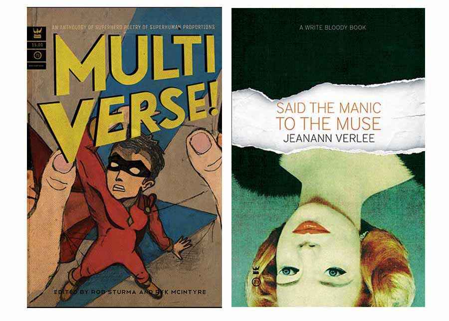
Book cover typography checklist
Make sure the book cover you’re working on turns heads (without making readers shake their heads).
✅ Are you using genre-appropriate typefaces?
Take a look at the bestsellers in the book’s niche on Amazon. Are there any prevailing trends in typographic selection?
✅ Is all the text on your cover readable?
Make sure the title and the author’s name (or nom de plume!) are easily legible. Is your font size large enough for the reader’s comfort? Is there enough color contrast between the text and background to see everything clearly?
✅ Does your cover look good as a thumbnail?
On Amazon, cover thumbnails are around 100 px across, sometimes less. Does the text on your cover look good and read clearly, even at small sizes?
✅ Are you making good use of typographic hierarchy?
The most important text on your title. Unless you’re already a household name, we recommend making your book title bigger than your name.
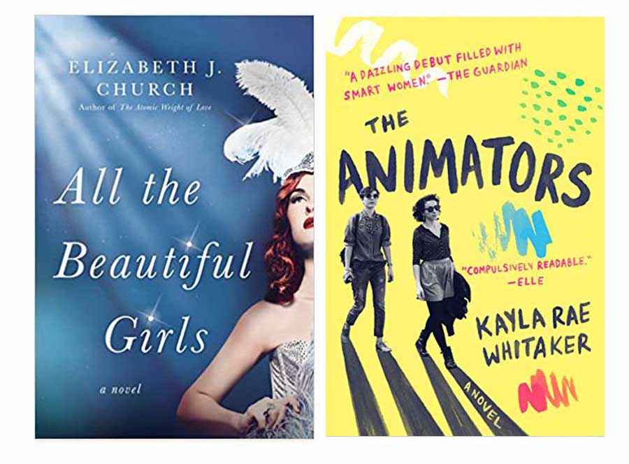
Book interior typography checklist
Check your book's interior for readable, professional-looking text.
✅ Are you using appropriate typefaces?
You won’t have as many typeface options for the interior of a book. But there are still genre conventions to keep in mind. Flip through published books in the book’s niche. Do you tend to see serifs or sans-serifs? You may also want to consider what kind of typefaces predominate for print books versus digital formats.
✅ Is the text easily readable?
Try to preview your text in its published form, whether that’s an epub or mobi file (read more about the different formats here), or a proof of the print book. Your computer screen can be deceiving, and you need to make sure the typeface you chose translates well to the book’s final form.
✅ Have you avoided unprofessional typefaces?
Some typefaces are perfectly readable, but still look sloppy or generic — not what you want for your book. Examples of fonts to avoid include the much-maligned Comic Sans, as well as MS Word standbys like Times New Roman and Arial.
Q: What considerations do you prioritize when choosing fonts for book covers versus interiors?
Suggested answer
Typography on a book cover plays a different role than typography for the interior. Most importantly, the fonts used on the front cover can be (and should be) way more expressive than the font(s) used in the interior. That's because both types of design need to address different design solutions. The front cover is like the advertising poster for a book, trying to attract new readers by piquing interest and inspiring action. Whereas the interior typography first and foremost needs to be highly legible and "invisible" in a way. So the front cover needs to attract attention and lure the buyer in, and the interior needs to deliver the story in the most efficient way, after you've bought the book. Because of those two different goals, the typography of a front cover is to be treated totally different than that of the interior formatting. You could say it's about "attracting" versus "functioning".
I love to pick a font with huge amounts of character that align with the tone of voice of the book. Something bold that stands out and signals what the book is about. And because the font in the interior will be way more subdued or subtle, I always try to "marry" the two by having elements of the cover design flow over into the interior so the contrast between the two designs won't be too high. The common elements can be different from the typography, but it can also mean that the chapter titles will be typeset in the same font as the main front cover typeface. That way you get a nice "visual bridge" that will tie the design of the entire book together and make it one coherent piece of work.
Arjan is available to hire on Reedsy ⏺
First it's important to know the reader's target age and interest. Then the book's genre. At this point it doesn't matter if cover or interior, these will be my first step to consider.
After that the main difference between cover and interior is that cover needs a font that is very eye catching based on the initial considerations.
The interior needs to be clean, readable and have fonts appropriate for text on printed books and ebooks.
Interesting fact: for illustrated kid's books, for example, fonts with a round "a" and "g" are preferable for beginning readers.
The fonts on the covers should help readers identify the kind of book that cover holds.
Veronica is available to hire on Reedsy ⏺
For book covers, I always try to choose fonts that are appropriate to the subject matter. If the book is set in a historical period then I always first try to use a font that is correct for that period. Therefore I wouldn't choose a sans serif font like Helvetica or Frutiger for a book dealing with the Medieval period. Nor would I choose a Blackletter font such as Fraktur (Medieval) if the book is set in the 18th Century. Of course you can only use this logic so far and only if it is appropriate to the theme. Also the font must sit well with the imagery and colours. This is hard to describe as you get a feel for how fonts combine with images through experience. Covers also need to attract attention so typical (but not always) a slightly bolder weight of the font can be used. Or a more ornate font can be employed that wouldn't be suitable for the body text due to its quirks - but that works well for a title line on the cover.
For book interiors, the most important decision is readability. There are a few tried and tested fonts I often return to as they are classics but I don't stick to them religiously. I always analyze the manuscript. If it has many levels of heirarchy then I will use a typeface that has many font weights (roman, bold, display, caption, etc.) so that I'll have options for different types of information - captions, subheads, running headers, fotnotes, etc. If the manuscript is a normal novel, then less weights are required so regular, italic and bold is usually sufficient. Again subject matter is also a consideration. A book about future technologies may require a slightly more modern looking font. But always, always, always readability and legibility.
Wayne is available to hire on Reedsy ⏺
Remember: typography plays a crucial role in making a book look polished. Invest some time and energy in getting it right, and you’ll give readers an enjoyable experience — hopefully turning them into lifelong fans of the author.
Reviewed by Raúl Gil
Illustrator and designer passionate about cover design and visual identity.
After an extensive career (+20y) in multiple areas of design, learning and collaborating with all kinds of professionals, he decided to recover his passion for illustration, dividing his activity between commercial work for clients and more personal projects in any medium in which images, words and/or interaction combine to tell stories.
He enjoys working on projects in which illustration can provide a decisive value. This covers many areas. From offering alternative readings in editorial content to building complete narratives for books and games or helping to consolidate visual identities.
His work is influenced by classic European and American comic books, animation and contemporary illustration, with an important focus on characters and the clarity and legibility of the images. You can visit his portfolio here. He also writes a semi-monthly newsletter.

