Blog •
Posted on Mar 06, 2023
Live Chat: How to Design Characters That Resonate
Below is the transcript from our live chat on February 28th, 2023, where Reedsy’s in-house illustrator, Raúl Gil, and freelancing illustrators Andy Baker and Cristina Dan discuss character design in publishing.
This transcript has been edited for length and clarity.
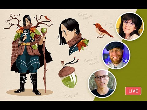
Skip to 6:20 for the start of the discussion.
Origin stories: illustrating for books
Cristina: I started as an art teacher and a father asked for an illustrator for his fantasy book. That was my first project. I loved working on it, and I’ve been a full-time freelance illustrator ever since.
Andy: My first break was an initiative for young comic artists in Birmingham where we could ask questions to comic artists like John McRae and Dave Gibbons and they’d deliver critiques. That was my catalyst to do art. Before that, I was doing a few different jobs. I was working for Apple when somebody came in who wanted illustration work for a school, so I handed out my business card.
Raúl: I worked for editorial projects — especially branding projects and product design — on the art director side of things, working with photographers and illustrators. Sometimes, instead of counting on professional illustrators, I had to solve it on my own. My first illustration project for books happened because there was a need for it. I started with no specific style, adapting to what the book needed at the time. Then, approximately three years ago, I took the plunge and jumped into full-time illustration.
FREE RESOURCE
The Full-Time Freelancer's Checklist
Get our guide to financial and logistical planning. Then, claim your independence.
Character design in publishing
Raúl: I’ve picked some examples to show how characters can be powerful for books in different ways.
On book covers
Raúl: Here, it’s quite obvious that we are selling the book by explaining what the characters are going to be like, the tone, and the target audience. It’s a powerful communication tool.
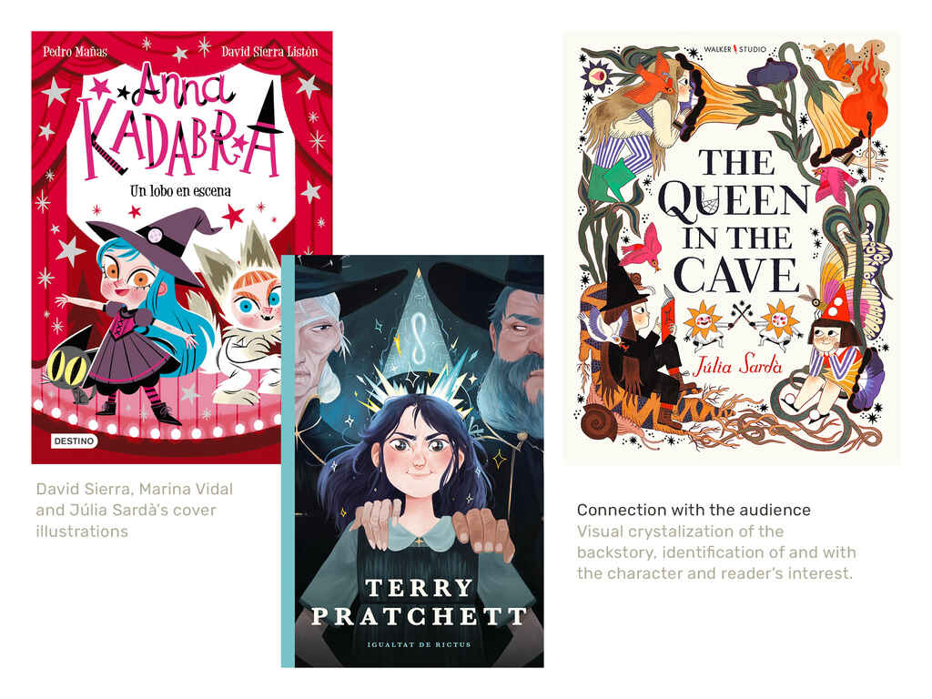
The Terry Pratchett book is part of a serialized Catalan publication where all covers feature characters looking at you. You can feel that something is happening, which builds the story. It’s very evocative, demonstrating how character design can be used for powerful covers.
In illustrated book interiors
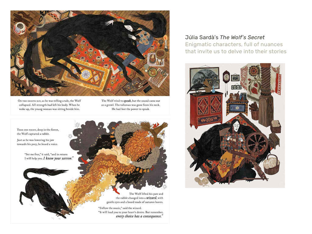
Raúl: Júlia Sardà is a pretty famous Catalan illustrator, working on high quality books. This is one of her most recent ones — The Wolf’s Secret. She uses characters that are very enigmatic, sometimes dark, but full of nuances that invite you to delve into the story.
🎨 Consistent and intriguing character design that propels the plot forward is a central factor for the success of illustrated storytelling in media like children's literature, graphic novels and cartoons, and manga, to name a few.
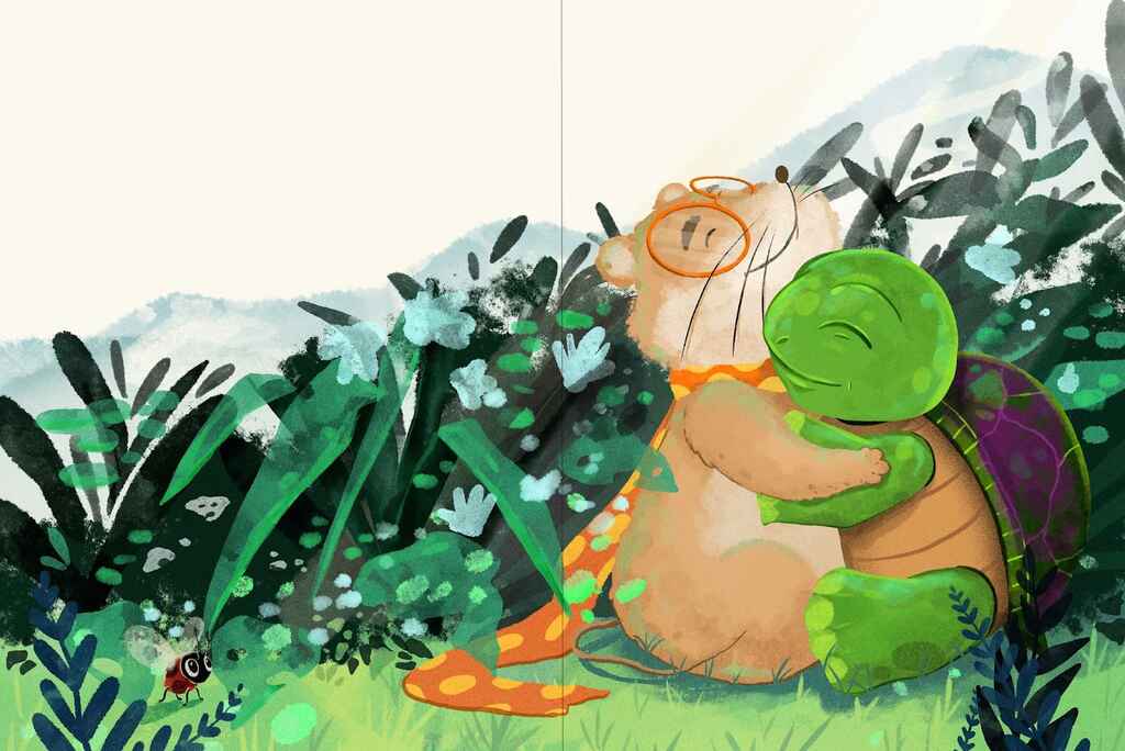
Cristina: This is from a book called The Magical Turtle. I like the purple shell and the connection between the characters — how loving they are to each other.
In nonfiction
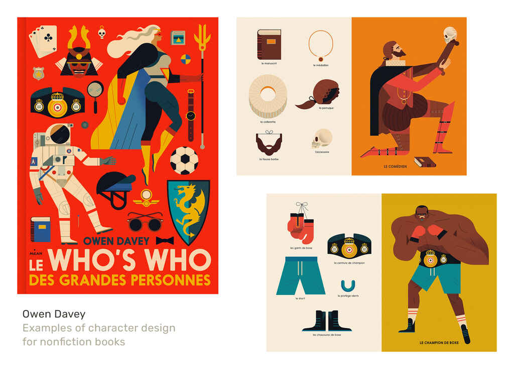
Raúl: Sometimes people think that characters are only good for fiction. But this visual dictionary for children, illustrated by Owen Davey, is a good example of why that might not always be true.
Instead of showing the objects without context, the reader can make associations by dividing the characters up into components. In the case of the boxer, you can talk about the belt and the gloves, while the character itself makes it visually interesting and appealing. Children will probably remember the book for the characters, putting the objects into context and showing how they’re used.
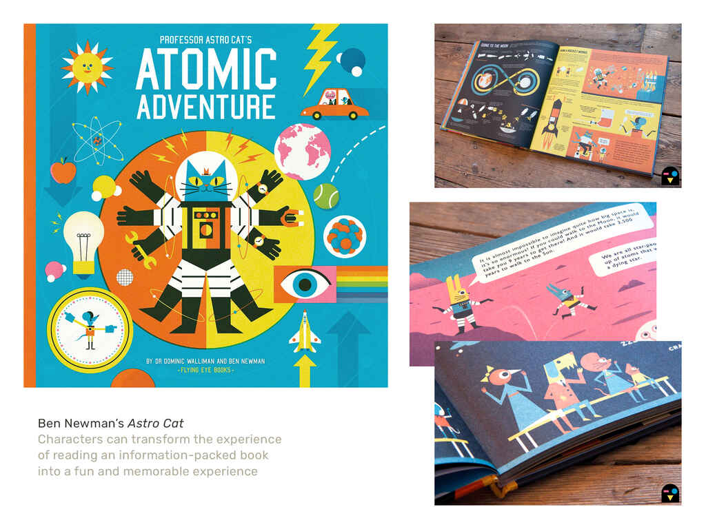
Similarly, this is a series illustrated by Ben Newman. The amount of information is incredible. It's all very scientific and could be extremely boring if it wasn’t for the beautiful illustrations, especially the characters. Parents will be reading along with their children, following the stories of the characters while using different objects to explain. Even if it's about science and data, the characters are transforming it into a beautiful experience.
Good character design
Andy: I don't think there's such a thing as bad character design. There are some awful characters out there, but really, it comes down to personal choice and trends. What's popular today wasn't popular a few years ago.
Generally speaking, I think relatability, readability, and wide appeal [are key]. It has to have appeal in some way, shape, or form — whether it’s the style, the colors, or the clothing: something that makes it not a standard, clip art kind of character. It has to have something different that each individual artist lends to it.
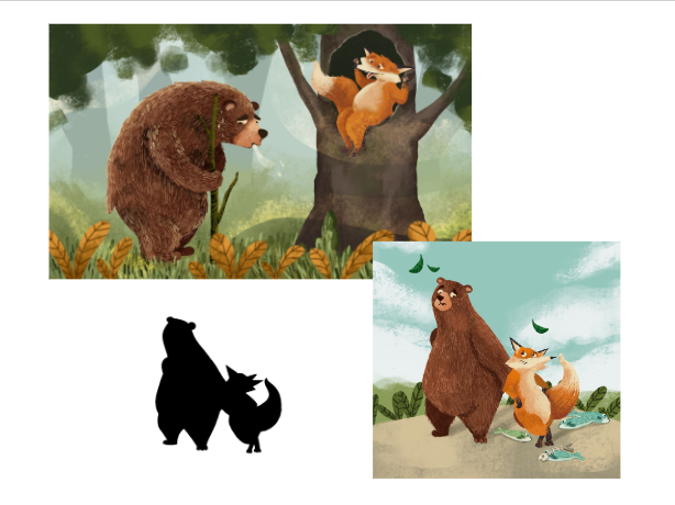
Cristina: Yes, this is a traditional Romanian story called A Bear Fooled by a Fox and what I like about this design is the difference between the characters. One being very tall, the other very short. One rounded, the other with narrow angles. And their personalities are also very different, which shows in the design very well.
Martin: This demonstrates the point Andy was making: the idea that characters have to read easily.
Raúl: It's true that characters need to be visually interesting. They can’t just be plain and average. And to answer the question “what is good design?” I suppose there are some technicalities. For example, if you’re using typography in a bad way, that’s obviously not good design. But that’s perhaps not the most important thing about design.
I think that good design is that which manages to fulfill its purpose or intention. So when it comes to character design, a good character is one that conveys what it has to convey.
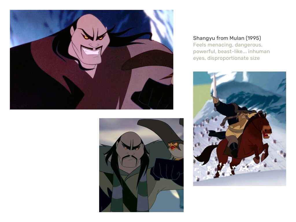 Raúl: This villain from Mulan has to be menacing and dangerous. I think they did great work with it because, from a physical point of view, he's huge. He seems powerful, almost like a beast, and at the same time, if you look at him — even when he’s not smiling — his eyes are not human, with the black mascara and the yellow color, looking at you almost like a bird of prey. He’s extremely menacing, so even if the design is super simple, it delivers what it has to communicate.
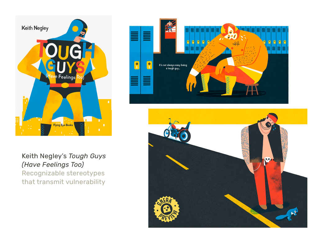
Raúl: This, however, is a completely different case. It's for an illustrated book by Keith Negley called Tough Guys, which I really like. I find it super fun, talking about male feelings and using a lot of stereotypes of “tough guys,” while transmitting suffering and vulnerability in different contexts. You can identify stereotypes very easily; you see the fighter and the guy with a motorbike, and you can start to imagine their backstories. At the same time, something is happening in these scenes which makes you feel that they are in pain. Using generic modals or stereotypes that are easily identifiable is good, if it’s a conscious decision.
Andy: I don’t see that there’s any difference between graphic novels, books, or animation and design, personally. They all still need to appeal and I like simplistic characters. The key difference between print and animation or concept art, I think, is that you have to be a chameleon to be in concept art and animation, as opposed to having a distinct style in print.
Finding your own style and illustration process
Andy: As an animation artist, or if you’re working in concept art, you often have to produce design, after design, after design, while also molding your style to Family Guy or The Simpsons, for example. But I think that allows you to grow as an artist and find your own style too. Your style is an amalgamation between everything you’ve worked on.
You can look at where an animation or concept artist or a character designer were two years ago versus where they are now, and you’ll see how the projects and personal styles are totally different because they’re constant sponges, being asked to draw in different styles every time.
Cristina: Right now, I think I’ve found a good spot with my personal style, but it was a long road until I came here. I'm still exploring my personal art, but when I'm working with the clients, I'm following almost the same pattern every time.
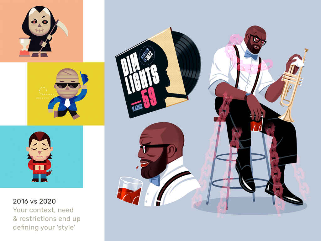
Raúl: I started as a designer and used vectors to illustrate, which kind of defined my style. The designs on the right are very simple, geometric, and flat. When I started looking for something completely different, using other tools, they took a new direction. I think you could even say that these designs are by two different illustrators.
Character design projects
Andy: Through Reesdy, I tend to be brought in quite late in the process, when the author has developed an idea, and a bit earlier for animation projects because I have experience with scripting and storyboarding. For school projects, I’m involved in the very early stages, doing workshops and teaching the kids. I love those kinds of projects because it gives you a grassroot approach, but for me, there’s no blueprint. Each project is very different.
With Reedsy, it tends to be [straightforward commissioned designs], which is quite nice. It keeps it simple. I just have to draw, rather than develop ideas from scratch. With that said, I still find myself making suggestions for things to tweak, because I can’t put my story hat away.
Martin: Cristina, for picture books, the designer is sometimes described as the director of the book. You’re taking the script and you’re choosing the costumes, the actors, the lighting, the backgrounds, and the sets. How much guidance do you tend to get from your clients and how prescriptive are they with what they want to see on the page?
Cristina: It depends. I love when authors give me creative freedom, but no two people are the same. Every author has their own way to do things and some of them guide me more while some of them give me more freedom.
After I read the story a couple of times, I make my first sketches, draw the full storyboard and send it to the author. From there, it’s a back and forth with the author.
Andy: The work I do through Reedsy tends to drift towards the comic book style. Accidentally, I’ve done mostly black and white interiors. I’ve got one project at the moment which is a cover as well as the interior, but it tends to be more storyboarding, gags, and cartoons, so it’s all interiors for me.
One of the first projects I worked on through Reedsy was a lady in Florida. She was very open, she didn’t really know what she wanted for the illustration, and it turned out that we had the same silly sense of humor. I didn’t touch the text, but she let me have my creative freedom.
The project I'm on now is a bit more rigid. [The author] knows what he wants the characters to look like and I'm just going with the character description, rather than leading the charge myself.
Experimenting to find the right concept
Raúl: I sometimes do an experiment where I randomize three unrelated concepts from a pre-made list and try to build characters out of them. They can be basic objects, colors, roles, professions, etc. and the point is to try to mix them.
Sometimes it’s super hard and makes you think outside of the box. I think that embracing randomness and the unexpected brings you to interesting places, so that was the main purpose of the exercise.
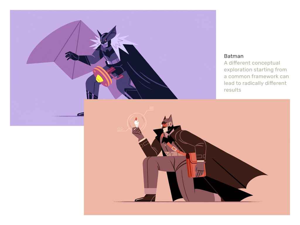
Raúl: Batman is a character that already exists but you can use this exercise to create different situations. I think it shows how illustrators do things differently.
When you start working on new characters, many people just start sketching to find different concepts. For me, sometimes it's useful to write. I feel like illustrators should probably write more, and writers should draw more as it helps explore different concepts. It's what you do when you do editorial illustrations, for example; having a specific main point and then trying to make connections between them, finding some kind of image that ties these different elements together.
That's what I did with this exercise, taking something that we all recognize, like Batman, and trying to make different written explorations; use two models and find the result. They end up working very differently because all the initial planning and concepts were so distinct: a detective and a creepy night creature. They’re the result of the same process and starting point, but with different development.
Martin: Andy and Cristina, when you send concepts to clients, do you send concepts that are radically different to see if the client will bite?
Andy: Yes, I always do that. My default style is outrageously cartoonish at times and I also do caricature, so I always try my default style first to see if it lands. Then, it gets a bit filtered.
Cristina: I always go for my personal style. If someone were to ask me to replicate somebody else’s work, I always say no.
Inspiration
Cristina: Did you watch Gravity Falls, the children's show? I love the artwork in that and it has inspired me a lot. It made me want to illustrate. I think what really drew me to it was the fun part of it. The characters of Gravity Fall simply look very fun!
Andy: I was very heavily influenced by Bill Watterson, the Calvin and Hobbes guy, and Barry Larson’s Far Side. I used to love gag cartoons like Garfield. Those were my early influences. Animation is totally different. Everything by Aardman, like Wallace and Gromit.
It’s interesting with style. My new office friends laughed at the sheer amount of books I brought in. It ranges from Hanna-Barbera stuff to some Bruce Tim.
Andy: There’s all sorts of inspiration, but this is the style I like to work in. Big, bright colors and based on my comic book training. It’s very different from Batman, but this is where I find joy, and I think that’s a big thing. You’ve got to enjoy what you do because if you’re not enjoying it, you're just going to produce second rate work.
Martin: What can you tell me about choosing eyes?
Andy: There’s a lot! The humans got the same eyes, but obviously the dog and the cat got slightly different ones. I think it depends on your character’s motivation. If they're like the villain from Mulan, with tiny, beady, glowing eyes, it's a bad guy; big, blue eyes, with lots of reflection, then it's a baby or something cute.
From a design point of view, there always has to be something that's the same [across characters]. If you've got the same eyeball style and the same ears for your characters, normally that’s enough of a “design theory” to pull it all together, even if some of the characters might look totally different. If they all have the same ears and the same eyes, then you can play with the design a bit more. You can have a much bigger character or a muscly character that wouldn’t really fit in the same universe, but because of the anchor point, you can get away with it.
Developing character silhouette and palette
Maritin: Cristina, going back to The Magic Turtle, what was the brief that you received for this project?
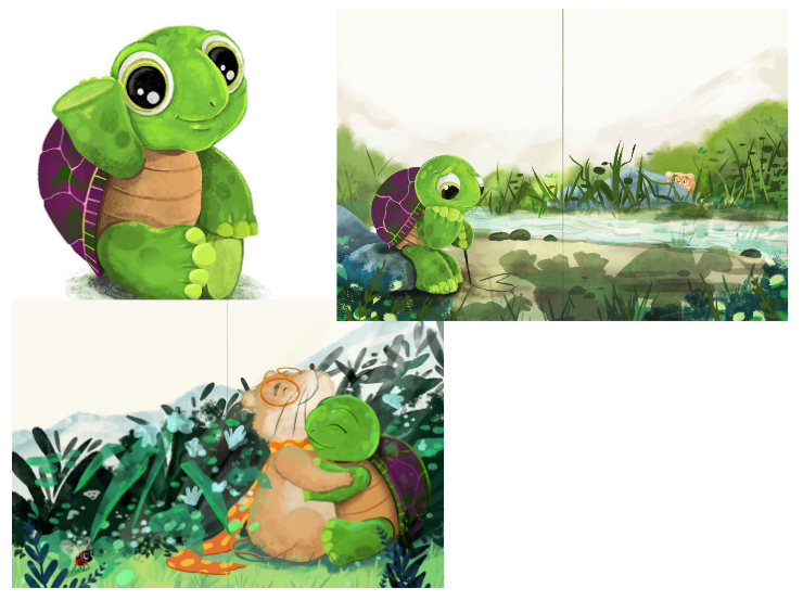 Cristina: It's a story about a turtle who doesn't have any friends, which you can see in the second spread. He’s very sad and lonely, but at the end of the book he finally found his best friend. It’s very important to have consistent characters that look the same on the cover and all of the pages of the book. When developing the concept, I presented two different options for the turtle, but this made the cut because it was cuter.
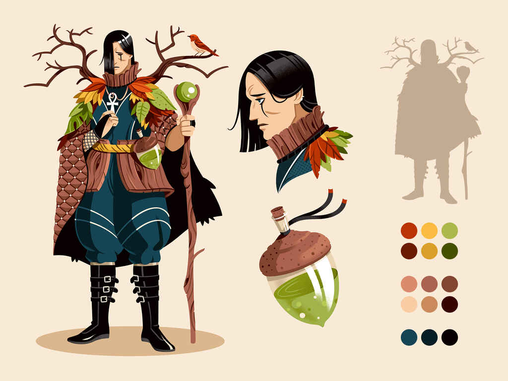
Raúl: This is a character I developed through my experiment. The concepts I got were ‘goth’, ‘tree’, and ‘shaman’ . It's an example of how to make a character exploration and find something interesting, perhaps unexpected.
In this case, there are three levels to the color palette: we have the dark blue and black for the inner parts of the character, all the browns for the skin and wooden elements, and finally, the most saturated and bright colors for the sleeves and smaller components.
The silhouette is like a bell with the cape, then there are branches which make it feel like a tree. There are some details for the face and objects which the character might be using as well.
Martin: Andy, do you tend to establish a palette before you start?
Andy: Sometimes, if it’s for a particular genre. If it’s for a Western, you’ll know which direction you’re going. But I tend to do my artwork and then try out different colors. You can stumble upon happy accidents and find your color identity.
Cristina: I try to keep my color palette narrow, while also creating a colorful book at the end. I pick my colors when I do the cover and then go with those for the interior as well.
Stereotypes and generic solutions
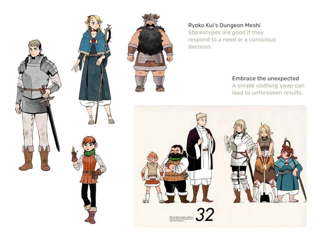
Raúl: This is an example from Ryoko Kui’s manga series Dungeon Meshi. The story is very unexpected, but the characters are quite stereotypical: the classic knight, the elven mage, the dwarf warrior, etc.
[Kui] is using stereotypes that are very clearly identifiable, expressing that adventurous, classic Dungeons & Dragons vibe. If you analyze it, there’s nothing super special about the armor or the sword of the knight. But, I think that’s good in this case, because you know what to expect, you can identify the different roles they'll probably have, and their specific position in the group. But then it’s not like that at all in the story; it plays with those stereotypes.
At the same time, on the right, she did an exercise with the characters, swapping the clothes. Then we see something really unexpected. The apparently weak, fragile character is the warrior of the team, carrying out super big acts, which makes you ask yourself, “what is happening here?” You want to know more about the character, so sometimes embracing the unexpected, as I said before, can be interesting. It makes it dynamic.
Andy: We wouldn't be doing our job properly if we didn't present clients with options for their characters. If I'm very blinkered, saying “I want it to look like this,” my colleague can come up with something completely different, which I might never have thought of. That’s amazing. And that’s how the film and animation industry usually works: the characters you see on the screen are usually borrowed from all of the artists and then a style is chosen. I think you have to be willing to have pushback from a client and from other people in order to get a better character design.
🤔Looking for more tips on how to create iconic character design? Check out this blog post.
Covers vs interiors
Andy: I think cover work is very different and it’s quite popular in the comic book world to see different art styles on the cover and the interior. The job of the cover is to be visually appealing.
I’m a big believer in “less is more” in comics [interiors]. I like the strong silhouettes. Batman on a ledge with his cape flow in the rain — can't get any better than that. It’s a stereotype, but I firmly believe that stereotypes are good.
If you’re working on a cover, you can spend more time on the details. You can draw all the chain mail and dents in the armor. You can go mad because you're only drawing that character once. Whereas if you are doing sequential artwork for the character, you're probably going to have to filter it down a bit. Even more so if you're animating. The level of detail on the pages of some comic book artists, however, is insane.
Raúl: I think we have a couple of slides that illustrate what Andy said very well.
Raúl: These characters don't have to be super detailed, just expressive, communicative, and flexible. They’re the actors and actresses in your story, so you have to be able to do what you need with them. They are presenting a different set of expressions.
Raúl: Covers are designed for impact. You can play with textures, colors, and details to create more elaborate illustrations. Obviously, it has to be appealing, so you’ll dedicate more work on a single cover image. For non-illustrated books, the characters won’t be used for the interior design at all so you don’t need to do extensive character exploration before either.
Want to meet and network with fellow illustrators? Check out our deep dive into the Society of Children's Book Writers and Illustrators to find out how.
Q&A Session
Do you ever ask authors for supplementary information about the characters? Do you read the whole book, or do you rely on the content of the story or the brief?
Andy: It depends on how long the book is. Character descriptions help. If you get one that says, “a knight of the realm,” that’s useless. You need more information, and an author will have an idea in their head of what the character looks like. Whatever you feel that you need to ask to get the best out of yourself, ask for it.
Cristina: I usually do video calls at the beginning of a collaboration, and if the story is about a child, I will always ask about things like their age, their skin tone, and other things about their appearance that the author wants me to illustrate.
Raúl: The last time I did actual character work, I got a full character profile from the writer. That was useful because even if I'm not going to use all the information, I like to know what the writer has been thinking and created for their character in their head. As long as it's not super restrictive, all the additional information is useful because then I have a lot of ingredients to use and explore, finding different solutions for the same character.
Martin: Very often, authors just want what they want and they'll describe every single detail because it's the one opportunity to see their book come to life.
Raúl: I think in this case authors are considering the illustrator as a tool, and not a collaborator. I don't think you should contact an illustrator to do that kind of work if you respect them as artists, professionals, and creatives.
Andy: I get that all the time; “this guy is doing this, and you see this in the background,” etc., where you’re not describing one image, you’re describing different panels in a comic book. So you need to rein the authors in and say, “Look, I know what’s in your head, but you only have one image.”
I’d love to hear how artists use shape theory to build their characters.
Andy: I teach kids shape theory with sausages and mash, and crisp sandwiches. The sandwich and crisps are triangles and squares, and sausages and mash are oblong, circle shapes. And this is basically the easiest way to describe a character. Triangles for villains, with pointy noses, for example. I’ll build characters out of bread and crisps, because that’s how design works, and it suddenly clicks for the children. Shape theory or shape language, and color language are illustrating 101.
What is your setup?
Raúl: Mine is fairly simple. I work with an iPad, with a support for it and an apple pencil. Then I use my computer to edit on Procreate. I use Photoshop if I want to add some color adjustment or corrections. That's it. One single application, one single device.
Cristina: I use an iPad and Procreate only, including all of the post work and editing.
Andy: I do my animation stuff on Photoshop and Adobe Animate, but all the illustrations are on my iPad as well. At first, it was a bit like drawing with a sausage on an iPad grid. I couldn’t get the precision. But that changed and I don't know many artists that don't use a Procreate and iPad combo.
I can also highly recommend the Sketchboard Pro. It’s a thing that you put your iPad into and it gives you a bit of arm rest and elevates the iPad so you feel like you're working on a retail space.
Are there any big nos when it comes to cover creation?
Raúl: Cover design is a very extensive topic, but a big no if we’re talking about design, not just illustration, is readability. That tends to be something that authors struggle with when they try to create their own covers: choosing the right typography, the right weight, etc. So readability and feasibility are minimums. The most obvious contrast is going to be better than trying to combine two colors that are just too far away and makes it impossible to read anything.
We could share tons and tons of tips for cover design, but it’s very extensive.
Cristina: I’d say to leave enough room for the title. For my first cover, I didn't put the title in beforehand and the illustration suffered.
Raúl: Yes, it’s easy to think you have space to make an illustration and end up not leaving enough room for typography. The illustration and the typographic information should work together. It's the same with the balloons and thought bubbles in comics. You can't design something if you're not adding all the information and playing with all the different elements, including title, the author, and the type you need for the cover.
Andy: That's a big thing for anyone who wants to do comics. Leave room for your speech balloons! A lot of people don't, and end up having to put something really important to the top left corner where readers might miss it. You have to allow for the space to breathe.
Do you recommend any brushes on Procreate?
Raúl: I've been using some of the default brushes for a long time. Then I started using Max Ulichney’s brushes. He’s a famous artist who also creates brushes for Procreate that are quite successful. He has a lot of different kits, and I’m using the Comics MaxPack, I think. If you like watercolors, he has some watercolor brushes which are super good. That’s my recommendation.
Andy: Yeah, MaxPacks, generally speaking, are really good. I use a lot from RetroSupply.co, which is a mid-century type of brush maker. Then there's one pack from True Grit Texture Supply, which I use all the time for my inking, called the Rusty Nib Pack. You can buy it so it works on your Procreate and on Photoshop. That's a really nice brush texture if you like your art to be a bit ‘dry brushy’.
Cristina: For me, I'm using the same five default brushes every time. I'm actually kind of afraid to change them because I feel like they are such a big part of my style.
Andy: Yes, a lot of people ask what sort of brushes you use, and we all have preferences. We like the different aesthetics that some brushes bring to the table, but effectively “a good workman doesn't blame his tools.” You can achieve anything you like with the default brushes on Procreate. They have some really nice inky brushes and watercolor brushes, and they’re designed by the makers, so you know they work perfectly with the device.
I’m terrible because I see all these really nice illustrations and think “If I buy that brush set, I’ll be able to draw like that person,” and it doesn't work like that, unfortunately. You can end up spending a fortune on them. Some of them aren't cheap. I think MaxPacks are fairly competitively priced, but some sell for $40 for a set of brushes.
Martin: Well, we’ve just passed the hour. I want to thank you all for joining, and thank you everyone at home for tuning in as well. I really appreciate it. We'll see you all soon. Goodbye!
JOIN REEDSY
Find exciting new projects
We connect publishing professionals with our community of 1,500,000 authors.
For more professional insight on topics like on how to showcase your experience, get more freelance clients, or notifications about events like this, subscribe to our Freelancer newsletter or follow us on LinkedIn.