Blog •
Posted on Aug 27, 2024
Live: Breaking into Cover Design as an Illustrator (Part 1)
About the author
Reedsy's editorial team is a diverse group of industry experts devoted to helping authors write and publish beautiful books.
More about the Reedsy Editorial Team →Below is the transcript from our live webinar on Breaking into Cover Design as an Illustrator (Part 1), held on September 24th, 2024 with guest speakers Tim Byrne & Florian Garbay. The talk discussed the advantages illustrators have over other designers and how they can break into cover design.
This transcript has been edited for length and clarity.
Getting started as a cover designer
Florian: I started out as a graphic designer and printmaker, creating posters and event visuals. Later, I transitioned to being an art teacher and took on freelance work to expand my client base. That’s when I found Reedsy, where I began designing book covers. Along the way, I’ve worked on projects like board games, music sleeves, and concept art for video games, though some of it is under NDA.
Tim: I worked in-house at HarperCollins. I joined as a junior designer and stayed there for four years. Then I left and went freelance, and I've been freelance ever since. During that time, I've mostly worked on book covers, but I have branched out into other areas like the museum and exhibition space.
Working in-house as a designer
Martin: What does the in-house collaboration process look like?
Tim: When I started 20 years ago, designers would commission illustrators to execute a specific vision. Illustrators were brought in either to match an existing concept or because their style was perfect for a project. For example, a designer might say, "We love Tim's style, let's see what concepts he comes up with."
In publishing, there was a collaborative process involving the designer, art director, illustrator, and commissioning designer. Afterward, the cover would be discussed in a broader meeting with marketing, sales, and editorial teams, where everyone had a stake in the book's cover and shared their opinions.
Adapting your style to fit a niche vs. finding a niche that fits your style
Martin: Did your style decide your niche or did you pick the genre and then fit your style to it?
Florian: I've worked on a lot of horror stories because the genre fits my drawing style, which includes a lot of dark shadows. I've also done many adventure books, heavily influenced by the eighties blockbuster movies that have shaped my life. That influence shows in my work, and when clients approach me, we often share the same vision. So, I know I'll enjoy working on their projects since I'm accustomed to drawing in that style.
Martin: I notice in Eye of the Turtle that your style stands out compared to your darker, more fantastical work.
Florian: I’m always open to trying new things because I have a broad range of interests. While it's easier for me to illustrate characters I’m familiar with, I like taking risks with new topics, even though it can sometimes lead to frustration. As an illustrator, I’m not limited by stock images like designers sometimes are. I can create everything from scratch, bringing a more complex vision and perspective to my illustrations.
Martin: How do projects like Firestorm begin? Do clients bring a concept, or do you develop ideas after reading a synopsis?
Florian: Before starting a project, I speak with the client to understand their vision and target audience. Then, I describe my cover concept — composition, background, colors — and get their feedback before sketching. My process has two stages: a black-and-white draft to show the general mood, followed by adding color and details. That's when the magic happens, as clients often struggle to see the full picture with just the black & white sketch.
Keeping abreast with the publishing trends
Martin: How do you keep abreast with all the trends and know which to incorporate in the project?
Tim: I'm a total bibliophile. I browse around bookshops a lot. That's a great place to see all the latest covers.
I also browse Pinterest and Instagram, follow publishing houses and design websites, and read articles on book jacket design. There's a lot of inspiration out there. For me, it's about finding a way of working that I really enjoy and bringing in a certain style for a particular cover. I’ve recently worked on the Churchill installation with the museum; that was a very different design brief, and a very different look. I was referencing posters from the 1940s and used an airbrushing effect.
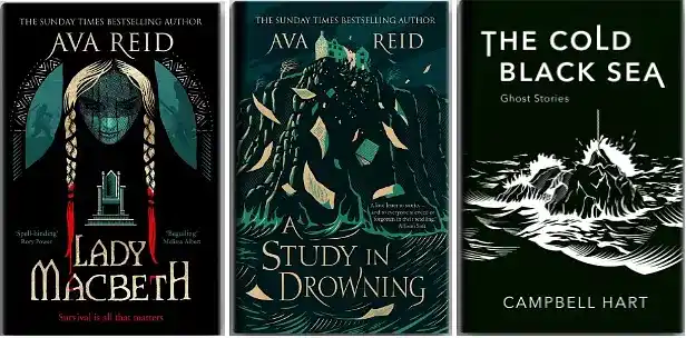
Whereas these — what you just saw there with Cold Black Sea, Lady Macbeth, and Study in Drowning — had more of a wood engraving feel.
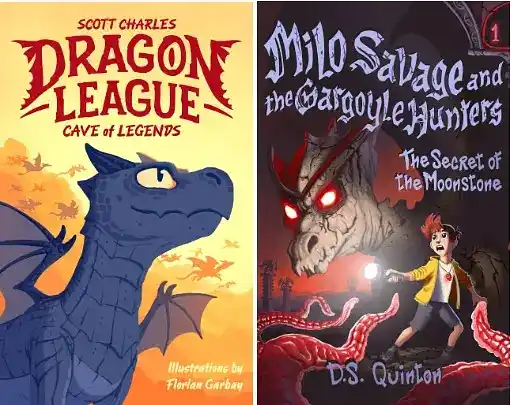
Florian: From what I have seen, the trends in the middle grade space do change a lot. If you look at something less stylized, like a simple adventure book with animals, you will see that the drawings have been influenced a lot by well-known cartoons. There's more spatial awareness on those covers; the sense of depth is greater. In recent publications, we see a simpler design, especially with so much emphasis on selling on online platforms where you just have a tiny thumbnail to deal with.
Get more inspiration for your next book design projects
Using stock images v/s creating custom illustrations
Tim: It depends on what's right for the jacket. It's about the story, the book, and its genre—that's the main decision-maker in choosing which direction to go and which illustrative approach to take.
Looking at other covers in the same area is a real help because you want your cover to sit alongside those. Of course, you want it to stand out, but not so much that it doesn't also fit in the genre.
Managing contrast between type and background
Tim: Typopgraphy is a big part of cover design. Working as a cover designer, you need to be able to harmoniously incorporate that. When you're looking at typography, it's really important to look at how it is working with the whole illustration.
A key advantage for illustrators is that we can seamlessly integrate type into the design, treating it as another element. This creates harmony and a sense of depth, especially by weaving elements through the text.Treating the typography as an illustrative element is important because you can think of what's behind the lettering so that it stands out clearly.
If you just place the typography on top of an illustration or design, it can conflict with a busy area of the illustration, and then you'll have to consider darkening or lightening that area. But if you're thinking abouthow it works with the other illustrative elements from the beginning, then you can make sure that it stands out.
From an illustrator's perspective, if you don't feel comfortable drawing typography from scratch, you can take a font and manipulate it. You can do a lot of work changing elements of the fonts to make them more distinctive and also make them work with the other illustrative elements of the cover.
Determining your quote for a project
Tim: When I send quotes to clients, I assess their brief and think of what the work will involve and the nature of the cover. That's the determining factor for pricing it. I have a range of prices that I won't go below. That's the other thing I would say to designers: know your worth. Another big factor is time — how long it's going to take? All of those factors play into the price.
Software costs should also be factored into your rates. I use Adobe Illustrator daily, which is a bit pricey. Previously, I used Adobe Photoshop, costing €70 a month. Currently, my software is affordable and I aim for a sustainable workload, completing three or four projects monthly. I calculate my living expenses, including taxes, and divide that by the number of projects to determine my rates.
Martin: We discourage the lowest-price strategy at Reedsy because clients usually don't choose the cheapest option. Instead, it’s better if you can offer more value without significantly increasing your effort. For example, you may include an audiobook cover or social media assets with a picture book cover design. This adds value for the client so you can increase your prices without much extra work for you.
Giving advice to your younger self
Martin: If you could go back and give yourself one piece of advice, what would you tell yourself to set yourself up a bit better?
Tim: I’d say, “hire a really good accountant.” That would be my primary advice. Also, hire somebody to help you with promotion. Self-promotion and posting on social media play a big part in today’s world.
Florian: I would say to myself, “be more organized.” I had trouble, just today, finding the right file because I was so badly organized two years ago.
Q&A session
How do you balance multiple projects at the same time?
Florian: To balance multiple projects, you just have to be organized. Some projects will take a lot of time, and you have to reserve time for them. When I start my week, I look at my calendar and schedule time for everything, which I try to stick to. Sometimes things don't go according to plan, and I have to take that into account as well. You also have to factor in time for just thinking about an idea.
I don't work too much each week, maybe a maximum of 40 hours. So it's not impossible to balance multiple projects, you just have to organize yourself at the beginning of the week.
Do you recommend having an agent?
Tim: Not really. It's a good thing to consider if you're working purely as an illustrator. As a cover designer, it's not necessarily needed.
How do you get your very first client?
Florian: I worked for someone else because he didn't have the time to do a new project. So I just proposed myself to do it because my style fit the project. So networking is a great start.
How do you ensure that you get money in return for your work?
Martin: This is one of the assurances Reedsy provides. We take a deposit before the work begins. We handle payment collection and client follow-up, which are tasks that freelancers often have to manage themselves.
Florian: It has never happened to me because I ask for money before starting work and before sending the final files. If they don't pay me, they don't get anything. That's the deal. And I've never had anyone object to this idea. They simply agree to pay me.
Tim: I haven't had any problems. But I would say that I do quite often chase payments. Sometimes payments get lost or delayed. It's always good to send a follow-up email to check if you are going to get paid within your timeframe. I know a lot of freelancers who offer a five to ten percent discount if clients pay within two weeks of invoicing as a way to try to encourage people to pay up so they don't have to chase.
JOIN REEDSY
Find exciting new projects
We connect publishing professionals with our community of 1,500,000 authors.
For more designer tips and resources on how to become a cover designer, the impact of a good book design, or notifications about events like this, follow us on LinkedIn.
Reviewed by Linnea Gradin
The editor-in-chief of the Reedsy Freelancer blog, Linnea is a writer and marketer with a degree from the University of Cambridge. Her focus is to provide aspiring editors and book designers with the resources to further their careers.
As the editor of Reedsy’s freelancer blog and a writer on the Reedsy team, Linnea has her hand in a bit of everything, from writing about writing, publishing, and self-publishing, to curating expert content for freelancing professionals. Working together with some of the top talent in the industry, she organizes insightful webinars, and develops resources to make publishing more accessible to writers and (aspiring) publishing professionals alike. When she’s not reading, she can be found dribbling on the football pitch, dabbling in foreign languages, or exploring the local cuisine of whatever country she happens to be in at the time.
