
Blog •
Posted on Aug 03, 2022
Live Chat: The Book Cover Design Process
About the author
Reedsy's editorial team is a diverse group of industry experts devoted to helping authors write and publish beautiful books.
More about the Reedsy Editorial Team →Linnea Gradin
The editor-in-chief of the Reedsy Freelancer blog, Linnea is a writer and marketer with a degree from the University of Cambridge. Her focus is to provide aspiring editors and book designers with the resources to further their careers.
View profile →Below is the transcript of the freelance webinar on July 27, 2022.
Guests:
Patrick Knowles has 30 years of experience designing book covers for top publishing houses around the UK and has worked on covers for authors such as George R.R. Martin and Charlaine Harris. In addition to book covers, he is also an illustrator and lettering artist.
Sarah Lahay (neé Beaudin) is a book cover and marketing designer who started out in theater design and has been in the publishing industry for 11 years. She works across all genres, and when she’s not stuck with her nose in a book, she also designs marketing material and posters.
This transcript has been edited for lenght and clarity.
Skip to 9:12 for the start of the discussion.
Origin stories
Sarah Lahay: I started with a Bachelor of Fine Arts in theater design and production, but I realized I didn't want it as badly as everybody else around me, which meant that it was not my passion — it was just a job. So I needed to take some time and find my passion, which was books.
The skills I picked up during my Bachelor's are completely transferable; design concepts are the same no matter what medium you're working in, as is production management. It's just now, instead of talking about types of lamps, I talk a lot about paper types.
I worked as a book cover designer in traditional publishing before the pandemic and before most publishers were comfortable with remote work. But my partner works for the circus, so when he hit the road full time, I needed to have a job that let me work remotely.
I became a freelancer with Reedsy in 2018.
Read more about how Sarah Lahay travels with the circus as a freelance designer in this story.
Patrick Knowles: I went to art college and started off doing magazine design, but I always wanted to do books. I got into publishing through an old college colleague who was working for a children's publisher and then built up from there.
I’ve worked in-house for HarperCollins and Hodder & Stoughton and many other big UK publishers. It’s been an interesting, not always straightforward journey.
JOIN OUR NETWORK
Supercharge your freelance career
Find projects, set your own rates, and get free resources for growing your business.
1. At the Glass Wall (Patrick)
![]()
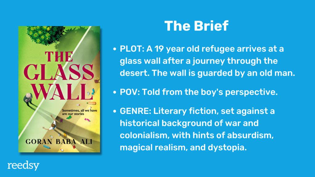
Patrick Knowles: One of the things that really appealed to me with this project was that it deals with the issue of immigration and alienation. I was really fascinated by the whole subject. This really stood out as being something different and original and current.
Pin down genre
Patrick Knowles: One of the first things I had to get the author to do — and this is quite common — was to pin down the main genre. Because genre is a kind of communication. If you go into a bookshop, the genre of the book should really shout out at you.
Spy thrillers or chick-lit often have very distinct characteristics but literary fiction tends to be a lot broader and expand out to give more creative possibilities. So you have to really talk to the author.
With this brief, there were quite a few things that he was talking about — magical realism, politics, etc. — so I had to ask him what the main thing he wanted to bring out of the book was. Because the cover can really only focus on one thing.
Q: What role does genre play in your initial design decisions?
Suggested answer
![]()
Genre serves as a crucial foundation for my initial design decisions, acting as a framework within which to innovate rather than a rigid set of rules. As both an illustrator and published author, I understand how genre conventions shape reader expectations while also seeing opportunities for creative distinction within these boundaries.
When approaching a new project, I first analyze current successful covers in the genre, identifying key elements that signal genre membership to readers. For romance, this might mean focusing on emotional connection and relationship dynamics, while for thrillers, I emphasize tension and mystery through composition and color choices. For fantasy books, I balance magical elements with character focus, ensuring the cover promises the right kind of adventure to readers.
However, my understanding of storytelling helps me go beyond surface-level genre conventions to capture each book's unique essence. I combine genre requirements with innovative visual approaches, using both traditional and AI-enhanced techniques to create covers that feel fresh while remaining marketable within their category.
Sergey is available to hire on Reedsy ⏺
Coming up with a concept
Patrick Knowles: The author talked a lot about this glass wall where one side is desert, dust, and rubbish, and the other side is like a paradise with greenery, and a lake. So immediately I had an image in my mind. I wanted to bring out the contrast of these two worlds on the cover. And of course the glass wall was a visual trope I could use to weave into the design.
I was thinking about how to represent the alienation of the immigrant on one side of the glass wall and the man on the other side, and being trapped behind the glass wall, trying to get through to the world on the other side. And more practically, should I show the wall from the top or from the side? What would be the most interesting angle?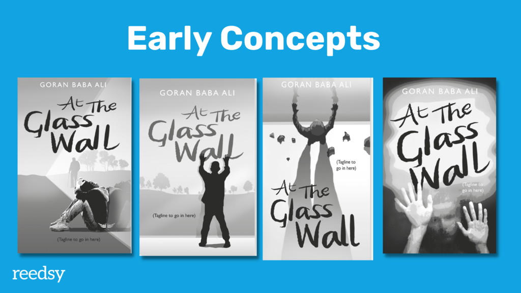
Working with the author to get the right tone and feel
Patrick Knowles: Often, clients will include book covers in their design brief to give a sense of the kind of feeling they’re after, because feel is really important. People might not be consciously aware, but if you go into a bookshop, you will be drawn to books that feel good to you. They look good, but they also have a feel about them — whether it's horror or poetry, it's often the aesthetic feel that you want to build on.
This author didn’t include any covers in the brief, so I sent him two examples just to show what kind of color palette I thought would be good for the book.
Patrick Knowles: The initial starting point is so important to get right. You can easily go down a rabbit hole if you're not careful. If the author isn’t clear about what kind of market they're publishing into, it's really hard to pin down.
Sarah Lahay: I think that a lot of people often don't even know what to ask for in their brief, if they're not from the traditional market. The Reedsy brief that comes with the quote request prompts them to go through the things that they need to consider, but not everyone knows how to fill out that information correctly. They get a little bit genre-confused.
Sometimes they don't attach covers that they like, or that they're inspired by, so I find it's really helpful to start the communication right off the bat with a client call. Once I've booked a client, I always have a face-to-face or voice call with them to go over the technical needs of their book, their target market, their genre, and what they want to accomplish with publishing this book. Basically, who they’re trying to reach and how.
Q: Can you describe how you collaborate with authors to refine cover concepts?
Suggested answer
![]()
My collaboration process begins with a detailed creative brief that draws on my experience as both an author and illustrator. I understand the deep personal investment authors have in their work, having published five books myself, so I approach each project with empathy and professional insight. The process starts with thorough discussions about the book's themes, target audience, and the author's vision.
I provide multiple initial concepts, usually 2-3 distinct directions, each accompanied by detailed explanations of the design choices and their marketing implications. My two free revision policy ensures authors feel confident in the process, knowing they have room to refine the chosen concept. During revisions, I encourage specific feedback and maintain clear communication about how each change serves the book's goals.
Throughout the collaboration, I share progress updates and explain my design decisions from both an artistic and marketing perspective. This transparent approach, combined with my understanding of storytelling, helps build trust and results in covers that authors are proud to represent their work.
Sergey is available to hire on Reedsy ⏺
Feel always becomes part of that. My favorite question to ask authors is “what is the feeling you want someone to have when they first see your book cover?”
A lot of people start off really broad, saying for instance “I want them to be curious and intrigued.” But that's kind of a side feeling. So I ask them “what’s the emotional resonance of the book?”; “what’s the emotional journey?”; “will the feeling readers have when they start be the same as when they close the book?”; “does it start with hope and end with hope or is it just dark the entire time?”.
With these questions, we can work backwards to the initial impression we want readers to have from the cover.
Refining the concept
Martin: Going back to At the Glass Wall, what’s the next step after the author has chosen a concept that they like?
Patrick Knowles: Once you’ve settled on a concept, it’s a matter of taking it into color, looking at different typefaces, and whether you want to use photography or an illustrative style
For At the Glass Wall, we wanted it to “sit back” a bit from reality, and an illustration was a perfect way of doing that. So I created these visuals mixing my own drawing and stock images. We felt like the vertical view of looking down on the wall from above best captured the division between the two worlds.
This was one of those books that seemed to happen quite quickly in terms of coming to a decision. I think the author saw the possibilities. With some authors, you have to fight more for your design because sometimes they like things for the “wrong” reasons. So you need to have this conversation that Sarah mentioned, where you direct the author in a path that will lead them to a good conclusion, helping them to be part of that process without dictating.
Sometimes you have to compromise and you don’t get the cover you think is the best one, but that’s part of the process. They’re paying for it so they want to be part of that.
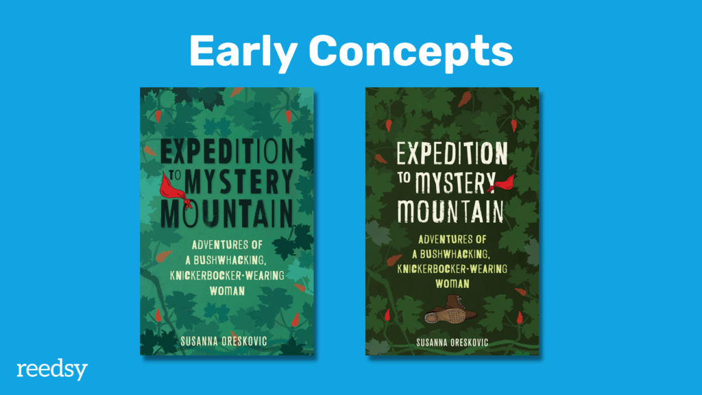
2. Expedition to Mystery Mountain (Sarah)
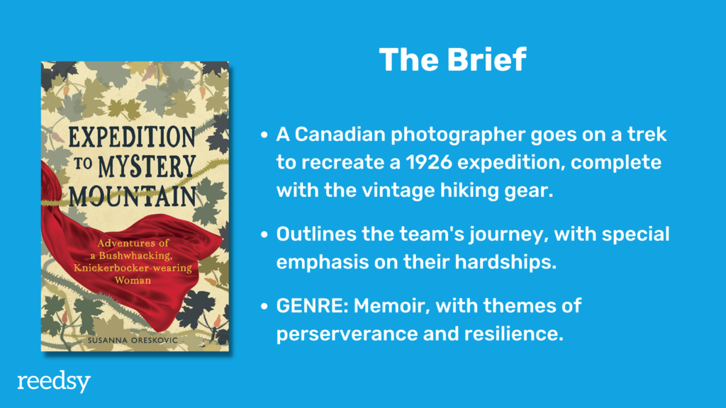 Sarah Lahay: As a cover designer, this was a fun project to work on because we started in one place and the end result is incredibly different. We had our first meeting and talked a lot about what the book is about. I did some reading of the book, but I didn't get all the way through the book before we started working on the design.
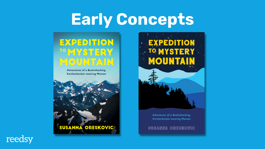
Sarah Lahay: We started off with concept 1, which is very inspired by national parks posters, and a national geographic feel. It features the top of the mountain that they go exploring — Mount Waddington in BC — but it turns out it's not the right direction, since they don't actually make it to the top of the mountain. Instead, the book has a lot of scenes going through the valley, and there’s a recurring scene in the book where, at the end of a day of hiking, they build their camp and come together and reflect on what's happened.
That’s where concept 2 came in. This is a bit more down to the ground, with the low mountain in the background. And even though the author is a photographer, we really wanted to go with an illustrative cover because she didn't want to give away the pictures that are in the book right off the bat.
This tree outline is actually based on a photo that she took, but it still wasn't giving quite the right vibes because this still has that ‘expansive expedition’, ‘top of the mountain, ‘sky’ feel, and the story, when we got to the heart of it, is about trudging through the valley.
Sarah Lahay: We wanted something that was a bit more down to earth, quite physically. That’s how we got to concept 3, which is kind of the direction that the book stays in. This captures one of the hardest parts of their journey where, before they call it quits, they are going through a valley that is absolutely filled with devil's club, which are these huge towering plants that are so sharp and prickly they scrape everyone into shreds.
I tried to create an image that gives that sense of depth, like you're going through it. And the author was really keen on focusing on the word ‘bushwhacking’ so this design is literal ‘bushwhacking’ — like climbing through the brush.
We also threw in her silk scarf that's a part of her vintage uniform and what the original explorer Phyllis Monday was wearing when she went on the adventure in 1926, starting to tie in elements of her personal story into the design.
In concept 4, you can see how we tried a couple different color schemes and added the hobnail boots. But it still wasn’t quite clear enough — there wasn’t enough focus on the story at this point.
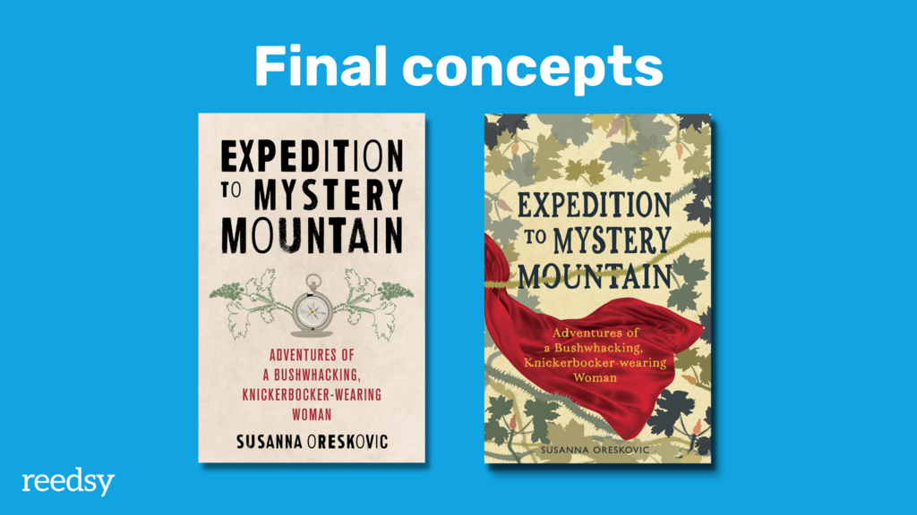
We tried another direction again with concept 5. To me, a compass is always a good place to go when it’s literally an adventure story, but also about self discovery. So we drew in an old fashioned compass and the devil’s club, in a different style. But this felt entirely too modern and a little too far off the beaten path.
In the end, we used this vintage 1920s color scheme but went back to one of the previous versions, with layers of devil's club. It’s not super realistic in terms of the different colors, but it brought together all of the elements that the author was loving — a piece of her costume, that vintage 1920s feel, and that very earthy part of the adventure.
Martin: How long did this project take from start to finish?
Sarah Lahay: This one took about two months. It was a bit longer than we had initially planned for the collaboration, with the illustration changing so drastically from beginning to end.
Sometimes you just knock it out of the park and your author loves version two and you can proceed with a couple of changes. Sometimes your collaboration really is about coming back to the drawing board together and reworking it so that you're telling the story from the correct angle.
Are you able to read every book you design for?
Sarah Lahay: It really depends on the project. I like to read as much of the book as possible because it gives you a sense of nuance. You can get really into the details and pull out what you think is important in the story, which might not be what the author initially said.
But unless I'm also doing the interior of the book, chances are I don't have time to read the entire book before I start designing. In those cases, I'll do a breakdown with the author so that they tell me their elevator pitch and then I'll read the opening, a bit of the middle, and a bit of the end. Whenever it’s possible, if the time and the budget for the project allow, I will read the whole book.
Patrick Knowles: I almost never read it. I just don’t have time. Often, I request a synopsis so that at least I have a good overview of the story arc. Very occasionally I'll ask for the manuscript. It really depends on the nature of the book. Some books follow a genre so neatly that you know what has to be done and you can draw the salient image out of the author — the kind of tropes that they want on the cover. I like the idea of being able to read, but honestly, I'd be up all night if I did.
Keeping up to date with trends
Sarah Lahay: I like to do a bit of comparative market research every time I start a project, but because I have my finger on the pulse, it's not a deep dive. I'm working on multiple projects every month and I'm staying on top of what's coming out in the industry.
That being said, I will never turn down an opportunity to spend some time browsing in a bookstore, especially as I'm traveling and seeing different bookstores around the world. Even going into a library and seeing what kind of books are out there that I might not have had a chance to work on recently.
Martin: Patrick, do you go to bookshops for inspiration as well?
Patrick Knowles: Absolutely. And obviously Amazon's a good place as well, though you have to be aware they bring out both new titles and backlist stuff. There are also things like The Bookseller over here in the UK and I follow publishers on social media to get a regular view of what's going on in the world.
You do see changes, which is interesting. I saw some changes recently to some major authors of chick-lit over here who, over the last two or three years, have repackaged their stuff. So you see a new shift in styling and that's really important to keep track of. Because while you’re seeing [design concepts] from a contemporary marketing point of view, authors might see it from a completely different angle and you have to show them what’s happening right now on the market to advise them what route to go.
Sarah Lahay: You have to walk a fine line when you're designing a cover and guiding someone through the design process. You want the book to stand out, but it can't stand out so far that the people that want to buy it don't know what they're looking at.
Q: How do you balance creating a standout design with fitting market trends for specific genres?
Suggested answer
![]()
Balancing uniqueness with market fit requires a deep understanding of both design principles and reader psychology. As someone who creates both covers and interior illustrations, I approach this challenge by first ensuring the design speaks the genre's visual language while looking for opportunities to introduce distinctive elements that make the cover memorable.
I maintain an extensive research database of current market trends across different genres, but my experience as an author helps me understand when and how to diverge from these trends effectively. I focus on creating designs that capture attention in thumbnail size while maintaining their impact at full scale, using innovative combinations of traditional and AI-enhanced techniques to achieve this balance.
The key is finding ways to innovate within genre expectations rather than completely breaking from them. Each design decision is made with both artistic merit and market awareness in mind, ensuring the cover stands out while still clearly communicating its genre to potential readers.
Sergey is available to hire on Reedsy ⏺
Patrick Knowles: That's a very good point. Authors will often come at the cover from a purely narrative point of view, but actually, you have to look at it from a design point of view that people will understand. And you don't want to show the whole story on the cover — what you want to do is draw out something from the narrative that will make an exciting and interesting image to draw the reader in. Because if you tell them the whole story on the cover, what's the point of buying the book?
3. Island of Gold (Patrick)
![]()
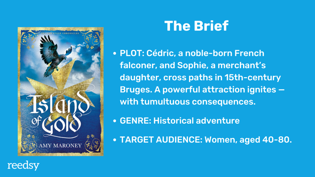
Martin: The next cover is by an indie historical fiction author who wants to diverge from the aesthetics of her first series. After a bit of research, she noticed that a lot of historical fiction uses stock photos of contemporary models wearing period clothing, but she was looking for something a little bit different.
She sent in some covers for inspiration:
Patrick Knowles: Amy had already published before so she knew some of the issues involved in producing a cover, which was actually very helpful. She also understood that you have to present historical fiction in a particular way.
You’ll find with genres that they’re quite broad — there are genres within genres, if you like. So if you're looking at historical fiction, for example, you might have someone like Hilary Mantel, who does extraordinarily good historical fiction. Her cover styling is one kind because her books are very weighty and academic, but also entertaining. What Amy was doing was much more towards historical romance.
Royalty free vs licensed images
Patrick Knowles: With historical novels, there are also specific issues you have to deal with, such as the sense of time. This was set in the 15th century which presents its own problems. How do you find images with the right kind of costumes and ships for that on iStock or Shutterstock?
These things limit what you can do. I've had several authors recently who wanted to do battle scenes, but that’s very difficult to get royalty free — it’s going to cost an arm or a leg. So sometimes you have to go for something else.
The basic principle is that royalty free is a bit like buying something off the shelf in a supermarket, and licensed images are a bit more like going to a specialist. The problem with that is that the license will cost you more because you’re buying the image for a certain period, for a certain number of territories — the UK, the world, etc. After that, you have to renegotiate the license.
The cost will be much higher — maybe four or five times the cost of the royalty free image, depending on what site or photographer you’re using.
Presenting concepts to clients
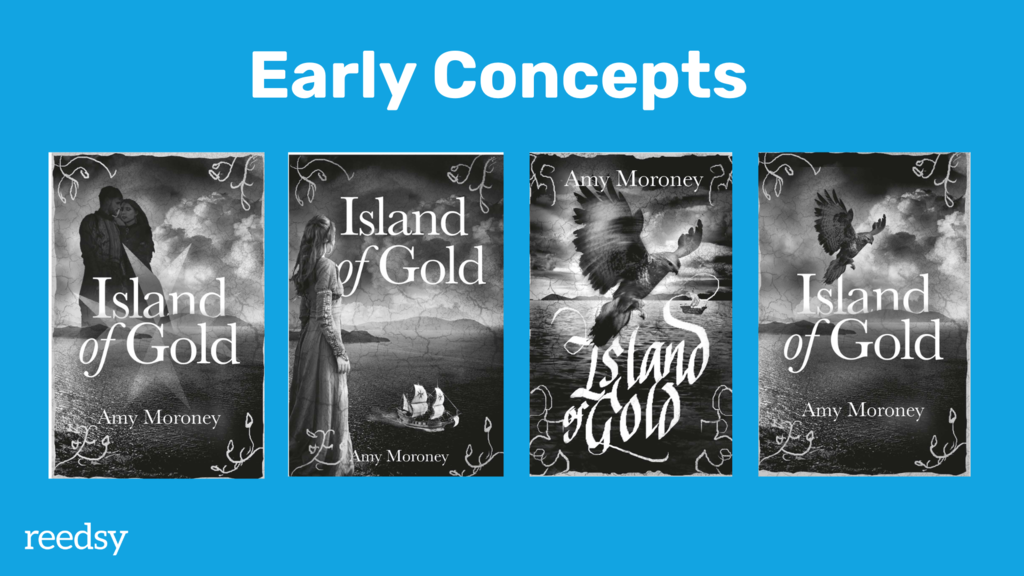
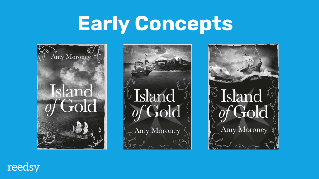
Patrick Knowles: I talked the author out of using human figures partly because of the main issue of period costume, but also because — like she highlighted herself — a lot of historical fiction has a woman on the cover wearing a beautiful dress. And I said, “if you want to do something a bit different, a bit more intriguing, let's move away from that — let's use some of the symbols that are in the book.”
One of the symbols was this hawk, which is quite a powerful image. There was also the maltese cross since it was partly set on Malta. So that became a motif which we decided to use, with the actual island in the background. Then I sketched in a medieval border to add a slightly more romantic feel.
Martin: I noticed that you do the initial concepts in black and white. Is that to save time?
Patrick Knowles: It is a matter of time, and also because I don’t want to show the author too much at the beginning. Otherwise they can start focusing on little details. So I present them as sketches and ideas — or concepts as you say — to get their initial response. Then, in the next stage, we can go into more detail to make it look like a real book cover in color.
Sarah Lahay: I collect three to five different ideas and I don't polish them completely, but I get them close to what they could be and share those.
I always try to give my client one that’s exactly what they asked for (even if it’s not a great starting place), one that’s my interpretation of what I think the story could be focused on, and then a couple in a few different styles. So one might be more type-heavy and one might be more photographic or illustrative.
I share those with my clients so that they can choose one direction to focus on, and then we narrow in on one concept and revise until we get it right. I'm only revising one image, where we really focus on the details. Once we have the overall idea, we check whether the color scheme works, if we want to try a new typeface, or if we should keep the background and the rest of the concept the same, for instance.
This helps keep the process efficient and, like Patrick was saying, it’s really about teaching your client how to clearly communicate what they’re after. Then it's our job as designers to interpret that.
Talking about design with non-designer clients
Sarah Lahay: I ask my clients for “feeling” words rather than any technical language, because I don't expect them to know what kerning is. They don't need to know that tight kerning is what's giving their cover anxious vibes. They just need to know that they're looking for anxious vibes, and it's my job to figure out how to give them that.
Patrick Knowles: Coming on the back of that, I think it's really important to help the author not design the cover. We have to tread very carefully because you want them to be involved, but some authors really want to tell you what the cover should be — but when you show them what that would look like in reality, they realize it doesn’t really work.
Island of Gold might not be the best example of discussing design because the author and I already knew the elements we wanted so it was more a question of what the emphasis should be. We went with the hand lettering because of the historical feel and then it was really more a discussion of tweaking things like the borders (with the illusion of gold foil) and the kind of ship.
But with some authors, you might go through a second stage where you're doing color and they’re being quite specific about very small details that aren’t that crucial. Obviously that eats into the budget because the longer you spend on it, the less you’re being paid for it.
Designing for series
Patrick Knowles: Another thing about Island of Gold was that this was going to be the first of a series. Once we had established that series feel, we could then carry on and do two more books.
Martin: Is a lot of the hard work already done if you've established a brand for the series?
Patrick Knowles: Yes, definitely. Sarah, do you do series as well?
Sarah Lahay: Yeah, I do series, and I find that the first book is the hardest. It’s easier to continue with a series for two reasons. Number one, you've set up your series style; you’re going to keep a lot of the typefaces or border elements the same so that it has a cohesive look. Number two, you've also set up how you're going to communicate with the author, and it's no longer the first time they've published anything. That makes the process go a lot faster.
4. From No to How (Sarah)
![]()
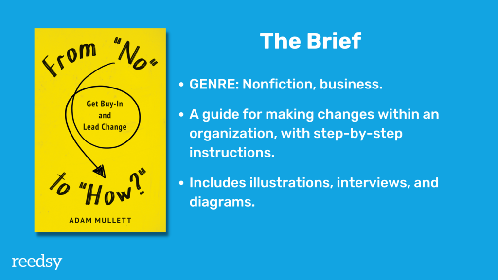
Sarah Lahay: This was a really good client collaboration. Adam came to me because he had seen my work and knew he wanted to work with me, but he didn’t have anything else on the drawing board. We really got to start from zero.
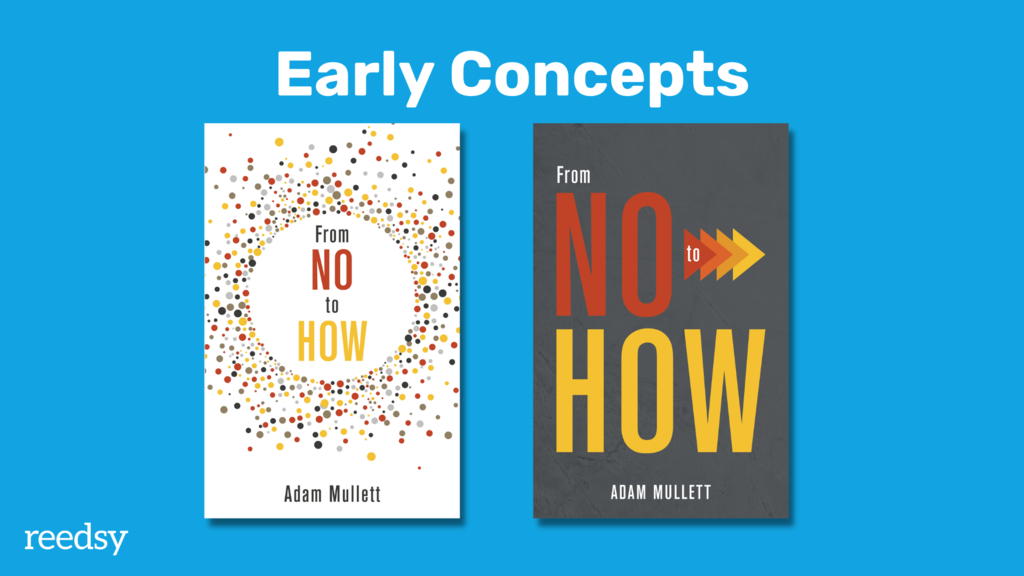
Sarah Lahay: My first idea was having all of these little scattered ideas that you kind of pull together and focus into one thing. This also really fits the genre of business self-help books. But it wasn't specific enough or interesting enough for Adam's writing style and what he was trying to achieve. His book was actually more about giving direction or instructions, and this felt a little bit too big-picture.
From that discussion we developed concept 2, where we started adding in the arrows for a sense of direction or progression. But it was still feeling a little bit too serious. And with a business book, it's really hard to find that middle ground between being taken seriously and also being fun.
I got to work on the interior of the book too, and I found out he hired an illustrator to do all of the diagrams within the book. He also did a bunch of client interviews and instead of including photographs, he had caricatures of each person included. These details all had a whiteboard drawing-style to them. So we took that idea and re-integrated it.
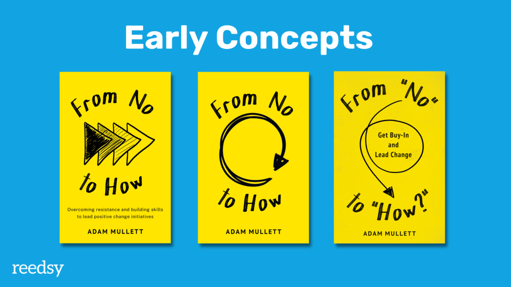
Sarah Lahay: In concept 3 and forward, I used that whiteboard and black marker drawing-style on a yellow background instead of white because we wanted to give it a level of punch, but also a level of fun. But concept 3 felt a little bit too stagnant, despite the progress arrows. So we moved onto a version with a swirl (concept 4), but that felt a little bit too cyclical, indicating progressing from an idea and back to the start — not getting from one point to another.
As we kept working, we got to our final iteration, where I added in some quotation marks, and the author's subtitle. We also added in this loop, which gives it a sense of directional shift, but also a playfulness and a sense that it's not just one direction — it could literally go in any direction — while still giving you steps to follow.
Working on nonfiction covers
Martin: For nonfiction titles like this, you are asked to take an abstract concept that has no physical presence, and create a new, interesting way to portray it. It looks simple, but I can imagine this takes a lot of work?
Sarah Lahay: It’s definitely a challenge to work with a nonfiction book if it doesn't include a photograph. There’s a level of deep thinking that you have to go through that can take a lot of time. But I think that's actually where the fun is, when you get to play with an idea and narrow it down from what it is literally, to what it could be if you get creative with it.
Working directly with the author vs. an art department or publisher
Patrick Knowles: When you design for publishers, you work with the art department — art directors and designers generally — which has its pros and cons.
One of the nice things about working for Reedsy is directly working with the author, which on the whole is a good process. I've maybe had a couple of difficult authors in the entire time I've been with Reedsy, but generally speaking, most authors are really nice to work with.
The thing about working with art directors and designers is they understand the way you think, so you can overcome some of the stages you have to go through with authors. It’s a much quicker process.
Working with publishing companies, you sometimes work with bigger name authors who have a bit of clout. They can actually be difficult, so having an editor and an art director between you and the author can actually be a good thing, because you don’t have to deal with potential problems that arise.
Response from self-publishing authors
Patrick Knowles: Working with self-publishing authors is wonderful since you get to bring their book to life. They’re usually so grateful because you’ve presented it in a way they could never have dreamt of and it looks like a professional, proper book. That’s a great feeling.
Sarah Lahay: For me, it was a nice change to work more directly with people who are invested in the product. I wasn’t really surprised by that, but it’s very satisfying. Working with traditional publishers is a job, but working with people who are self-publishing feels more like a vocation, because you are helping them create their dreams. That’s satisfying in a way that going into an office and working for another department or a third party isn’t always.
FREE RESOURCE
Offer Letter Checklist + Template
Follow our tips to successfully sell clients on your services while setting clear expectations.
Q&A
What factors do you take into consideration when quoting for a job?
Patrick Knowles: A lot of factors, surprisingly. When you read the brief, you quickly get a sense of whether the author is serious and know what they’re talking about — that they can write. You wouldn’t believe the number of badly written briefs that I just turn down. Then, I look at the kind of content they’re writing about, and ask myself whether I really want to do another zombie apocalypse. If it’s a series, that’s good because then you know that you’ve got two or three potential projects in the future. And if it’s a good subject, then great.
Sometimes you can also do a call with the client before the final offer goes in. That does help you get a picture of what the feel of the book is and what the author is like to work with. And, of course, you also have to consider what they’re asking for and what their budget is.
Sarah Lahay: I have a bit of flexibility in my timeline now that I’ve got enough work on my plate, so I like to actually be interested in the subject matter. If it’s a nonfiction book, I want to make sure that it matches my values.
If I’m going to spend this much time interacting with the subject matter, then I also want to know that the client I’m working with is responsive. So when I get a brief, I always ask follow-up questions and whether or not I’m going to take on the project largely depends on if they actually respond to those questions, and the thought that they put into it. Because I want to work on projects that my client is just as engaged in as I am.
Do you supply working files along with the final artwork?
Patrick Knowles: If they ask for them. It’s not very often because most people don’t have the tools to do anything with it.
Sarah Lahay: Unless I’m working with a traditional publisher, I generally state in my offer that it doesn’t include the working files. Then I explain to my clients why that is, if they’re curious.
A lot of people think they want them because they want to be able to make edits later on, but if they don’t have the software they can’t do that. If they make changes to it beyond the PDFs that I send that are print ready, then I can’t guarantee the quality of those when they go to the printer. Whereas if I give print ready PDFs, then I can make sure that the author is getting a final quality product that I can support.
Another thing that a lot of indie authors don’t consider is that if they don’t own the fonts, they’ll have to buy them. Whereas as someone who does this professionally, I already own the fonts for commercial purposes. So it can increase the cost exponentially.
So I kind of talk them through all the reasons why they probably don’t need it and they generally agree. If they still want the files, I revise my quote accordingly.
Martin: I’d be worried that authors would tinker with the files and credit me as the designer even though it’s no longer really the design I worked on.
Patrick Kowles: Most people who’ve requested files are not going to be tinkering with it. They want it for archiving purposes in case they need it later on for reference.
Like Sarah, I also emphasize the font and quality issue. But most of them understand that and it’s very rare that they ask for the files.
If you could go back to tell yourself something at the start of your journey as a book designer, what would that be?
Patrick Knowles: As with a lot of things in life, I’d say be more confident about what you do and take more risks with it.
Sarah Lahay: I would give myself permission to play more. I think we talk a lot about writers being afraid of the blank page, and we forget that designers can sometimes fall into the same trap. As long as you set up your process so that there’s plenty of time to dig in creatively and play and explore, all of that sense of fear or anticipation disappears — you can just play until you come up with the right idea. Make time in your schedule for that and you’ll be a much happier designer.
Martin: Amazing. Thank you so much to both of you for sharing your process and design concepts. It’s been wonderful.
For updates on upcoming webinars with top publishing professionals, subscribe to our Freelancer newsletter or follow us on LinkedIn.

