Last updated on Oct 14, 2025
The 45 Best Book Covers of 2020 — Feast Your Eyes!
Martin Cavannagh
Head of Content at Reedsy, Martin has spent over eight years helping writers turn their ambitions into reality. As a voice in the indie publishing space, he has written for a number of outlets and spoken at conferences, including the 2024 Writers Summit at the London Book Fair.
View profile →While 2020 pumped the brakes on many of us, the publishing industry didn't show any signs of slowing down. With countless new publications this year came a bounty of gorgeous book covers for us to peruse and obsess over. To celebrate a great year in book design, we've enrolled the help of Reedsy's talented book designers to compile a list of the best book covers from the past 12 months.

Get an amazing book cover
Let readers judge your book by its (professionally-designed) cover.
The Best Fiction Book Covers of 2020

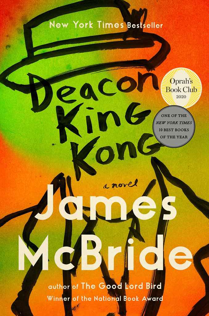
Deacon King Kong by James McBride
We’ll start off with Deacon King Kong, a release from Riverhead (an imprint of Big 5 publisher Penguin Random House). It investigates inter-racial experiences in a housing project in 1960s and 1970s New York. Framing the title with a minimalist brushstroke illustration, designer Jaya Miceli accentuates the vibrant colors that signify these uproarious decades.
Verge by Lidia Yuknavitch
While we’re on the topic of vintage throwbacks, Verge’s stream of colors is another book cover that’s hard to miss. The design is bold and slightly psychedelic — just the right amount of complexity to hint at Yuknavitch's spectrum of short stories centered around people pushed to the limits of life.

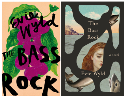
The Bass Rock by Evie Wyld
Designer Euan Monaghan shares with us his favorite picks of this year: two editions of The Bass Rock by Evie Wyld. One offers a pop of color, the other plays with negative spaces. “Both are intriguing and eye-catching,” says Monaghan, “and though two radically different approaches, they each manage to capture the uneasy, almost gothic nature of Wyld's story.
Cleanness by Garth Greenwell
In contrast to the bursts of colors we’ve had so far, Cleanness makes good on its title with a stark photographic image presented in high-contrast black and white. The sans-serif typeface works harmoniously with the peculiar orientation of the photo and the deceptive lighting to create a stunning cover that clearly shows physicality as a central element of this novel.

Cat Step by Alison Irvine
Continuing on with the monochromatic aesthetics, we have Cat Step, an experimental novel from an indie publisher about a mother trying to find her way as a parent. Utilizing fragments of an image (one of the trends we’ve spotted in 2020 book covers), Luke Bird's fiercely contemporary cover design really brings out the internal and external conflicts that Irvine's protagonist must face.

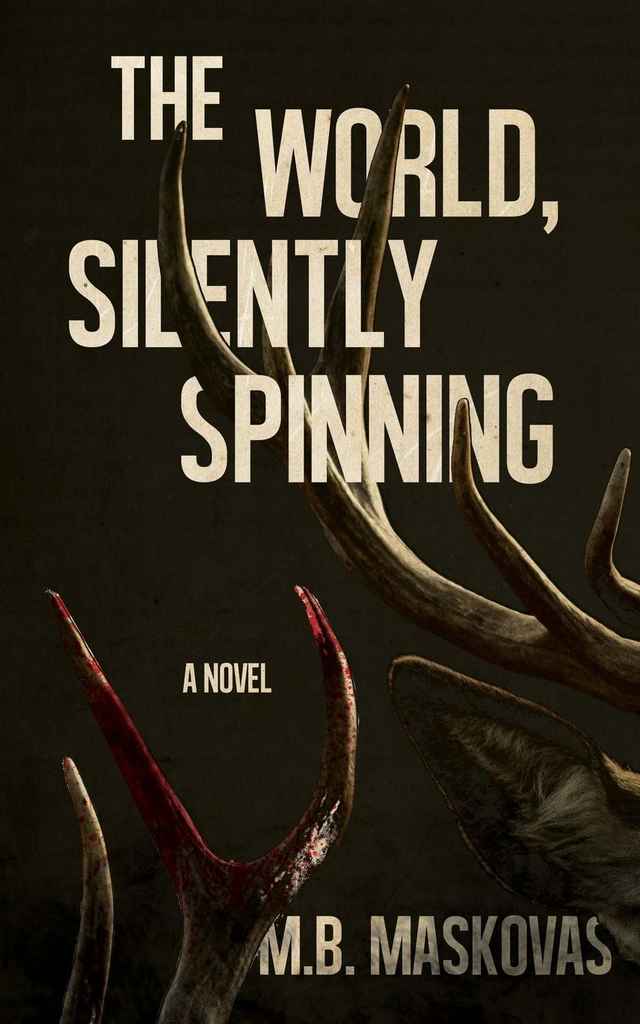
The World, Silently Spinning by M. B. Maskovas
Author M. B. Maskovas commissioned this bold design for The World, Silently Spinning by Matthew Revert after meeting him on Reedsy. Intertwining his text with a tight glimpse of antlers engaged in a bloody duel, Revert creates a chilling, mysterious atmosphere that contrasts the violence of the image with the silence of the title. It’s a little different from his usual, more colorful designs, but it brings the same sinister energy as his hallmark mystery titles.
Meet the best designers in the industry on Reedsy
Steve M.
Available to hire
I've enjoyed creating MG, educational and fiction books for 30+ years. Let's make a book for children, adults, parents & teachers will love!
Florin E.
Available to hire
I am a professional editorial illustration artist and graphic designer, creating a wide range of graphics that can be used for any project.
Daniel G.
Available to hire
I specialize in humorous character focused covers, but my style naturally fits both horror and dramatic works too.
Night. Sleep. Death. The Stars. by Joyce Carol Oates
This book cover of Joyce Carol Oates's latest novel is all about the typography. Jason Anscomb, who recommended this design to us, pointed out how, along with the typeface, “the subtle interplay of the model, the shadows, and the lighting all make this book cover so memorable. It’s like a puzzle that takes a little bit of time to solve.”

Jamie Keenan, the designer behind this masterpiece, happens to be another professional you can meet on Reedsy!
The Party Upstairs by Lee Conell
You can almost see how much fun Stephanie Ross had when she made the cover for The Party Upstairs, which features the kind of paper dollhouse you'd imagine Wes Anderson made as a precocious child. The level of details — from cardboard floors and the different wallpapers, to the intricate decorative paintings on the wall — makes it impossible not to love this design.

Pizza Girl by Jean Kyoung Frazier
Pizza Girl’s cover lives up to the NYT’s review of the story itself: “fresh, funny, and bittersweet.” The color palette’s allegiance to neon adds a burst of energy to the design, itself an ode to the 90s Southern California and its vibrant, pop-culture T-shirts. Simply put, this dust jacket has everything you need to zhuzh up your preppy bookshelf.

My Dark Vanessa by Kate Elizabeth Russell
The color scheme used in this version of My Dark Vanessa is outstanding — a rare overlaying of blue on orange that can't help but attract the eye. By intertwining the blocky texts with the flowy locks of ginger hair, Jo Walker balances the different design elements while also creating a peculiar sense of mystery.

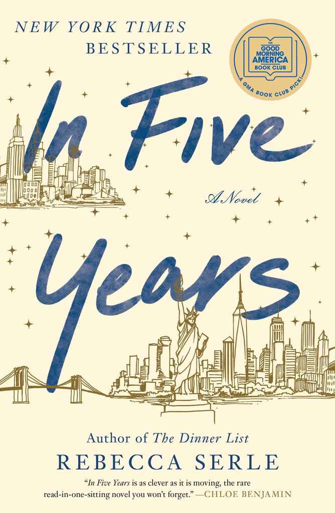
In Five Years by Rebecca Serle
This book cover for Rebecca Serle’s In Five Years was picked by one of Reedsy’s most requested designers, Vanessa Mendozzi. She shared that “the combination of gold and blue colors, along with the typography, is excellent.” It’s a dreamy cover fitting for the dream-like tale told behind it. (And how beautiful are those fine line drawings of NYC?)
Apartment by Teddy Wayne
If you check out Hokyoung Kim’s portfolio, you’ll notice that modern, almost cinematic illustrations are a specialty of hers. In her artwork for the cover of Apartment, her chosen perspective and use of shadows brings to life an urban tenement that holds a multitude of experiences, including a sense of isolation, which is exactly what the novel explores. Designer Patti Ratchford goes along with this, tilting her type and thereby creating a unique and unsettling cover.

Strange Beasts of China by Yan Ge (translated by Jeremy Tiang)
There’s something about the cover for Strange Beasts of China that makes it impossible to look away. From the big feature in the foreground to the magnetically tilted shadows, the cover design seems to illustrate the point of view of the mysterious creature that Yan Ge's cryptozoologist protagonist is on a quest to find.

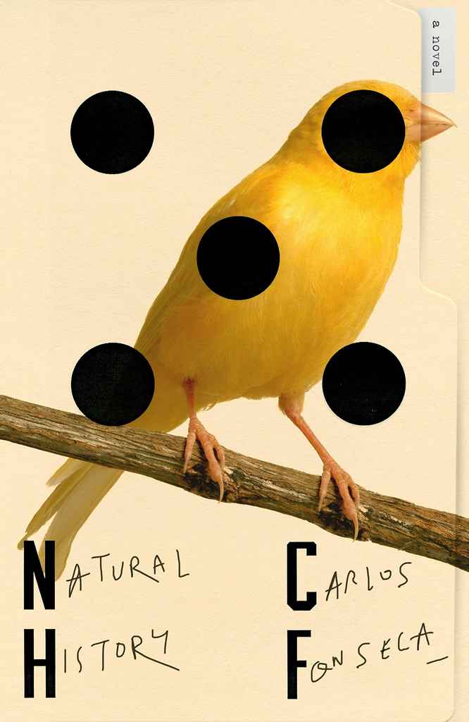
Natural History by Carlos Fonesca, translated by Megan McDowell
Natural History doesn’t sport what you’d call a typical book cover — it features a manila folder, a very sophisticated drawing of a bird, several mysterious shapes, and scraggly writings. In the hands of an amateur, these elements wouldn’t comprise a whole; but with an expert’s skills, they come together to provoke curiosity with a razor-sharp edge. (That's our way of saying that working with a professional cover designer can make all the difference. 😉)
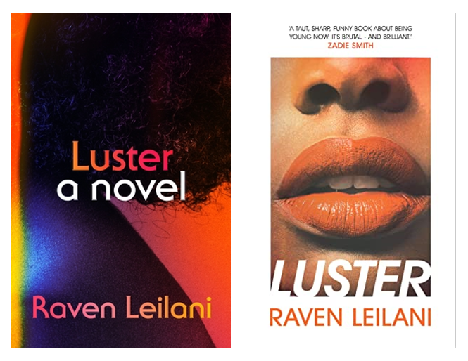
Luster by Raven Leilani
We have another duo for you with these two different editions of Luster. While they employ radically different approaches to color and composition, both versions pull the reader's eye towards physical features unique to Black women in ways that mirror the novel's exploration of the lead character's sexuality.
Weather by Jenny Offill
Weather’s eye-catching collage cover isn’t just pretty. This sophisticated design parallels the fragmentary narrative style of the book — as John Gall shares in his interview with Spine Magazine.

All the Acorns on the Forest Floor by Kim Hooper
All the Acorns on the Forest Floor looks homely and delicate: from the little bird to the lower-case text, the whole book cover gives off a welcoming, heart-warming feeling that pairs well with the theme of family love that runs through the book. It’s just one of those designs that you can easily see hanging in a cozy living room.

Clap When You Land by Elizabeth Acevedo
This novel has been taking the world by storm since its release in May, and the book cover is as beautiful as the book itself. Erin Fitzsimmons’s artwork is like a poster — it’s perfect for its young adult target audience, and also extremely effective at giving us a glimpse of the dual narrative of the book.

The Majesties by Tiffany Tsao
While this book was technically already published in Australia in 2018, it had a different title — Under Your Wings — and book cover. The 2020 edition published by Atria Books features a stunning yet faceless oil painting (portraits are a thing this year, as you may have noticed) against a bright yellow background. It elegantly alludes to the multitude of mysteries and the identity crisis that this volume uncovers — and it certainly wouldn’t look out of place on a museum wall.

Burnt Sugar by Avni Doshi
Let’s take a ride to the other side of the color wheel: Burnt Sugar’s in-vogue purple cover. Against this backdrop, the deeply contrasted thorny leaves can easily catch the eye of passers-by. (To clarify, Burnt Sugar was published in July 2020 in the UK. Folks in the US will be able to get this lovely book cover — and Booker-shortlisted novel — on their shelves from January 2021 onwards.)

Prosper’s Demon by K. J. Parker
If you’re looking for something a bit darker, Prosper’s Demon is right up your alley. From the historic attire to the smoking head, everything on this cover is intriguingly bleak. The style is not quite what Reedsy designer Christine Foltzer usually works with, but she does brilliantly nonetheless. It’s hard not to pick this up just to know what happened to the person in the portrait (spoiler alert: it’s got a lot to do with demonic possession).

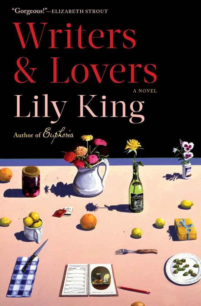
Writers & Lovers by Lily King
With all the detailed, delicately drawn objects laid out in it, the cover of Writers & Lovers almost makes you think of a curiously unmelted Dalí painting. Whimsical and laconic, it makes you want to look closer just to see what message each item may be holding.
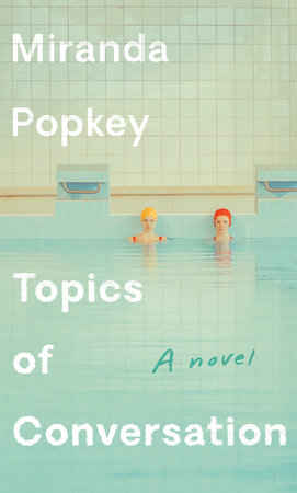
Topics of Conversation by Miranda Popkey
Featuring one of Maria Svarbova’s signature swimming pool photos, the cover of Topics of Conversation exudes a mellow air from the get-go. The white type that sinks into the photo, like it was etched into the tiled walls and dropped into the rippling water, ties everything together, making a harmonious cover. We can almost smell the chlorine.
Ledger by Jane Hirshfield
As you’ll have discovered if you follow John Gall’s work, he takes a liking to putting books into his book covers (#meta). For this poetry anthology, he’s inserted a neatly opened (wait for it) ledger into the design. He’s also added some spice to the design by curving the lines of the bottom page and drawing attention to the author’s name. Clever, no?

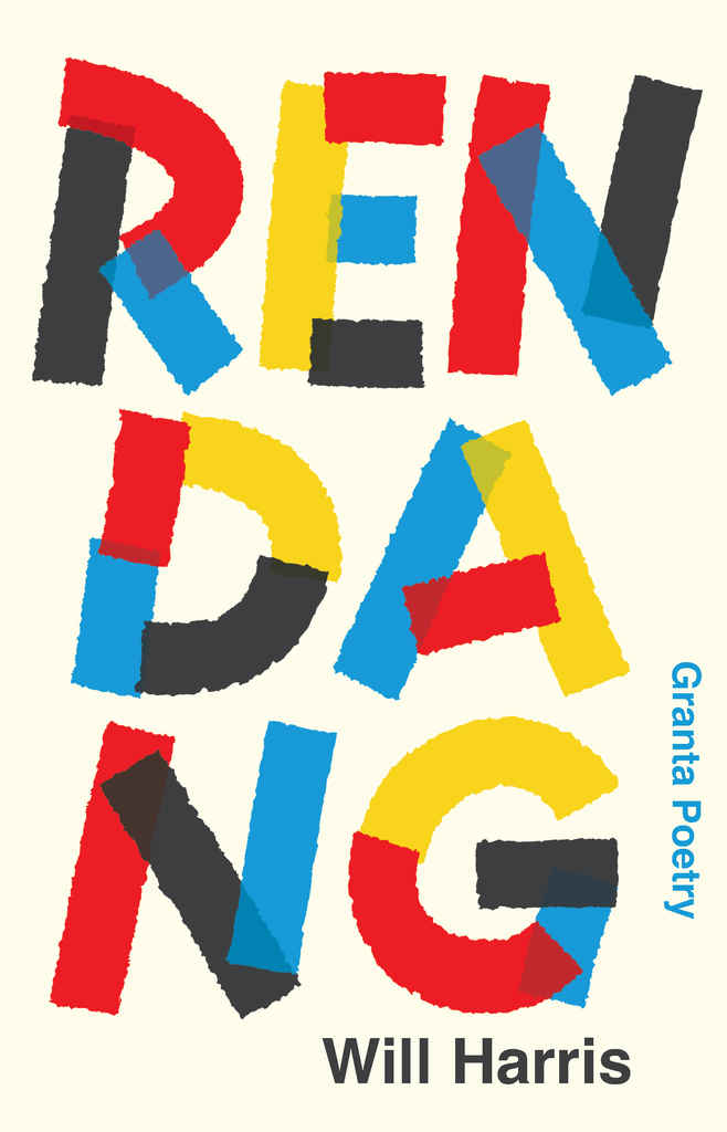
Rendang by Will Harris
Another poetry book with a different approach to cover design is Rendang by Will Harris. This was published in the UK by the publishing division of the literary magazine Granta, featuring letters in bright primary colors and a tape-like typeface on the cover. It's a testimony to the effectiveness of designer David Pearson’s “type as image” philosophy.
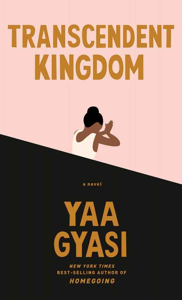
Transcendent Kingdom by Yaa Gyasi
Kelly Blair’s minimalistic design for Transcendent Kingdom is gracefully simple without being forgettable. The tilted axis dividing the two planes of color also adds some dimension to the whole picture.
The American Fiancée by Eric Dupont
This book’s cover could have been chaotic, with the sprawling type layered on top of the detailed painting, but it is anything but that. Stephen Brayda skillfully pulled everything together and made a coherent design in which the text and the picture complement each other, making anyone who sees it wonder what the girl hugging a deer is up to.

Little Girl Lost by Cheryl Bradshaw
The cover design for Little Girl Lost sparks curiosity. The title eludes the eye just the right amount, coming in and out of the background, while the golden hair right at the edge teases readers, urging them to flip the page and find out what’s inside. And that’s everything you want in a mystery book cover.

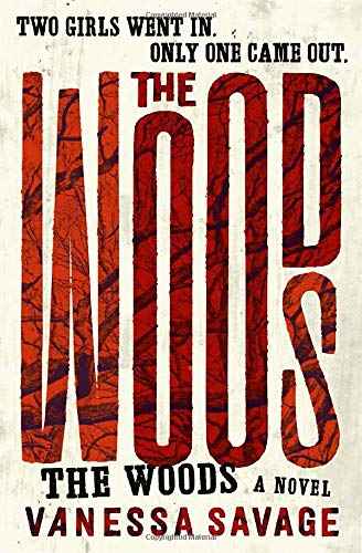
The Woods by Vanessa Savage
The Woods’s book cover reminds us once more of the importance of typography in book cover design: the text is in and of itself the art. In overlaying the title with scraggly tree branches and giving the letters different sizes, the designer creates a quirky but creepy sense of disorder that matches the book’s mystery genre while still maintaining harmony in the whole spread.
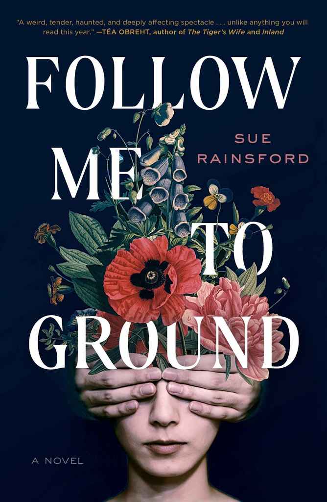
Follow Me to Ground by Rue Rainsford
The 2020 edition of Follow Me to Ground opts for a more elaborate design than its previous covers, featuring ornate flowers intertwined with the title itself. Despite the flowers, the design has a mysterious aura that goes hand in hand with the magical realism that the story brings. As for the closed eyes of the mannequin, that’s a clear nod to the disruption of the senses that’s about to go down as soon as the reader opens the book.
To Sleep in a Sea of Stars by Christopher Paolini
If you want to instantly step into another world, do nothing more than pick up this book. The cover design is quite literally out of this world. From the deep dark background emerges the mysterious electric blue of another life source — which is what this science fiction epic is all about. Add to that the precision and control of a sans-serif type, and the cover leaves you in total awe.

The Best Non-Fiction Book Covers of 2020
Pelosi by Molly Ball
Reedsy designer Stewart Williams’s top pick for non-fiction is the biography of Speaker of the House, Nancy Pelosi. “This is a clean design with elegant type and a sensible, muted color palette that is still evocative, highlighting the central image. It’s a simple design: a no-BS book cover for a no-BS public figure.”

Uncanny Valley by Anna Wiener
Here’s another suggestion from Stewart Williams: Uncanny Valley. (If, like us, you think he has impeccable taste, you should to check out his Reedsy profile!) It doesn’t feature many elements, but each is made with a lot of deliberation. The anaglyph 3D graphics and the neat typography immediately set the tone for the memoir, which is a story of a writer discovering the start-up environment of Silicon Valley.

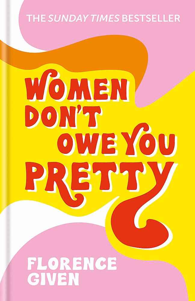
Women Don’t Owe You Pretty by Florence Given
Ironically, the book cover for Women Don’t Owe You Pretty is astonishingly pretty. This hardcover version features a very bold combo of red and yellow for the title, which stands out effortlessly from the more mellow pink and orange backdrop. (And doesn’t this warm color scheme and fun typeface remind you of a delightful vintage ice cream parlor?)
We Keep the Dead Close by Becky Cooper
Book covers are supposed to be memorable, and Alex Merto’s utterly haunting work on We Keep the Dead Close is as memorable as they come. The darkroom atmosphere brings us back to the 1960s, when the murder investigated in this book took place, while the shadowed photo of the victim sends chills down our spines. It’s the perfect cover: striking a balance between serious questions about justice and the thrilling real-life investigation that occured.

Carry by Toni Jensen
The woodcut print-style illustration on the cover of Carry is simply beautiful, with a red-and-blue color scheme that does a great job of letting the title shine through. Instead of obscuring this piece of art, the overlaying of the type on the illustrations actually nicely highlights the title while also incorporating it into the whole design.

Hood Feminism by Mikki Kendall
Sometimes less is more, as you can see with the cover for Hood Feminism. Instead of letting the illustrations stand in the foreground, the designer chose to let it sink beneath the cover, peeking through from the cut-out letters that make up the title. It plays directly into the book’s subtitle about forgotten women in the fight for equality.

Mad at the World by William Souder
If you love John Steinbeck’s books as much as we do, you may have seen this one before. Mad at the World’s cover does everything just right: from the sepia-toned photograph to the elegant type, everything makes the reader think of nostalgia and literary classics. The image of a man’s back also makes a brilliant pair with this book’s intriguing title: it tells the reader that this biography will look inward, at this literary giant’s inner psyche and his attitude toward the world. Paradoxically, then, by turning his back to the reader, the man on the cover (presumably Steinbeck) invites the reader in.

The Inner Coast by Donovan Hohn
Donovan Hohn’s specialty is writing about humans and the environment, and this book is a collection of his latest essays. This cover design, beyond its brilliant composition with the text falling into a pyramid shape, is an apt representation of Hohn’s writing: the place where the wide ocean meets our man-made homes.

The Art of War by Sun Tzu, translated by Michael Nylan
Here we’ve got another new edition of a classic text, The Art of War, and Jaya Miceli scores again with an uncomplicated design. The armor and strong, bold type that nestles in it does the job beautifully, though Miceli also played with the lighting to keep the cover from being one-dimensional.

HumanKind by Brad Aronson
HumanKind’s book cover is just heart-warming, despite its use of cool colors. The illustrated cover art gives it a lovable, child-like quality that makes this non-fiction somewhat more approachable. It’s also perfect for this incredibly loving story about friends and family coming together to support a woman in her struggle with leukemia.

World of Art collection published by Thames and Hudson
To cap things off, we have the new editions of the World of Art collection, each of which provide an overview of a style or artist. These are elegantly simple, allowing for the art featured in the middle to strike an impression with passers-by. They’re also very pretty on the inside, thanks to the handiwork of Reedsy’s Adam Hay.

As you can see, it has been a relatively busy year for the cover design world, and we by no means could’ve captured all of that creativity within a single post. But we do hope that these managed to give you some inspiration (perhaps even the names of some designers you want to reach out to) or even just get you evermore excited about books.
