
Blog •
Last updated on Jul 10, 2024
Live: Font Discovery and Licensing
About the author
Reedsy's editorial team is a diverse group of industry experts devoted to helping authors write and publish beautiful books.
More about the Reedsy Editorial Team →Below is the transcript from our live webinar on Font Discovery and Licensing, held on July 1st 2024 with guest speaker Axel Corjon, CEO of Fonts Ninja. The talk discussed the importance of typography, tools to discover, compare, and acquire fonts, and the basics of font licensing.
This transcript has been edited for length and clarity.
Why Does Font Matter?
Typography is one of the three main pillars of branding and design, alongside color and images. People often view typography merely as a functional tool — letters forming words, sentences, and so on. However, typography carries an emotional impact that is perceived even before reading the text. This emotional response precedes its functional purpose, underscoring its importance in design.
The emotional impact of typography
To illustrate this, let’s consider a basic example: When you see a well-chosen font, you immediately feel something, even before you start reading. This isn't just a designer's mantra; it's been proven. A study by Monotype showed that the right choice of typography can boost positive consumer feedback by 13%. While 13% might not sound significant, it's a substantial number in this kind of study.
And it makes sense. Typography surrounds us daily; it’s everywhere in our environment. We have no choice but to attach emotions to it. This influence can be quite powerful in shaping our perceptions and interactions with brands. Let’s take a look at a few case studies.
Case Studies
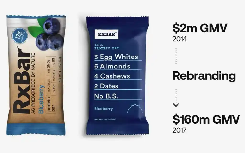
RXBAR's rebranding: By focusing on typography, RXBAR rebranded and saw an 80-fold increase in revenue. They stripped down their design to just typefaces and two shades of blue and white, demonstrating how typography alone can carry a whole brand identity.
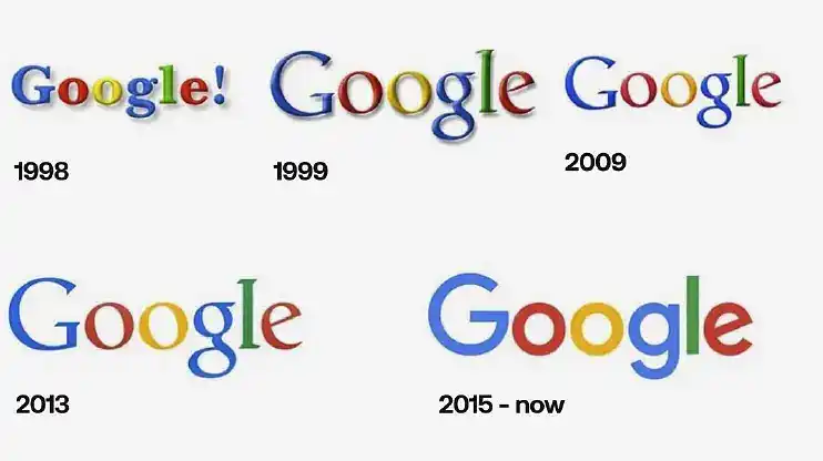
Google's logo evolution: Over time, Google’s logo underwent several changes, but the most significant transformation came with the change in typography. Ultimately, it is the typeface that really helped their logo project the image of a modern tech company.
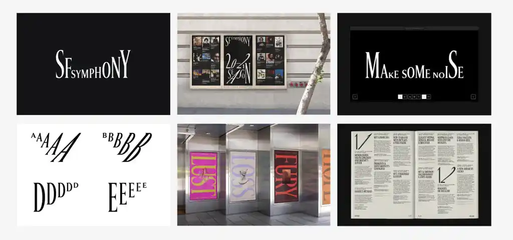
San Francisco Symphony's rebranding: Weir Collins' rebranding of the San Francisco Symphony is another great example. The new design centers on typography, combining it with typographic animations and sounds to create an emotional impact. This innovative approach highlights the creative potential of typography.
Typography is a simple and efficient way to evoke emotions and create a memorable identity for your brand.
The importance of font diversity
Despite typography's importance, there's a troubling trend: a vast majority of websites rely on just a few typefaces. A study I conducted on 2 million websites revealed that four typefaces dominate around 70% of them. This overuse diminishes the unique emotional impact typography can have.
Here are a few things you can keep in mind to avoid this pitfall:
Avoiding common fonts
Many designers turn to Google Fonts, only to end up using the same fonts as everyone else. While free fonts are appealing, relying on them often leads to a lack of distinctiveness. Instead, I believe commercial typefaces can offer a lot more creativity and identity to your work.
Investing in typography
Commercial typefaces might seem expensive, but the key issue is often understanding the type of licensing you need. They are essential creative assets. We regularly invest in great photography, 3D assets, music, and video — why not typography? Creating typefaces requires significant skill and time, so purchasing the right license is crucial for quality and uniqueness in design.
As designers, we need to carefully choose and invest in the right typefaces, as it is vital for creating memorable and emotionally impactful designs.
Learn more about how to apply these principles in book design:
How to Find the Perfect Typeface
Now that we've established the importance of selecting the perfect typeface, the next question is: how do we find it? There are typically two different processes you can follow:
- Continuous inspiration: Accumulate your typeface library over time by browsing various content such as websites, newsletters, and social media on a daily basis.
- Active search: Start a project by looking for the right typeface for that project specifically.
Continuous inspiration
Newsletters
Newsletters might seem like an old-school approach, but they work exceptionally well when it comes to discovering new fonts. Information comes directly to you, and you can easily unsubscribe if you no longer find them useful.
Some excellent sources for newsletters to consider are:
- Fresh Fonts
- PimpMyType
- Foundries: newsletters from various type foundries can be very beneficial. These newsletters often include content about the process of creating typefaces, new releases, and the history of typefaces. Checking out different foundries and subscribing to their newsletters is a great way to continuously receive design inspiration related to typography.
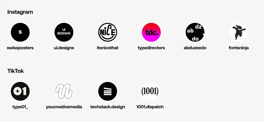
Social media
Platforms like Pinterest, Instagram and TikTok are also fantastic for discovering new typefaces and design ideas. Follow various accounts dedicated to typography for regular inspiration. Some accounts are well-known, while others might be lesser-known gems.
Fonts Ninja browser extension
Fonts Ninja is a valuable tool for quickly identifying typefaces used on websites. Here’s how it works:
- Launch Fonts Ninja while browsing a website.
- Identify the typeface in use along with its styles (e.g., medium, bold).
- View previews of different styles, uppercase and lowercase characters, and stylistic sets.
- Access information on where to purchase the typeface and find similar fonts.
Using Fonts Ninja helps you bookmark and reference typefaces you discover, making it easier to remember and utilize them in future projects.
Active search
Design showcase websites
When you need to find the perfect typeface for a specific project, the following resources can be extremely helpful:
These websites showcase excellent designs and often provide information about the typefaces used. While Fonts Ninja can verify the results for accuracy, these sites are great starting points when working on a specific project. They offer insights into what has been done in the project’s area of interest and can serve as a source of inspiration.
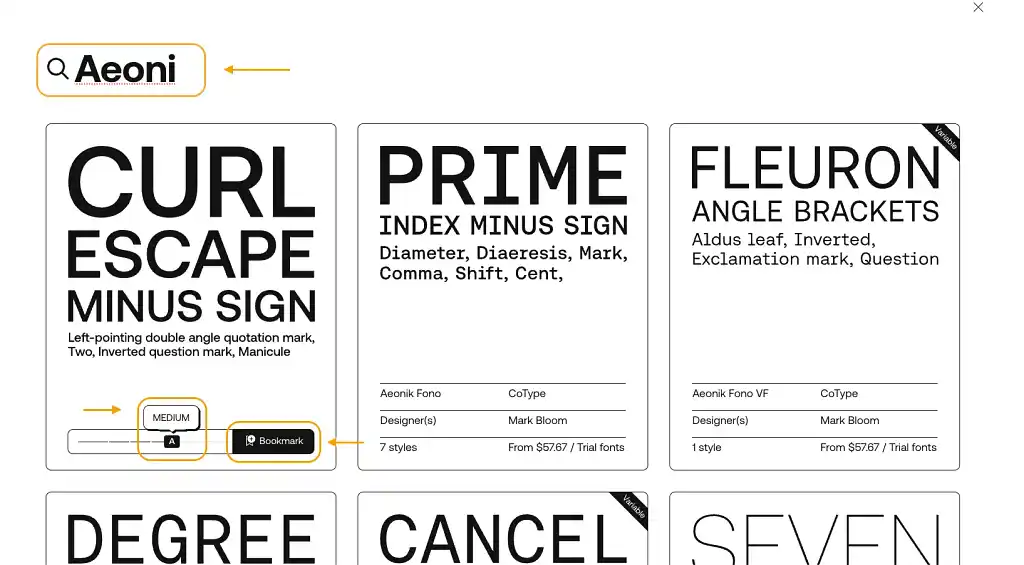
Fonts Ninja website
The Fonts Ninja website offers a comprehensive platform for discovering typefaces from independent designers, foundries, and popular font repositories like Adobe Fonts, Google Fonts, and Creative Market. Here’s how you can use it:
- Search for specific typefaces or explore similar fonts for inspiration.
- Use filters to narrow down your search to specific styles like slab serif or triangle serif.
- Bookmark and organize your favorite typefaces for easy reference.
Fonts Ninja functions like a Pinterest for typefaces, allowing you to explore, bookmark, and compare different fonts. This ensures you find the perfect typeface for your projects by mixing continuous browsing and focused searches.
By utilizing these tools and resources, you can efficiently discover and choose the right typefaces, whether you're seeking continuous inspiration or actively searching for a typeface for a specific project.
Get more inspiration for your next book design projects:
Understanding font licensing
The complexity of font licensing
Font licensing can be complicated, and everyone in the industry — type designers, foundries, and distributors — knows it's not straightforward. Here, we'll break it down into three main categories: free, commercial, and subscription-based licenses.
Free fonts
Free fonts can be divided into two categories: open source and free licenses. With a free license, you can use the fonts for free but cannot modify or update them. Open source licenses, on the other hand, allow modifications and updates.
Some sources for free fonts you can try:
While free fonts have the obvious advantage of being cost-free, they often come with limitations in choice and quality compared to high-end commercial typefaces. However, some open-source fonts can be quite exceptional.
Commercial fonts
Commercial font licensing is more complex than free font licensing and typically involves two types:
- Classic licensing: This covers desktop licenses, web licenses, and other usage or media based licenses. For instance, a desktop license is required for installing the font on a computer for design work, while a web license is needed to use the font on a website server. Generally, classic licensing is straightforward, but there are always some complex cases that might not be covered by standard classic licenses. In such situations, you would need to contact the foundries for clarification and additional licensing options.
- Employee-based licensing: This model adjusts the price based on the number of employees in the company that will be using it, making fonts more accessible for smaller companies and more expensive for larger ones. Foundries like Dinamo and Production Type have adopted this model. In my opinion, it ensures that font designers receive adequate compensation for the value their fonts create.
Some foundries also offer global licenses, like Neue Haas Grotesk, where one payment covers all types of usage (desktop, web, print, etc.). While this is straightforward, it can be expensive and challenging for foundries to sustain.
Subscription-based fonts
Subscription services like Monotype Fonts, Adobe Fonts, and Fontstand provide access to a wide range of typefaces. These services are beneficial for trying out different fonts quickly, but they have limitations:
- Adobe Fonts: You don’t own the fonts; you only have a license to use them under Adobe's terms. This means you cannot use the font files outside the guidelines provided by Adobe. You can use the fonts in the design you made for your clients, but you cannot share the font files for your clients to use on their own desktop.
- Monotype Fonts & others like Pangram and Blaze Type: This type of service offers a subscription model with limited commercial use, akin to a "Spotify for typefaces." Be cautious of the fine print, as commercial use for these subscription models can be restricted.
Specialized licensing examples
Here are some examples of licensing requirements for different projects:
- Branding: Both the designer and the client need desktop licenses or trademarking licenses. Some foundries may require additional branding licenses, especially when the majority of your brand is carried by a specific typeface.
- Websites: The designer needs a desktop license, while the client needs a web license if they are self-hosting the font files and not installing it to their own computer. If they’re installing the font to their own desktop, they will need to have a desktop license. A simple way to think of it is like having Photoshop. The font is basically a software. If you’re using the software, you’ll need to purchase a license to use the software and if you’re sending the PDS file to your client, you can’t really give your Photoshop account to your client. They would need to buy their own Photoshop license to open your file.
- Social Media: The designer needs a desktop license, and sometimes the client requires a social media license.
- Book Covers: Requires a desktop license, and potentially an EPUB license if embedding fonts in digital formats. If you vectorized the fonts first then you typically don’t need an EPUB license. This could change depending on the foundry but that’s the common practice.
Supporting type designers
Future Fonts is a platform where type designers can sell incomplete fonts at a lower price, providing updates over time. This helps designers financially while they complete their projects and allows users to support the creative process.
Key Takeaways About Font Licensing
- Understand your need and confirm with your foundry: Always check the specific requirements of the type foundry for each project. Some licenses might not cover all the usage you think they do.
- Support designers: Purchasing licenses not only ensures you’re legally compliant but also supports the hard work of type designers.
Font licensing can be intricate, but by understanding the different types of licenses and being mindful of the specific requirements for your usage, you can navigate it effectively and support the industry.
Q&A session
Choosing the right fonts for new self-taught designers
Question: "I'm an author trying to do her own graphic design who is font dyslexic, aka every font I choose looks bad. Do you have any specific tips for how to know what fonts look best for different purposes?"
Answer: There's no such thing as font dyslexia; it's all about personal taste and context. Just as colors can look great in one scenario and bad in another, the same applies to typefaces. If you think your choices look bad, it actually shows you're paying attention to your selections.
Try experimenting with different typefaces. Serif fonts can convey a sense of luxury or tradition, while sans-serif fonts often look more modern and tech-oriented. Don’t be afraid to break the rules and have fun with your choices. Start designing with a typeface you know and like, then duplicate your design and try different typefaces. It's a slow process, but it helps in finding the right fit.
Reedsy design tips for self-taught designer/author:
- Learn from others: Explore Reedsy’s cover library, where you can filter by genres to find relevant inspiration for your own projects.
- Hire a professional: Consider hiring one of the many talented designers available on Reedsy to assist with your design needs.
- Utilize design features from Adobe and Canva: Tools like Canva and Adobe Fonts offer font combinations suggestions by typing in keywords (Canva), or by selecting certain design aesthetics and glyph styles (Adobe), which can be a helpful starting point for new designers.
Canva font licensesFont Licenses
Question: "Can you address Canva font licenses? I've done the graphics for a client's book and need to make sure the fonts I've chosen from Canva are legal. Also, how do I find the licenses from Canva, if you can help? Thank you."
Answer: Generally, fonts available within services like Canva are covered for most uses, especially given Canva's broad licensing agreements. Fonts with a crown icon may require a premium subscription. It's crucial to review the specific terms of your Canva subscription to ensure compliance. Canva likely doesn't track different uses for different royalties, but you should still verify the licensing terms for each font you use.
Detecting unlicensed font use
Question: "Are there any steps to detect websites or designs online that use fonts without a license?"
Answer: Yes, there are services that help track unlicensed font use. Monotype has tools for this purpose, and another service called Font Radar, which we developed, helps type designers and foundries protect their intellectual property.
How fonts are designed
Question: "Can you give any insights into how fonts are designed? Is it done by hand or digitally these days?"
Answer: It depends on the designer, but most start with hand sketches before moving to digital tools. There are some commonly used software like Glyphs, FontLab, and RoboFont. Designing a typeface is a lengthy process requiring significant skill and time. Designers often revisit and tweak characters repeatedly. There's also the intricate task of kerning, adjusting the spacing between characters to ensure readability and aesthetic appeal. There are many books about creating typefaces from places like Blaze Type that can provide valuable insights into the process.
Additional resources
For more information or specific questions about fonts and licensing, you can reach out to Axel via email at axel@fonts.ninja or check out Font Ninja website.
For information about how to create a great freelancer profile, get more clients, or notifications about free webinars, check out our blog and follow us on LinkedIn.

Reviewed by Linnea Gradin
The editor-in-chief of the Reedsy Freelancer blog, Linnea is a writer and marketer with a degree from the University of Cambridge. Her focus is to provide aspiring editors and book designers with the resources to further their careers.
As the editor of Reedsy’s freelancer blog and a writer on the Reedsy team, Linnea has her hand in a bit of everything, from writing about writing, publishing, and self-publishing, to curating expert content for freelancing professionals. Working together with some of the top talent in the industry, she organizes insightful webinars, and develops resources to make publishing more accessible to writers and (aspiring) publishing professionals alike. When she’s not reading, she can be found dribbling on the football pitch, dabbling in foreign languages, or exploring the local cuisine of whatever country she happens to be in at the time.
