
Posted on Mar 14, 2025
50+ Eye-Catching Book Cover Ideas to Get You Inspired
Nick Bailey
Nick is a writer for Reedsy who covers all things related to writing and self-publishing. An avid fan of great storytelling, he specializes in story structure, genre tropes, and character work, and particularly enjoys sharing insights that spark creativity in fellow writers.
View profile →Savannah Cordova
Savannah is a senior editor with Reedsy and a published writer whose work has appeared on Slate, Kirkus, and BookTrib. Her short fiction has appeared in the Owl Canyon Press anthology, "No Bars and a Dead Battery".
View profile →You know the mantra: “Don’t judge a book by its cover.” But that’s easier said than done. As an author, your book's cover is your not-so-secret weapon to give readers a strong first impression of your book... and get them to buy it.
In other words, cover design is one of your most important assets and can have an enormous impact on sales — so you need to get it right.
For this post, we've cherry-picked 54 brilliant covers to give you some book cover ideas. We’ve grouped these covers by what they have in common, along with commentary on the trends they represent — while also noting which “classic” design elements will never go out of style. Happy viewing!
Illustration-oriented book covers
1. Minimalism continues to intrigue.
To quote Antoine de Saint Exupéry: “A designer knows that he has achieved perfection not when there is nothing left to add, but when there is nothing left to take away.” Minimalist covers strip a cover elegantly down to its bare essentials. Often characterized by a simple font and a marginal amount of content, these quiet, clever covers instead rely on white space to turn acres of nothing into something.
Q: How do you best work with clients to capture their vision for their book cover?
Suggested answer
![]()
Firstly, always listen to what the client is saying and - read between the lines - what do they really want. Read the brief. Then read it again. I don't just slavishly give the client exactly what they ask for. They are paying me for my expertise. So I will consider what they want to achieve (which is usually different than what they initially want to see). Then I will come back with ideas that will achieve their aims. Its a bit of back-and-forth between me and the client until we align on the final cover. Clients tell me all the time, they could never have expected the final cover to look how it does, and how thrilled they are with the result. Sometimes a client will come with a firm idea or element. If that serves the book then great, I will incorporate it in a way that optimises what the cover needs to communicate. Its ultimately about communicating clearly with the client.
Wayne is available to hire on Reedsy ⏺
The best way to capture a client’s vision is to start by asking lots of questions. I like to find out not just about the story, but also about any concerns or fears they might have, what they do and don’t like, and how they want the book to feel on the shelf. Sometimes a video chat helps enormously to get a sense of their taste and personality.
If a client has a specific idea, I always do my best to use that and make it look professional. If I think the project could benefit from a different approach, I will suggest alternatives, but always as part of a collaborative discussion.
Stage one of my process is research and idea generation. I play around, try out unusual or even odd concepts, and see what comes from that experimentation. With every idea I present, I include variations in colour, composition, or typography so the client can see the possibilities.
Many authors actually do not know exactly what they want, and that is great too. In those cases, I cast my visual net wider, presenting lots of ideas and styles to see what resonates with the book. Once we have settled on a direction, the refining and to-and-fro can take several stages to resolve. Getting every detail right on the spine and back cover is equally important. From there, we work together to shape a cover that is both creatively exciting and commercially strong.
Clare is available to hire on Reedsy ⏺
Communication is key. Asking questions and asking for examples of favorite covers is a start.
After that I like to send a few different concepts. I like to make it clear that the first round is still like a shot in the dark and work in progress. Specially when the client is not sure what they want. The best way to understand what a client expectation is, for design and style, is to send a few different options first and start working from there.
Veronica is available to hire on Reedsy ⏺
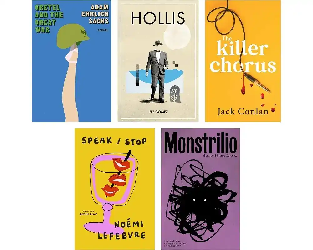
Cover designs like Adam Ehrich Sachs’ Gretel and the Great War manage to do a lot with a little. The simple silhouette of a ballet dancer’s leg topped with a military helmet cleverly merges feminine grace with unnerving wartime imagery — an effect further accentuated by its clean linework and bold, complementary colors.
2. But maximalism is gaining traction too.
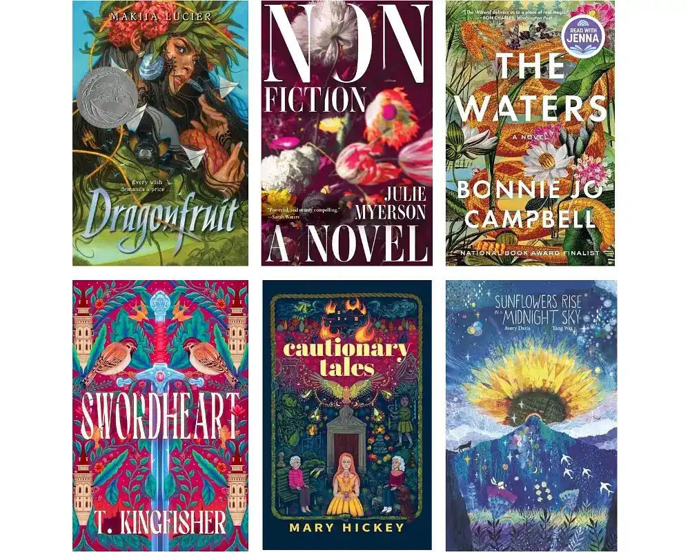
While minimalism shows no signs of slowing down, its so-called “maximalist” counterpart is steadily gathering momentum as well. The design philosophy behind these covers is essentially just: detail, detail, detail. Covers like Swordheart and Cautionary Tales are bold, expressive, and positively packed with eye-catching elements that will make any passerby stop and stare.
Q: As a standard, how many concepts and rounds of revisions do designers offer in their quotes?
Suggested answer
![]()
I provide a minimum of three distinct initial concepts, each showcasing a unique design approach. This variety allows the author to explore different creative directions. Occasionally, if inspiration strikes, I may offer additional concepts, but three original designs are always guaranteed to start the process. Once the author selects their preferred concept, we refine it through up to three rounds of revisions, though many projects require only one or two rounds to achieve the final design. If multiple initial concepts resonate, we combine elements—such as typography, color palettes, or layouts—from several designs to create a cohesive and tailored final cover.
Rachel is available to hire on Reedsy ⏺
As a standard, my process includes three main stages, each with clear steps and opportunities for feedback and revisions to ensure the final design meets the client’s expectations.
For concepts, I offer three black-and-white thumbnail sketches in the first round. These serve as the foundation for the design, allowing him to select one concept to move forward with. If necessary, he can request revisions during this stage, with up to three revision rounds included. Additional rounds are available for a fee, though most clients are satisfied with the initial sketches.
Once a concept is chosen, we move to the Detailed Sketch Round, where I refine the selected design, adding more clarity and, if relevant, suggesting a color scheme. The client is entitled to two revision rounds at this stage, with extra revisions available for an additional fee. Revisions during this phase should be smaller and align with what was approved in the previous round to avoid production delays.
Finally, during the Final Cover Round, I produce the polished, final version of the design. One last minor revision round is included to ensure all details are perfect.
This structured process allows for clear communication, minimizes unexpected delays, and ensures both the client and I are happy with the final product.
Carl is available to hire on Reedsy ⏺
I’m happy to provide unlimited revisions for my clients until we create a design they absolutely love—that’s just how I like to work!
Robert is available to hire on Reedsy ⏺
Typically up to three revisions included. However, I want you to REALLY love the end product. Additional revisions are case by case :)
Michael is available to hire on Reedsy ⏺
The short answer is two per round.
I have several rounds during a project, and before I start each round, I ask for and read through all the authors' notes about what they are looking for. If I've forgotten something that they specifically asked for in the beginning, I won't count that as part of a revision. If the author has changed their mind about something or updated the manuscript in a way that requires changes to the artwork, that will count as a revision. After two revisions, I will do more, but it will be at an additional cost.
I send my clients a PDF of my work process before we start a project. It outlines all the steps/rounds in the project and the revisions allowed in each. It also goes over the additional fee that will be added to the project budget if the revision amount is exceeded. It's important to always be on the same page from the very beginning about this. If an illustrator doesn't mention revisions, it's something I would bring up before starting a project. It's frustrating as an illustrator to have endless revisions without additional pay for extra time spent on the project. It's also frustrating for an author to suddenly be asked to pay more when they weren't aware that was the expectation.
Danika is available to hire on Reedsy ⏺
I supply a minimum of 3 different concepts but I often give a few more if the books subject has inspired me or I've come up with more valid designs than the standard 3.
I carry out 3 rounds of revisions to the client's chosen preferred front cover option. Another 3 rounds for the combined back cover and spine. And if I'm commissioned to design the interior, 3 rounds to revise that too.
Wayne is available to hire on Reedsy ⏺
I think my method is a little different from most as I offer different rates depending on how much/how often the client wants to potentially make changes/revisions. Sometimes a client is happy for me to describe how I envision each illustration, do very rough sketches (stick-man level!) and then leave me to outlining, painting etc until they get the final image. Other clients want to see the final outlines (second stage); while others may want to be able to make changes even once I've painted (this is usually only clients where the characters in the book are people they know, I've found).
So each rate has a different number of rounds of revisions included. The higher the rate the more rounds of revisions. Most authors go for the mid-rate, which includes revisions at sketch stage, and at final pencil outline stage.
Siski is available to hire on Reedsy ⏺
I usually invite the client to give feedback at every stage of the process, thumbnail, sketch and final, ensuring that there's no miscommunication throughout. If there is a situation where the feedback stage becomes drawn out, I limit myself to a maximum of two rounds of revisions before additional fees get added. However, I try to remain flexible when responding to client feedback, with my goal always being to end up with a result the client is happy with. Extra fees are normally only added if the revisions cause serious delays or are outside the scope of what the client is paying for.
Torbjörn is available to hire on Reedsy ⏺
I love working closely with authors, making them an integral part of the process at every step. Typically, we begin with the sketch phase, during which I offer two free revisions. After that, we move on to approving the color palette together, and again, the author has the opportunity for two free revisions per page or spread.
This approach allows authors the freedom to provide input without additional costs, ensuring the process remains fluid and collaborative. It’s a system that works wonderfully and often leads to amazing results!
Mariana is available to hire on Reedsy ⏺
Technically there should be a maximum of three rounds of revisions after I send rough sketches. If there is ever a time where the author asks for a fourth round and it's reasonable and the person is friendly and kind then I'll do a fourth! I've never felt I had to charge more because of too many revisions. It's usually only one or two.
Penny is available to hire on Reedsy ⏺
While the covers we’ve featured here are beautifully decorated with bright, attention-grabbing colors, that isn’t a mandatory component of maximalist design. As long as your cover is visually interesting enough to draw wandering eyes to every corner of the composition, it’ll fit the bill for maximalism.
Hire a pro book cover designer on Reedsy.

Nalle M.
Available to hire
A versatile cover illustrator with a passion for good storytelling, digital drawing and all things fantastical and weird!

Florin E.
Available to hire
I am a professional editorial illustration artist and graphic designer, creating a wide range of graphics that can be used for any project.

Steve M.
Available to hire
I've enjoyed creating MG, educational and fiction books for 30+ years. Let's make a book for children, adults, parents & teachers will love!
3. On launch days, we wear pink.
The light, salmon-y tone of “millennial pink” had the design world in a chokehold a few years back, in the mid-to-late 2010s — so much so that Pantone named rose quartz their color of the year in 2016. Millennial pink was everywhere in this era, from the pastel aesthetic of The Grand Budapest Hotel, to the cover of Ariana Grande's thank u, next.
Q: How does a professionally designed cover impact the success and sales of a self-published book?
Suggested answer
![]()
I think it determines in most cases whether or not the book gets sold. Either consciously or subconsciously. Part of my job as a designer is understanding marketing and trends. I look at book covers, LOTS of book covers. And take notes. Personally I don't think I'd buy a book with an unprofessional cover. If the author didn't take the cover seriously, then what's to say the story is any better? Is this project something they just typed up and published on a whim? Or is it something they really believe in and want to make the best product possible?
Michael is available to hire on Reedsy ⏺
A professional cover plays a huge role in the success of self-published books because it’s the first thing people notice. It gives your book credibility and helps it stand out, making it look just as polished as those from traditional publishers. A great cover not only grabs attention but also sets the tone for your story and appeals directly to your target audience. In a crowded market, it can be the difference between someone scrolling past or deciding to give your book a chance.
Robert is available to hire on Reedsy ⏺
It's an enormous impact. I would say it's the single biggest factor in whether your book sells. When I see a cover that looks amateurish, I subconsciously assume that the writing is probably going to be at an amateur level as well. It's as simple as that. I always judge a book by its cover. The book may be the greatest work of the new century but if it is packaged in a way that communicates carelessness or lack of attention, then that has huge repercussions for the reputation of the work and the respect that it needs in order to sell.
Just go into any book store. Look at the new released that are elegantly designed. You immediately assume that its worth reading because the author, the publishers, everyone deemed it worthwhile to invest time in producing. That assumption is critical in getting your work out to a new audience. Humans are visual creatures. Otherwise, art, advertising, TV, the internet, social media, none of that would need to exist.
Wayne is available to hire on Reedsy ⏺
First impressions count. An eye pleasing cover ensures that the book gets picked up in the first place!
Tommy is available to hire on Reedsy ⏺
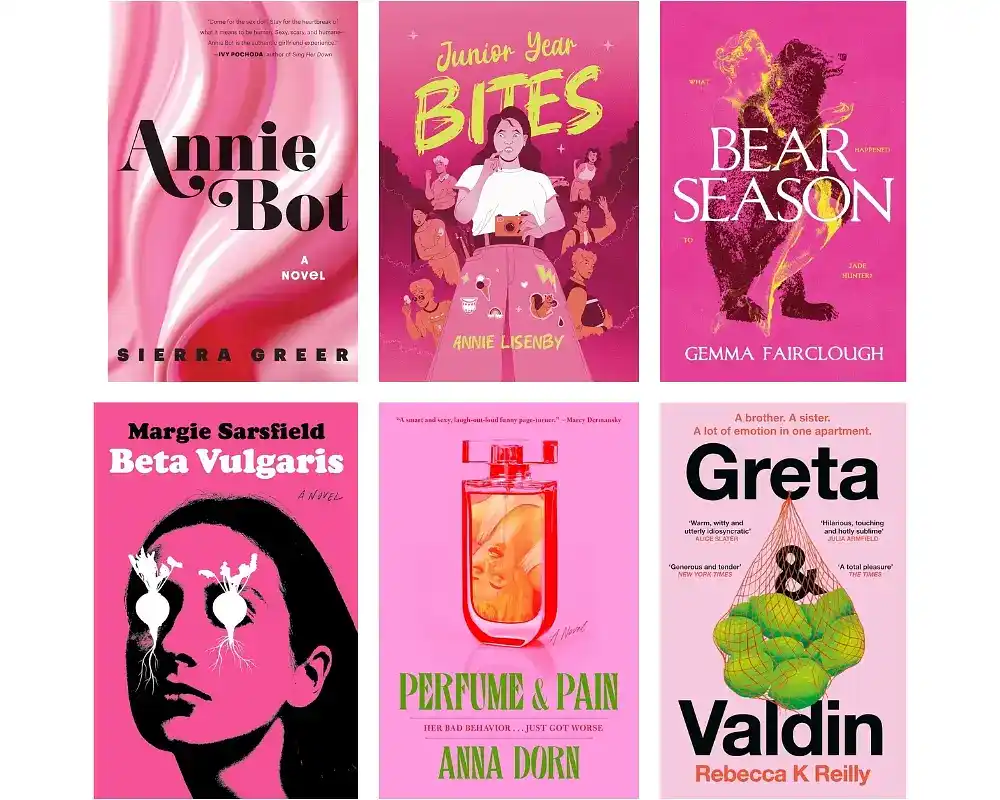
Pink seemed to take a step back in the early 2020s… only for it to explode back onto the scene with the pop-culture-defining release of Barbie in 2023. Pink is officially back, and it’s bigger and bolder than ever — with brighter, more vibrant shades stepping into the pinklight, as seen on covers like Margie Sarsfield’s Beta Vulgaris and Annie Lisenby’s Junior Year Bites.
4. Frames within frames create a 'meta' aesthetic.
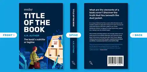
From If on a Winter’s Night a Traveler by Italo Calvino to Carlos Ruiz Zafron’s The Shadow of the Wind, the classic frame-within-a-frame motif has been around for decades — and for good reason. This style of design lends itself well to book covers; the symmetry is both pleasing and functional, delivering text-based information such as title, author name, and blurbs while catching the eye of bookstore patrons.
These designs can also easily be adapted to various different formats, whether for hardcover editions, paperbacks, e-books, or promotional materials — every publisher’s dream!
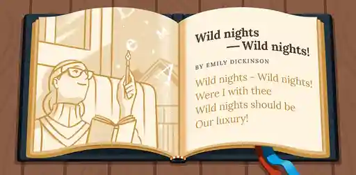
5. Hand-painted covers add a personal touch.
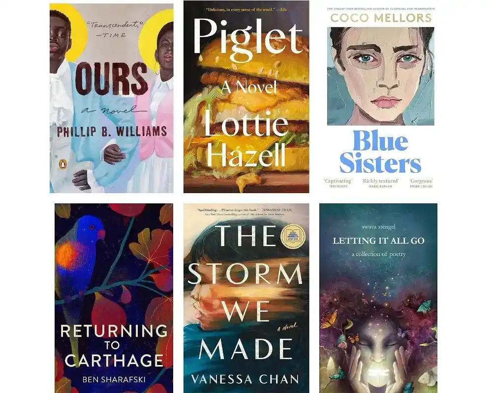
In addition to the framed designs above, there's another trend on the uptick that’s making every cover a painting — literally. Hand-painted book covers add an intimate touch that digital illustrations sometimes lack, which helps create an immediate emotional connection with potential readers. This is especially true for covers that get up close and personal like Blue Sisters — you can’t help but want to discover the story behind those forlorn eyes.
Typography-focused book covers
6. Incorporate imagery into your typography to turn heads.
There’s no better illustration (!) of how powerful typography can be than a cover that turns its typography into an image unto itself.
Q: Is it worth paying extra for a custom design instead of a premade cover?
Suggested answer
![]()
I think that is entirely up the specific author, but I sure think so!
With any craft there is a great spectrum of cost and quality out there, be in shoes, clothes, furniture, cars, food, you name it! I would encourage an author to ask themselves what is this worth to me, how much can I afford, and what I am hoping to get out of this?
There is always going to the cheaper quicker option out there, and that might be right for some folks. It is also true that there are artist out there who will work with you to pour themselves into the work, because this is what they love doing and how they choose to spend countless hours. This will cost more because it is their job and a craft they have honed over years of practice.
Somewhere in this wide spectrum you will find what is best suited to your needs right now.
Charles is available to hire on Reedsy ⏺
Unless you find a premade cover that perfectly fits your story, it’s worth investing in a custom design.
Premade covers are usually created to appeal to a broad genre and a pool of tropes, which helps them sell but often relies on visual cues that have been used over and over. The risk is that your book won’t stand out, or worse, it could look too similar to others already on the market.
A custom cover, on the other hand, is crafted to reflect the unique story, characters, and themes of your book. It communicates the right mood to potential readers and delivers an original, polished, and memorable design.
Alexandra is available to hire on Reedsy ⏺
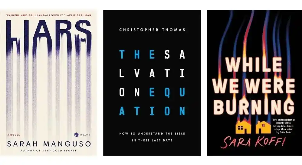
Take the cover of Sarah Manguso’s Liars, for instance: it does a brilliant job conveying the book’s message in a few neat strokes. Each letter fades into smudged, vertical streaks reminiscent of mascara-tinted tears streaming down a face, evoking themes of emotional vulnerability and deception. Christopher Thomas’ The Salvation Equation also incorporates its title into the visual design, taking a more mathematical approach by cleverly arranging each letter in a satisfying grid format.
7. Big titles can create a big impact.
Big, bold typography on covers is another trend in recent years, and it’s not hard to see why. This kind of typography shouts: “This is a book that you want to pick up.” That, or: “Here… we… go!” Like elephants in the room, these covers demand attention.
Q: What sources of inspiration do you turn to when creating book covers?
Suggested answer
![]()
My main source of inspiration always comes from the book itself. I focus on its emotional core — the atmosphere, themes, and tone — and translate that into a single visual that feels true to the story. Beyond the book, I draw inspiration from films, TV shows, digital illustration, and other visual arts, which offer fresh ways to approach composition, color, and mood.
I also pay attention to genre trends and bestselling covers, blending those insights with my artistic influences. This combination helps me craft covers that are faithful to the story while standing out in the market.
Alexandra is available to hire on Reedsy ⏺
The first and best source of inspiration is the work itself. I love to read the works in their entirety, if possible, and steep myself in the words, characters, and worlds of the book. Often a scene, or simple well written line can set off a whirlwind of ideas.
I love when authors send other imagery that excites them, as that often excites me too and gets us into the world of visual communication. Some authors have gone as far as to create entire mood boards and playlists, which I love! (You know who you are!)
Artists also inevitably bring with them everything else excites them. For me this is other paintings, other stories, music, poignant moments from real life, and more. In my experience the best images come from fusing the author’s world and enthusiasm with my own, and together we pull off something we are both genuinely stoked about.
Charles is available to hire on Reedsy ⏺
The starting point is always the story. Then comes the world around me: the September breeze, the open window, the neighbor hanging laundry, the child running along the beach, and the shapes of his movements, my cats, the people I observe, the shifting colors of nature. Afterwards, I turn to references, exploring different cultures, clothing, and traditions to enrich my imagination and transform it into images.
Sasha is available to hire on Reedsy ⏺
When I start a new cover, I always research the genre first. Even if I am familiar with it, things change and evolve, so it is important to understand what is out there, what readers expect visually, and where there might be space to do something fresh. I also look closely at the subject matter itself, which often takes me beyond books into films, comics, toys, merchandise and anything else that captures the right mood or cultural references.
I need to sit with a project at the beginning. Inspiration does not arrive instantly, it often comes once I have started the research, and sometimes in completely unexpected places. I might be walking in the park when something clicks, or scrolling Instagram and stumble across a striking animation that sparks an idea.
Normally I am looking for a key that unlocks the design, a spark or concept that brings everything together and makes the direction clear.
Typography is another big source of inspiration. The right typeface can set the tone before a single image is added, so I spend time exploring fonts that express the feeling of the book. I usually pull everything together into mood boards, which help me and the client see how colour, imagery and type might combine into a strong direction.
Inspiration can come from anywhere, but I always try to anchor it back to the book’s story and its audience, so the cover feels both creative and perfectly placed for its market.
Clare is available to hire on Reedsy ⏺
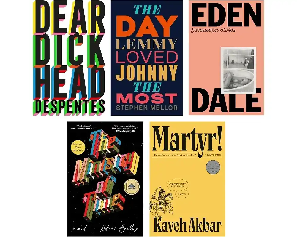
Expect to see this sort of typography bathed in bright colors like The Ministry of Time or The Day Lemmy Loved Johnny the Most, as subtlety isn’t exactly the game here. Alternatively, some covers prefer to keep their text black to contrast with their strikingly bold backgrounds (see: Martyr! and Eden Dale).
8. Keeping text simple lets illustrations shine.
Let’s go now to the opposite end of the spectrum. Simple and understated typography can also be used with purpose on book covers — it elegantly balances the elements to highlight the illustration rather than the text. Great designers aren’t afraid to let the typography be restrained so that the illustration can take the center stage. Because of that, the end effect is stunning: covers of this kind allow the (often) jaw-dropping artwork to grip the reader's imagination.
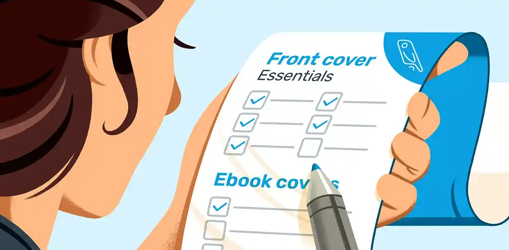
FREE RESOURCE
Cover Design Checklist
Make sure your book cover ticks all the boxes with our handy guide.
Genre-specific covers
9. Vector-based art abounds in romance.
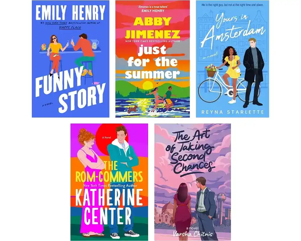
If you’ve enjoyed a romp into the romantic in the past few years, chances are you’re familiar with this kind of cover. Since the release of Sally Thorne’s The Hating Game in 2016, bright, vector-based illustrations have been everywhere in romance. Bold background colors contrast simplified character designs — depicting our leading lovebirds in playful, stylized poses that hint towards their relationship dynamic without giving away too much.
10. Grand, fantastical covers hint at the stories within.
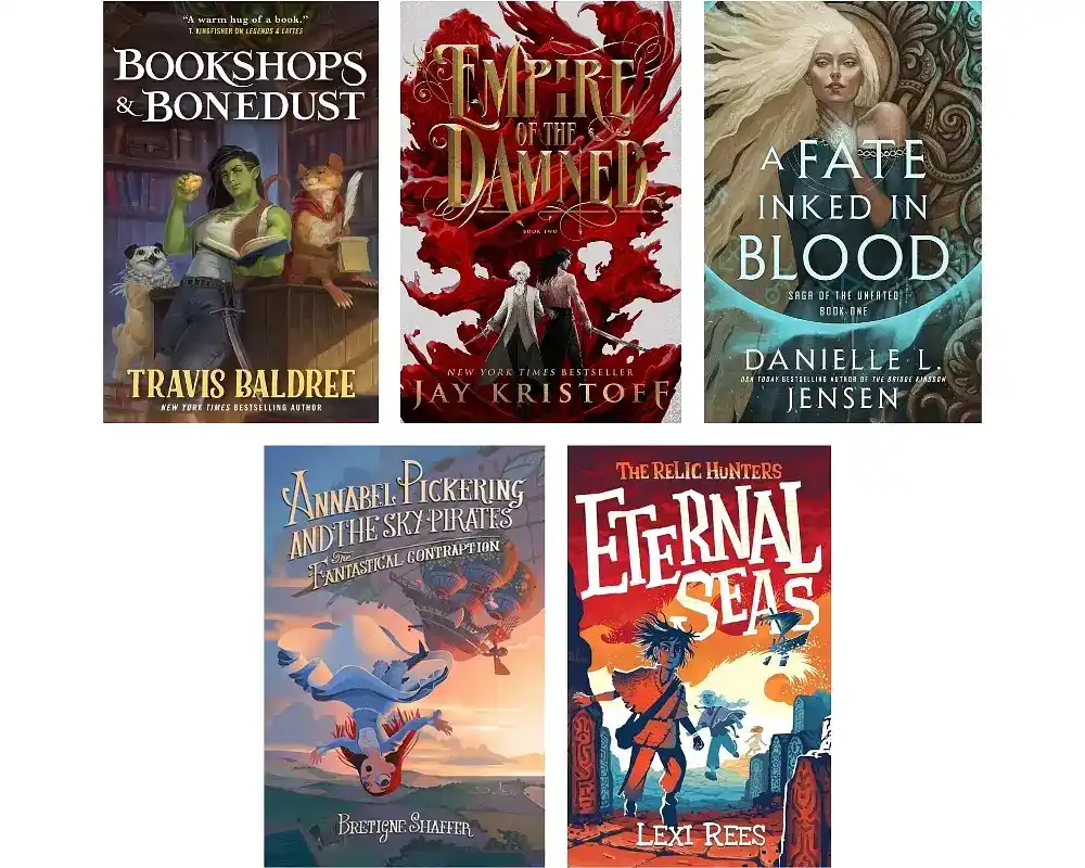
We’ve already touched on what makes a romance cover distinctly romance, but what about the other half of the romantasy phenomenon? Contemporary fantasy books are just as easy to identify on store shelves — they're chock-full of fantastical elements that will make any fantasy fan stop and stare. Swords, dragons, sacred stones, potions; anything and everything that hints towards an otherworldly adventure adorns these covers.
Q: How do genre-specific tropes influence book cover design, and how important are they for appealing to the target audience?
Suggested answer
![]()
Very. You want the audience to perceive the book's genre at a passing glance. A part of the design should deliver what the audience expects. But that doesn't mean you can't have fun with the design, either. Start with the tropes, and then put your own spin on them. Best case, you help to modify what audiences expect.
Michael is available to hire on Reedsy ⏺
Genre tropes are crucial in book cover design because they instantly communicate the book's category to potential readers, helping it stand out in a competitive market. By aligning with familiar visual cues while adding a unique twist, a well-designed cover can both meet audience expectations and spark curiosity.
Robert is available to hire on Reedsy ⏺
Intricate symbols and ornate backgrounds à la A Fate Inked In Blood are a staple. However, fantasy aimed at younger readers like The Relic Hunters and Annabel Pickering and the Sky Pirates often prefer a more whimsical aesthetic to spark the imagination of their target audience.
11. Nature meets horror.
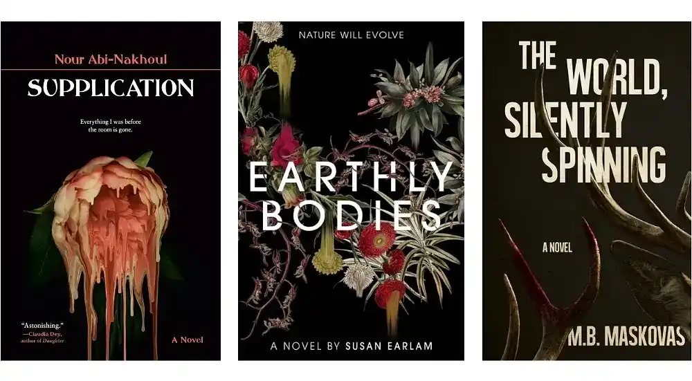
It’s natural to fear the unnatural, but make no mistake — there’s plenty to fear in the natural as well. Horror covers incorporating nature into their design have been on the rise in recent years. The imagery on covers like Supplication and Earthly Bodies might seem familiar at first glance, but taking a closer look reveals the unnerving truth that everything isn’t quite what it seems.
12. Kids love quirky animals!
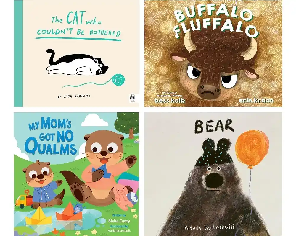
It can be difficult to keep up with the chaotic, ever-changing landscape of cover design, but fear not. One thing will always remain certain: silly, emotive animals on children’s books covers will never go out of style. Whether it's a lethargic cat, a disgruntled buffalo, or an incredulous bear, featuring an expressive animal character on your children’s book cover will capture kids’ imaginations and help create that all-important emotional connection with your young audience.
Looking for further inspiration? Check out the Reedsy Book Cover Art Gallery, where you'll find tons of wonderful examples of the work being done by freelance designers today.


1 response
Piyush says:
21/10/2019 – 10:43
This is a wonderful post.