This transcript has been edited for clarity.
Today, I’ll be going over some submissions of children’s books synopses and first pages, each with the author’s description of what they envision the illustration for that page to be, and come with a rough concept for each.
To give you an idea of who I am, it’s probably best that I show you some examples of what I’ve worked on. I take on a range of projects, from cute illustrations for younger children to elaborate fantasy ones that are for an older audience.
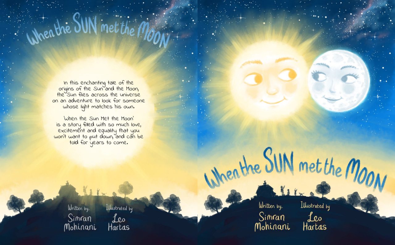
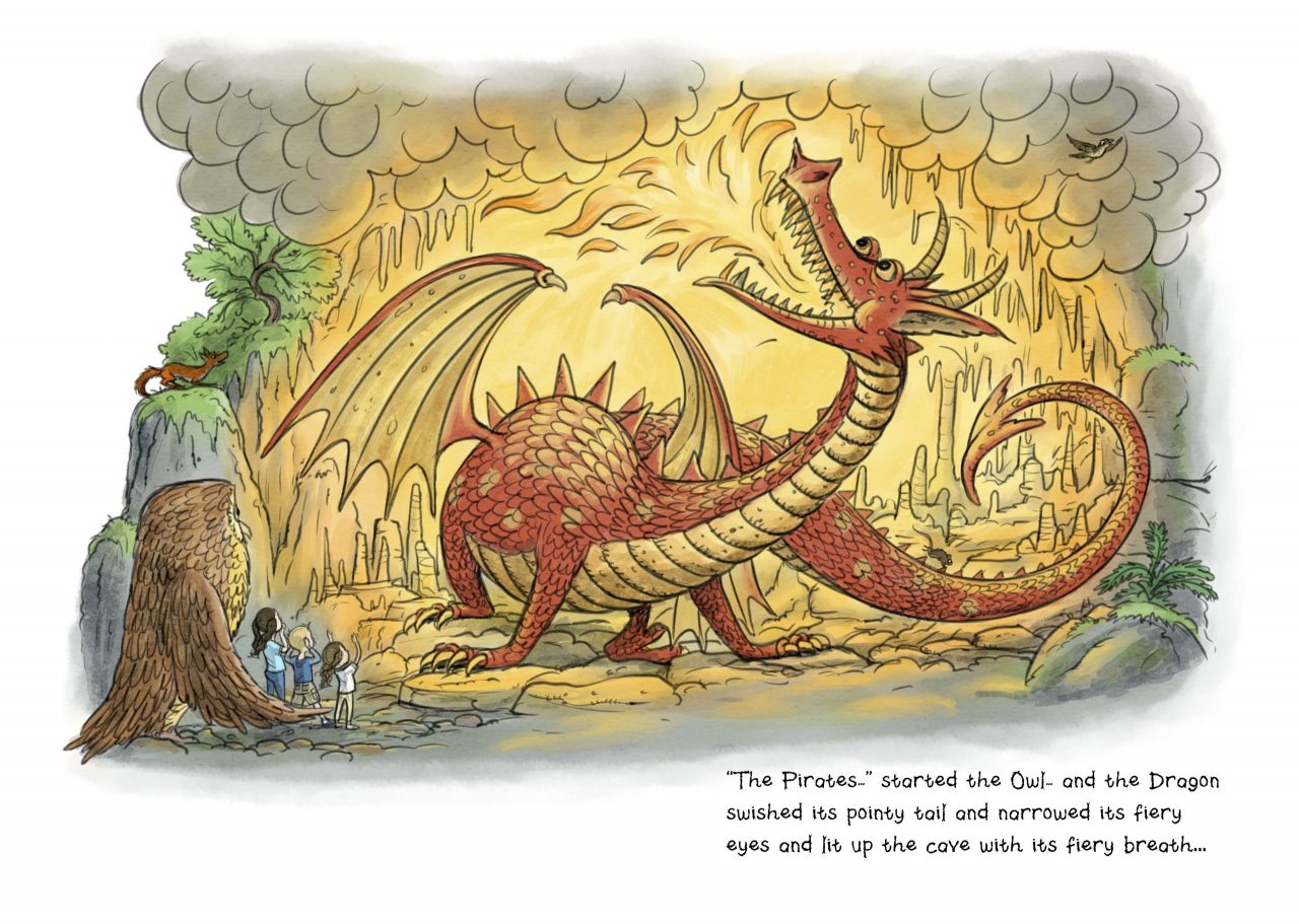
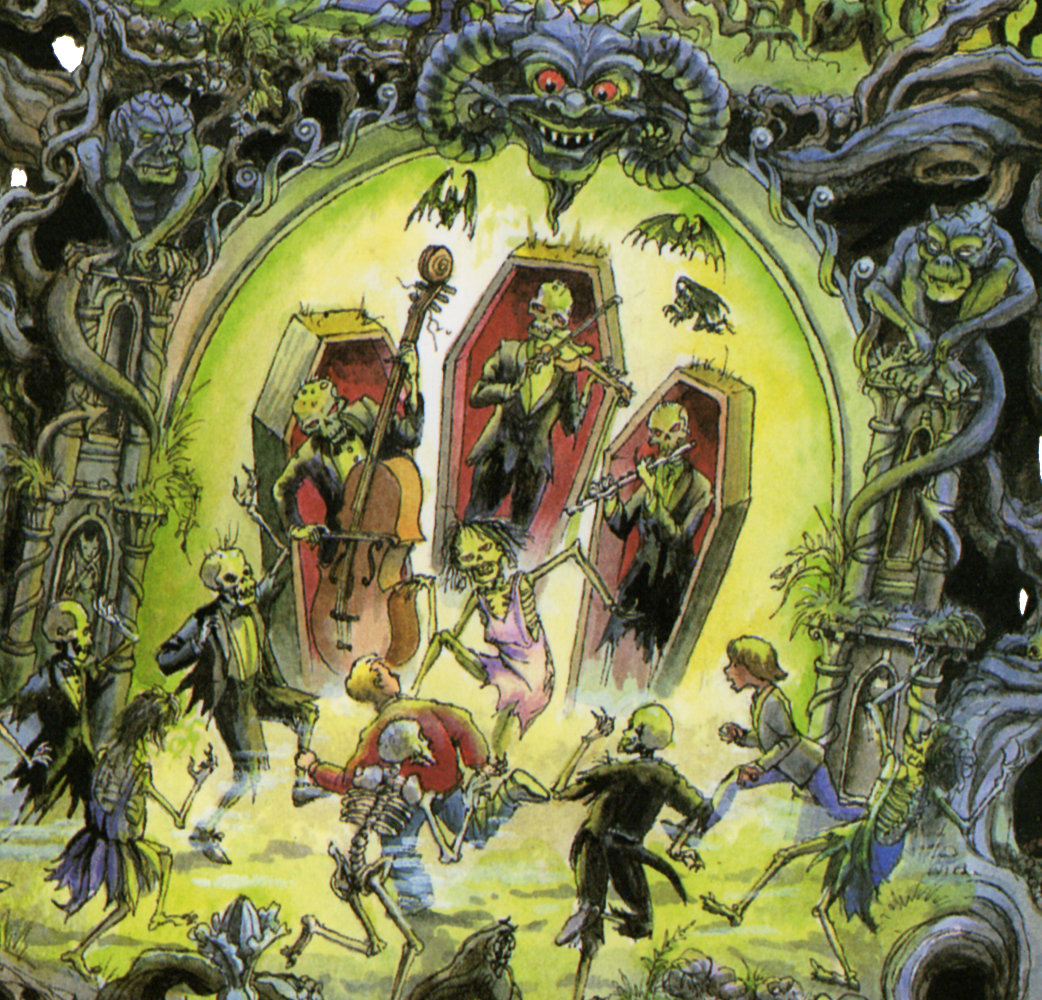
I hope these samples show you the scope and variety of my work.
Before we get into the drawing, here are an overview of the process and some tips for authors who are looking to work with an illustrator.
The illustrating process
Oftentimes, when you work with a traditional publisher, the overall plan and the book interior design is covered by their designers — illustrators only work specifically on the drawings. The liaison will be done through the publisher; when I work with them, I hardly ever meet the authors. And traditional publishers prefer to use their own illustrators, so if you come to them with an illustrated book, you’d most likely be rejected.
When I work with indie writers (like I do through Reedsy) I like to layout and design the book as well, and I’ll go over my process quickly here. Note: not all illustrators do the layout and design work.
For those who are curious: the software I’m using is Clip Studio Paint, which is great for drawing and illustrating while not being as costly as Photoshop (which I also have experience using). I usually use Clip Studio in combination with Affinity Publisher to put images and texts together.
The Breakdown
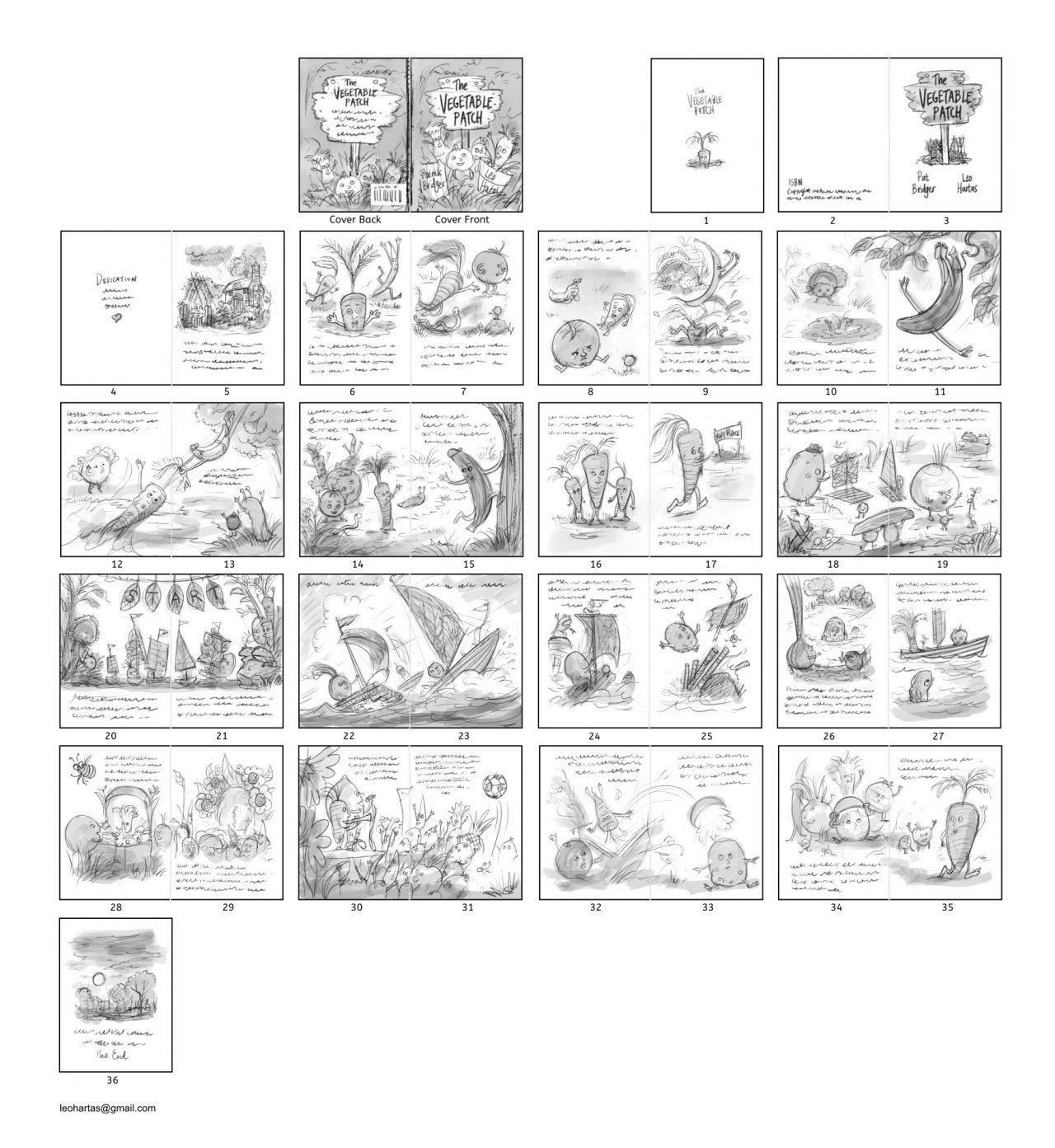
When an author sends me a text for a picture book, or a book with illustrations, I have to figure out how I'm going to break it up into a format that would include both text and illustration. I would then take that text and break it down into double-page spreads. As I go through the text, I’d imagine scenes and look for logical breaks in terms of imagery to determine the pages. So perhaps:
- page 1 is a simple title page,
- pages 2 and 3 would cover the copyright page and the dedication page,
- pages 4 and 5 are for the first scenes in the story, and so on.
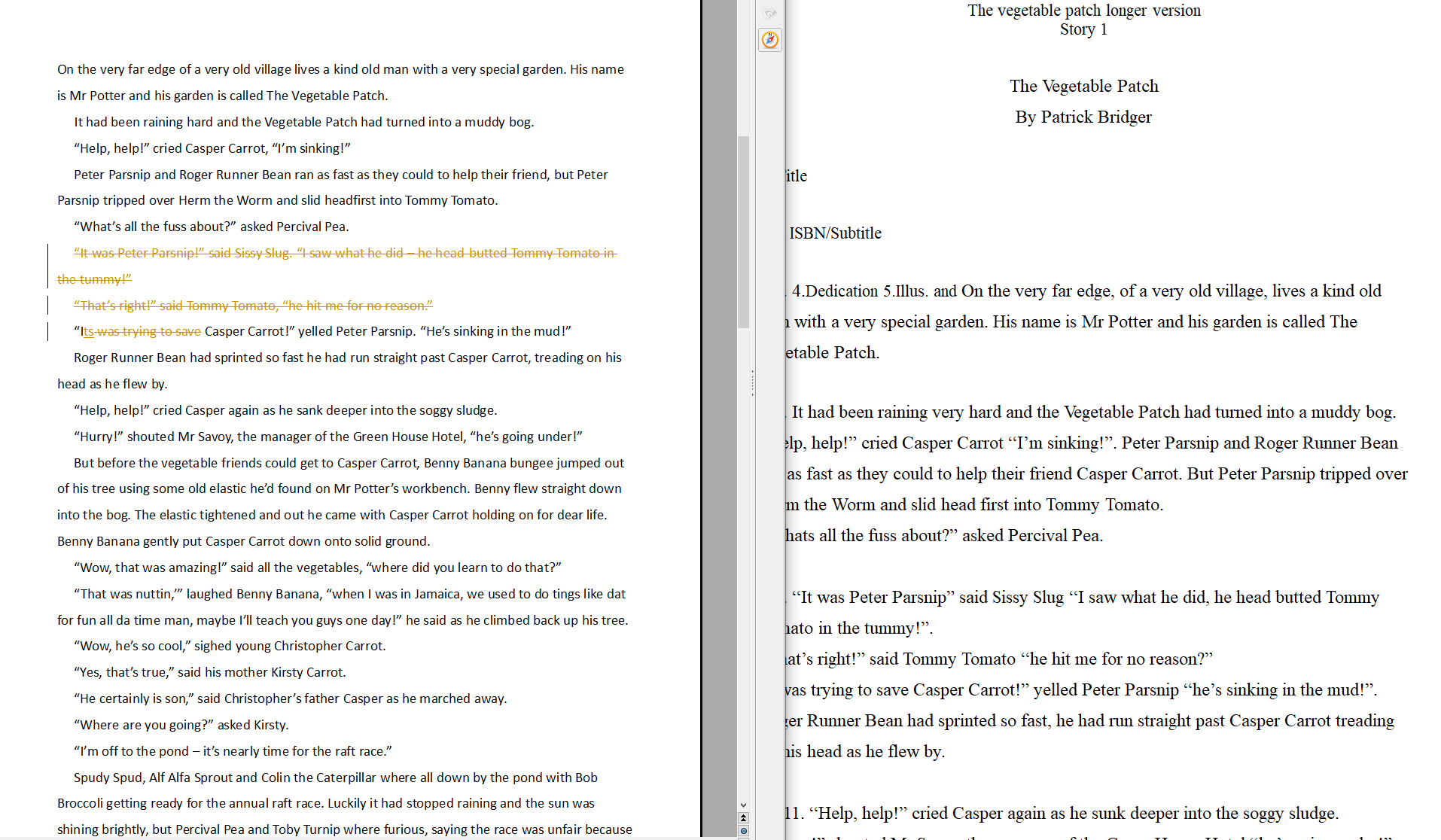
The manuscript would usually come with some descriptions of the drawings, although we can discuss it back and forth, especially when you’re self-publishing. Usually, a couple lines of description is great, and be sure to include descriptions that are crucial in the text.
You don’t have to be too detailed since a lot of book illustrations are quite small and there isn’t a lot of space to include everything. In any case, I have the story to refer to for inspiration — a good illustrator would pick up on the descriptions and emotional impact of the text — and I can always ask authors for clarification or more details if I need it.
The Flat Plan
After the breakdown, there needs to be a flat plan for the entire book, with the potential pages and scenes in order — this is the first draft to be sent to the author. Here, I’d roughly design each page — where the text is going and how the illustrations flow — so that both myself and the client could check it. This depends also on the format of the book, and if the author isn’t sure about yet, I can offer some advice, given my experience and expertise. It’s very important to figure this out according to what your target group is — in children’s literature, different kinds of books work for children of different age groups.
Once that’s approved, I start working on the sketches of each page — these are pre-color. I’d lay out the pages as they would appear in the book. This version’s outlines are what I hope will be the final drawings, which is again sent to the author for a look.
The time it takes to complete the outline drawing for this stage really depends on the complexity of each drawing and, of course, how many drawings are required. For one drawing, if it’s simple, I can complete a rough sketch in 2 to 3 hours, but a more detailed drawing (e.g., that of a crowd or a cityscape) can take a day or two.
Coloring and final corrections
The final step is to put in the colors. Changes that I’d make when coloring are usually tiny corrections — I always try to catch little details that can be improved on. The whole illustration process entails continuously improving the drawing.
For the demonstrations I’m doing today, it’ll be more like the rough sketches that I do for myself, coming up with the concept, before sending them off to the client.

Ready to bring your story to life?
The best children's book illustrators are on Reedsy. Sign up for free and meet them.
Learn how Reedsy can help you craft a beautiful book.
How much does it cost to hire an illustrator?
The cost of children’s book illustrations really depends on a lot of things. It's unlikely that illustrators get enough income to cover expenses from royalties, so we usually charge per project. There's such a variety of illustration for children’s books — from full-color picture books (which can mean dozens of pages of work) to sparser illustrations; from simple scenes to really complex drawings.
We also have to take into account how much time a project might take, which differs with every illustrator, and how much reference gathering is required. Really complex books are more costly: for one that I worked on in the 1990s, which had a lot of small details, I got around £20,000. This is unusually high and would be beyond a publisher's budget today. On average, you would be looking at £1,200 for a very simple book (and higher as the level of complexity increases).
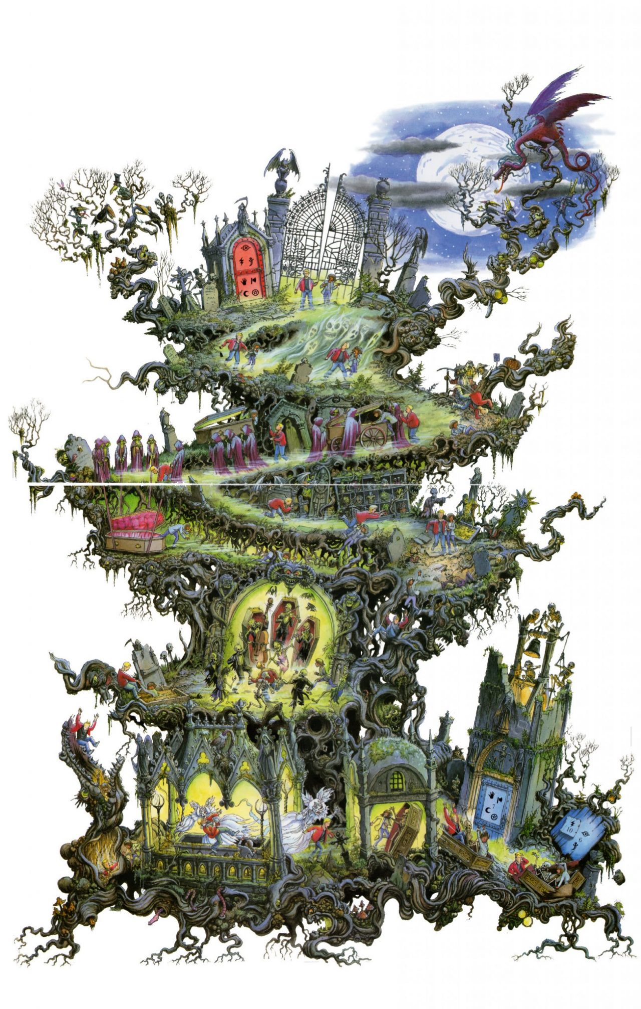
Illustrators will set their prices according to the market, factoring in their costs and individual style of working (I could spend days working on a single illustration). Every artist works differently and so can charge different prices. Personally, I try to get all the ancillary stuff around illustrating books done — like book interior designing — to get the average price down. Working on that takes less time so I can take care of it for authors quite quickly.
What about copyright?
When you sign a contract with an illustrator, you will agree on terms in which you get to retain the copyright (or moral rights). So basically, you can take the work and do what you like with it. If there isn’t a term like that in the contract, anything I draw, I own.
Tips for authors looking for illustrators
Before you approach an illustrator, there are a couple of things you could do to make realizing your picture book easier.
Know where your book will be shelved
One bit of advice — though, of course, you should be mindful of the current Covid-19 situation — is to visit a bookshop and have a look through all the children's books to get a feel for where your book might fit in. Books are divided into sections and subsections for a reason; if you do something that doesn’t really sit in any single section, I think you'll struggle more to sell your books to those people who make the decisions.
Have an idea about format
It’s also good to have an idea of what you imagine the book to look like. Will it be portrait or landscape, what trim size are you considering — those kinds of things. If you’re going to publish through KDP, check out the sizes that they have because they do have a set of fixed sizes.
For today’s submissions, I’ve done a bit of sketching beforehand since we don’t have that much time, and I’ll flesh things out a bit more as we go.
Illustration demonstrations
Buster the Pirate King by Kathy Haaga
Synopsis: Buster, the Pirate King, is a big, handsome, long-haired black dog, who is the captain of “The Last Resort,” but sadly, he's not a very brave pirate. He is, though, an excellent cook, so when a rival band of pirates, the Chunky Chinchillas, capture the lovely Pirate Maiden Lily (a Golden Retriever) instead of fighting them, he cooks them a gourmet dinner, which puts them all to sleep, and he rescues Lily. It turns out, Lily is an excellent sailor, and she sails the ship to safety, while Buster cooks up tasty treats.
First page’s text:
Far away, across the sea, there lived a Pirate King.
He had the finest ship that ever sailed
And the king's name was Buster.
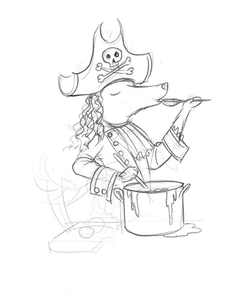
Author’s vision: I see a big, long-haired black dog with long, floppy ears, a long feathery tail, dressed in pirate regalia: a red patch over one eye, striped trousers, black boots, colorful vest, a billowy white shirt. He's on the deck of the colorful, friendly-looking pirate ship."
I love drawing pirates, and I love the idea of the dogs as pirate characters. As an illustrator, I usually am working with a fairly small amount of information, so I do get creative and add on certain details I think is suitable — such as the skull and crossbones here on the pirate’s hat — and run it by the client. If I need extra information or there's something that the client wants me to particularly draw, I’ll test it out — like the curly King Charles hairstyle, which I think fits the theme of this story — and see what the author thinks.
The other thing I always keep in mind when working is how I can give character to the characters. Part of it is obviously what they look like, but the other thing is their gesture. Sometimes, you need to refer to stereotypical ways of showing something visually.
So I've drawn Buster, from what Kathy suggested, with his nose up, perhaps a little haughty. And then he's also a gourmet cook — I always imagine gourmet cooks will be tasting their food just like this.
I do act things out too — it helps me figure out how the characters, or in this case, his hands, are going to look.
Another thing I like to think about is what else I can bring into the picture — such as the stew dripping from the pot in this illustration. These don’t have to be specific details, it can just be something that adds live to the character beyond what’s described in the text.
Battlefield Angel: Clara Barton Goes to War by Leigh Springer
Synopsis: When the American Civil War first broke out, it was not considered ladylike for a woman to care for the wounded on the battlefield. But Clara Barton couldn’t stand to stay home and knit socks when the soldiers needed her help. Paraphrasing Clara Barton’s poem, “The Woman Who Went to the Field,” written in 1892, Battlefield Angel tells the story of Clara Barton’s pioneering efforts on behalf of the wounded, often under fire, on more than a dozen different battlefields.
First page’s text:
The woman who went to the field, you say
What did they know about the war anyway?
What could they do? Of what use could they be?
They would scream at the sight of a gun, don’t you see?
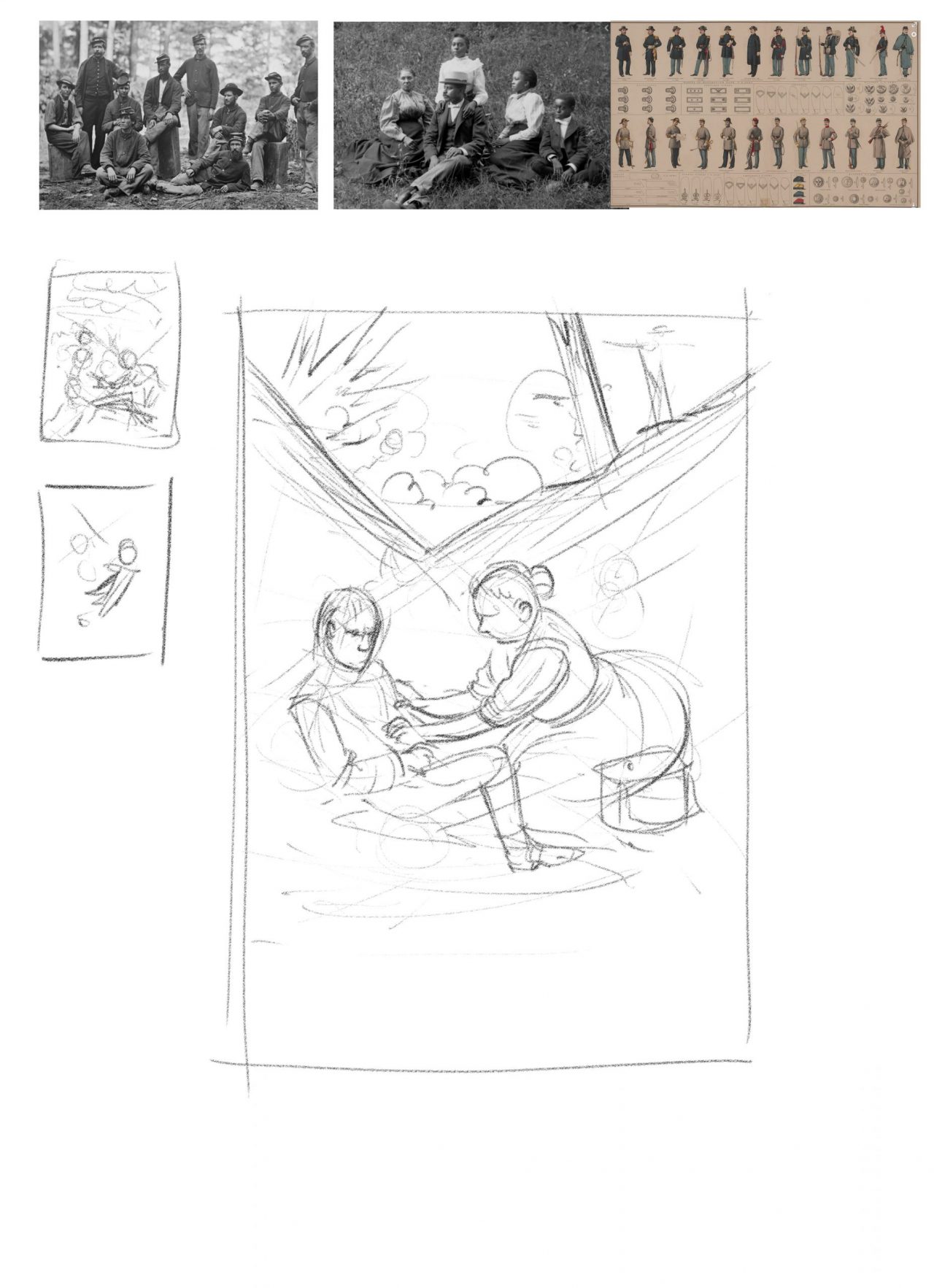
Author’s vision: Instead of a woman screaming at the sight of a gun, I see the picture of a round-faced, middle-aged woman kneeling down to give a wounded soldier a drink of water, with bullets and artillery shells whizzing by overhead, while dozens of other soldiers reach out their hands towards her for help. One man has grasped hold of the hem of Clara's skirt, but in general, the wounded soldiers exhibit remarkable patience while waiting their turn.
What I loved about this is it isn't a story that I knew about, and I really love to learn more about the world as I work. And the learning comes with looking up plenty of reference material — I’d ask the client to provide some, if necessary. I’d check on these references to make sure I’m getting all the details correct as I go.
This is a really interesting scene, and the way I would approach this, because it’s more complex than the last illustration, I’d do a little thumbnail to work out the composition. We're in a wartime situation, so there's a lot of stress and drama going on — and you could illustrate this scene in many different ways.
My thinking for this one is to lean into the stressful atmosphere. For instance diagonal, angled lines like these, creates an unsettling feeling for the reader, so I want to have them there. You’d see sort of a battle up here beyond the trees, perhaps an explosion going on above the characters. And this suggests that they’re in a gully, in the lower portion of the drawing. In the gully, we can create a sense of calm, with the nurse tending to the soldier (the diagonal line we created earlier also subtly directs our attention to her, as it points directly at her). I've read that in war, even amidst all the horror and fighting, there can be a strange sense of calm, so I'm taking inspiration from that.
The Snigglenitch by C. M. Arnold
Synopsis: After befriending a young girl, a troll-like creature defies his evil goblin king and sets out to thwart his plan to kidnap thousands of children for their tears.
First page’s text:
Sat on a rock in the middle of nowhere
Sadder than sad, as lonely as one
The Snigglenitch thought his sad lonely thoughts
Alone he sat, pensive and glum
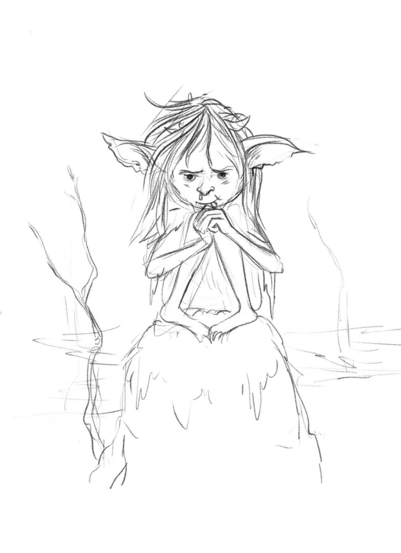
Author’s vision: As described in the opening verse. The Snigglenitch has a snaggle tooth and dirty brown hair.
There’s very limited information here for a nice, simple scene, so I've got the freedom to add something to the story. And sometimes simplicity is what you go for, actually.
I started this character, which I really like, and he has a snaggletooth here. He's a bit glum, so I’m going to focus on getting that expression right. Even something subtle, like where the eyes happen to be looking, can make a big difference, and I’d test little details to gradually get the perfect image. Doing this can take up a significant amount of time, but it’s a critical part of the illustration.
I’d also like to add a red nose, with a little drip on the end. I imagine he has these big ears that are slightly floppy and forlorn. His hair's coming down like this, with bits and pieces of leaves and scrap in it.
And sometimes when I notice something wrong, and I might move the features I’ve drawn around to try and improve it. For instance, I’d bring the face of this Snigglenitch down a little, to try and figure out its age — also to suit the age range of the readers. I’d need to talk to the author more to know exactly what age group this is for, and the range is quite large, as black-and-white illustrations in Middle Grade and some Young Adult novels are in vogue.
Nhoza Matoza by Suzella
Synopsis: It’s a very simple story with sparse dialogue of a young girl, Nhoza (7), looking for belonging and a sense of family after her father, her only caregiver, goes out to buy milk but never returns. The short story reflects on how Nhoza deals with this abandonment and loss through turning her love and attention to nature for her new magic of self-nurturing.
First page’s text:
Oho mtwana (Hush baby)
Umama kekho (Mom is not here)
Uyothengi sinkwa (She’s done to buy bread)
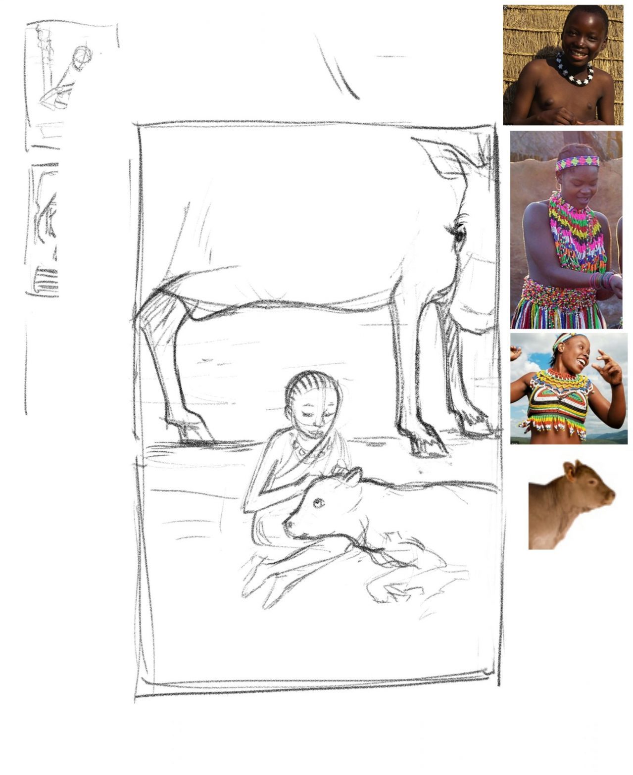
Author’s vision: Set in a meadow in the foothills of the Bulwer mountains, KwaZulu-Natal, South Africa. Azure skies, red-hot poker flowers, there’s one black male farm cow and a female black baby calf. In the middle of these cows is Nhoza, a Zulu girl with a short cornrow hairstyle. She is wearing a simple white sundress. She is singing an isiZulu lullaby to the baby calf who has its head in her lap. She strokes the calf gently, as if it were a cat.
For a brief like this, I get to learn about other cultures, and I try to learn their styles and what might work in this case. Obviously, with this, I'm going to do a lot of reference gathering. I want to make sure I get things right.
Again, I sketched some thumbnails to play around with the compositions. And I may even ask the author whether it's okay to try out with a different style, which sometimes just means trying out different color schemes, or trying out more abstract images. Sometimes I’d see a text and it’d fire up my imagination like that.
So specifically here, the description calls for a black male cow, and I’m playing with the idea of making this cow so big he goes off the frame. I like the idea of the child and the calf looking really small in the frame in this wonderful, sensitive moment here.
To see more of Leo’s work visit his Reedsy profile. If he’s available, you can even send him a request to work on your book!

