We're back with another edition of Reedsy Live Chats. This time it's a cover critique with U.S. based designer Jake Clark. As always, we've brought you a small recap but to get the full experience of Jake's informative session, just watch the video above!
Comments and advice
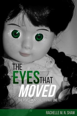
The Eyes That Moved — Rachelle M.N. Shaw
Kendra Merrick has a knack for spotting unusual trinkets and treasures, and she isn’t afraid of using unconventional—or illegal—methods to obtain them. When she meets Adam, a fellow sleuth and collector, they embark on their biggest adventure yet: the Whitson house. The house is a marvel, and its secrets are even stranger than Kendra imagined.
Kendra stumbles upon the find of a lifetime. But she may have signed on for more than she bargained. There’s a darkness in the house that wasn’t there before, a pair of eyes in every corner, watching, waiting. And Adam isn’t at all who he claimed to be.
"Instantly comes across as creepy. The choice of image is good and makes you feel uneasy. It avoids the trope of excessive gore in horror which is good. The text can be read easily, but the author name can be a little bigger. It's a second in a series of books designed using repetitive elements, which helps establish a brand. It's also good practice in black and white covers to push the highlights and darken the shadows. Use of eyes is very common in covers but it's done well here."

Secret Destiny — Kathy Kulig
Desperate and on the verge of financial disaster, Destiny Noir accepts the job at Dark Odyssey. The hedonistic club in a mansion along the South Florida coast caters to the rich and powerful, providing a particular service that satisfies their clients’ sinful requests. Performing kinky sex shows at private parties with her lover Darius Logan should be easy for two lovers. The risk to her professional reputation is high, but the money and scorching sex is too good to refuse. This club is just what the couple is looking for. But there are always consequences, especially when their fun and well-paying side job spins out of control.
"This immediately tells you that it is a romance/erotica novel. The title font is nice but a little small, and there are too many curls. The three images are competing with each other. The diagonal is forcing the viewer into one corner. There are two ways to go about a cover, either follow the tropes of your genre or go against them. The benefit of following tropes is the reader gets a sense of the story immediately, but it's very easy to be overlooked as a new author. 50 Shades of Grey is an excellent example of this, as it's not a typical romance cover."
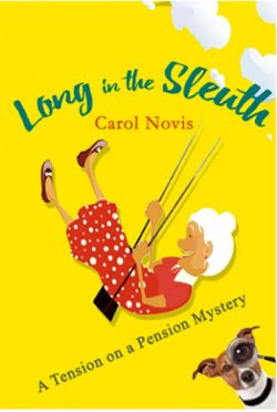
Long in the Sleuth — Carol Novis
From the author: "Here is a prospective cover for my cozy mystery, about old ladies in a Jewish retirement home who solve murders. I would be very interested in your opinion."
The use of bright colors is great, it immediately communicates that it's a lighthearted book. There could be some more clouds added on top to reduce the negative space. The graphic of the grandma is nice but perhaps doesn't work for the book. It would be great to see the dog in the same flat style illustration. The diagonal slant of the subtitle doesn't work, and the author title is getting a little lost.
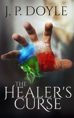
The Healer's Curse — J.P. Doyle
From the author: "My main character, Alex, is able to heal others by touching them. Unfortunately, Alex finds out that his healing comes at a terrible cost to himself and others around him. For the cover, I wanted to have Alex break the fourth wall and reach out to heal the reader. The four colors on his palm represent two sets of effects when Alex touches someone else: The removal of damage: trauma (red) and disease (green), and the restoration of health: healing (white) and revitalization (blue)."
"The cover works quite well overall. It might be a better idea to stick to lesser colors for the hand. The hand reaching out is really nice. Text can be read clearly which is great, though author title can be a little smaller. It would be great to see more particles and atmospheric work around the hand. The hand reaching out even more would be great."

The Mask of Deception — Marisol Pareja
The Mask of Deception reveals the history of idol worshiping and how Voodoo now hides in a well-known religion by masking its true identity. This unique and compelling book is a result of Marisol Pareja’s escape from organized religion, and the 40-year journey she endured to share her experiences with you.
Will it give you the courage and conviction to stand up and fight for your very soul?
"First impression was that the novel was a thriller, but after reading the title and synopsis, it's more to do with voodoo and religion and the cover works perfectly well for that too. The dark borders focus the viewer on the central portion of the cathedral which works well. There's way too much text, and all in upper case, some of the extra text should be turned to lower case for some relief. While the color of the title works great with the central image, the font is a bit dated and a bit too distressed."

The Devil in the Bottle — Carol Buchanan
After Vigilantes ended a criminal conspiracy in Alder Gulch during the winter of 1863-1864, they founded a “People’s Court” to administer justice. At the same time, Joseph (aka Jack) Slade has settled near Alder Gulch with his wife and adopted son. As a manager with the Overland Stage Co., he ruled 600 hostile miles by intimidation. While he worked for the Overland, passengers and the mail traveled on time, in safety. But Slade’s drinking ended his career.
Early in March 1864, while on a spree, Slade threatens the People’s Court judge at gunpoint and tells the Vigilantes they are “all played out.” Dan and the other Vigilantes face a horrible choice. By yielding to Slade, they expose honest people to the criminals’ rise. Yet Slade, despite his murderous reputation, has committed no capital crime to justify hanging him. Will the devil in the bottle get Jack Slade?
"Always keep in mind that covers look much darker in print. The use of eyes here doesn't work too well as it doesn't pop out in the darkness. Since it's the third book in a series, it might be worth it to mention that somewhere in there. Even if they are stand alone novels, it's great to have readers know that there's more to the story."
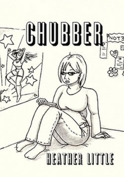 Chubber — Heather Little
Remember when you were a kid in middle school and the most important things were trying to fit in, trying to belong and just wanting to be liked? Then puberty comes along and gives you the smackdown. Toss in mean girls, bullies and not to mention: discovering boys. . . Whoa! How does a girl cope? Well with best friends, of course.
Join Lucy as she encounters life full-on, learns how to accept herself and discovers the true meaning of self-worth and friendship.
"The cover does manage to communicate what the story might be about. You can guess it's a coming of age story, involving teenagers and school life. While it does let you know that, there are more effective ways of doing that. There's a lot of imagery from schools and classrooms that can be used to communicate a similar feel. Right there's too little happening."
 The Unseen — Guyanne Lillie
Lilly and her friends, Hannah and Erin encounter the Spirit realm. Consequently, worlds collide.
Spiritual warfare becomes a reality when an unseen enemy stalks and attacks determined to steal their destinies and ultimately destroy them.
Through adversity and trial, warriors ablaze sealed with the fire of God are born.
"The cover is really sharp and well done. The author name is sized perfectly. The title could be a little bigger. The title could also use some texture as it's too flat right now and looks digital. There's a very nice vertical flow with the glowy eyes at the bottom. The background could use a little more atmospheric particles to make it pop out more."

Threat — Horton Prather
Jake Grayson returns to Honduras to pursue his relationship with Amélia Ramirez. A psychotic killer is on the loose, seeking revenge, and she’s stalking Jake and Amélia!
They don’t know the killer’s identity, but they must flee to avoid the threat. What do they do when she follows, pretending to be a friend?
"The title pops out a lot better on screen. There's a bit too much going on with about seven elements playing with each other. While all the elements might have some significance in the story, it begins to feel a little bit like a collage. It's best to stick with two or three images."
 Strange Fruit — Tyran Saffold Jr
Ehhis is young man who moves from a small, racist town in Idlewild, Texas to Harlem, NY in 1921. He has aspirations of presenting an unheard of form of art to the citizens of Harlem, Spoken-Word. But his dreams of becoming an entertainer are quickly interrupted when he witnesses a murder within the first few months of his move to Harlem.
"The microphone graphic is great, even though it's a bit busy. It reminds you of noir images. It tells you that the story is probably about some sort of murder of crime involving a musician. The reflection of the man could be a lot bigger. Even though title and author name doesn't need to dominate the cover, you should be able to read it clearly. Right now, the text gets lost. There are great ideas in this cover, but it needs to be executed a little better."
Did you agree with Jake's opinions on the designs you saw here? Was there something he said that you want to apply to your book? Feel free to leave any questions you might have for Jake in the comments below.

