I think for a lot of people, typography is another world. It's a strange subject that perhaps you've dabbled in a little bit, but hopefully tonight, you'll have a slightly clearer picture about something about how it works with cover design. It is an enormous subject. I could talk for hours on typography: You only have to walk down a high street in a shopping mall, or you can look in your cupboards where your food is and see the vast range of typefaces we have now. They're on everything. But, of course, they came from somewhere.
I went to a lecture about street signs when I was at university many years ago and one of the lecturers there was a guy who designed letterforms that went on signs. When I came home, I said to my parents, "Mom, Dad, I went to this lecture on signage and a man who designs letters for road signs," and my mom looked at me and she said, "What do you mean, 'designs letters'? They just come out of a book, don't they?" And they don't, of course, and I'm sure all of you realize that they don't just come out of books. They're all designed. They all have people spending hours, days, weeks, carefully forming the letters that we have.
You know, nowadays, we are so rich in that we have such a vast range of typefaces to choose from. That, in itself, can be a problem because you're almost spoiled for choice. Part of the problem now in design ... or not the problem but challenge as a designer, is to look at the typefaces that you've got, look at the subject matter of the book you're producing, looking at the market and thinking well this is going to be just the right one for this subject.
Serif and Sans Serif Fonts
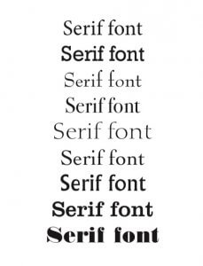 One of the main type sorts are serif fonts, which have these sticky out bits, called serifs. No one's quite sure where the word serif comes from. It's believed originally they were done because when they wrote and used brush lettering, they would start the brush with a little wiggle, and then move it down the vertical, and then wiggle at the other end and then bounce up to form the serifs. That's a theory that's probably true.
Just looking at the ones here, you can see in this small selection, what a vast array of different designs there are. And they all communicate something subtly different from each other. So, the second one down is what we call a slab serif, where you have got very blocky serifs. The third one down looks slightly more antiquated with very large serifs. It's reminiscent of the kind of lettering that would be found in the 10th, 11th, 12th Century with versals. That's another subject in itself. And then, going down, you can see all different font styles.
And then there are sans serif fonts.
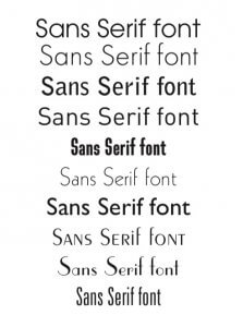 Again, you can see, you know, a different feel from every font. Every font has a different kind of a way of expressing itself. The bottom three, there's the very kind of dated looking, like 1930s fonts there. You've got condensed fonts, which means they're very squashed. You've got expanded fonts, which are very stretched out — and everything in between.
And then we have scripts. We have blackletter, which that kind of gothic feel, which is great for your kind of your horror stories, or your kind of things set in the medieval periods. I've put historical fonts, what do I mean by that is that you have certain fonts which evocate a historical period. This particular font is taken from a series of Bibles ... printed Bibles ... from around about the 14th Century. And so, you might find fonts that are evocative of the 1920s, or Victorian era, or whatever.
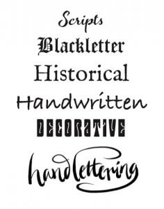 Handwritten fonts, nowadays, you can literally scan in your handwriting and produce a font from that, which has been quite interesting. That's different to hand lettering, and I'll explain why. Decorative fonts are a fonts ... that's not a terribly legible one, but are fonts which are very, very decorative, which can be fantastic for, you know, fantasy books, or books evoking lots of things to do with fantasy and stuff like that. Hand letterings leave a little bit more stylized than handwritten. Hand lettering actually follows certain forms and tends to have certain kind of structures to it, which handwriting doesn't in the same way.
So, let's start off with looking at a typeface, Garamond. These are just versions of the same typeface, Garamond. There's even one called Sabon, which was based on Garamond. Each of those has their own flavor. So, if you look below the ag's there, the very first squiggly ag, that was actually taken from the original Garamond typeface, which was I think in the 14th Century or 15th Century (my history's not that great).
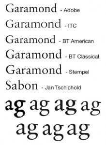 But, you can see next to those are these different versions of the fonts. All Garamonds, all having slightly different expressions, all very subtle difference. But, for example, if you're doing text design for an inside of a book, and you choose ITC Garamond as opposed to Stempel Garamond, you'll have a different flavour to your text, so these all are all important considerations, but I just wanted to highlight that so you understood there's a whole range of things even within one typeface itself.
Let's crack on with actually looking at some book covers. Now, if we are looking at books, we often think about it in terms of the subject matter or the author. That's very important, particularly if you are an author, as you obviously want to get your product across. But, from a design point of view, the main purpose of a book cover is to sell the book.
When you're putting a book on the shelf, what is it that you have to draw the customer? It isn't often the name of the author. Okay, if you're J.K. Rowling or another big author, then people are going to go into the bookshop particularly to go for your book. But, as a new author, you don't have that luxury of having a well-established name.
So, what you've got is the book cover, and what the book cover had got to do is attract you. What it uses to attract you is emotion. Now, this is a very interesting thing. We don't often go into a bookshop thinking about the emotion that the book cover is giving us, but it is giving us an emotion, even if you're not aware of it. Now, it doesn't mean to say you break down in tears every time you go and fetch the book, but what it does mean is that the designer has worked hard to produce something of the flavor, the atmosphere, or whatever it is about the book, in such a way that hopefully you'll be enticed to buy it.
Earlier on today, I had a little think about some of the different kinds of emotions that you might think about when looking at a book cover. There might be a sense of tension on the cover, a sense of mystery, of complexity. You can have the emotion of humor on a cover. You can have a visceral sense where you might have, for example, some kind of slasher novel or heavy crime, where there's a sense of blood or whatever it is.
Another emotion which is very important for certain areas of the market is aspirational. Now, this is important for example, if you're doing a book on spirituality, or maybe a self-help book, and a book that's going to try and point you in a new direction. And so, for example, Paulo Coelho books like The Alchemist often have beautiful landscapes or that kind of thing. Desire is also an important emotion if you're doing romantic fiction, or things of that nature.
Another good one actually is authority. And authority not in sort of sense of police authority, but the sense of a book having authority on the shelf. So, if you produced a major biography, for example, or you're producing the book about X, Y, or Z, the typography needs to look authoritative. It needs to say, "This is the book to have."
And so, all these kind of emotions are really what drives the design, ultimately to get the best kind of visual communication. What we're dealing here, is with here, is a visual language, but in some ways, it's a visual language that we're not conscious of. It's more of a subliminal thing that we respond to.
It's impossible to look at a book cover without considering the way the type works in the relationship to the image as well. I've got very few books here, if any, that are just typography because I think that's very rare nowadays.
General Fiction
So, let's crack on. The first page ... I'm going to look a little bit about general fiction, but this evening, because we have such a large area to cover, I'm going to look mainly at crime fiction, and sci-fi, and fantasy, because these are the two areas that I get asked most often to design covers for through the Reedsy website.
 There are so many good designers out there now, and I'm just one of many, many, many cracking designers around the world. There'll be one or two of my book covers here, but a lot of these are by other designers. These are just some generally good covers which I put up here because I like them. I think they're beautiful covers. But, look closely at the type, because the type often is not necessarily complex.
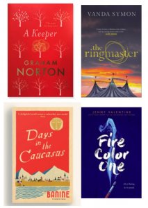
The first book there, A Keeper by Graham Norton, has very beautiful, simple type. It's a serif type at the top, in italics. The author's name quite big, bold and spaced, because he's quite well known here in the UK, and spaced typography. Now, if you spaced typography like that, it often gives a sense of classical authority and space, which is lovely. It was a fashion, I think, in the 1980s, where everything was really spaced. So, everything was very, very widely spaced, and it became quite ridiculous. It's not quite that bad nowadays.
But, you know, there are some things you can do with types, say for example The Ringmaster next to it, has got a slight texture to it. I love the way they just put that little quick hand drawn flick of the circle there. That says so much ... just little technique like that can lift the whole of the typography. I love the Days in the Caucasus. I mean, that is a book which has a kind of period feel to it, not only because of the illustration but because the typeface they've used, to me anyway, looks like something you would've found in the 1950s probably. It looks might have even been hand drawn. I don't know.
A lovely example of brush-drawn lettering on the right with Fire Color One. Again, it evokes something. It evokes a sense of airiness, but also remains vital, like you can feel the brush being drawn on the page. It has a kind of tactile response.
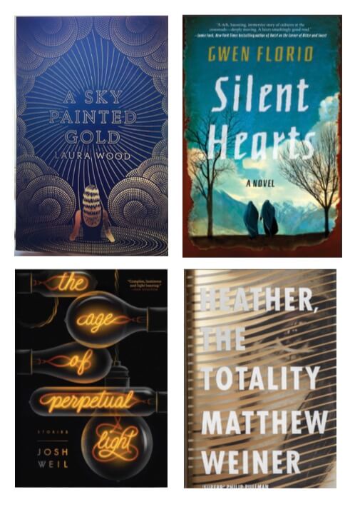 A Sky Painted Gold is beautiful. If you see the actual thing, all that is gold blocked onto the surface of the cover. It has a real shimmer to it. The font, itself, if you look closely, is a serif font, in capitals. It's quite nicely spaced out, but they've outlined it, so that when you have it in gold, it has this lovely shimmery effect, along with all the dots around it, the lines around it. It's a very beautiful cover.
Now, I understand that as self-published authors, you're not going to be able to use gold foil unless you've got a lot of budget afforded to you. It's still worth looking at these sort of techniques anyway, considering them. Silent Hearts, again that font there looks like a kind of a period font from maybe the 1950s, but it might be a new font. I don't know, I haven't seen it before. It's got a lot of character to it. Again with the illustration, it has a lot of the sense of space and peace about it.
I love the one below that, The Age of Perpetual Light. I've no idea what this book's about, but again a very clever use of type as illustration. Again, it's something worth considering, if you've got ... if you're employing a designer who is also an illustrator, there's something you might consider if it's an area appropriate for your subject matter ... to produce an image that's also the title, is very, very clever, and very satisfying somehow. Again, it's a very kind of beautiful feel.
And the opposite, in a sense, with Heather, The Totality. The typeface here, which is a condensed sans serif face, is very, very plain, but that's because it's actually sitting on top of a very complex background. Again, I think this was done on acetate, so it's kind of got a plastic cover with gold on it, and so it really shimmers. If you had a very complex typeface on there, it wouldn't work. This is something that a lot of young designers find difficult: how do you make the font really zing out of the background.
So, be aware here: I think of most of these covers have type that comes out of the cover very strongly because there's contrast. Contrast is a really useful tool in design.
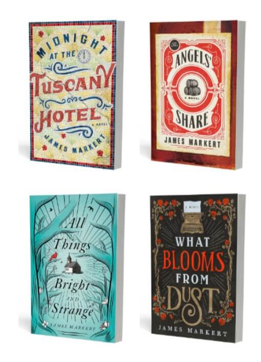
I love this Tuscany Hotel, not only because it's beautifully designed in terms of the lettering, but also it's done in mosaic, so it actually looks like, you know, the entrance to a hotel, where you step on the beautiful mosaic on your way into the hotel. It evokes that kind of tiling that you get in Italy. And again, we got to looking around these books, you got some beautiful, these sort of decorative typography, a lovely combination of fonts as well.
Now, it is good to combine fonts. Look at the Midnight at the Tuscany Hotel, we've got probably just two main fonts. The Angels' Share, again two fonts. It's not great to go away from two, or maybe three fonts unless you're doing a particular cover that really warrants it, because it gets very complicated. You have to be very, very good at handling type to do that. But, there are no rules, in a sense, in the way what looks good is what works.
Romantic Fiction
These are just an example of romantic kind of fiction, so they get more of a kind of carefree, light and scripty font at the top, and then a stronger sans serif from below it. Works very well with the illustration. It's sort of beautiful.
 I love this cover below. This was designed I think by David Mann, who is the art director at Bloomsbury, UK, a fantastic designer. This is a beautiful book. But again, the typeface is quite unusual. I could be wrong but it looks like a kind of a typeface you would've found around the Edwardian period. It's certainly got that kind of feel, but stacked like that, vertically, it's a really unusual layout, and it immediately makes you want to pick it up and find out what's going on. Of course, underneath the jacket, you've got this beautiful piece of foiling which is absolutely stunning.
Science Fiction and Fantasy
A lot of people come to me for this. It's a particular genre which is actually quite interesting for type because we often do quite some interesting things for the kind of books that you want to evoke for atmosphere, or period, or other worlds, you know, drama, or whatever it is. I've put on the first page here, The Hunger Games because that's such a well-known book. It's been out for quite a while, and of course the films.
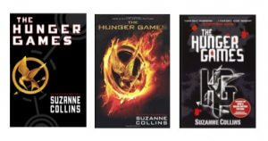 There are three examples here of the way that the publisher has handled the type. The one on the left has quite blocky, strident type. It's the sort of a book that is set in a kind of a totalitarian state, so this is reflected in the lettering. You can imagine the first cover, with its square, blocky, letterform coming out of Communist Russia in the 1930s and '40s. The one on the right almost evokes a swastika with the HG logo there.
And that's something else you could consider. So, what we call a logotype is where you use a lettering, a group of lettering, to form a particular, almost like an image that can be used. So, if you're doing a series of books, you might want to get the designer to design a series style for your main heading, that will then become the logotype for the series of books.
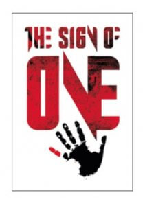 Below that is, I think of The Sign of One, which I designed for a British children's publisher, and they were looking for something that had a feel of The Hunger Games in it, so I designed a typeface that had a very similar kind of feel to The Hunger Games feel. He didn't use it in the end, but I just put that in there as it ties into what we were just talking about.
Adapting a typeface
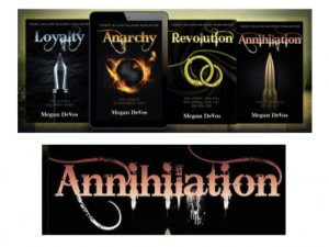
The next page looks at adapting a typeface. This is quite a common thing that we do in fantasy kind of books, where you look closely at the word Annihilation. I could be wrong but I think they've taken a conventional serif font, and they've adapted it to do a rather kind of quirky and slightly anarchic font, little sticking out flanges in the middle of the letters, the kind of brush-drawn ascenders and descenders, these lovely swirls going around it.
And you look at the books, and immediately, you have a feel of a book here that's going to be intriguing, possibly set in a future world. It's obviously a book that's dark because it's black, it's got these intriguing images on the front. But, the typography definitely says fantasy. It definitely says something that's otherworldly, it's not your average sort of everyday kind of book.
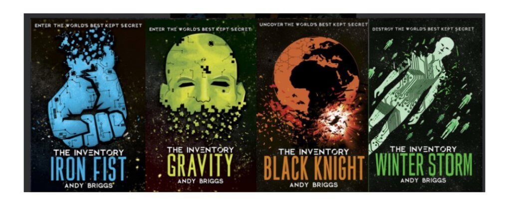
Then you have the books The Iron Fist, Gravity, Black Knight, and Winter Storm, they've really focused on the images here, and the fonts are very condensed sans serif typefaces. That's very clean kind of feel. But, also has that equal kind of authorities you might find in the previous covers, on The Hunger Games, that sort of sense of strident authority and strength. That's an important emotion for a book that's going to convey that kind of element really.
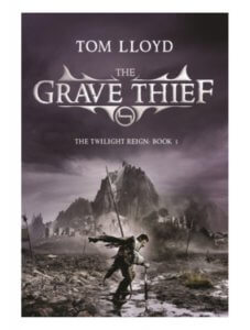
This next book I've found this recently on Twitter. The publisher (who I think is Gollancz, a fantastic publisher for sci-fi and fantasy books here in the UK) have recently rejacketed The Grave Thief. Now the first cover there, I would call this, you know, a classic fantasy cover. You've got a font, which has been adapted, so it's made to look astutely more decorative, but a fantastic piece of artwork there, this figure in the foreground, and the kind of slightly quirky decoration around the typeface giving it a kind of logotype kind of feel. It's got a real sense of it establishing it as a title.
But now, the new hardback version of it has a completely different feel. I'm showing this because this shows that even within the sort of sci-fi and fantasy area, you don't have to follow the genre's style. I mean, you know, the thing about genre is, it's going to be broken, whatever it is, it's going to be different at certain times.
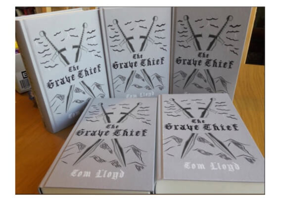
But, the thing about a genre also, it's important to know that your book is selling into a market where people will recognize the genre. So, even if you're going to be breaking out of the genre with your final cover design, you want to be aware of what else in the market is looking like.
Often when I'm dealing with authors on Reedsy, and they come to me with a proposal for a book, I will ask them to either post on their brief, or send me examples of other books that are in the market, because that really gives me an idea, not only what they're looking for, what their expectations are, but what the marketplace is expecting.
That doesn't mean to say you can't break away from that. Initially, on The Grave Thief, they've used on the bottom a gothic blackletter like we saw earlier on, to evoke that kind of feel of that kind of gothic, and the very simple line drawings. It's a very different kind of feel. I'd be interested to know which of those you prefer. I'm not going to say. I'll be interested to know what you think.
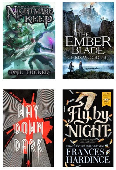
Here are some more fantasy covers. The first one, Nightmare Keep is what I would call a more traditional mainstream kind of fantasy typography, and it's very well done. It's beautifully crafted ... a lot of detail within the lettering itself. Even the author name has a lovely sort of twirls and twittles and a very strong illustration. You know that is a fantasy book without even thinking about it. But, interestingly enough, the one directly below it, Way Down Dark, is more of a dystopian book, set in Australia. The typography they've used there is completely different feel. In fact, all these have different feels.
If you look closely, the type of "The Ember Blade," has just added a little bit of finesse on the M, the A, and on the E's. They probably used a standard typeface and just tweaked it. But, just that small amount of tweaking is enough to give it the flavor you need to kind of evoke something that's slightly more than the ordinary.
Fly By Night by Frances Hardinge has been recently repackaged very beautifully. I can't remember who the publisher is. But again, that beautifully hand hand-drawn very, very strong. Again, it has a certain emotion and beauty to it.
On the next page, we've got some really beautiful examples of the sorts of kind of styles you can use for, you know, high fantasy type of things.
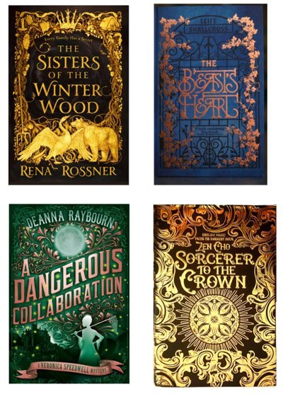 I think A Dangerous Collaboration is more of a kind of mystery rather than a fantasy, but you still get the point, that these are very beautiful covers. Sisters of the Winter Wood, that typography there is not that complicated if you look closely. That actually is a font, I think it's Yana, designed by Laura Washington. It's a lovely, lovely font.
The one next to it, The Beast's Heart, which is a retake of Beauty and the Beast, they've obviously hand-drawn all that lettering, so it fits within the gate. Again, if you've got a designer who's good at hand lettering or letter design, it's worth talking about the possibility of having a purely typographic cover, if it's appropriate to the subject you're publishing in.
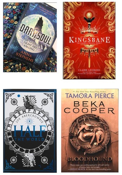 Then there are examples of a subtle sort of typography for fantasy. In A Dark Soul, they haven't done a lot with the typeface there, and same with Kingsbane, but it's enough, again, just to lift it. The books below have actually done almost nothing with the typefaces at all, in terms of making them, you know, fantasy. But, it's the strength of the illustrations around them that really give the feel of the fantasy. Although, with the Beka Cooper, they've used ... they've extended out the K and the R. That looks like Copperplate font. They've had little dots in the O's and things just to give it that sense of intrigue.
Sci-Fi Type
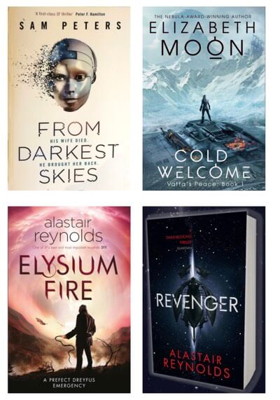 In times past, science fiction often had quite elaborate typography. The tendency nowadays is to slightly cleaner, simpler type. These are four lovely covers. If you look closely, again, they've used very simple, mainly yes, sans-serif typefaces, and just tweaked them slightly, just enough to give a slightly different feel.
The nice thing about sans serif typefaces, you know within a sci-fi context, is they have a more mechanistic feel to them, so they lend themselves naturally to the world of the machine, the idea of space or whatever. So, they tend to be used more on sci-fi covers, not exclusively. Sci-fi covers can also have serif faces too. You can see how they've taken away bits of some letters and added bits more to give the sense of that kind of sci-fi feel.
Again, a completely different feels there.
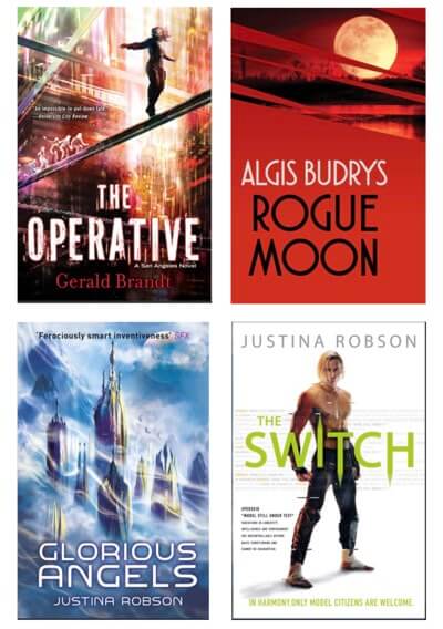 You've got slightly corrupt type on The Operative. The Algis Budrys is a new package of a series, again, I think, by Gollancz. They've just sort of used a plain sans-serif face, but the whole series looks very stunning. It's got a bit of character to it.
Glorious Angels, I suppose I would think is a more traditional kind of sci-fi font fact, the sort of font that has a slight quirkiness about it. It's slightly extended. It has unusual letter shapes. But, with Switch, next to that, all they've done is literally dragged some of the letters up and down into points. That was enough just to give that kind of unusual quality. So, you don't necessarily have to do a lot with a font to make it unusual, or to make it kind of evoke a period or genre. You can get very elaborate, but it doesn't always need it. It's worth looking at these kinds of elements to see what you can do.
Interview: Crime Fiction
Note: In this section, I interview my colleague and client, Sean Garrehy, who's art director at Little, Brown. Sean's been in the industry now for about 18 years designing covers, but he's particular penchant is for crime fiction, and he has a lot of experience in this area. So, I thought he would be an ideal candidate to talk a little bit more about the subtleties and differences between the different sub-genres within the crime fiction area.
Sean and I were talking a little bit earlier about the whole importance of market and the marketplace, and how that, in a sense, helps define ultimately how the book is going to be pitched towards the marketplace, and therefore how it's going to look.
So, Sean can you tell us a little bit more about that, maybe show some examples of different kind of markets and different kind of covers?
Yeah, well markets are something that when we get briefed, it's an everyday word at a publishing house.
 For instance, we have an area of the market which we kind of label "cozy crime" which has a certain feel and look, you know. It can be sold in the supermarkets and in the likes of [British book-chain] Waterstones.
You know, the markers are there, the illustration, the type that marries well with this illustration so the two — they're working in harmony. The type is big, but illustrated covers are very much in this area. I'm not saying they don't use photographs, but you know, it might be a really lovely photographic landscape, maybe still illustrative type could work.
 Then there is historical type for books which are set in the 1800s. A lot of these books do have railings and lamps on, and roads, and this one I wanted to show because the type is really strong on it. Andrew Smith designed it and it's very much led by those kinds of old packaging — bottle labels and such. So, it's a kind of old typography, used in a really contemporary way.
It's not so much the typography that says it's crime: more the imagery that surrounds type. How would that compare with the more sort of hard-edged crime fiction then, in terms of the readership and the sort of book it's portraying?
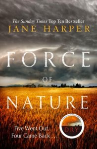 Well, some of the stuff that's kind of a sort of a crossover on that, things like that we've done for Jane Harper. Very landscape based, but still very big type.
You know, it's kind of got that serif typeface on her name, still very big. The title is very big ... flagging up the other book. You know, it's a lot of typography to fit on there. The landscape giving it the sense of place. You know, slight scratchiness to the typography marries well with the atmosphere of the image.
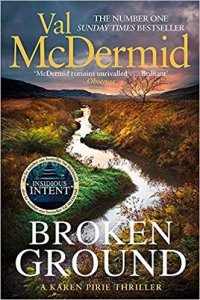 Again, one of our big authors, Val McDermid. Her type is similar to Jane Harper's: it's very big, a little bit more commercial. It sings out from the shelf to the supermarkets. The whole idea is to kind of drive that large type, marrying and marry it with those kinds of large landscapes.
What does the large type do then? Is that kind of just shouts a bit more then?
Yeah, it sort of flags it up a little bit more as 'crime'. A lot of commercial type is a lot bigger, because you're vying in a marketplace with a lot of other books.
On the more 'literary' end, the expectation of the book might be not as big with that kind of crowded marketplace. If Val's got a new book out, or Mark Billingham, or Patricia Cornwell, you know, you want to make sure that it's clear, this is the new book, really, really hard and punchy and edgy.
So, on that Patricia Cornwell, for example, why did you choose a typographic image over say, a photographic image which you've used in the past for that kind of series?
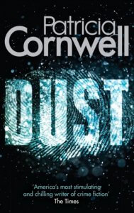 She's all about forensics, so it's just trying to push it as far as possible. Using type as image isn't new, but there are always new ways to do it. Mark Billingham, where again, the typography is really powerful, punchy and clean, still with a bit of personality to it. You know, Alex Grey is the same, just in a different way. Clear and concise.
Just to wrap up, if you were an unpublished author, you wanted to get your work published, and you're a crime author, what are the important things to think about when you're going to communicate with a designer about what your book's about, and how he or she is going to represent your work?
I've seen so many e-books that have small type. You know, the important thing about typography: make it clear what it is. Subtitles don't necessarily work when it's so small. And be honest: who is generally your book aimed at? If people might want something that's a bit more whodunnit, a bit softer, and then you don't want to mis-sell it.
I mean, the reason that a lot of books are punchy and look like that because they send a message, you know, a clear message of what sort of book you're going to get. So, I think you just have to be realistic about where it is, and who it is you want to attract to your book.
As you heard from what he was saying there, the important thing is to really know your market. The importance of market cannot be stressed enough. How you get to know what your market is, is really up to you to research. A very good thing I have often advised a lot of authors is to go to a good bookshop and talk to the staff, because they really understand what they're selling, what the kind of books that your book might fit into, study the kind of covers that are out there with that kind of book.
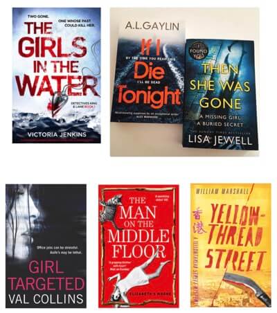 The images at the top are classics of heavy crime. They're the kind of covers that would actually work very well as e-book covers. There's emotion created in the way the type is distorted. The type on The Girls in the Water makes it look a little bit like blood ... very strong, very powerful sans serif typefaces again. It's very common to have sans serif for this kind of Crime, because it's really punchy.
The books below are some covers I had designed recently, but they're all different kinds of crime. The one on the right, Yellow-Thread Street belongs to a very quirky series of books, so I did a very quirky cover, because it did not fall into common crime genre.
Next page, again we've got three versions of The Devil's Detective. I'm not quite sure which is the oldest but the one on the right is, I think, is the newest version. Again, you know, it's three ways to skin a rabbit. They're all different. They all have their own feel. They all have their own value as covers.
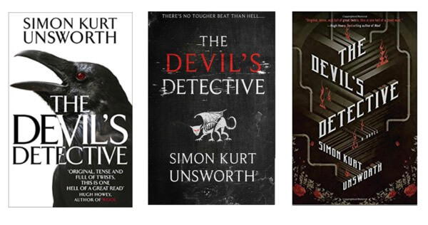
From the publisher's point of view, they're repackaging it. They want to give a different flavor, perhaps catch a different kind of audience. They're always looking at different ways to put a spin on the cover. I love the one on the right because it's very inventive, but I don't know what the book's about exactly, so it may not fully summarise what the book is. I don't know. You have to decide for yourselves what kind of cover really evokes the kind of feeling you want to get across to the audience you want to attract.
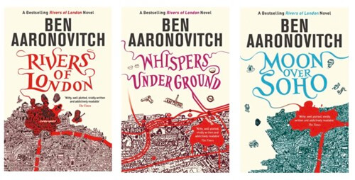
The Ben Aaronovitch covers, these were very hard to design for because at that particular point was a new kind of sub-genre in crime fiction. It was kind of supernatural fantasy stories with a strong crime aspect to it. The lettering was chosen to evoke the whole kind of feel of rivers, obviously, but also to give a fantasy feel at the same time. They've done very well, which is good.
Period Crime
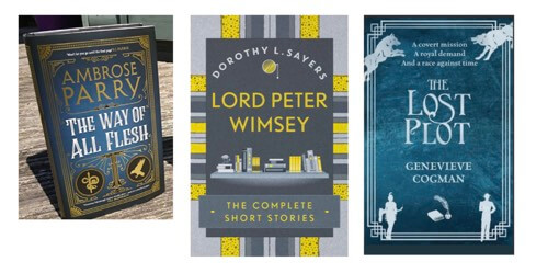
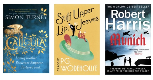
I mentioned a little earlier the ability of font, a typeface, to evoke a period in time. So, the Ambrose Parry, The Way of all Flesh has definitely got a feeling of maybe Edwardian or Victorian. Lord Peter Wimsey has a very clean sans serif font. I'm not exactly sure what it is but it has a kind of feel of the 1930s about it, which is lovely. The Lost Plot, again, that kind of Edwardian feel.
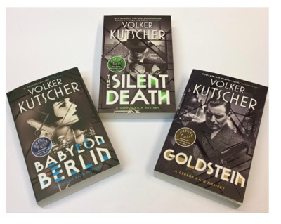 These Volker Kutscher books were made by a fantastic British designer called Mark Swan. They evoke the 1930s film noir art deco kind of typefaces. Obviously, the photographs say a lot about that period, but I think if you took the photographs away, the typeface is strong enough to convey that kind of period.
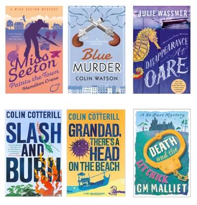
These next covers are ones which I've designed, more in the cozy crime kind of area. You will see more color. Also, the fonts tend to be more friendly, more inventive, less strident, less in your face. And the two Colin Cotterill ones are perhaps a little bit more in your face, but are slightly different books, but still quite colorful.
Literary fiction and Non-Fiction
I'm going to quickly run through the final of pages. I mentioned earlier on the ability for type to evoke time, so if we go to historically set fiction, you can see all those covers evoke certain periods of history, and mainly through the typography. It's partly through the imagery, but mainly through the typography.
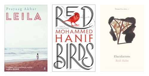
Literary fiction is a whole different genre again. Again, it's hard to pin down. You kind of know literary fiction when you see it, but often it has quite reserved typography. Sometimes it can be very, very small typography, like in the Elucidations on the right. Often, it's very carefully thought through.
These are particularly lovely books. Yeah, again, you could talk all evening about literary fiction.
Nonfiction tends to be perhaps cleaner, tends to be a little bit simpler perhaps, in the layout. But, that's a generalization. Some nonfiction stuff can be very complicated. I mean, I don't want to make generalizations here. Again, we could do a whole evening on nonfiction.
If you'd like to see more about current cover design then go to Spine Magazine. My own work can be found on my somewhat out-of-date site. If you like me to work on your next cover, then send me a request through my profile on Reedsy. If you have any questions for me, just leave them in the comments below.