We are very excited to bring you the highlights from our first Reedsy Live Chat, which as promised will be a regular feature in the coming months. Every live chat features one professional from the Reedsy marketplace hosting an interactive session that includes among other things free advice on topics like editing, book design, and marketing.
We started things off with our first Cover Critique, a big thanks to the terrific Mark Ecob for an informative session.
Mark runs his own design studio and specializes in book cover design. He has worked with large publishing houses like Penguin, Little, Brown and Amazon, as well as independents such as Faber and Icon. Since 2012 he has been Associate Art Director for Unbound, the London based crowd-funding publisher. His work has been recognised three times by the Design & Art Directors Association (D&AD), and exhibited at the Hay Literary Festival 2012.
For those of you who missed it, we've compiled a brief recap. However, we strongly recommend you watch the videos.
Solomon's Magpie
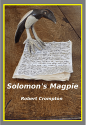
Author: Robert Compton
The type is clear and can be read. However it doesn't communicate setting, time frame, or what it's about. There is no coherent message and the layout choice is amateur.
The Devil in the Bottle
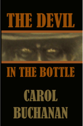
Author: Carol Buchanan
While the text can be read clearly, the layout doesn't have a clear hierarchy in terms of image, title and author name. Unless you're a famous author, it's best to have a small font for your name. A small subtitle could help in communicating the genre.
The color palette is too mute and the image resolution is low.
Freya's Inferno
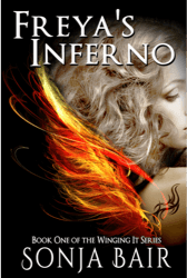
Author: Sonja Bair
Very good picture but it is cropped on the right awkwardly. There's a lot of empty space on the left. 'Book One' text is not centered. Letter spacing is poor and author font dominates title font.
There's too much going on vertically, but overall it's a very good stab at a cover.
Inferior Nutrition
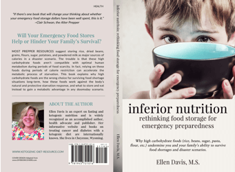
Author: Ellen Davis
This cover has probably been made using a template. It tells you immediately that it is non-fiction, with classic font and layout choices.
The subtitle is too long, and the grey background doesn't work.
The Wizard's Bones
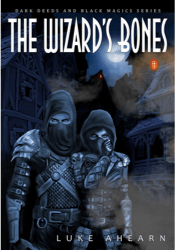
Author: Luke Ahearn
Fantastic illustration and appropriate color palette makes it a good cover for the fantasy genre.
Type layout looks random, and the type could stand out with embellishments like texture and lighting to give it a 3D effect.
What Happened at Apache Lake
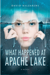
Author: David Balzarini
Beautifully typefaced and looks professional. However sense of space is confusing and it's not clear what's going on in the background photograph.
A font combination of Serif and Sans Serif can be used rather than same font for both title and author name.
The chat got interrupted due to unforeseen technical challenges (Mark's phone died), but things picked up speed quickly as he came back and went through the final four covers lined up. Click here to continue watching.
Gods
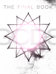 Author: SW Hammond
Really nice, but a little confused. This is really nicely done but there's too much going on. The title fights with the central motif and the author name gets lost in the bottom. The silver color of the font could work as foil in the print version but it isn't the best choice for a screen.
The grungy effect is nice.
The Reluctant Adventures of Fletcher Connolly
 Author: FR Savage
Looks professional. Immediately communicates that it is comedic sci-fi.
Overall the elements could work harder together to get more happening.
Betrayal
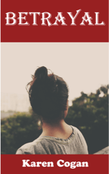 Author: Karen Cogan
The photograph is beautiful. However the book is a romantic suspense and this isn't communicated by the cover, looks more along the lines of a literary fiction cover.
The red bands distract from the photograph and the typography doesn't work as the two fonts used are completely different. As a general tip, image, type, color, layout, hierarchy, all of these elements should communicate one coherent message.
The Necromancer
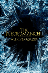
Author: Alex Stargazer
A very professional job and the best cover of the lot by far. This is a great example of font embellishment I mentioned earlier, compared to slapping plain text on a cover.
Subtle effects make a big difference. The gold font color is an excellent choice.
General cover design tips from the session
While critiquing these different covers, and during the Q&A session afterward, Mark shared some pretty good elements of advice regarding covers. So make sure that your next cover incorporates all of them!
- Different elements like image, type, layout, should be organized in terms of a justifiable hierarchy
- Don't use a large font for author name unless you're Mark Dawson
- Always use complementing fonts (eg. serif, sans serif) rather than the same for title and author name
- Small embellishments to type like lighting and texture is an easy way of making text gripping
- The front, back, and spine should all be versions of one motif that communicates a coherent message
- A subtitle makes it much easier to communicate genre, mood and setting