Blog •
Posted on Aug 23, 2018
Finding Your Style in Book Cover Design
About the author
Reedsy's editorial team is a diverse group of industry experts devoted to helping authors write and publish beautiful books.
More about the Reedsy Editorial Team →Ricardo Fayet
Reedsy co-founder and Chief Marketing Officer, Ricardo Fayet has worked with hundreds of authors on their launches and marketing campaigns. He is the author of two bestselling guides on marketing for authors, and a regular presenter at the largest writers' conferences.
View profile →Micaela Alcaino is a graphic designer, turned book cover designer, who fell into the publishing world by chance. Helped by her distinct and recognizable style, she has built an enviable body of work, designing covers for many bestselling and prize-winning fiction titles. In this interview, she shares the story of how she came to work at one of the world's largest publishing companies — where she still manages to put her stamp on every cover she designs.
Could you tell us a bit about yourself?
I’m a born-and-raised Aussie, now living in London, and I design and illustrate book covers for a living.
How did you get started in book design?
I actually fell into it by chance. I moved to London from Sydney fresh out of university and wanted to find a job in graphic design. I didn't realize designing book covers was an actual job until I turned up for an interview with Transworld Publishers. They took a chance on me, and I fell in love with it straight away. To me, it’s one of the best jobs out there for graphic designers — every project is completely different from the next, using your imagination is a must, and you get to read incredible manuscripts and then make the journey to find the right cover for it. I never looked back.
Tell us a little about your role at HarperCollins. How did it come about?
I’m a senior designer at HarperCollins where I work on a variety of book covers and internals. I was brought on by my boss at a previous job who had moved there a little before I did. I work across all genres, from fantasy to crime and thriller to non-fiction, and I get to illustrate some of my own covers and design internals, such as the insides of cookbooks.

FIND CLIENTS
Grow your business on Reedsy
Submit your application to join our curated network and connect with clients.
How did you develop your own style as a book designer?
Experimentation. I think playing around and experimenting with different concepts eventually leads you to your own style. I’ve tested many different types of illustration and played with typography and hand lettering — eventually, you find your rhythm. I really believe that playing and experimenting evolves a designer.
Q: How did you experiment to discover your book cover design style?
Suggested answer
I wouldn’t say I have a defining personal style. My covers are always focused on the market and what works within a particular genre. Being a commercial designer and art director is a bit like being an actor: I put myself in the shoes of the reader or buyer and imagine what they are looking for, how the book will feel on the shelf, and what will catch their eye.
Thinking like the buyer makes it easier to make design choices that are both creative and commercially effective. It helps me balance originality with clarity, so the cover stands out while still fitting within the expectations of the genre. Every project is an opportunity to explore ideas, but the ultimate goal is always to create something that resonates with its audience.
Clare is available to hire on Reedsy ⏺
I’ve always strived to improve and provide my clients with the best artwork I can create, experimenting with different techniques and approaches along the way. Funny enough, there was a time when I worried I didn’t have a recognizable style — and maybe I still can’t claim that 100%!
Over time, though, my work naturally evolved. By focusing less on “having a style” and more on honing my craft, my covers became more polished and personalized without me even realizing it. That process of experimentation and growth is really what shaped the style I use today.
Alexandra is available to hire on Reedsy ⏺
Often times your style comes from your limitations. Most of my favorite illustrators have a style that's quite different from mine and it's not from lack of trying. When I was starting out I would try to make a design in the style of someone I emulated and found myself unable to achieve it. So much of illustration and design is about problem solving so instead of giving up you have to navigate around it and maybe even embrace it to find success.
For example, I remember trying to do a cover with a city in the background. I love drawing people but I'm bored by pretty much everything else. My brain doesn't have any architectural acumen and eventually I just gave up on that part. I skipped ahead to laying out the text and found that it covered so much of my drawing, making the background almost irrelevant. I didn't want to lose the idea so I experimented with turning the text into the city itself. I've always been more an illustrator than a graphic designer so this felt like a world unfamiliar to me but I loved the outcome I had stumbled upon and found my style continuously moving into designs like these. Some people are maximalist and their art is amazing, but with book covers in particular, we've got so many ideas we have to condense and make apparent at the same time.
When I hit a roadblock with my style not working with the brief or connecting to my initial idea, "simplify" is usually my mantra. I look for ways to shave it down and make it more economical. Style doesn't come easy and often times you have to elbow your way through a lot of designs to reach the final one. That can be intimidating for me because it feels like the illustrations I make during this process are wasted, but just like going to the gym, the exercise creates the effect. Don't be afraid to scrap something so that it can be reborn anew. If you're good, your style never just reaches a set point. It continues to morph as you absorb new passions and experiences. Trust that your style is inherently inside of you always, it just needs the shaping from the expert that is you.
Nick is available to hire on Reedsy ⏺
How did you start creating covers like this? Where did you get your inspiration?

Lots of places. Pinterest, traveling, billboard campaigns, art exhibitions, product packaging. Everywhere, really. I try not to get ideas from other book covers so that I don’t get stuck in a genre spiral when it comes to designing.
Q: What sources of inspiration do you turn to when creating book covers?
Suggested answer
My main source of inspiration always comes from the book itself. I focus on its emotional core — the atmosphere, themes, and tone — and translate that into a single visual that feels true to the story. Beyond the book, I draw inspiration from films, TV shows, digital illustration, and other visual arts, which offer fresh ways to approach composition, color, and mood.
I also pay attention to genre trends and bestselling covers, blending those insights with my artistic influences. This combination helps me craft covers that are faithful to the story while standing out in the market.
Alexandra is available to hire on Reedsy ⏺
The first and best source of inspiration is the work itself. I love to read the works in their entirety, if possible, and steep myself in the words, characters, and worlds of the book. Often a scene, or simple well written line can set off a whirlwind of ideas.
I love when authors send other imagery that excites them, as that often excites me too and gets us into the world of visual communication. Some authors have gone as far as to create entire mood boards and playlists, which I love! (You know who you are!)
Artists also inevitably bring with them everything else excites them. For me this is other paintings, other stories, music, poignant moments from real life, and more. In my experience the best images come from fusing the author’s world and enthusiasm with my own, and together we pull off something we are both genuinely stoked about.
Charles is available to hire on Reedsy ⏺
The starting point is always the story. Then comes the world around me: the September breeze, the open window, the neighbor hanging laundry, the child running along the beach, and the shapes of his movements, my cats, the people I observe, the shifting colors of nature. Afterwards, I turn to references, exploring different cultures, clothing, and traditions to enrich my imagination and transform it into images.
Sasha is available to hire on Reedsy ⏺
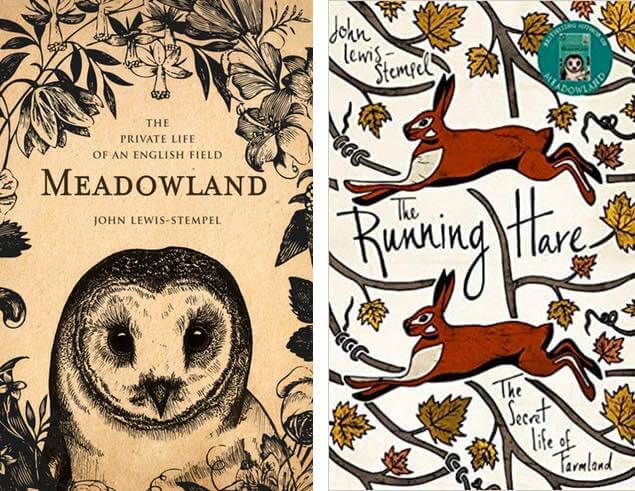
I’ve also always loved drawing but I was never trained as an illustrator. I used to sit and sketch in the park and draw animals for hours. When I was given John Lewis-Stempel’s first book Meadowland, I submitted one of my own owl drawings as one of the concepts. To my surprise, that design was picked for the cover! That really gave me the confidence to submit more of my illustrations for projects.
Then, when The Running Hare came along, I wanted to move a little away from my natural style of black-and-white pen drawings and experiment with colors and patterns. I researched patterns and came across a postcard that my boss had in her office — that sparked a couple of ideas. I sat down and sketched out half the cover, then duplicated it to see how it would sit. I then played with colors and textured brushes in Photoshop to bring it to life. I also submitted other black-and-white drawings as options, but I'm really happy that this was chosen for the final cover.
Q: How do you maintain originality while keeping up with design trends in the publishing industry?
Suggested answer
At the end of the day, the thing that matters most to me is my intuition when it comes to my own originality. While it is always important to be aware of current trends, and to be open to professional feedback and direction, a successful artist also has to maintain their own natural expression, otherwise their work ends up looking generic and uninspired. This is an important balance every professional designer and illustrator has to find.
I am hired for this unique expression. Having a unique voice will always be a valued, in-demand design trend.
Jessica is available to hire on Reedsy ⏺
What was the process like for taking your cover for Hannah Green and Her Unfeasibly Mundane Experience from an initial idea to the final design?

I had so much fun doing this cover!
I first read the manuscript before I did any design work. I then researched the different ways I could represent the ‘devil’ character in the book, which naturally led me to the snake. I sketched out a few snake shapes to see how the title might fit in (it's a pretty long title!). Once I figured out the shape of the snake, I created a color palette and just started illustrating until the cover came together.
It took about two days of drawing and redrawing and recoloring until I came to this. Funnily enough, instead of creating around five different covers, I just submitted this cover, and it was approved in-house and by the author immediately. This doesn’t normally happen!
Q: Can you describe a book cover project where you took risks that paid off creatively?
Suggested answer
One project where I really took a creative risk was The Harry Potter Wizarding Almanac. We had an idea that we thought would work and spent almost a year developing it. I had done thumbnail visuals and started working them up, but as we got closer to the print deadline, the elements just didn’t quite feel right.
At that point, it would have been easy to push ahead, but we decided to take a step back, breathe, have a walk around the bock and a cup of tea, and started thumbnailing from scratch. Over the next three hours I came up with around twelve completely new ideas, and an hour later we narrowed it down to two designs worth pursuing. Both marketing and publicity loved them, and the end result was a really exciting cover that we were all proud of. It was full of special magical moments and more attractive to the market. Sometimes you need to be brave enough to stop and start over.
It was a lesson in trusting gut instinct, embracing fear, and being willing to take a step back, even when the deadline is looming in order to find something truly fresh. The risk paid off and the cover ended up being something special for everyone involved.
Clare is available to hire on Reedsy ⏺
I worked on a compilation cover for the second volume of a series of comic books called Death Jr. published by Image comics. There had already been an initial run of the comics with 3 separate covers as well as a collection cover illustrated by a very popular comic book artist. I had complete autonomy in the composition and the stylization of the characters for the cover and had gotten approval before the coloring phase.
The general color scheme of the previous covers had usually been within the motif of the title: darker, gothic and somewhat earthier color palettes. But my instinct for this cover's color palette was to go bolder and brighter. But still within the context of the IP. The background sky color I had chosen was a very bright pink/red tone. Close to a deep Magenta, as opposed to the deep blue of the first volume or the grays, purples or even greens and ochre of the first few covers. I wanted my cover to stand out from the rest and make this compilation cover distinct and different. I had to represent an eye-catching cover to sell the rest of the great work everybody had done on the interiors after all!
But it apparently was so different in fact that a supervising art director had suggested that I follow the similar color palettes of the previous ones. But this was where I decided to stand my "color-theory-ground" and explain exactly why I had landed on that color. The deeper, gothic color palette had all been done before by previous artists and this compilation cover would just get lost in a sea of sameness. He didn't quite agree, but to his credit, he still let me go with it! And sure enough, when I finally saw the cover on a comic book shelf with a lot of other comic books around it, I felt that my gamble paid off.
And even to this day, while it was certainly risky for me to choose that color and have a creative clash with my superiors, it still is a cover that I am very proud and honored to have created. I felt justified when a peer, unprompted, actually told me that it is one of the more memorable covers from that IP.
Arvin is available to hire on Reedsy ⏺
One of the most exciting moments in my work was shifting toward 3D object-based scenes. It wasn’t so much a risk as a deliberate choice — I wanted to provide my clients with more unique and exclusive cover visuals, without the licensing restrictions that often come with photo-based covers.
Some of the first projects I applied this to were the Paradox Trilogy and the Demons After Dark: Covenant series. The timing was perfect: shortly after, AI-generated photo images began gaining momentum, which made my 3D approach even more valuable. The covers became immersive, cinematic, and distinctive, capturing the story’s atmosphere in a way that resonated strongly with both authors and readers.
This move gave me the confidence to continue developing my 3D-based process and reinforced the importance of creating covers that are both original and tailored to each story.
Alexandra is available to hire on Reedsy ⏺
What is your favorite book cover that you created and why?
Oh no! I couldn’t say I have a favorite! But I definitely favor the ones I get to illustrate!
What advice would you give to fledgling designers looking to get into publishing?
Make sure you establish a portfolio; even if it isn’t paid work. Redesign book covers of your favorite books. Play with typography, illustrations, and photography. Don’t favor one genre just because it’s your favorite to read. The more genres you can design for, the more valuable you become.
So which is your favorite genre of book to work on?
I love to read everything really, but I would say my guilty pleasure is definitely fantasy.

JOIN REEDSY
Find exciting new projects
We connect publishing professionals with our community of 1,500,000 authors.
Looking for more tips and guides for freelance publishing professionals, such as how to choose your freelance designer rates? Head over to the Reedsy Freelancer Blog.

