When Matt Guzman decided to publish his genre-blending middle grade fantasy novel, he was faced with a challenge: how could he create an effective cover for a story that didn’t fit neatly into a single box?
You could say a lot about my debut middle grade novel — and that was the problem. When I finished writing Rieden Reece and the Broken Moon, I knew I had a bit of a hydra on my hands: it was part-adventure, part-science-fiction, with a healthy dash of fantasy, mystery, and psychological thrills. It would be difficult to show all of that and appeal to my audience — young readers who may need some guidance on their emotional journeys — without creating a big, old mess on the cover.
A niche designer for a niche story
If you’re looking for the closest thing to a universal truth in self-publishing, it’s that you should always get a professional book cover. Communicating story, tone, setting, and the book’s title in the blink of an eye is both a science and an art — and since my book is somewhat niche, I needed a cover designer who would understand my niche.
I wanted someone who could take my genre-bending book and turn it into a single, laser-focused image. Most importantly I needed a designer who could convey my story’s emotional tone.
When I first saw Kim Dingwall’s artwork on her Reedsy profile, I knew she’d be the perfect fit for Rieden Reece. Her illustrations were atmospheric and seemed to capture characters’ emotions with incredible sensitivity.
The only problem: her lowest pricing tier was four times what I’d budgeted for. I mulled it over for a week, but everytime I resolved to look for a more affordable alternative, I found myself returning to her portfolio. I couldn’t get her art out of my head. So I did what anyone who found their dream designer would do. I bit the bullet and hired her.
Finding the right mood for my cover
To kick off the collaboration, Kim and I brainstormed elements we might feature on the cover. I definitely wanted to see the main character Rieden brought to life, and I also really liked the idea of showing a broken moon, which is the central premise of the story.
Before long, Kim directed our discussion to mood. She asked a lot of questions about emotions: What emotions would Rieden have on the cover? How did I want the readers to feel when they saw my book?
I could easily answer what I had envisioned for Rieden. I imagined him looking up at the fractured moon with defiance, curiosity, and awe. But when it came to the readers’ emotions, I was less sure. I wanted kids to be curious and want to curl up under the covers with my book. I wanted there to be a sense of foreboding — but nothing that tipped into despair or hopelessness. To get across the tone I was imagining, I referenced Kim’s design for Stacy D’Alessandro’s book, Return to Zentobia.
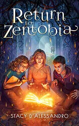
I really liked the balance of darkness and adventure, and thought something similar would work well for Rieden Reece. Despite my somewhat disjointed direction, Kim understood exactly what I meant and was ready to get started on the first round of illustrations.
Bringing my cover to life
When Kim told me that she wanted to share some concepts for the cover, I was imagining a couple of pencil sketches. Instead, what she brought back from the drawing board were these gorgeously detailed, full-color mockups.
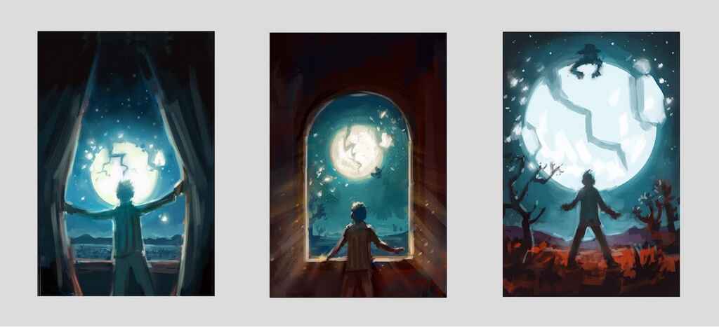
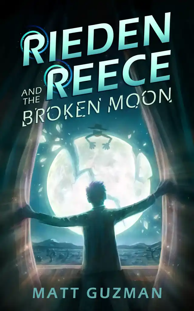
Out of the three concepts, I leaned towards the scene of Rieden looking at the moon from his bedroom window. The way he gripped the curtains and confronted the broken moon conveyed that sense of determination I was after. Ri wasn’t afraid. He was facing his adventure with his whole body. It was perfect!
Once we chose our scene, we played around with the details: the size of the moon, the precise color palette, and the placement of the title. I liked the yellow light rays from a different concept, and I also liked how the moon in another concept almost filled the width of the design, so I requested both of these in the next round.
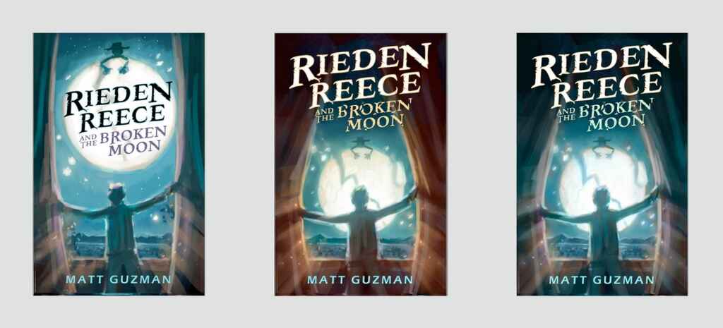
Again, Kim’s drafts were so high-quality already, it was easy to visualize the final product. I ended up agreeing with Kim that a smaller moon underneath the title was tidier and better conveyed the dark yet hopeful mood, especially in the blue-toned version of the scene.
With the illustration finalized, the only element left was the title treatment. I wanted something fun and adventurous, in the vein of Indiana Jones. 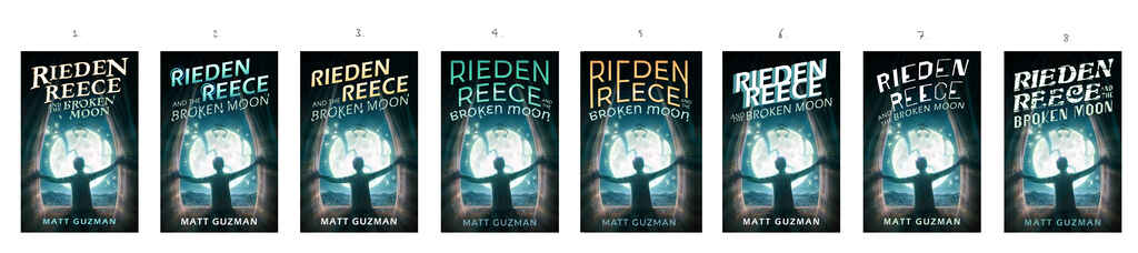 As in previous interactions, I gravitated towards blue tones. Something about a blue swirling font clearly read as “middle grade sci-fi” to me, and it felt like a suitable match for the bright moon lighting up the night sky..
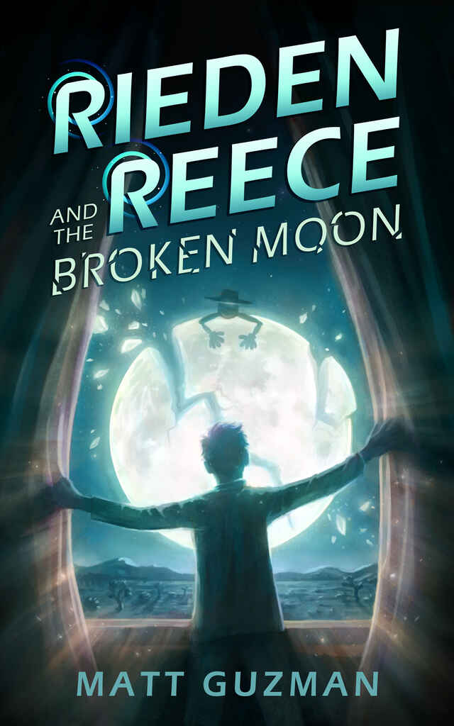
And in just three rounds of designs, we had it: the final cover!
My book cover is a crowd pleaser
Every person who sees my cover tells me how much they love it — and I can’t help but to agree with them! It does so much of the heavy lifting when it comes to selling the book. I remember signing a few copies just after the launch, and a young reader approached my table, curious about the gathered crowd. He took one look at my cover and his face lit up — I could tell that he was instantly hooked.
A young kid took one look at my cover and his face lit up — he was instantly hooked.
Not only does Kim’s artwork make an incredible first impression, it communicates the story’s essence much more effectively than I could ever summarise in a short blurb.
When I now think back to how I was um-ing and ah-ing about hiring Kim, I laugh. I’m so happy I made that choice. I couldn’t have asked for better artwork to introduce readers to my story and I certainly couldn’t have asked for a better collaborator than Kim.
Working with her on my covers has been one of my favorite parts of publishing — second only to writing the stories. Bringing the ideas inside my head to life as book art is something beyond my wildest expectations. Kim has made the experience of publishing a great joy and working with her is something I look forward to for the next books in the series.
So if you have any kind of budget, I highly recommend hiring a cover designer. You’ve got to spend your money on something, so if you’re going to spend it, do yourself a favor and work with someone like Kim.

