When wife-and-husband duo K.A. and Derek finished making their picture book, they created a cover by using one of Derek’s illustrations and adding a title. Soon realizing that illustration and cover design require different skills, they reached out to Reedsy for a design consultation with an experienced cover artist.
Even illustrators can use professional cover design help
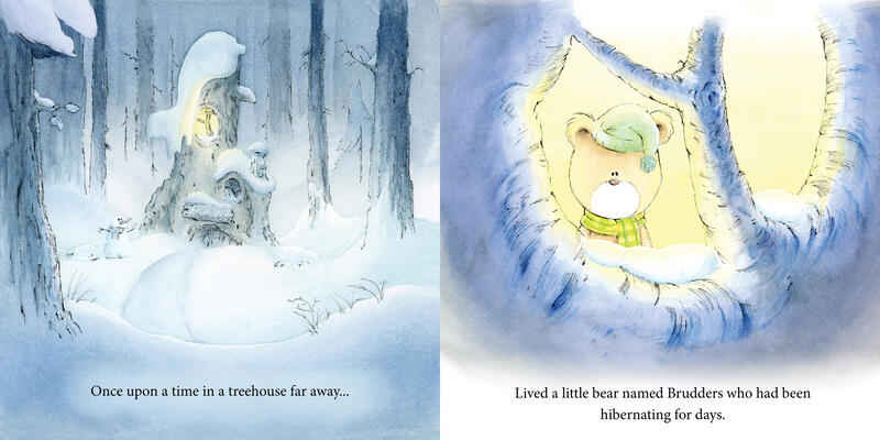
Brudders Learns How to Make Friends started as a happy coincidence. My husband Derek and I each hoped to be published: him as a children’s illustrator, and me as a nonfiction writer. One night, he showed me sketches of a bear character he’d been working on, and despite having no experience with children’s fiction, inspiration struck. Just like that, an idea started developing in my mind. It was the beginning of our children’s picture book!

As Brudders the Bear came to life, we were very busy polishing every aspect of the book. We were constantly googling and learning about self-publishing — a process which was very much facilitated by Reedsy’s blog. Despite our careful planning, we realised that we were treating one important thing as an afterthought: the book’s cover. We kept comparing it to the interior, saying to ourselves: “Something’s not right; this isn’t doing the book justice.”

At first, we thought choosing a scene from the book and putting a title above would work just fine. (Excuse me while I choke on my coffee laughing at this in hindsight). We tried to fix it, playing around with Derek’s beautiful painted twig frame, but we had the hardest time laying out the title and the illustration within that frame. That’s when I thought of Reedsy again and suggested looking at the cover designers on their marketplace. Perhaps, we could consult with someone…
A personal masterclass in cover design
Scouring Reedsy’s cover designers, David Miles’ profile kept popping up in our searches. His portfolio included a large variety of covers with different creative elements. This made us comfortable that he could put himself into Brudders’ shoes and give us advice specific to our book. So we reached out, explaining that we were just looking for a consultation and David was on board.

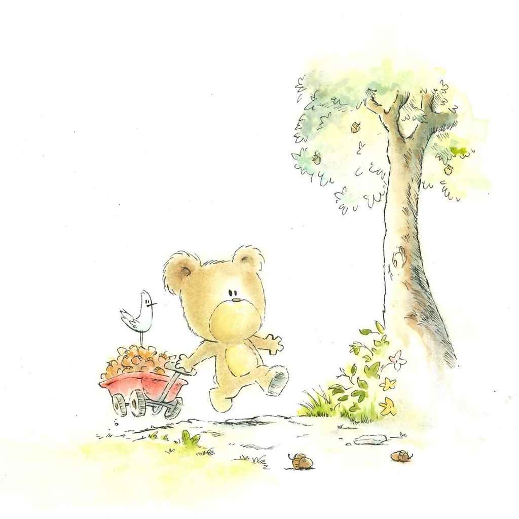
Going into the collaboration, we sent David a few of Derek’s cover options along with some information on the story, its characters, and voice. We also shared an alternative painting of Brudders pulling a red wagon through the forest. We knew we wanted the cover to portray three main elements:
- The protagonist’s personality;
- The message of the story; and
- The enchanting natural landscape of the book (much like the one Derek and I grew up in as kids).


Out of the illustration options, David liked the alternative painting the best. He explained how it better communicated Brudders’ character and the message of the story. He also pointed out how the movement alludes to the book’s adventurous nature.
After agreeing on the illustration, David put together a few cover mock-ups to give us an idea of font, layout, and how everything could tie together. We jumped on a phone call and David guided us through his decision-making steps.

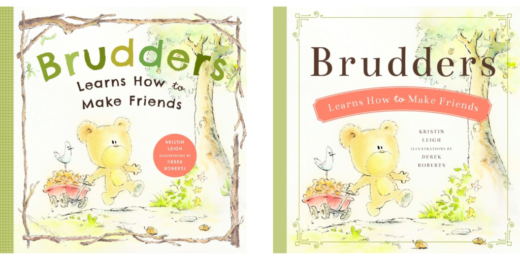
Not all was bad from the original cover: he loved the twig frame and suggested it as a recognizable element for future books in the series. He showed us how Derek’s illustration could better fill the frame, letting our hero take center stage. A really valuable piece of advice was that covers should pull from a small pop of color. He showed us how he could use the red of the cart to draw the reader’s eye to something else important — like the creators’ names or the title of the story.
Inspired by David’s great layouts and beautiful color palette, we went back to the drawing board. We continued to work on the twig frame he liked and redesigned the tree to flow over and better frame the title. As David suggested, we also leveraged the wagon’s red color and added our own twist: a fun, wavy banner to finish off the title. After three weeks of planning and then repainting the watercolor illustration, we had our cover!

A cover that feels right
When you compare the final cover to the original, you can see how much of a difference consulting with David has made. The new design really brings out Brudders and his journey. It has strong, recognizable elements — all of which can be carried over to the next books.

David not only provided us with design options we can use for the entire Brudders ® series, he also taught us some of the fundamentals of cover design. We can now tackle the cover for the second book with more confidence and professional know-how. And if we run into any issues, we know we can turn to Reedsy and rely on David to help us polish the design.
Your book can have many wonderful, well-intentioned selling points, but the cover is the first and sometimes only thing people will actually see. They will make up their minds instantly (even if they didn’t mean to), so our advice is to make your cover a priority as early as possible in your self-publishing journey. If at the end of the day you look at your cover and feel it isn’t truly doing your story justice, hire a cover designer.
***
Buy Brudders Learns How To Make Friends and hire David for your book covers.

