Last updated on Oct 16, 2025
How To Build an Author Website: a Step-by-Step Guide [+ Checklist]
Ricardo Fayet
Reedsy co-founder and Chief Marketing Officer, Ricardo Fayet has worked with hundreds of authors on their launches and marketing campaigns. He is the author of two bestselling guides on marketing for authors, and a regular presenter at the largest writers' conferences.
View profile →The Reedsy Network
Reedsy's publishing freelancers come from all over the world and specialize in various disciplines, from editing to design.
View profile →An author website is a must for any writer who wants to be taken seriously. It’s the best way to showcase all your books and achievements in one place and an important marketing tool to grow your readership. Luckily, you don’t need to be a tech wizard to make a beautiful site — with a bit of guidance, anyone can do it.
Here’s how to build an author website in 7 steps:
- Collect book covers, descriptions, and reviews.
- Prepare author bios, headshots, and press links.
- Choose a memorable and discoverable domain.
- Consider buying the domain from third-party providers for cheaper rates.
3. Choose a website builder and hosting service
- Compare website builders by ease of use, customization, and features.
- WordPress is recommended for flexibility and SEO.
- Design the look and feel of the site.
- Include essential homepage elements.
- Hiring a professional designer can help your site stand out.
5. Add content to your website
- Core pages to include: About, Books, Contact, Blog (optional), and Media Kit.
- A blog can help with SEO and engagement.
- Choose a mailing list provider and integrate signup forms.
- Create a compelling lead magnet to encourage signups.
7. Keep improving the user experience
- Focus on mobile optimization and accessibility.
- Regularly update content to keep readers engaged.
1. Gather your assets
Start by gathering some materials to streamline the process. You’ll want to put all these materials in a dedicated folder so they remain accessible. (If you’ve never worked on a website before, you’d be amazed how easily assets can get lost!)
For your books
-
High-resolution cover images
-
Brief descriptions (50–100 words for homepage/catalog display)
-
Long descriptions (250–400 words for dedicated book pages)
-
Your best editorial and reader reviews
-
Purchase links to major retailers (Amazon, Barnes & Noble, Apple Books, Kobo, etc.) — or your Universal Book Link
-
ISBN and publication details
Make sure all images are high-resolution and all text is sufficiently engaging. Also consider pulling “highlights” from your reviews, the same way you might put quotes on a book cover (e.g., “A magnificent tour de force” or “Characters that leap off the page”).
For your author brand
-
Professional author headshot (high-resolution press shot)
-
Author bio (again, short and long versions)
-
Contact information for your agent and/or publicist (if applicable)
-
Social media handles and profile links
-
Any press coverage, awards, or notable achievements
In time, you could even start an author blog to share your thoughts and keep readers up-to-date on your books. We’ll talk about this more below (as well as growing a newsletter) — but it’s not mandatory for starting an author website, so don’t worry if you’re not quite there yet.
For unpublished authors
If you haven't published a book, you can still start building a professional presence by adding:
-
Pages for works in progress (with brief descriptions)
-
Links to shorter works published online (literary magazines, blogs, Medium articles)
-
Details of your writing background and credentials
Preparing these assets beforehand will make the website-building process much faster and more efficient.
2. Buy a domain name
A domain name is your “street address” on the web, which you can buy — or more accurately, rent — in order to get started. There are many services through which you can acquire your own domain, such as Cloudflare, Namecheap, and Porkbun.
Here are a few tips for choosing domain names:
-
Go with your full author name if it’s available, or something close to it (e.g. rupikaur.com).
-
If your name is already taken, try including “author” or “books” (e.g. johncaseyauthor.com or johncaseybooks.com)
-
For author names that are long or easy to mistype, pick something as simple as possible (e.g. Chimamanda Ngozi Adichie’s website is simply chimamanda.com).
-
If you can, purchase an email to use alongside your domain. This should be something like firstname@yourdomain.com, and will greatly increase your chances of building a successful mailing list
💡Pro tip: You can also buy a domain name directly from many website builders, which we’ll cover in the next step — but it will usually cost you more money.
3. Choose a website builder and hosting service
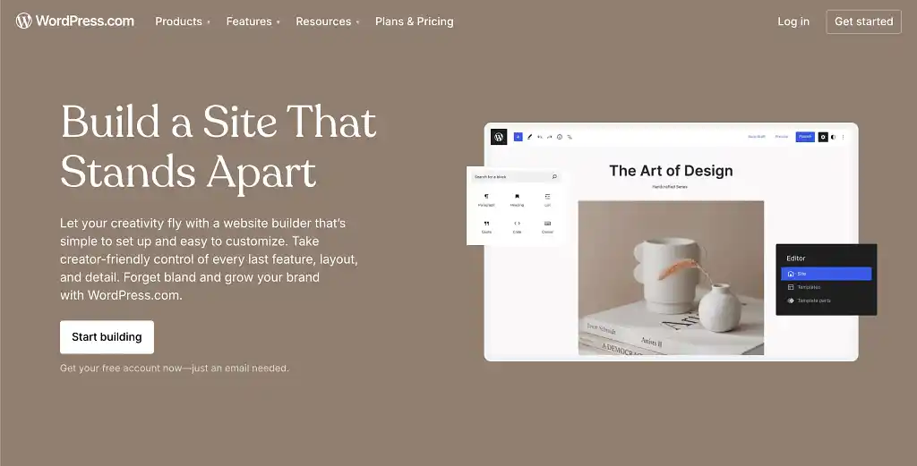
A website builder is a site where you can craft the layout and content of your author website — whereas a hosting service merely provides the servers on which your website will run. To use a real estate analogy, if your domain is your street address, the hosting server rents you the land; the website builder is the construction company that lets you build on top of it.
Most website builders today come with hosting included, meaning you can get your domain directly through them (as mentioned). This spares you the trouble of connecting your domain registrar with your website builder and paying two separate annual bills. But again, doing all this through your website builder is more costly.
Below is a table comparing some of the most popular website builders available. Take a look to see which suits you.
Best website builders for authors
|
Feature |
WordPress |
Squarespace |
Wix |
Shopify |
|
Customization
|
⭐⭐⭐⭐⭐ |
⭐⭐⭐⭐ |
⭐⭐⭐⭐ |
⭐⭐⭐⭐ |
|
Design quality
|
⭐⭐⭐⭐ |
⭐⭐⭐⭐⭐ |
⭐⭐⭐⭐⭐ |
⭐⭐⭐⭐ |
|
Book cover / portfolio display |
Buildable |
Built-in |
Built-in |
Built-in |
|
Blogging
|
✅ |
✅ |
✅ |
✅ |
|
Cheapest plan
|
Free |
$16/month |
Free |
$5/month |
|
Mailing list
|
Third-party |
Built-in |
Built-in |
Built-in |
|
E-commerce
|
✅ |
✅ |
✅ |
✅ |
|
SEO support
|
✅ |
✅ |
✅ |
✅ |
|
Ease of use
|
⭐⭐ |
⭐⭐⭐⭐ |
⭐⭐⭐⭐⭐ |
⭐⭐⭐ |
|
Best for |
Those wanting maximum customization and SEO |
Those prioritizing design and simplicity |
Those with no technical experience |
Those planning to sell products directly |
Our top pick: WordPress 🏆
If you don’t mind a slight learning curve, we think that WordPress is the best website builder for customization and SEO capabilities. It does everything a good web designer should do, plus lots of extra wiggle room.
For the strongest possible web presence, we recommend combining the flexible functionalities of WordPress with the unique artistry of a professional web designer.
💡Pro tip: Low-cost hosting ($3-10/month) is perfectly acceptable for author websites with little traffic. However, consider scaling to better hosting as your audience grows to ensure fast load times and reliability.
If you have different needs, another service might be best for you. But once you’ve found a place to host your website, it’s time for the exciting part — designing your little corner of the Internet!
Q: What website builders and hosting services do you recommend for authors looking to create a professional author website?
Suggested answer
This is not a one-size-fits-all answer. Many factors go into choosing the right platform for your website. However, to answer the question straight:
- For complete control, I use and recommended WordPress + Avada on WP Engine. Alternatives to this could be WordPress + Elementor or WordPress + Divi on another host that specialized in WordPress, aka Managed WordPress hosting. (Avoid GoDaddy for anything but domain names.)
- If you want more out-of-the-box but less control, you can go with a DIY builder like Squarespace or WIX. These are capable of handle most features authors needs.
- I advise against Weebly, as they have fallen behind.
Every web designer has an opinion on this, but the truth is, if we're talking about standard author websites, most website/web design platforms and hosts are capable of achieving what's necessary. It comes down to the designer and their mastery of the platform chosen. The bottom line is:
- Is it mobile friendly?
- Is it SEO friendly?
- Does it load fast?
Besides that, deciding factors can include:
- How much customization do you require?
- How much of "web design basics" do you want to learn to maintain the content? Because no matter what, any DIY or drag-and-drop builder is going to have a learning curve for anyone unfamiliar with web design.
- How much do you want to pay monthly/annually?
This is a brief introduction on choose a website platform and host. There's a lot that goes into choosing, but don't over think it. They can all get the job done, as long as you have the right person at the helm.
Chad is available to hire on Reedsy ⏺
Let's start with the "big three": WordPress, Squarespace, and Wix. Each has its own pros and cons. I'd start with identifying the goal of your website, the complexity of your design, and your comfort level.
WordPress
With countless themes and plugins to choose from, WordPress allows for almost limitless design, but this comes at a cost as plugins and themes must be updated regularly.
I recommend the free Astra theme and Elementor with an upgrade to the Pro version. This mimics the feel of the Squarespace and Wix interface, but with so many more capabilities. If mobile first is your goal, this is a great choice as you can create an entirely different experience.
There is no built-in function for SEO, but there are countless plugins to choose from. I typically use Yoast SEO.
Your WordPress site is only as good as your host provider. Be cautious about what may seem like a bargain. Companies like GoDaddy and Bluehost seem less expensive but don't include backups, added security, SSL, etc. The add-ons can add up.
I recommend that all of my WordPress clients choose WP Engine. They offer a daily backup, a staging environment for future updates/design. They also offer an add-on "Smart Plugin Manager" that keeps everything up to date and will restore from a backup if there's ever an issue (cost $100 annually).
Squarespace
Squarespace is a great choice for authors' sites. The user interface is drag-and-drop, and most clients find it easy to self-manage and make changes going forward.
Need a blog, a store, or a scheduling tool? Interested in custom merch, forms, social media feeds, and links? No problem, it's all built in and ready for you when needed.
The downside of Squarespace is site speed, and though you can customize on mobile, it is somewhat restrictive.
Squarespace covers the basics for SEO: H1, SEO descriptions and titles, alt-text, etc. There is a free (or paid) Chrome extension called SEO Space that is a game-changer for Squarespace's SEO. If you choose Squarespace, I HIGHLY recommend this tool!
Wix
I have a love-hate relationship with Wix. It shares a similar drag-and-drop design tool and a variety of pre-built sections and components, which can help jumpstart your creativity.
Unlike other web building tools, it allows you to draw way outside the lines, meaning there are no restrictions to brand guidelines, so you can choose as many fonts and colors as you like. This can lead to style overload, and why I often get hired to clean up Wix sites.
Wix allows for customization on mobile. More so than Squarespace, less so than WordPress/Elementor.
The biggest advantage to Wix, as I see it, is the built-in SEO tool. In my experience, Wix sites tend to show up on search engines more quickly if you follow their guidelines. They are also the only platform that attempts to address ADAA compliance issues.
Summary
Understand your priorities and find a tool that you enjoy working with that best meets your needs.
Sharon is available to hire on Reedsy ⏺
This all depends on what backend you're most comfortable with. Youtube has some great video tutorials for Wordpress/Squarespace/Wix, which will offer an overview of what it's like to create or update a page. That's where I'd start, as you want something that's easy for you to update.
Self-hosted Wordpress will give you the most control. This is especially important if you have 5+ books. Some designers can offer automation—meaning they can set the site up so you only have to add a new book page and the book's cover/info automatically appear everywhere it needs to across the site. (Double check with your designer to make sure they offer this.) Which is great if you have a long series or multiple books.
However, Wordpress doesn't have a default visual editor. (Some plugins/themes offer visual editing with mixed results.) Most hosting options are solid—look for free SSL, and if there's a limit on emails addresses or domain names/sites. Space is nice, but most sites don't hit 2gb (unless there are multiple sites and a separate store). 5gb is usually more than enough. It's nice to have the option for multiple sites, in case you want to have a separate store later (or a separate site for a pen name).
For specific host recommendations, I've had good luck with Hostgator, SiteGround, MDDHosting, and Inmotion. While Bluehost is often recommended online, it's been very slow this year (2024) especially for the price. I've heard good things about Cloudways, Hostinger, and A2 Hosting. Wordpress.com is also viable with their business plan, though it won't give you as much control as a standard host.
For page builders (visual editors), I tend to recommend Squarespace over Wix, as I find Squarespace more intuitive since Wix's update (introducing Studio) this past spring (2024). Page builders offer no automation, which means adding a new book can be a laborious process depending on where you want the book's info to appear. For example, if you only want the cover on the book page and the home page, that's only two pages to update. If you have a series and want each book in the series to have a "read more" section with the other books in the series, then you have to update the cover manually on each of the series' book pages. Not a big deal for a small library, but rather a pain for a larger one.
At baseline though, start with YouTube. Skim tutorials on what it's like to create/update a page on the platform you're interested in. This will give you a better sense of how the platforms operate. Whatever is easiest for you to operate is (almost) always the best option.
Tessa is available to hire on Reedsy ⏺
4. Design your site
Designing your own author website
Each of the website builders mentioned above offers plenty of free templates for you to choose from. Here’s a couple of examples from our top pick, WordPress:
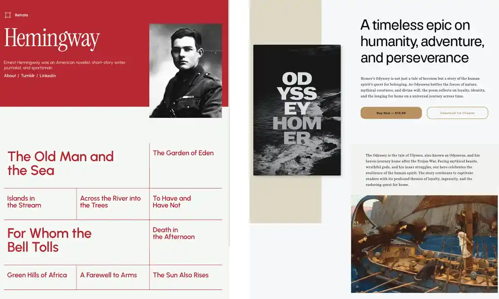
While you might not find the perfect template, each one is customizable — meaning you’ll be able to make it your own. Think about your author brand and what you want to communicate to your site’s visitors. Do you want there to be an air of sophistication? Should there be lots of colour and bold visuals, or would a simple design be better? If you’ve published books, consider whether it’s worth basing the site’s design on your most recent book cover.
Once you’ve picked a site builder, browse through the different templates and pick the one that speaks to you the most. You can then drag and drop your prepared assets. This approach is great for building an author website on a budget — but there’s a catch.
If you’re hoping to stand out and build a truly unique website, using ready-made templates risks creating something that looks too similar to other author websites, which could damage your brand.
Q: What key elements should every author include on their homepage to engage visitors and build their brand?
Suggested answer
If you think of a website like a book, it needs to follow some formula: outline, chapters, and plot.
In the case of an author's website, this could translate to a compelling banner image with an attention-grabbing and relevant headline that, at a glance, tells your visitors what your site is about. This is your H1.
Below that, write a few sentences that expand on the headline. This could be the perfect place to introduce yourself, your current book, or project. Depending on your comfort level, you might also want to include an image of yourself or your book cover, if not already above.
From here, you can get creative, depending on where you are in your career. These could include:
-- an excerpt from your book
-- reviews or quotes
-- a list or logos of outlets where people can purchase your book (Amazon, Barnes&Noble, etc.)
-- upcoming events, book readings or signings
-- latest blog posts
-- news and/or press
For the above, pick and choose what is most relevant, and if you don't have access to those yet, that's okay. Be where you are and add on as needed.
When possible, add links to other reputable websites. For example: news, press, reviews, or where to purchase. Links to external websites should always open in a new window so your website remains open, while links to other pages or sections on your site should open in the same window.
As you reach the bottom of your home page, be sure to include a sign-up form. Even if you are not ready to market your work or send emails, the time to start gathering emails is NOW! Pro tip: It's a nice touch to send a thank-you email when someone subscribes. This can be automated through most web builders.
Finally, make sure you include a way for people to reach you. This doesn't have to be on the home page, but should be clearly linked from it. And last but not least, be sure to include links to your social media, as followers can become buyers!
Good luck!
Sharon is available to hire on Reedsy ⏺
This depends on the goal of the author's homepage, their current marketing strategy and the overall size and structure of the whole website.
That said, if there is one single element you need on your homepage, for SEO it's an <h1> tag with either the author's name or the primary book.
If we're talking the best single element for visitors, it's a nice looking mockup of the primary book.
Chad is available to hire on Reedsy ⏺
💡Listen to our top-rated web designer, Stuart Grant, discussing how to make your website work for you. He shares his best tips from 6 years of helping authors create stunning sites.
Hiring a professional author website designer
For a more distinctive and polished website, the best option is to work with a professional author website designer. Collaborating with a designer allows you to tailor the site to your branding, and web designers can also help with technical issues — so this is also a good option if you’re a website newbie.
Working with a professional web designer guarantees:
-
A unique, professionally branded site
-
Site features tailored to your needs
-
Technical support for challenges like connecting your domain or setting up mailing list integrations
-
Mobile optimization and accessibility compliance
-
Avoiding visual design mistakes
It’s a bigger investment than a site builder, but if you choose the right person, the results will be refined and unique. Thoroughly vetting your web design candidates is important, but if you choose to hire a designer through Reedsy, we do the legwork for you. You can learn more about the costs of professional web design by reading this article.

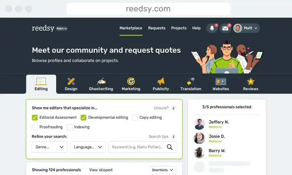
Web designers are available all over the internet — but if you want a designer with specific expertise around author websites, you can find them on the Reedsy marketplace. Browse some of their profiles below and get in touch with them for a quote.
Hire an expert web designer
Matthew P.
Available to hire
A 5-star rated WordPress web designer, who will build you a beautiful, custom author site to wow your readers and develop your brand online.
Elena S.
Available to hire
Custom websites for authors & small businesses. Your story, your spotlight.
Matthew Y.
Available to hire
I create attractive, intuitive websites on WordPress and Squarespace that deliver your message and that are easy to update and maintain.
5. Add content to your website
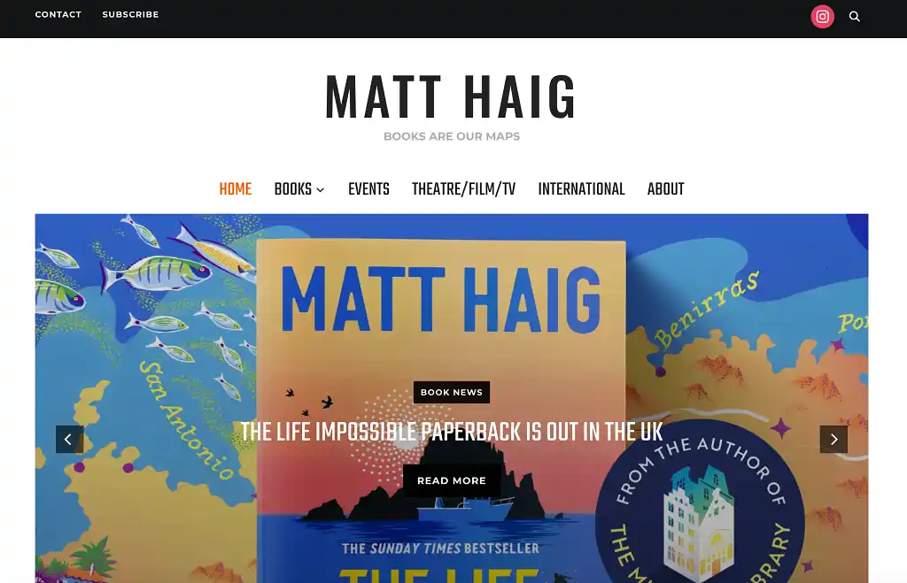
With your assets in hand and your site fully functional, this is where you decide what goes where — starting with the homepage. Some authors, like Matt Haig, heavily feature their book covers on their homepage:
Others, like Chimamanda Ngozi Adichie, might have a professional headshot and author bio first:
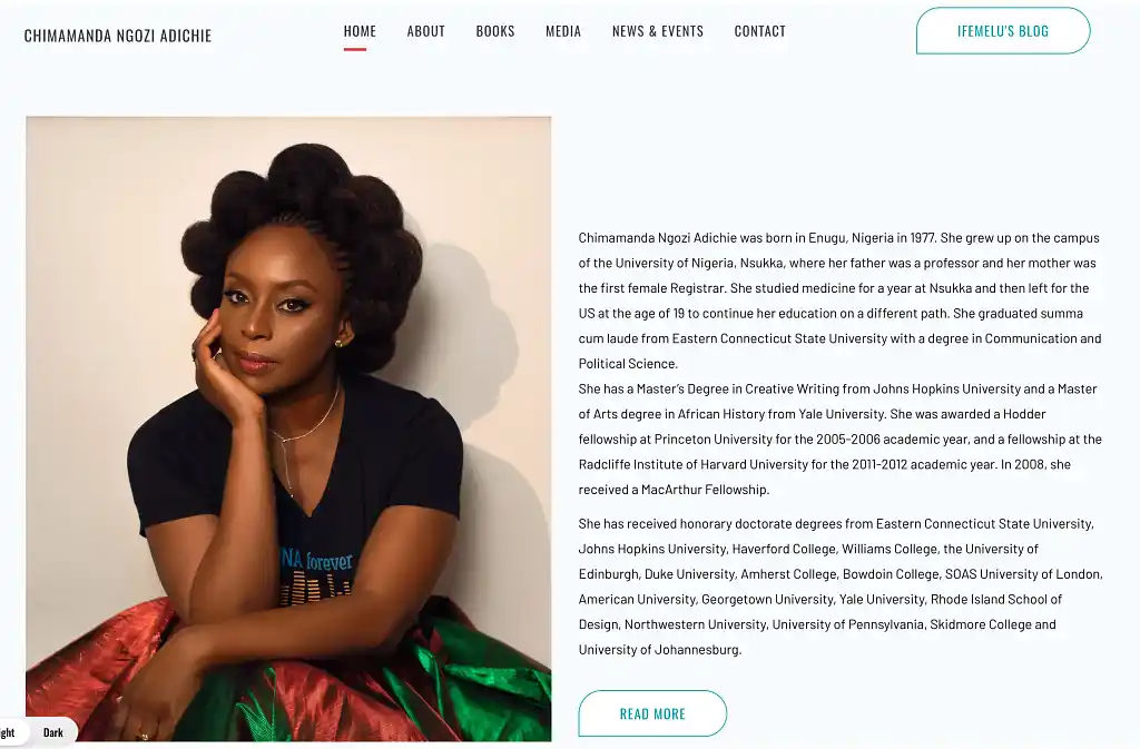
Each approach has its own merit, and your choice depends on what you want people to see first. Is a personal bio necessary to foster connection between your readers? Or would you rather your books take the lead? It’s entirely up to you. Check out more author websites here for ideas — or just google your favorite authors.
In any case, your most recent or upcoming book should be somewhere on your homepage — even if it’s after the jump — and you should also be sure to include an email signup form, social media links, and clear navigation to other pages. Speaking of which…
What other pages should an author website have?
Generally speaking, a professional author website should also include the following:
About page
Share a longer version of your author bio, writing journey, credentials, and personal details that help readers connect with you. Include a headshot, and make sure to keep the tone authentic to your author brand. Here are some tips on how to write a killer author bio.
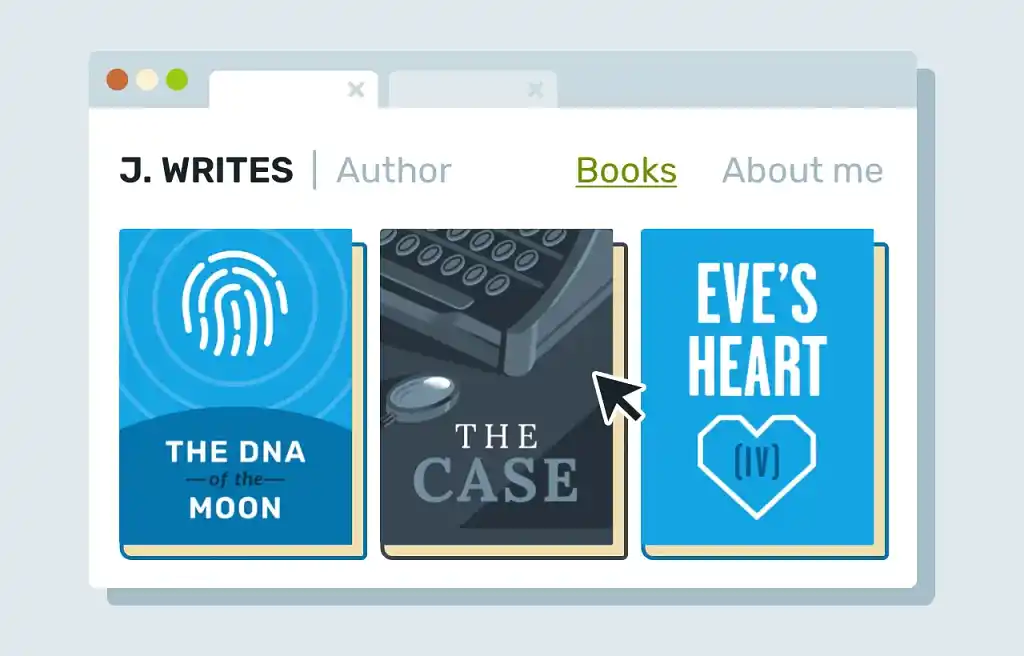
Books page
Showcase all your published works with:
-
High-resolution cover images
-
Long descriptions
-
Purchase links to all major retailers
-
Reviews and testimonials
Consider creating separate dedicated pages for each book or book series, especially if you write in multiple genres or have extensive backlists. Lee Child even created a dedicated website for his Jack Reacher series, and Terry Pratchett’s website delves into the characters of his acclaimed series, Discworld.
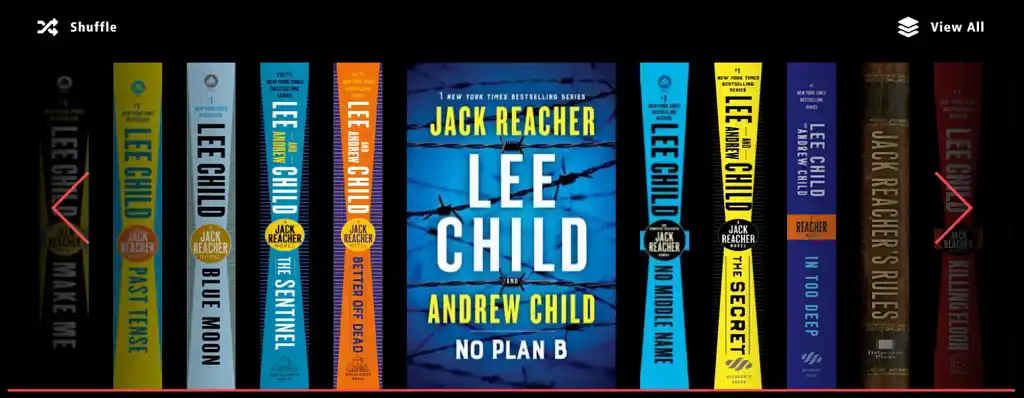
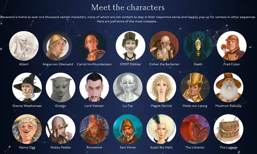
Furthermore, think about how to ensure your descriptions will impress and engage readers. Nonfiction authors, for example, should emphasize their own credentials and expertise — while fiction authors should focus on storytelling and creating an emotional spark.
Contact page
Provide a simple way to get in touch with you: a contact form or email address. Additionally, if you have an agent or publicist, make sure to include their information here.
Blog
A blog is useful to keep your audience in the loop and to share your latest thoughts and ideas. Fiction authors can use blogs for writing updates, cover reveals, and behind-the-scenes content.
Having a blog also helps with SEO optimization — meaning you can target search phrases that are relevant to your book — and keeps visitors engaged for longer, which is important for reducing your site’s bounce rate.
Media kit
To make it easier for journalists, podcasters, and event coordinators to access your professional materials, consider creating a media kit page with these resources:
-
High-resolution press shots
-
Author bio in multiple lengths
-
Book covers and descriptions
-
Press coverage and reviews
-
Contact information for interviews and appearances
This allows you to easily link to all your professional assets for various campaigns.
6. Set up an email newsletter
A mailing list is crucial for nurturing your readership, and it’s a cornerstone of a strong author platform. Also, unlike social media, an email newsletter is a communication channel where you have complete control over whom you’re reaching. If you use it consistently, you might just turn casual readers into life-long supporters.
You can read about setting up a mailing list in more detail here, but here are the three main steps:
Choose a mailing list provider
To set up a mailing list, you’ll first need to choose a provider. Some website builders, such as Wix, offer integrated mailing list services. But for a more comprehensive approach, choosing an external mailing list provider is often the best way to go.
Some providers offer free plans, such as MailerLite, which is free up to 500 subscribers. This means that you can save on your marketing costs as you grow your reach. Other options, such as Kit (previously ConvertKit) are specifically designed with creators in mind. Having a software that is tailored to your needs helps to address any learning curves, and we’ve found that Kit is great for beginners.
💡Pro tip: Most email clients require you to have an official email address, such as info@yourdomain.com, for sending email campaigns. If you use a premade email address such as Gmail, you risk your mail campaigns going straight to spam. Fortunately, when you purchase a domain name, you should also be able to purchase the associated email domain at the same time.
Integrate with your website
Connect your email provider by creating a signup form and embedding the code on your website — most platforms provide step-by-step instructions on how to do this. Make sure to sign up to your own mailing list and send a test campaign before you publish.
As for where to place signup opportunities on your site, the answer is: as many places as possible (without it being too over-the-top). You’ll want to prominently feature it somewhere on your homepage — and maybe in a footer or sidebar on other pages as well.

FREE COURSE
How to Build Your Author Mailing List
Learn how to connect with your audience and sell more books with email.
💡Pro tip: When creating the call to action (CTA) for newsletter signups, try to avoid generic text like "Subscribe to my newsletter." Instead, aim to offer something specific: "Get a free short story when you join my reader community" or "Be the first to know about new releases and exclusive content."
Create a free resource for your visitors
Most website visitors won't subscribe without an incentive (who doesn’t love free stuff?). A lead magnet is a valuable free resource that you can offer in exchange for an email address. The content of the lead magnet can be anything you want — as long as it’s valuable to your readers.
If you write fiction, it could be a short story, or perhaps the first book in your series of multiple books. If you’re writing nonfiction, it could be access to an exclusive online course or the first chapter of your book. Whatever you decide, make it worth your readers’ time (and email).
To activate the lead magnet, you’ll have to create the resource (often a PDF file) and another email sequence that delivers the file to those who request it. Again, be sure to test the lead magnet signup yourself to check that everything is working.

If you’ve followed all our steps so far, you have a professional website up and running — congratulations! From now on, it’ll just need a bit of love and maintenance.
Create automated campaigns
The beauty of emails is that they can be automated. For example, you should set up an automated welcome email that:
-
Thanks new subscribers
-
Delivers any promised lead magnet (more on this below)
-
Sets expectations for email frequency
-
Reflects your author brand and personality
Any emails that follow will depend on what you want to promote — but once you have a firm idea of this, they can be automated as well.
Q: What topics should authors cover in their newsletters to keep readers engaged and build a strong following?
Suggested answer
Authors can write about a lot more than just their book! Ideas to write about are:
- Top 10 favorite books - Write a blog post about your ten favorite books and then share it with your newsletter audience.
- Behind The Scenes - This is a broad category. You can write a newsletter about how you got the idea for the book, or about how certain characters came to be, their motives or any backstory that may not have been mentioned.
- Appearances and events - This should go without saying, but letting your audience know about any scheduled appearances in person or online is great to share with your mailing list.
- Ask them something! - Make your audience feel important and seen by asking for their input on something. Make sure it's something that you really want to know because the public can sometimes surprise you!
- In Depth Bio - You can write a more in-depth bio and share it with your audience. This pulls back the curtain and allows your fans to learn more about you, further strengthening their interest and trust in you / your author brand.
- A Short Story - Write a quick story and share it with your subscribers. Giving away free content is critical to gaining and keeping customers/fans these days.
This is just scratching the surface. I hope this has sparked some ideas of what authors can write newsletters about.
Chad is available to hire on Reedsy ⏺
7. Keep improving the user experience
Building your website is just the beginning — there’s always room to improve your visitors' experience! From dynamic, interactive elements to banners for price promotions to a calendar page for your book tour, your options are endless. Here are some things to consider:
Mobile optimization
Ensure your site is responsive — meaning it looks and functions perfectly — on smartphones and tablets. Mobile traffic now accounts for over 60% of web traffic, making this crucial for user experience and SEO. Most site builders have a built-in feature for viewing your site as it appears on mobile devices. You might be surprised how different it looks!
Website accessibility
In addition to making your site mobile-friendly, you’ll also want to ensure that it is readable and accessible to all:
-
Use readable fonts (minimum 12pt font, which is 16px)
-
Ensure sufficient color contrast
-
Add alt text to all images
-
Make navigation keyboard-friendly (e.g., scrolling with up and down arrows)
-
Include transcripts for audio/video content
Regular content
Keep your site content fresh by regularly adding:
-
Blog posts
-
News about upcoming releases
-
Cover reveals
-
Event announcements
-
Reader testimonials
-
Book reviews
💡Pro tip: If you find yourself short on ideas for your website, why not check out the competition? Take a look at the website of your favorite author, or maybe explore websites that are within your genre.
Options for scaling
While most website builders offer a free service, the tools are often limited. As your traffic grows, consider upgrading hosting, or looking into hiring a professional web designer. On Reedsy, you’ll find top-notch designers to help you tailor a website to your needs.
Hire an author website designer
Hundreds of the best website designers are on Reedsy. Sign up to meet them within seconds!
Learn how Reedsy can help you craft a beautiful book.
Remember, this is your home on the internet — and it will influence what readers, agents, and strangers alike think of you when they Google your name. Your website is worth the extra care and effort to make it as beautiful and professional as possible; hopefully, this post will set you on the right path. For even more ideas and inspiration, check out the previous post in this series, which showcases 13 additional author website examples.
8 responses
Harry Christman says:
08/05/2019 – 12:31
Some great advice here. Though I have a website with my book cover on it, I know it needs to be improved to catch the reader's mind.
Eyeland Gurl says:
08/05/2019 – 12:31
Excellent advice for authors. I always enjoy seeing how creative authors can get with their website and blog designs. This piece is an inspiration to me. Thanks so much for sharing!
Janet Nicholson says:
08/05/2019 – 12:31
Thanks for this info. White font on a black background is very difficult to read, especially for people with astigmatism. I'm not the only reader who doesn't bother reading a website with light font on a dark background. I think it would be worth keeping this in mind when designing a website.
↪️ Ricardo Fayet replied:
08/05/2019 – 12:32
I totally agree with you, light fond on a dark background is rarely easy on the eyes. However, you see it quite often out there because on newer screens (like the retina ones) it doesn't render quite as badly as on old screens.
C.F. Lapinel says:
08/05/2019 – 12:31
Great piece. Lots of cool insights. Thanks!
↪️ Ricardo Fayet replied:
08/05/2019 – 12:32
Glad you liked it! We'll have a second piece on author websites next Tuesday, so do come back for more insights! Or alternatively, join the newsletter on the ribbon above, we only send them once a month :)
H Gibson says:
08/05/2019 – 12:31
Interesting article. I am glad my website ticks most of the boxes. Due to some of The Chronicles of Han Storm's ('older' 65+ years) niche market readers, it was essential to design a basic, user friendly environment.
↪️ Ricardo Fayet replied:
08/05/2019 – 12:32
Of course! It's very important to take your target market's demographics and interests into account when designing your website. Of course, if your books respect those rules and you design your website in such a way that it reflects your books' branding, this shouldn't be a problem!