Author Michael Campling had written several books and short stories when he won the Self-Publishing Formula scholarship. As one of the sponsors, Reedsy provided him with free professional publishing services, one of which was cover design. With this opportunity, it was time to give his mystery series a makeover.
The Mystery of the Underperforming Book Sales
Although my mystery series was more commercially successful than my other work, I felt it could do so much better. As a self-published author, I had pretty much handled everything myself: from my covers to advertising my books. But I was under no illusion that professional assistance in marketing and design could make a huge difference, especially in terms of my covers.
A helping hand came in the form of the SPF Foundation scholarship. It’s an amazing opportunity that supports ten indie authors every year with lifetime access to the two flagship SPF courses (Self-Publishing 101 and Ads for Authors) and $2,500 worth of Reedsy publishing services, including design and editing.
Reedsy, as one of the sponsors of the scholarship, opened the doors to their publishing marketplace and enabled me to commission new covers for my Devonshire Mysteries with a top-tier designer: Patrick Knowles. His portfolio stood out to me because the covers made me want to read those books. I could tell that he really understood the mystery genre. So I used my funds to hire him for the series.
Creating covers that evoke a ‘cozy crime’ atmosphere
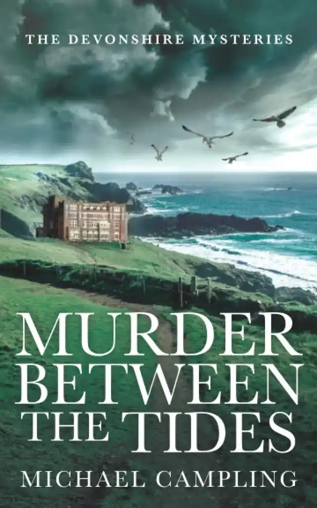
When I created the original covers, I did some market research, so I already knew which direction I wanted to take the designs. Firstly, my books aren’t thrillers but they’re not entirely cozy either, and it was important to me that the imagery conveyed a sense of ‘cozy crime’. Secondly, I wanted the story’s setting — the brooding landscape of Dartmoor — to feature on the covers.
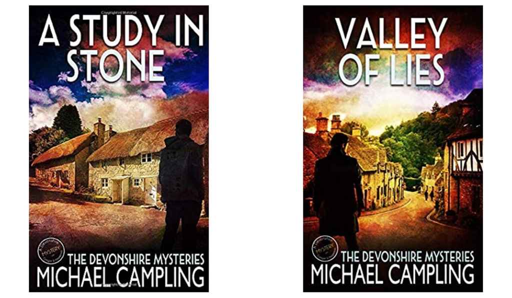
Having shared my ideas with Patrick, he started by developing several concepts for the first book. I picked out the details I liked: flying birds (typical for crime fiction) and a winding path that draws in the eye. When it came to other design elements like the font, I relied on Patrick’s judgment. He’s incredible at typography so I trusted his choice of a more classic style.
Once the first cover was complete, the others followed quickly. From the beginning, we considered consistency across the series, and the typography, birds, and a depth-creating composition were a given for the next covers. What was open for discussion was the specific Dartmoor scenery we were going to use. As an example, my main feedback for the second cover concerned the lighting of the landscape.
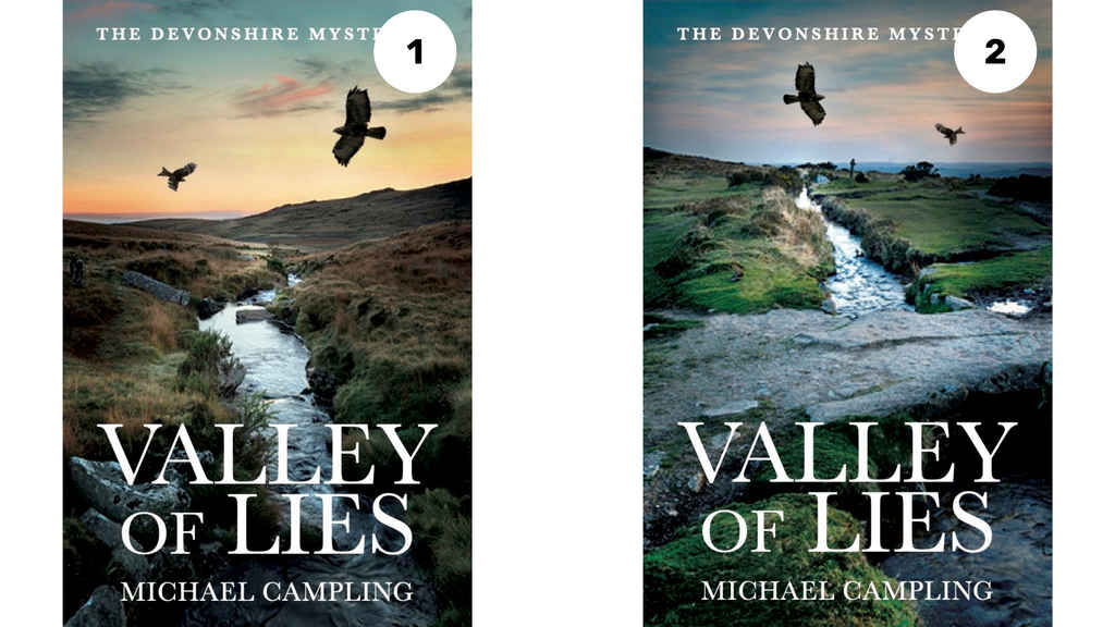
Michael's notes for Patrick:
1: A strong contender but the sky is a bit too warm and cozy. I think it needs to be more brooding. Might need another element in the foreground?
2: I like the sense of depth, but I’d like to see it with a different composition. Perhaps the stone bridge could be lower? I’m not sure about the warm sunset.
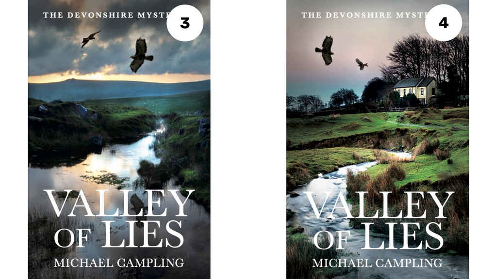
Michael's notes for Patrick:
3: I like the dramatic sky and brooding horizon, but I'm not keen on the large stretch of water across the foreground. I love the bird's reflection, but the title is hard to read.
4: This is probably my favorite. I like the way the house adds interest, but the bare branches behind it don't work. The story is set in summer.
By the time we came to the recently released fourth novel in the series, Patrick’s first attempt nailed the brief. While he understood my vision right from the start of the collaboration, our constant communication, going back and forth via messages, meant that he developed a real feel for my series.
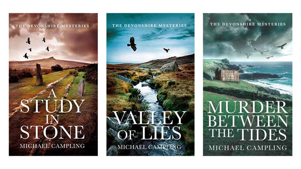
Seeing my covers lined up next to each other, I couldn’t be happier with Patrick’s work. Not only do the covers stand out, but they give potential readers a sense of what to expect. The color tones, typography, and balanced design work together to create a brooding atmosphere.
6,000+ downloads in two days with my new Reedsy covers
Since the rebrand with the new covers, the books’ sales have increased significantly. The professional covers themselves make a huge difference: a Fussy Librarian promotion with the new design led to 4,000 downloads in one day, and more than 2,000 the next day. And now, I don’t have to do much advertising at all: my first book is permafree and gets a few hundred downloads every day without any promotion, partly because of the attractive cover.
Being an indie author is great but can feel like a solitary occupation. Before I started using Reedsy, I found it difficult to find and hire the right professionals. Now I’ve teamed up with a reliable and talented designer and I didn’t hesitate in investing my own money in Patrick after I spent the scholarship funds. He continues to design my Devonshire Mystery series today.
***
Buy The Devonshire Mysteries here and hire Patrick for your book covers here.

