Mark Guerin has entered the world of published authors with a splash. His debut novel, You Can See More From Up Here, has been featured in the Boston Book Festival, on local media news segments, and in literary podcasts. However, before his book started receiving this amount of attention, it was a completed manuscript without a cover. And Mark knew that he wasn’t going to “hit the presses” until he found the right designer to execute his vision.
Finding a designer who "gets it"
I’d already written one other novel before starting You Can See More From Up Here, so completing a novel wasn’t a totally new experience for me. However, this is my first experience publishing a book. I’m lucky to be working with a small press, but their resources were admittedly limited, and I felt that the cover designer they hired couldn’t quite capture the rather specific vision I had for You Can See More From Up Here. I didn’t want to settle, so I started looking for cover designers elsewhere.
Working with a designer who kept me involved every step of the way
Eventually, I found Reedsy and began browsing the profiles of its freelance designers. I came across Jason Anscomb’s profile, and immediately knew I wanted to work with him. There wasn’t a single cover in his portfolio that I didn’t like, and I was impressed with his ability to play around with images and typography, combining them in creative and original ways.
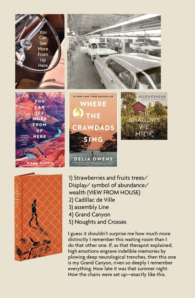
Once I’d hired Jason through Reedsy, the design process started. Jason pitched a few different ideas for the look of the book cover, basing them off of a few story elements that I’d highlighted. (These included a bowl of strawberries, a purple Cadillac racing through a field of corn, a carp in a goldfish bowl.)
Jason gave me the following mood board, which was meant to be the foundation from which the concept for the cover would be designed.
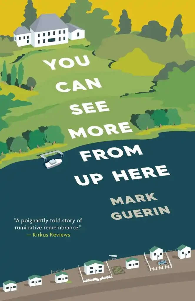
We continued to talk back and forth. Eventually, I mentioned that perhaps the most literal reflection of the title would be an image that showed the view from within the protagonist’s house, looking down at the river, the fishing cottages, and the factory that populate the setting of my story (which also happens to be where I grew up). Coincidentally, that idea brought us to our final concept: a depiction of the house itself. I sent Jason a Google satellite view of my childhood house and hometown, and the decision to make the cover a ‘bird’s-eye-view’ of the setting was made.
From that point on, things rolled on quickly. Jason kept me involved the whole way, as we fine-tuned certain details, changing how the trees looked, individualizing the cabins at the bottom of the cover, tweaking the shape and size of the house up top. Most importantly, we decided to make the big house look like it was on top of a hill and looking down, to emphasize the symbol of wealth.
The color palette and typography were all Jason’s idea, and I loved those from the start.
“When Mark mentioned that the setting of the story was based on a real place, I started virtually “driving” around the neighborhood using Google Maps to ensure that I had a real sense of place, and an understanding of the types of houses and the nature in this environment."
— Jason Anscombe, Cover Designer
A book cover that’s completely unique to my story
I’m appreciative of how very responsible and flexible Jason was throughout the process. At the end of the day, our discussion led to a cover that looked exactly like what I’d envisioned and the response from others has been unanimously positive. A number of people have told me that the cover would make them want to pick up the book in a bookstore and look inside. You can’t ask for much more.
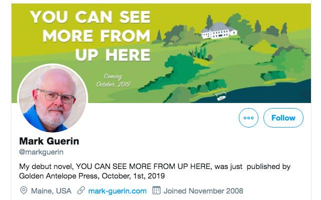
Jason also provided me with art for various ads, banners for my Twitter, Instagram and Facebook pages, and a bookmark. I’ve also used the cover on my website: www.mark-guerin.com
Since publishing You Can See More From Up Here at the beginning of October, I’ve received praise from Kirkus Reviews, Foreword Reviews, Midwest Book Reviews, Reedsy Discovery, as well as a number of other published authors. I’ve been featured on Portland Good Day Maine (a TV news show), as well as at the Boston Book Festival. I’m confident my book cover has contributed to these successes.
"Thus, You Can See More From Up Here actually felt like a coming-of-age story - Walker learns plenty about himself as well as his father - and despite this ‘coming-of-age’ arriving twenty years too late, Guerin’s description of Walker’s drive in the Cadillac is enough to reassure you the past has finally been left where it belongs."
— Kristiana Reed, Reedsy Discovery Reviewer
For me, achieving a book cover that I’m very proud of reinforced the importance of not settling for a designer who clearly and obviously uses stock photos or art. This is especially true for literary novels, which need covers as unique as the content inside.
Covers that use stock art run the risk of unoriginality. I understand that the market requires certain genre novels to adhere to a certain look, but even so: original images, art, and typography will always catch a reader’s eye more effectively. In my opinion, the trick to a good cover is the same trick required to write a good novel: break with convention at the same time as you follow it. Meet readers’ expectations by giving them the kinds of books and covers they like, but exceed those expectations by daring to be original, too.

