As an Editor for British Library Publishing, Jon Crabb looks after projects from the commissioning stage, through the editorial and design process, to final production. A small team (the full-time editorial staff consists of just himself and the managing editor), they produce about 40 books a year, including literary anthologies, illustrated ‘coffee-table’ books, and reissues of classic crime fiction. Jon’s story is about wanting a splash of modernity for the cover of a historical book — and turning to Reedsy to find that fresh perspective.
This is British Library Publishing’s story
Last summer we started working on the cover for a book of reproduced letters, some never before published, sent by the Tudor monarchs and other figures of the age called Tudor Monarchs: Lives in Letters. We usually have a wealth of visual material to work with for our book covers, but Tudor Monarchs proved itself to be uniquely challenging.
Turning to Reedsy for professional design
The “perfect” book cover would have been a painting of a Tudor monarch writing a letter. Unfortunately, after a lot of time looking, we came to the conclusion that this painting didn’t seem to exist. While the letters themselves are fascinating, they don’t make for a striking cover, so I thought that an elegant, typographic approach could work instead. I knew we needed to hire someone to get started on the cover quickly — and that’s why I looked to Reedsy.
The many iterations on the way to the right book cover
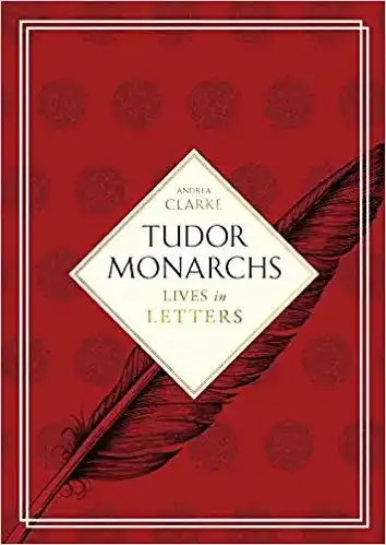
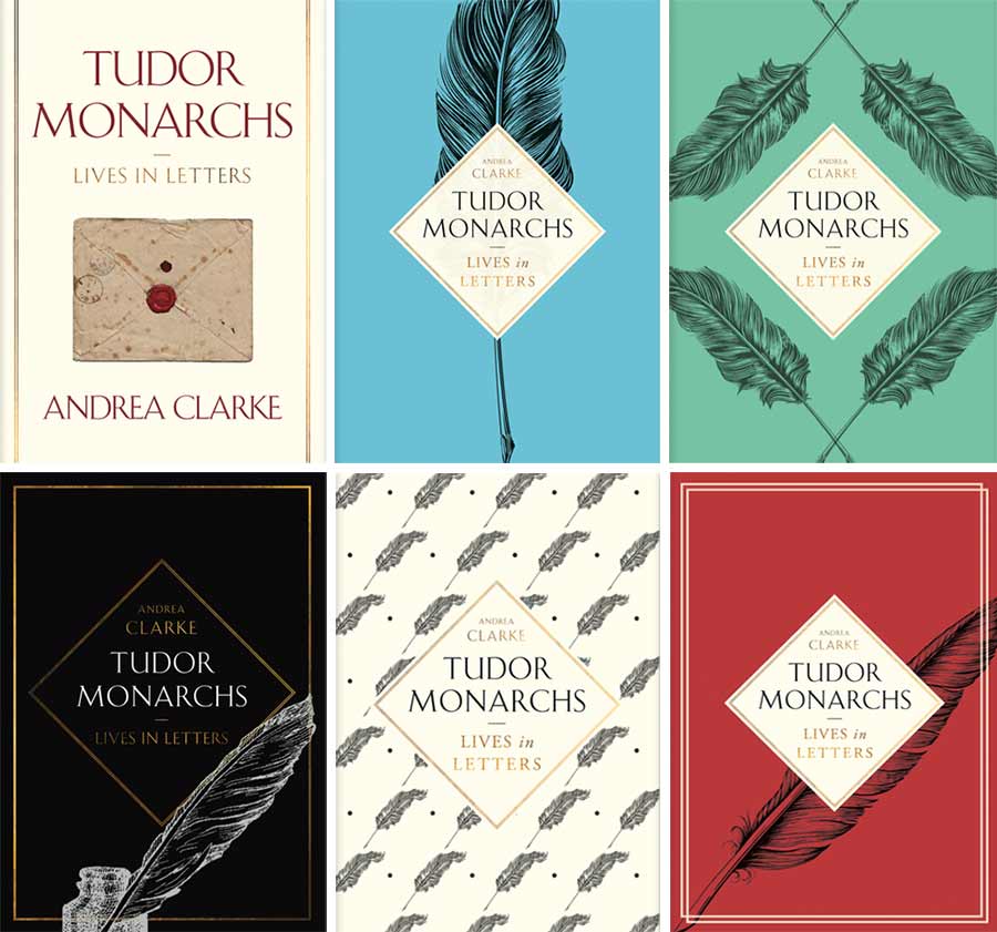
Ben Anslow’s portfolio was a great mixture of different genres, but in each case I thought he had successfully matched strong typography with simple graphics. We were keen for Tudor Monarchs to have a modern feel and stand out from other books on the period, which tend to have quite old-fashioned covers. And right from the get go, his portfolio won our author’s support which was a great relief. The final cover ended up being very similar to Ben’s initial proposal. Still, we went through a large round of iterations while getting to the finished product — in particular with incorporating the diamond panel, the large feather motif, and the Tudor Rose. It was important to use all of these elements in order to achieve a Tudor feel with a modern twist.
“When it comes to the design process, my approach is to send the client a big assortment of ideas just to get the ball rolling. I think it’s a good way to start because you never know what the client might like the look of in the beginning — they could even end up choosing something that contradicts the brief. You never know. A typical amount of initial covers could be anything from 6 to 25, it really varies based on the project. I’ll often send a lot of work to begin with because I’ve learned that a) clients like options and b) it’s a much better when your client is struggling to choose because they have too many options they like as opposed to too few.” — Ben Anslow, Freelance Designer
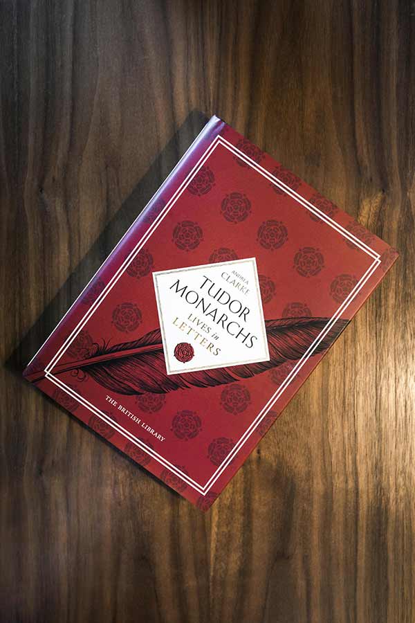
Once the cover was signed off, it took a few more rounds to finalise production options — such as foil blocking on the case — and get the actual files set up for the printer. Different publishers involve their cover designers to different degrees during these final stages, but I wanted to keep Ben in the loop until the end, and he made himself entirely available for this. We were very happy with the final result, and especially grateful for the much-needed fresh perspective on a tricky title. In the month since it was released the book has seen strong sales — which of course is partly in credit to the cover! We look forward to working with Ben in the future.
Tudor Monarchs: Lives in Letters is available in paperback on Amazon.

