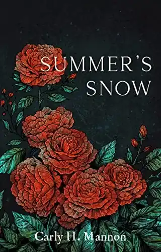
Carly Mannon wanted something different for the cover of her fantasy romance book: a simple and artistic cover that could stand the test of time.
Looking for artistic cover designers
I’m not a fan of most fantasy romance covers. They’re often beautiful but with too much going on for my taste. I much prefer the look of classic hardbacks and collectors editions: simple detailed designs that spotlight beautiful hand-drawn illustrations. So when it came to publishing my feminist fairytale retelling, a flashy cover was out of the question. I wanted my book to have a timeless quality.
At first, I came up with a few design ideas myself, researching images and motifs I could use, but I quickly realized that if I wanted to get a cover that could achieve the quality and artistry I had in mind, I would need a professional illustrator. Searching through Reedsy’s marketplace, I found Angela Rizza. Her ornate illustrations immediately caught my attention, reminding me of those fabulous old tapestries where every detail is hand-crafted with care.

I was also drawn by the fact that Angela was also a tattoo artist. There are people out there who put her art on their skin, confident that it’ll never go out of style. That’s the sort of ageless effect I wanted for my cover.
Finding the right illustration
Angela and I started our collaboration with an in-depth discussion. She asked me lots of questions about my book, and together, we pulled out some key pieces of imagery: roses, a swan, calla lilies, and a crescent moon. Then we explored the details further: the shape of the flowers, the petals, and the colors. To show her what I was imagining, I shared my vision board with her.

Following our conversation, I couldn’t wait to see what ideas Angela would come back with. And when she did send me her first concepts, they certainly didn’t disappoint.
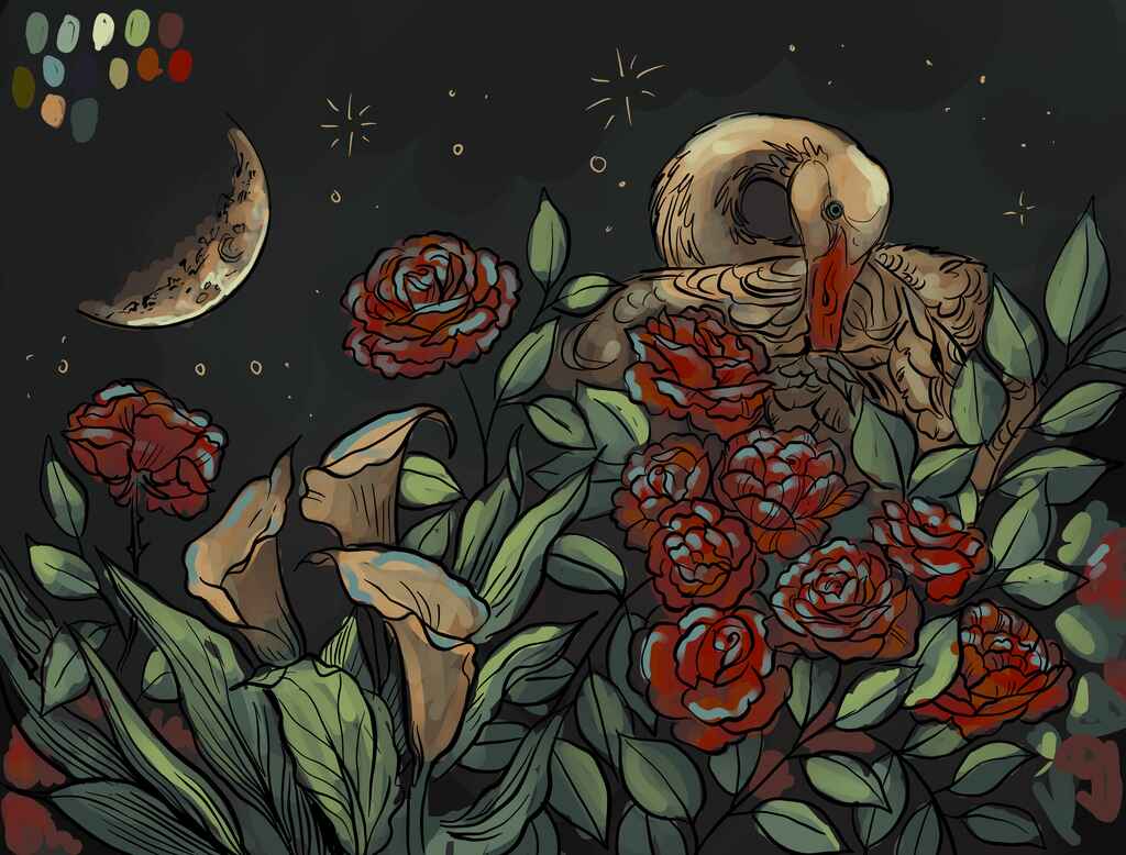
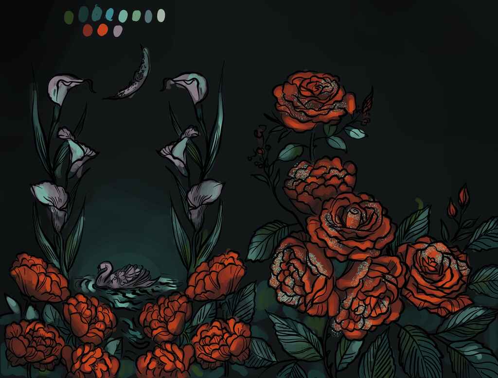
Both concepts were beyond gorgeous. I loved how the illustrations popped off the black background and tempered the otherwise whimsical elements with an air of maturity. Angela’s swan illustration captured the story’s tone beautifully, but I found myself leaning towards the simple frame approach of the roses. Plus, I really liked the back cover of the rose option. How the lilies give way to the swan felt very Secret Garden.
Once we decided on the rose illustration, Angela started work on the detailing. I didn’t think the illustration could get much better, but with the shading, the drawing truly looked like it came from another time.

Readers display my book on their shelves
I am absolutely obsessed with how the cover turned out. I’m extremely biased, but I don’t believe I’ve seen a more beautiful cover. You could frame it, and it wouldn’t stick out in an art gallery.
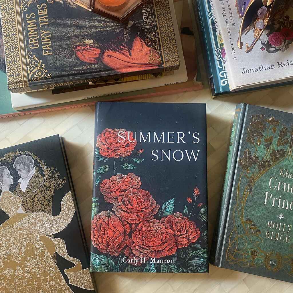
What’s more, Summer’s Snow sits perfectly alongside classic editions of my favorite books. I do a lot of promotion on TikTok and Instagram, and my comments get flooded with compliments for the artwork — many people have told me they display the book in their homes because they love the art so much.
Hiring a professional designer is honestly the best thing you can do for your book. Spend the time to find the cover designer that is perfect for you, and you will love your cover ten years from now. Like the ink of a gifted tattooist, a great book cover is something you’ll want to stay with you for the rest of your life.
