
Ben Gartner’s middle grade fantasy novel started as a fun side project with his kids. But when it became a story too good to keep to themselves, Ben needed a cover they could be proud of — so he hired a Reedsy cover designer.
Who to hire for an exciting and fantastical cover?
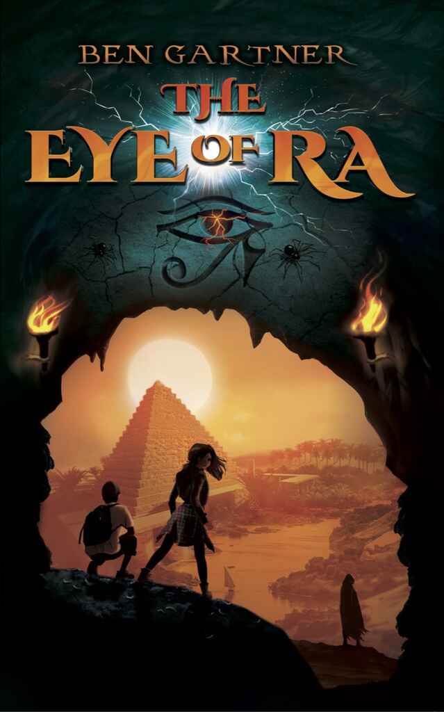
As soon as my sons and I made the choice to publish our fantasy novel, we wanted to do it properly. Professional editing, design — the whole nine yards. In The Eye of Ra, siblings John and Sarah go on a time-traveling quest to ancient Egypt, so we wanted a cover that was equal parts fun and adventurous. We weren’t sure what that would look like, but we wanted a designer who could convey this spirit and deliver a cover we could hold up with pride and show off to family and friends.
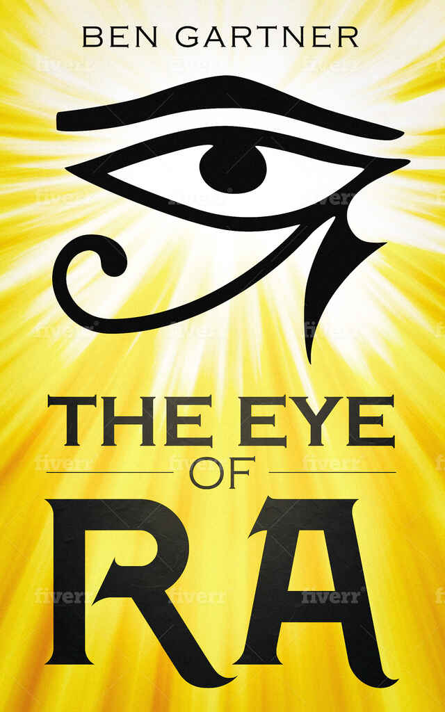
To find a cover artist, I looked at various design services, including Fiverr. I was surprised by the low prices and, out of curiosity, commissioned one of their designers to take a crack at it. The result was as I expected, but certainly not as compelling as we wanted.
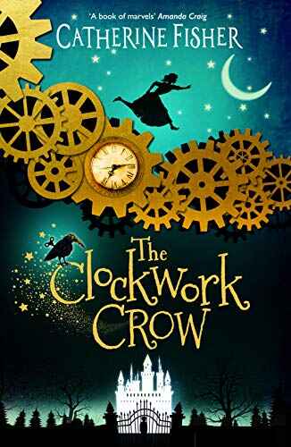
After a little more research, Reedsy emerged as my go-to marketplace to find talent. It’s easy to use and their professionals have years of experience in the publishing industry. Searching through Reedsy’s designers, Anne Glenn quickly became my top choice. She has a variety of stunning covers under her belt (including a Jeffrey Archer book), and I was particularly fond of her Clockwork Crow design. I was hoping she could do something similarly fantastical for my book and fortunately for me, Anne was available.
Seeing my story come to life on the cover
Starting the collaboration, Anne wanted to read the book first and develop a few concepts without my input. I quite liked the idea and was curious to see her vision for the artwork. This vision manifested itself as a 9-page PDF with a fantastic selection of illustrations, fonts, and layout mock-ups.
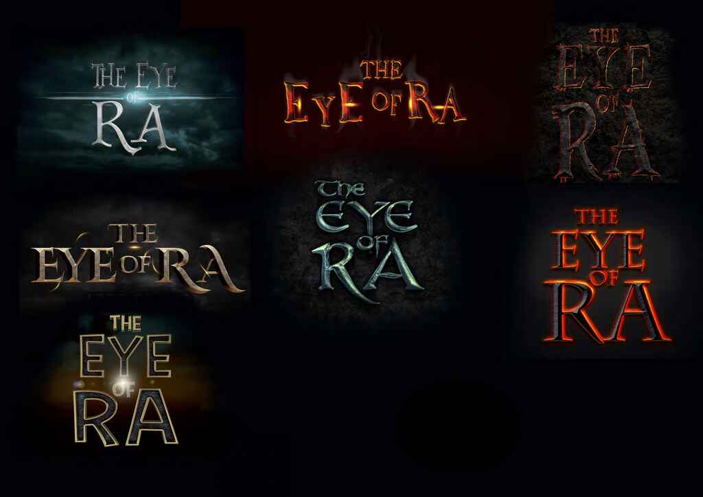
Going through Anne’s concepts, I was amazed: all of her ideas eclipsed any vague notions I had for the cover. This is why you hire a professional!
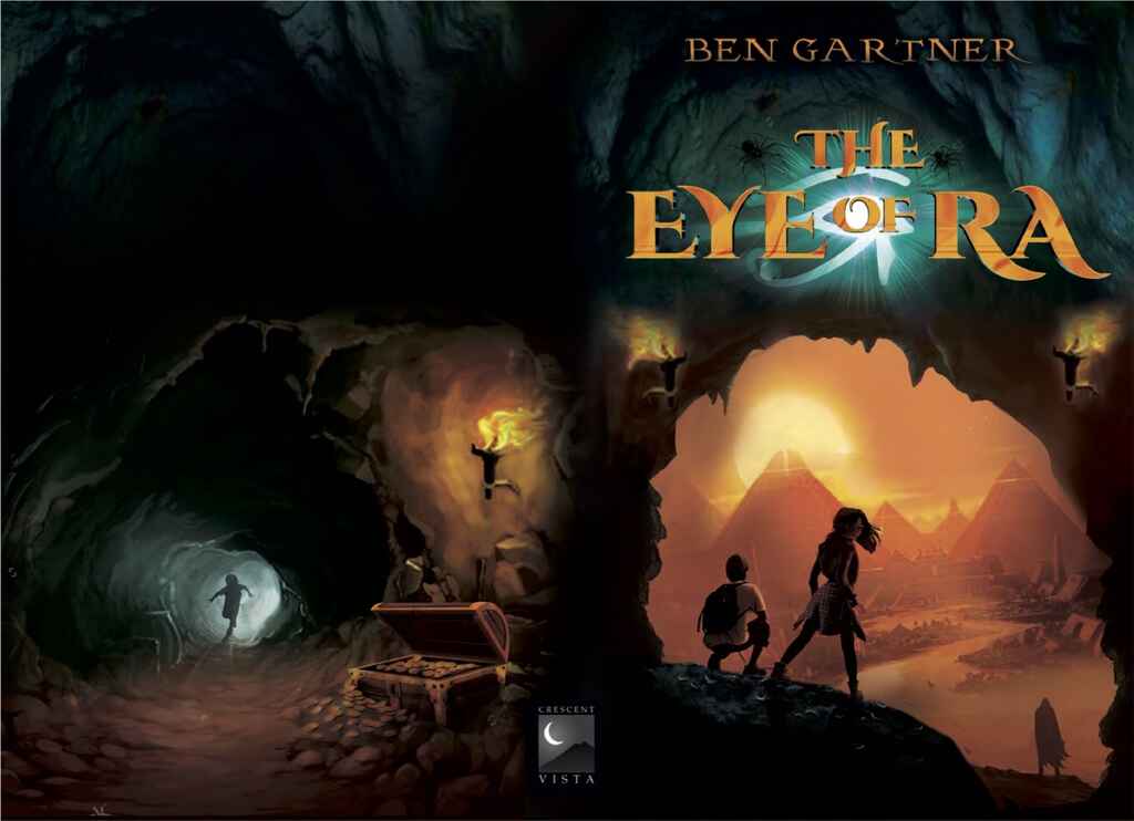
After carefully considering her ideas, we jumped on a call to discuss what we liked and what we didn’t, and how elements might piece together. I loved typefaces with a long-tailed ‘R’, but was unsure how much of the new world should be revealed through the cave opening.
Anne was very gracious and accommodating of my often-less-than-concrete musings. She knew I wanted to keep potential readers on their toes, but explained how the motif of heroes stepping into a fantasy world works best if we stage my protagonists on the brink of a new landscape. Ultimately, I deferred to her artistic judgment, and by the end of the call, we decided on a first concept — which, in hindsight, was pretty close to the final cover. A few more rounds of revision and the face of my debut was ready.
Creating a cohesive series that sparks curiosity
Originally, The Eye of Ra was a stand-alone novel, but as we reached more readers, we kept getting one question: what happens next? Since we had so much fun the first time around, my sons and I put our heads together to continue the story of our sibling duo. Naturally, Anne was our woman for the covers.
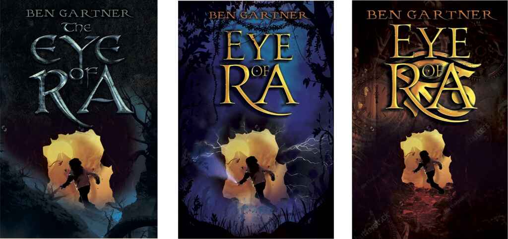
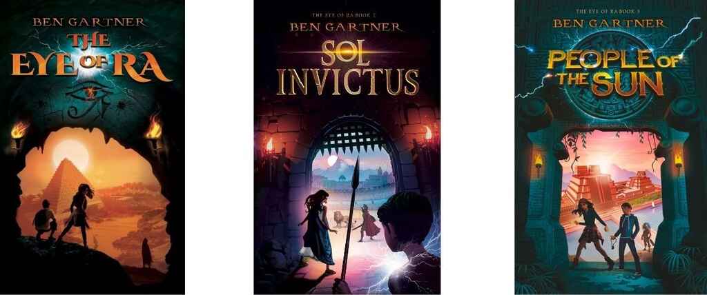
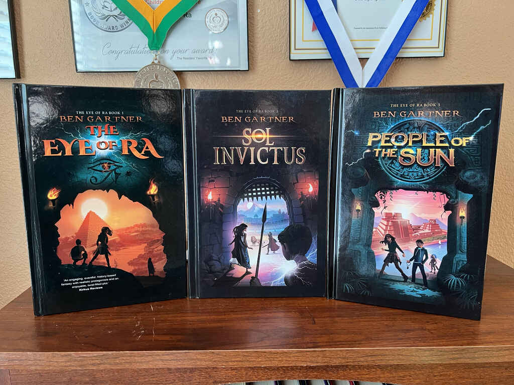
Using the first cover as a guide, we kept the same overall layout for the second book. This gave us room to play with the centerpiece of the design: the archway into the new world. The first book shows a glimpse of the Egyptian pyramids, and we were excited to pick a new image that would get kids curious for the next adventure. Book two takes the magic to ancient Rome — and what’s more exciting than an archway that gives way to a gladiatorial arena?
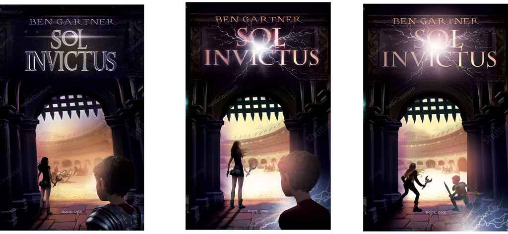
Once we decided on the right set-up, Anne masterfully balanced novelty and continuation across the series. Every book features the sun — both in title and image — and this subtle repetition is just one of many harmonies Anne created on the covers. My favorite recurring element, though, is the third, mysterious figure who you can find on each cover like Where’s Waldo.
Watching the covers come to life was a definite highlight of my publishing journey: fun and tremendously rewarding, it’s something I’ll never forget. In fact, I have the covers displayed in my office.
Compelling covers put my books in the hands of readers
I’m flattered and honored to reveal that The Eye of Ra has racked up overwhelmingly positive reviews from the likes of Kirkus, Publisher’s Weekly, and Reedsy Discovery. We have won numerous indie awards, such as Reader’s Favorite Gold, and after two years, my debut is still #1 in several major Amazon categories.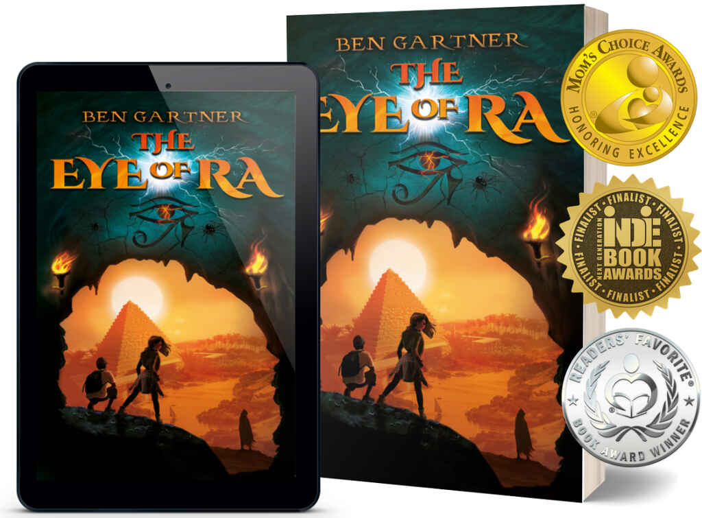
But what delights me the most is all the terrific feedback from young readers, parents, and teachers. I remember after one particular school visit, I received a video from a kid, in which he spoke with such heart about the story and how it inspired him to stick with writing. Our adventure books reminded him how fun stories could be. That’s exactly what the series is about — and the covers set that tone before you even open the books. I have no doubt they have played a huge role in getting the books into the hands of readers.
Readers will judge your book by its cover, so make sure you hire someone who can capture your book’s personality. Make sure it’s a cover you love. And, besides, it’s a super fun part of the process, so don’t forget to enjoy it!

