Upper Hand Press is a one-woman show run by Ann Starr. Founded in 2014, Ann’s goal is to amplify the voices of indie authors who might be overlooked by traditional publishers. Ann’s story is about finding herself in a situation with an MIA designer and a looming publication date. That’s when she turned to Reedsy, to hire a freelance designer who would work quickly, but carefully.
We’ll let Ann Starr take it from here...
Free Ferry is the first poetry published by Upper Hand Press, and it is an extraordinary volume that demands elegant presentation. Poetry should be beautifully presented as a rule, but this text is truly special, and I wanted the book to feel organic in design and content.
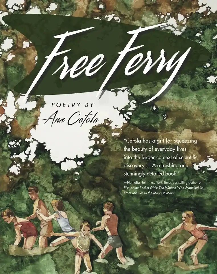
When I came across a painting by eminent watercolourist Linda Gall, I was astonished at how well it resonated with the central themes of Free Ferry: investigation of the earth, and the loss of the pastoral in the atomic age. The painting has large open areas too, like the poem’s pages, divided between narratives in different eras. I was over the moon when she agreed to let me use it for the cover of the poetry collection.

The challenge: a time crunch
“A bit of a time crunch” understates my situation when it came to developing the cover for Free Ferry. I had been working with a local cover designer who inexplicably fell by the wayside, and my interior designers failed to produce a sufficiently sophisticated concept. My production schedule was in ruins and I had to move the publication date back by almost a month.
It was in this haste that I ended up deciding to work with designer David Provolo: he was the first one to respond to my bids. And I’m so happy that he did! David had an immediate understanding of what I wanted for the cover and interior of the anthology.
The solution: a fast-working designer
At the beginning, I told David what parts of the painting I wished to have featured. After that, he ran with it! He had an instinct for the material, clearly having taken the time to read the poems. David’s grasp of mid-century American iconography and graphic design were perfect for the subject and gave exactly the right look to the cover and to the interior. There’s a combination of “jet age” and pastoral in the design that is completely on target.
David initially designed a round of three covers, which included a concept that is almost identical to the one we ended up using.
First round of covers:
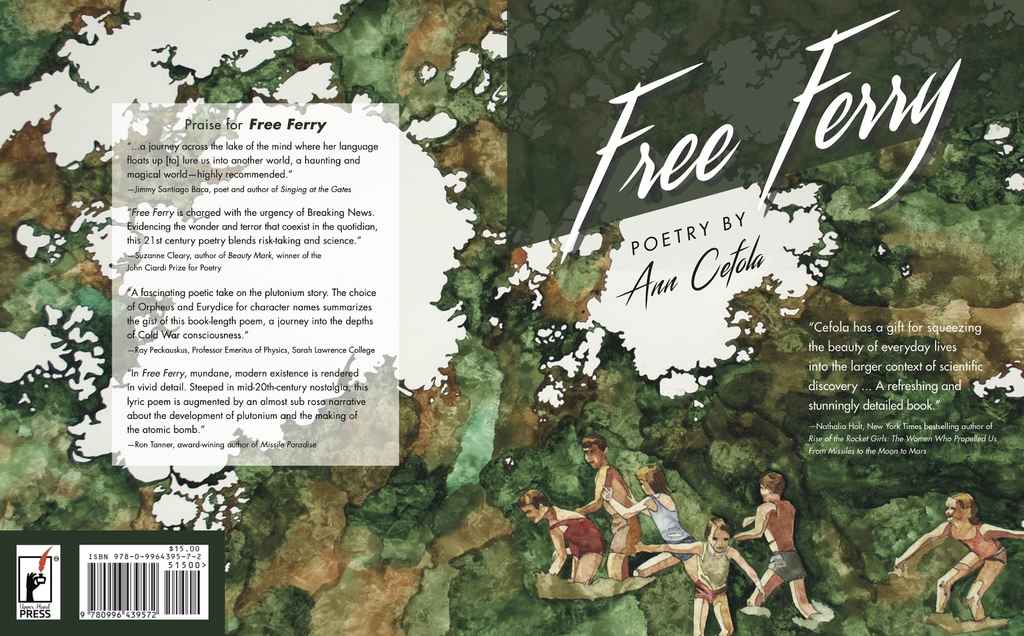
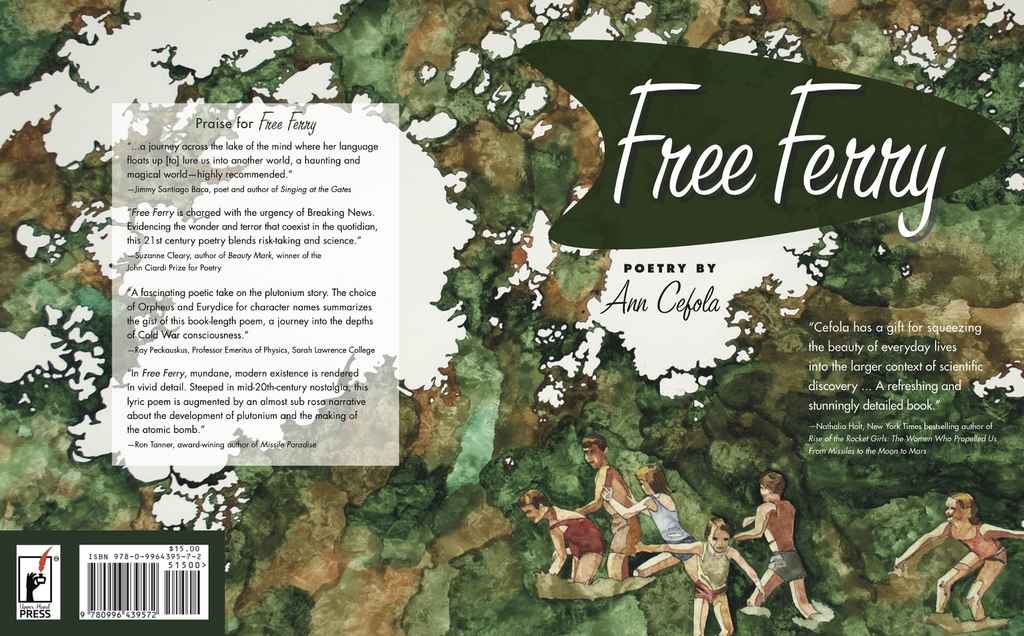
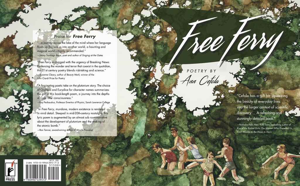
“One reason I was interested in designing the cover for Free Ferry was the use of Linda Gall’s enchanting artwork. When given an image that demands to be presented in all its glory, it’s the responsibility of the designer to frame, not distract, and this is a welcome opportunity to me.” — David Provolo, Cover and Interior Designer for Free Ferry
The outcome: a book cover that reflects the poetry’s themes
The final cover reflects the elegance, beauty, and sense of excitement inherent in Free Ferry. David provided a highly integrated cover, with a design that offers a flavor of the text to come. The richness of the design suggests a whole environment and promises a story.
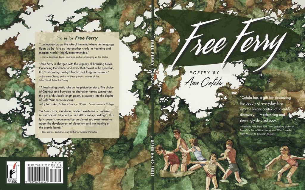
So far, Free Ferry has been doing very well. We have received positive feedback from prestigious poetry reviewers, as well as Amazon reader reviews, and are making many direct sales through the Upper Hand Press website as well as through distributors. This is in large part due to the eye-catching cover designed by David. I couldn't have wished for more.
“I’m pleased with the final product as a composition and visual statement that is evocative of Free Ferry’s brilliant poetry and an expression of the thought process behind the design. The time period of Free Ferry compelled me to further research its art and design. The spirit of The Atomic Age and The Space Race can be seen in the shape behind the title: a rounded rocket pointing to the future; a flamboyant fin on an American car. One of the design principles that guides me is visual cohesiveness. The exterior and interior of the book are harmonically united by a shared sensibility and typography.” — David Provolo, Cover and Interior Designer for Free Ferry
