Adam Bender's debut novel takes place in the Wild West. According to him, the landscape of self-publishing bears some similarities with that setting. Adam’s story is about how working with professional book cover and interior designers helped him successfully navigate this new territory.
This is Adam’s story
In this new frontier of self-publishing — which can often feel a little like the Wild West — it’s easy for authors to take that word “self” a little too seriously. And while relying only on yourself to get the whole job done may save some cash, it won’t do a novel any justice. Few writers can do it all, and there’s no shame in asking other to contribute their expertise to make a book what it needs to be. After finishing The Wanderer and the New West, I used Reedsy to connect with professional collaborators to help me produce a novel that could stand side-by-side with traditionally published books.
Working with a professional cover designer
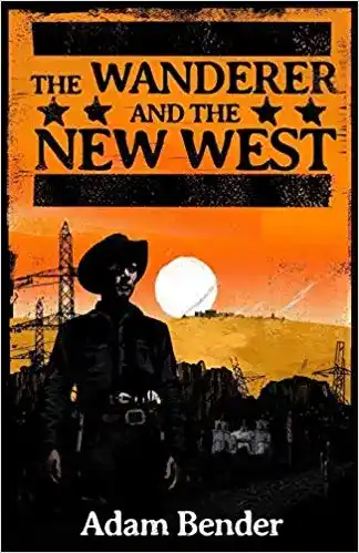
For my book cover, I wanted a pulp or graphic-novel style that would say to readers: “This is a Western, but it ain’t your grandpop’s Western.” That’s when I found Ben Mcleod. Ben’s profile revealed he liked all the pop culture I was into, and the samples in his portfolio had this gritty epic style that looked ready for an oversized poster. I asked for a quote, and Ben quickly got back to me with an enthusiastic pitch and a reasonable price. I didn’t think twice. Ben started the cover design process by asking me to describe key scenes, themes, and images in my novel. I started by outlining:
- The main character: the Wanderer. I emphasized his two guns (one classic and one modern) and his computer-powered eyewear.
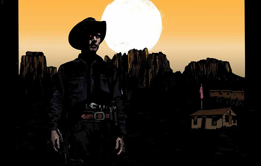
- The setting: a small, modern-day town in Arizona. I mentioned that a Saguaro cactus or great red rocks in the landscape would work. I also mentioned a church that plays a pivotal role in the first chapter.
- Important symbols: guns, trains, stetsons, and the American flag.
To get the ball rolling, Ben sent back this initial concept based on my notes:
From there, we got to a near-final cover concept quickly. At first, I thought the reader might think the book took place in the past like most Westerns, so we brainstormed together some more modern elements like a road, power lines and street signs. We ended up overdoing this a little, making the cover look too crowded, so we started stripping it back again. It took a few rounds, but Ben patiently modified the cover until we got it where it needed to be. In the end, I was more than satisfied with the result:
A word from cover designer Ben Mcleod: “It was a bit of a juggling act because we didn't want it to look overly futuristic or old western — it had to touch on both. So as we got more and more ideas for elements to add to the cover, we could become more selective with what we used. Some of the things we added were more subtle but I liked the idea that they might become more significant to the reader as they go through the story — such as the church. Rather than tell you what the book is about the cover is designed to give you an interesting setting, and to draw you in.”
Working with a professional interior designer
The book jacket looked great, but I still needed someone to lay out the interior and convert the whole thing to an eBook. This is something authors sometimes don’t spend enough time on because the inside of a book is “just text” and may seem unimportant. Not so! A book that doesn’t follow industry standards for spacing, headers, page numbering or countless other minor details will look majorly unprofessional.
Mark Thomas came highly recommended by others on Reedsy. After accepting his offer, I sent Mark my edited manuscript and the name of the font Ben used for the book title. I flagged some of the more complex elements in the novel, including blog-style interludes and tweet-style passages, and Mark suggested special styles to make this work without over-complicating the look of the book.
Mark then sent me a draft of the interior and asked me to scan for problems. It looked great, but we went through a few rounds weeding out little imperfections. He responded quickly and in days we had a PDF ready for printing. He then helped me convert the print book into an eBook fit for a Kindle. This isn’t as simple as sticking the print version into an app and clicking “Change to eBook.” Some elements had to be simplified to work for digital reading. There were a few bugs, including some issues related to page breaks and spacing, but Mark quickly sorted them out. I was just glad it wasn’t me poring over the code!
The pride you feel when your book looks 100% professional? Priceless
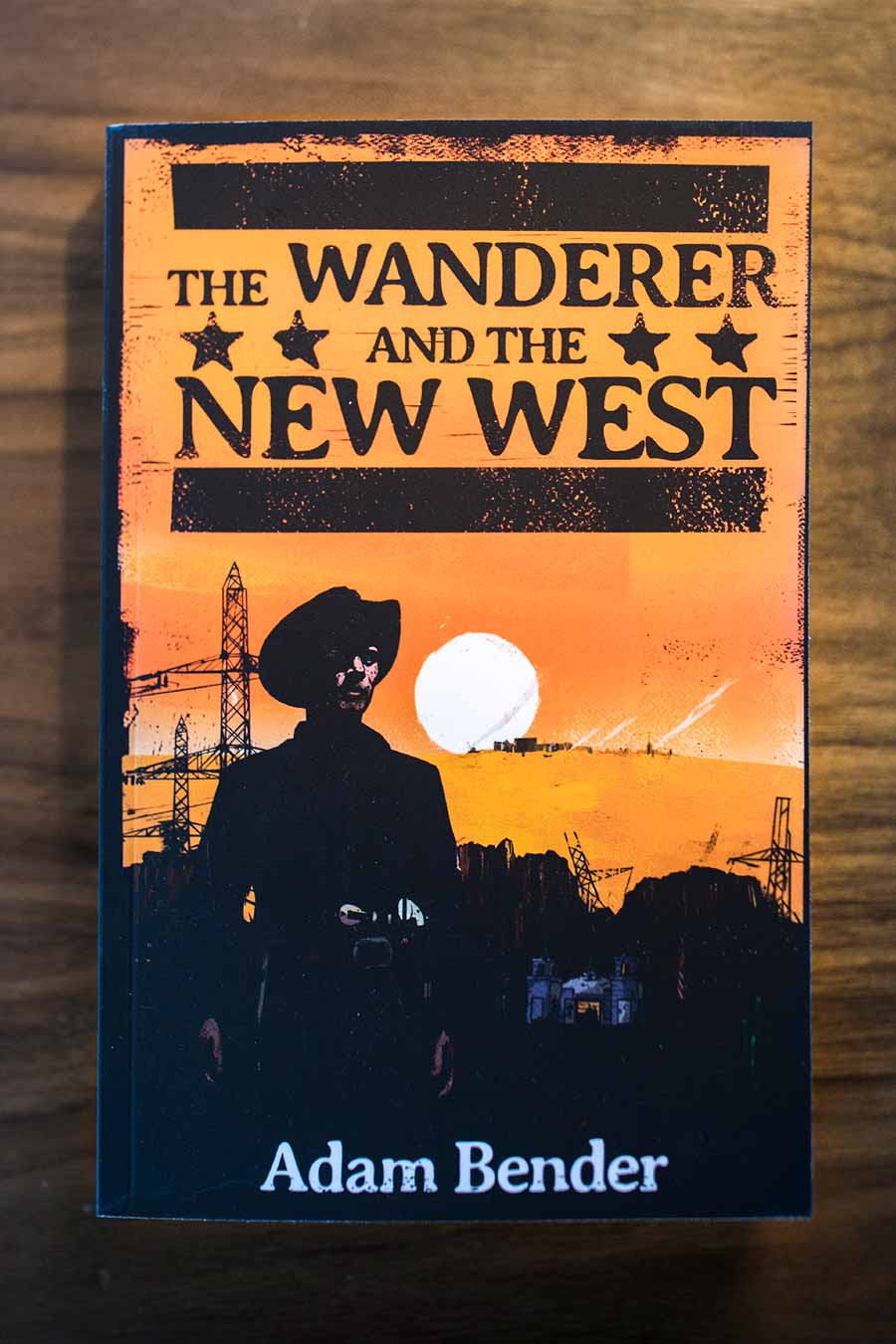
The Wanderer passed a big first test when I received the proof of the paperback. The first thing I thought when I saw Ben’s cover was, “Hey, this actually looks like a book I’d want to read!” And when I opened it up, it looked like a real book too! Soon after publishing, I scored a starred review from Kirkus Reviews and five-star ratings from five separate critics who reviewed the novel early on Readers’ Favorite. I couldn’t have done that without my gang of Reedsy collaborators. Next time I venture out into the self-publishing frontier, it’s heartening to know I won’t be riding alone.

