Menu
There are currently 1,000+ designers available on Reedsy, come meet them.
Find the perfect designer for your next book
1 million authors trust the professionals on Reedsy. Come meet them.
Menu
There are currently 1,000+ designers available on Reedsy, come meet them.
Find the perfect designer for your next book
1 million authors trust the professionals on Reedsy. Come meet them.
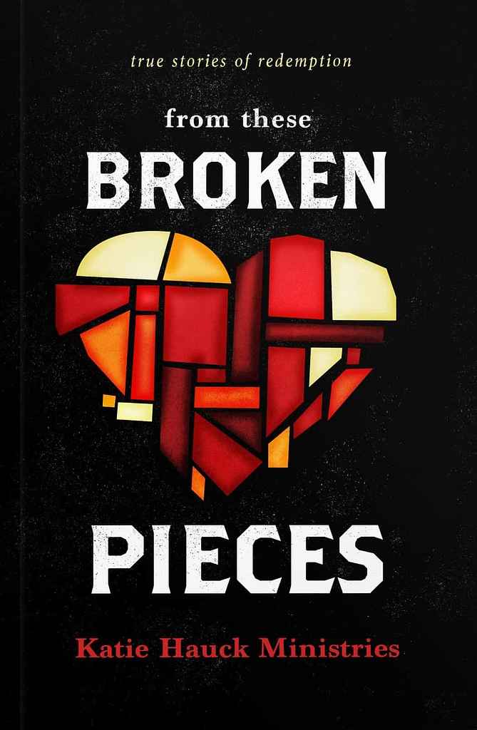
Designer: Christian R.
Designed by Christian R.
Available to hire ⏺"Broken Pieces is a collection of stories about healing from trauma through the power of Jesus. The central image of a reassembled stained glass heart conveys this theme. Aimed at those who have been incarcerated or are in rehab, we used a grittier font and bold colors to attract the audience, avoiding the typical Christian self-help look. The bold colors and illustrated elements set the book apart from others in the genre, while still accurately reflecting its message."
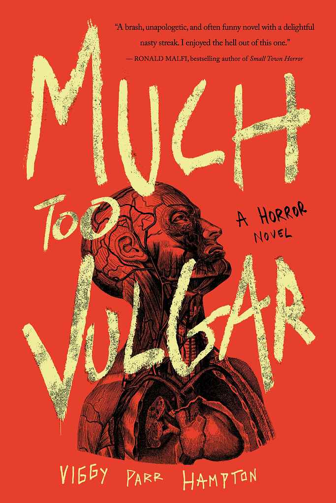
Designer: Nuno M.
Designed by Nuno M.
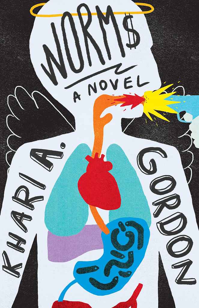
Available to hire ⏺"This is the second cover I’ve designed for Viggy, following the style of her previous book, A Cold Night for Alligators. The rough, hand-drawn title contrasts with the deep red-orange background, adding urgency and rawness. The anatomical illustration beneath the text serves as a grotesque, eerie focal point, reinforcing the book's theme and complementing the distressed calligraphy. Together, these elements create a bold, eye-catching, and unsettling cover that mirrors the tone of the story."
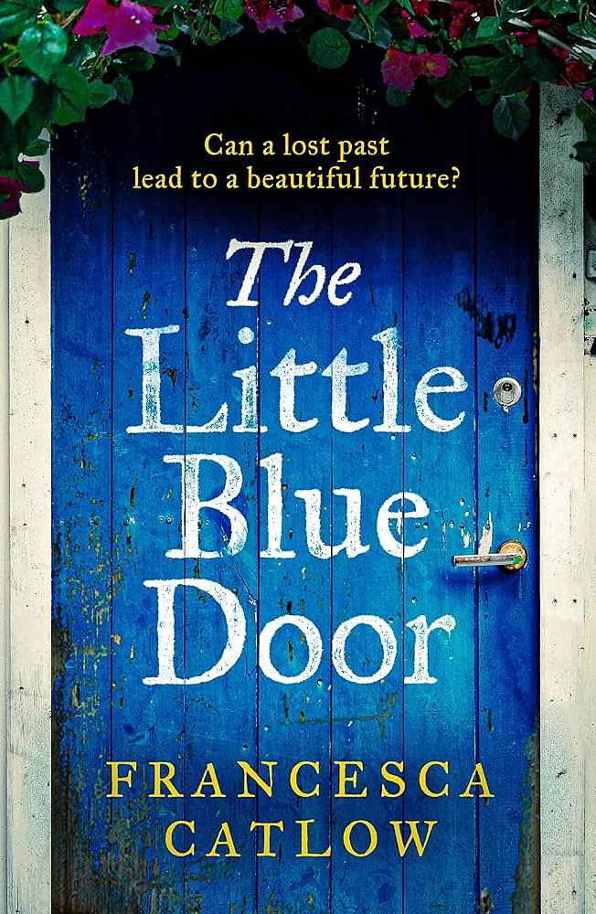
Designer: Andrew D.
Designed by Andrew D.
Available to hire ⏺"As I discussed image options with Francesca, the idea of a close-up blue door quickly became the winning concept. Focusing on the door would make the cover stand out and establish a visual motif for future covers in the series—whether a door, window, or entrance, each featuring a zoomed-in arch."
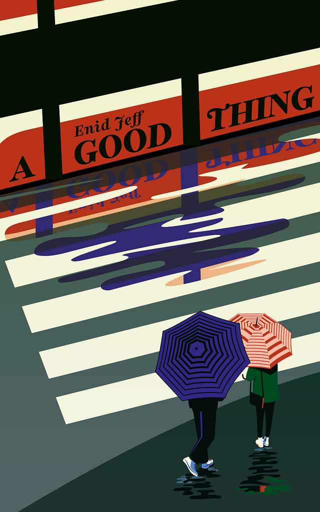
Designer: Sarah L.
Designer: Alexander N.
Designed by Alexander N.
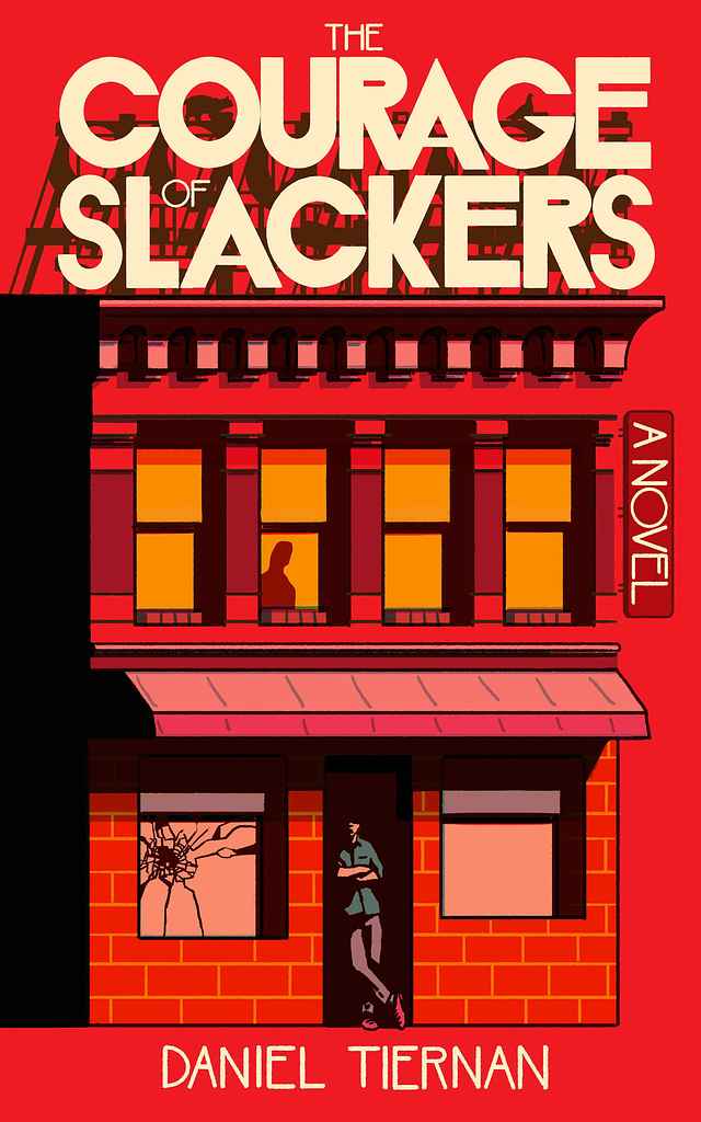
Available to hire ⏺"The cover features a fictional but typical Minneapolis dive bar, grounding the story in a distinct aesthetic while hinting at key plot elements. The 'Art Deco' style, common to Minneapolis bars, influenced both the cover design and the font. It worked well for a modern minimalist design: it's readabile at small scales while remaining interesting up close. Details like the main character, a lurking figure, broken glass, and a cat stalking a pigeon on the roof add suspenseful hints to the story."
Designer: Barış Ş.
Designed by Barış Ş.
Available to hire ⏺"The cover is directly inspired by the plot, aiming to capture the intense sense of action and adventure. It embraces an underground vibe, signalling to the audience that they’re in for a wild, unpredictable ride filled with eccentric twists. The bold typography and edgy illustration style were carefully chosen to reflect the chaotic energy of the story, letting readers know they’re about to dive into something thrilling and out of the ordinary."
Designer: Barış Ş.
Designed by Barış Ş.
Available to hire ⏺"The cover explores themes of transformation and progression with a distinctly feminine and empathetic touch. The aim was to convey these ideas through a sense of calm and serenity, illustrating the process of healing, personal growth and renewal."
Designer: Christian R.
Designed by Christian R.
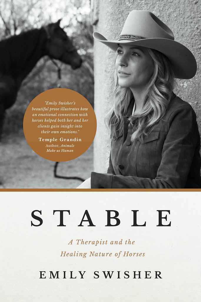
Available to hire ⏺"The photo (by Sinuhe Xavier) captures the atmosphere of the author's work with horses. I used colors, typography, and layout to firmly place the book in the memoir genre, drawing inspiration from memoirs in the fashion or cinema industries. This approach elevates the cover beyond the typical 'western' or 'country' categories, and conveys refined earthiness to match the story. The callout circle for the endorsement balances the negative space, adds visual interest, and a sense of authority."
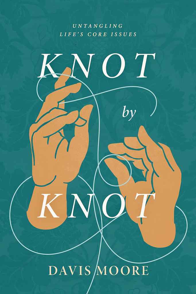
Designer: Christian R.
Designed by Christian R.
Available to hire ⏺"The book explores how the good news of Jesus helps readers untangle the knots of sin and addiction. The hand, inspired by ancient Christian iconography, symbolizes God's hand, while the background texture comes from historic art archives. The colors and illustration are on-trend with Christian self-help books, but the ancient elements add uniqueness. I love incorporating Christian symbolism and artwork to connect modern readers to the rich history of the church and the timeless Gospel message."
Designer: Joe M.
Designed by Joe M.
Available to hire ⏺"The author wanted me to convey a complicated suspense/thriller story in a simple, elegant way — one that evoked a mood rather than telegraphed the plot line. That directive suited my style perfectly, because I tend to prefer captivating, moody images that draw the eye while offering subtle hints of what lies within. I feel like this has both a contemporary yet classic look; one that will look fresh ten years from now as it does today."
Designer: Jason A.
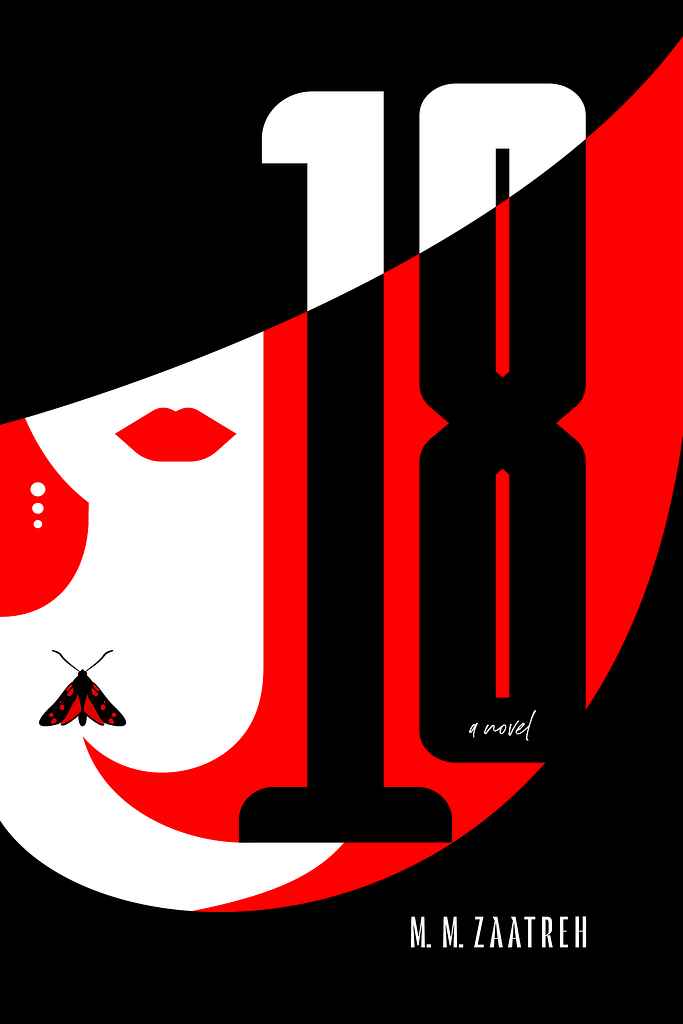
Designed by Jason A.
Available to hire ⏺"The novel is a mystery about good and evil, focusing on symmetry. A mysterious woman and two six-spotted moths are significant to the plot, so they had to be on the cover. To portray these themes I went with a high contrast color scheme in a vector art style, to give it a modern feel. The woman's obscured face and cutaway title effect are meant to convey there's much more going on under the surface in this story."
Designer: Rodney H.
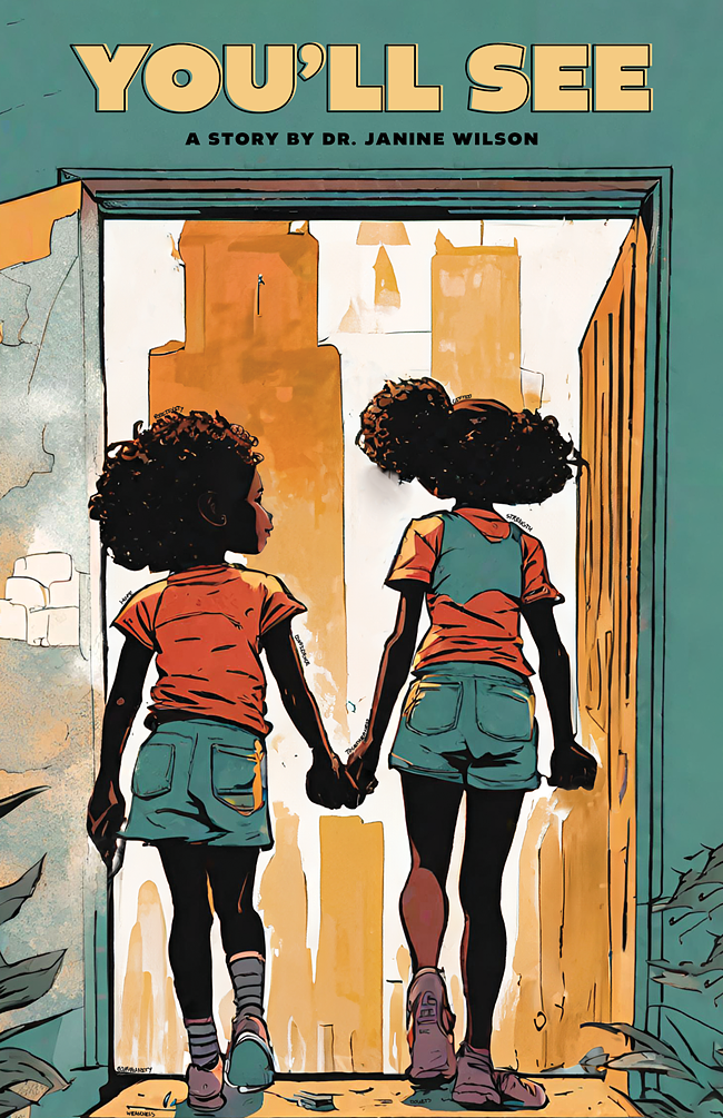
Designed by Rodney H.
Available to hire ⏺"The cover design symbolizes the strength of family bonds, with the girls stepping into the world surrounded by positivity, confidence, and grace. They are encouraged to embrace their talents and appearance to achieve their aspirations. What stands out is the texture of the illustration, the color palette, and the typography, bringing the characters to life. Their height, hair, style, and setting combine to inspire their unique story."
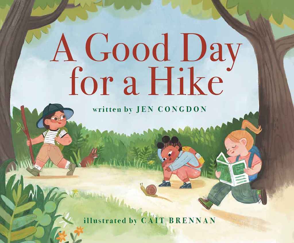
Designer: Michele T.
Jen Congdon
Designed by Michele T.
Available to hire ⏺"For this cover, I chose a classic serif font that remained easy to read without overpowering the playful artwork. This clean, readable typography complements the joyful illustrations, achieving a harmonious balance between visual charm and timeless design. The result is a cover that feels both fresh and classic, appealing to young readers while maintaining a sophisticated, enduring look."
Designer: Vanessa M.
Designed by Vanessa M.
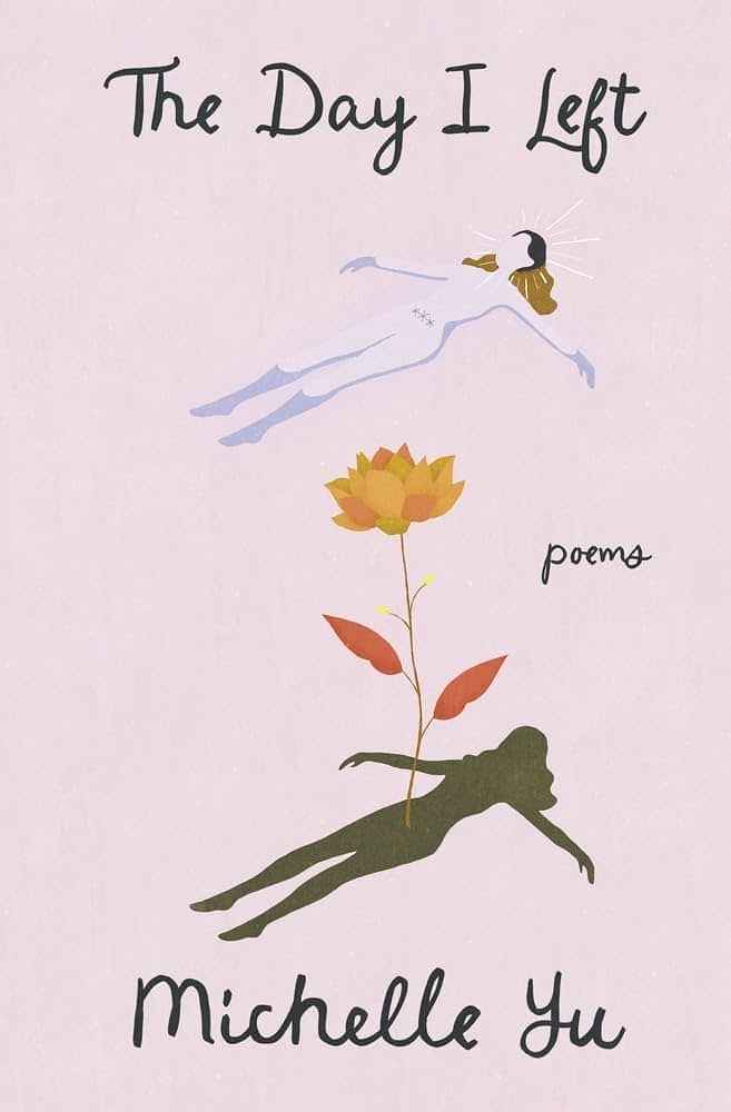
Available to hire ⏺"I wanted the cover to reflect the emotional depth and raw honesty of the poems. The minimalist design, with its contrasting colours and simple lines, creates a sense of quiet intensity. It’s like a visual metaphor for the rollercoaster of emotions that readers will experience as they delve into the collection."
Designer: Vanessa M.
Designed by Vanessa M.
Available to hire ⏺"I wanted the cover to capture the book’s vibrant and uplifting message. The cheerful colours reflect the Caribbean-inspired approach to health and wellness. Featuring the author, Dr Lisa Leslie-Williams, the design creates a sense of warmth and optimism, inviting readers to embark on a transformative journey towards a healthier, happier life."
Designer: Zuchal R.
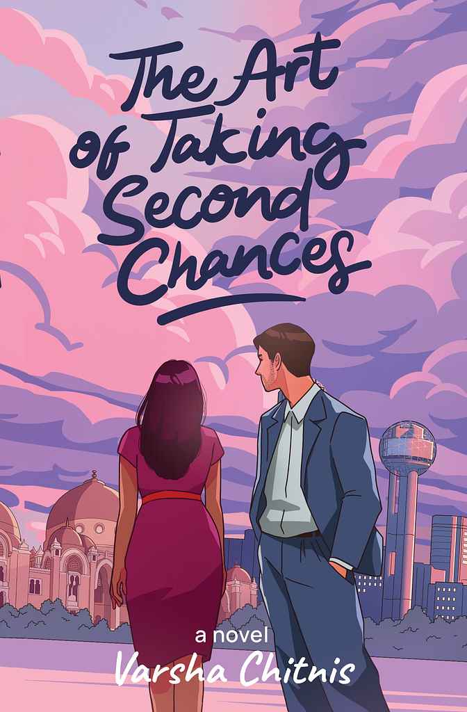
Designed by Zuchal R.
Available to hire ⏺"The cover focuses on the main characters, Tara and Sameer, and their challenging journey, set against the backdrops of Baroda and Dallas. Initially inspired by a specific scene, the concept evolved through collaboration with Varsha to emphasize the settings. The faceless depiction of the characters invites readers to imagine them, while cloud graphics and a hand-drawn title add symbolic and artistic touches. The pink and purple palette enhances visual appeal and reinforces the book's theme."
Designer: Stephanie H.
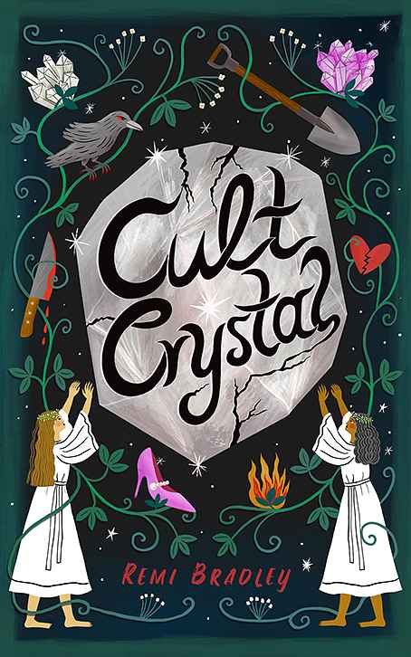
Designed by Stephanie H.
Available to hire ⏺"My main goal in designing the cover for this dark, mysterious, and sometimes humorous novel about female friendship in a cult called the Crystal Collective was to translate the title's essence into an illustration: two women worshipping a cracked crystal, hinting that not all is well in the cult. I balanced this with icons relevant to the plot to spark interest, ensuring the illustration and title remain clear and readable even at thumbnail size."
Designer: Margarita C.
Designed by Margarita C.
Available to hire ⏺"In the plot, the moment when the characters meet is important—it's the trigger for the story, and it happens while they are waiting for the tram. I believe the key is to introduce the tram almost as a third character. Overlaying the title on its side adds dynamism and metaphorically reinforces the idea of how fleeting that moment of meeting is. Either you act, or it never happens, and the opportunity vanishes just as the tram does."
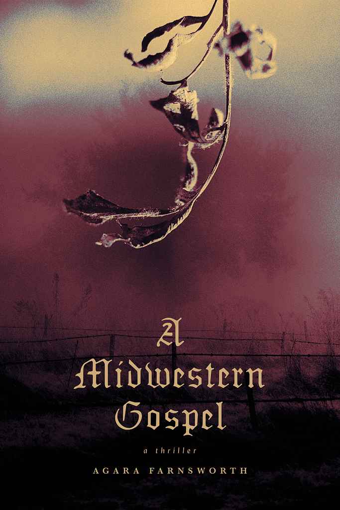
Designer: Nuno M.
Designed by Nuno M.
Available to hire ⏺"This cover design effectively reflects the tone and setting of a thriller novel based in the South. The muted colors, decaying leaf imagery, and Gothic typography come together to hint at a story full of tension, secrets, and moral conflicts, drawing in readers who are fans of suspenseful, atmospheric tales."
Designer: Steve K.
Designer: Steve K.
Designer: Jason A.
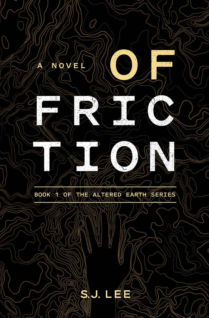
Designed by Jason A.
Available to hire ⏺"The priority was to create a consistent series look across all three books, focusing on the protagonist's arm transformation as the story progresses. S.J. prefers minimalist compositions and wanted to pay homage to the Southern Reach series, which was a big influence. We used a gridded title treatment and a textured background interacting with the protagonist's hand, tied to the book's events. These core elements will be carried through the entire series."
Designer: Margarita C.
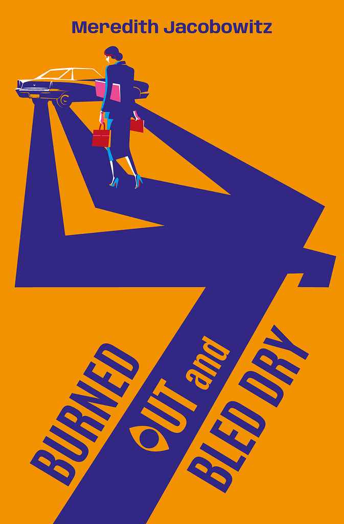
Designed by Margarita C.
Available to hire ⏺"My goal was to instantly convey the novel's genre—cozy mystery with a touch of humor. Inspired by Saul Bass, I created a shadow suggesting a murder scene, with the hurried protagonist walking over it, unaware of what's awaiting her at the car. The exaggerated, almost caricature-like shadow adds dark humor, softening the tension. The title treatment features an 'o' as an 'eye,' acting as a witness. The metaphor hints that the car holds a secret, with the shadow offering a clue to what's coming."
Designer: Jason A.
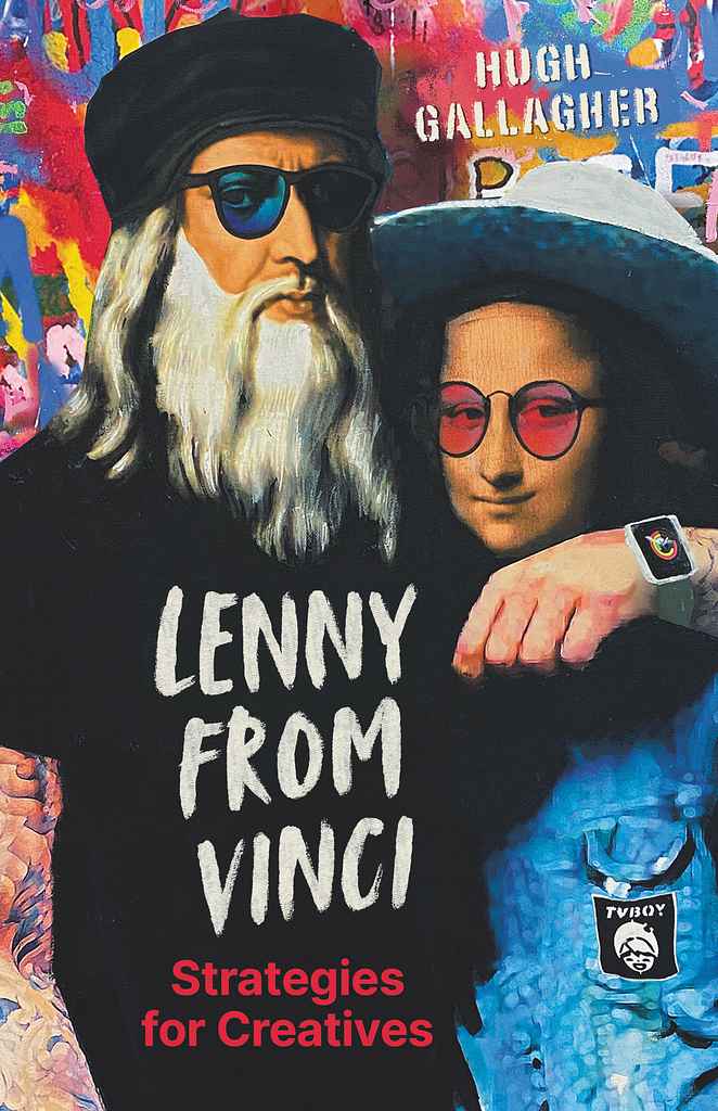
Designed by Jason A.
Available to hire ⏺"This book is a strategy guide for creative people, bringing LDV's principles into the present. To give it a modern feel, Hugh commissioned cover art from street artist TVBOY. I made subtle adjustments to the artwork for the cover and designed the title to appear screenprinted on LDV's shirt. The back cover text mimics a poster wheat-pasted over TVBOY's graffiti, giving it the feel of something you'd see on the streets of Palermo, TVBOY's hometown."
Designer: Laura D.
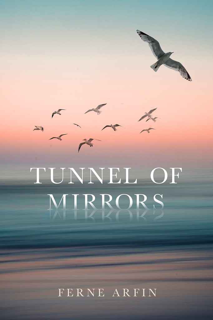
Designed by Laura D.
Available to hire ⏺"It was important that this beautiful novel have a beautiful, romantic cover without being trite. The story takes place in the 1900s and is about a young woman coming to New York from Ireland. The ocean is a big part of the story in various ways. The gull flying away from the other birds was inspired by the main character, a very independent, unique young woman. I wanted to add some interest by having the title look like it's sinking into the sea and being reflected like a mirror."
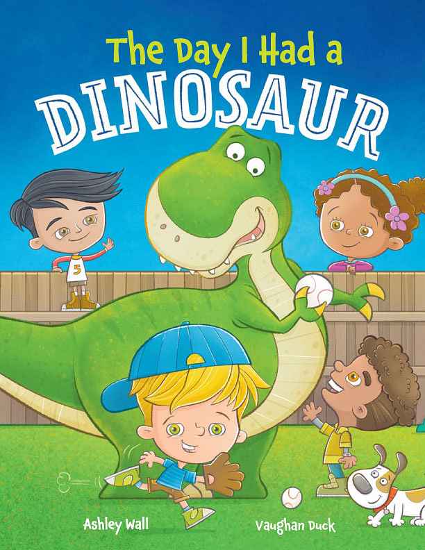
Designer: Vaughan D.
Designed by Vaughan D.
Available to hire ⏺"The picture book captures children imagining themselves playing with large construction vehicles, like bulldozers. The cover features the main character enjoying a bulldozer, creating an exciting visual that hints at the fun story inside. With the trend of strong characters on covers, especially for small online thumbnails, I focused on using bold colors and a clean design. Strong illustrations and text design were emphasized to ensure the cover stands out and reflects the story."
Designer: Rebecca F.
Designer: Owen G.
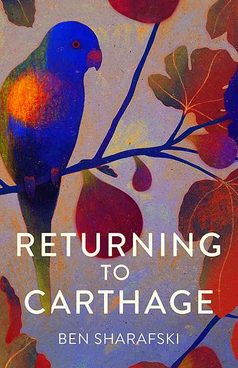
Designed by Owen G.
Available to hire ⏺"For this short story collection, I aimed to evoke a sense of place and atmosphere without focusing on a specific narrative. The fig tree and Lorikeet, featured in multiple stories, serve as a tonal and geographical anchor. While botanical and avian illustrations are popular, I chose a less patterned approach with a mix of delicate and saturated colors. Starting with a subdued palette, I added rich, vibrant hues to bring the cover to life and reflect the warmth of the stories."
Designer: Taylor B.
Designer: David T.
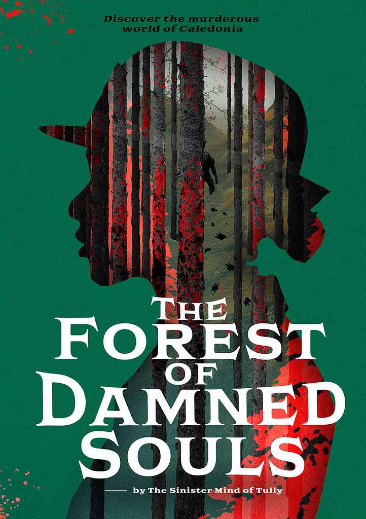
Designer: Rafal K.
Designed by Rafal K.
Available to hire ⏺"It's a Scottish thriller featuring a fresh female constable solving mysterious crimes in the vast Scottish woods, blending thriller, fantasy, and a sci-fi twist. Scottish thrillers are often straightforward, with covers focusing on the main character or motifs. I wanted to go beyond that, highlighting the genre's greatest asset—mystery—without sacrificing artistic quality. The cover itself is a riddle, with the solution revealed only by reading the story, adding intrigue and depth."
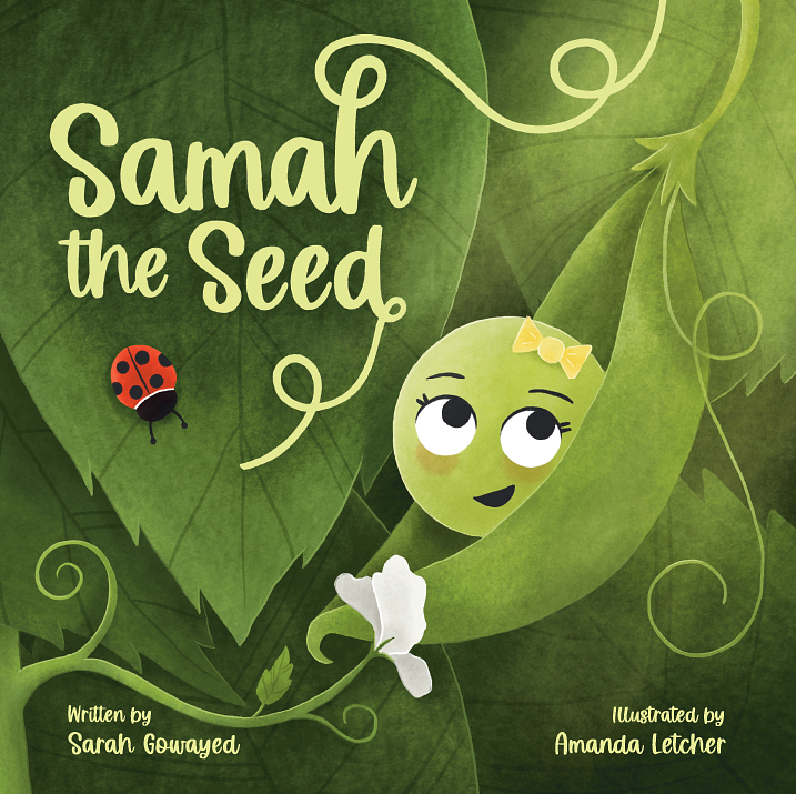
Designer: Amanda L.
Designed by Amanda L.
Available to hire ⏺"In the cover for Samah the Seed, I wanted to create a richness of colour and the feeling of closeness that Samah has with her Baba. It was important to convey the underlying theme of spirituality without being too specific, so the glowing light coming from the top right was added to reference God in a way that all readers could relate to. The book title was hand drawn so that it could appear to be connected to the plant and further reiterate the growth for Samah throughout the book."
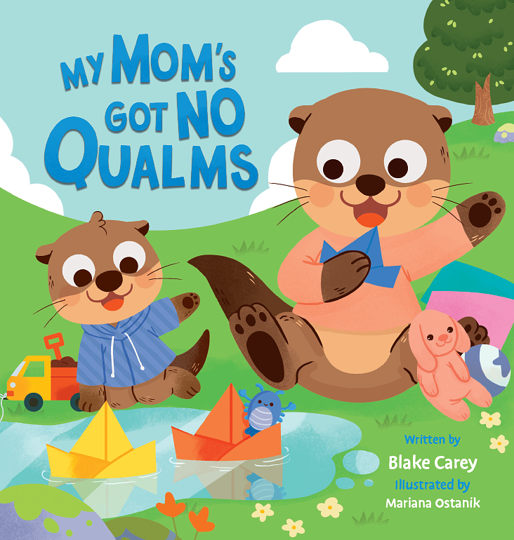
Designer: Mariana O.
Designed by Mariana O.
Available to hire ⏺"For this cover, I aimed to convey joy, playfulness, and the special times we share with our families, especially moms. I chose a bright, cheerful color palette to reflect these emotions. The illustrations, inspired by the animals the author’s children love, capture young readers' emotions with big eyes and smiles. The typography enhances the playful tone with bright, contrasting colors, and textures add to the overall feel. It's a fun, engaging cover for both kids and grown-ups."
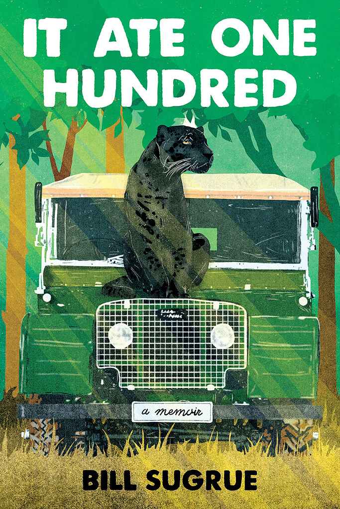
Designer: Barış Ş.
Designed by Barış Ş.
Available to hire ⏺"The cover illustration plays with the book's title, inviting the audience to initially think the story revolves around a "big cat who ate one hundred." However, the true essence lies deeper: the artwork symbolizes the harsh realities of survival in the wilderness, where unseen dangers lurk in every shadow. The aim was to evoke a sense of displacement, drawing the audience into the experience of being far from home and confronted with the vast unknown."
Designer: Latte G.
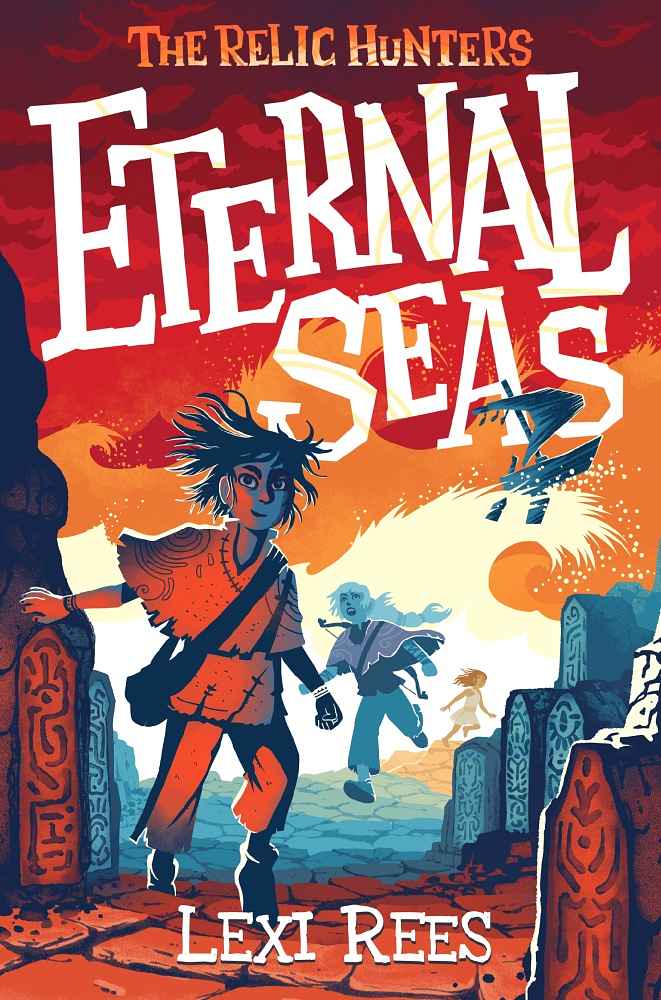
Designer: Florian G.
Designed by Florian G.
Available to hire ⏺"We aimed to convey adventure, danger, and establish a fantasy world with young heroes. Middle-grade stories often use detailed, figurative illustrations, but I suggested a more graphic style inspired by cut paper. The colors are strikingly powerful and they are rarely used in this book category. The logo stands out beautifully, even as a thumbnail. Despite the amount of information depicted, the image remains very easy to read."
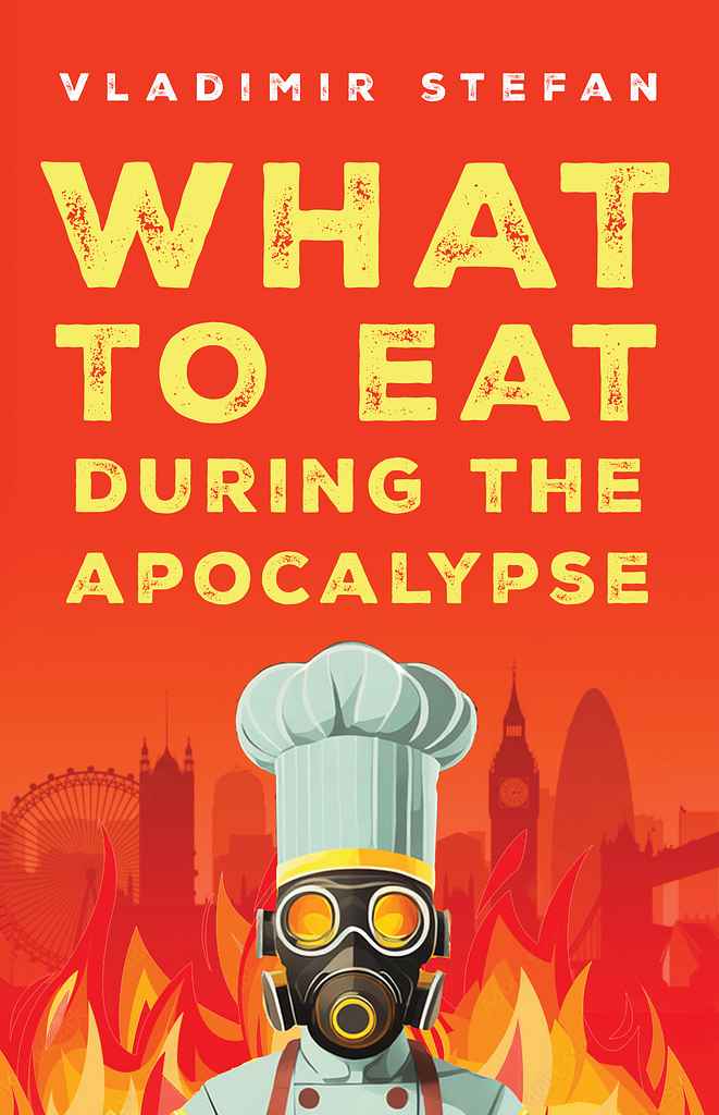
Designer: Christian S.
Designed by Christian S.
Available to hire ⏺"This design highlights the quirky, funny title—dystopian recipes!—while presenting the dark backdrop in an engaging way. We chose a gas-mask-wearing chef to capture the book's strange spirit. Borrowing market trends like simple, solid colors and an illustrative style appealing on social media, we created a timeless look. The distressed sans serif typography is readable and suggests breakdown. We aimed for a design that lets the clever title shine."
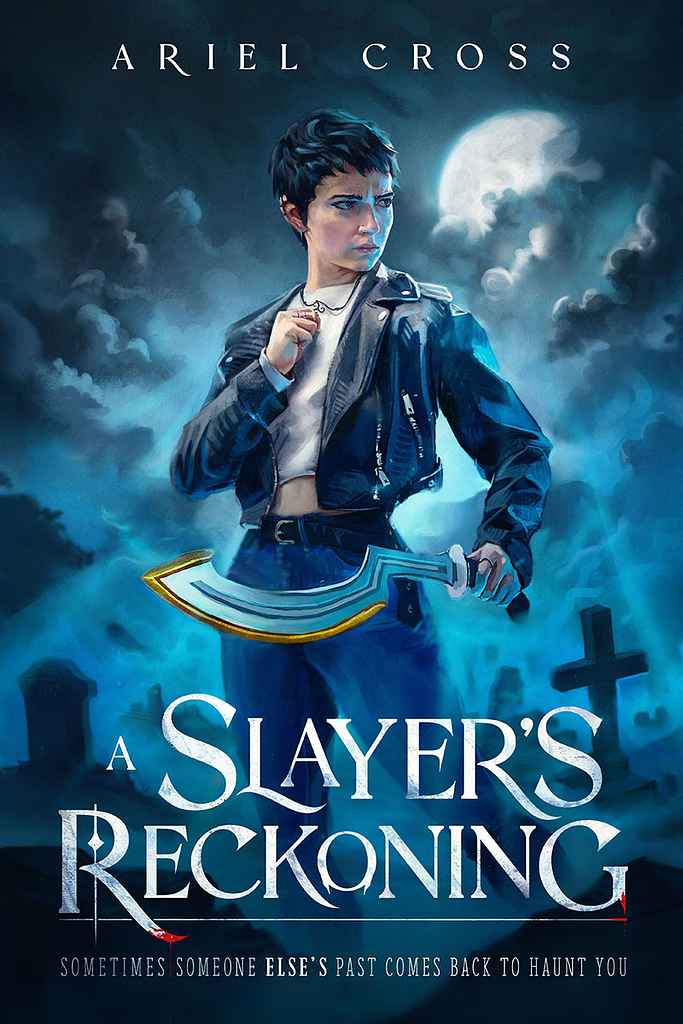
Designer: Joshua G.
Designed by Joshua G.
Available to hire ⏺"This story gave me a clear vision from the very start about what I needed to show: a badass Terra wielding her khopesh in a graveyard. To make it happen I built the prop weapon and sourced the outfit myself for a reference photoshoot I did with local model, Ella. When the final painting is paired with the title the reader knows exactly what to expect. The vibes? Revenge. The Fantasy? Urban. With licks of blood dripping from the 'teeth' of the typography as an allusion to the vampire sub-genre."
Over 1,000 professional book cover designers are available on Reedsy, come meet them. Learn more about Reedsy
Get an eye-catching book cover
Request quotes from 200+ of the most talented cover designers in the industry.
Enter your email or get started with a social account: