Menu
There are currently 1,000+ designers available on Reedsy, come meet them.
Find the perfect designer for your next book
1 million authors trust the professionals on Reedsy. Come meet them.
Menu
There are currently 1,000+ designers available on Reedsy, come meet them.
Find the perfect designer for your next book
1 million authors trust the professionals on Reedsy. Come meet them.
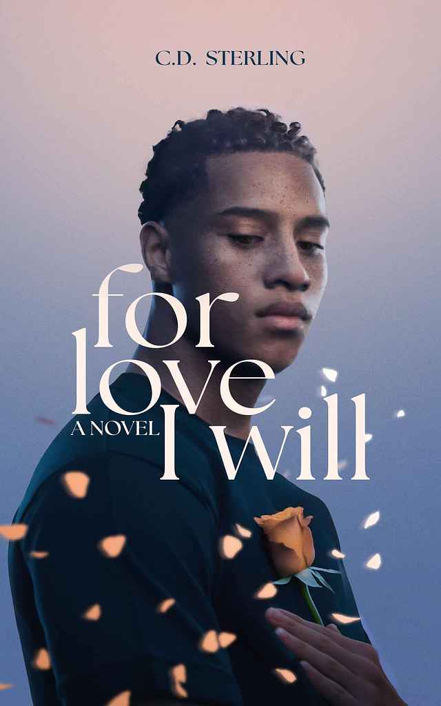
Designer: Felix D.
Designed by Felix D.
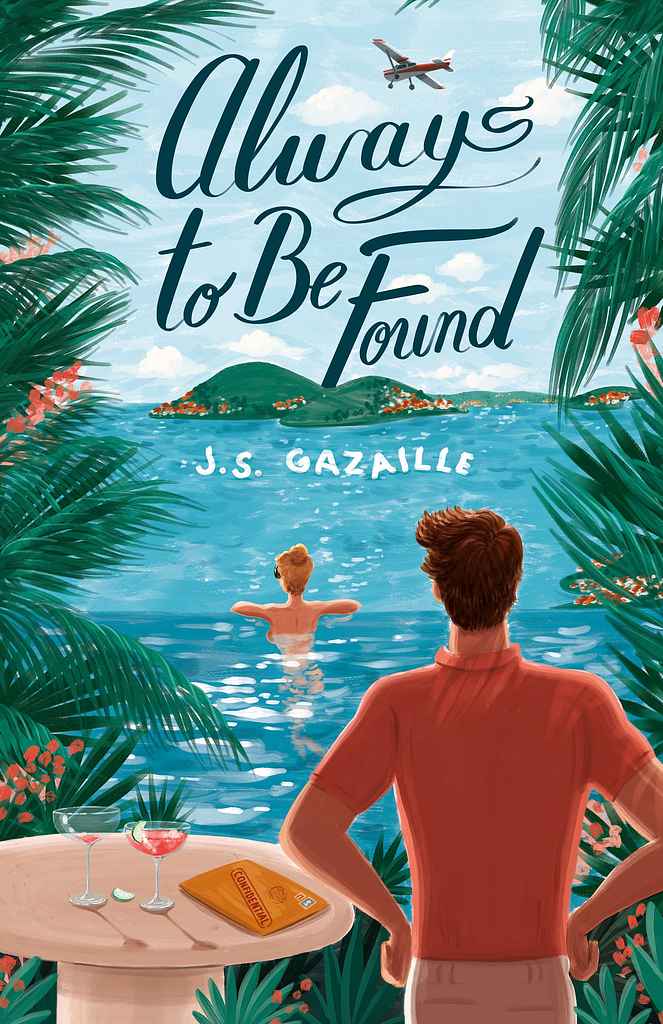
Available to hire ⏺“Always to Be Found blends rom-com charm with thriller intrigue against the stunning Caribbean islands of St. Barths and the Magdalen Islands. I created an illustration with joyful colors and carefree elegance—yet beneath, mystery simmers. The blonde protagonist lounges poolside at her luxurious villa, unaware she's being watched. Who is this hidden man—friend or foe? What's the secret in the confidential envelope beside her? My cinematic approach instantly immerses readers.”
Designer: Andy M.
Designer:
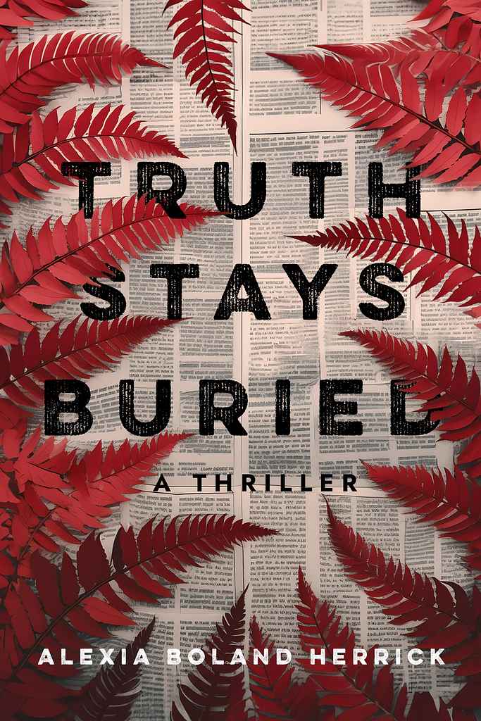
"In this Australian thriller, a body is discovered in the fern-dense Sapphire mountains of eastern Australia, and a local reporter must chase the truth. We decided to depict this almost literally, with ferns “covering” up the news print below. We chose a gritty, bold sans-serif to give a dark, contemporary feel. And we repeated the fern motif through my interior design of the book, using fern artwork on the title page for section breaks in chapters, providing a bespoke reading experience."
Designer:
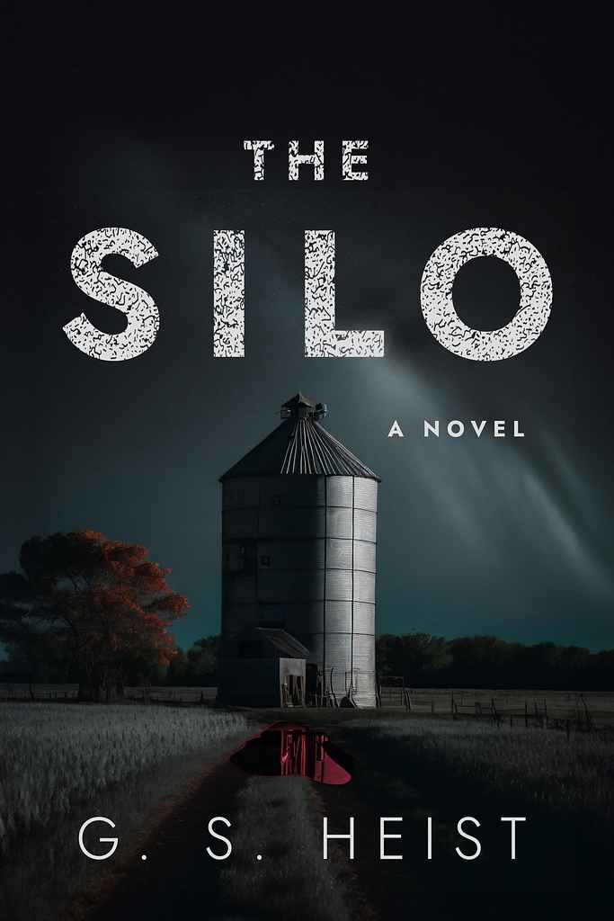
"We went dark and atmospheric for this debut novel by a former police chief—a psychological literary thriller set in the American Midwest. The cover focuses on the silo at the story’s core, with a subtle blood pool in front as ominous foreshadowing. A large, readable sans-serif font was distressed for a grungy, rough feel, mirroring the novel’s events. The silo motif was repeated throughout the interior design of the book, which I also designed, in section breaks and half-title artwork."
Designer: Paul P.
Designed by Paul P.
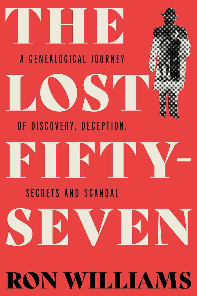
Available to hire ⏺"Ron had to turn detective for his geniolocical mystery, so in designing the cover, I was aiming for a modern take on the classic detective novel. I took vintage elements, and treated them in a modern way to give the overall composition a contemporary feel. The halftone picture is of the author and his sister staring quizzically out of their enigmatic father’s silhouette."
Designer: My Lan K.
Designed by My Lan K.
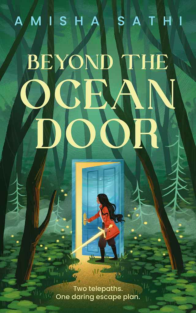
Available to hire ⏺"For this coming-of-age fantasy, I aimed to create a beautiful yet mysterious scene. The main character opens a door that only she can see through, sparking curiosity about what awaits her. Her glowing sword suggests both magic and danger, while the light pouring from the door has a liquid quality, hinting at its oceanic nature. Though digitally painted, I added texture and soft edges to give the illustration a traditional, hand-painted feel, enhancing its depth and atmosphere."
Designer: Richard L.
Designed by Richard L.
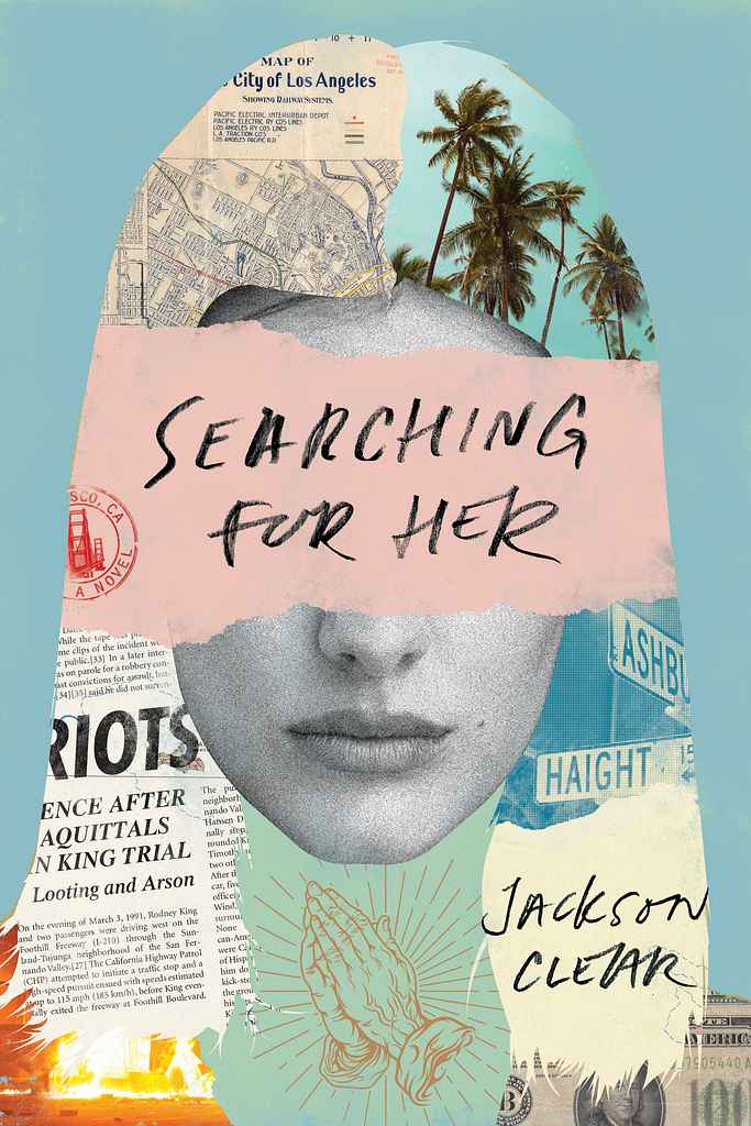
Available to hire ⏺"For this darkly comic novel of a disturbed young man’s unorthodox search for his soulmate I ended up with a collage approach centered around a young woman’s face. This suited not only the love story angle, but also the edgy writing style and all the mayhem that ensues—ultimately culminating during the Rodney King riots. California is an important aspect—almost as if a character in the story—and is featured prominently in the collage through various visuals. The typography is hand-lettered."
Designer: Danna Mathias S.
Designed by Danna Mathias S.
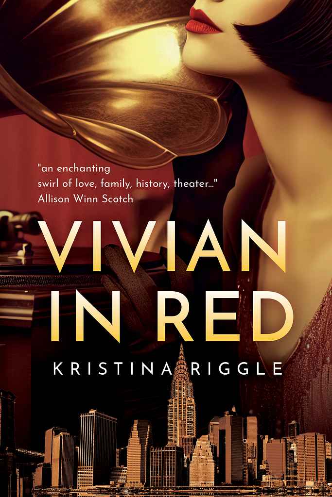
Available to hire ⏺"For this cover, we wanted to communicate the era (Jazz Age/Roaring Twenties) in New York City, a feeling of mystery with a touch of romance, and the underlying theme of musicals. I worked with the lush red and gold color palette to evoke warmth, lightly era-specific typography for the title, and framed the title with thematic elements to create a cohesive and clear message."
Designer: Ryan M.
Designed by Ryan M.
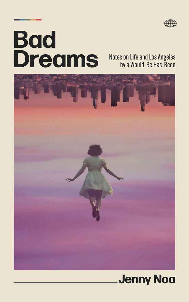
Available to hire ⏺"From the start, I imagined an upside-down L.A. floating above a dreamer in free-fall—perfect for Jenny’s surreal, witty essays on trying to make it in the city. That image became the core: disorientation meets hope, with retro-minimal type, a pastel-violet sky, and a subtle rainbow nod. Jenny’s thoughtful input helped refine every detail into a cover that feels both current and unmistakably hers."
Designer: Owen G.
Andrew McLinden
Designed by Owen G.
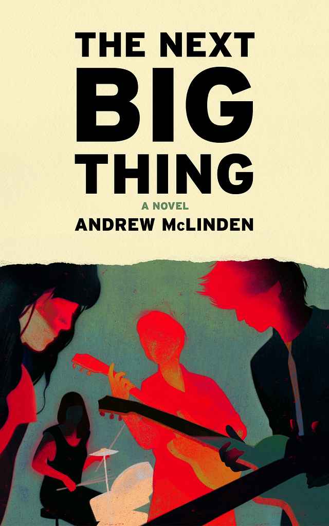
Available to hire ⏺"In this dark satire of the music industry, The Next Big Thing follows Danny McAllister, a toxic, careless, and occasionally malevolent lead guitarist whose influence slowly corrupts those around him. Rather than depicting his misdeeds literally, I used color as a metaphor—violent red bleeding across and affecting the other band members. The design draws inspiration from live gig photography, band posters, and set lists, with the torn paper edge subtly hinting at Danny’s destructive nature."
Designer: K. D.
Designed by K. D.
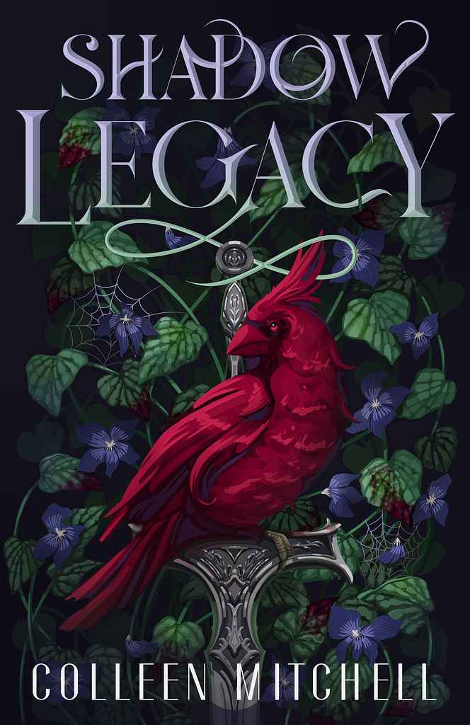
Available to hire ⏺"This cover needed to convey the genre of fantasy, with a twist of vampires. It needed to capture reader attention who are seeking out the genre, but also showcasing it in a fresh way. To show this visually, I created a design centered around the cardinal with a red eye to show its "turned" traits. Along with some spider webs, floating feathers, and a darker background, the overall tone of the story is shown."
Designer: Vanessa M.
Designed by Vanessa M.
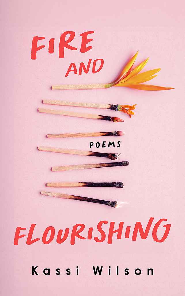
Available to hire ⏺"I envisioned the cover as visually striking and meaningful, featuring an artistic arrangement of burned matches that gradually transition into a vibrant flower, symbolising resilience and rebirth. It serves as an invitation for readers to delve into a collection that celebrates the strength and beauty of healing and flourishing, even after life’s most challenging moments."
Designer: Vanessa M.
Designed by Vanessa M.
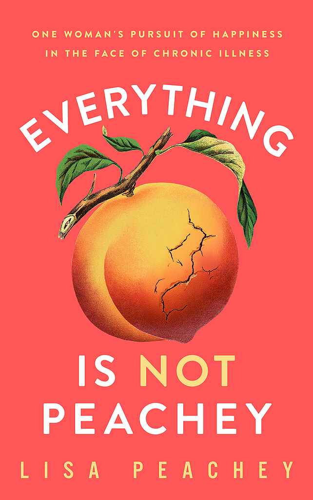
Available to hire ⏺"I aimed for a cover that grabs attention with a vibrant pink background and a striking peach illustration. The seemingly perfect peach, subtly cracked, symbolizes the author's journey with chronic illness. The design is simple yet impactful, encapsulating the book's themes of hope, resilience, and the challenges of living with chronic illness."
Designer: Vanessa M.
Designed by Vanessa M.
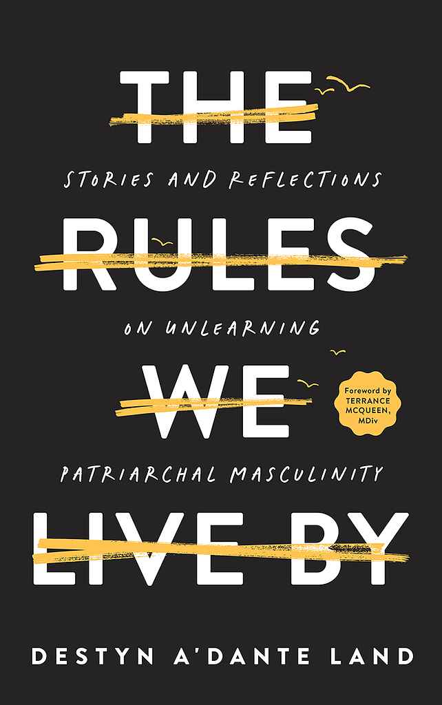
Available to hire ⏺"I wanted the cover to be striking and thought-provoking. The bold, crossed-out title symbolises breaking free from societal expectations and embracing personal freedom. Birds taking flight, superimposed on the crossed-out text, reinforce the theme of liberation. The minimalist design—with its stark black background and clean typography—creates a powerful visual that invites readers to explore the book's journey of self-discovery and growth."
Designer: Andy M.
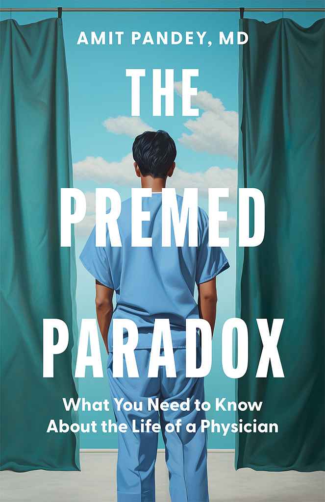
Designed by Andy M.
Available to hire ⏺"The cover design captures the complex emotions that many young physicians experience at the beginning of their medical journey—hope, fear, and excitement—while stepping into the unknown. This visual representation makes the book relatable and engaging for its readers. Unlike traditional medical textbooks that typically use photographs, this cover features a surrealist-style illustration, highlighting the book's distinctive approach."
Designer: Driss C.
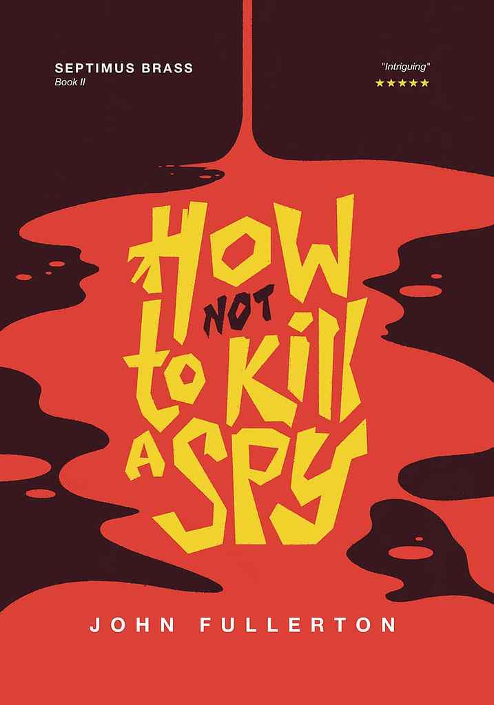
Designed by Driss C.
Available to hire ⏺"The book tells a story of death and mystery. Initially meant to associate lettering and illustration, the design evolved toward a more minimalistic and impactful approach. The angular and rough letters of the title contrast with the curves of the blood puddle, foreshadowing the tension to come. The colours are reminiscent of old polars, while vibrant enough to fit with modern trends."
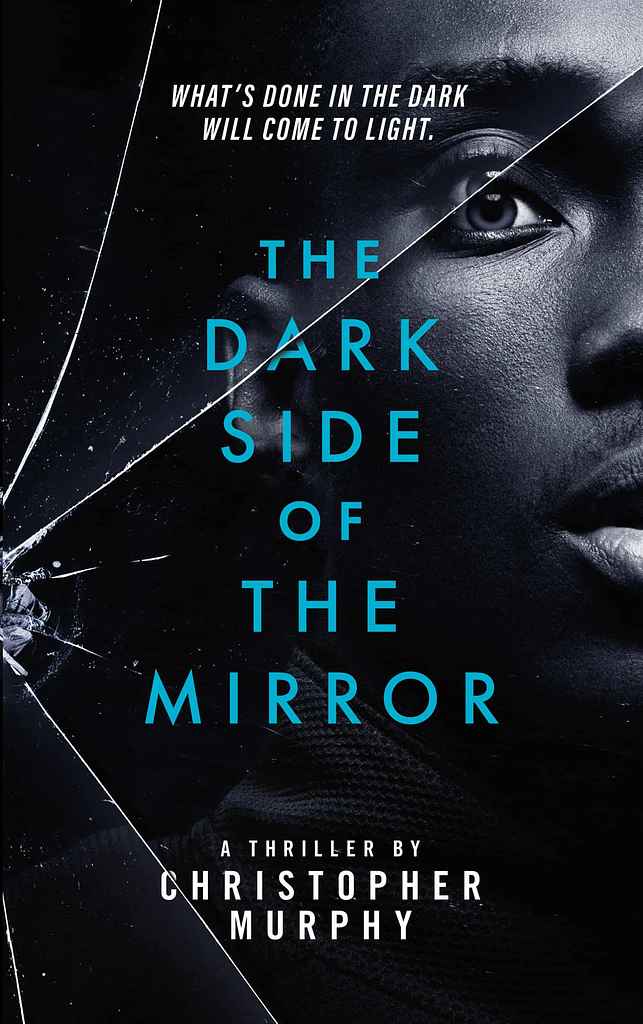
Designer: Leah J.
Designed by Leah J.
Available to hire ⏺"This portrait-led cover draws readers’ focus to the main character, with shattered glass hinting that all may not be as it seems while subtly reinforcing the novel's title. We used a familiar thriller-style typography and color palette, combined with full-bleed portrait photography to make it eye-catching and unique. The shattered glass overlay, extending across the spine and back cover, acts as the cover’s main catalyst, distorting the character's eye and elements of the typography."
Designer: Madli S.
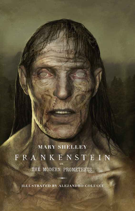
Designer: Alejandro C.
Mary Shelley (New illustrated edition)
Designed by Alejandro C.
Available to hire ⏺"Frankenstein is an enduring icon that has been reimagined countless times, though the creature's true appearance often remains ambiguous. My challenge was to faithfully capture Mary Shelley’s original vision. For the slipcase design, I imagined a scientific sketch—a conceptual blueprint of the creature's face, as if drawn by Victor himself. This creates a striking contrast: the slipcase shows the creature in its 'draft' phase, while the book cover depicts it fully realized, in flesh and blood."
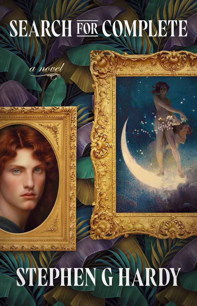
Designer: Ryan M.
Designed by Ryan M.
Available to hire ⏺"The classical framed art reflects the book's timeless exploration of love and relationships, inspired by the Aristophanes Myth on the Origin of Love. To blend originality with current trends, I added rich, moody foliage in the background, focusing on the classical portraits. The right frame, featuring a female figure within a crescent moon, captures the ethereal themes, while the left portrait represents the main character. This unconventional romance cover suits a story that defies the genre."
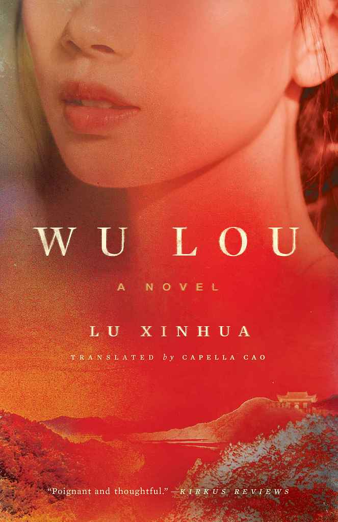
Designer: Richard L.
by Xinhua Lu (Author), Capella Cao (Translator)
Designed by Richard L.
Available to hire ⏺"The book opens with a haunting scene in a secluded Cambodian jungle temple in the early 1970s. Tutu, a young woman, finds her fiancé, a Khmer Rouge officer, crushed beneath a Buddha statue, setting Wu Lou, the temple’s master monk, on a path of exile. The cover reflects this era and setting, with a "never-ending redness" of trees, leaves, and petals evoking beauty and bloodshed. Tutu is featured prominently but tightly cropped, with a subtle Cambodian landscape and temple in the foreground."
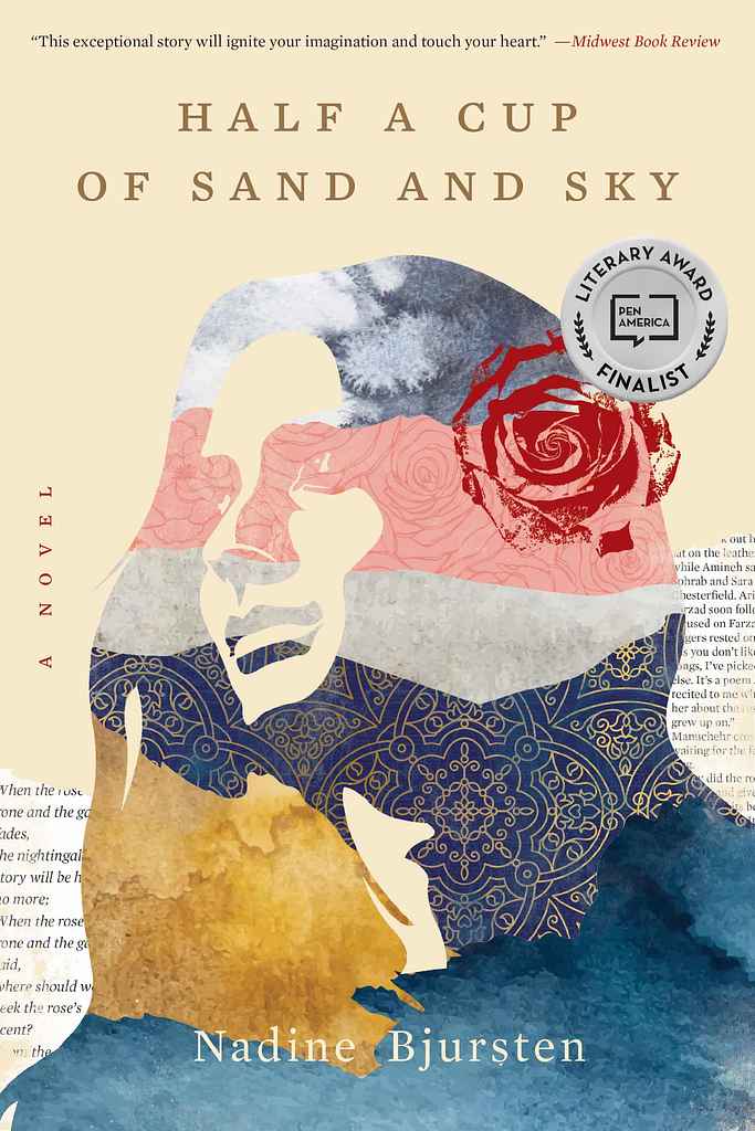
Designer: Richard L.
Designed by Richard L.
Available to hire ⏺"Finalist for the PEN/Bellwether Prize, the book portrays one woman's search for love and belonging amid political turmoil. Bjursten immerses readers in a life, nation, and era with lasting impact. For this layered story, I aimed to depict the protagonist as a strong, visionary woman without resorting to visual clichés or a literal photo. The solution was a silhouetted collage incorporating fragments of the title and story... sand, sky, sea, rose gardens, Persian heritage, and literature."
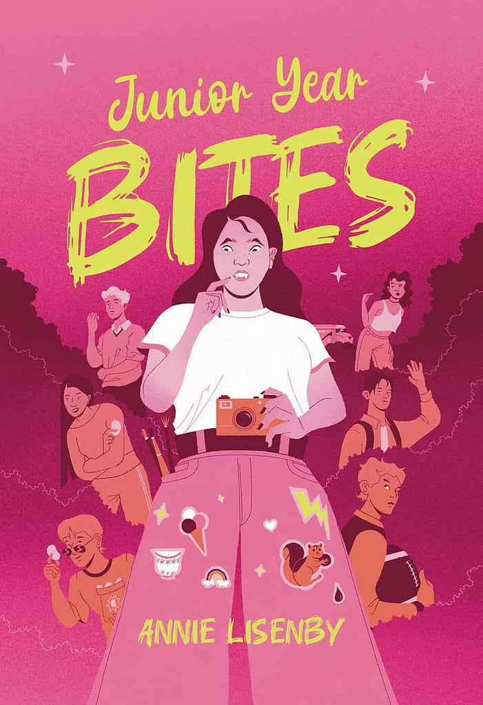
Designer: Driss C.
Designed by Driss C.
Available to hire ⏺"This book is a YA story where the protagonist must adapt to her new vampire life. The quirky story and characters inspired a cover featuring the protagonist as a bridge between her vampire friends on the left and her human social circle on the right. A pink palette and bright yellow title signal it as YA at first glance. To incorporate elements the author requested, like a teacup, squirrel, and paintbrushes, I included them within the protagonist's outfit, foreshadowing events in the book."
Designer: Raúl L.
Designer: Diego S.
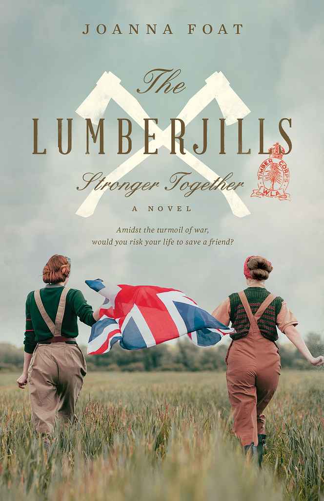
Designer: Richard L.
Designed by Richard L.
Available to hire ⏺"This novel draws inspiration from the heroic true stories of the Women’s Timber Corps, a branch of the Women’s Land Army in the UK during WWII. Image research was challenging, but finding a great reenactment photo with playful, optimistic women’s gaits felt perfect. It captures camaraderie and warmth, true to the book’s spirit, while contrasting with the harder visual of crossed axes. The Union Jack takes center stage, adding a pop of color and almost becoming a character itself."
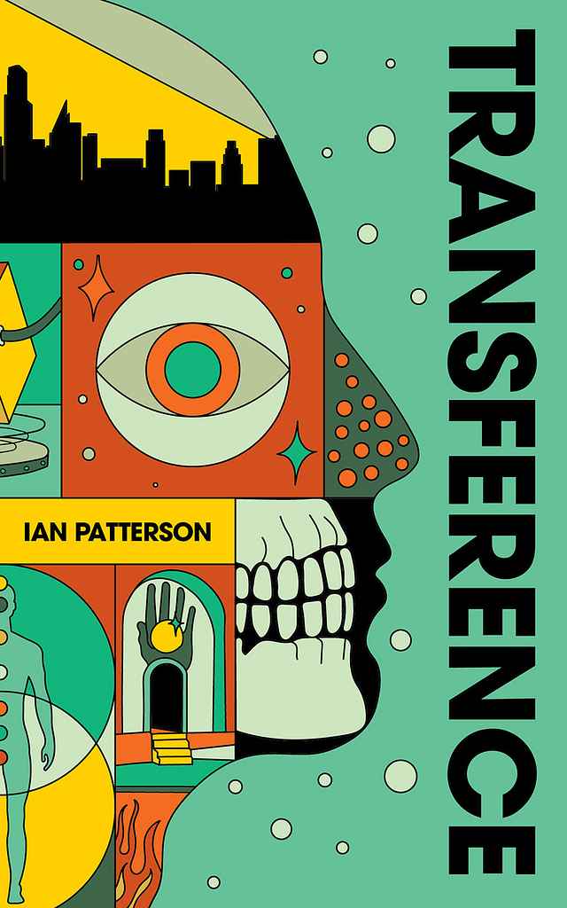
Designer: Barış Ş.
Designed by Barış Ş.
Available to hire ⏺"This cover captures the story’s layered narrative, blending illness and the human body with interdimensional travel. Symbolic elements—halls, doors, paths, and a watching eye—evoke the narrator’s presence and themes of surveillance. With a magical realist, maximalist aesthetic, the design reflects the story’s fusion of medical, spiritual, and speculative elements, setting it apart within the dystopian and cyberpunk genres."
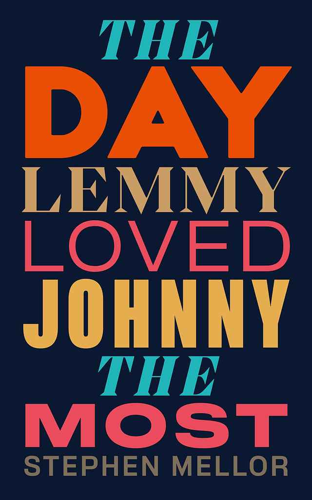
Designer: Dominic F.
Designed by Dominic F.
Available to hire ⏺"I had great fun designing The Day Lemmy Loved Johnny the Most. This cover uses bold typography to highlight the strong prose within the story. Mixing colors and typefaces keeps it modern while retaining a classic literary feel. Stephen wanted a clean, graphic approach, so I experimented with typography to form the story’s tree. In the end, the bold type-only approach won out, with the tree motif featured on the back and spine."
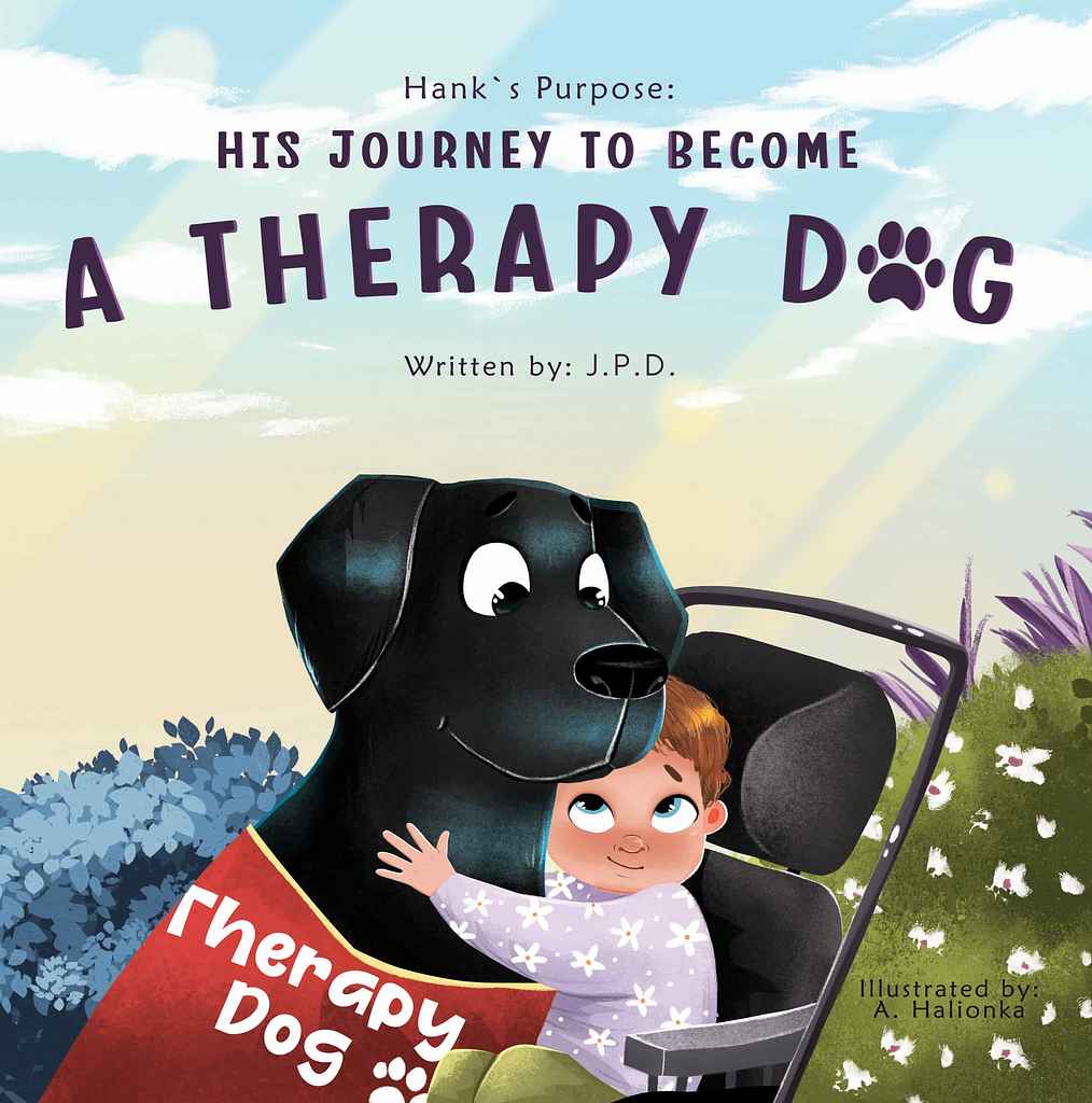
Designer: Anastasiya H.
Designed by Anastasiya H.
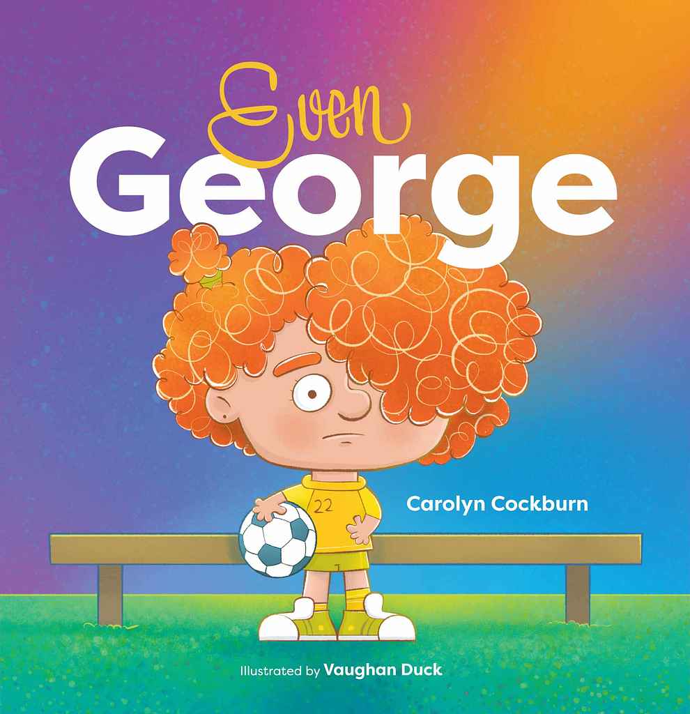
Available to hire ⏺"The cover reflects the main theme. The child in the wheelchair and Hank’s gentle expression highlight care and connection, conveying therapy and friendship. I created a warm, friendly atmosphere with bright, soft colors popular in children’s books. The large, endearing image of Hank aligns with market preferences, while expressive character emotions evoke warmth and affection. A paw print replacing the letter “O” adds a playful, memorable touch that hints at the book’s theme."
Designer: Madli S.
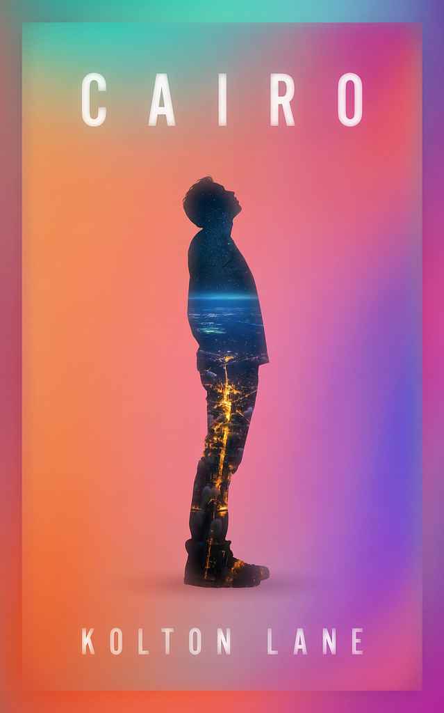
Designer: Ryan M.
Designed by Ryan M.
Available to hire ⏺"Here I aimed to capture themes of self-exploration and freedom. The silhouette looking upward reflects the author's personal journey, while the embedded cityscape shows how Cairo becomes part of his identity. I balanced originality with modern trends by using vibrant gradients for an ethereal feel, layering the city's urban lights within the figure for uniqueness. The design is intended to feel both intimate and expansive, inviting readers into the transformative journey within the book."
Designer: Heather V.
Designer: Elias P.
Designed by Elias P.
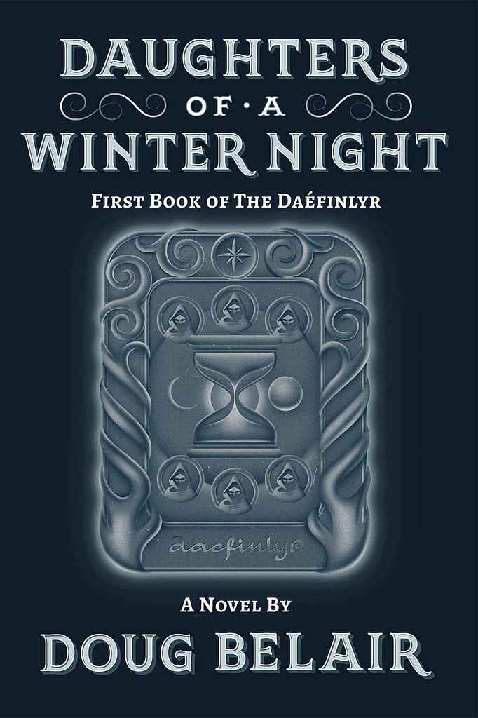
Available to hire ⏺"The cover's main element is a silver tile crafted by the author's version of Elves or Guardians, protectors of the weave of Time, represented by an hourglass. We opted for a classic look over the typical illustrated characters of modern fantasy, blending elvish, nature-inspired imagery with hints of the story's characters. My work often combines illustration and hand-drawn typography. Here while the silver tile catches the eye, the hand-lettered title and author’s name capture the book's tone."
Designer: Vaughan D.
Designer: Euan M.
Joaquim Maria Machado de Assis (Author), Américo Lucena Lage (Translator)
Designed by Euan M.
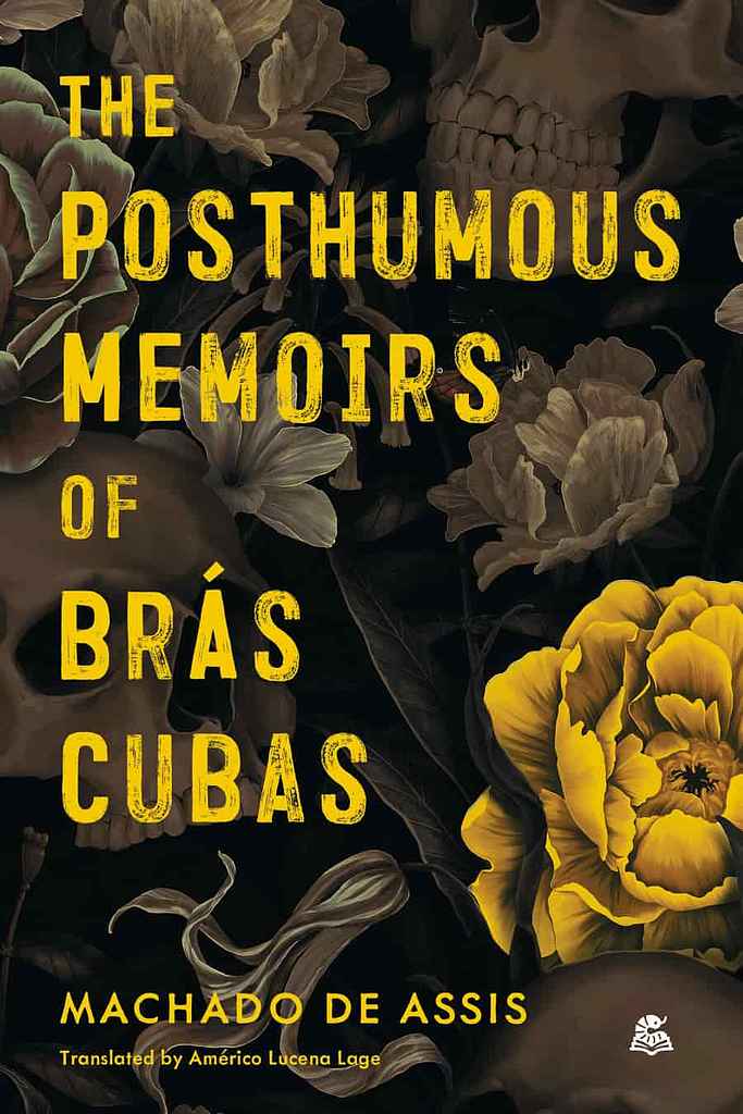
Available to hire ⏺"The brief called for a “mix of dark, moody tones with occasional bursts of vivid colour, reflecting the novel’s shifts between somber reflection and satirical wit”. This contrast also helps to gives the cover a sense of depth—I almost see the type (which is based on hand-painted letters from Brazil, where the novel is set) as being painted onto a window, behind which lies the illustration."
Designer: Driss C.
Liam Auden Brant
Designed by Driss C.
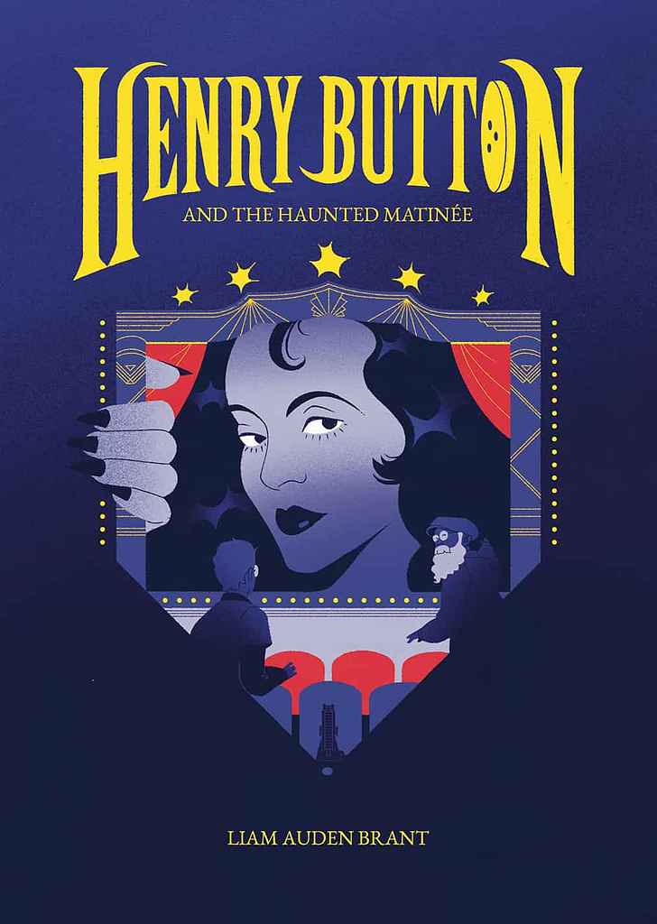
Available to hire ⏺"The main challenge with Haunted Matinée was evoking the feel of old black-and-white movies while keeping a colorful design for middle-grade readers. Bright red and yellow elements balance the main blue. Since Henry Button is a series, I designed the title as a standalone for continuity across volumes, adding familiarity and timelessness. The design includes many details and easter eggs, like the diamond-shaped illustration, which hints at the glamour of Old Hollywood."
Designer: Julianna L.
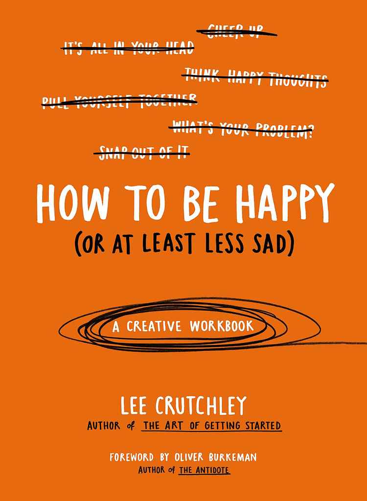
Designer: Lee C.
Designed by Lee C.
Available to hire ⏺"The book has a down-to-earth, approachable tone and simple content, so I kept the cover straightforward in layout and color. Hand-drawn lettering adds a human touch, matching its unique approach as a creative workbook on depression and happiness. The two colors, black and white, emphasize that this isn’t just another self-help book, with white text for typical advice and black for added realism and humanity."
Over 1,000 professional book cover designers are available on Reedsy, come meet them. Learn more about Reedsy
Get an eye-catching book cover
Request quotes from 200+ of the most talented cover designers in the industry.
Enter your email or get started with a social account: