Menu
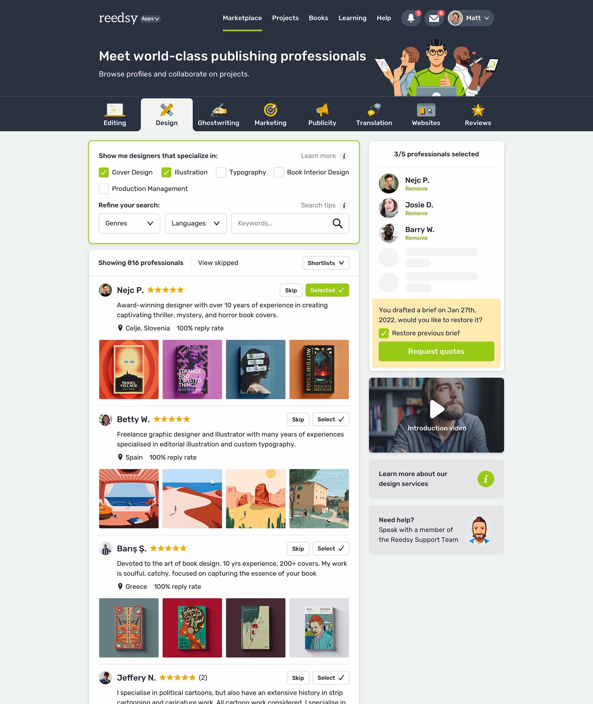
There are currently 1,000+ designers available on Reedsy, come meet them.
Find the perfect designer for your next book
1 million authors trust the professionals on Reedsy. Come meet them.
Menu
Looking for artistic design inspiration? Browse these illustrated book covers designed by professionals on Reedsy. See one you love? Get your own illustrated cover from that designer on our marketplace.
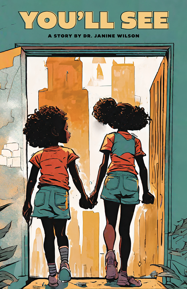
Designer: Rodney H.
Designed by Rodney H.
Available to hire ⏺"The cover design symbolizes the strength of family bonds, with the girls stepping into the world surrounded by positivity, confidence, and grace. They are encouraged to embrace their talents and appearance to achieve their aspirations. What stands out is the texture of the illustration, the color palette, and the typography, bringing the characters to life. Their height, hair, style, and setting combine to inspire their unique story."
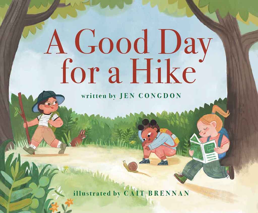
Designer: Michele T.
Jen Congdon
Designed by Michele T.
Available to hire ⏺"For this cover, I chose a classic serif font that remained easy to read without overpowering the playful artwork. This clean, readable typography complements the joyful illustrations, achieving a harmonious balance between visual charm and timeless design. The result is a cover that feels both fresh and classic, appealing to young readers while maintaining a sophisticated, enduring look."
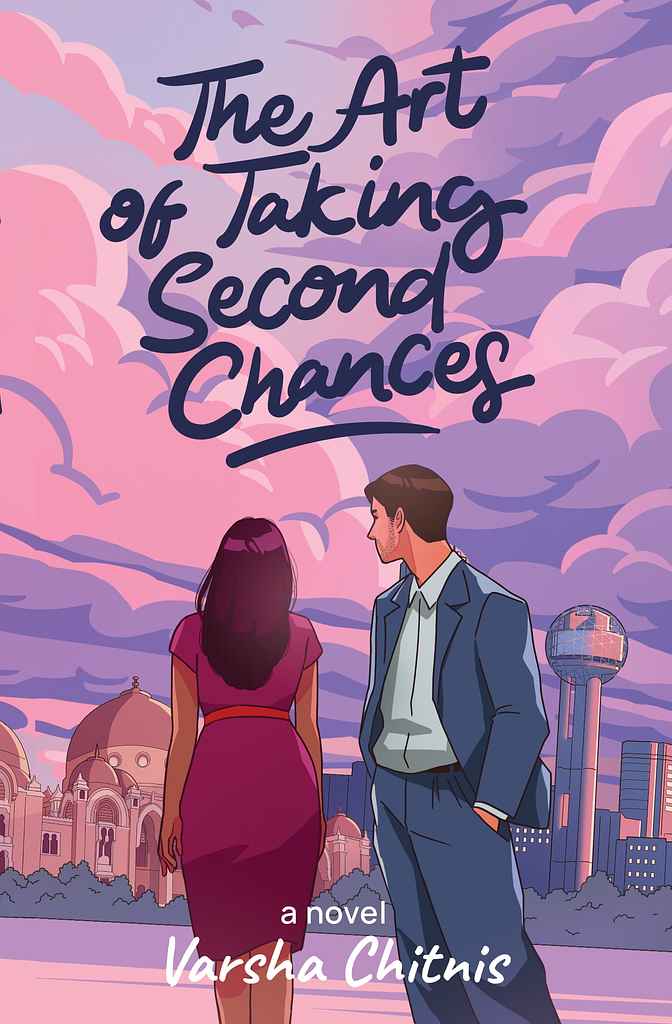
Designer: Zuchal R.
Designed by Zuchal R.
Available to hire ⏺"The cover focuses on the main characters, Tara and Sameer, and their challenging journey, set against the backdrops of Baroda and Dallas. Initially inspired by a specific scene, the concept evolved through collaboration with Varsha to emphasize the settings. The faceless depiction of the characters invites readers to imagine them, while cloud graphics and a hand-drawn title add symbolic and artistic touches. The pink and purple palette enhances visual appeal and reinforces the book's theme."
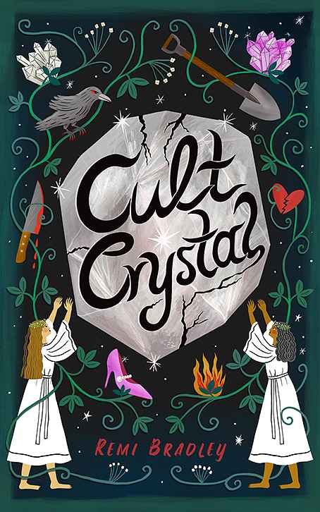
Designer: Stephanie H.
Designed by Stephanie H.
Available to hire ⏺"My main goal in designing the cover for this dark, mysterious, and sometimes humorous novel about female friendship in a cult called the Crystal Collective was to translate the title's essence into an illustration: two women worshipping a cracked crystal, hinting that not all is well in the cult. I balanced this with icons relevant to the plot to spark interest, ensuring the illustration and title remain clear and readable even at thumbnail size."
Designer: Margarita C.
Designed by Margarita C.
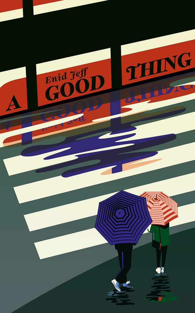
Available to hire ⏺"In the plot, the moment when the characters meet is important—it's the trigger for the story, and it happens while they are waiting for the tram. I believe the key is to introduce the tram almost as a third character. Overlaying the title on its side adds dynamism and metaphorically reinforces the idea of how fleeting that moment of meeting is. Either you act, or it never happens, and the opportunity vanishes just as the tram does."
Designer: Steve K.
Designer: Margarita C.
Designed by Margarita C.
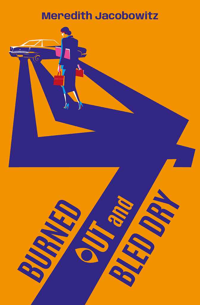
Available to hire ⏺"My goal was to instantly convey the novel's genre—cozy mystery with a touch of humor. Inspired by Saul Bass, I created a shadow suggesting a murder scene, with the hurried protagonist walking over it, unaware of what's awaiting her at the car. The exaggerated, almost caricature-like shadow adds dark humor, softening the tension. The title treatment features an 'o' as an 'eye,' acting as a witness. The metaphor hints that the car holds a secret, with the shadow offering a clue to what's coming."
Designer: Vaughan D.
Designed by Vaughan D.
Available to hire ⏺"The picture book captures children imagining themselves playing with large construction vehicles, like bulldozers. The cover features the main character enjoying a bulldozer, creating an exciting visual that hints at the fun story inside. With the trend of strong characters on covers, especially for small online thumbnails, I focused on using bold colors and a clean design. Strong illustrations and text design were emphasized to ensure the cover stands out and reflects the story."
Designer: Owen G.
Designed by Owen G.
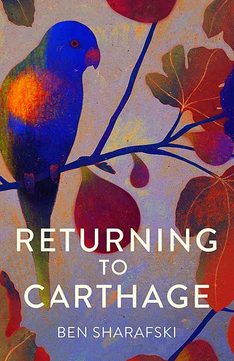
Available to hire ⏺"For this short story collection, I aimed to evoke a sense of place and atmosphere without focusing on a specific narrative. The fig tree and Lorikeet, featured in multiple stories, serve as a tonal and geographical anchor. While botanical and avian illustrations are popular, I chose a less patterned approach with a mix of delicate and saturated colors. Starting with a subdued palette, I added rich, vibrant hues to bring the cover to life and reflect the warmth of the stories."
Designer: Taylor B.
Designer: Amanda L.
Designed by Amanda L.
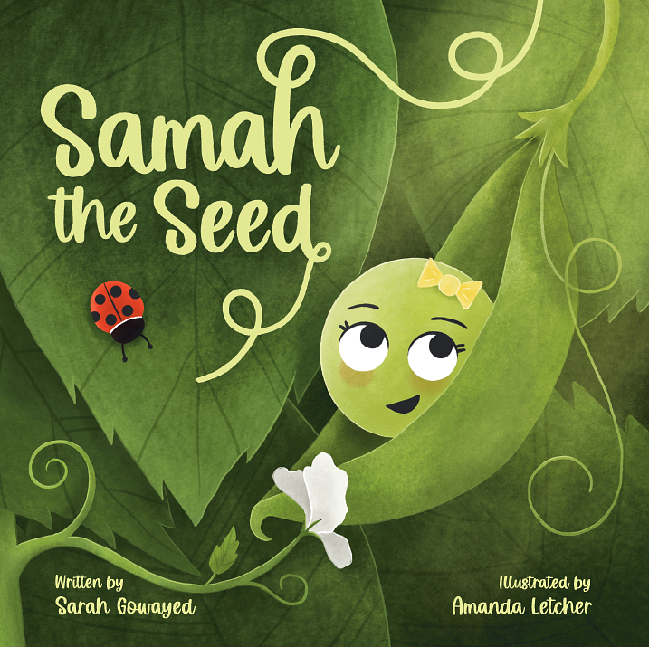
Available to hire ⏺"In the cover for Samah the Seed, I wanted to create a richness of colour and the feeling of closeness that Samah has with her Baba. It was important to convey the underlying theme of spirituality without being too specific, so the glowing light coming from the top right was added to reference God in a way that all readers could relate to. The book title was hand drawn so that it could appear to be connected to the plant and further reiterate the growth for Samah throughout the book."
Designer: Mariana O.
Designed by Mariana O.
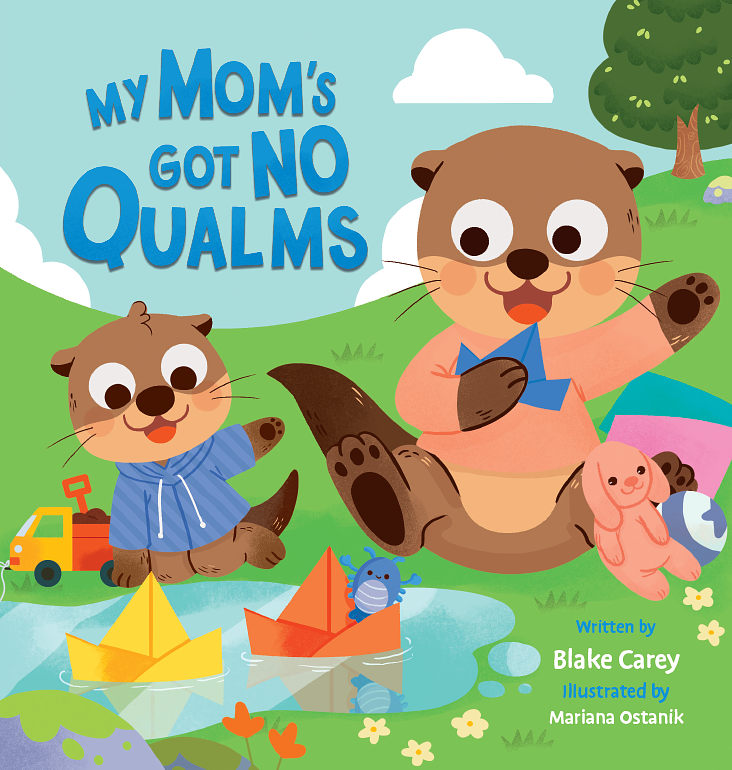
Available to hire ⏺"For this cover, I aimed to convey joy, playfulness, and the special times we share with our families, especially moms. I chose a bright, cheerful color palette to reflect these emotions. The illustrations, inspired by the animals the author’s children love, capture young readers' emotions with big eyes and smiles. The typography enhances the playful tone with bright, contrasting colors, and textures add to the overall feel. It's a fun, engaging cover for both kids and grown-ups."
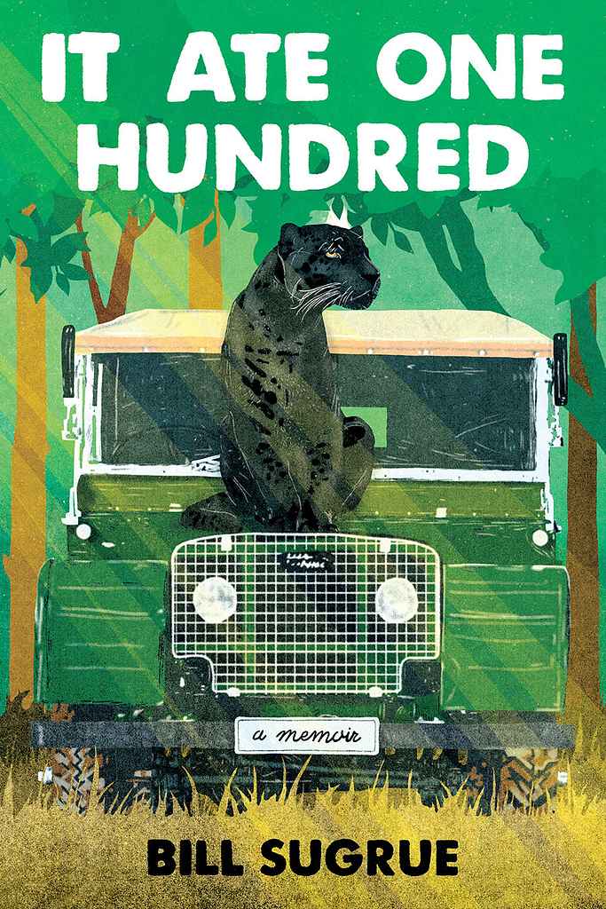
Designer: Barış Ş.
Designed by Barış Ş.
Available to hire ⏺"The cover illustration plays with the book's title, inviting the audience to initially think the story revolves around a "big cat who ate one hundred." However, the true essence lies deeper: the artwork symbolizes the harsh realities of survival in the wilderness, where unseen dangers lurk in every shadow. The aim was to evoke a sense of displacement, drawing the audience into the experience of being far from home and confronted with the vast unknown."
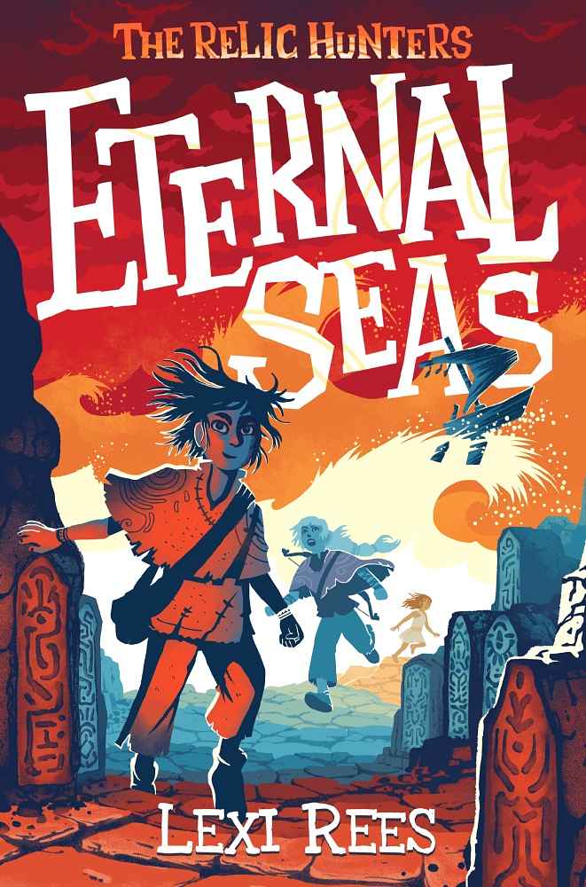
Designer: Florian G.
Designed by Florian G.
Available to hire ⏺"We aimed to convey adventure, danger, and establish a fantasy world with young heroes. Middle-grade stories often use detailed, figurative illustrations, but I suggested a more graphic style inspired by cut paper. The colors are strikingly powerful and they are rarely used in this book category. The logo stands out beautifully, even as a thumbnail. Despite the amount of information depicted, the image remains very easy to read."
Designer: Christian S.
Designed by Christian S.
Available to hire ⏺"This design highlights the quirky, funny title—dystopian recipes!—while presenting the dark backdrop in an engaging way. We chose a gas-mask-wearing chef to capture the book's strange spirit. Borrowing market trends like simple, solid colors and an illustrative style appealing on social media, we created a timeless look. The distressed sans serif typography is readable and suggests breakdown. We aimed for a design that lets the clever title shine."
Designer: Joshua G.
Designed by Joshua G.
Available to hire ⏺"This story gave me a clear vision from the very start about what I needed to show: a badass Terra wielding her khopesh in a graveyard. To make it happen I built the prop weapon and sourced the outfit myself for a reference photoshoot I did with local model, Ella. When the final painting is paired with the title the reader knows exactly what to expect. The vibes? Revenge. The Fantasy? Urban. With licks of blood dripping from the 'teeth' of the typography as an allusion to the vampire sub-genre."
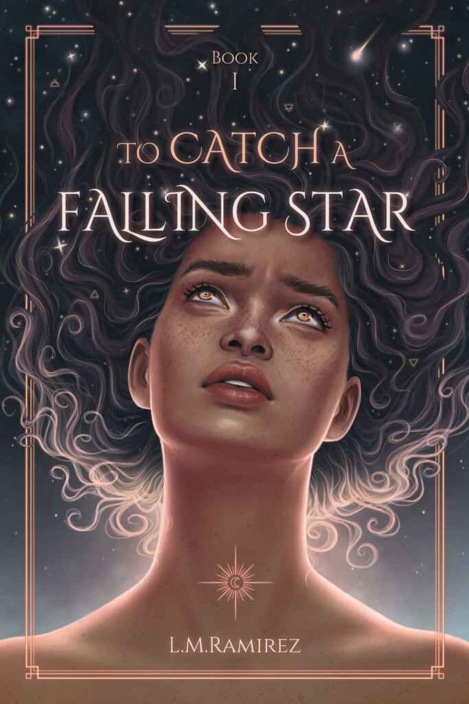
Designer: Madli S.
Designed by Madli S.
Available to hire ⏺"The author requested a fully illustrated cover featuring a portrait of the main character. After discussing the storyline, it became clear that stars and the universe play a key role in the story. The final concept shows the main character gazing up at the stars, reflecting on her identity and origins. We aimed for a dreamy, mysterious mood to captivate YA fantasy readers and evoke the sense of wonder central to the narrative."
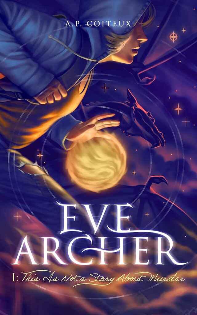
Designer: Candice B.
Designed by Candice B.
Available to hire ⏺"The novel is an urban fantasy with outer space elements. The protagonist's clothing conveys the urban vibe, while nebula clouds represent space. I included a dragon and fireball in the background to highlight the fantasy aspect.To break away from typical YA covers, I chose a cropped side view to convey action and suspense, rather than a glamorous front portrait. Graphic elements like concentric circles and stars blend symbolism with realism for a unique and sophisticated design."
Designer: Driss C.
Designed by Driss C.
Available to hire ⏺"The Big Shot Trader is all about evolving in a highly competitive, stressful industry. The idea was to use a slightly over-the-top composition to emphasize the 'clog in the machine' feeling of the main character. Balancing an overwhelming corporate blue with vibrant yellow details helped the cover stand out without losing the familiarity of current market trends. Incorporating the title into the decor is often a great way to make a design truly unique."
Designer: Denise T.
Designed by Denise T.
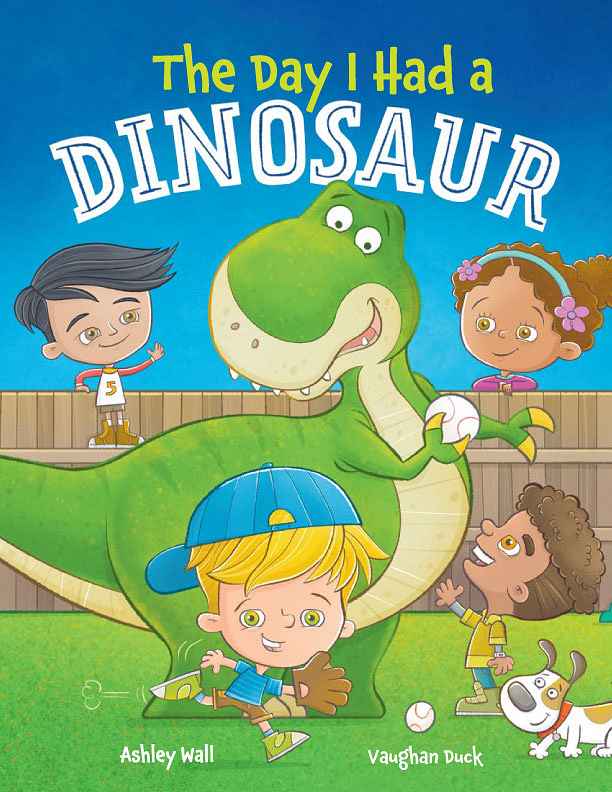
Available to hire ⏺"Henry is self-centered and needs to change if he wants friends. To convey this, I designed a cover showing him holding the ball to himself in a team game. Moreover, all elements of the illustration and fonts are centered around Henry, emphasizing that it's 'all about him.' To make the cover stand out, I focused on the color palette, legibility, clear communication, and delivering a strong message."
Designer: Nejc P.
Designed by Nejc P.
Available to hire ⏺"The book is a dystopian novel about a shadowy authoritarian figure terrorizing a small Cotswold village. The cover needed to balance the village's cozy atmosphere with the looming fear of change. Inspired by Olly Moss and vintage Penguin covers of 1984, I used distinct color, shapes, and composition to convey the dystopian themes. A subtle visual easter egg is hidden in the design: the eye color on the cover matches that of the main character, adding a personal touch to the artwork."
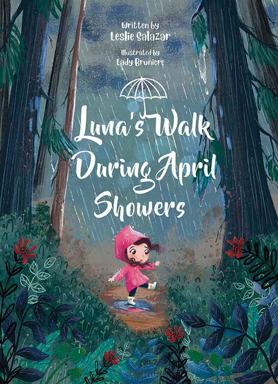
Designer: Aline B.
Designed by Aline B.
Available to hire ⏺The cover portrays Luna joyfully exploring nature on a rainy day, capturing the book’s theme of finding beauty in rain-soaked surroundings. My signature whimsy and cuteness are evident in the detailed, nature-focused backgrounds, appealing to both young readers and their parents. The umbrella with the book's title adds a charming touch, symbolizing protection and enjoyment during a rainy day’s adventure while making the title stand out in a cute way.
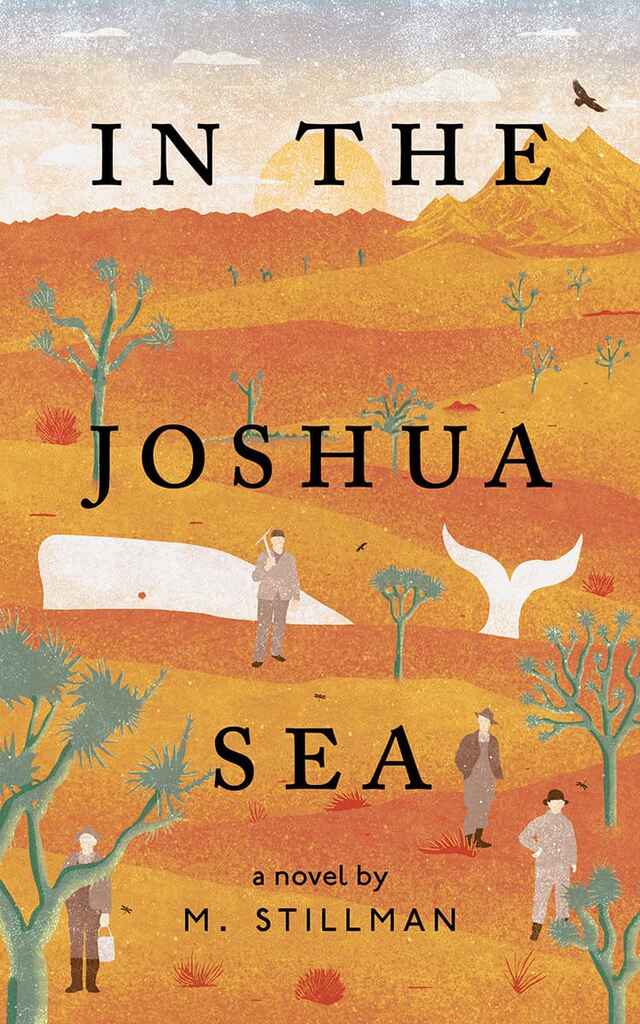
Designer: Barış Ş.
Designed by Barış Ş.
Available to hire ⏺"The cover art aims to visually encapsulate the author's deep connection to Joshua Tree National Park. The challenge was to harmoniously merge the desert landscape with oceanic elements, striking a balance between these contrasting environments. By combining unexpected imagery—such as a whale amidst the desert and Joshua trees—the illustration becomes both captivating and intriguing."
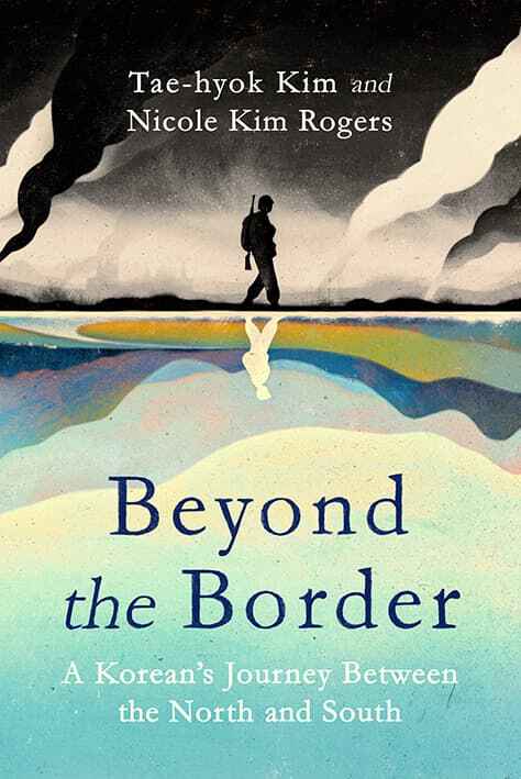
Designer: Owen G.
Designed by Owen G.
Available to hire ⏺"The book is an honest memoir of one man's experience through the Korean War and the country's divide to the modern day. The cover, split in half, reflects both the North-South Korea divide and the author's contrasting life experiences. The design symbolizes the divide between past and present, young and old, positive and negative. A serif font grounds it as a serious memoir, while painterly tones and hand-drawn elements add a sensitive, human touch, balancing contrast without being too harsh."
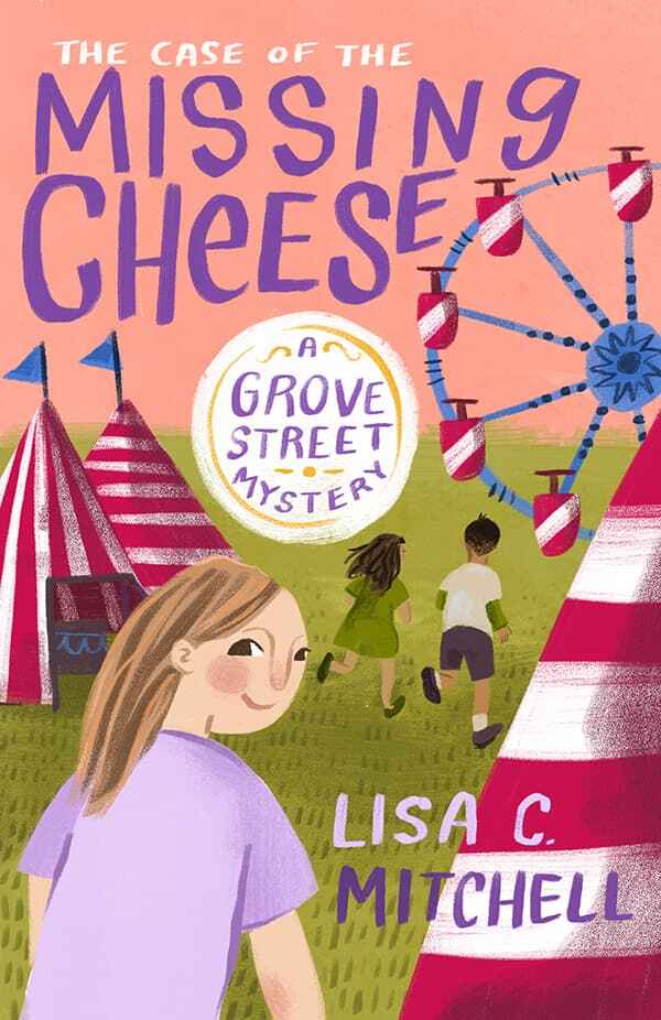
Designer: Caitlin B. A.
Designed by Caitlin B. A.
Available to hire ⏺"For this Middle Grade, the author and I wanted to find the right balance of whimsy and mystery 一 nothing too "kiddy" and nothing too scary. The carnival is an important setting in the book, and this audience usually responds well to character-based covers, so I put together a narrative image that included enigmatic body language with slightly discordant but vibrant colors that aligns with the genre while still intriguing the reader to find out more."
Designer: Hugh C.
Designed by Hugh C.
Available to hire ⏺"The book is about a multiple perspective family saga with elements of crime, suspense, and romance. The different windows show each character and hints at aspects of the narrative without overtly giving anything anyway. Working closely with the author who wanted a cover that is minimalist and retro but with contrast and texture - the design is inspired by futurist and Art Deco graphic design and the limited sombre colour palette conveys melancholy, hope and a tad bit of danger."
Designer: Jesus F.
Designer: My Lan K.
Designed by My Lan K.
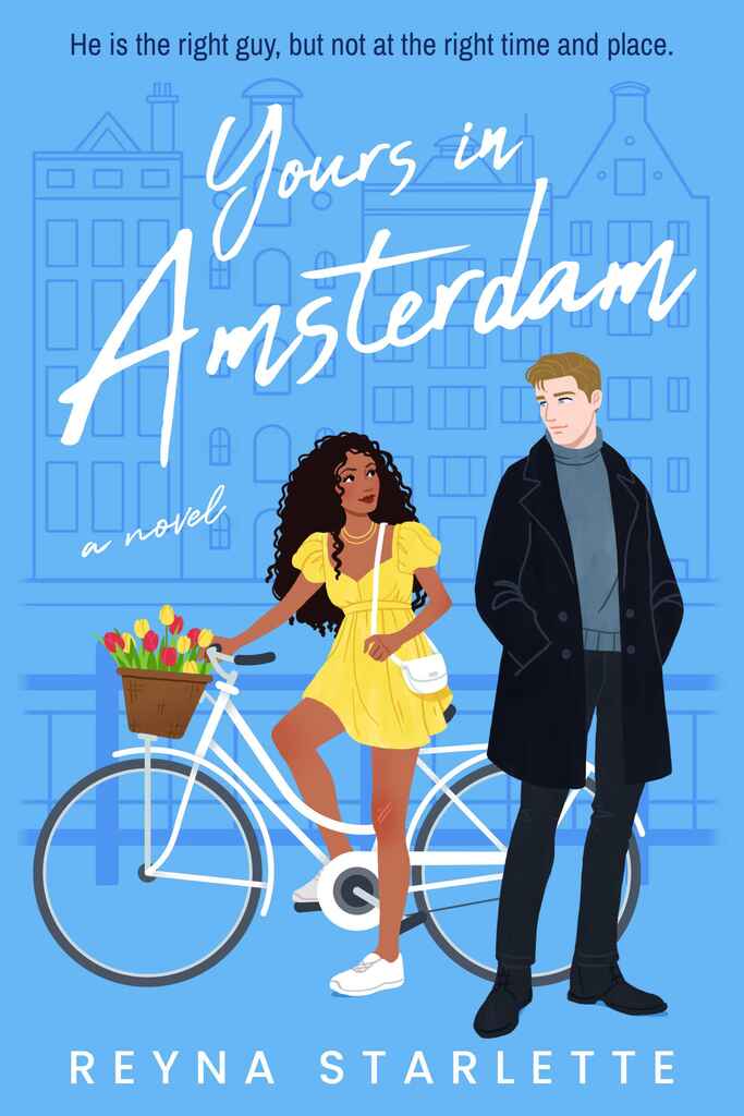
Available to hire ⏺"The cover highlights the two main characters with subtle elements that reveal the story's setting in Amsterdam in a style that aligns with contemporary romance trends. I added soft textures to the characters' clothes for depth, and a script font for the title evokes a handwritten letter. To hint at the plot, I included a bruise on the female character’s knee, reflecting how they meet after she falls off her bike, and used expression, pose, and outfits to showcase their personalities."
Designer: Madli S.
Designed by Madli S.
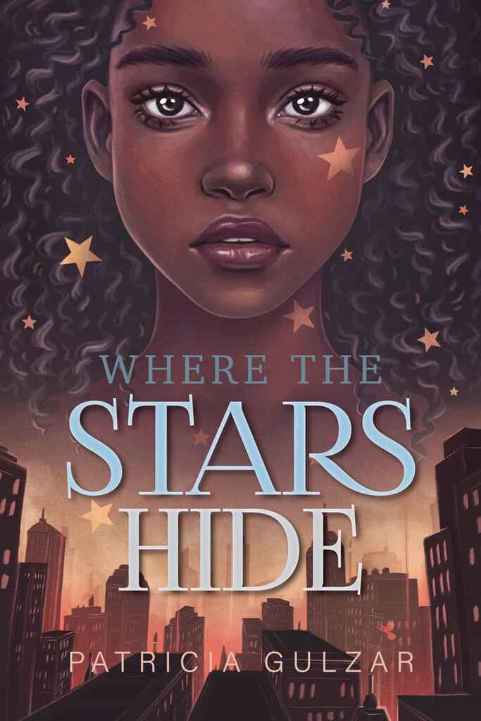
Available to hire ⏺"The author of this magical YA fantasy had a clear vision for the cover—an illustration combining a close-up portrait of the young protagonist and a futuristic cityscape with a strong red glow. After discussing the storyline, we finalized a concept and color palette that best represents the narrative. The goal was to create a dark, mysterious illustration with intense eye contact from the main character, designed to captivate the target audience."
Designer: Eva P.
Designer: Patricia M.
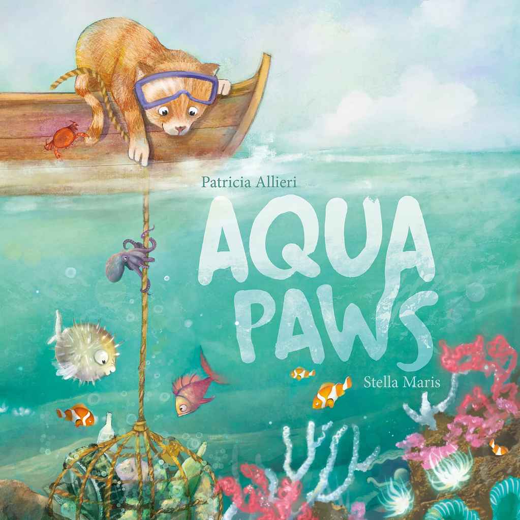
Designer: Stella M.
Designed by Stella M.
Available to hire ⏺"The approach for this cover was to blend two distinct worlds—above and below water, reflecting the cat's everyday life and his adventure destination—in a playful yet serene way. The goal was to create an atmosphere that highlights the cat's curiosity and the underwater scene, with an environmental theme. Textured typography ensures the title is always legible while being playfully integrated into the illustration. Also, the contrasting colors capture kids' attention and make the cover dynamic."
Designer: Kelsey M.
Designer: Taylor B.
Designer: Xavier C.
Designer: Dion MBD
Designer: Caitlin B. A.
Designed by Caitlin B. A.
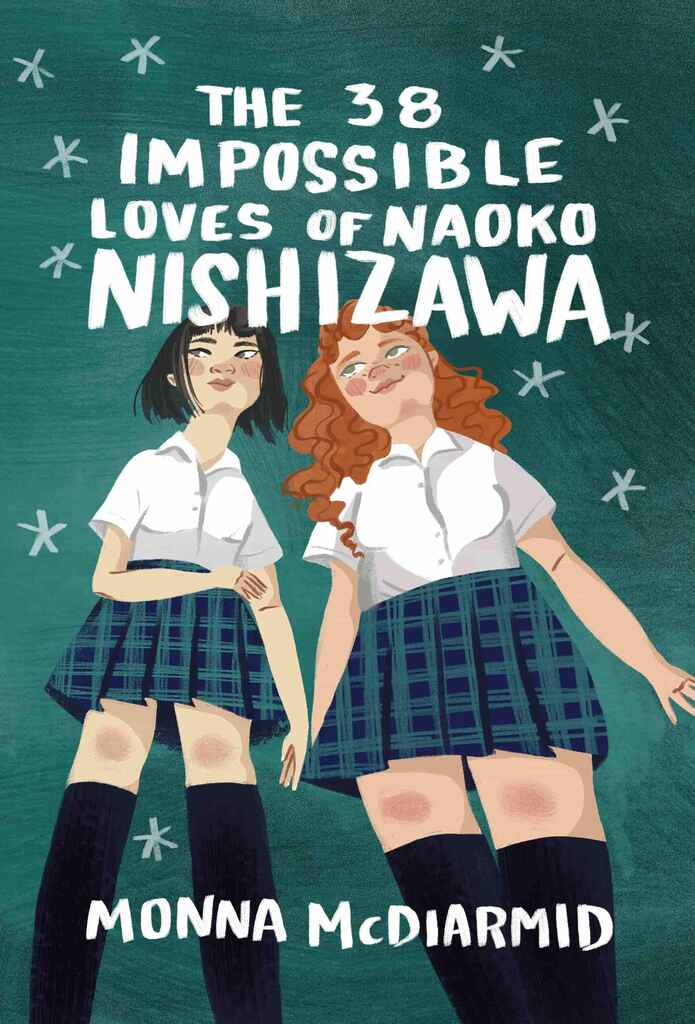
Available to hire ⏺"For this YA novel, the author wanted to emphasize the relationship between these two characters, which was in line with common visual themes in the genre. The friendship is at the center of the story, so I was sure to use body language that showed a comfortability and closeness, and we wanted to be sure to spend a lot of time getting the features of each character correct, emphasizing the uniqueness of the girls, despite their uniforms."
Designer: Caitlin B. A.
Designed by Caitlin B. A.
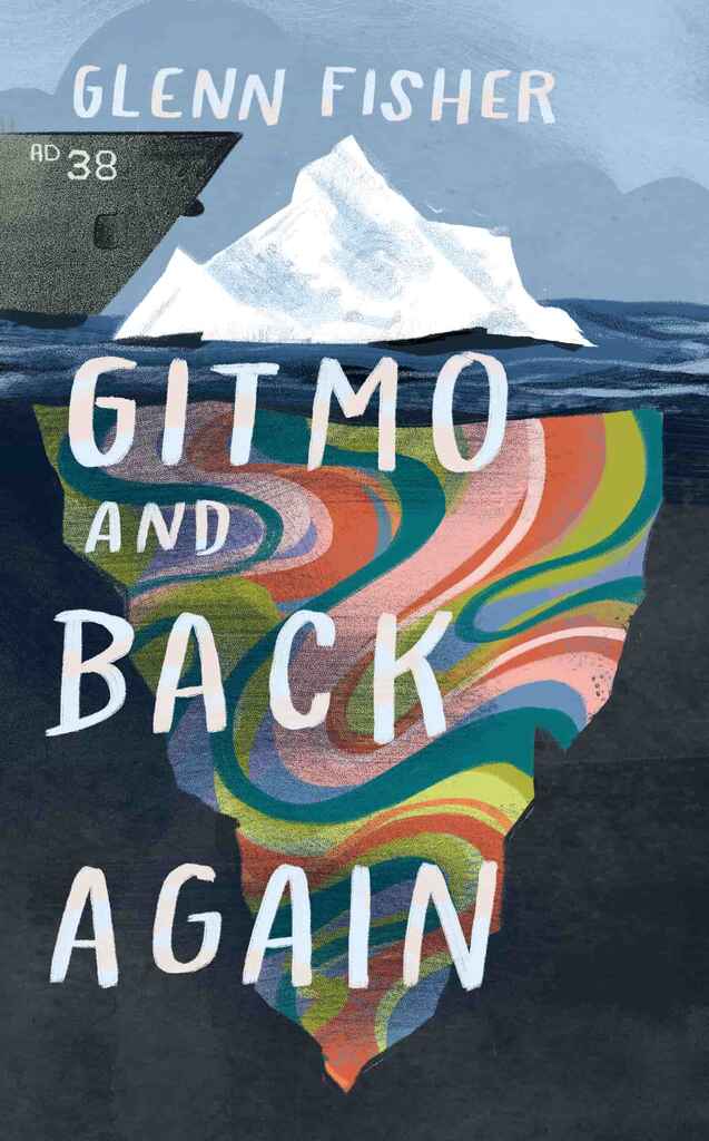
Available to hire ⏺"The author initially envisioned a ship crashing into a sailboat or icebergs adorned with peace signs, reflecting the story of a young man in the 1970s eager to escape his small town and join the revolutionary events shaping his country. To bring the 1970s counter-culture concept to life without falling into clichés, I opted for a collage-style design. Instead of the overused peace signs, I "cut" the icebergs from a psychedelic print, balancing clear messaging with a fresh, original aesthetic."
Over 1,000 professional book cover designers are available on Reedsy, come meet them. Learn more about Reedsy
1,000+ designers available on Reedsy ⏺
Enter your email or get started with a social account:
