Menu
There are currently 1,000+ designers available on Reedsy, come meet them.
Find the perfect designer for your next book
1 million authors trust the professionals on Reedsy. Come meet them.
Menu
There are currently 1,000+ designers available on Reedsy, come meet them.
Find the perfect designer for your next book
1 million authors trust the professionals on Reedsy. Come meet them.
Looking for design inspiration? Explore these captivating fiction covers designed by professionals on Reedsy. See one you love? Get your own striking cover from that designer on our marketplace.
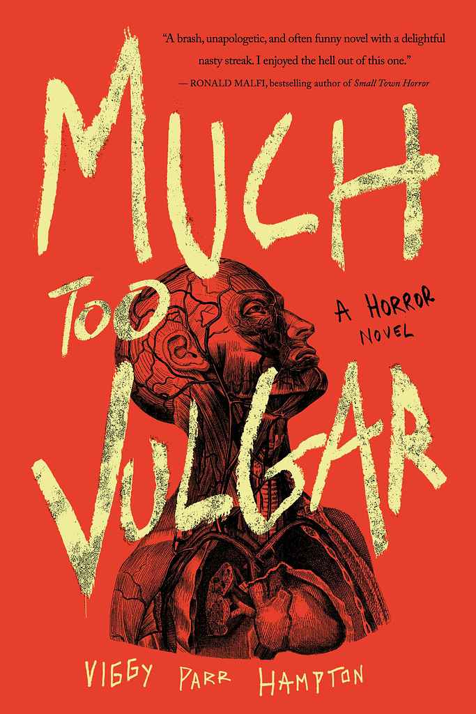
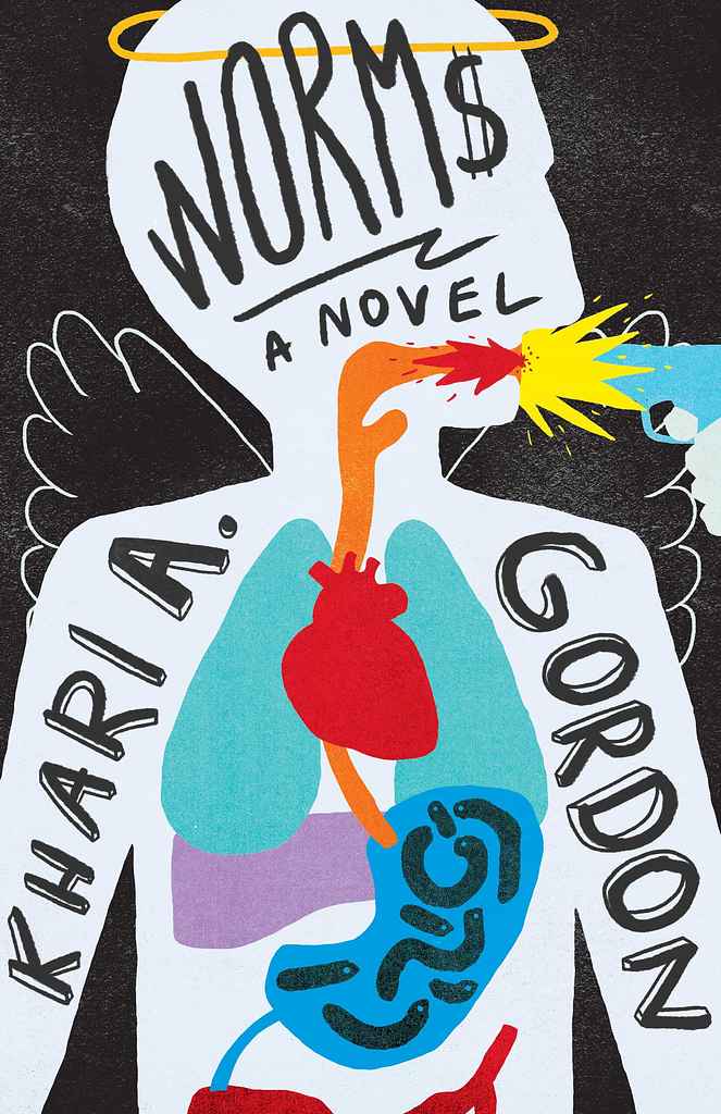
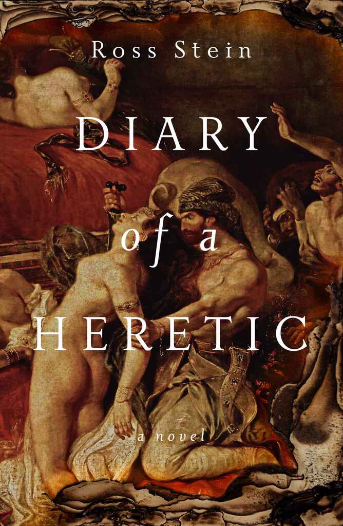
Designer: Nuno M.
Designed by Nuno M.
Available to hire ⏺"This is the second cover I’ve designed for Viggy, following the style of her previous book, A Cold Night for Alligators. The rough, hand-drawn title contrasts with the deep red-orange background, adding urgency and rawness. The anatomical illustration beneath the text serves as a grotesque, eerie focal point, reinforcing the book's theme and complementing the distressed calligraphy. Together, these elements create a bold, eye-catching, and unsettling cover that mirrors the tone of the story."
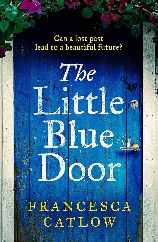
Designer: Andrew D.
Designed by Andrew D.
Available to hire ⏺"As I discussed image options with Francesca, the idea of a close-up blue door quickly became the winning concept. Focusing on the door would make the cover stand out and establish a visual motif for future covers in the series—whether a door, window, or entrance, each featuring a zoomed-in arch."
Designer: Sarah L.
Designer: Alexander N.
Designed by Alexander N.
Available to hire ⏺"The cover features a fictional but typical Minneapolis dive bar, grounding the story in a distinct aesthetic while hinting at key plot elements. The 'Art Deco' style, common to Minneapolis bars, influenced both the cover design and the font. It worked well for a modern minimalist design: it's readabile at small scales while remaining interesting up close. Details like the main character, a lurking figure, broken glass, and a cat stalking a pigeon on the roof add suspenseful hints to the story."
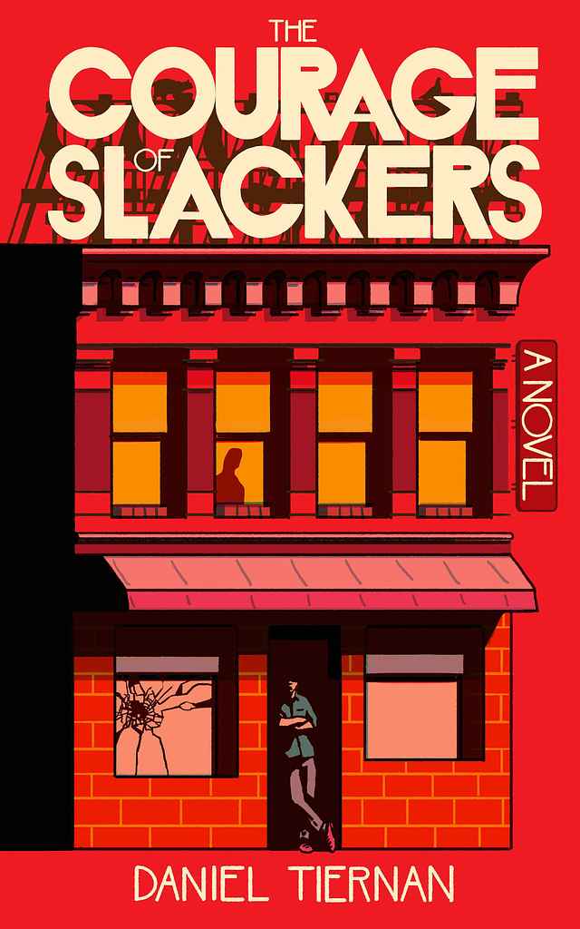
Designer: Barış Ş.
Designed by Barış Ş.
Available to hire ⏺"The cover is directly inspired by the plot, aiming to capture the intense sense of action and adventure. It embraces an underground vibe, signalling to the audience that they’re in for a wild, unpredictable ride filled with eccentric twists. The bold typography and edgy illustration style were carefully chosen to reflect the chaotic energy of the story, letting readers know they’re about to dive into something thrilling and out of the ordinary."
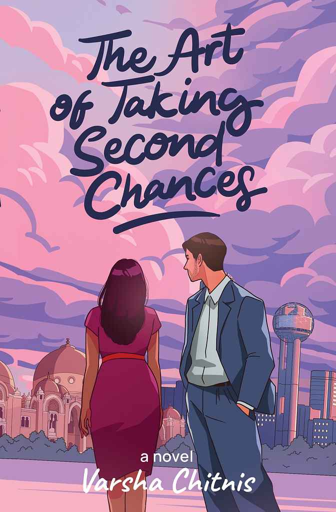
Designer: Zuchal R.
Designed by Zuchal R.
Available to hire ⏺"The cover focuses on the main characters, Tara and Sameer, and their challenging journey, set against the backdrops of Baroda and Dallas. Initially inspired by a specific scene, the concept evolved through collaboration with Varsha to emphasize the settings. The faceless depiction of the characters invites readers to imagine them, while cloud graphics and a hand-drawn title add symbolic and artistic touches. The pink and purple palette enhances visual appeal and reinforces the book's theme."
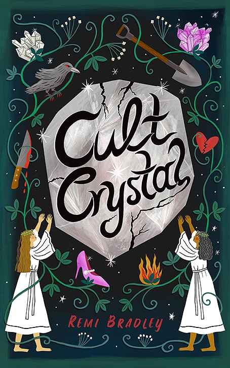
Designer: Stephanie H.
Designed by Stephanie H.
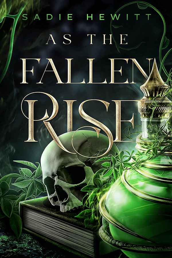
Available to hire ⏺"My main goal in designing the cover for this dark, mysterious, and sometimes humorous novel about female friendship in a cult called the Crystal Collective was to translate the title's essence into an illustration: two women worshipping a cracked crystal, hinting that not all is well in the cult. I balanced this with icons relevant to the plot to spark interest, ensuring the illustration and title remain clear and readable even at thumbnail size."
Designer: Margarita C.
Designed by Margarita C.
Available to hire ⏺"In the plot, the moment when the characters meet is important—it's the trigger for the story, and it happens while they are waiting for the tram. I believe the key is to introduce the tram almost as a third character. Overlaying the title on its side adds dynamism and metaphorically reinforces the idea of how fleeting that moment of meeting is. Either you act, or it never happens, and the opportunity vanishes just as the tram does."
Designer: Nuno M.
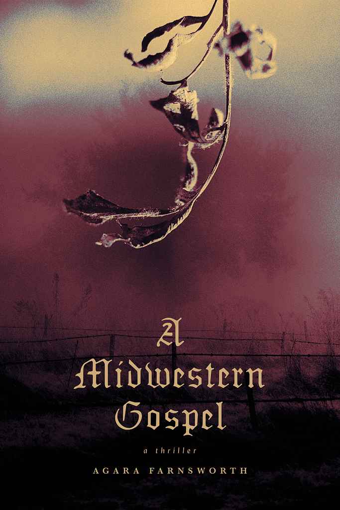
Designed by Nuno M.
Available to hire ⏺"This cover design effectively reflects the tone and setting of a thriller novel based in the South. The muted colors, decaying leaf imagery, and Gothic typography come together to hint at a story full of tension, secrets, and moral conflicts, drawing in readers who are fans of suspenseful, atmospheric tales."
Designer: Jason A.
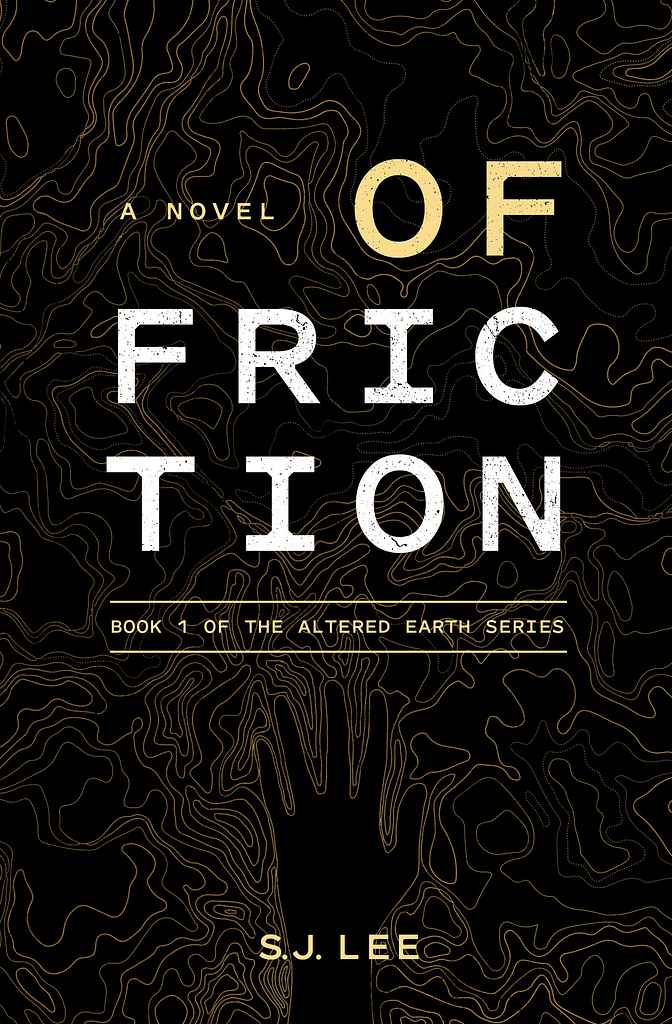
Designed by Jason A.
Available to hire ⏺"The priority was to create a consistent series look across all three books, focusing on the protagonist's arm transformation as the story progresses. S.J. prefers minimalist compositions and wanted to pay homage to the Southern Reach series, which was a big influence. We used a gridded title treatment and a textured background interacting with the protagonist's hand, tied to the book's events. These core elements will be carried through the entire series."
Designer: Margarita C.
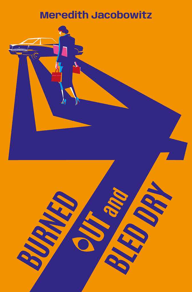
Designed by Margarita C.
Available to hire ⏺"My goal was to instantly convey the novel's genre—cozy mystery with a touch of humor. Inspired by Saul Bass, I created a shadow suggesting a murder scene, with the hurried protagonist walking over it, unaware of what's awaiting her at the car. The exaggerated, almost caricature-like shadow adds dark humor, softening the tension. The title treatment features an 'o' as an 'eye,' acting as a witness. The metaphor hints that the car holds a secret, with the shadow offering a clue to what's coming."
Designer: Laura D.
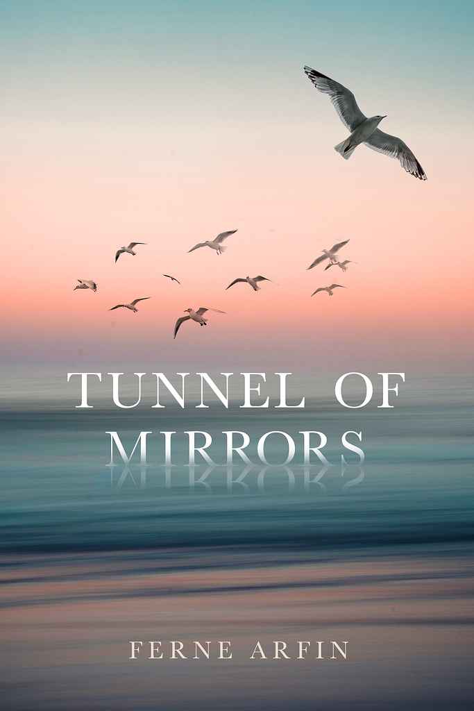
Designed by Laura D.
Available to hire ⏺"It was important that this beautiful novel have a beautiful, romantic cover without being trite. The story takes place in the 1900s and is about a young woman coming to New York from Ireland. The ocean is a big part of the story in various ways. The gull flying away from the other birds was inspired by the main character, a very independent, unique young woman. I wanted to add some interest by having the title look like it's sinking into the sea and being reflected like a mirror."
Designer: Rebecca F.
Designer: Owen G.
Designed by Owen G.
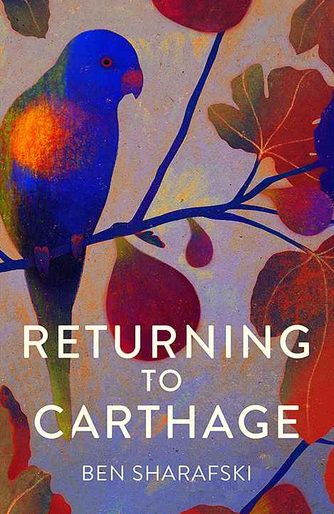
Available to hire ⏺"For this short story collection, I aimed to evoke a sense of place and atmosphere without focusing on a specific narrative. The fig tree and Lorikeet, featured in multiple stories, serve as a tonal and geographical anchor. While botanical and avian illustrations are popular, I chose a less patterned approach with a mix of delicate and saturated colors. Starting with a subdued palette, I added rich, vibrant hues to bring the cover to life and reflect the warmth of the stories."
Designer: Rafal K.
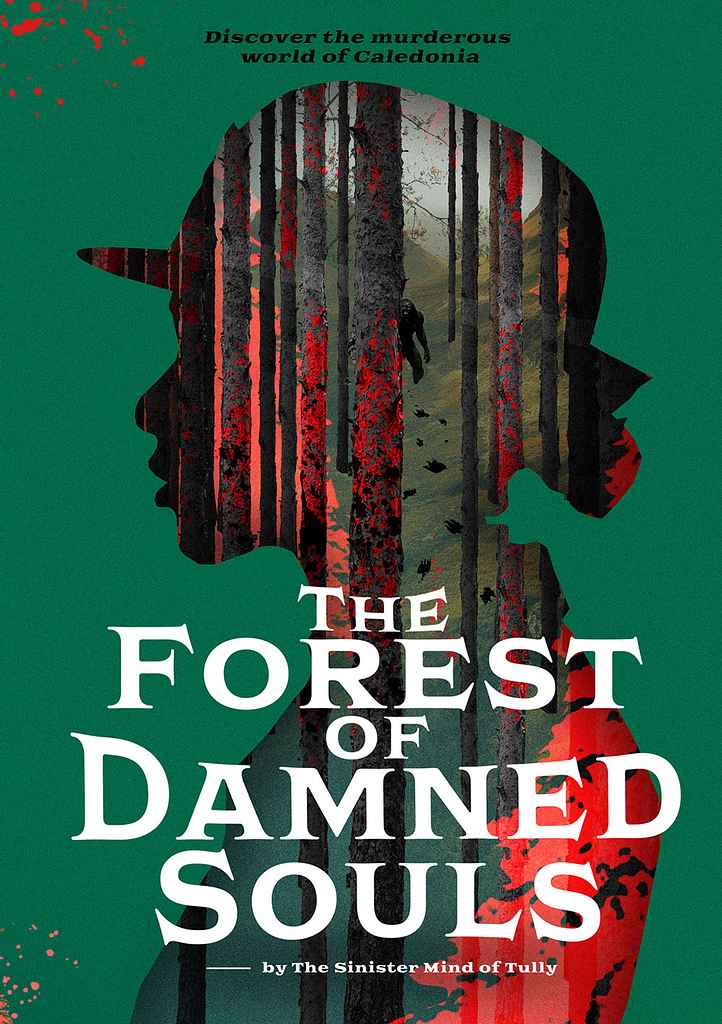
Designed by Rafal K.
Available to hire ⏺"It's a Scottish thriller featuring a fresh female constable solving mysterious crimes in the vast Scottish woods, blending thriller, fantasy, and a sci-fi twist. Scottish thrillers are often straightforward, with covers focusing on the main character or motifs. I wanted to go beyond that, highlighting the genre's greatest asset—mystery—without sacrificing artistic quality. The cover itself is a riddle, with the solution revealed only by reading the story, adding intrigue and depth."
Designer: Latte G.
Designer: Christian S.
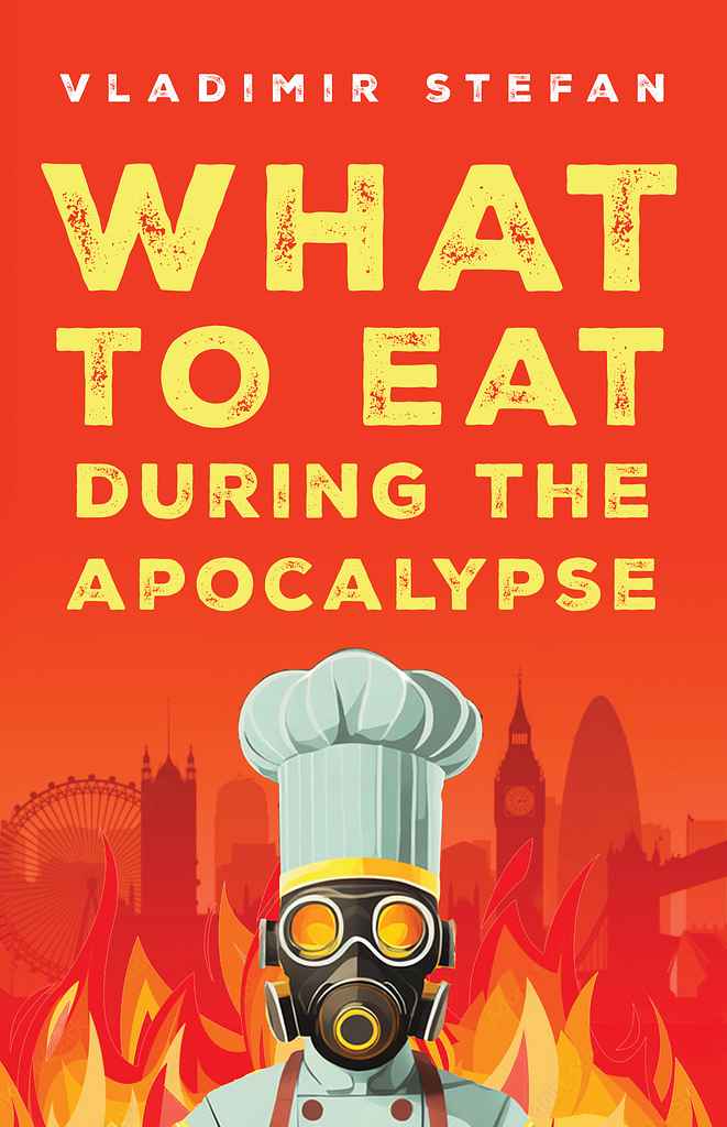
Designed by Christian S.
Available to hire ⏺"This design highlights the quirky, funny title—dystopian recipes!—while presenting the dark backdrop in an engaging way. We chose a gas-mask-wearing chef to capture the book's strange spirit. Borrowing market trends like simple, solid colors and an illustrative style appealing on social media, we created a timeless look. The distressed sans serif typography is readable and suggests breakdown. We aimed for a design that lets the clever title shine."
Designer: Hampton L.
Designer: Nejc P.
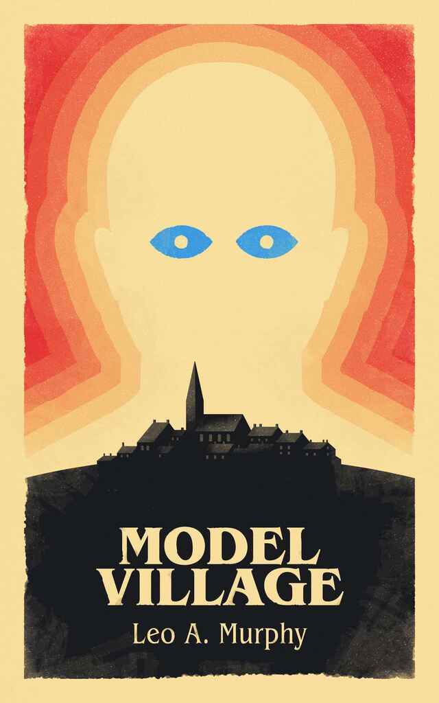
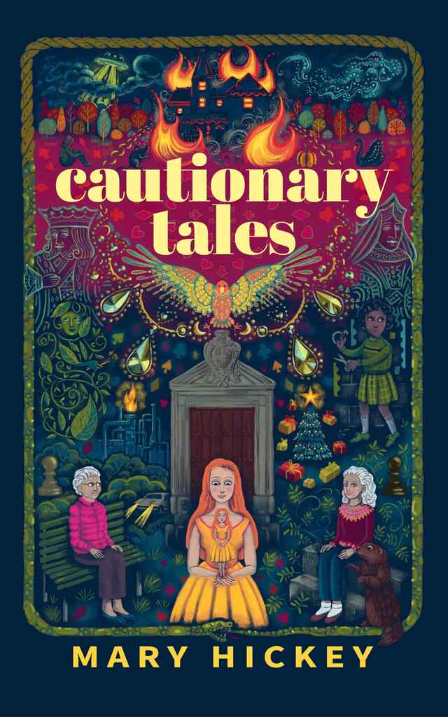
Designed by Nejc P.
Available to hire ⏺"The book is a dystopian novel about a shadowy authoritarian figure terrorizing a small Cotswold village. The cover needed to balance the village's cozy atmosphere with the looming fear of change. Inspired by Olly Moss and vintage Penguin covers of 1984, I used distinct color, shapes, and composition to convey the dystopian themes. A subtle visual easter egg is hidden in the design: the eye color on the cover matches that of the main character, adding a personal touch to the artwork."
Designer: Joe M.
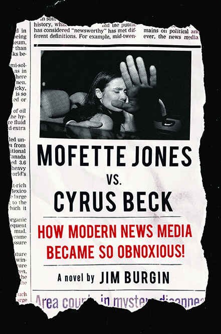
Designed by Joe M.
Available to hire ⏺"For this title, the author wanted a rough, almost cinéma vérité feel to the cover since it deals with the ugliness of tabloid journalism. While using vintage elements like newspapers, etc., can sometimes feel trite and overly nostalgic, I tried to thread the needle by keeping the design bold and graphic while also being restrained and impactful. I believe I was successful, since the cover definitely grabs attention."
Designer: Nejc P.
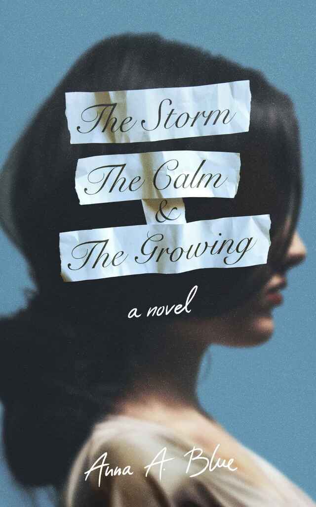
Designed by Nejc P.
Available to hire ⏺"For The Storm, The Calm and The Growing, I aimed for an authentic, raw cover to reflect the story’s tone. I printed, tore, and photographed pieces of the title, and handwrote the author’s name to create a personal, intimate feel. The cover embodies the book’s themes: enduring hardships, finding calm in acceptance, and growing stronger. The tactile, torn typography and natural imagery evoke the emotional depth of the romance while visually representing the protagonist’s journey."
Designer: Barış Ş.
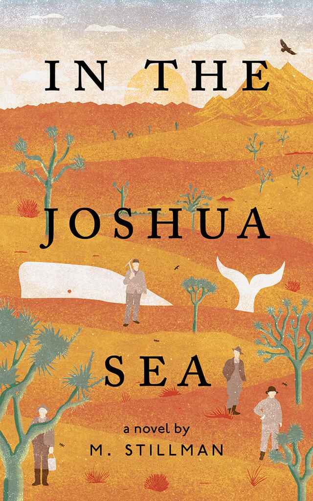
Designed by Barış Ş.
Available to hire ⏺"The cover art aims to visually encapsulate the author's deep connection to Joshua Tree National Park. The challenge was to harmoniously merge the desert landscape with oceanic elements, striking a balance between these contrasting environments. By combining unexpected imagery—such as a whale amidst the desert and Joshua trees—the illustration becomes both captivating and intriguing."
Designer: Vanessa M.
Designed by Vanessa M.
Available to hire ⏺"I wanted the cover to be a whimsical and eye-catching representation of the book’s unique blend of Irish charm and Hollywood dreams. The image of an Oscar trophy, adorned with a traditional Irish leprechaun hat, immediately sets the tone for the story. I believe this cover effectively communicates the book’s light-hearted and aspirational tone, inviting readers to join the protagonist on his unforgettable journey."
Designer: Danna Mathias S.
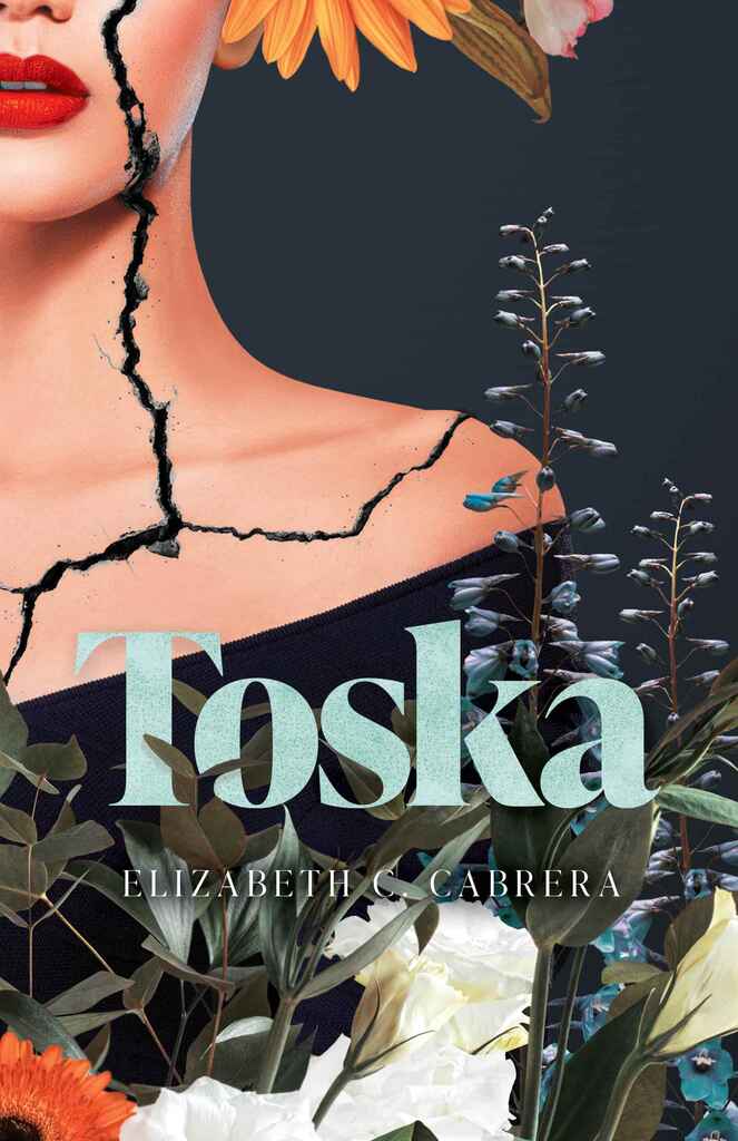
Designed by Danna Mathias S.
Available to hire ⏺"The book is about a woman navigating adulthood. We used florals to symbolize her 'blooming beautifully' into it, with the crack representing the challenge of 'keeping it together.' The heavier serif title font, common in fiction, is balanced by the unique cover image and florals winding through the text. The contrast between the woman's cracked face and the beauty of the florals adds a unique, fun element. I also used texture in the title for cohesion and chose an unexpected title color."
Designer: Patricia M.
Designer: Richard L.
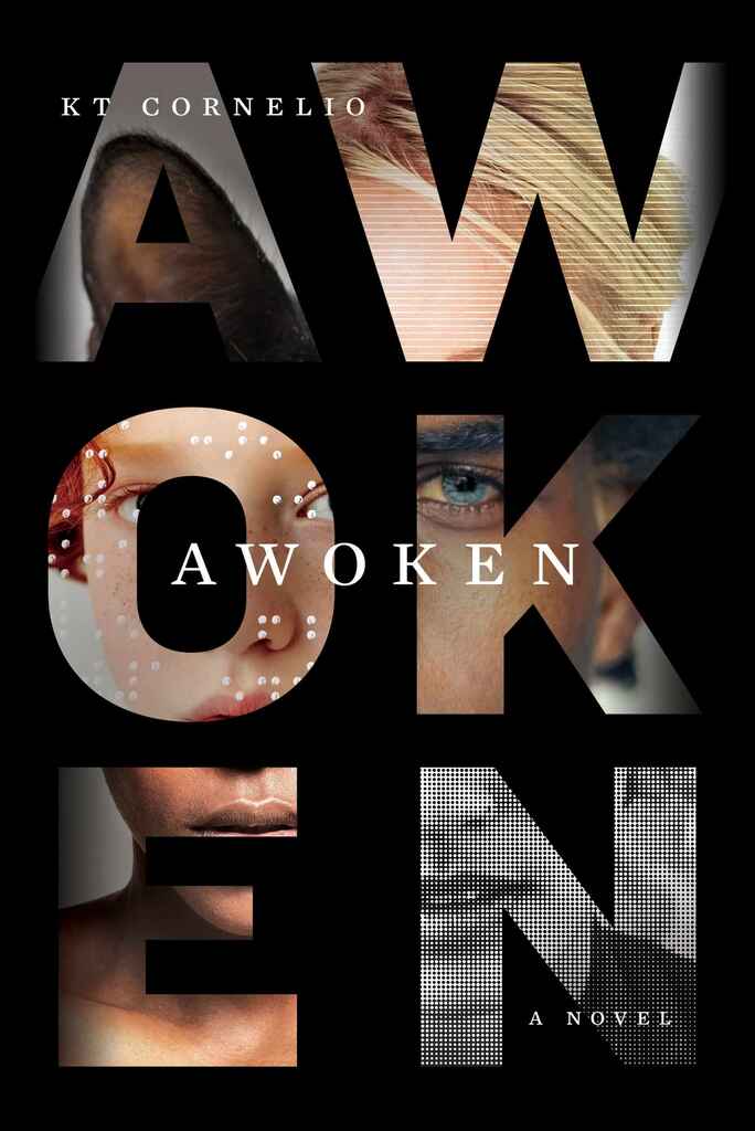
Designed by Richard L.
Available to hire ⏺"Awoken immerses readers in the lives of highly sensitive characters, diverse in age, race, gender, ability, sexuality, and even species. The novel follows parallel timelines, and the visual solution was to use the title letters as canvases, displaying fragments of these scenes while forming one unified character when viewed as a whole. Straddling the line between sci-fi and literary fiction, the design reflects this duality, capturing the novel's complexity and depth."
Designer: Mark T.
Designed by Mark T.
Available to hire ⏺"The design was drawn from ideas of the UK’s corporate culture business and personal excesses of the mid 1980s. The imagery of a paint-daubed Neoclassical statue is a nod toward the financial market background of the main character. The rugby ball has ties to the same character’s sporting background. Basically: work hard, play hard. The typography is cool and considered. The green colour scheme has a playful Penguin-esque vibe."
Designer: Rafael A.
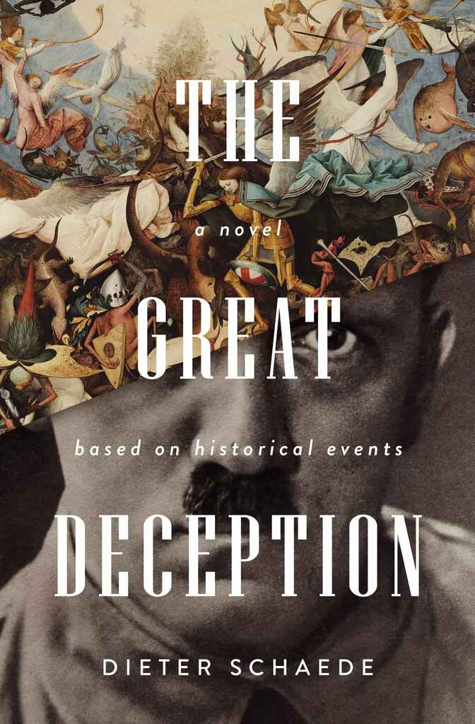
Designer: Devin W.
Craig A. Czuchna
Designed by Devin W.
Available to hire ⏺"The author of this sci-fi-meets-dark-academia book wanted to see the story's two main characters on the cover, but divided by spans of time and space. I used double exposure photography mixed with glitchy visual elements to create a surreal movie poster style cover, and really let the book title placement create separation in the design."
Designer: Caitlin B. A.
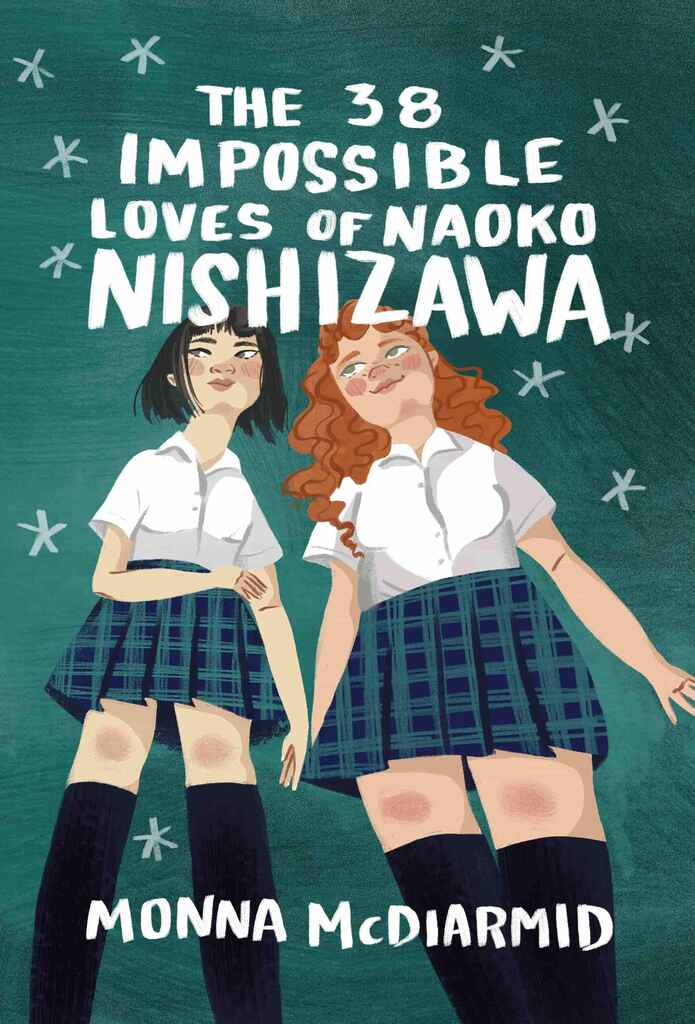
Designed by Caitlin B. A.
Available to hire ⏺"For this YA novel, the author wanted to emphasize the relationship between these two characters, which was in line with common visual themes in the genre. The friendship is at the center of the story, so I was sure to use body language that showed a comfortability and closeness, and we wanted to be sure to spend a lot of time getting the features of each character correct, emphasizing the uniqueness of the girls, despite their uniforms."
Designer: Caitlin B. A.
Designed by Caitlin B. A.
Available to hire ⏺"The author initially envisioned a ship crashing into a sailboat or icebergs adorned with peace signs, reflecting the story of a young man in the 1970s eager to escape his small town and join the revolutionary events shaping his country. To bring the 1970s counter-culture concept to life without falling into clichés, I opted for a collage-style design. Instead of the overused peace signs, I "cut" the icebergs from a psychedelic print, balancing clear messaging with a fresh, original aesthetic."
Designer: Rafael A.
Designer: Devin W.
Designed by Devin W.
Available to hire ⏺"I leaned heavily into the young adult illustration aesthetic for this cover design. I worked closely with the author to understand his vision and incorporated several spooky elements in the illustration that pop up throughout the story. I illustrated the main characters in addition to designing a number of interior illustrations and a hand-drawn typeface. The author said it was fun to see his story come to life. It was a bit like getting to illustrate my own animated movie."
Designer: Liam R.
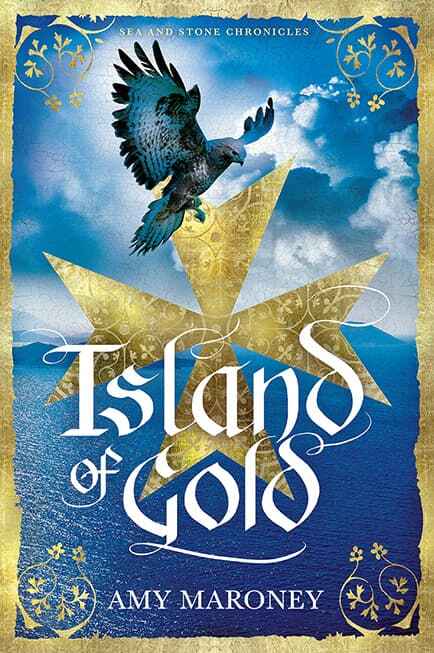
Designer: Patrick K.
Designed by Patrick K.
Available to hire ⏺"This cover needed to feel lush and enticing while reflecting the historical period of the book. Gold border decorations and hand lettering were used to evoke a sense of a bygone era. Initially, the cover featured a hovering hawk, but we recently updated it to include the main protagonist with her hawk, aiming to appeal to a broader market and enhance its presence in the genre."
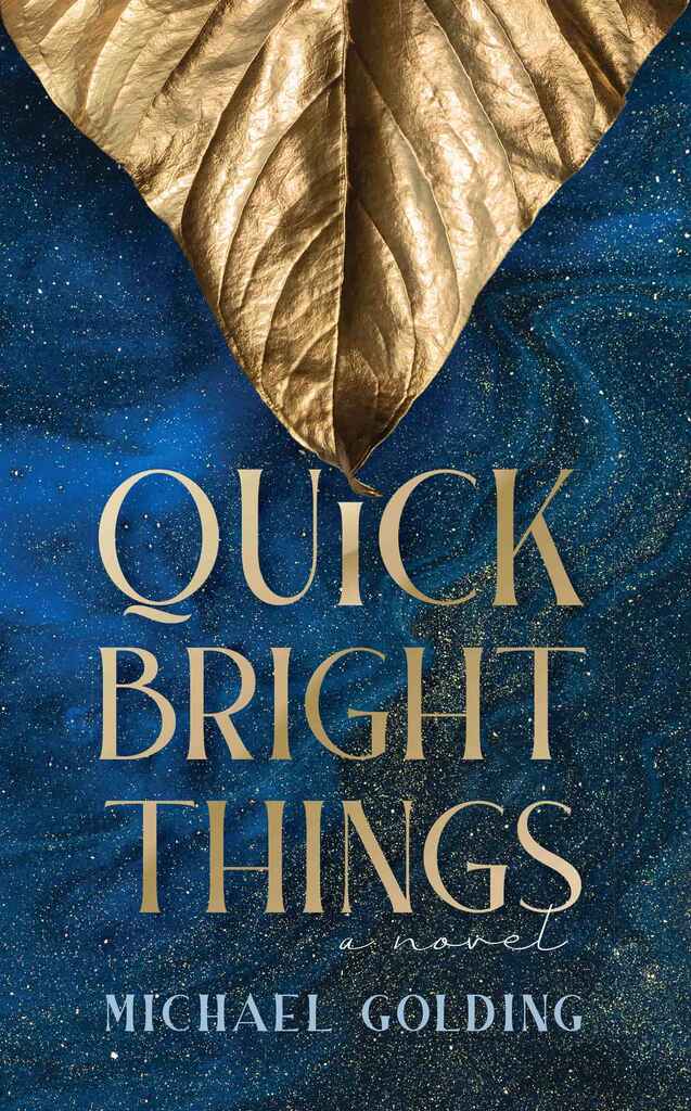
Designer: David P.
Designed by David P.
Available to hire ⏺"Set in New York City in 1948, this novel follows a production of “A Midsummer Night’s Dream”. The cover is intended to evoke the glamour and magic of the theater. The gilded leaf suggests the forest, as the background conveys the enchantment of Shakespeare’s AND Golding’s stories."
Designer: Nuno M.
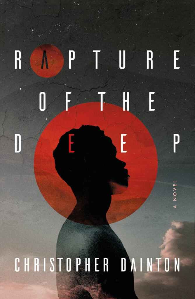
Designed by Nuno M.
Available to hire ⏺"This cover features a striking, minimalist design that captures the themes of dystopia and Afro-futurism. The contrast between the textured, cracked background and the smooth figure creates a tension that aligns with dystopian narratives. Sharp, geometric typography reinforces modernity and futurism, while the muted palette of reds, blacks, and grays enhances the bleak atmosphere. The overall composition is visually balanced but evokes a sense of unease and contemplation."
Designer: Rafael A.
Over 1,000 professional book cover designers are available on Reedsy, come meet them. Learn more about Reedsy
Enter your email or get started with a social account: