Last updated on Aug 09, 2022
10 Brilliant Fonts for Your Book Layout
It’s easy to forget that the book fonts we see today are the results of hundreds of years of design evolution. From designs emulating handwriting to the crisp, clean serif designs you’ll find in most publications, modern fonts are the culmination of centuries of people combining form and function into something magnificent, but that its users barely even notice anymore. Of course, as an author, you can’t get away with this same indifference: font selection is an essential step to designing your book — both inside and out.
Free course: Book Design 101
Learn about formatting and typesetting professional-grade interiors in this course on the fundamentals of book design. Get started now.
What is a font?
Before we get started, let’s clear up a terminological detail. True typography experts will be quick to point out how the term ‘font’ is commonly misused in everyday, non-technical conversation.
For typographers, ‘typefaces’ are different lettering designs, like Times New Roman and Arial. ‘Fonts’, on the other hand, are size, weight and style variations on typefaces, like 12 pt Times New Roman bold and 14 pt Arial italic. However, for convenience’s sake, we’re going to be using the term ‘font’ to refer to both the overall styles of type and their variations.
How to choose a book font
Choosing the 'right' font to use for a book's body matter often comes down to individual taste. With the exception of a few universally reviled typefaces — cough cough, Comic Sans — almost any legible font can be considered. Having said that, there are a few things that any discerning book designer will want to keep in mind.
It needs to be readable
Imagine a beautiful chair. It may be the most gorgeous thing to look at, but if it’s uncomfortable to sit on, then what use is it really? The same goes for fonts. Though you obviously want your font to look nice on the page, it also needs to do its job and be easily readable so that readers can immerse themselves in your words without getting distracted or having to decipher what things say.
To serif or not to serif?
 Although you may not know the serif by name, you’ll definitely have noticed these little lines or strokes coming off the end of letters in certain fonts like Times New Roman (and the modified Times font that we use here on the Reedsy blog!).
Supposedly, serifs lead the eye from one letter to the next, making the reading experience easier and less tiring — although there isn’t actually much scientific evidence in favor of this. But as a result of this theory, you'll commonly see serif fonts used for large bodies of text while 'sans serif' fonts — literally, without serifs — are usually reserved for shorter bits of text like chapter titles and headings.
All this said, humans are adaptable and your reader should be able to adjust to pretty much any font after a chapter or so. If there is a font choice that you think would really elevate or set your work apart, feel free to choose novelty over convention.
Style is still important
To draw your reader in, you’ll want a modern, stylish font that will appeal — but this is pretty subjective, so again, go with one that you like. Your font choice should also be influenced by the contents of your book. You can get a bit creative with titles and headings that capture the spirit or genre of your book a little better. Or even go all out and do something funky with the body text — as long as it makes sense for the layout of your book. Many of the so-called font rules can be broken if the situation really calls for it.
Use fonts to tell a story
For example, the novel Interior Chinatown tackles the idea of typecasting and stereotyping in the film industry. To give it the feel of a Hollywood movie, the book is written in screenplay format using Courier as the standard font.
Needless to say, this is an unusual choice for a novel — using a specific font that is often strongly advised against for book typesetting. But in the case of Interior Chinatown, Courier is a very intentional choice serving a particular purpose and contributing to the impact of the book itself. This is a prime instance in which typical font conventions can be eschewed in favor of effect.
Pro tip: Some sites such as MyFonts allow you to test samples of text in a particular font before you take the plunge and buy it. This is especially useful when choosing among very similar fonts, as you may not be able to pick up subtle differences until you see them in a larger block of text.
10 brilliant book fonts
1. Garamond
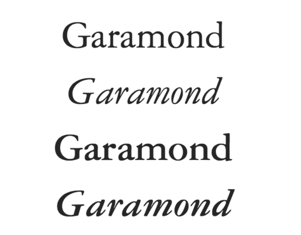 Quick fact: Styled after the work of prominent 16th-century engraver Claude Garamond, this family of fonts rose to prominence as a standard option in Microsoft Word.
If this font were a character: Garamond, a 1920s detective lurking in the shadows of a New York alleyway, waiting for a corrupt district attorney to leave a mob-connected nightclub — right at home in a suspenseful thriller.
2. Caslon
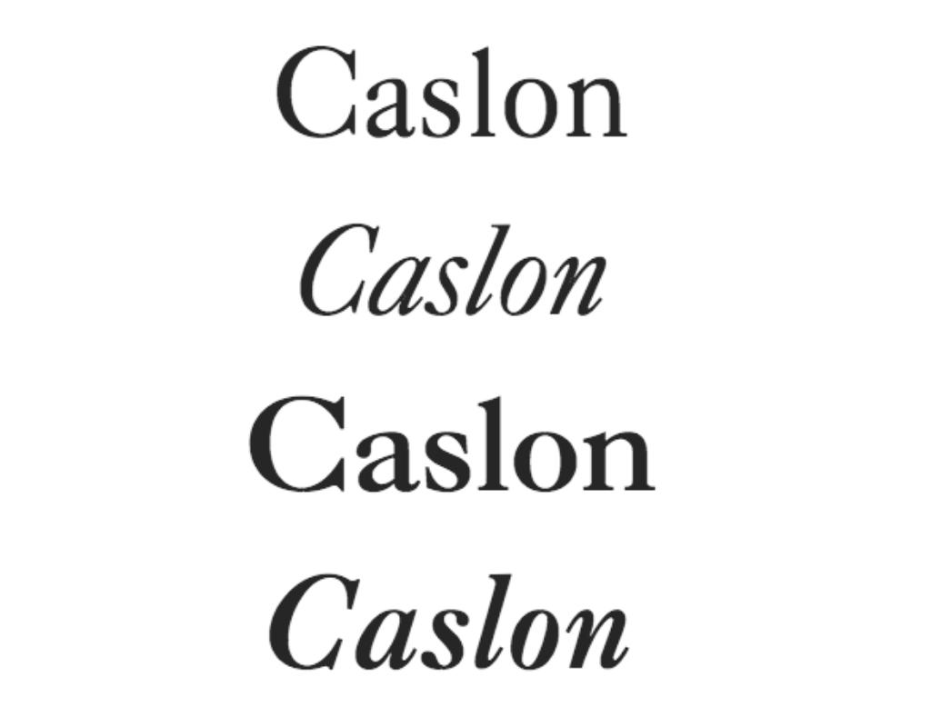 Quick fact: Caslon's designer William Caslon spearheaded the development of an English typographic style, sparking a move away from imported Dutch fonts that were common in England at the time.
If this font were a character: Caslon, a no-nonsense bespectacled professor, who still gets visits from ex-students years down the line because they feel like they owe all their success to him. Clear and reliable, Caslon is great for nonfiction.
3. Baskerville
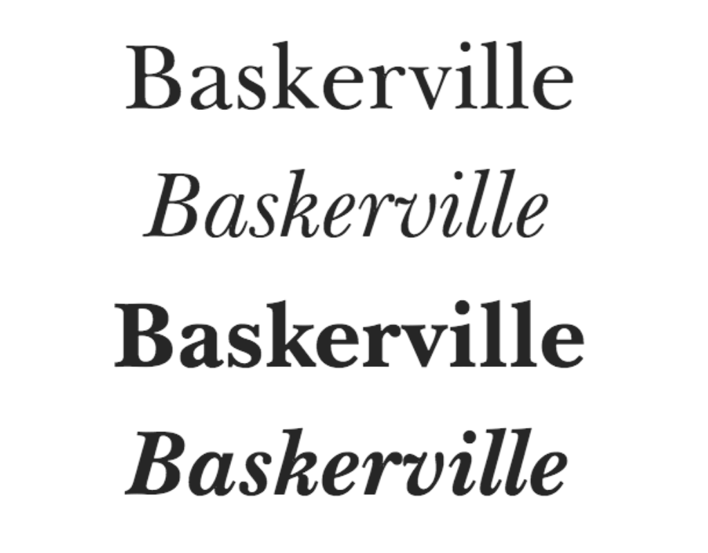 Quick fact: Baskerville was novel in the 18th century for its contrasting thick and thin strokes. John Baskerville, the creator of this font, was heavily influenced by his background in calligraphy.
If this font were a character: Baskerville, lady of the manor, runs the house like a tight ship. Servants quiver under her iron gaze — but her icy exterior melts away when she sits down at her easel. Baskerville clips down the hallways of a transporting piece of historical fiction.
4. Sabon
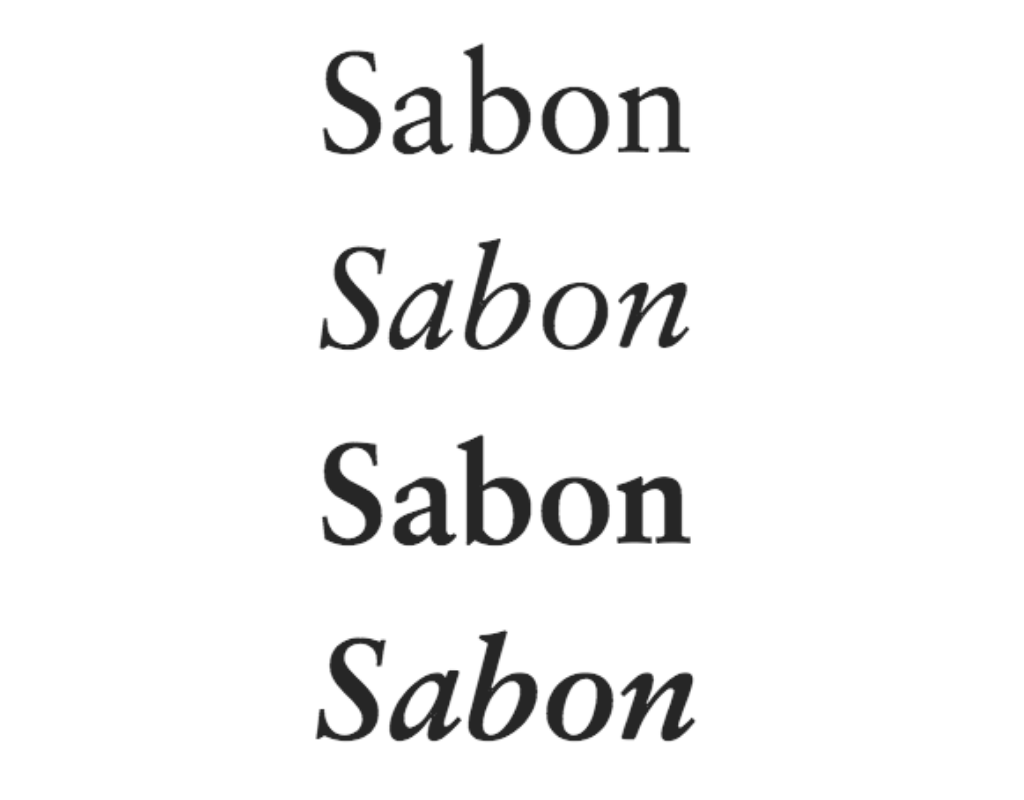 Quick fact: You may notice from the image above that each variant of the Sabon font has the exact same letter spacing (or tracking, as typographers call it). This is a consequence of limitations of the hot-metal typesetting machines used at the time of its development.
If this font were a character: Sabon, a shy hopeless romantic, steals a glance at the sweetheart who doesn’t know of her true feelings — before finally plucking up the courage to go and say ‘hello’. Hence springs a sweet and dreamy romance.
5. Dante
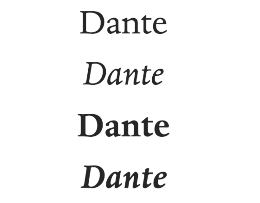 Quick fact: Dante was originally designed in the mid-20th century, for exclusive use by the Officina Bodoni, a private press admired by book collectors across the world.
If this font were a character: Dante, a mischievous teen who just pressed the forbidden big red button in the control room. The spacecraft lurches. Dante dares to take you on a rollicking sci-fi adventure.
Speaking of which, want to take readers on an otherworldly adventure? Check out our post on how to write science fiction!
6. Bembo
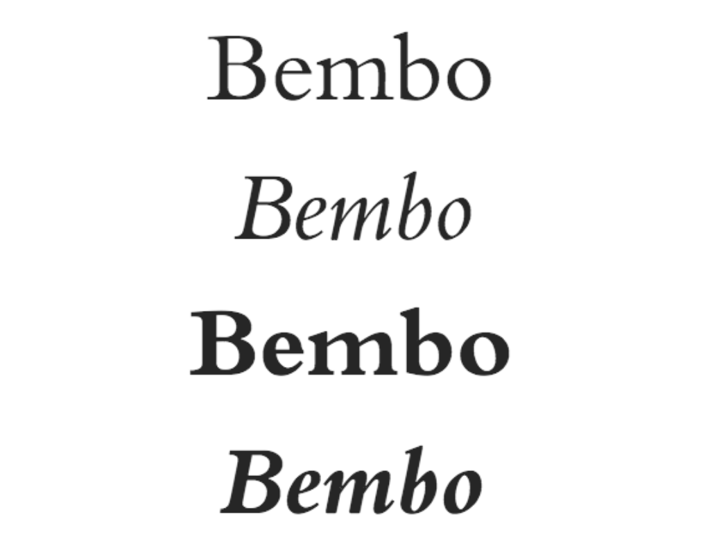 Quick fact: Unlike many typefaces which are named after their designers, Bembo takes its name from the author who first used it in publication: Italian poet Pietro Bembo.
If this font were a character: Bembo, a wanderlusting photographer dining alone in the shade of a palm tree, a third helping of fried fish already on its way — but can it truly fill the chasm inside of him? Bembo is a great choice for some evocative literary fiction.
7. Janson
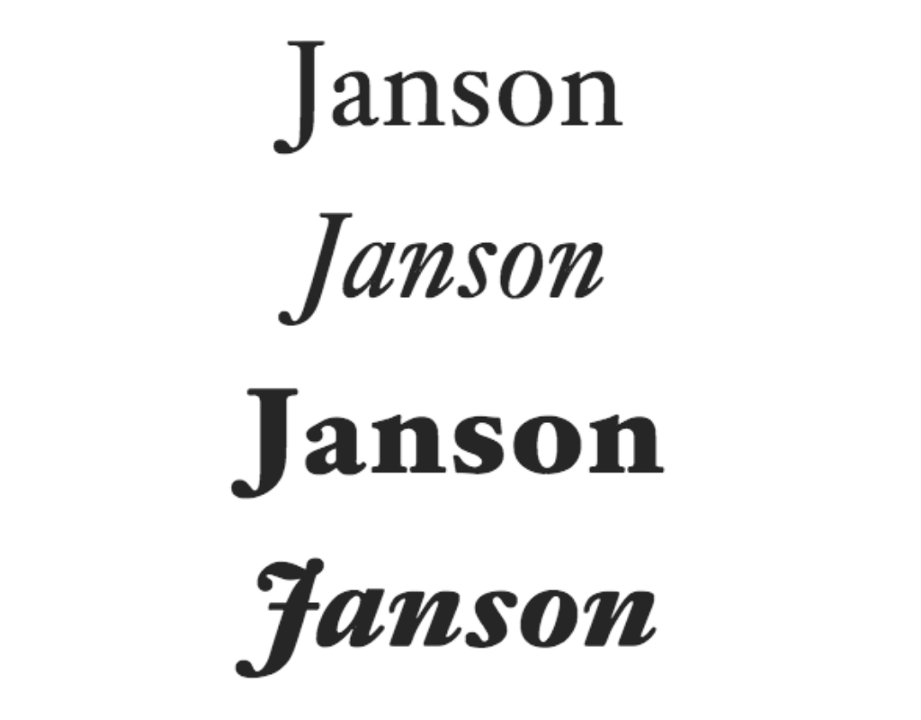 Quick fact: Although this typeface was actually designed by the Hungarian punchcutter Miklós Kis, it was originally mistakenly attributed to Anton Janson, whose name it still bears.
If this font were a character: Janson — a wise old soul who, after years living the fast life of a musician, has traded in the trumpet for a trowel, growing fruit and vegetables in abundance. Take a trip down memory lane with Janson in your memoir.
8. Bison
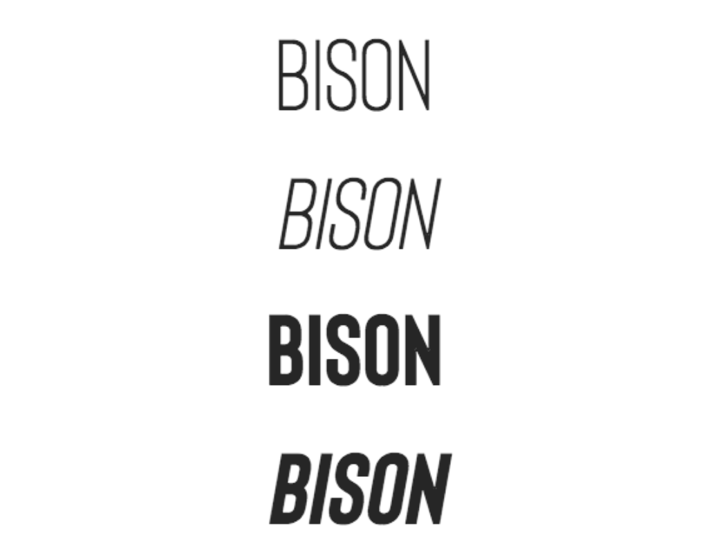 Quick fact: This all-caps sans serif font was inspired by the animal from which it takes its name. (But to be honest, we don't really see the resemblance.)
If this font were a character: Bison, a large and in-charge CEO, feet propped up on the desk, looking out across the city from the 90th floor. Bison brings a sleek and confident touch to headers and titles.
9. Captain Comic
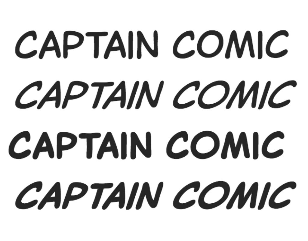 Quick fact: Clearly inspired by the lettering style found in the pages of comic books, Captain Comic is the sophisticated older sister of Comic Sans. Use with caution!
If this font were a character: Captain Comic, a dauntless hero, scales a clocktower in the dead of night — aware of what danger could await at the top, but fearless nonetheless. Captain Comic reigns supreme in an action-packed graphic novel.
10. Pequena Pro
 Quick fact: Pequena Pro was designed in 2016 by Rodrigo Araya Salas and supports both Roman and Cyrillic alphabets. (Look, these quick facts can't all be winners.)
If this font were a character: Pequena Pro, a talking hippo, is on the lookout for food (as always) when she comes across a family of meerkats stuck on the bank, and offers to help them cross the river. Pequena Pro is delightful for a children’s book.
How to access book fonts
The simplest way to get your hands on the most suitable fonts for your book is to work with a professional typographer. They will have access to font libraries and many of these experts can even create bespoke typefaces, should your project call for it.

Make your book font-astic!
The best typographers are on Reedsy. Sign up for free and meet them.
Learn how Reedsy can help you craft a beautiful book.
But if you take the DIY approach to formatting your book, then you’ll need to get hold of fonts yourself. Here’s what to know if you’re taking this route:
You don't buy a font, you license it. If you're going to be printing physical copies as well as publishing ebooks, you need to confirm that the font can be used in print and not just in digital work (which some are).
Fonts come in bundles. Quick switch to typography terminology here — to use all fonts of a certain typeface (for example Caslon Regular, Caslon Bold, and Caslon Italic) you need to buy the whole family of Caslon fonts, either individually or as part of a bundle.
Free isn't always good. Free font download links can sometimes carry viruses. Also, bear in mind that the individual offering the free font might not actually have the right to distribute it — and there could be consequences for using them.
On that note, here some trustworthy sites that offer both free and paid fonts:
Paid:
Free:
⚠️ Whether you download your fonts for free or purchase them, make sure to read the Terms and Conditions carefully so that you understand exactly what you are and aren’t allowed to do with them.
All fonts have a time and a place — yes, even Comic Sans — but that place may not be in your book. As you undertake this critical selection process, make sure that you’re thinking about the specificities of your book and precisely what you want your font to achieve.