Posted on Apr 11, 2015
The Perfect Book Cover: An Interview with Graphic Designer Nuno Moreira
About the author
Reedsy's editorial team is a diverse group of industry experts devoted to helping authors write and publish beautiful books.
More about the Reedsy Editorial Team →“The perfect cover is seductive, mysterious, puzzling.”
At Reedsy, we have the chance to work with exceptionally talented and creative people. Whether they express themselves in words or images, they are always striving for their creative output to reach a level of perfection that each of them defines and idealizes in a different way.
Today, Nuno Moreira, a Portuguese graphic artist now residing in Tokyo, offers us what may be the “perfect” definition of a book cover. Before that, he outlines the differences between working for a publisher and working directly with an independent author; and explains how a lousy cover first got him into book design.
But get to the “perfect cover” question. It’s worth it.
Hi Nuno, great to have you here. You’re a freelance cover designer based in Tokyo, and work predominantly with independent authors and small presses. How did you first get into book design?
Hi there, thank you for the opportunity. I started working with books and editorial design back in Portugal, in 2007, designing books for a handful of publishers, most of them no longer in activity nowadays. It all started because I was reading a book by Alejandro Jodorowsky and the cover was just horrible. I stopped and thought to myself: how can such provocative ideas be hidden behind such a lousy cover? So, I immediately put the book aside and wrote an email to the publisher. Months later I found myself working not for that publisher, but for two others and then things just gradually took from there. Basically, Jodorowsky is to blame for my book cover practice!
I always loved reading and being surrounded by books and magazines and with time it only got worse (in a good sense of course). Since then I started art directing for Editorial Estampa - a publisher with over 50 years in Portugal - and then, slowly I started taking commissions from varied publishers and authors. These last 4 years I’ve been designing mostly for independent presses and self-published authors in the US and UK.
Is working with an independent author different than working for a publisher?
It depends, but I tend to have the same kind of professional relationship with all sorts of clients, be it bigger publishers or not: everything has to be clear and we have to understand each other’s positions and tasks. Where I mostly see the difference is that independent authors want to have more control on the output (which I can clearly understand since it’s their book and it comes entirely from their pocket) and sometimes are less flexible to be surprised by different directions in cover art. I think we all suffer from this lack of perspective when we are too deep into a certain project and fail to see that things can be approached from all sorts of angles.
When I’m working for a publisher usually they serve as a bridge between the author and me. They filter the authors’ intentions or their over-creative ideas that might block my own approach to the cover. I still think authors having a mediator (or a third person within the industry to rely on) is crucial because it helps keeping things balanced, the publisher's function should not be overlooked, their job is extremely important.
Free course: Book Design 101
Learn the fundamentals of book design, from creating beautiful covers to formatting and typesetting professional-grade interiors. Get started now.
Your job can sometimes be frustrating when the publisher pursues a direction that you’re not 100% in agreement with, and you still have to comply. Do you think that designers should have more creative freedom?
That is entirely a matter of trust. And to trust someone you have to see that person’s work and see if they are right for the job. I always think that when I go to see a doctor I don’t tell him what to do. I tell him the symptoms and I trust his sense to treat me. You know what I mean? I can’t speak for other designers but if you want to work with me there has to be a certain degree of trust and letting go to be able to arrive at satisfying results. I’m the kind of person who really does a lot of sketches and different comps until picking 2 or 3 really good ones to send as proposals to a client. I consider things, A LOT. Sometimes I do about 40 different versions of a cover until I can find a point of satisfaction or feel that “eureka” moment, other times it’s pretty effortless and it all comes out quickly. If you’re a creative person and exercise your visual side you know when that moment occurs, so I’m always searching for that spark when sketching a cover. This means: I don’t work with stock images, I don’t work with pre-conceived concepts or “covers on demand”. I don’t work with literal interpretations of titles into images. I think the readers have the right to be treated as educated and intelligent people and if you’re an author or publisher, you shouldn’t be afraid to take risks and trust a good designer to come up with something bold and different. In sum, let's leave clichés at the door.
You have your very own particular style of work, which emphasizes detail to color and rich texture. Do you think it is a style that suits any genre, or do you specialize in some?
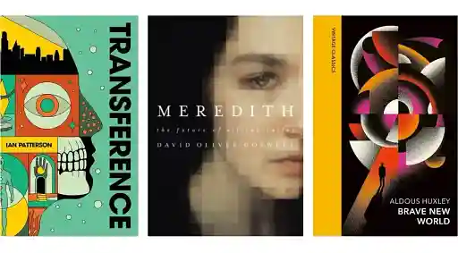
I think my approach to design can extend to almost every genre and kind of book. It’s true I emphasize texture and color, mostly through watercolor techniques and the proper combination of typography. I’ve seen the best results coming in genres such as poetry, an example being the Leonard Cohen book “God is Alive, Magic is Afoot”, but also memoirs, suspense, thrillers, historical novels or fiction in general. I’m always hungry to start a new project!

If you had to define what the “perfect cover” is for a fiction book, how would you go about it?
The perfect cover is an image that points me to something I didn’t think about before. It gives me a skew angle on the title of the book, or just about an obscure detail. The perfect cover is seductive, mysterious, puzzling. The perfect cover is either bold or very subtle. The perfect cover stimulates my imagination or serves as a gateway to what we can find inside. The perfect cover is not explicit or gives too much away. The perfect cover is not ashamed to be seen riding the metro or appearing in public places.
Is there something designers can do to train their skills and develop them further, or is it all just pretty much inherent talent?
Inherent talent comes from lots of work and being stubborn. A designer or creative person, in general, has to keep training their muscles and researching. But then again, I think a creative person is by nature of the curious and questioning kind, so the need to keep learning new things is kind of built-in already. Personally, I do a lot of manual collage (or photomontage) that keeps me away from the screen and it’s also a way of studying composition, drawing, painting and having different approaches to image and communication. Sometimes that leaks into book cover artworks or posters, which is very satisfying. I also do my own photography projects and that is a whole different universe and could lead into a completely different interview. Apart from direct visual practices, being surrounded by different people and having different experiences is pretty important as well. I mean: reading about different topics, travelling, going to see all kinds of exhibitions and movies, listening to new music, there’s so much out there to discover, see and learn. Writing or creating is a beautiful thing, but we need source material to accomplish good results and that source material comes from having experiences and living. To be totally honest, 80% of my best ideas come from when I’m completely away from the studio.
Thank you for your time, Nuno!
Want to learn more about working with professional book cover designers on Reedsy? Click here! And if you want to check out some samples of their work, just pop over to our book cover art gallery.
We are big believers in the value of talented professional designers. We’re sure you are too! So here’s an exclusive offer: get 10% off any design quotes through Reedsy! Just sign up to Reedsy using this link and submit a cover design request to any of our freelancers; then drop us a line at service@reedsy.com to claim your discount!



3 responses
George_Si says:
08/05/2019 – 12:31
If you seek cool vector graphics with rights allowing you unlimited print run or using it on items for resale such as BOOK COVERS, you may want to check out this site: http://toonstyle.com - there's a growing collection of unusual cartoon vectors there!
Michael C. Boxall says:
08/05/2019 – 12:33
“Points me to something I didn’t think about before” is a great definition. It reminds me of something an editor once said about the perfect magazine story: it tells the reader something they never knew they wanted to know. A few years ago Flavorwire ran a piece on the twenty most iconic book covers. There’s boldness and subtlety in spades. If I had to pick one as the best--that is, most eye-catching and most intriguing--I’d put my money on the Penguin edition of A Clockwork Orange. It’s bright, colorful and bizarre, also threatening. The same could be said of Catch-22. And of In Cold Blood--simple but chilling. I think the original cover to The Godfather is still being used; I know I saw it again not long ago, that puppeteer’s fist. All the covers Flavorwire lists are from about fifty years ago. There’s nothing recent. The only cover I’ve seen lately--within the last couple of years--that has stuck in my mind was wrapped around Annabel Lyon’s novel about Alexander the Great, The Golden Mean. It used a photo of a naked boy sprawled on a white horse. I think that image was only on the original edition, and cravenly swapped for something less powerful in case it offended the prudish. Has the Golden Age of book covers passed?
↪️ Moulton Mayers replied:
13/03/2020 – 08:16
I am puzzled and mystified about the staggering cost of book design and authors' need to give away their books after spending so much to bring those books to the market: Why is book design so prohibitively expensive? There seems to be a disconnect between what book layout artists and book designers are asking for and how much authors are actually making. I have run across a few reasonable book producers (layout artists and designers); but by and large, the prices that the majority of book producers are asking are downright ridiculous. It seems to me as if writers and book producers should partner to produce a profitable book business model because it doesn't seem to make sense to pay $5000.00 top bring a book to market that will be swamped by a tsunami of trashy books.